
Winter Sunset
Posted: August 13, 2015 Filed under: Etched Branches, Prancers, Stamped Landscapes | Tags: Faber-Castell Albrecht Durer Watercolour pencils, Fabriano Watercolour Paper, Penny Black stamps 11 Comments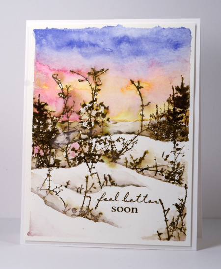
I have another wintry scene today created back in January when it really did look like this outside! I used painter’s tape to mask the edges of the watercolour panel then frisket film to mask the snow while I painted the sky with colour picked up from my watercolour pencils. I stamped some trees before moving the frisket mask down to create more snow banks. Before I moved the frisket film each time I added twigs and scrub in the snow banks by stamping parts of the ‘Etched Branches’ stamp. Frisket film is a plastic film which is waterproof and sticky on one side making it perfect for masking with wet mediums like watercolour.
Occasionally I am asked in classes what to do when paint seeps under the masking tape around the edges of a panel. You can see it did so in a few places on the one above. Often I will do nothing and it will have some uneven edges to add to its uniqueness. If it looks too messy or unbalanced I sometimes trim or add a die cut to cover the offending area.
Don’t forget to keep checking the PB blog if you are interested in the new products from the ‘Especially for You 2015’ release. There are new cards everyday and a chance to win some new stamps and dies.
Supplies:
Stamps: Etched Branches, Amazing, Prancers (PB)
Inks: Walnut stain distress ink (Ranger)
Cardstock: Fabriano 100% cotton hotpressed watercolour paper
Also: Faber Castell Albrecht Durer watercolour pencils, Graffix frisket film
Snowy Hillside
Posted: August 11, 2015 Filed under: Tannenbaum | Tags: Penny Black creative dies, Penny Black stamps, Ranger Distress stains 9 Comments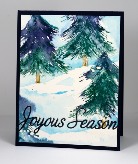
The fun continues on the Penny Black blog today with more new dies on display. I have another new die featured on today’s card; ‘Joyous Season’ will be available along with the remainder of the new release on August 25th.
I made my little scene with the Tannenbaum stamp again, inking with both green and blue stains and painting the sky and snowdrifts with lighter blue stains. My watercolour paper was splattered with masking fluid before I began and then rubbed off when all the ink was dry. Because I was mounting the panel on a dark blue card base I decided to die cut the sentiment straight out of the panel. It is barely noticeable in the photo but I went over the revealed blue letters with a clear wink of stella marker to give them a little sparkle.
Supplies:
Stamps: Tannenbaum (PB)
Creative Dies: Joyous Season (PB)
Inks: Chipped Sapphire, Pine Needles, Tumbled Glass, Broken China, Vintage Photo distress stains(Ranger)
Cardstock: Canson 100% cotton hot pressed watercolour paper
A Very Merry
Posted: August 10, 2015 Filed under: A Very Merry | Tags: Fabriano Watercolour Paper, Penny Black creative dies, Penny Black stamps, Ranger Distress stains 3 Comments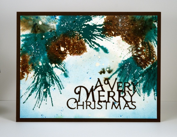
On the Penny Black blog for the remainder of August you can see one new product after another as the ‘Especially for You 2015’ release is revealed. This week is all about new dies and there are a whole stack of new word dies featured on the PB blog today. One of the new word dies happens to be ‘A Very Merry’ on my card above. The pine bough is a new stamp too but I can give you details about that another day. There is a giveaway to coincide with the new release too so pop over to the blog.
If you have visited here before you will know my watercoloured cards range from quite neat and controlled to rather free, watery and loose. This is one of those loose ones that almost didn’t make the cut. However there was something about it, just enough definition in a couple of pine needles and cones to keep me from tossing it. It is stamped and painted on watercolour paper splattered with masking fluid. Before I stamped any images I spritzed some water and some spots of distress stain over the panel. I painted some tumbled glass distress stain also to fill in parts of the background. I let it dry a little before inking the pinecone stamp with distress stains and stamping it three times. It was quite wet so I dropped some bister powder into the wet areas to give some extra depth of colour. When it was almost dry I stamped over the initial images to add more definition in a couple of places. To complete the card I attached the panel to a dark brown card base and die cut the sentiment out of the same colour.
Supplies:
Stamps: Brush Pines (PB)
Creative Die: A Very Merry(PB)
Inks: Pine Needles, Evergreen Bough, Vintage Photo, Tumbled glass, Black soot, Gathered twigs distress stains/markers/inkpads (Ranger)
Cardstock: Fabriano 100% cotton hot pressed watercolour paper & Brown card
Also: Blue and Green bistre powder, Winsor & Newton masking fluid.
Winter view
Posted: August 8, 2015 Filed under: Prancers, Skyline, Stamped Landscapes | Tags: Fabriano Watercolour Paper, Penny Black stamps, Tsukineko Memento inks 6 Comments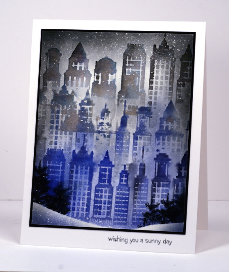
Here is another wintry scene I created back in January for Splitcoaststampers. My first month with the Dirty Dozen was January and all the projects had to be finished and uploaded by the 13th. When I was planning my time and projects I did not know our children had planned a trip for my husband and I to celebrate our anniversary and birthdays. They had purchased air tickets, broadway tickets and a hotel room in New York for four days! Some cards were finished before I left on January 6th and a couple, including the one above, were finished when I returned. Inspired by our trip I created this card for the ‘All Cooped Up’ theme and could not imagine a better place to be cooped up in winter than an apartment overlooking Central Park. As you can see from our photo we enjoyed walking through the park in bright sunshine. Freezing cold but sunny.
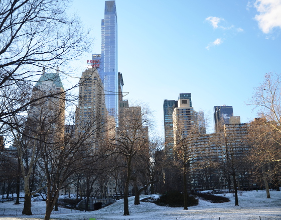
To create this scene I splattered masking fluid on watercolour paper with a spatter brush, then, when it was dry stamped partial imprints of the skyline stamp spritzing both the stamp and paper to make sure my colours blended. I used a brush to pick up and add more colour around the buildings to create the impression of a grey day. Before stamping the bottom buildings I added a snow bank mask so the base of the buildings and the trees would appear behind it.
Supplies:
Stamps: Skyline, Summer Fun, Prancers (PB)
Inks: Memento London Fog, Tuxedo Black, Paris Dusk (Tsukineko)
Cardstock: Fabriano 100% cotton hotpressed watercolour paper, Epic Black & Solar White cardstock(Neenah)
Also: Winsor & Newton masking fluid, Kemper spatter brush
Tannenbaum trio
Posted: August 6, 2015 Filed under: Stamped Landscapes, Tannenbaum | Tags: Bister, Penny Black stamps, Ranger Distress stains 10 Comments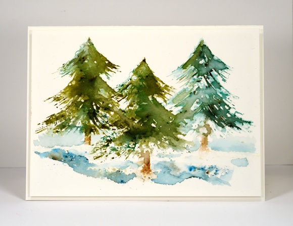
I had a look through my supply of Christmas stamps this week to find some tree stamps to experiment with. I love the ‘before the snow’ tree but it is nice to mix things up a little. Someone said at my class tonight, “You can never have too many tree stamps,” an opinion I entirely agree with. The tree stamp above comes with a decorative topper which I surgically removed ( don’t worry, I kept it in case I need it). I stamped each tree with distress stain first then painted over the stamping with a paintbrush. Next I added some bister and stamped again with water. I did the other trees the same way but varied the original stamping colour so the trees would all look a bit different. The bister moves differently each time which makes the trees more interesting. I painted some water below the trees and added bister powder to create snow banks. Often I will add blue for the sky and a sentiment but I was happy with this one the way it was so I didn’t risk messing it up with further stamping or painting.
By the way there is a brand new challenge on One Layer Simplicity hosted by our talented team member, Karen Dunbrook. It is called Strip Down, you had better check it out to find out exactly what’s required!
Supplies:
Stamps: Tannenbaum (PB)
Inks: Evergreen Bough, Forest Moss, Vintage Photo, Gathered Twigs distress stains/marker (Ranger)
Cardstock: Canson 100% cotton hot pressed watercolour paper & Green card
Also: Blue and Green bistre powder
Cosy Cottage
Posted: August 4, 2015 Filed under: Christmas Cottage | Tags: Fabriano Watercolour Paper, Penny Black stamps, Ranger Distress inks 11 Comments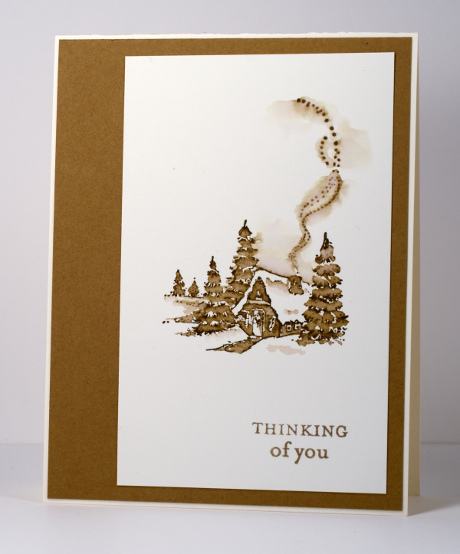
From January to June this year I was honoured to be a member of the Dirty Dozen at Splitcoaststampers. My term on the team is over now but I will forever be a Dirty Dozen Alumni which brings its own opportunities and privileges. Right now there are all sorts of challenges going on especially for fan club members. Alumni have dreamed up wonderful projects and multiple challenges are being released each day.
While I was a member of the Dirty Dozen I created projects with a different theme each month. This is one of the first cards I shared; the theme was “All Cooped Up”. I made it during the bleak midwinter, a far cry from our current hot midsummer! I stamped with one ink then pulled colour from the stamped image with a small paintbrush to fill in the trees, cottage and path. I kept it clean and simple when finishing the card by matching the ink colour exactly with a cardstock mat.
Supplies:
Stamps: Christmas Cottage, Enjoy Life (PB)
Inks: Vintage Photo Distress Stains (Ranger)
Cardstock: Fabriano 100% cotton hot pressed watercolour paper, Neenah Natural White 110lb card stock, Tan cardstock
Orange blooms
Posted: August 4, 2015 Filed under: CAS, Promenade, Softly | Tags: Penny Black stamps, Penny Black stencils, Ranger Distress stains 20 Comments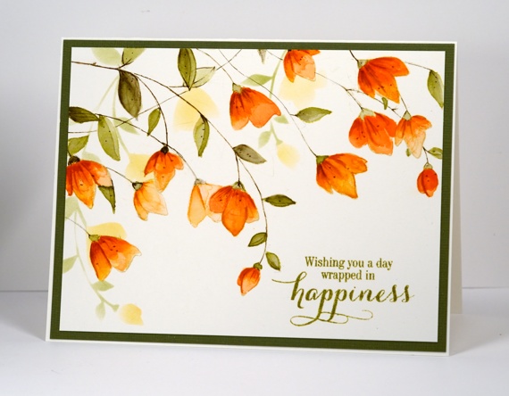
When I set out to create this card I knew I had stamped a similar layout with this stamp before but it wasn’t until the card was completed and I looked at the earlier card that I realised just how how similar! This one has a wee bit more going on and was painted with distress stains not watercolour pencils. I began by stamping the large ‘Softly’ stamp a couple of times. Each time I inked it I wiped off some of the antique linen ink so the two imprints would not interfere with each other too much. The antique linen ink is pale so I was able to paint inside the lines and have them disappear into the darker oranges and greens.
I had to repeat my mantra (walk away, just walk away) periodically through the making of this card because I was trying to follow the steps shown on this photo tutorial. I painted all the petals with a diluted wash of ‘dried marigold’ distress stain first. After it dried I added another layer keeping the colour undiluted. Once that dried I painted some darker areas with ‘spiced marmalade’, let it dry then finally added some ‘rusty hinge’. ( I have just discovered what a warm brown rusty hinge is; it works well with orange tones). After waiting once again for it to dry I added some details with the spiced marmalade and rusty hinge markers. I stuck with just ‘forest moss’ stain for the leaves but began by diluting for the first wash then increasing the intensity as I added shading.
When all the painting was finished I used the co-ordinating stencil ‘Promenade’ to sponge some background flowers before adding a sentiment and a green mat. This card is a little bigger than A2 (6.25″x4.75″) so I will need to hunt through my envelope supply to find a match.
Thank you so much for dropping by and for your kind comments. I have been interested to read about your opinions and experiences with the different watercolour powders I have been featuring.
Supplies:
Stamps: Softly, Sprinkles & Smiles (PB)
Stencils: Promenade (PB)
Inks: Spanish Moss Versafine (Tsukineko) Spiced Marmalade, Dried Marigold, Forest Moss, Rusty Hinge, Antique Linen distress products (Ranger)
Paper: Canson 100% cotton hot pressed watercolour paper, Green textured cardstock
Birthday Bister
Posted: August 3, 2015 Filed under: Bister, Footnotes, Soft Wings | Tags: Bister, Penny Black stamps, Ranger Distress stains 16 Comments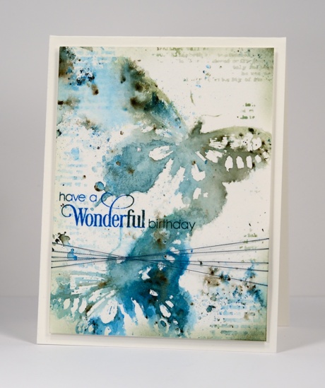
For my daughter’s 21st birthday card I chose blues, greens and the ‘soft wings’ butterfly stamp I always enjoy using. A reader commented a while back that bister and color burst work well with butterflies so it was time to try. I stamped the butterfly in a mix of distress stains which created a watery imprint I could add the blue and green bister powder to. I did multiple impressions then left them to dry while I added some texture around the rest of the panel. I used distress stain on the text stamp from ‘footnotes’ to add the patterns and did some splattering and spritzing with both stains and pearl-ex spray. Once the whole panel was dry I added the sentiment then trimmed and sponged some darker colour around the edges before adding some thread and popping up the panel on a watercolour paper card base.
Supplies:
Stamps: Sprinkles & Smiles, Soft Wings, Footnotes (PB)
Inks: Bundled Sage, Pine Needles, Evergreen Bough, Salty Ocean Distress Stains (Ranger) Deep Lagoon & Olympia Green Versafine inks (Tsukineko)
Paint Powder: Blue and Green Bister
Cardstock: Canson hot pressed 100%cotton watercolour paper
Also: home made interference blue pearl-ex spray, machine embroidery thread
Color burst poppies
Posted: July 30, 2015 Filed under: Color Burst, poppy pair | Tags: color burst, Fabriano Watercolour Paper, Penny Black creative dies, Penny Black stamps 7 Comments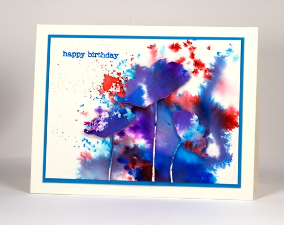
This watercolour powder experiment displays on one card some of the different effects you can get with color burst powders. Depending on how much water you add you can get fine dots of colour or very watery blends of colour. I sprinkled the powder on a piece of watercolour paper and spritzed lightly at one end but more generously at the other. The fine dots must have got hardly any water, the little irregular shapes a bit more water then the purple and blue areas were fairly saturated. All the purples and shades of blue came from only pink and blue powders.
I die cut poppies from the watercoloured panel and some from foam as well then attached them all together with stick it adhesive.
Supplies:
Stamps: Snippets (Penny Black)
Creative dies: Poppy Pair (Penny Black)
Inks: Color burst watercolour powders(Ken Oliver), Salty ocean distress (Ranger)
Cardstock: Fabriano cold pressed watercolour paper
Also: Stick it adhesive sheet (Ken Oliver)
Brusho in the garden
Posted: July 28, 2015 Filed under: Brusho | Tags: Brusho, Fabriano Watercolour Paper, Penny Black creative dies 6 Comments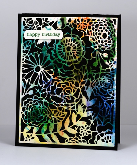
I tried out yet another watercolour powder recently when I got together with some arty crafty friends. Brusho seems to be similar to Color Burst and has a lovely range of bright colours. The panel featured on the card above was cut from one of my first experiments. I sprinkled green, blue, orange and yellow brusho powders on watercolour paper then spritzed and tilted the paper to let the colours blend a little. I did walk away (to eat chips) and let it dry alone. You can see some sections of the paper remained without colour.
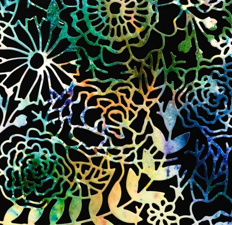
The multicoloured panel seemed a good match for the intricate garden die I had not used before now. I tried backing it with green and white but the contrast of the black card base was the most effective.
Supplies:
Stamps: Snippets (Penny Black)
Inks: Brusho watercolour powders
Cardstock: Fabriano cold pressed watercolour paper
Creative die: In the garden (Penny Black)











 Heather Telford