
Purple Iris
Posted: February 14, 2017 Filed under: Pure Iris | Tags: Penny Black stamps, Tsukineko Memento inks 13 Comments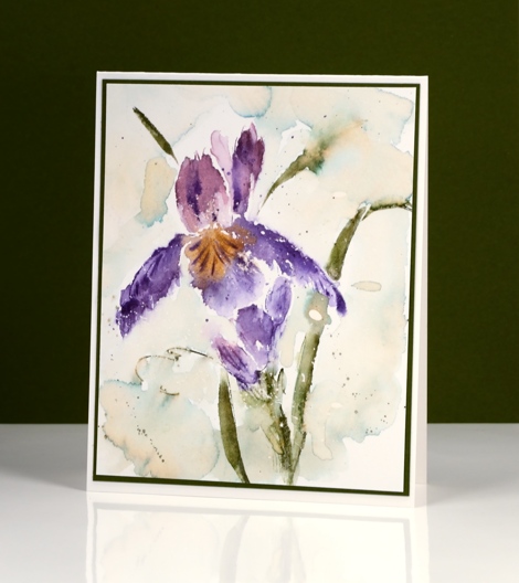
This iris card is a project from last year; it features one of my favourite techniques for brush stroke stamps: inking with memento markers. You could use any water soluble markers I imagine, it is easy to apply colour to the stamp with them and their water solubility makes it possible to get nice colour blends. I stamped on a piece of hot pressed watercolour paper which I had splattered some masking fluid over.
I began with some drips of water on the watercolour paper panel. I inked the stamp with the markers listed below, spritzed the stamp and used the MISTI to stamp on the panel. Wherever the stamp hit the water droplets it bled into the surrounding area. I also blended the ink with a paint brush and water. When the panel was almost dry I stamped again in purple and green to get some extra definition on the leaves and petals. To frame the iris I painted some very diluted northern pine ink around the background then waited for it to dry again before adding some splatter.
I remember when I did made this panel I ended up stamping several at the same time; some ended up darker and more defined, others were pale and looser. It all depended on how much ink and water I applied to the stamp.
Thanks for dropping in; I’ll be back tomorrow with brand new stamps from Penny Black!
Supplies:
Stamps: Pure Iris(PB)
Inks: Memento Cantaloupe, Grape Jelly, Sweet Plum, Olive Grove, Pistachio (Tsukineko)
Cardstock: Hot pressed Fabriano watercolour paper, Olive Green cardstock
Also: masking fluid
Red Blush
Posted: February 13, 2017 Filed under: Red blush | Tags: Brusho, CAS, Penny Black stamps 20 Comments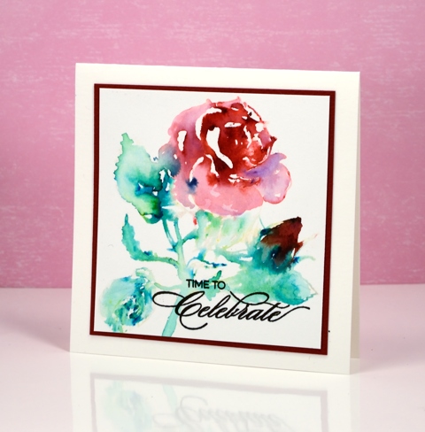
I am participating in the CAS watercolour challenge again this month and as it turns out I have used exactly the same technique as last month. I really didn’t set out to do that but sometimes cards just emerge from experimentation more successful that expected! The theme of the challenge this month is ‘Love’ so a red rose fits in nicely along with a reminder to celebrate, perhaps Valentine’s day or an anniversary.

I used the water stamping technique to create this image and I almost didn’t continue with it after the initial application of brusho powder. I stamped the rose with water then sprinkled crimson brusho over the flower and bud area and emerald green over the leaves and stems. This technique can create a mess but it can also give you a loose watercolour representation of the stamp. Once the colours started reacting with the water I used a brush to move some colour into areas that needed more and a paper towel to remove colour where there was too much.
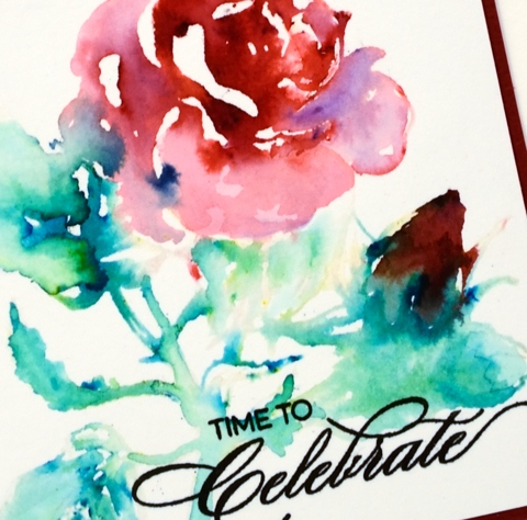
All that colour in the rose is from crimson brusho, which you can see is a mix of different colour crystals. The darkness of the bud is a mix of crimson and emerald green. Initially I thought it was going to be a dirty brown but it has enough red tones to resemble the way the colour of a bud is often darker than the full blown rose. Thanks for dropping by; make sure you check out all the ‘Lovely’ inspiration over at CAS Watercolour challenge
Supplies
Stamps: Red blush, Heartfelt (PB)
Ink: versafine onyx black ink (Tsukineko)
Paint: crimson & emerald green brusho (Colourcraft)
Paper: hotpressed 100% cotton watercolour paper, red cardstock
Shining lights
Posted: February 10, 2017 Filed under: African Trees, Hand lettered, Tribal | Tags: Darkroom Door stamps, Ranger Distress inks, Tsukineko Versafine inks 10 Comments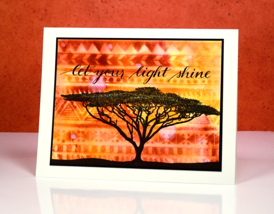
I’m still having fun with the African stamps from Darkroom Door, this time combining a loose watercoloured background with a sharp silhouetted tree in the foreground. I stamped the ‘tribal’ background first on watercolour paper in several colours of distress ink. Once the whole pattern was stamped I painted over it with water and the colours blended from into each other.
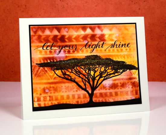
I let the background dry completely before dropping some water strategically here and there. When water comes in contact with distress ink it reacts and dilutes the ink. By letting the water sit for a minute then dabbing it up with a paper towel I was able to create light patches which look a bit like lights in an already abstract sky.
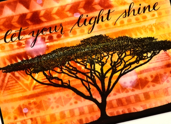
I stamped the tree over the ‘sky’ once it dried then painted the ground with black soot distress stain. My sentiment, inspired by the ‘watermark lights’ was handwritten in McCaffery’s Penmans black ink.
Supplies:
Stamps: Tribal, African Trees (Darkroom Door)
Inks: Distress wild honey, spiced marmalade, fired brick inks, black soot distress stain (Ranger) versafine onyx black (Tsukineko)
Cardstock: neenah natural white cardstock, neenah epic black cardstock, fabriano hot pressed watercolour paper
Writing ink: Mc Caffery’s Penman’s ink black
Nib holder: Exclusive handmade from Foiled Fox
Floral border
Posted: February 9, 2017 Filed under: Centerpiece, Stitched Edges | Tags: Fabriano Watercolour Paper, Penny Black creative dies, Penny Black stamps, Sakura Koi watercolour paints 18 Comments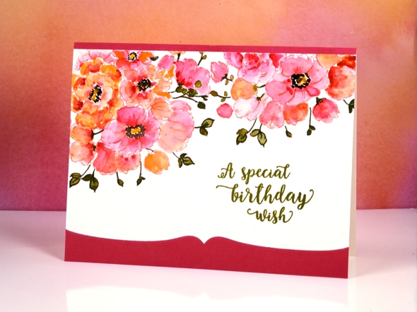
Between Christmas and New Year I did some major re-organising in my work room and changed the way I store my stamps. I am still working out a few details and wondering the best way to store my wood block stamps but other than that the new system seems to be working well. One benefit of doing some serious sorting was re-acquainting myself with my supplies. I pulled out a stamp from a few years ago and my Koi watercolour travel set to make this card.
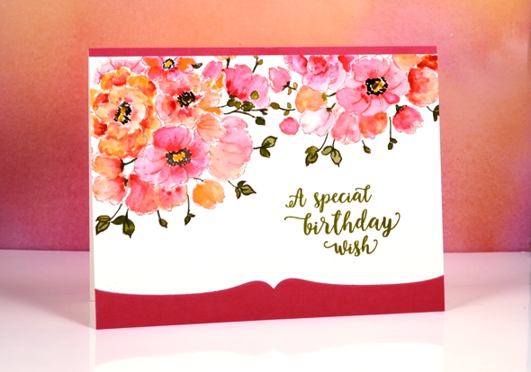
The stamp is a bouquet of flowers in a vase but as you can see I left the vase out of the picture and just worked with the flowers to create a border. With masking I could have positioned the flowers even more closely but I was hoping to finish this card fairly quickly so I just stamped the flower part of the stamp with the MISTI then moved my watercolour panel and stamped again. I used distress ink to stamp so I could blend it while painting. To keep it simple I used two colours of paint on the petals switching back and forth between a pink and a pale orange. I painted olive green into the leaves but then went around the edges and over the stems with a marker. To complete the flowers I painted black dots and yellow centres.
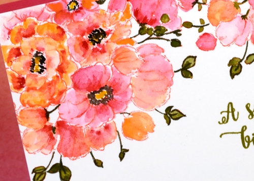
It really was a fairly quick panel to paint, the time consuming part ended up being the way I mounted it between a strip of pink and a die-cut edge of pink. I should have just attached it over the top of a pink panel but I made it less bulky but more fiddly by cutting both the watercolour panel and the pink cardstock with the edge die then aligning them on the card base. The Happy Little Stampers challenge this month is watercolour with an optional twist of die-cutting, so I’m popping over to add this one in.
As I write this I am sitting beside an amaryllis which looks like it might just burst out in bloom today. It is a gift from one of my artsy accomplices and it has been growing very steadily since the new year. It’s nice to have a real flower inside when all outside is snow and ice!
Supplies
Stamps: Centerpiece, words of kindness (PB)
Creative Dies: stitched edges (PB)
Inks: abandoned coral distress ink (Ranger) Olive grove memento marker, versafine Spanish moss (Tsukineko)
Cardstock: Fabriano 100% cotton hot pressed watercolour paper, Neenah Natural White 110lb cardstock, pink cardstock
Also: Koi watercolor field sketch travel kit (Sakura)
Effulgence note
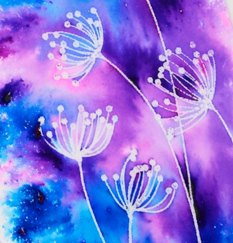
Posted: February 7, 2017 Filed under: Color Burst, Effulgence | Tags: color burst, Penny Black stamps, WOW embossing powders 13 Comments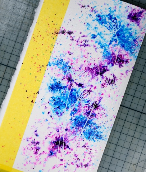
When I was making my pink and gold love card last week I had two panels on the go. I created both using the emboss resist method along with colorburst powders. I didn’t do too much blending on this one so the patterns the powders made after I’d spritzed them remain, especially on the left hand side of the panel.
I embossed the ‘Effulgence’ stamp on hot pressed watercolour paper in clear powder then sprinkled ultramarine and violet colorburst powders over the panel. I spritzed the panel from above and watched the colour move before adding any more powder or water.
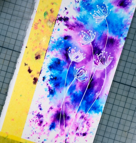
I wanted the area around the flowers to be completely covered in paint so I blended some areas with a paintbrush. Around the edges I left it abstract. The panel was very tall and thin so I ended up with a tall thin card finished with a sentiment popped up over the flower stems.
Supplies:
Stamps: effulgence, sentiment collection (PB)
Paint: violet & ultramarine Colorburst watercolor powder (Ken Oliver)
Cardstock: hot pressed watercolour paper
Ink: versamark (tsukineko)
Also: clear embossing powder
Family Tree
Posted: February 6, 2017 Filed under: Hand lettered, Tree heart, Triple Banner | Tags: color burst, Hand lettering, Penny Black creative dies, Penny Black stamps 16 Comments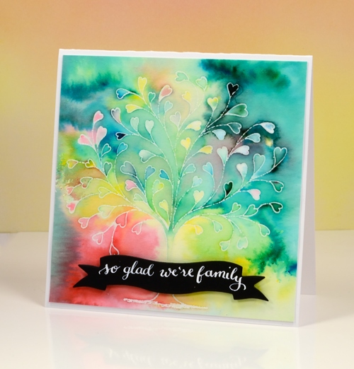
This delicate tree stamp is called `tree heart`but it reminded me of a family tree. I tried turning it into my family tree with names along the branches but it did not look that good! Instead I used the emboss resist technique with colorburst powders.
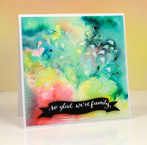
I embossed the tree in clear powders on hot pressed watercolour paper then sprinkled a few different colours of powder over the panel. I kept the colours separate as I sprinkled knowing they would blend anyway as I started adding water. I spritzed first then used a small paintbrush to move and blend the paint.
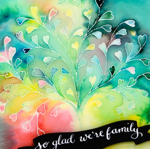
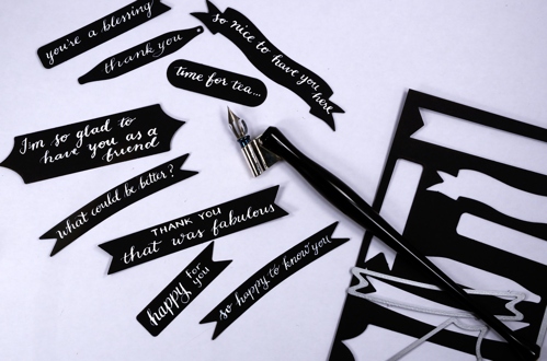
I love the way the emboss resist technique traps colours in little white borders. My next live class is a Watercolour resist class and, as often happens, I nailed two projects then took much longer to finalise the third. I was so happy to complete the designs I rewarded myself with some lettering playtime and made a bunch of custom black on white sentiments. I pulled out nine different banner, tag and label dies by Penny Black, cut them from black cardstock then used Dr Ph Martins Bleedproof white paint and a nib pen to write a sentiment on each one. The nib holder in the photo is an exclusive handmade holder sent to me by the lovely team at The Foiled Fox. It is delightful to write with. The bleedproof white paint is too thick for the nib straight out of the jar so I mixed some with a bit of water and it worked nicely.
Now I have a few sentiments in reserve ready to add to future cards.
Supplies:
Stamps: Tree-heart(PB)
Dies: Triple banner, Tagged, A Pocketfull (PB)
Paint: Colorburst watercolor powder (Ken Oliver) Bleed proof white (Dr Ph Martin)
Cardstock: hot pressed watercolour paper, Neenah Solar White
Ink: versamark (Tsukineko)
Also: clear embossing powder (WOW)
Nib holder: Handmade by The Foiled Fox
Stillness
Posted: February 2, 2017 Filed under: Stamped Landscapes, Winter Ledge | Tags: Penny Black stamps, Tsukineko Memento inks, WOW embossing powders 12 Comments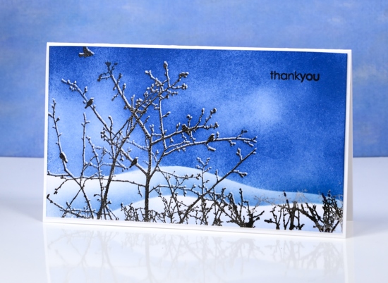
After a week of balmy temperatures hovering around zero, we are back to real winter weather again and bright scenes like this one. Winter here is often prettiest when it’s the coldest.
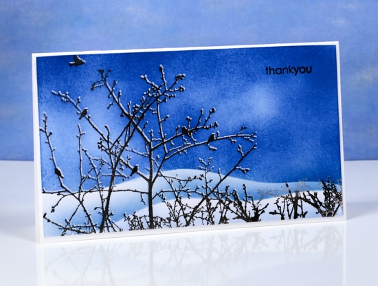
I stamped and embossed this scene using ‘winter ledge’ and a stamp positioner so I could get the thin layer of snow on the branches. The trick to this is to stamp first in versamark then move the cardstock up ever so slightly then stamp in pigment ink, in this case versafine onyx black. Once the panel is stamped twice you can emboss both images at once. The embossing resists ink once you sponge or paint over the top. I sponged this scene in memento Danube blue ink creating snowy hills behind the branches with post-it note masks.
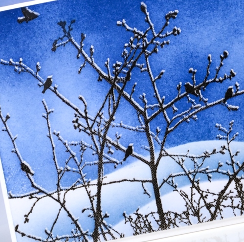
I hesitate to say that I hope you are all staying warm as I know our family in Australia have been wishing for a little respite from the heat. I hope you are enjoying the weather, whatever the weather, whether you like it or not!
Supplies
Stamps: winter ledge, snippets (PB)
Inks: versamark, versafine onyx black, memento danube blue (Tsukineko)
Papers: Neenah solar white
Also: clear embossing powder
Lovely Neighbourhood
Posted: February 1, 2017 Filed under: Color Burst, Neighborhood love | Tags: color burst, Fabriano Watercolour Paper, Penny Black creative dies, Penny Black stamps 2 Comments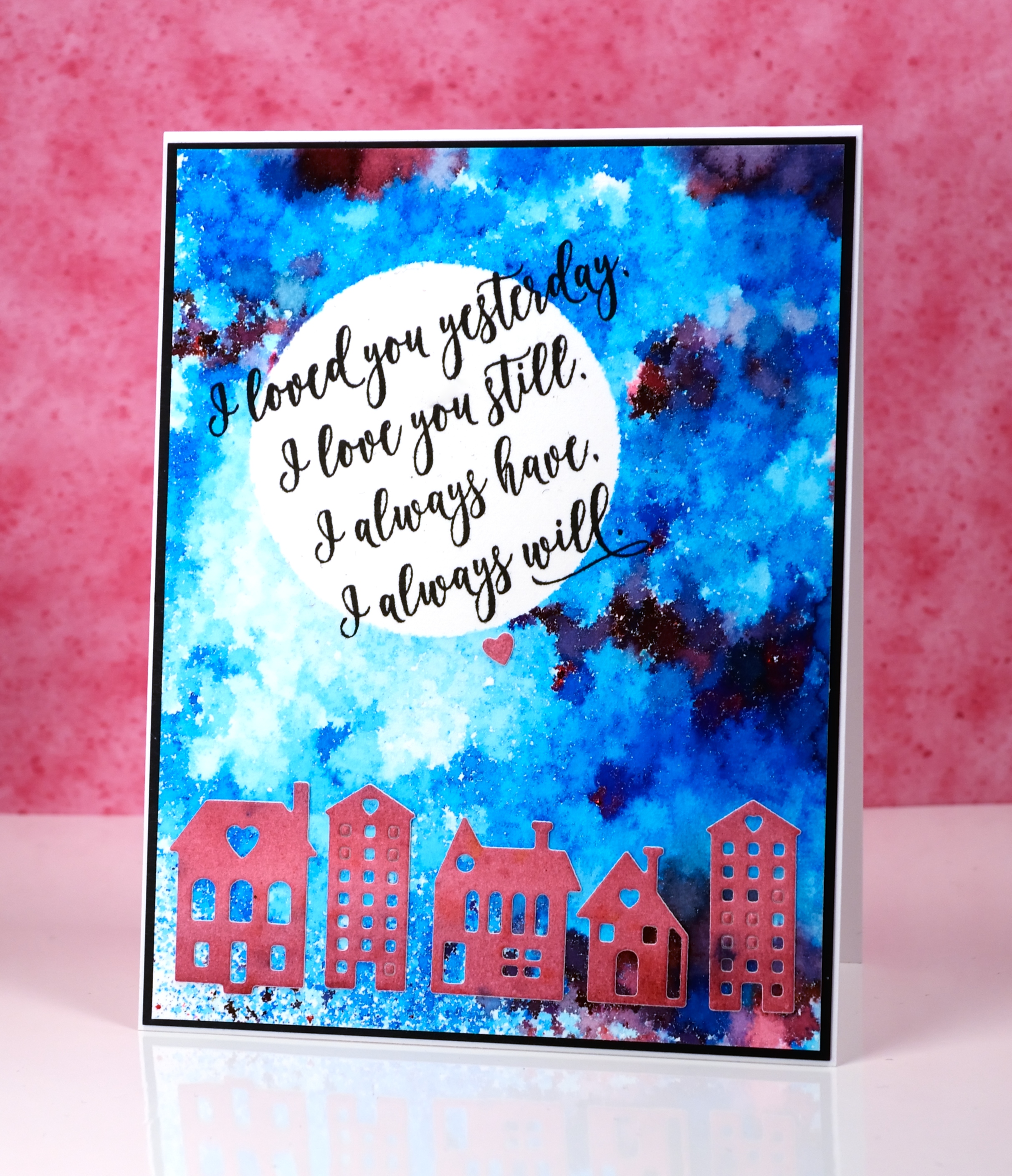
These cute little dies are part of a set called Neighborhood love; I love the little house and building dies Penny Black has brought out even though they challenge my fear of the fiddly factor. I started this card by positioning a frisket film circle mask on a piece of watercolour paper. I sprinkled ultramarine blue powder and a tiny bit of merlot over the panel and spritzed it lightly from above. I spritzed only until I could see some patterns appearing but stopped before all the spots of colour started joining together. I used a heat tool to dry it, pointing the tool down at the panel not from the side to reduce the chance of the wet paint moving across the panel. It reminds me of a mosaic.
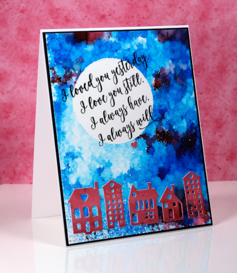
I painted another small piece of watercolour paper with merlot colorburst powder then die cut the buildings from the piece and attached them across the bottom of the panel.
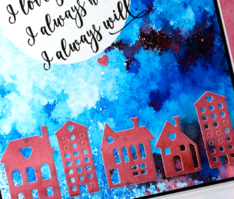
I removed the mask then wanted to hand letter a sentiment inside the moon; I ended up not being game and chose this sweet sentiment from the ‘forever & always’ set.
Supplies:
Stamps: Forever & Always (PB)
Die: Neighborhood Love (PB)
Paints: Merlot & Ultramarine Blue Colorburst powders (Ken Oliver)
Inks: Versafine onyx black ink (Tsukineko)
Cardstock: hot pressed watercolour paper, neenah epic black cardstock
Also: Grafix frisket film
Gold love
Posted: January 31, 2017 Filed under: Color Burst, Effulgence, Guest design | Tags: color burst, Penny Black stamps, WOW embossing powders 12 Comments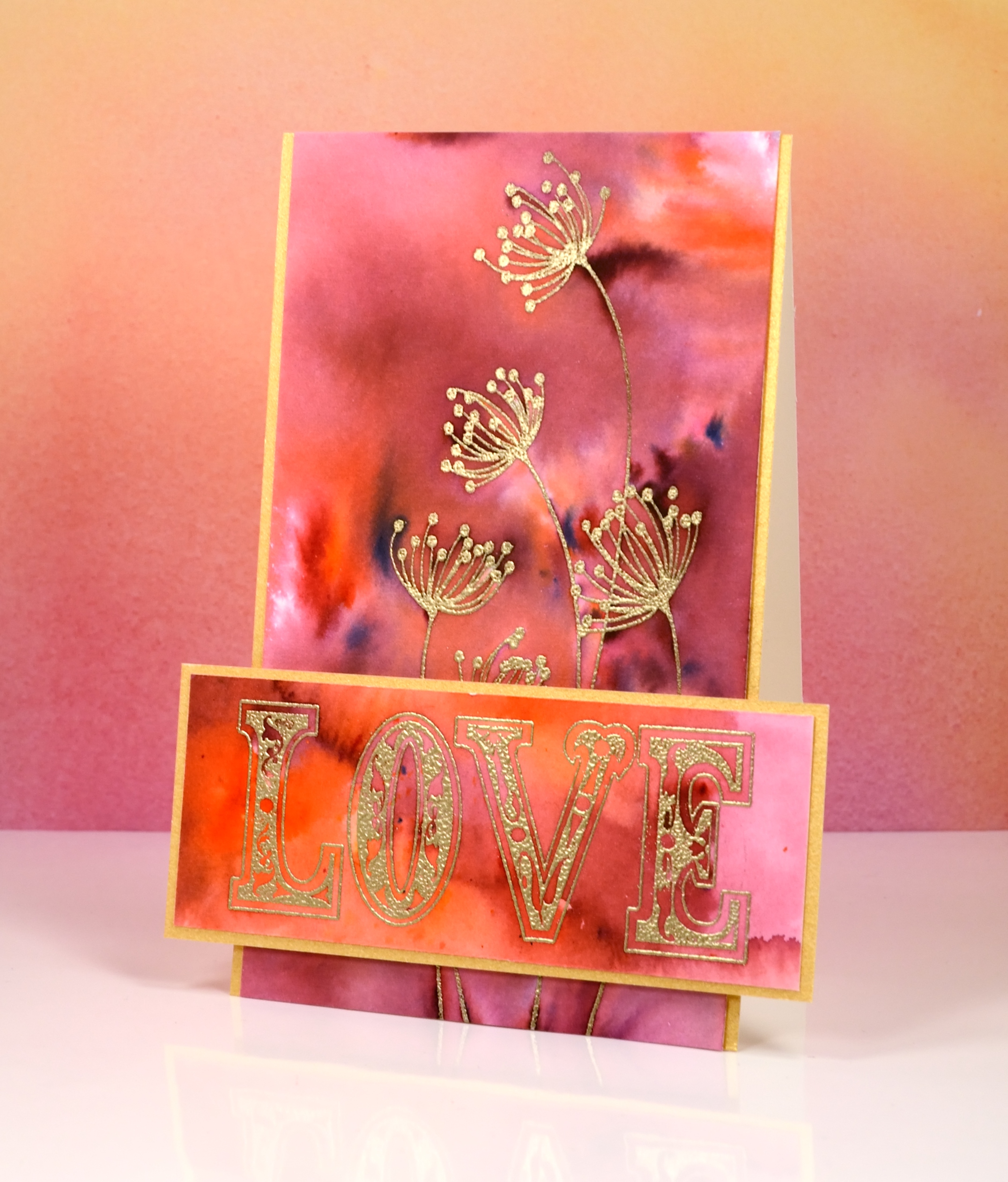
I’m thrilled to be a guest on The Foiled Fox blog today. If you have never visited The Foiled Fox you absolutely should; their blog is full of delightful projects and their shop is stocked with all the good stuff, paints, inks, stamps, markers, tools…and so much more. To find out more about this card just pop over to The Foiled Fox where there are some more pics and details.
Supplies:
Stamps: effulgence, all about love(PB)
Paint: Merlot & Tangerine Colorburst watercolor powder (Ken Oliver)
Cardstock: hot pressed watercolour paper, gold shimmer
Ink: versamark (tsukineko)
Also: gold embossing powder
Elephant congrats
Posted: January 30, 2017 Filed under: African Trees, CAS, Tribal | Tags: CAS, Darkroom Door stamps, Ranger Distress inks 8 Comments

With fond memories of the One Layer Simplicity challenge I decided to make a one layer card for the current Case This Sketch challenge.

I masked my card base and stamped the ‘tribal’ stamp from Darkroom Door in distress inks. I stamped one colour after another just inking part of the pattern each time. With the mask still in place I sponged over the stamping in the colours listed below. Next I repositioned my first mask and added a second mask to reveal a thin strip of cardbase above the pattern then sponged with fired brick distress ink. To complete the design I stamped an elephant and a sentiment in fired brick ink.
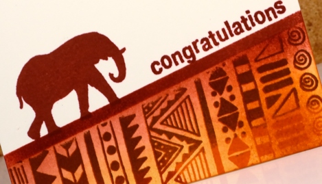
Some goals are reached with much elephant-like plodding rather than the speed of a gazelle!
Supplies:
Stamps: All Occasions, Tribal, African Trees (Darkroom Door)
Inks: Distress wild honey, spiced marmalade, fired brick, vintage photo inks (Ranger)
Cardstock: neenah natural white cardstock


