
Love art poppies
Posted: June 14, 2016 Filed under: CAS, Love Art | Tags: Kuretake Zig clean color real brush markers, Penny Black stamps, Tsukineko Versafine inks 12 Comments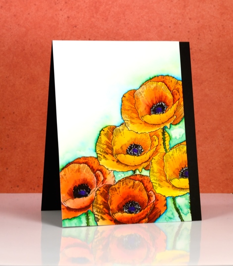
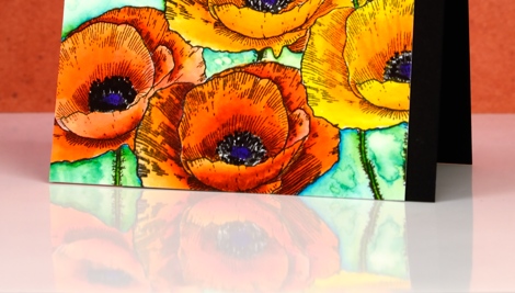
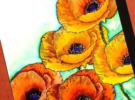
My inspiration for this panel came from my garden. I only have one colour of poppy in my garden, orange. I didn’t quite capture the colour; but it was a good colouring exercise. To create the collection of poppies I had to mask several times then stamp over my masks. Fortunately the cutting required for a mask of this poppy wasn’t too fussy!
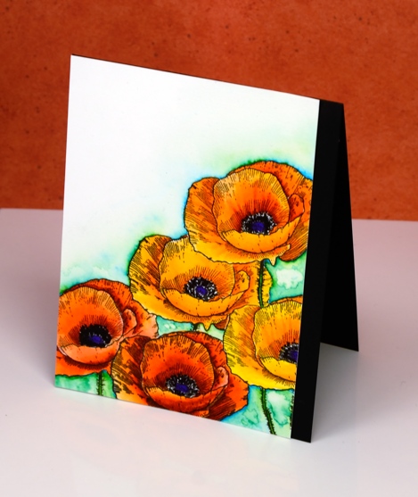
I used zig clean color real brush markers and worked with one orange, one yellow and one red. The colours remained bold and bright because I blended with very little water and just worked with a combination of red and orange or orange and yellow. The centres are purple and black. The background is also zig markers, a mix of blue and light green with water marks to break up the brightness and give a little texture.
When I photograph my cards I sit them on a piece of glossy cardstock; I like the strong reflection I got this time.
I fully intended to add a sentiment in that big empty space in the top right corner but didn’t notice I hadn’t until I was editing my photos. I will wait and see who I send it to and add a sentiment later.
Supplies:
Stamps: Love Art (PB)
Mediums: Zig Clean color real brush markers(Kuretake) Versafine Onyx Black ink (Tsukineko)
Cardstock: Hot pressed Fabriano watercolour paper, Neenah Epic Black cardstock
Vintage sunbursts
Posted: June 10, 2016 Filed under: Nature's Paintbrushes, Sunbursts | Tags: Penny Black stamps, Ranger Distress inks, Speedball elegant writer 9 Comments
I have two last cards to wrap up my vintage watercolour week. These differ from all the previous cards as they were stamped with solid or ‘silhouette’ stamps rather than outline stamps. The technique used on all my other cards involved pulling brown ink from the outline either into the image or into the back ground.
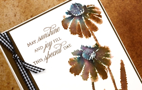
With a solid stamp the inside of the image is already full of ink so I adapted my technique in order to get the same vintage brown & black effect. Because there were no petals or wings to be filled I didn’t incorporate watercolour pencils into these designs. On the ‘sunburst’ stamp above I inked most of the stamp with vintage photo distress ink but left the flower centres and the base of the stems to be inked with the elegant writer pen. I spritzed the stamp so the brown and black would blend into each other and the pink and green tones would bleed out of the black. I moved the colour around a little with a paintbrush.
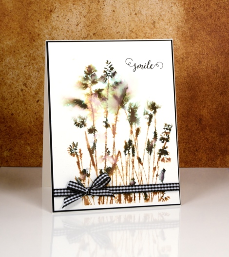
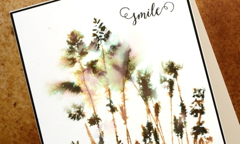
On the ‘nature’s paintbrushes’ stamp I inked first with vintage photo ink then added the elegant writer black on the seed heads of the grasses. I spritzed with water before stamping and also on the watercolour panel so the colour and image would bleed into the surrounding area.
When I was looking for some ribbon or twine to finish the cards I spied my black gingham and was surprised how much I liked it on the predominantly brown card.
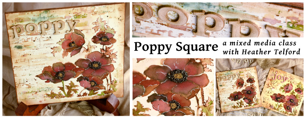
Thank you so much for leaving me such kind comments this week; I glad some of you have tried the technique or plan to. I know many of you are not in my area but for those who are, I have a June class where we will be using similar techniques to make a poppy themed art square. (My first mixed media class!) All the details are on my upcoming classes page. I am also offering it at Crop A While in Orleans.
Supplies:
Stamps: Sunbursts, Nature’s Paintbrushes, Happy Snippets, Treasured Sentiments(PB)
Inks: Vintage Photo distress ink (Ranger) Elegant writer pen (Speedball)
Cardstock: Hot pressed Fabriano watercolour paper, black and natural cardstock (Neenah)
Also: black and white gingham ribbon
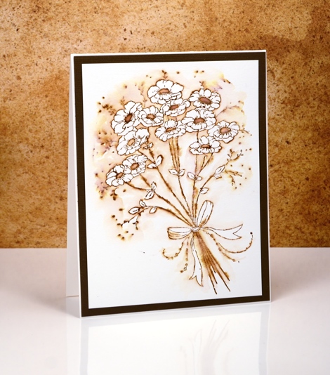
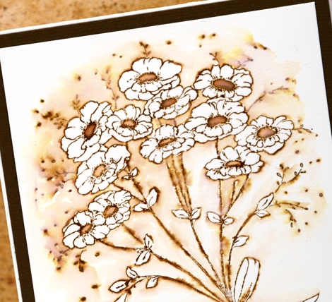
Vintage Flower Box
Posted: June 9, 2016 Filed under: Flower box | Tags: Faber-Castell Albrecht Durer Watercolour pencils, Fabriano Watercolour Paper, Penny Black stamps, Ranger Distress inks, Speedball elegant writer 13 Comments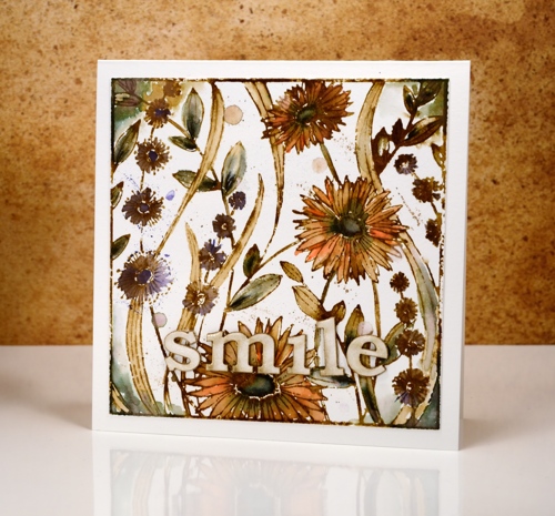
I’m continuing my vintage watercolour theme today with the square ‘flower box’ stamp. I completed this panel using the technique shared in my video tutorial. I stamped the image with vintage photo ink and added black here and there with the ‘elegant writer’ pen from speedball.
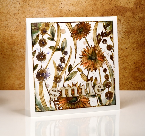
Most of the leaves and the centres of the large flowers have a black/green tinge to them; this is what happens when you add water to the elegant writer ink. I also spread it around the corners with a paint brush.

The orange and purple colouring is from watercolour pencils. I pulled colour from the pencils and filled the petals and flower shapes drawing in brown from the stamped outlines at the same time. I added splatters of colour from the pencil and water droplets for an aged look.

The word ‘smile’ is laser cut from matboard and glazed with crackle glaze. Thanks for joining me this week; I’m so pleased you are enjoying my vintage theme.
Supplies:
Stamps: Flower Box (PB)
Inks: Vintage Photo distress ink,Vintage Photo distress stain (Ranger) Elegant writer pen (Speedball)
Cardstock: Hot pressed Fabriano watercolour paper
Also: Albrecht Durer watercolor delft blue, raw umber, dark orange pencils (Faber-Castell), Rock candy clear crackle paint(Ranger)
Vintage Elegance
Posted: June 8, 2016 Filed under: Elegance in Motion, Life's Journals 8 Comments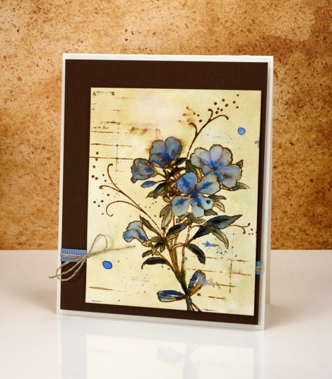
Today’s vintage style card has a slightly different look to it because I gave the watercolour paper some colour before I began. While I was working with vintage photo ink and different stamps I just cleaned each stamp with a wet wipe. The wipe became quite ‘vintagy’ itself but before I threw it away, I tried wiping it across a piece of watercolour paper to see how much colour transferred. The result is the yellowed look on this card.
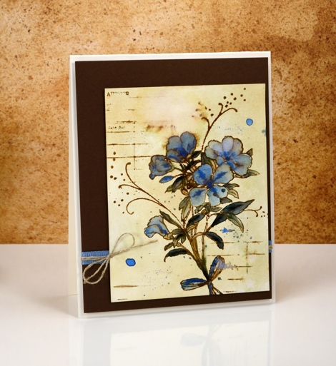
I let the paper dry completely before stamping the ‘Elegance in motion’ stamp in vintage photo ink. Once again I used the elegant writer pen but only on a couple of leaves. The rest of the colouring was done with a blue water colour pencil, a pale first layer then more intense details.
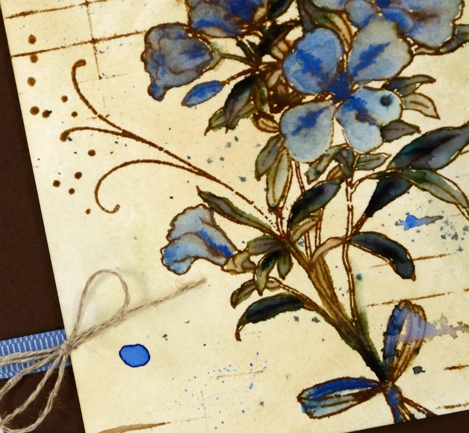
I added some lines using the ‘library card’ stamp then splattered and blurred the stamping in a few places. I was happy to find some blue ribbon in just the right tone and some linen twine for a little accent on the side. You can find my earlier ‘vintage watercolour’ cards here:birdhouse, butterflies, tulips, jubilance, poppies.
Supplies:
Stamps: Elegance in Motion, Life’s journals (PB)
Inks: Vintage Photo distress ink,Vintage Photo distress stain (Ranger) Elegant writer pen (Speedball)
Cardstock: Hot pressed Fabriano watercolour paper, brown cardstock, Neenah natural white cardstock
Also: Albrecht Durer watercolor phthalo blue pencil (Faber-Castell), blue ribbon, linen twine
Vintage Jubilance
Posted: June 7, 2016 Filed under: CAS, Jubilance | Tags: CAS, Penny Black stamps, Ranger Distress inks, Ranger Distress stains 17 Comments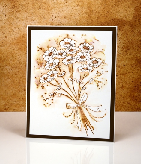
More vintage flowers on display today with a slightly different technique to try. As with my previous vintage style watercolours (birdhouse, butterflies, tulips) I stamped the image in vintage photo distress ink. Other water based dye inks in brown would probably work but I like the ease with which I can dilute and spread the vintage photo ink or stain.
After stamping, instead of pulling ink from the outline into the flowers and leaves, I pulled ink out into the background leaving the flowers and leaves white. The contrast of brown with white makes the flowers pop and look whiter than they would if they were not surrounded by colour. It is a simple technique you could try with any colour ink.
I would love to hear if you try some ‘vintage style watercolour’. Thanks for dropping by.
Supplies:
Stamps: Jubilance (PB)
Inks: Vintage Photo distress ink,Vintage Photo distress stain (Ranger)
Cardstock: Hot pressed Fabriano watercolour paper, brown cardstock
Vintage tulips
Posted: June 6, 2016 Filed under: Flower Gala | Tags: Faber-Castell Albrecht Durer Watercolour pencils, Fabriano Watercolour Paper, Penny Black stamps 14 Comments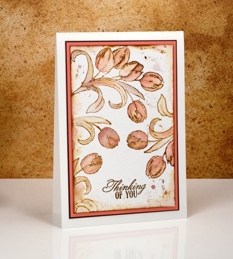
I have some more vintage style watercolour cards to share this week. Last month I posted a video tutorial showing a method for creating a vintage look with brown dye ink and watercolour pencils. I have created a few more cards along the same lines dreamed up some variations as well. To see the original card and video tutorial click here.
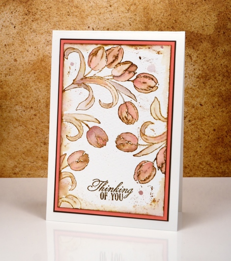
For this tulip card I used almost the same method as shown in the video but left out the elegant writer pen (as I did in this butterfly card). I stamped the original tulip images in vintage photo distress ink then blended the ink in the outline stamping with colour from both pink and brown watercolour pencils. I painted some distress stain around the edges of the watercolour panel and splattered some as well.
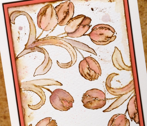
Thanks for dropping in; I hope you’ll come back each day this week for more vintage style designs.
Supplies:
Stamps: Flower Gala , Soar (PB)
Inks: Vintage Photo distress ink,Vintage Photo distress stain (Ranger)
Cardstock: Hot pressed Fabriano watercolour paper, brown cardstock, coral cardstock
Also: Albrecht Durer watercolor medium flesh, VanDyke pencils (Faber-Castell)
Stamping with alcohol inks
Posted: June 4, 2016 Filed under: Alcohol Ink, Autumn Jewels, Pinwheel | Tags: Penny Black creative dies, Penny Black stamps, Ranger Alcohol Ink 11 Comments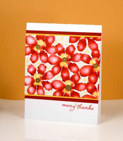
A few months ago I tried all sorts of fun techniques with alcohol inks and I am keen to get them back off the shelf to try some more. Today’s cards are all examples of stamping with alcohol inks, using die-cut felt as the ‘stamp’.

I did all the stamping on glossy photo paper which allows the inks to move and blend a little but nowhere near as much as the on yupo paper. Yupo paper is a synthetic paper which is totally waterproof so the ink does not soak into it at all but spreads across it as it dries. The photo paper does absorb ink even as the glossy surface lets it spread and blend a little.
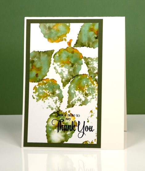
By varying the amount of ink you drop on the felt die-cut you can get a lacy effect or a full print. By adding a little blending solution to the felt you can dilute the colour and get a blurry effect within the shape. The possibilities are extensive with this technique.
Supplies:
Stamp: Words of Kindness, Sentiment Collection, Happy Snippets (PB)
Die: Autumn Jewels , Pinwheel (PB)
Ink: Alcohol inks (Ranger)
Cardstock: Glossy photo paper, coloured cardstock, Neenah solar white & natural white
Autumn Mist
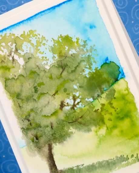
Posted: June 2, 2016 Filed under: Shade Canopy, Stamped Landscapes | Tags: Fabriano Watercolour Paper, Penny Black stamps, Tombow dual brush pens, Tsukineko Memento inks 8 Comments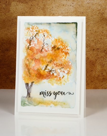
Don’t worry I am not switching over to fall cards. I just happen to have made a card in autumn colours with a misty look about it so the line from Puff the Magic Dragon sprang to mind. I created both of today’s cards with the ‘shade canopy’ stamp from Penny Black. The little scenes are framed with the white edge made when I tape the watercolour paper down with painter’s tape.
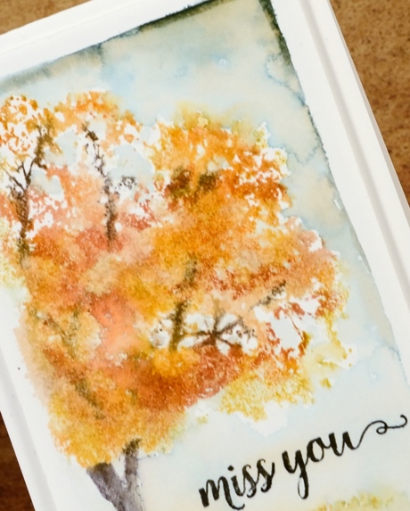
I used markers to ink the stamp and for the backgrounds on both cards. The autumn card is coloured with memento markers and the summer one with tombow dual brush pens.
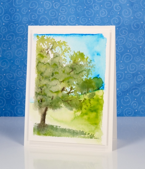
It is possible to get quite a lot of definition in the foliage by inking the stamp and adding little or no water or, as I did, use more water on the stamp and achieve a looser more impressionistic look. On the summer card I coloured the sky and hill first then added the tree over the top. For the fall card I painted the sky last, adding it around the foliage.
Supplies:
Stamps: Shade Canopy, Words of Kindess(PB)
Inks: Tangelo, Potter’s Clay, Espresso Truffle, Northern Pine Memento markers Versafine Onyx black (Tsukineko), 173, 452, 126, 228 dual brush pens (Tombow)
Cardstock: Fabriano 100% cotton hot pressed watercolour paper
Stencilled
Posted: May 31, 2016 Filed under: Alcohol Ink, Hypnotic | Tags: Penny Black creative dies, Penny Black stencils, Ranger Alcohol Ink 16 Comments
If you haven’t tried stencils with your alcohol inks you might be surprised at the lovely effects you can get. Let me warn you though, they might not do what you want them to, but they will probably do something cool. There is a bit of trial and error involved when working out how much blending solution or rubbing alcohol to apply through the stencil. Too much and it spreads under the stencil and you lose the pattern definition. Too little and you will not remove enough colour to get a pattern. It is worth playing with applicators too. Applying solution with a q-tip will take much longer but you will have more control.
I started with a deep blue pattern on yupo paper with little patches of burgandy ink. When it was dry I positioned the ‘hypnotic’ stencil over one corner then removed colour with blending solution on a felt applicator. I kept an eye on the felt as I pounced it through the stencil because it was picking up blue ink. If it got too blue it wasn’t removing ink anymore. I like the batik look with some lines of blue in the white spaces
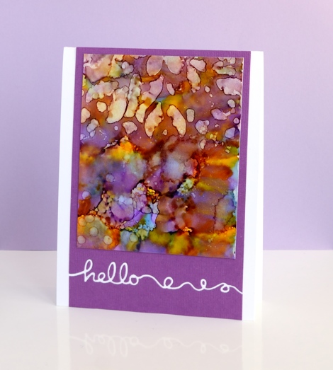
On these two purple toned panels I used the same technique but was not as careful to keep the stencil still on the one below. The pattern from the stencil is just a mix of abstract shapes. The blue panel at the top of this post is all about the stencilled pattern but these two messy purple ones are just here because I love the colours. Before I die cut the word ‘hello’ out of the purple cardstock I positioned a strip of ‘stick it’ adhesive on the back where the word would be. That made it easy to attach the panel to the card base and pop in the little loops and circles that were cut out. I saved the purple ‘hello’ cut out of the card below and stuck it inside the card above.
Supplies:
Stencil: Hypnotic (PB)
Stamp: Happy Snippets (PB)
Die: Doodles (PB)
Ink: Alcohol inks (Ranger)
Cardstock: Yupo, mauve cardstock, Neenah solar white
Hummingbird treat
Posted: May 30, 2016 Filed under: Sweet Visit | Tags: Penny Black stamps, Tsukineko Memento inks 9 Comments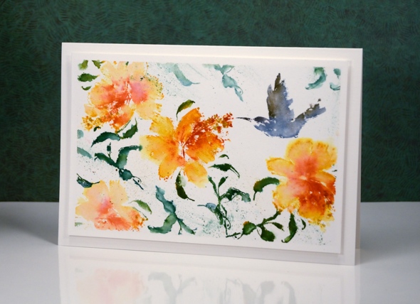
I went searching for my bird feeders yesterday but couldn’t find them. I have been a bit discouraged in the past when my bird feeders have doubled as squirrel feeders. The hummingbird feeder is a different deal to the seed feeders of course as it needs syrup. I do know where that is so perhaps I can tempt some hummingbirds to hover in my garden.
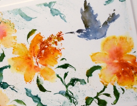
These hibiscus and the hummingbird were inked with memento inks, spritzed with water then a little blending added after stamping. You can see I added a generous amount of splatter around the leaves too.
Supplies:
Stamps: Sweet visit(PB)
Inks: Nautical Blue, Espresso Truffle, Cottage Ivy, Bamboo Leaves, Cantaloupe, Tangelo, Potter’s Clay Memento markers (Imagine Craft/Tsukineko)
Cardstock: Fabriano hot pressed watercolour paper


