Felicity
Posted: April 19, 2017 Filed under: birds and banners, Felicity | Tags: Brusho, Penny Black creative dies, Penny Black stamps, WOW embossing powders 17 Comments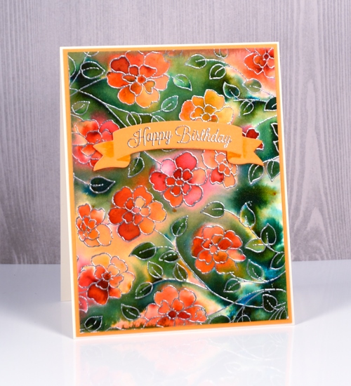
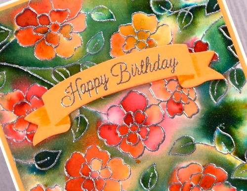
Today’s card looks like it was created with a background stamp, which is practically the case, but not quite. I used the new slapstick cling stamp, ‘Felicity’ and stamped it twice to more than fill a card front. The stamp is actually longer than my average card but a bit narrower. The organic arrangement of the flowers made it easy to stamp it twice and make it look like one big image. I stamped in versamark ink then embossed in silver powder on hot pressed watercolour paper. I taped it down then spritzed all over the panel with water. It wasn’t soaking wet but it was wet enough that the brusho I sprinkled on next started reacting straight away. I picked up some more brusho colours the other day to expand my collection and three out of four on this card are new to me. I sprinkled orange, sandstone and rose red over the flowers, spritzed again, tilted the panel to move the water and waited to see if I needed more. I did this a few times then switched over to sprinkling the olive green brusho over the rest of the panel. The olive green was more intense and the leaves on the panel are small so some areas got very dark, very quickly. I used a folded paper towel to remove liquid and colour where there was too much. I also tilted the panel so colour would flow down towards the closest embossed barrier which makes for nice dark contrasting areas next to some of the silver embossing.
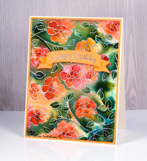
I let the panel dry naturally then trimmed it and matted with orange cardstock. I cut a curved banner from the new set ‘birds & banners‘ and embossed one of the co-ordinating stamps from the ‘banner sentiments‘ set in silver. The die cut banner looks folded so I used a marker to add a little shadow to the areas which appear to be behind the main section. I cut the same banner from orange fun foam so I could pop my sentiment up on the floral panel.
When I looked up the name of this new stamp, I was delighted to see it is called ‘Felicity’. I have a dear cousin called Felicity who I haven’t seen in many long years but I have fond memories of. I am going to try hard to actually send a ‘felicity’ stamped card to her, maybe this one.
Supplies
Stamps: Felicity, banner sentiments (PB)
Dies: birds and banners (PB)
Inks: versamark
Papers: hot pressed watercolour
Paints: orange, sandstone, rose red, olive green brusho
Added extras: Zing silver embossing powder
Flower medley
Posted: April 18, 2017 Filed under: birds and banners, flower medley | Tags: Nuvo crystal drops, Peerless Transparent Watercolors, Penny Black creative dies, Penny Black stamps, Tsukineko Versafine inks, WOW embossing powders 4 Comments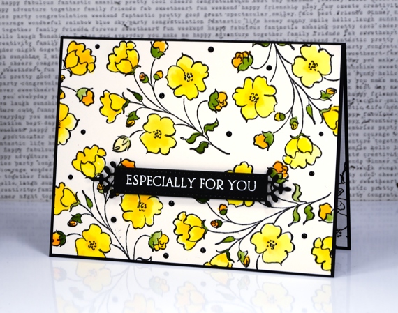
I’m sharing another card today made with products from the new Penny Black release ‘Celebrate.’ The flowers featured on today’s card were made with just one of the stamps from the new transparent set ‘flower medley’. I stamped it all over a piece of watercolour paper with black versafine ink then embossed in clear powder. I used my peerless watercolours to fill in all the flowers, buds and leaves.
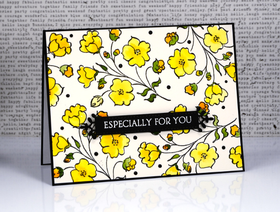
The fancy little banner you see is a diecut from the new set, ‘birds & banners’ which has a co-ordinating stamp set of nineteen sentiments. I embossed one in white on the banner then popped it up over the floral panel.
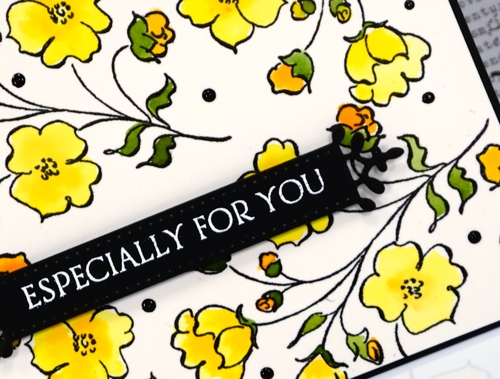
When I had put the card together on the black card base I decided it needed little dots of black ebony nuvo crystal drops to fill in a few spaces and look cute!
Supplies
Stamps: flower medley, banner sentiments
Dies: birds and banners
Paper: hot pressed watercolour paper, epic black neenah cardstock
Inks: onyx black versafine, versamark (Tsukineko)
Paints: peerless transparent watercolours
Also: ebony nuvo crystal drops, clear embossing powder, white embossing powder
Full of glee
Posted: April 17, 2017 Filed under: full of glee | Tags: Penny Black stamps, Ranger Distress inks, Ranger Distress stains, Tsukineko Versafine inks 6 Comments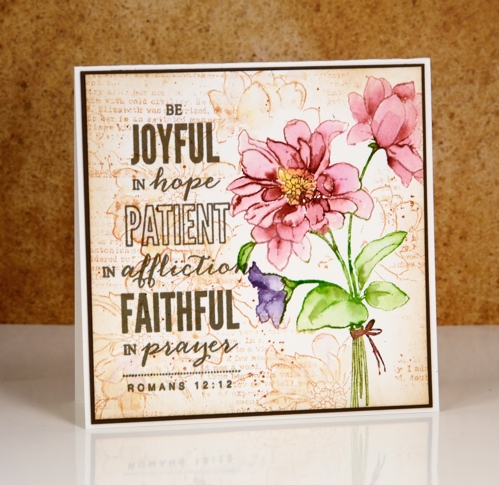
There is a lovely new batch of stamps and dies available from Penny Black; you can check out the catalogue here. My card today features a couple of the new stamps, full of glee and a scripture verse from the hope shines set.
I used my stamp positioner to stamp the ‘full of glee’ image on hot pressed watercolour paper. I started by inking only the pink petals with a Victorian velvet distress stain. I stamped that much, cleaned off the stain and inked the smaller flower in dusty concord, stamped, cleaned and moved onto the leaves and stems in peeled paint stain. Once the whole image was stamped I used a small watercolour brush and water to blend colour from the stamped image into the petals and leaves to fill them. If there was not enough colour I added some stain with the paint brush.
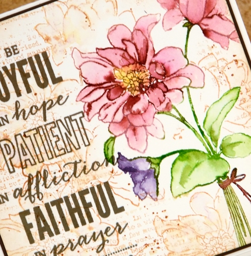
I let all the painting dry before adding scattered straw stain to the centre of the flower. To create the background I inked the full of glee stamp with tea dye distress ink and pressed it down randomly around the image then did the same with the text stamp from the footnotes set. I blended some of the ink with a damp paintbrush and added some splatter as well.
I finished the panel off with the sentiment stamped in versafine vintage sepia ink. I often switch to versafine ink when doing my sentiments as it is a pigment ink which gives a nice sharp print and sits on the paper rather than sinking into it as dye inks tend to do. I matted the panel and attached it to a natural coloured card base.
Supplies
Stamps: full of glee, hope shines, footnotes
Inks: scattered straw, peeled paint, Victorian velvet, dusty concord distress stains, tea dye distress ink (Ranger) versafine vintage sepia (Tsukineko)
Paper: hot pressed watercolour paper, brown cardstock
Pop out roses
Posted: April 11, 2017 Filed under: Pop out rose, Script | Tags: Brusho, Penny Black creative dies, Penny Black stamps, Ranger Distress inks 4 Comments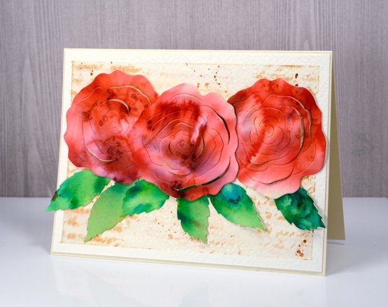
I’m a guest over at The Foiled Fox today sharing these die cut roses. This really was an easy card to make because the ‘pop out rose‘ die creates the lovely petals and brusho powders create the pretty colours. I used three different red brusho powders on watercolour paper and some leaf green brusho for the leaves. While the paper was still damp I sprinkled some salt over the panel to get subtle patterns.
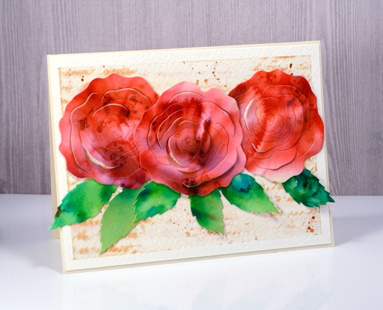
The partial cuts in the roses make it possible to lift petals so I folded some up and kept others glued down when I attached the roses to the background panel. To make the background panel I stamped the ‘script’ stamp from Penny Black on cold pressed watercolour paper in tea dye distress ink then painted over the top with water. The result is a softly blurred background with splatters of ink to add to the aged look. Pop over to the Foiled Fox blog for more details and to see the products I have used on this card.
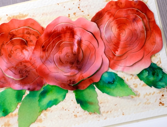
Thank you to the wonderful Foiled Fox team for having me back again; it’s always a pleasure.
Red Tulips
Posted: April 10, 2017 Filed under: gift card pocket, Hand lettered, Tulip Queue | Tags: Peerless Transparent Watercolors, Penny Black creative dies, Penny Black stamps 10 Comments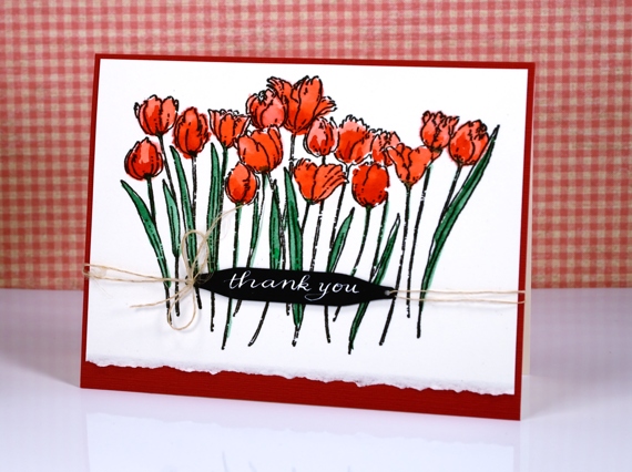
I have planted quite a few tulips in our garden over the years and over 100 daffodils. Sadly I do not get to see that many when spring rolls around. I believe the squirrels dine out on the tulips; I’m not sure if they eat the daffodils too. I do get a few red tulips each year which have been blooming ever since we moved here so I can’t take any credit for keeping them alive!
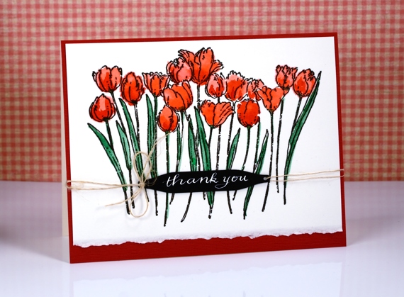
I stamped this lovely outline stamp on hot pressed watercolour paper and coloured it with peerless watercolour paints. The deckled edge is left when I cut up the large sheets of watercolour paper I buy. Sometimes it makes a nice design detail.
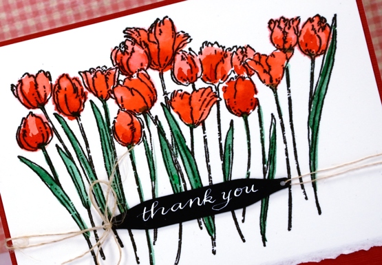
I used a hand lettered sentiment tied on with some hemp twine and framed it all in red to make the tulips pop.
Supplies:
Stamps: Tulip Queue (PB)
Dies: gift card pocket set (PB)
Inks: versafine onyx black (Tsukineko) Dr Ph Martins bleedproof white
Cardstock: fabriano hot pressed watercolour paper, red and black cardstock
Spring blossoms
Posted: April 6, 2017 Filed under: CAS, Spring blossoms | Tags: Penny Black stamps, Ranger Distress stains 7 Comments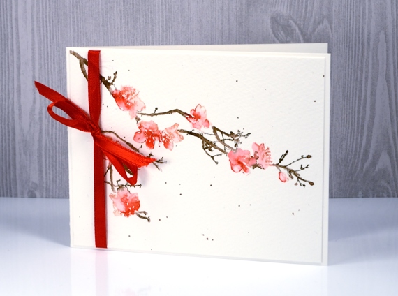
I’ve been wanting to watercolour this image ever since I stamped it as a black silhouette on an earlier card. The details are fairly small so I kept a light hand with the ink and used a stamp positioner so I could add colour little by little. On a piece of cold pressed watercolour paper I stamped first the blossoms in spun sugar distress stain, then added little dots of festive berries stain and blended with a small watercolour brush. I inked the stems with a gathered twigs distress marker then, after stamping blended on the paper, again with a fine tip brush. I added gathered twigs stain splattered around the blooms.
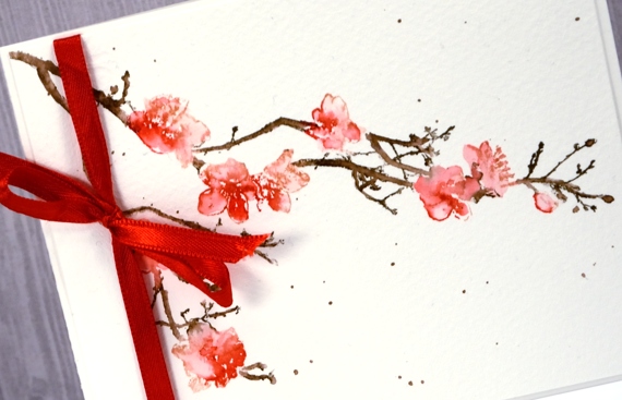
I chose not to add a sentiment but pulled out some ribbon to complete the card.
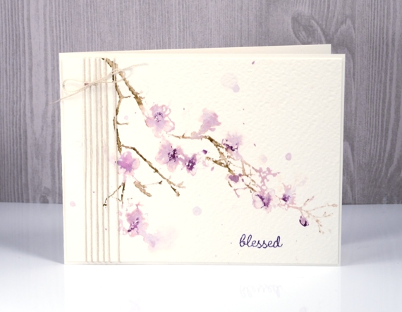
The technique for this one was almost the same but I used rough watercolour paper and more water so the blooms are more like blobs in some places. It’s more of an abstract look.

This one I finished off with bookbinding thread and a sentiment. Both cards are very simple but I felt that a delicate stamp called for a delicate card.
Supplies
Stamps: spring blossoms, spiritual snippets (PB)
Inks: spun sugar, festive berries, gathered twigs, milled lavender, dusty concord, distress stains (Ranger)
Paper: cold pressed and rough watercolour paper (Fabriano)
Also: bookbinding thread, red ribbon
Dawn & Dusk
Posted: April 4, 2017 Filed under: cattail clique | Tags: Fabriano Watercolour Paper, Penny Black creative dies, Penny Black stamps, Ranger Distress stains 10 Comments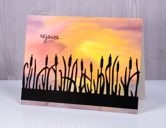
The star of today’s cards is the pretty cattails clique die from Penny Black. I cut it as a silhouette out of black cardstock for my dawn card and painted it for my dusk card later on in this post.
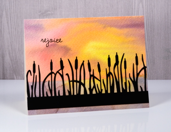
To create my dawn background I taped down some rough watercolour paper. More often than not I use hot pressed(smooth) watercolour paper but I decided this time to let the texture of rough paper add to my project. I taped across the panel about two thirds of the way down so I could paint the sky first. I used the wet into wet technique and painted first mustard seed, then worn lipstick, spiced marmalade and dusty concord distress stains onto the panel. In some places I blended the colours into each other but left one area lighter and more yellow to represent the sun. When that was dry I removed the tape and positioned it over the top section to reveal the lower section. I painted again with the same colours but blended it more to represent the reflection of the sky in the water.
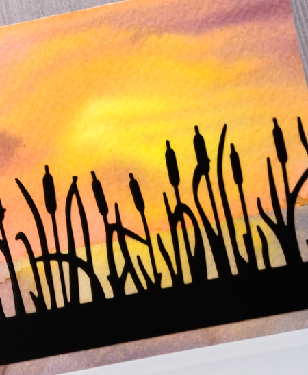
I applied a double sided adhesive to black cardstock then die cut the ‘cattails clique’ out of it and attached it to the watercolour panel and added a sentiment in black ink.
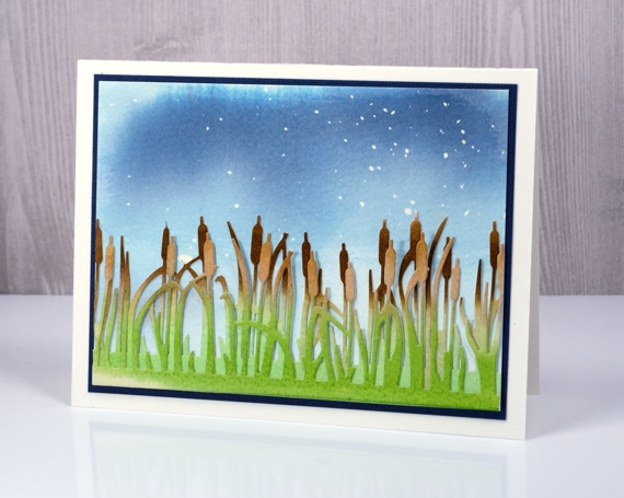
For my dusk card I used cold pressed watercolour paper but this time started by splattering masking fluid over it. I then painted stormy sky and faded jeans distress stain over the panel diluting it with water towards the bottom. On separate pieces of cold pressed watercolour paper I painted gathered twigs distress stain across the top of each panel and mowed lawn distress stain over the bottom of the panel. Once they were dry I cut two more ‘cattails’ pieces to layer over my sky panel.
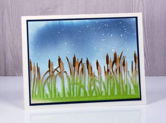
Before assembling the card I rubbed all the masking fluid off the blue painted panel to reveal ‘stars’ in the evening sky. I layered and offset my cattail die cuts, attached them at the bottom of the panel and matted the scene in dark blue cardstock.
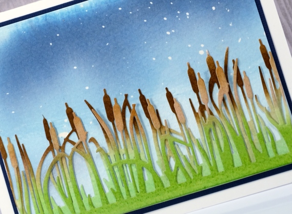
I love creating scenes with stamps and dies so the cattails die makes me happy.
Supplies
Stamps: Spiritual snippets (PB)
Dies: Cattail Clique (PB)
Inks: mustard seed, worn lipstick, spiced marmalade, dusty concord, stormy sky, faded jeans, mowed lawn, gathered twigs distress stains, versafine onyx black ink
Paper: rough & cold pressed watercolour paper, black cardstock, blue cardstock
Also: masking fluid, double sided adhesive sheets
Cherish
Posted: March 29, 2017 Filed under: Delicate silhouettes, first blush | Tags: Penny Black creative dies, Penny Black stamps, Ranger Distress inks, Ranger Distress stains 23 Comments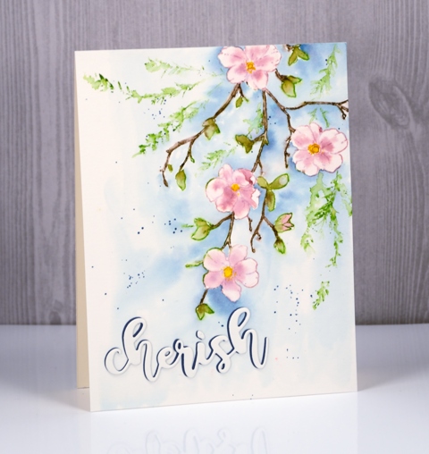
I have featured this stamp on cards a couple of times already but it is going to be one of those stamps that I reach for again and again. The flowers are perfect for a range of colouring techniques but pretty as an outline as well and the way the branch reaches across the panel is just so lovely.
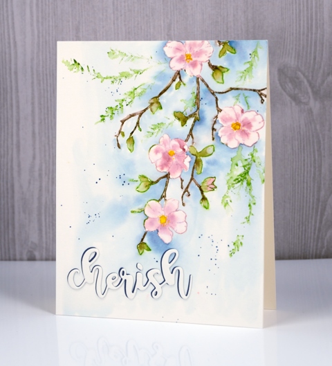
I pulled out some distress products for this design and the stamp positioner so I could build it up colour by colour. I started by stamping the flowers in Victorian velvet distress stain, then the leaves with peeled paint distress stains and finally the stems with gathered twigs distress marker. Once the design was all stamped I blended colour into the petals, some I was able to pull in from the outline stamping, but if it was too pale I picked up some stain on my brush and added it. I did the same with the leaves and used a very fine brush to paint over the stamped stems and twigs. I let everything dry thoroughly before painting the background in faded jeans distress stain ( I think ). I also splattered a little blue stain around the flowers.
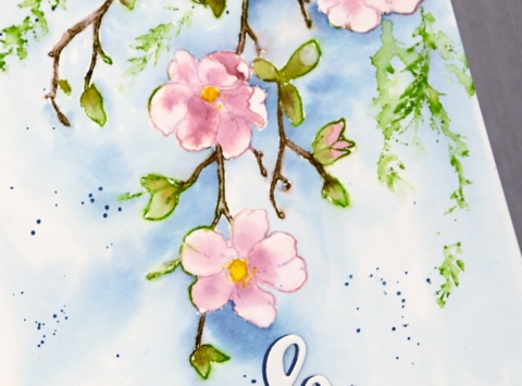
I wanted a little more foliage around the branch so I inked the leafy spray from ‘delicate silhouettes’ set in mowed lawn and pressed it around the spray then softened the stamping with a wet brush. I was in two minds whether to add a sentiment or not; I’m still not sure if I should have. But to keep it subtle I added it in the same watercolour paper with just a shadow of dark blue peeping out the side. If you have blossoms where you are I’m sure you are enjoying them; mine will appear eventually, I know!
Supplies
Stamps: delicate silhouettes, first blush
Inks: Victorian velvet, mowed lawn, peeled paint, mustard seed, faded jeans distress stains, gathered twigs distress marker
Die: forever friends
Paper: hot pressed watercolour paper (Fabriano), blue cardstock
More Matelasse
Posted: March 28, 2017 Filed under: A blizzard, bird flower doily, Brusho, CAS, Dies, Metropolitan, No two are alike, the gift | Tags: Brusho, CAS, Penny Black creative dies 5 Comments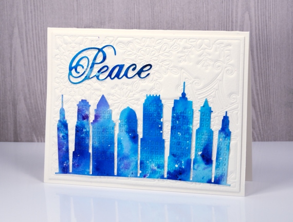
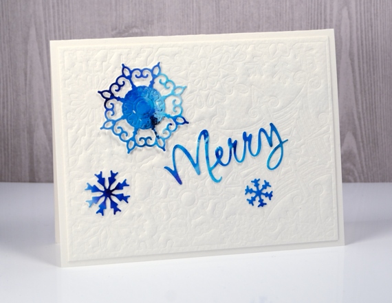
I have a few more cards made with matelasse style backgrounds topped with bright brusho elements. I once again chose intricate dies for the backgrounds. In the cards above and below I embossed watercolour paper with the no two are alike die. For focal elements I die-cut the city skyline, some snowflakes and a couple of words from a panel painted with turquoise and cobalt blue brusho.
The background below was embossed with the bird flower doily then matted with the same painted paper I die cut the dove from. All the dies I used for these three cards are listed and linked below.
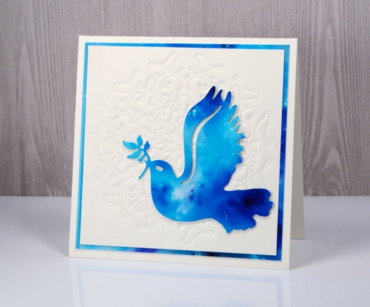
I used my big shot/big kick to emboss these panels and my ‘sandwich’ was:
- multipurpose platform with one tab showing and one flipped open out of the way
- cutting plate
- silicon mat
- watercolour paper (damp)
- die
- cutting plate
Matelasse cards & a winner
Posted: March 27, 2017 Filed under: Brusho, CAS, layered flower, Leaflets, the garden | Tags: Brusho, Fabriano Watercolour Paper, Penny Black creative dies 8 Comments