
Inspiration and Conversation
Posted: February 24, 2026 Filed under: Hand painted, sennelier watercolours | Tags: Fabriano Watercolour Paper, Hand painted, sennelier watercolours 18 Comments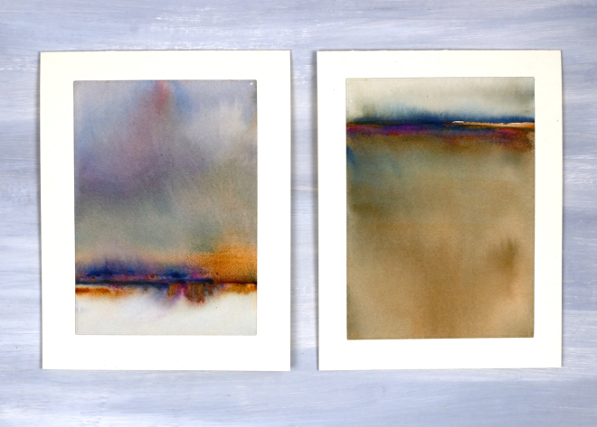
Today I wanted to have a bit of a chat with you, my readers, and especially take a few sentences to tell you how much I appreciate you. Some of you I have met but many of you I have not. Despite not having met in person I feel that we have formed a community and it is a very friendly and generous one. I took a break from the blog last year for several months and when I returned I was very encouraged by the comments and messages I received. Yes, it was nice to be missed, but more importantly it was lovely to see people engaging in discussion about techniques and materials. Many of you are kind enough to say you learn from my posts; I am so glad you do, but I also learn from you when you take the time to suggest products, methods and artists to check out.
Some of you have told me it is not as straight forward to comment these days. I’ve noticed this and I’m not sure why. I really enjoy hearing from you and read every comment and message I receive.
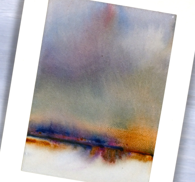
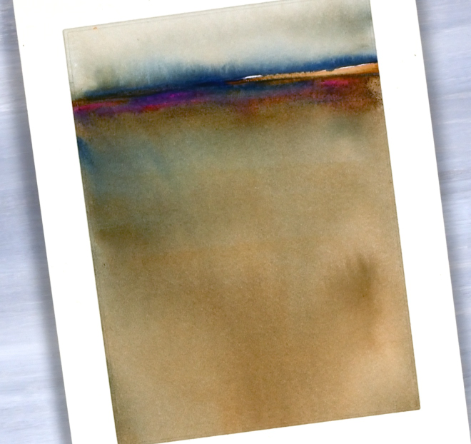
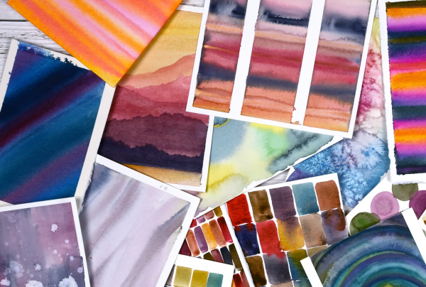
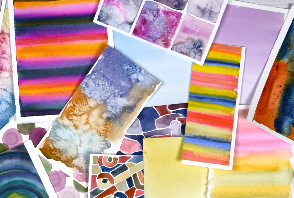
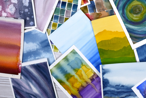
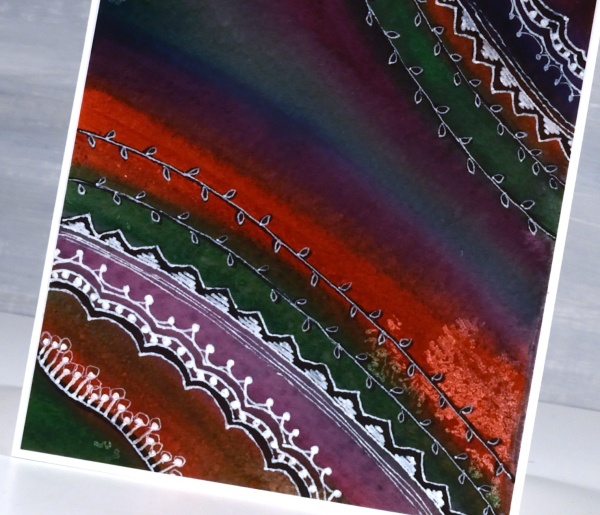
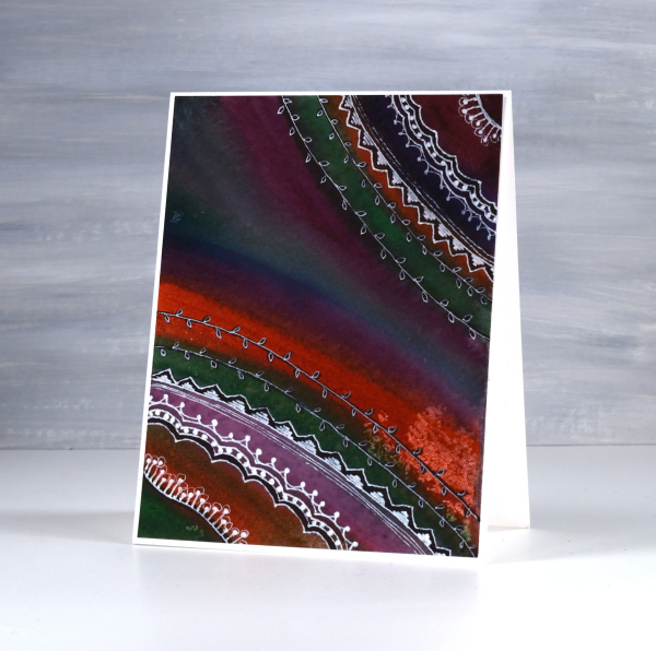
Today’s cards are inspired by the art of Claudia Drexhage. I encourage you to check out her website or instagram as her paintings are stunning and you will see where I got the idea for today’s abstract landscapes. I have only dipped my little toe into this technique but hopefully I’ll go in further in the future. One thing I find interesting about it is the way the abstract landscape can be seen one way and also turned upside down. I can’t remember which way I painted these panels originally but when I turned them into cards this week I decided I liked one with a big sky and the other with a big foreground. What do you think?
Thank you again for dropping in today and being part of this community. I look forward to seeing a few of you soon at some artsy get-togethers I am hosting but for those who don’t live close I look forward to seeing your inspiring creations if you share them on the interwebs or hearing from you in the comments or contact me button. Your encouragement and friendship mean a lot to me!
Birds on Birches
Posted: December 9, 2025 Filed under: beneath the birches, Dies, Penny Black, sennelier watercolours, winter trees | Tags: Fabriano Watercolour Paper, Penny Black creative dies, Penny Black stamps, sennelier watercolours 3 Comments
In case you were wondering I have done some watercolouring for Christmas cards this year; it’s not all napkin art. I created a batch of cards for a friend which included either watercolour skies or watercolour trees.
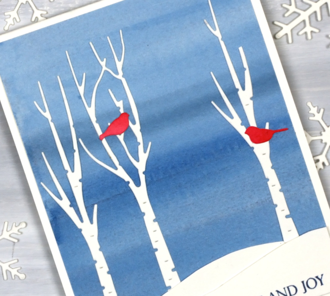
I painted a blended sky with a couple of different blues then added hand-cut snowbanks and die-cut trees and birds from the Penny Black sets, ‘beneath the birches‘ and ‘winter trees‘.

This would be a simple card to make in multiples by painting a large sheet of watercolour paper to divide into sky panels then add the white and red elements. The greeting is from the PB ‘Christmas sentiments‘ set. How is your Christmas card sending going? I sat in a waiting room yesterday and wrote about eight cards instead of reading a book or scrolling so that advanced me through my list a little.
The Tulip Mix
Posted: May 12, 2025 Filed under: AALL & Create, Echidna Studios, tulip background, Watercolour | Tags: AALL & Create, Echidna Studios, Fabriano Watercolour Paper, sennelier watercolours 5 Comments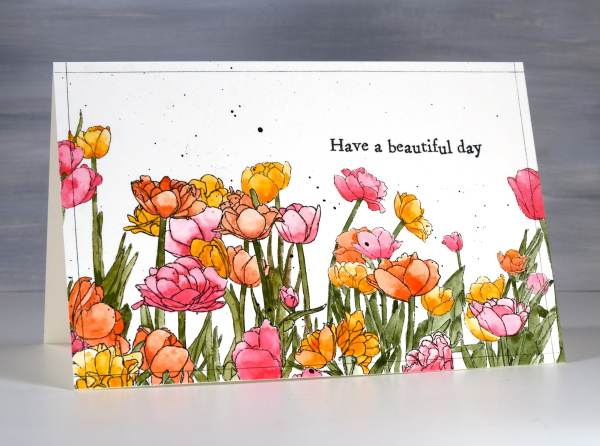
The tulip festival officially started here in Ottawa on Saturday but definitely not in my yard. There are potential blooms on a few lonely tulips but nothing looking showy or colourful yet. It doesn’t matter how many I plant, most do not shown up the following year! The tulips on today’s card are from Echidna Studios, the ‘tulip background digital stamp‘ printed on hot pressed watercolour paper.
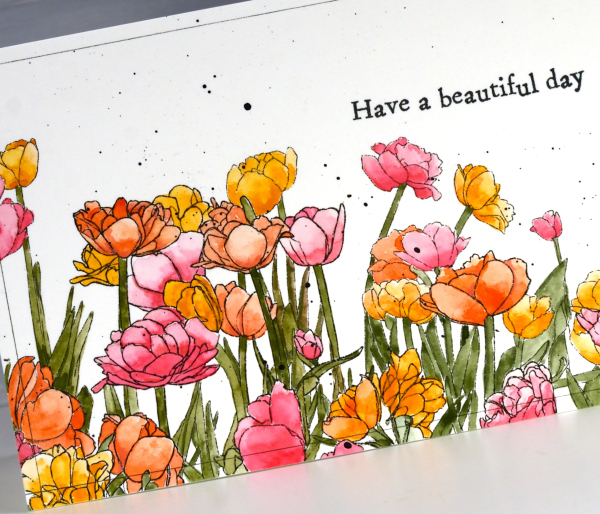
I used a limited palette of Sennelier watercolour paints, creating a pink, an orange and a yellow from a mix of opera pink and gold ochre. The green stems and leaves were mix of greenish umber and prussian blue. I’ve been painting patterns and experiments in one of my handmade art journals so the paints were already on the table and in the palette.
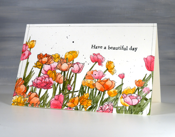
To finish the design I splattered black paint, stamped an Aall & Create sentiment and ruled very fine black lines around the border with the a .01 micron pen. I hope you do have a beautiful day!
Delicate florals on Watercolour
Posted: May 9, 2025 Filed under: Delicate Florals, Penny Black, Watercolour | Tags: Fabriano Watercolour Paper, Penny Black stamps, sennelier watercolours, Tsukineko Versafine inks 3 Comments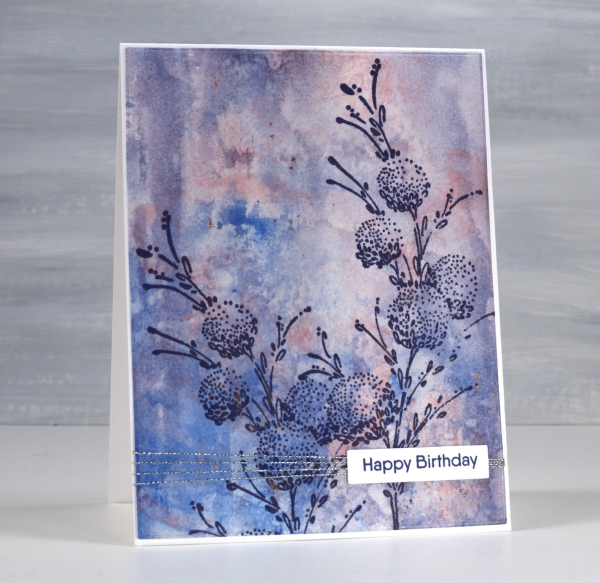
I have another floral stamp over a watercolour background; I don’t think I will ever tire of the combination. This background was created using a very different method to the previous card posted. Whereas the last one required careful blending of paint colours this one was definitely abstract and unpredictable. I randomly painted watercolours on a piece of clear acetate then smooshed it onto a piece of watercolour paper.

It took a few smooshings to start to build up pattern and depth of colour but eventually I had something I liked. Along the way I spritzed water to help the paint move and tilted the panel this way and that to spread it from one area to another. I didn’t like it when I first began but after several repetitions with the smooshing I could see it working as a pretty background.

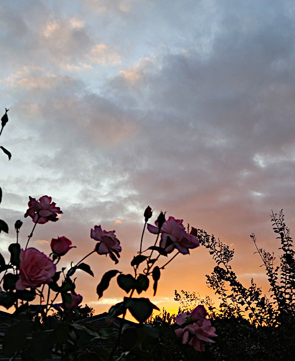
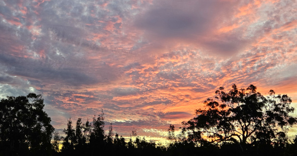
Once again I chose a Penny Black stamp, ‘delicate florals’ as the focal point over the background, this time choosing dark blue ink because I love the matchy-matchy! If you compare with the previous card you can see I added visual interested once again with a horizontal line down low on the card. It doesn’t get in the way but it leads the eye from left to right. While I was away I enjoyed the roses still blooming in my Dad’s garden. The tallest bush gave some foreground interest to yet another sunset photo.
Sunset Grasses
Posted: May 7, 2025 Filed under: Nature's Paintbrushes, Penny Black, sennelier watercolours | Tags: Fabriano Watercolour Paper, Penny Black stamps, sennelier watercolours 5 Comments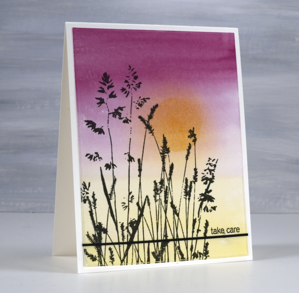
I have been away from my workroom, paints, stamps, papers and computer. I thought I might have shared a few blog posts while I was away but instead I took in the beauty of my surroundings snapping oodles of sunset photos along with other lovely scenery and dear faces. Now that I am back at home I will share some cards interspersed with occasional photos taken while away.
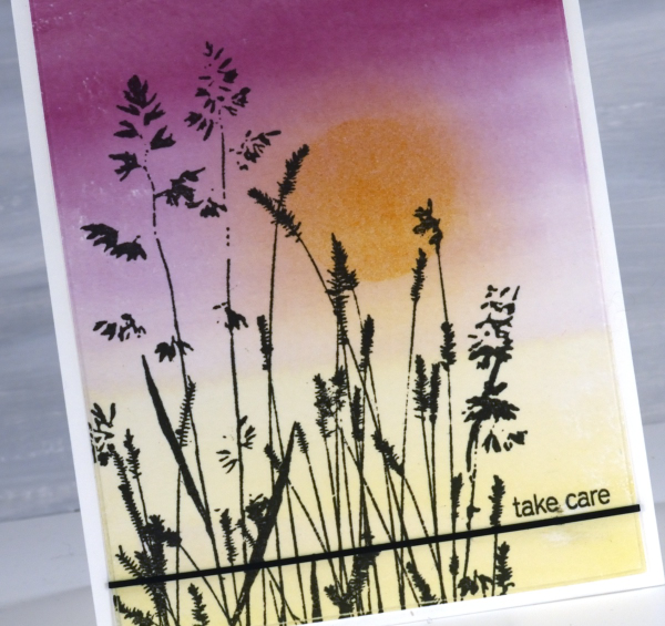
It’s been over a month since my last post which included snowflakes but before that one I was sharing cards made from watercolour panels. I ended last year and began this year wrapped up in colour mixing. I am still doing it and the result is quite the pile of panels ready to be stamped, die-cut or collaged into cards. This panel is an example of a gradation from one colour to another. I painted yellow from one end, deep pink from the other and blended them only slightly in the middle. When I picked the panel out of the pile I blended some darker yellow ink over the top through a circle post-it stencil then blended the edges once the stencil was removed.
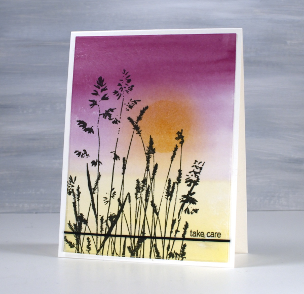
The lovely Penny Black ‘nature’s paintbrushes’ was a simple addition along with a thin strip of cardstock and a tiny sentiment from the PB ‘snippets’ stamp set. Thanks for dropping by despite how quiet it’s been her lately!
Pile of Watercolour Possibilities
Posted: February 27, 2025 Filed under: Classes, Hand painted, sennelier watercolours, Watercolour | Tags: Canson watercolour paper, Classes, Fabriano Watercolour Paper, Kuretake Gansai Tambi watercolour paints, sennelier watercolours 7 Comments
After teaching a couple of watercolour classes lately I have amassed quite the pile of panels. They are full of potential for card making. As well as painting separate panels I’ve also been creating abstract or background watercolours in a couple of art journals.
The purpose of the exercise has been two-fold. The main plan was to revisit a range of watercolour techniques in order to share them with others in classes. Additionally I chose to work small so we could complete quite a few practice pieces during class leaving us with ‘card sized’ panels to turn into cards later if we wished.
I have enjoyed the preparation and the classes so much that I have almost 100 panels on hand! My next in person class is going back to basics in regard to card making. I will cover assembly tips and tricks as well as design principles in order to create balanced and beautiful card layouts. It is exciting to have all these panels around just waiting to be transformed into cards.
As you can imagine I also have piles of gel prints, alcohol ink panels, collages and patterned papers that could be turned into cards. It’s rather nice to have all these options…
Whimsy and Watercolour
Posted: February 24, 2025 Filed under: Classes, Hand drawn, Hand painted, sennelier watercolours, Watercolour | Tags: Classes, Fabriano Watercolour Paper, sennelier watercolours 3 Comments
As I mentioned in January I have been playing with watercolour techniques then adding whimsical doodles over the top. Today’s card is another example. I switched the order in the title of the blog post because the whimsy has over powered the watercolour in this panel even though both elements are still obvious.
I used only three paint colours to paint the squares on the watercolour paper, some touching while wet, resulting in soft blends. All the colours you see were mixed from the same three paints – a blue, a pink and a mustard. The doodling was done with a black fine tip pen and a gold gel pen.
Even though the gold details from the gel pen are a minor part of the design they were the catalyst for choosing a gold mat and sentiment. In my upcoming in-person class I am teaching design principles and assembly techniques for card making and this thank you card is one of my examples. ( I wish I could remember who makes that pretty thank you die, but I’m not sure)
A New Handmade Book
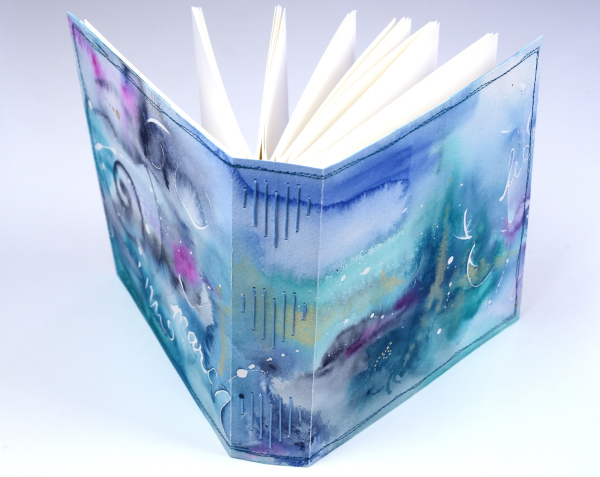
Posted: February 7, 2025 Filed under: Finetec paints, Hand painted, Handmade book, sennelier watercolours | Tags: Fabriano art journal, Fabriano Watercolour Paper, Handmade book, sennelier watercolours 6 Comments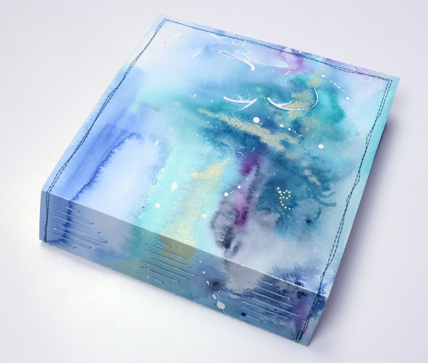
I’ve completed another challenge with Ali Manning in her Handmade Book Club. I have written before about Ali’s wonderful teaching. The most recent class was no exception. It was called ‘Valentine Palooza’ as a nod to the February timing and the cute heart binding on the spine of the book. The Handmade Book Club offers some free classes, some short challenges open to non-members (I have now done four of these) and a monthly or yearly membership ( something I would like to join at some point).
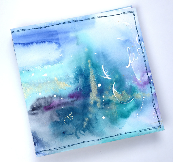
For this most recent challenge I chose to use cold pressed watercolour paper for the cover and hot pressed watercolour paper for the signatures. I watercoloured the cover in a loose abstract style over the top of some masking fluid words and squiggles. As I write this I realise I didn’t take any photos of the inside cover. Both the back and front covers fold over to make the cover more sturdy so my watercolour patterns continue inside.
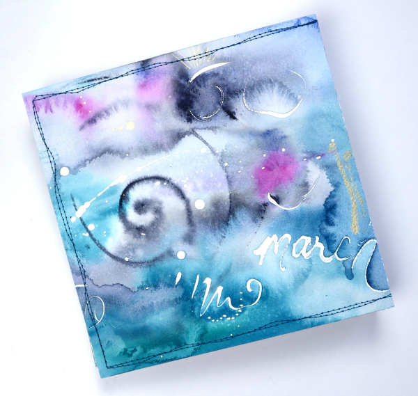
This cover was inspired by Tiffany Sharpe’s lovely stitched and watercoloured cover. I made my book 7″x7″ which was different to the rectangular examples in the workshop but all the steps are the same once you work out your dimensions. I have now made three 7×7 watercolour journals and like the page size for art journalling.
I’m playing with watercolour techniques a lot at present in preparation for my upcoming in person class on Watercolour Techniques. You will see some of the technique samples turned into cards eventually and some will be the base for future journal pages. You can see the other books I have made here: Mixed Media Journal, Coptic Journal, a second Coptic Journal, and Scrappy Journal.
Watercolour and Whimsy
Posted: January 17, 2025 Filed under: Hand drawn, Hand painted, Moda Scrap | Tags: Hand drawn, Hand painted, sennelier watercolours 6 Comments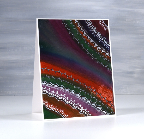
Last year I taught a class called watercolour and whimsy. The watercolour part focused on colour mixing and how to limit your palette and get cohesive results. The whimsy part included stenciling and doodling. The truth is we spent most of our time on the watercolour leaving little time for the whimsy.
I have gone back to my panels to finish the doodling details. Most were done on cold press watercolour paper with a mix of pan paints and tube paints. For each panel I chose several colours that would not necessarily look great together straight out of the pan/tube but with some mixing ending up looking like they were born to be together. This first one is a favourite. I love the way a deep green, a purple, an orangey red and a blue ended up looking so good together.
I did most of the doodling with a white gel pen with some black sharpie underneath here and there for more contrast. I have more cards to share made as part of the same class. The watercolour colour mixing part of the process is very relaxing and enjoyable. I haven’t added sentiments to either of these cards but I can add one before sending if I wish.

On the panel above and below, I painted again with a limited palette but touched each brush stroke to a previous stroke so that colours flowed into each other. The result was blends, watermarks and harder lines.
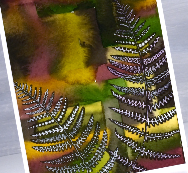
To add some whimsy I blended black ink through fern stencils. They are homemade stencils created die-cutting into grafix stencil film with dies from the Moda Scrap ‘fern die set‘.
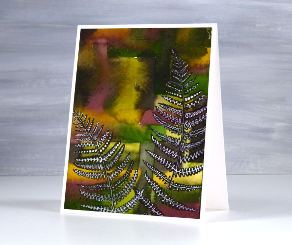
Once the black ink was dry I doodled different patterns on the fronds with white gel pens. This post includes affiliate links from Foiled Fox. If you buy through these links I receive a small commission at no extra cost to you.
Thunderbird Barbie Car
Posted: October 25, 2024 Filed under: Echidna Studios, Thunderbird Barbie car | Tags: cardmaking, cards, digital stamps, Echidna Studios, Fabriano Watercolour Paper, rubber-stamping, sennelier watercolours, stamping 3 Comments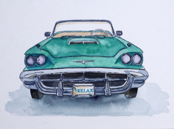
This cool car is the latest design in the Echidna Studios etsy store. The digital stamp set is called ‘Thunderbird Barbie Car‘ and includes the front view, which I chose to watercolour, and a side view; you can see that one in the etsy store.

I printed the image on hot pressed watercolour paper on an inkjet printer. In the past I have used only a laser printer to print the digital stamps but as my daughter has an inkjet printer I thought it would be interesting to compare the two methods. The ink from the ink jet printer did blur ever so slightly when I painted with watercolour paints but not so much that it spoiled the colour or line work.
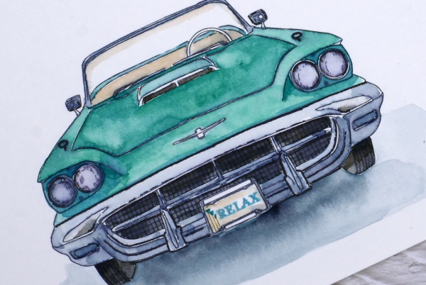
I found a T-bird photo on line and used it as inspiration for this turquoise car. I used Sennelier watercolours and a fine tip Staedtler permanent pen to darken a few lines after painting. I decided not to turn the panel into a card at this stage, perhaps it could end up in a frame instead. The cheeky little ‘Relax’ on the license plate is from the Penny Black ‘Enjoy Builder’ stamp set
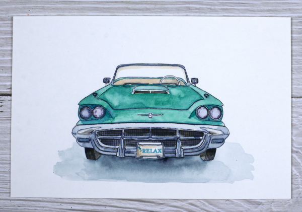
This is not the first car image in the Echidna Studios etsy store. My daughter has also drawn a fabulous Vintage Beetle design which I painted last year and a cool Vintage VW bus. This post includes affiliate links from Foiled Fox. If you buy through these links I receive a small commission at no extra cost to you.


