
Full of glee
Posted: April 17, 2017 Filed under: full of glee | Tags: Penny Black stamps, Ranger Distress inks, Ranger Distress stains, Tsukineko Versafine inks 6 Comments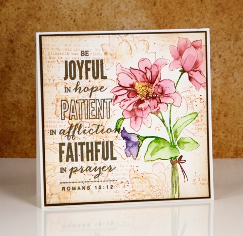
There is a lovely new batch of stamps and dies available from Penny Black; you can check out the catalogue here. My card today features a couple of the new stamps, full of glee and a scripture verse from the hope shines set.
I used my stamp positioner to stamp the ‘full of glee’ image on hot pressed watercolour paper. I started by inking only the pink petals with a Victorian velvet distress stain. I stamped that much, cleaned off the stain and inked the smaller flower in dusty concord, stamped, cleaned and moved onto the leaves and stems in peeled paint stain. Once the whole image was stamped I used a small watercolour brush and water to blend colour from the stamped image into the petals and leaves to fill them. If there was not enough colour I added some stain with the paint brush.
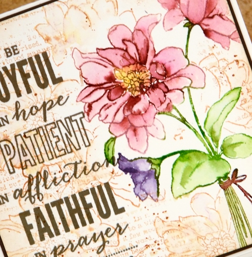
I let all the painting dry before adding scattered straw stain to the centre of the flower. To create the background I inked the full of glee stamp with tea dye distress ink and pressed it down randomly around the image then did the same with the text stamp from the footnotes set. I blended some of the ink with a damp paintbrush and added some splatter as well.
I finished the panel off with the sentiment stamped in versafine vintage sepia ink. I often switch to versafine ink when doing my sentiments as it is a pigment ink which gives a nice sharp print and sits on the paper rather than sinking into it as dye inks tend to do. I matted the panel and attached it to a natural coloured card base.
Supplies
Stamps: full of glee, hope shines, footnotes
Inks: scattered straw, peeled paint, Victorian velvet, dusty concord distress stains, tea dye distress ink (Ranger) versafine vintage sepia (Tsukineko)
Paper: hot pressed watercolour paper, brown cardstock
Pop out roses
Posted: April 11, 2017 Filed under: Pop out rose, Script | Tags: Brusho, Penny Black creative dies, Penny Black stamps, Ranger Distress inks 4 Comments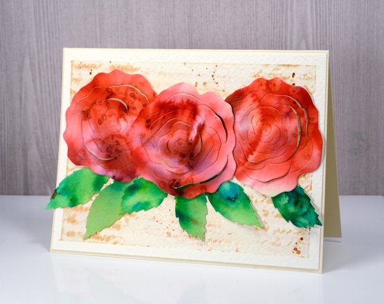
I’m a guest over at The Foiled Fox today sharing these die cut roses. This really was an easy card to make because the ‘pop out rose‘ die creates the lovely petals and brusho powders create the pretty colours. I used three different red brusho powders on watercolour paper and some leaf green brusho for the leaves. While the paper was still damp I sprinkled some salt over the panel to get subtle patterns.
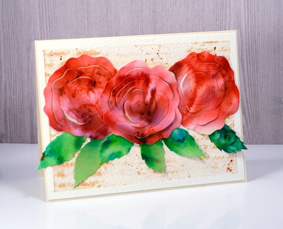
The partial cuts in the roses make it possible to lift petals so I folded some up and kept others glued down when I attached the roses to the background panel. To make the background panel I stamped the ‘script’ stamp from Penny Black on cold pressed watercolour paper in tea dye distress ink then painted over the top with water. The result is a softly blurred background with splatters of ink to add to the aged look. Pop over to the Foiled Fox blog for more details and to see the products I have used on this card.
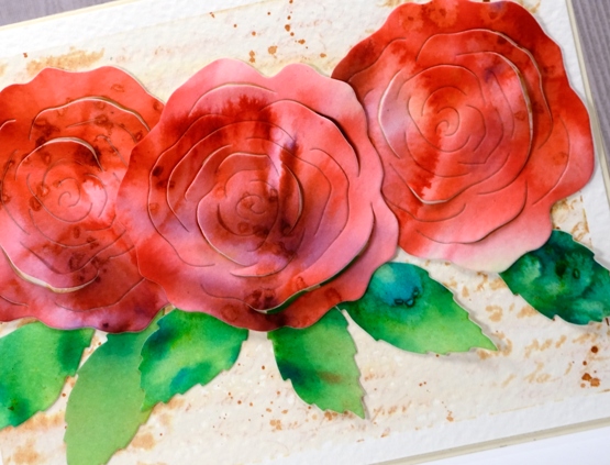
Thank you to the wonderful Foiled Fox team for having me back again; it’s always a pleasure.
Red Tulips
Posted: April 10, 2017 Filed under: gift card pocket, Hand lettered, Tulip Queue | Tags: Peerless Transparent Watercolors, Penny Black creative dies, Penny Black stamps 10 Comments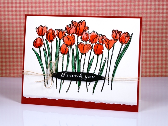
I have planted quite a few tulips in our garden over the years and over 100 daffodils. Sadly I do not get to see that many when spring rolls around. I believe the squirrels dine out on the tulips; I’m not sure if they eat the daffodils too. I do get a few red tulips each year which have been blooming ever since we moved here so I can’t take any credit for keeping them alive!
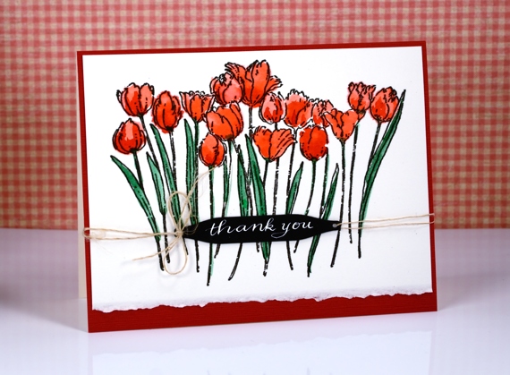
I stamped this lovely outline stamp on hot pressed watercolour paper and coloured it with peerless watercolour paints. The deckled edge is left when I cut up the large sheets of watercolour paper I buy. Sometimes it makes a nice design detail.
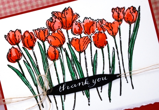
I used a hand lettered sentiment tied on with some hemp twine and framed it all in red to make the tulips pop.
Supplies:
Stamps: Tulip Queue (PB)
Dies: gift card pocket set (PB)
Inks: versafine onyx black (Tsukineko) Dr Ph Martins bleedproof white
Cardstock: fabriano hot pressed watercolour paper, red and black cardstock
Spring blossoms
Posted: April 6, 2017 Filed under: CAS, Spring blossoms | Tags: Penny Black stamps, Ranger Distress stains 7 Comments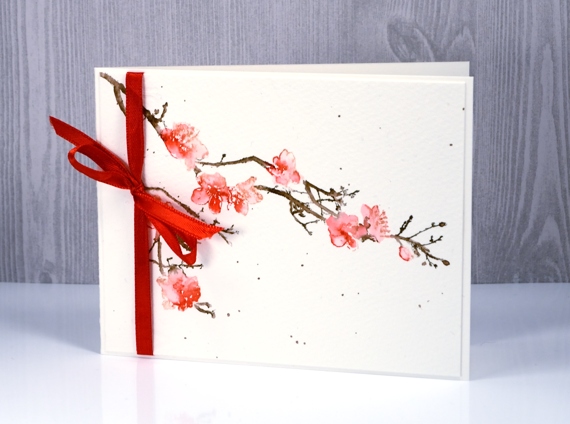
I’ve been wanting to watercolour this image ever since I stamped it as a black silhouette on an earlier card. The details are fairly small so I kept a light hand with the ink and used a stamp positioner so I could add colour little by little. On a piece of cold pressed watercolour paper I stamped first the blossoms in spun sugar distress stain, then added little dots of festive berries stain and blended with a small watercolour brush. I inked the stems with a gathered twigs distress marker then, after stamping blended on the paper, again with a fine tip brush. I added gathered twigs stain splattered around the blooms.
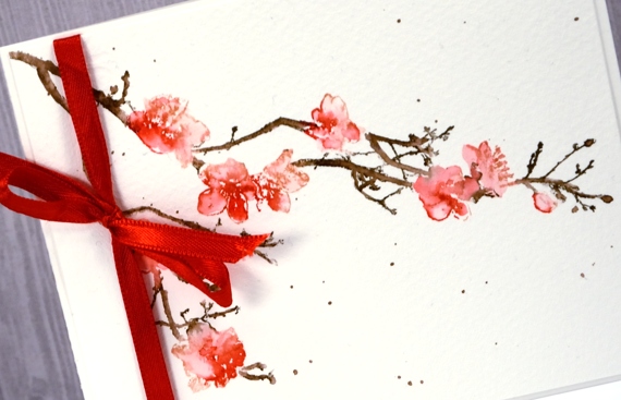
I chose not to add a sentiment but pulled out some ribbon to complete the card.
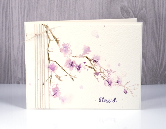
The technique for this one was almost the same but I used rough watercolour paper and more water so the blooms are more like blobs in some places. It’s more of an abstract look.

This one I finished off with bookbinding thread and a sentiment. Both cards are very simple but I felt that a delicate stamp called for a delicate card.
Supplies
Stamps: spring blossoms, spiritual snippets (PB)
Inks: spun sugar, festive berries, gathered twigs, milled lavender, dusty concord, distress stains (Ranger)
Paper: cold pressed and rough watercolour paper (Fabriano)
Also: bookbinding thread, red ribbon
Dawn & Dusk
Posted: April 4, 2017 Filed under: cattail clique | Tags: Fabriano Watercolour Paper, Penny Black creative dies, Penny Black stamps, Ranger Distress stains 10 Comments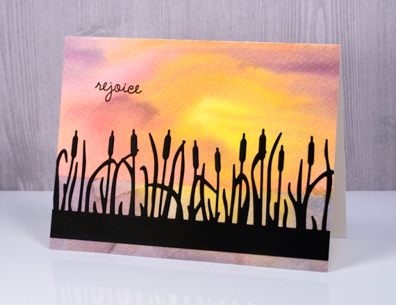
The star of today’s cards is the pretty cattails clique die from Penny Black. I cut it as a silhouette out of black cardstock for my dawn card and painted it for my dusk card later on in this post.
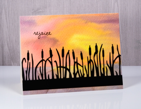
To create my dawn background I taped down some rough watercolour paper. More often than not I use hot pressed(smooth) watercolour paper but I decided this time to let the texture of rough paper add to my project. I taped across the panel about two thirds of the way down so I could paint the sky first. I used the wet into wet technique and painted first mustard seed, then worn lipstick, spiced marmalade and dusty concord distress stains onto the panel. In some places I blended the colours into each other but left one area lighter and more yellow to represent the sun. When that was dry I removed the tape and positioned it over the top section to reveal the lower section. I painted again with the same colours but blended it more to represent the reflection of the sky in the water.
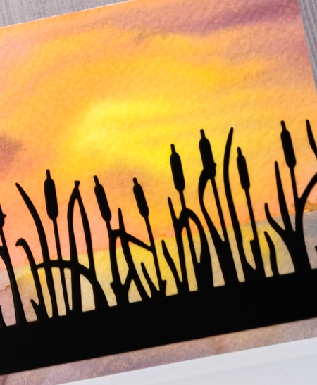
I applied a double sided adhesive to black cardstock then die cut the ‘cattails clique’ out of it and attached it to the watercolour panel and added a sentiment in black ink.
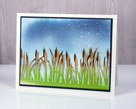
For my dusk card I used cold pressed watercolour paper but this time started by splattering masking fluid over it. I then painted stormy sky and faded jeans distress stain over the panel diluting it with water towards the bottom. On separate pieces of cold pressed watercolour paper I painted gathered twigs distress stain across the top of each panel and mowed lawn distress stain over the bottom of the panel. Once they were dry I cut two more ‘cattails’ pieces to layer over my sky panel.
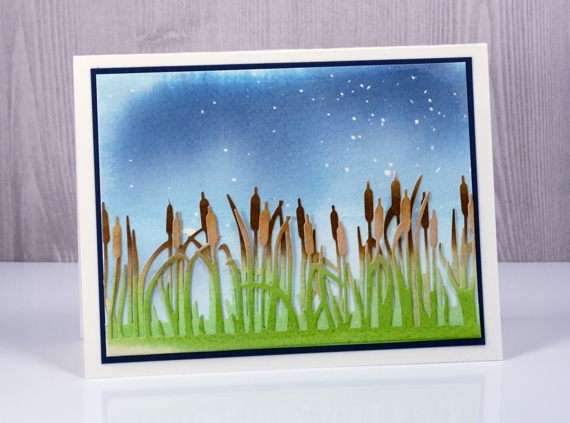
Before assembling the card I rubbed all the masking fluid off the blue painted panel to reveal ‘stars’ in the evening sky. I layered and offset my cattail die cuts, attached them at the bottom of the panel and matted the scene in dark blue cardstock.
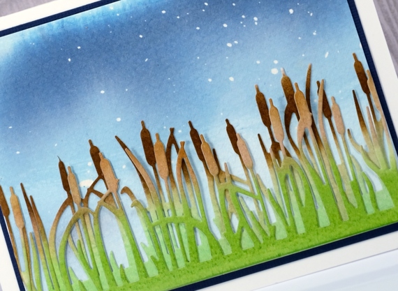
I love creating scenes with stamps and dies so the cattails die makes me happy.
Supplies
Stamps: Spiritual snippets (PB)
Dies: Cattail Clique (PB)
Inks: mustard seed, worn lipstick, spiced marmalade, dusty concord, stormy sky, faded jeans, mowed lawn, gathered twigs distress stains, versafine onyx black ink
Paper: rough & cold pressed watercolour paper, black cardstock, blue cardstock
Also: masking fluid, double sided adhesive sheets
Cherish
Posted: March 29, 2017 Filed under: Delicate silhouettes, first blush | Tags: Penny Black creative dies, Penny Black stamps, Ranger Distress inks, Ranger Distress stains 23 Comments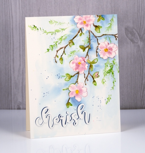
I have featured this stamp on cards a couple of times already but it is going to be one of those stamps that I reach for again and again. The flowers are perfect for a range of colouring techniques but pretty as an outline as well and the way the branch reaches across the panel is just so lovely.
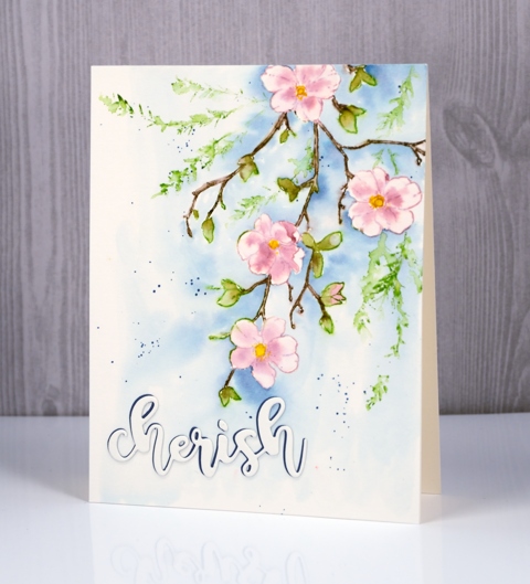
I pulled out some distress products for this design and the stamp positioner so I could build it up colour by colour. I started by stamping the flowers in Victorian velvet distress stain, then the leaves with peeled paint distress stains and finally the stems with gathered twigs distress marker. Once the design was all stamped I blended colour into the petals, some I was able to pull in from the outline stamping, but if it was too pale I picked up some stain on my brush and added it. I did the same with the leaves and used a very fine brush to paint over the stamped stems and twigs. I let everything dry thoroughly before painting the background in faded jeans distress stain ( I think ). I also splattered a little blue stain around the flowers.
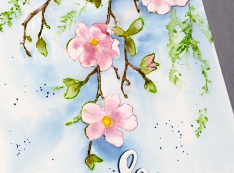
I wanted a little more foliage around the branch so I inked the leafy spray from ‘delicate silhouettes’ set in mowed lawn and pressed it around the spray then softened the stamping with a wet brush. I was in two minds whether to add a sentiment or not; I’m still not sure if I should have. But to keep it subtle I added it in the same watercolour paper with just a shadow of dark blue peeping out the side. If you have blossoms where you are I’m sure you are enjoying them; mine will appear eventually, I know!
Supplies
Stamps: delicate silhouettes, first blush
Inks: Victorian velvet, mowed lawn, peeled paint, mustard seed, faded jeans distress stains, gathered twigs distress marker
Die: forever friends
Paper: hot pressed watercolour paper (Fabriano), blue cardstock
Bible journalling
Posted: March 24, 2017 Filed under: Bible journaling, Fragrant Flowers | Tags: Bible journaling, Faber-Castell Albrecht Durer Watercolour pencils, Penny Black stamps, Tsukineko Versafine inks 9 Comments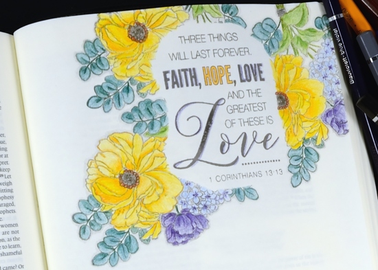
I have recently started some bible journalling. When I first saw the trend I decided I wouldn’t venture down that path but a couple of things changed my mind. The pastor of our church challenged us to read through the New Testament this year, a challenge I am enjoying and even managing to keep up with! I started jotting things down in a notebook as I read. Also I began taking notes during the sermons more carefully; there is usually an outline on the back of the weekly bulletin provided for notes. The problem was, even after I took the notes I brought them home and they piled up and eventually I tossed them out. Rather than continue that practice I decided to buy an interleaved bible which has a blank page after every printed page, and transfer my notes into that. I have been doing it for a month or so and it makes a difference for me to read the bible passage, hear the sermon, take notes, then come home and read through it all again as I add notes to my journalling bible. Most of the pages I’ve written on do not include colour illustration but I enjoy having the option of lettering, writing, drawing or stamping on the blank pages. The page I am sharing today has plenty of blank space left for notes on the passage highlighted in the stamped verse.
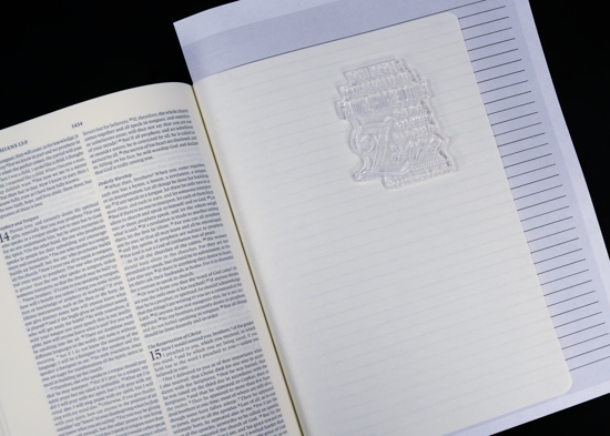
Now onto my process. I printed out a lined page to both guide my stamping and protect the page underneath.
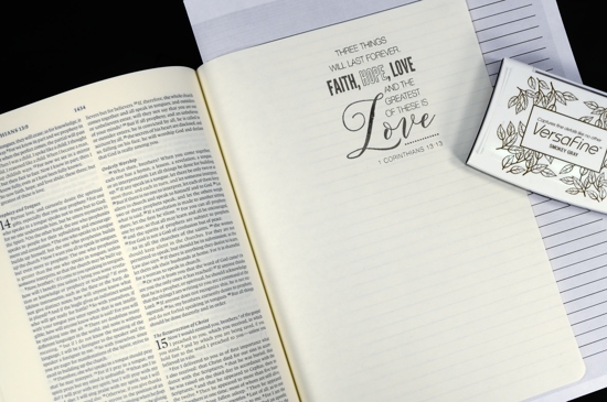
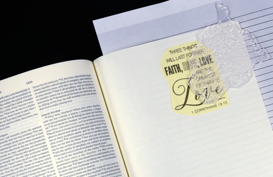
I stamped the 1 Corinthians verse from the set, ‘Faith’, in versafine smokey gray on the blank bible page and and on a post-it note to use as a mask.
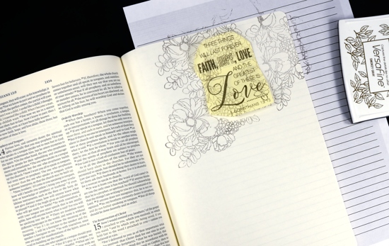
With the mask in place I stamped the floral bouquet from the ‘Fragrant Flowers’ set, also in smokey grey but a second generation impression. I did this three times to surround the verse.
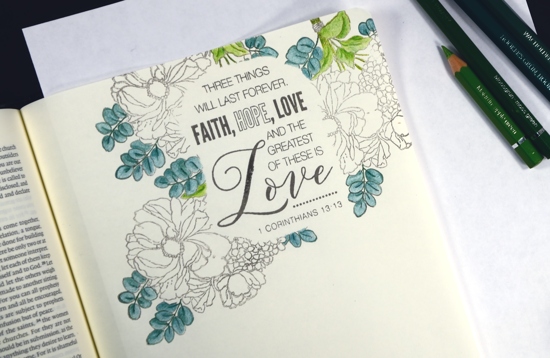
I decided to use my Albrecht Dürer watercolour pencils to colour my page but kept them dry. (you can click on the photo to view larger version) There are two types of leaves on the floral stamp so I chose two pairs of green pencils, yellow greens (apple green 170, moss green 168) and blue greens (Hookers Green 159, Juniper Green 165) I coloured with the lighter hue first then added shadow and definition with the darker.
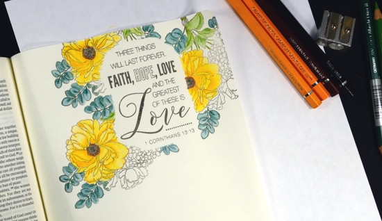
For the yellow flowers I chose two oranges and coloured all the petals with canary yellow (108) then added shading with cadmium orange (111). In the centre of the flowers I switched to browns (Venetian red 190, sepia 175)
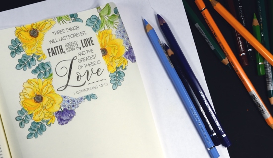
Purple and yellow are complementary colours so I chose blues and purples for the remaining flowers knowing it would give some visual impact to the page. (blue violet 137,Delft blue 141, sky blue 146)
Once all my colouring was done I shaded around the edges of all the leaves and flowers with cold grey IV 233 and added some colour around a few of the letters in the verse.
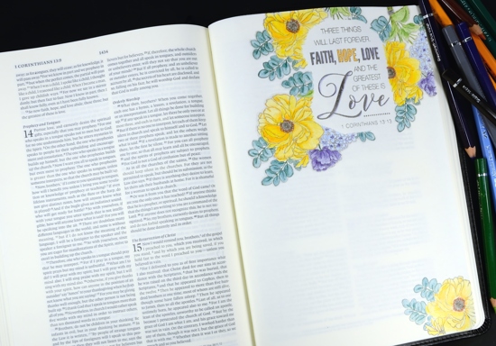
I balanced out the page with a section of the stamp coloured in the lower corner and will add journalling to the page some time in the future.
Supplies
Stamps: Faith, Fragrant Flowers (PB)
Inks: versafine smokey gray (tsukineko)
Pencils: Albrecht Dürer watercolour pencils (Faber-Castell)
Bible: ESV journaling bible interleaved (Crossways)
Silhouette blossoms & Foiled Fox Giveaway
Posted: March 21, 2017 Filed under: Alcohol Ink, Spring blossoms | Tags: Penny Black creative dies, Penny Black stamps, Ranger Alcohol Ink 59 Comments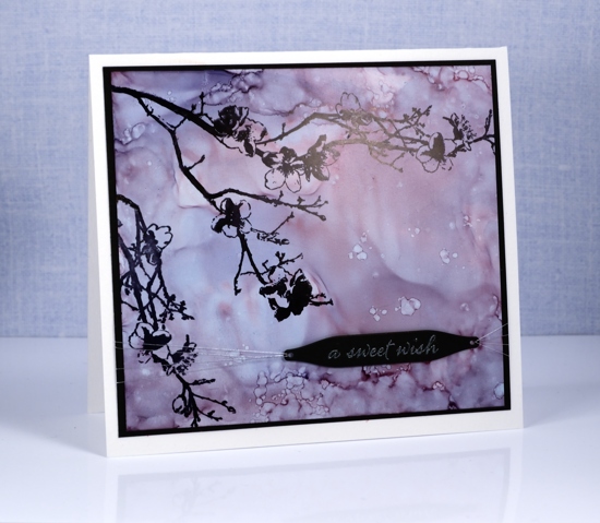
I am a guest of the wonderful Foiled Fox crew again today. To find out more about this silhouette blossom card you will need to pop over there. Once you are there you will want to browse through the lovely projects on their blog and wander the listings in their store.

Shauna from the Foiled Fox is offering one of my readers a $35 gift certificate from the Foiled Fox store this week. To enter the draw you need to check out their store then come back here to my blog and leave a comment letting me know what item you would put on your wishlist. You have until the end of Sunday March 26th EDT to let me know what you have your eye on. We will announce a winner next Monday.
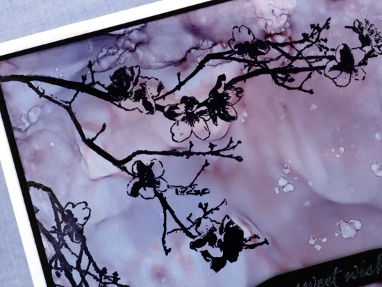
I have linked to the products I used below, you will find them all in the Foiled Fox store.
Supplies
Stamps: Spring blossoms, Happy snippets (PB)
Dies: gift card pocket set (PB)
Inks: stonewashed, cranberry & eggplant alcohol inks, Jet black archival ink(Ranger), versamark (Tsukineko)
Paper: neenah solar white cardstock, neenah epic black cardstock, white yupo paper
Also: Wow white pearl embossing powder, silver thread
Hey You
Posted: March 13, 2017 Filed under: Brusho, burst of blooms | Tags: Brusho, Penny Black creative dies, Penny Black stamps 8 Comments
Does this remind you of batik fabric? Having created and purchased batik fabrics over the years that’s what I immediately thought of when I finished this panel. There were a few techinques in play to get this effect. Maybe you find it a little messy, or maybe bright and happy. The main technique is emboss resist so I will just mention for any Toronto readers I will be teaching my Watercolour Resist class in Toronto on April 8th, the details are on my Upcoming Classes page.
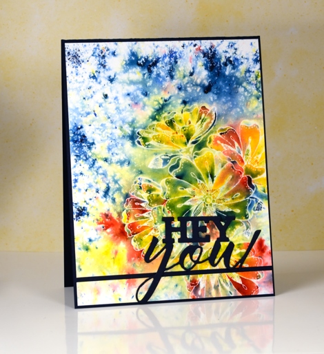
I started by embossing the ‘burst of blooms’ stamp in clear powder on hot pressed watercolour paper. Next I sprinkled red, yellow and blue brusho (colours listed below) and spritzed water from above. Once the paint had activated and the colours spread a little I dabbed them with a paper towel to remove excess liquid and dried with a heat tool .
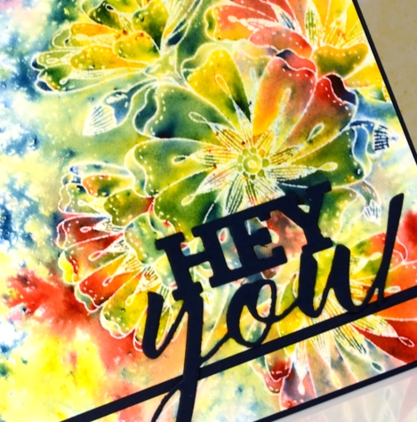
To mimic batik more closely I ironed the panel face down into a few pieces of printer paper to melt and remove the embossing powder but leave the white outlines. I mounted the panel on a navy card base but sliced a section off at the bottom to split the panel and make a line for the die cut sentiment to sit on. I haven’t used this card yet but I can make it a birthday, graduation or just hello card by adding the right words inside.
Supplies
Stamps: burst of blooms (PB)
Dies: you enjoy(PB)
Ink: versamark (Tsukineko)
Paint: lemon, prussian blue, scarlet brusho (Colourcraft)
Paper: hotpressed 100% cotton watercolour paper, Neenah patriot blue cardstock
Also: WOW clear gloss superfine embossing powder
Floral on black
Posted: March 10, 2017 Filed under: Gladsome, Hand lettered | Tags: Finetec artist mica watercolour paint, Hand lettering, Penny Black stamps, WOW embossing powders 11 Comments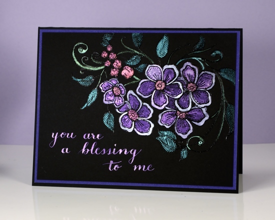
I’m sharing some shimmer today. Finetec artist mica pearl watercolours are very shimmery particularly on a black base. I worked on Neenah epic black cardstock and started by embossing the new outline image ‘gladsome’ in clear powder. The finetec pearl watercolour set has twelve colours so I chose a few and a small round watercolour brush to paint inside the lines.
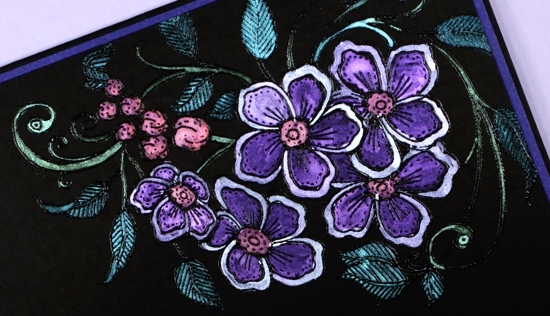
It is hard to capture all the shimmer and shine in a photo but the mica pearl paint looks lovely as it catches the light. This is the type of card you need to tilt back and forth to see all its prettiness. I wanted to keep my sentiment co-ordinated so I used a nib pen and the same violet paint used on the petals. This is my second card with the ‘gladsome’ stamp; I like to get a range of different looks from one stamp. I think this one will be appearing again.
Supplies
Stamps: Gladsome (PB)
Pen: exclusive nib holder (Foiled Fox)
Ink: versamark (Tsukineko)
Paint: Finetec pearl colours
Paper: black cardstock
Also: WOW clear embossing powder












