
Shimmery Summer Glow
Posted: June 6, 2018 Filed under: Nuvo shimmer powder, summer glow | Tags: Nuvo shimmer powder, Penny Black stamps 13 Comments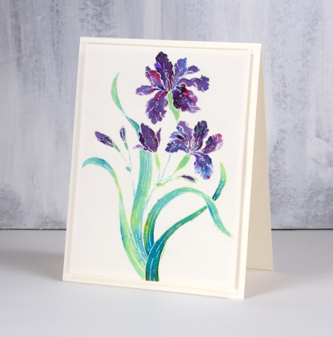
I was lucky enough to be in my local scrapbooking store, Crop A While, recently when they were unpacking the Nuvo shimmer powders. I jumped at the chance to give them a little test drive, after all they are watercolour powders! I used the summer glow iris from Penny Black and three colours of shimmer powder. I made one sample at the store then played around with the same image and three powders at home.
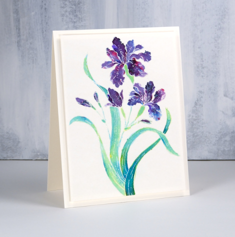
I embossed ‘summer glow’ in clear powder on two hot pressed watercolour paper panels and one cold pressed panel. My experiments moved from careful ‘stay inside the lines’ painting to free flowing colours all over the panel. The most controlled one I completed by dropping a little violet brocade, blue blitz and solar flare powders on my craft mat so I could pick some up with a damp brush. As with most powders the colour is intense; I was able to pick up a tiny bit, paint it into a petal then blend with water to get the depth I was after. I used violet brocade for the petals and ended up with some pink and blue sections as well as deep purple. To colour the stems and leaves I mixed the blue and yellow, adding more blue where I wanted shading.
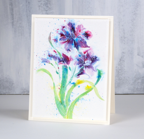
I used the cold pressed paper for a looser style and sprinkled some powder directly on the panel. It is tricky to sprinkle tiny amounts at a time but I tried to drop some violet brocade into the flowers and buds. I held my hand over the stems while I spritzed the flowers. The paint activated straight away, some inside and some outside the petals. I used a paintbrush to fill any petals that were too pale but tried not to alter the ‘random magic’ too much. Next I sprinkled the blue blitz and solar flare powders over the stems and leaves and spritzed with water. Again I moved the paint a bit with a paint brush to fill the areas enclosed by embossing.
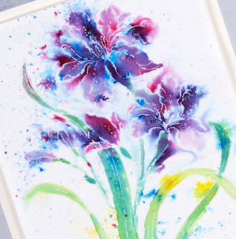
On the final panel I sprinkled the powders in the same areas and spritzed water liberally over the top so the colours filled the background as well as the embossed iris.
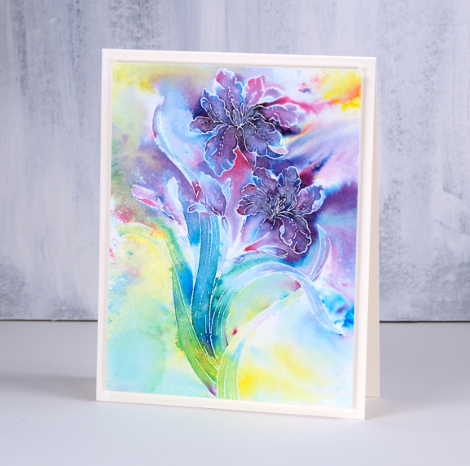
I know the messiness of this one won’t be to everyone’s taste but I think it turned out a little fun and funky.
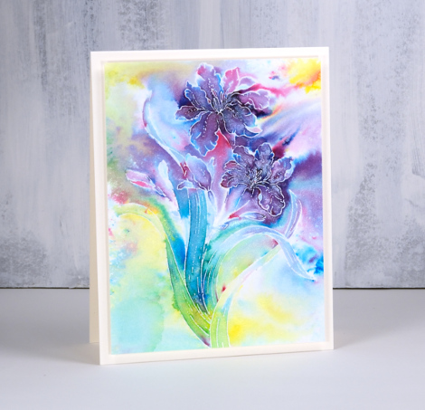
I popped up the panels with foam on cream card bases.
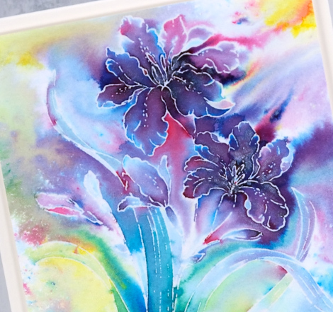
What you don’t see in the photos is the pretty shimmer in the paint when it dries. ( Since my first experiments I have bought a couple more colours so the fun will continue)
Supplies
Stamp: summer glow 40-610 (PB)

Ink: versamark

Paper: cold pressed watercolour paper, hot pressed watercolour paper, Neenah natural white


Paint: Nuvo shimmer powders blue blitz, violet brocade, solar flare
Also: clear embossing powder

Summer Dream
Posted: May 30, 2018 Filed under: summer dream | Tags: Penny Black stamps, Ranger Distress inks, Tsukineko Memento inks 3 Comments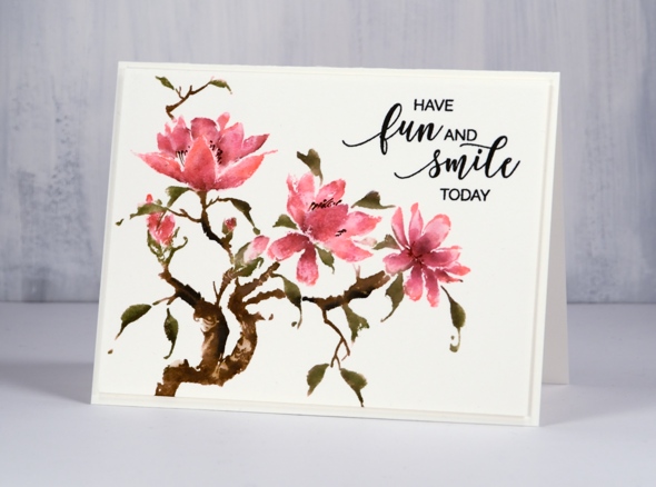
Penny Black has a selection of magnolia stamps including ‘Summer Dream’, featured on today’s card. I used a memento inkpad and distress markers to colour it, making use of a stamp positioning tool to let me add colour little by little.
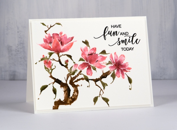
I inked the whole stamp with memento angel pink ink and stamped on hot pressed watercolour paper. Angel pink is a very pale ink so it is good for layering over. I used worn lipstick, picked raspberry and aged mahogany distress markers to build up detail and shading on the flowers then peeled paint and forest moss markers to create two toned leaves. I finished off the flowers by drawing the stamen with a black marker. I added gathered twigs and black soot marker to the twigs and stems to complete the image. When I ink with dye based markers I spritz the stamp lightly before stamping so the colour begins to blend on the stamp. I sometimes use a damp brush to blend on the paper also.
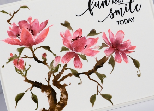
The sentiment from ‘Smile today!’ is stamped in versafine clair nocturne and the panel popped up on foam over a natural coloured card base.
Supplies:
Stamps: summer dream, smile today


Distress markers: worn lipstick, picked raspberry, aged mahogany, gathered twigs, peeled paint, forest moss, black soot


Ink: angel pink memento, nocturne versafine clair

Paper: hot pressed watercolour paper
Also: white foam

Pencil on black
Posted: May 23, 2018 Filed under: Appreciation, Coloured pencil, ebulliant | Tags: Faber-Castell Polychromos Colour Pencil, Penny Black stamps 3 Comments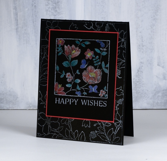
My coloured pencils feature more often in my projects these days. To create this card I stamped the Penny Black floral stamps in delicata white shimmer ink then coloured with my Faber Castell polychromos pencils. The feature image is from a 2-stamp set called ‘appreciation’ and the background image from a floral set called ‘ebulliant’.
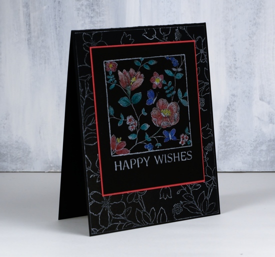
I used a white pencil to lightly colour the flowers and leaves before adding other colours over the top. I also coloured over the border and sentiment with a sharp white pencil to make them pop a little more.
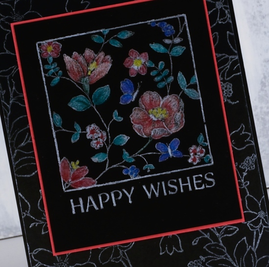
The delicata shimmer white ink definitely has shimmer to it and the overall effect of the pencils and ink on black is a bit like a printed fabric
Supplies
Stamps: appreciation 30-488, tranquility 30-484, ebulliant 30-747 (PB)


Inks

Paper: neenah black, red

Pencils: Faber Castell Polychromos

Belle
Posted: May 21, 2018 Filed under: A Pocket Full, belle, Foiling, Zigs & zags | Tags: Kuretake Zig clean color real brush markers, Minc, Penny Black creative dies, Penny Black stamps, WOW embossing powders 4 Comments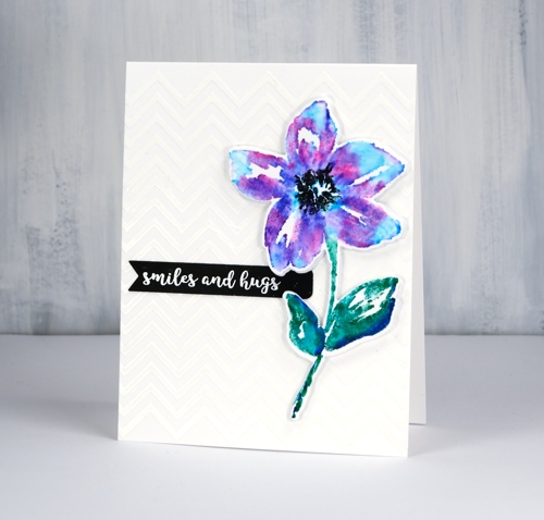
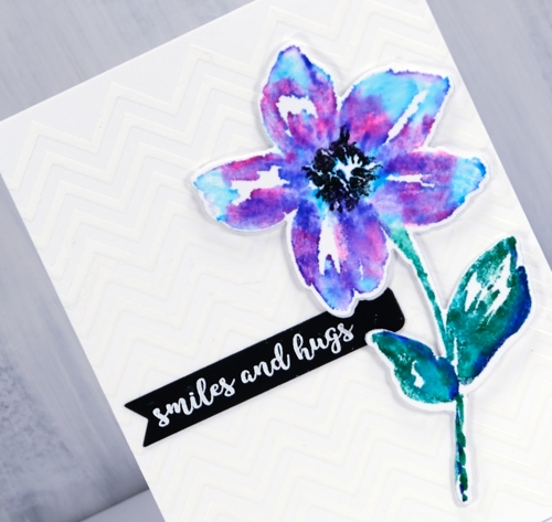
The zigs & zags stencil has popped up again today as a background for this die cut and watercoloured flower. I applied deco transfer gel directly to my card base (neenah solar white 110lb) then ran it through my minc with white foil. The result is a subtle chevron background. I wanted my flower to match the white card base exactly so I used the same neenah solar white which meant I did not add much water at all when blending my zig pens after stamping. I used a mix of blue, pink and purple and a blue/green combo on the leaves and stem then just a damp brush to blend with water. I made sure the blending was dry before stamping the black centre several times then used the co-ordinating die to cut out the flower plus a white foam one to pop it up over the background.
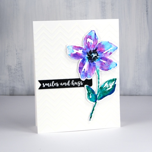
The little black banner was die cut with one of the dies from the PB ‘pocket full’ die set. I have pulled out all my little label, banner and tag dies from different sets and grouped them together so I can quickly cut the right size for a sentiment. This sentiment from the handy ‘banner sentiments’ set is embossed in white powder.
Supplies
Stamps: belle, banner sentiments


Die: belle cut out, a pocket full


Stencil: zigs & zags

Paper: neenah solar white, neenah epic black

Markers: kuretake zig clean color real brush pens pink, blue, violet, cobalt blue, green, black

Also: transfer gel, white foil, foam, minc, white embossing powder


Flower perch
Posted: May 9, 2018 Filed under: flower perch | Tags: Faber-Castell Albrecht Durer Watercolour pencils, Penny Black stamps, Ranger Distress inks 15 Comments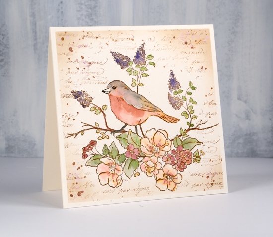
I have a tried and true colouring method for you today. I know I have shared this technique before but it’s a favourite of mine so here it is again! I even have a video where I demonstrate this technique with a different stamp.
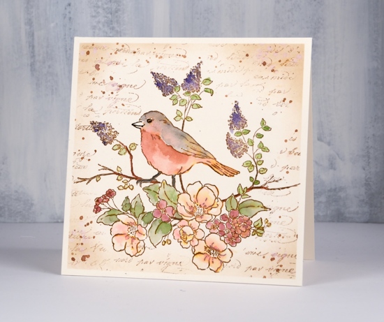
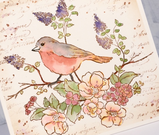
I stamped the ‘flower perch’ image in vintage photo and did all the painting with watercolour pencils. I used a damp brush to pick up colour from the pencil leads. When I paint onto the stamped image the colour from the pencils mixes with the vintage photo ink giving everything a brown tinge.
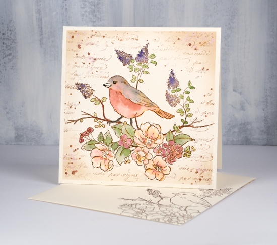
After I had completed the bird and branch I decided to add the script stamp to the back ground. I avoided the bird by placing post it notes here and there and by only pressing part of the stamp onto the panel each time. I can’t remember if I had taped the panel down at the beginning or whether I did it just before adding the script. Either way I had tape around the edges which enabled me to mask a plain frame around the panel when I sponged the border and splattered vintage photo ink here and there. I even remembered to stamp an envelope to match!
Supplies
Stamps: flower perch 40-593, script 40-470


Paper: hot pressed watercolour paper
Ink: vintage photo distress ink, vintage sepia versafine ink


Pencils: Faber-Castell Albrecht Dürer watercolour pencils (178, 190, 191, 195, 131, 187, 174, 141, 233)
Garden gems
Posted: May 4, 2018 Filed under: garden gems | Tags: Penny Black stamps, Ranger Distress stains 4 Comments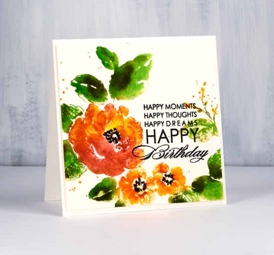
It’s been flowers, flowers and more flowers this week, all part of the new Nature’s Art release from Penny Black
To wrap up the week I have a card that features the ‘garden gems’ rubber cling stamp and was coloured with distress stains, just four colours applied to the stamp one by one then spritzed to get a loose watercolour look.
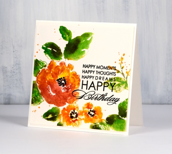
I used fired brick and carved pumpkin stains on the flowers then forest moss and peeled paint stains on the leaves. By using the stamp positioner I was able to stamp the lighter colour first then dab the darker stain on the stamp and print again adding some shadow and variety to leaves and petals. I drew the black centres straight onto the panel with a black marker and added a sentiment in black also.
Even though it meant losing some of the design I cropped the panel to a square, backed it with foam and attached to a square card base.
Supplies
Stamps: garden gems 40-591, smile today 30-461 (PB)

Stains: fired brick, carved pumpkin, forest moss, peeled paint distress stains


Marker: black soot
Ink: nocturne versafine clair
Paper: hot pressed watercolour paper
Also: foam sheet
Summer Glow
Posted: May 3, 2018 Filed under: summer glow | Tags: Kuretake Zig clean color real brush markers, Penny Black creative dies, Penny Black stamps 8 Comments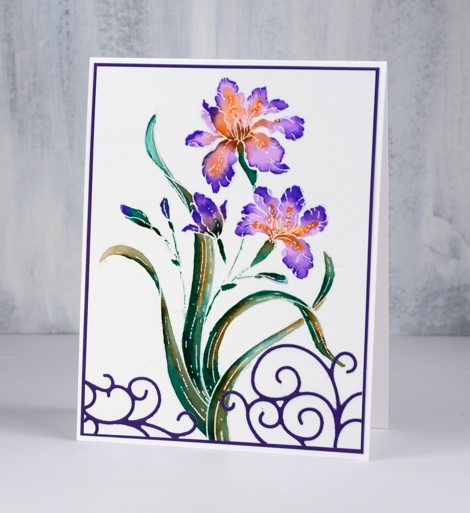
Yes, I’ve got more flowers to share today from the new Penny Black release, ‘Nature’s Art‘. This one is a large rubber cling outline stamp. I decided to try a combination I’ve heard about numerous times but never attempted: zig clean color real brush pens on bristol paper. I work on watercolour paper a lot of the time as you know but I’ve heard that blending the zig pens is easier on bristol. Well, it is. I embossed the image with clear powder on bristol paper then used five different colours to fill in the flowers and leaves. I started with purple pen at one end of each petal and tea rose at the other end (in this case the end closest to the centre of the flower). I blended the two colours together with a damp brush then added orange dots down the centre of the petals. I added a small amount of brown to the centre of the flower also.
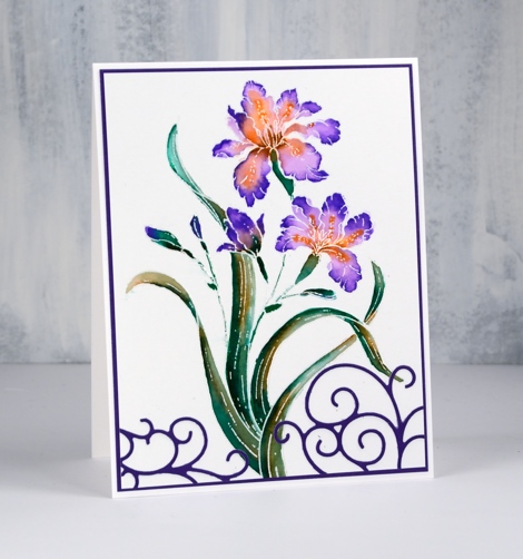
I coloured the leaves in green then added brown here and there before blending with a damp brush.
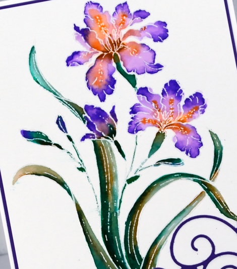
As a finishing touch I die cut the ‘scrolls half edger’ decorative piece out of purple cardstock which had double sided adhesive on the back. I matted the panel in the same purple then snipped pieces of the die-cut to lay over the base of the panel.
I’m looking forward to seeing irises pop up in my snow-free garden before too long; there is no snow on it now!
Supplies
Stamps: summer glow 40-610 (PB)
Die: scrolls half edger 51-446

Ink: versamark
Markers: zig clean colour real brush pens (tea rose, brown, green, violet, orange)
Paper: bristol, neenah solar white, purple

Also: clear embossing powder, double sided adhesive sheet

You’re fantastic
Posted: May 2, 2018 Filed under: ravishing | Tags: Penny Black creative dies, Penny Black stamps, Ranger Distress inks 3 Comments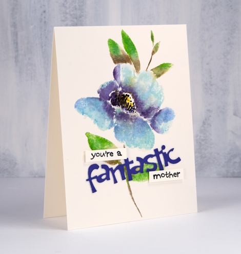
Today I am featuring the new brushstroke stamp, ‘ravishing’. I have chosen to colour it with distress inks and markers in a couple of my favourite colours. Once again I worked in a stamp positioner so I could add one colour at a time. First I inked the petals of ‘ravishing’ stamp with tumbled glass distress ink and stamped. Next I added dusty concord ink to parts of the petals, spritzed them then stamped. The centre I inked with a mustard seed distress marker, spritzed and stamped then finally added some black details on the stamp with a black soot marker. Once all the ink dried I drew some more details on the panel with the black soot marker.
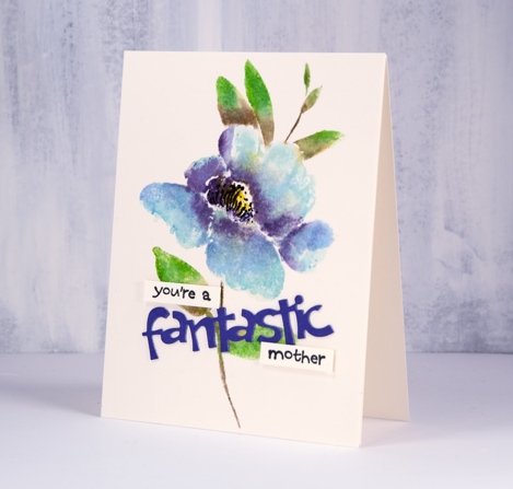
For a sentiment I die-cut ‘fantastic’ twice from purple cardstock backed with double sided adhesive. I stacked the die cuts together and attached them over the stem. I pulled out an older but very handy set called ‘word express’ and stamped a few words in black ink on watercolor paper. I popped them up with adhesive to create an encouraging message for a mother I know.
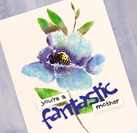
I cut the floral panel to exactly the size of my card base so it appears to be almost a one layer card.
Supplies
Stamps: ravishing 40-589 (PB), word express 30-106


Die: fantastic thank you 51-427 (PB)

Paper: hot pressed watercolour, purple cardstock
Ink: nocturne versafine clair
.
Distress inks & markers: mowed lawn & forest moss inks, tumbled glass, dusty concord, black soot and mustard seed markers


Also: double sided adhesive sheets, foam adhesive, stamping platform


.
Flower Field
Posted: May 1, 2018 Filed under: flower field, Foiling, Zigs & zags | Tags: Foiling, Kuretake Zig clean color real brush markers, Penny Black stamps, Penny Black stencils, WOW embossing powders 6 Comments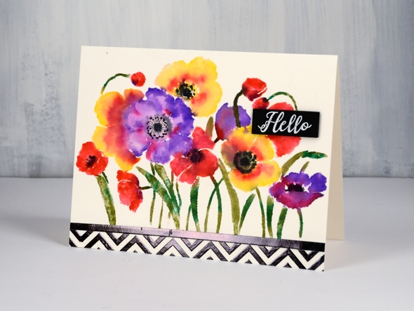
There are an unusual amount of processes involved in today’s card and I will say there are definitely ways to cut corners and get the same effect. It’s a bit like my approach to cooking; if I look at a recipe and the list of ingredients is more than 10, I’m reluctant, if there are multiple processes then I’m not interested! I’m very much a fan of the ‘one pot dinner’. My husband, on the other hand, will create all manner of elements from scratch before even starting the main recipe.
In the case of this card you might happen to have some black and white chevron cardstock to add to the card front. I did not, so I made my own with the Penny Black zigs & zags stencil. My chevron does have the bonus features of texture and shine. I taped my stencil on watercolour paper ( the same type I used for the floral panel) and spread transfer gel over it. I let that dry then lay black foil over it and ran it through the minc. I also ran some adhesive tape over a strip of cardstock and added black foil to that too so I would have a bold strip to position between the chevron and flower panels.
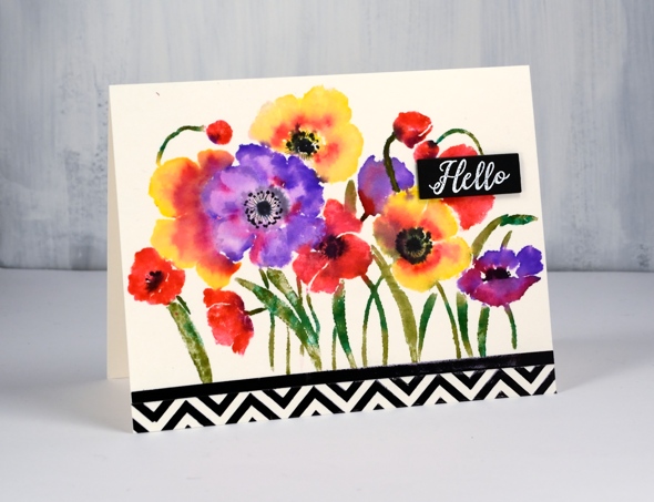
To create my bright and breezy flower panel I put the Penny Black ‘flower field’ stamp in my stamping platform and worked one colour at a time with zig clean color real brush pens. (I remember last time I posted about these pens I hinted that I might just need a few more colours. When I was in Toronto a couple of weeks back I picked up a few more.) I coloured directly onto the flowers with the pens and was able to add colour over colour as the brush tips are easy to clean off by drawing on a piece of scrap paper. I did spritz the stamp a little before stamping on the hot pressed watercolour paper so the images would be soft and blended. I added some black to the centres while the panel was still damp but dried it before adding fine details with a pigma micron pen.
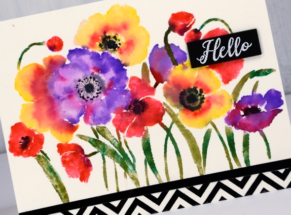
My little sentiment strip is embossed white on black to tie in with the zigs & zags.
Thank you for dropping in.
Supplies
Stamps: flower field 40-594, radiant 30-481


Stencil: zigs & zags (PB)
Ink: versamark
Markers: kuretake zig clean color real brush pens (violet, pink, olive green, carmine red, green, yellow, black), black pigma micron .01

Paper: hot pressed watercolour, natural white, black
Also: transfer gel, black foil, white opaque embossing powder

Tools: minc, stamping platform
Radiant blooms
Posted: April 30, 2018 Filed under: Peerless watercolours, radiant | Tags: Faber-Castell Polychromos Colour Pencil, Peerless Transparent Watercolors, Penny Black creative dies, Penny Black stamps, Tsukineko Versafine inks 12 Comments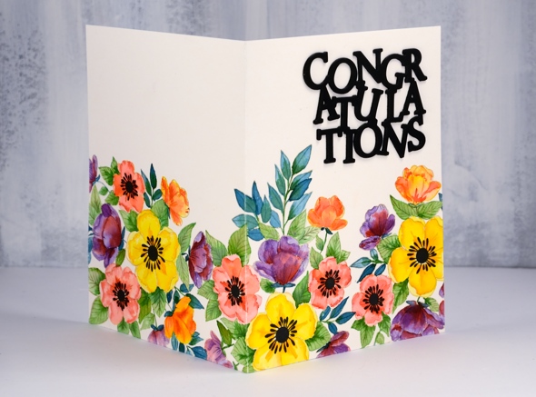
I am sharing floral cards this week here and on the Penny Black blog. This particular one makes me happy. It took me an age to complete but I think it’s bright and sunny. I’ve been wanting to create a card where the design continues across the back and front; my next challenge is one where the design covers back, front and inside!
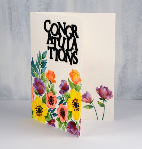
I used the large floral stamp from the transparent set ‘radiant’; it’s part of the new Nature’s Art release from Penny Black. I used my stamping platform and antique linen ink to stamp three prints across the panel. I wanted them to fit nicely together but not look like a repeat pattern so I changed the direction each time. If I had been really diligent I would have masked the first before I stamped the next but I just let them overlap a little. When it came to adding colour I decided which petals or leaves would be in front and painted accordingly. You can’t tell now can you?
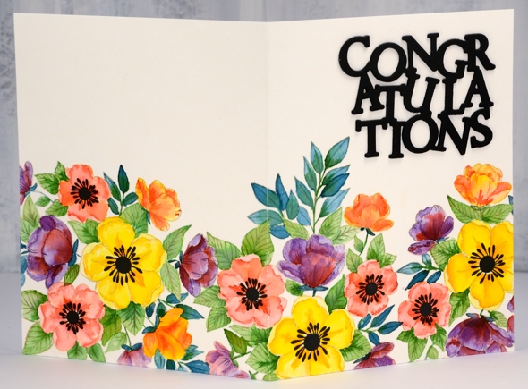
I used quite a few colours but I mixed and matched a bit. Basically I chose a yellow and orange for the large flowers, a peach and a pink for the medium flowers then did some smaller flowers with the orange and the pink (not new colours) I added a purple to the mix but shaded with the pink used earlier. On each flower I painted the lighter colour first then dropped in some of the darker one where I wanted shadow. I painted half the leaves with green and the other half with blue green then added shading to all with a darker green. When the same colour pops up in a few different mixes on your design it keeps things cohesive and visually appealing. Once all the painting was completed I used coloured pencils here and there to darken shadows and add more definition
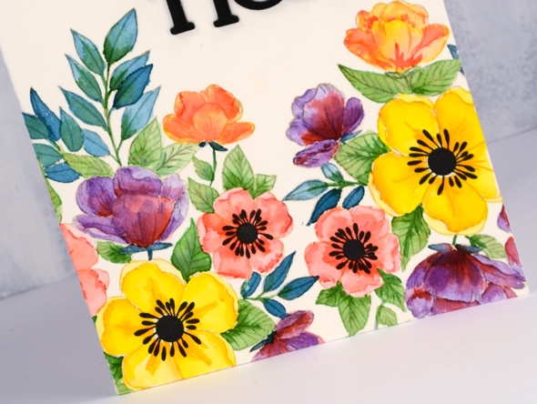
The set includes solid centres in two sizes for the flowers so I stamped them in black and created my die cut stacked sentiment in black also. And I almost forgot to mention I stamped and painted a couple of flowers inside too.
I’ll be back with more bright and breezy florals tomorrow.
Supplies
Stamps: radiant 30-481 (PB)
Die: congratulation 51-439 (PB)

Inks: antique linen distress ink, nocturne versafine clair

Paint: Peerless watercolours

Paper: hot pressed watercolour, neenah black
Pencils: Faber-Castell polychromos pencils












