
Christmas Glow
Posted: September 10, 2018 Filed under: Christmas glow | Tags: Penny Black stamps, Ranger Distress inks, WOW embossing powders 10 Comments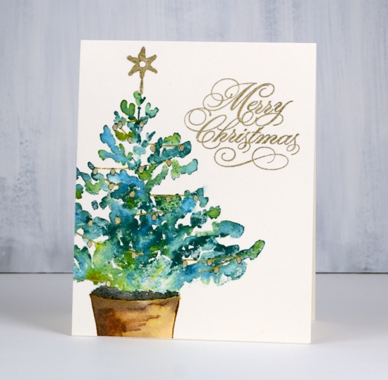
Penny Black has launched a challenge on their blog asking you to share your holiday themed PB creations.
Two lucky winners will receive a $25 shopping spree to our online store. And the grand prize winner will receive a $100 shopping spree to the Penny Black online store!That’s three winners! The $25 shopping spree winners will be announced here on the blog on September 28 and October 26. The grand prize winner will be announced on November 30th.
I am sharing Christmas cards on my blog this week; I hope you get inspired to do some creating with your PB stamps and dies. If you do make sure you enter the challenge; there are several ways to enter so check out the details here.
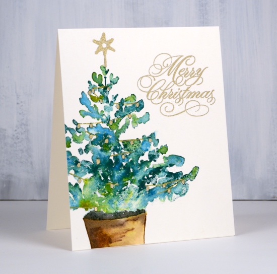
This large tree stamp is called Christmas glow and it is stamped on hot pressed watercolour paper. I coloured it with distress inks while working in a stamp positioning tool. I dabbed different green inks on the tree branches and spritzed lightly before stamping. I wanted to retain the shape of the tree but have the greens blend with each other so I added only enough water to move the ink a little. I stamped the pot in vintage photo then blended with a paint brush then added black soot ink to the inside of the pot.

I dried all the coloured stamping then inked the star and sentiment with versamark and coloured inside the string of lights with a versamarker (embossing pen) then embossed in gold powder. I used a gold gel pen to draw the string between the lights.
Supplies
Stamps: Christmas glow 40-627(PB), peaceful season 30-498(PB)


Inks: crushed olive, pine needles, mowed lawn, vintage photo, black soot distress inks & versamark


Paper:


Also: WOW metallic gold rich embossing powder, gold gel pen, embossing marker


Watercolour pencil cacti
Posted: August 30, 2018 Filed under: Happy together, Watercolour | Tags: Faber-Castell Albrecht Durer Watercolour pencils, Penny Black stamps, Ranger Distress inks 12 Comments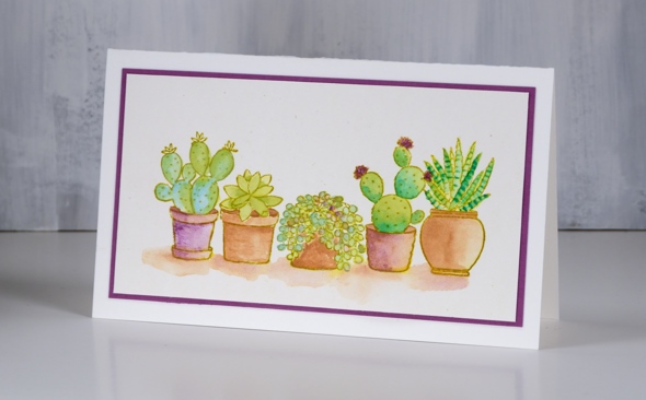
I’ve worked with this stamp before, last time with bister powder to colour it. It took longer with watercolour pencils but the process was quite relaxing. I used my tried and true Albrecht Dürer watercolour pencils from Faber Castell and limited my choices to light green, dark green, light blue, purple and brown.
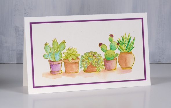
I stamped the image from the PB ‘happy together’ set in crushed olive distress ink then used a paint brush with my watercolour pencils to add colour. I painted shadows in a mix of brown and purple then matted with some purple cardstock.
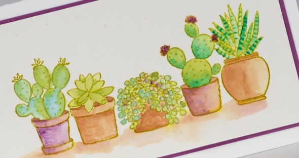
Now, help me out here, what is the right occasion for sending a cacti card??
Supplies
Stamps: happy together

Paper: hot pressed watercolour, neenah natural white, purple
Inks: crushed olive distress ink
,
Also: Albrecht Dürer watercolour pencils
Peaceful village
Posted: August 23, 2018 Filed under: peaceful village | Tags: Faber-Castell Albrecht Durer Watercolour pencils, Penny Black stamps, Ranger Distress inks 10 Comments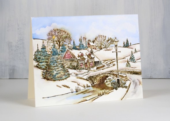
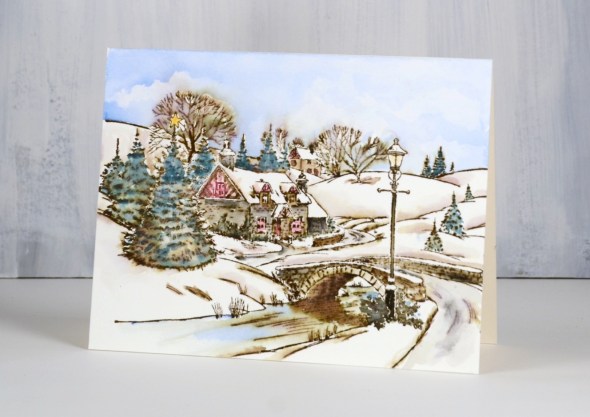
This is the last of my vintage style watercolours (for now) and I think this one might be my favourite. I don’t have step by step photos for this one but the process is exactly the same as shown in the tranquil hamlet video I posted earlier this week.
I worked on hot pressed watercolour paper but stamped with walnut stain ink instead of vintage photo. The walnut stain ink is a darker brown so the whole scene is a little darker but still has the vintage sepia look to it. I stamped in a stamp positioner because there is a lot of detail in the stamp.
As with my previous vintage style scenes I blended the stamping with water which pulled colour into the interior of the buildings, trees and bridge. As I blended the walnut stain ink I also added colour from watercolour pencils, including blue, green, black, yellow and red. I was careful to blend colour right up to the edges of snowy areas so it would contrast with the bright white of the snow on roofs and hills.
Supplies
Stamp: peaceful village

Ink: walnut stain distress ink

Paper: hot pressed watercolour paper
Pencils: Faber Castell Albrecht Dürer Watercolour pencils
Tools: stamping platform

Winter Solace
Posted: August 22, 2018 Filed under: Stamped Landscapes, Watercolour, winter solace | Tags: Penny Black stamps, Ranger Distress inks 4 Comments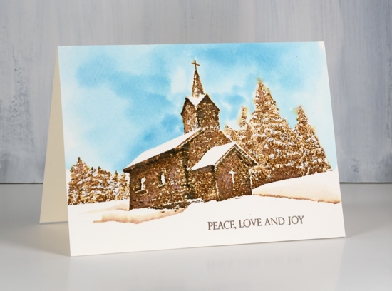
My vintage snowy scenes continue with this new Penny Black stamp ‘winter solace’. I kept it simple once again with vintage photo ink plus some black for shadows and some blue for the sky. The technique is similar to the one I shared in my recent video but because this is a more solid stamp it is necessary to blend the ink more carefully so as not to obscure the details in the stamp. I stamped in vintage photo distress ink on cold pressed watercolour paper.
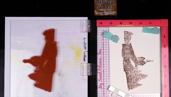
Rather than use watercolour pencils to add extra colour, I pressed black soot, vintage photo and broken china onto my glass mat to use as needed.
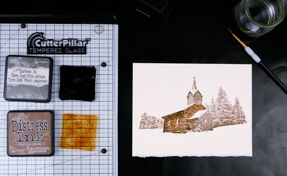
When blending the vintage photo ink I dabbed with a damp paintbrush instead of blending. I didn’t want the ink to cover the walls of the church uniformly, instead I left areas white and added black for shadows wherever I thought there would be some.
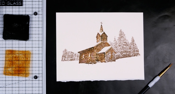
I added black under the eaves, under the windows and on the corners.
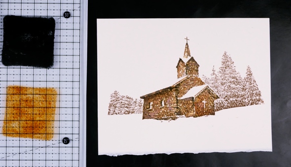
I used a pencil to lightly draw a roof line to give me a guide for painting blue sky. I painted right up to the pencil line and edges of building with water then added broken china ink to fill sky. I dabbed the blue ink around the edges of the trees with the point of the brush.
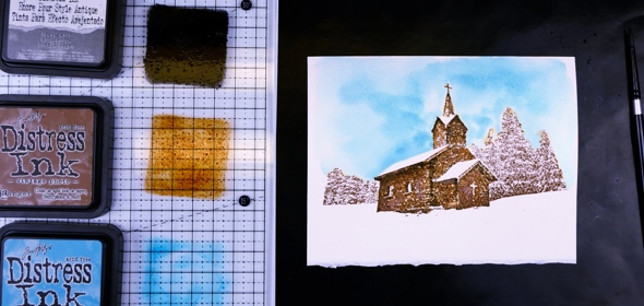
I blended water over the stamped sections of trees taking care to leave the white areas to look like snow.
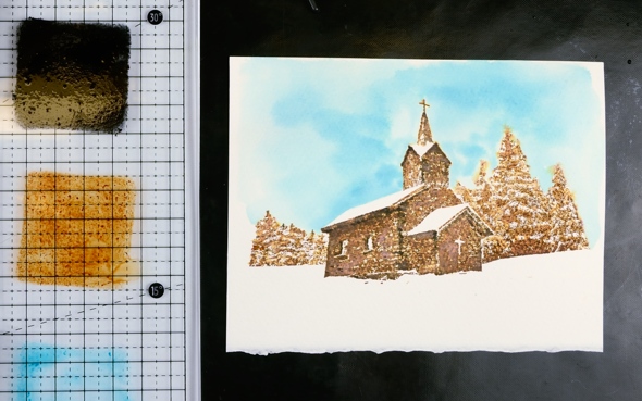
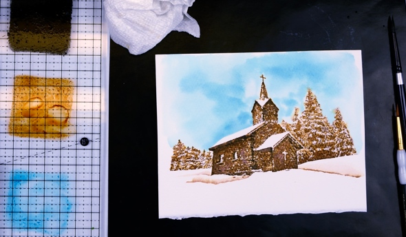
To add some snowbanks to the foreground I painted a few lines of vintage photo ink with a fine tip brush then blended them with water.
To complete the card I added a sentiment from the new ‘Christmas sentiments’ set.
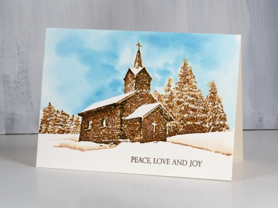
I’m looking forward to trying some other looks and colour schemes with this stamp.

Supplies
Stamps: winter solace, Christmas sentiments


Inks: vintage photo, black soot, broken china distress ink

Paper: cold pressed watercolour paper

Also: cutterpillar glass mat

Snowy cottage
Posted: August 21, 2018 Filed under: snowy cottage, Stamped Landscapes | Tags: Penny Black stamps, Ranger Distress inks 4 Comments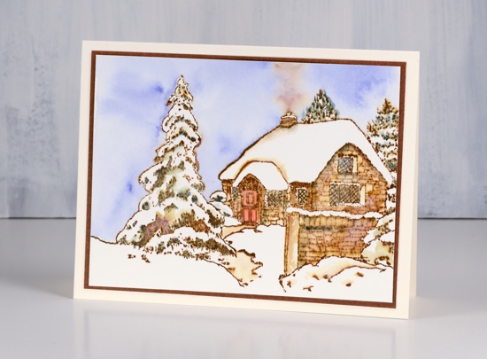
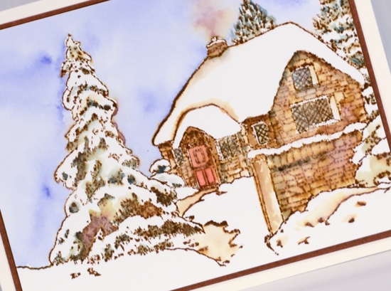
I’m continuing to feature stamps from the new Penny Black release. Today I have the second of my vintage style watercolours, this one stamped with a large clear stamp from the transparent set, Snowy Cottage. You can watch the video I posted yesterday to see the technique and refer to the step by step photos below to understand my process.
I used a stamp positioning tool to make sure the detailed stamp was fully printed on my hot pressed watercolour panel. I used vintage photo distress ink but other brown distress inks can give a similar vintage appearance.
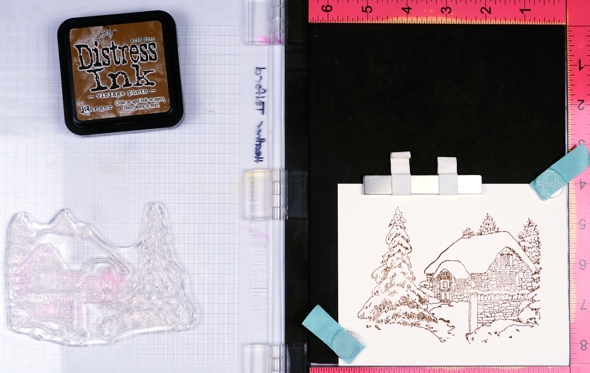
I began by using a damp brush to blend the stamped ink over all the stonework of the cottage and wall. I picked up a bit of black off a watercolour pencil to add to any shaded areas.
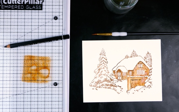
Next I added red to the door and blue to all the windows, again picking up colour from the tips of my watercolour pencils.
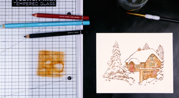
I used a darker blue to fill the sky with colour, painting first with water around the edges of the trees and roof then adding blue to the damp area so it would blend and move to fill the sky. While the sky was wet I picked up vintage photo ink on the paint brush and dropped it into the sky above the chimney.
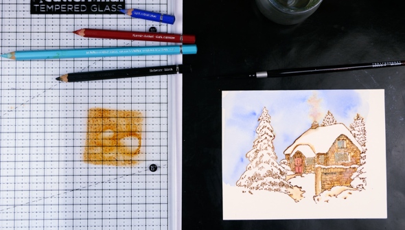
I also blended the areas adjacent to the snow to create contrast from snow banks to shadow. I picked up colour from a green pencil to add to all the trees, taking care to leave some areas white in each tree.
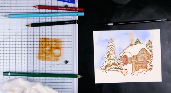
Finally I used a vintage photo distress marker to redraw the lattice on the windows.
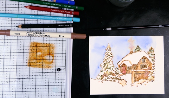
To complete the card I trimmed the panel then matted it with brown cardstock and added it to a natural white card base.
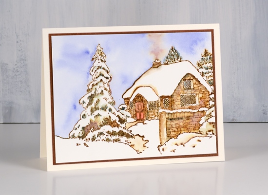
I hope you enjoyed my second vintage style scene, I’ll be back tomorrow with another.
Supplies
Stamps: Tranquil Hamlet

Ink: vintage photo distress ink
Paper: hot pressed watercolour paper, brown cardstock
Pencils: Faber Castell Albrecht Dürer Watercolour pencils
Tools: MISTI, Cutterpillar Glow premium

Tranquil Hamlet Video
Posted: August 20, 2018 Filed under: Stamped Landscapes, tranquil hamlet, Watercolour | Tags: Faber-Castell Albrecht Durer Watercolour pencils, Penny Black stamps, Ranger Distress inks 7 Comments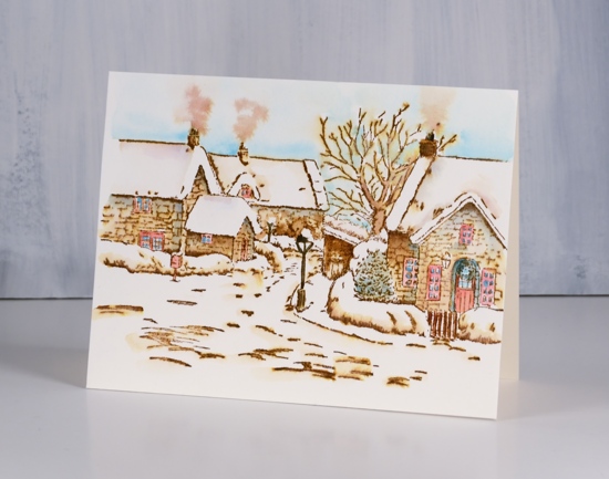
You’ve probably heard by now there is a new Penny Black release in town! Two actually, a big beautiful Christmas release and a fun fall release. The catalogues can be viewed here. I’ll be featuring vintage style snowy scenes all week here on the blog even though the sun is shining and the grass is green outside!
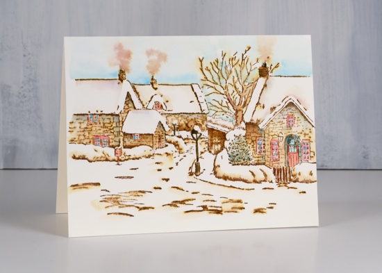
This lovely stamp called ‘Tranquil Hamlet’ is stamped in vintage photo ink and coloured with Faber Castell Albrecht Dürer watercolour pencils on hot pressed watercolour paper. Watch the video to see how
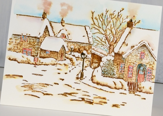
Thanks for dropping by; I’ll be back tomorrow with another snowy scene.
Supplies
Stamps: Tranquil Hamlet

Ink: vintage photo distress ink
Paper: hot pressed watercolour paper
Pencils: Faber Castell Albrecht Dürer Watercolour pencils (199, 159, 154, 151, 126)
Tools: stamping platform
.
Rose bowl
Posted: July 26, 2018 Filed under: rose bowl | Tags: Catherine Pooler inks, Penny Black stamps 7 Comments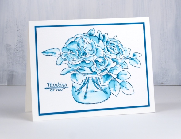
I mentioned recently that I’ve been trying the Catherine Pooler inks for some of my favourite techniques. A watercolour method I often use involves stamping an outline stamp in a nice juicy ink such as distress ink or stain then using a damp brush to pull the ink into the outlined areas (often petals or leaves). I stamped the Penny Black rose bowl stamp in CP daydream ink on cold pressed watercolour paper then used a watercolour brush and some water to blend the stamped ink to create shading and shadow.
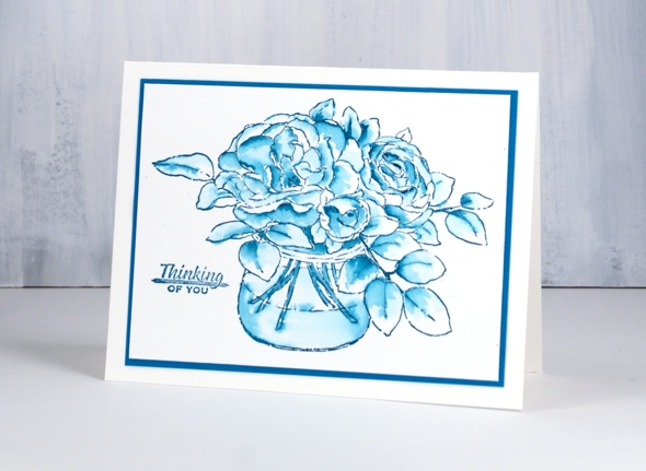
The CP ink is great for this technique; because it is so juicy, there is plenty to blend. At times I blended ink from the outline into the petal then had to dab away some colour because it was too strong. I used either a paper towel or a thirsty brush to pull colour off.
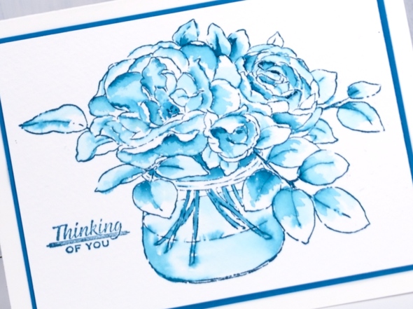
Not sure why I chose to stamp roses in blue to start off with but there they are. I added a sentiment from a set of tiny sentiments, matted in a matching cardstock and ended up with a simple watercolour design. You’ve probably gathered I’ll be using this technique with CP inks again.
Supplies
Stamps: rose bowl (PB), Just a little greeting (Hot off the Press)

Ink: daydream (CP)

Paper: cold pressed watercolour, blue
Soft pink poppies & a give away
Posted: June 25, 2018 Filed under: spontaneous joy | Tags: Penny Black stamps, Ranger Distress inks, Ranger Distress stains 31 Comments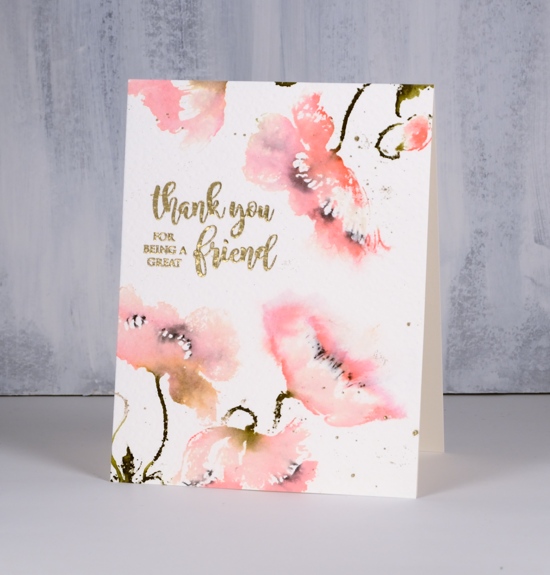
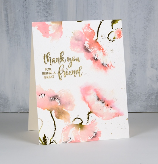
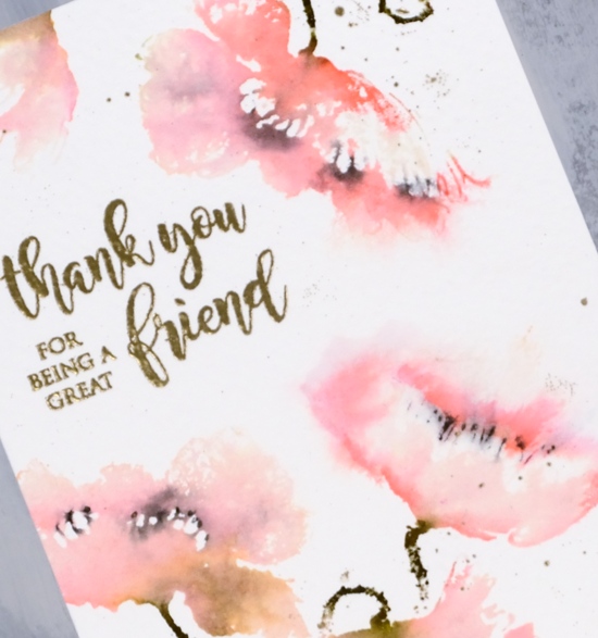
You can find me over on the Foiled Fox blog today sharing all the details about this soft summery card. It reminds me of one I made a couple of years ago with an all over poppy pattern. I used distress stains and markers to get a loose watery look then gold embossing powder for the sentiment and some gold splatter. You can read about my process on the Foiled Fox blog.
I have teamed up with the Foiled Fox today to not only share this card but also a GIVEAWAY! If you comment here or on the Foiled Fox blog you will be entered to win a $25 gift certificate to spend at the Foiled Fox online store. You have until the end of Sunday, July 8th to enter.

For extra entries you can follow Foiled Fox or me on youtube, instagram or pinterest. All the links are listed below.
Enjoy your summer days!
Supplies
Stamps: spontaneous joy 40-597, happy wishes 30-419


Paper: cold pressed watercolour, neenah natural white
Inks & Stains: versamark (tsukineko) spun sugar, tattered rose, forest moss distress stains, abandoned coral mini ink pad, black soot distress markers (ranger)


Also: metallic rich gold embossing powder (WOW), stamping platform
You are pretty fantastic
Posted: June 21, 2018 Filed under: Happy together, perspective | Tags: Kuretake Zig clean color real brush markers, Penny Black stamps 12 Comments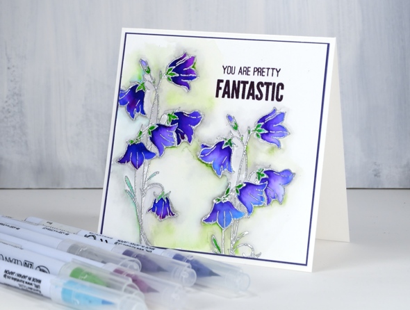
Our family is in the midst of a season of graduations as all three of our children are awarded diplomas or degrees. We enjoyed one last week, another yesterday and will attend one more next week. I will share some photos next week after our son graduates from high school. Today’s card is the one I made for my older daughter who has just received her Master of Teaching. As you can imagine I am exceedingly proud of her; I think she is pretty fantastic!
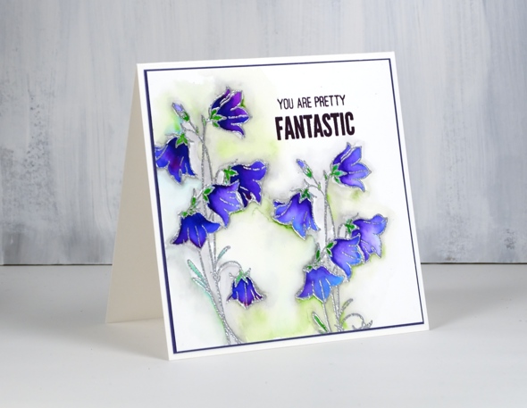
This card is also my only participation so far in Kathy Racoosin’s current 30 day colouring challenge. This month’s festivities have left very little time for colouring. I embossed the flowers from Penny Black’s ‘happy together’ transparent set in silver powder on hot pressed watercolour paper. I used four zig real brush pens for the petals colouring with a deep colour (purple or blue) near the base of the flowers and with a light blue near the tips of the petals. I then blended the two or three colours with a paintbrush and water until I had soft blends covering the flowers. I added a bit of violet to a few flowers for some extra depth and variation. I used light green and light blue for the leaves and sepals. To make the flowers pop a bit more I coloured around all the edges with a grey zig maker, blended it with water and a few dabs of light green. I was inspired by a few of Susie Lessard’s recent cards. (here’s the link to one on IG)
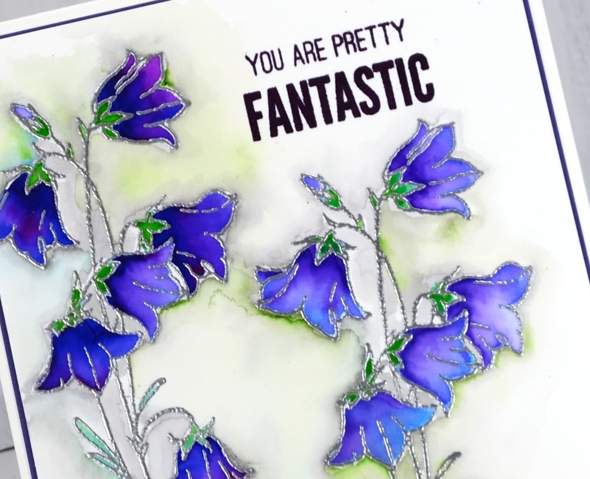
I completed the card with a purple mat and sentiment from the PB ‘perspective’ set also in purple.
Supplies
Stamps: happy together, perspective

Markers: zig clean color real brush markers (blue, purple, light grey, violet, light green, light blue)

Inks: versafine clair monarch, versamark

Paper
Also:

Happy Together
Posted: June 18, 2018 Filed under: Bister, Happy together, Tranquility | Tags: Bister, Penny Black stamps 19 Comments
I am quite happy with the way these little cacti turned out using only one colour of bister paint powder. Bister can create surprising results. I used blue bister powder on hot pressed watercolour paper over clear embossing.
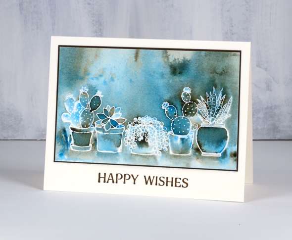
Bister paint powders have an earthy tone to them which you can see clearly on this panel. I sprinkled blue bister over the panel and spritzed with water until the paint activated. I tilted and turned the panel until the paint pooled in certain places. Where there was very little colour I used a paint brush to transfer some from a darker area. Once there was good coverage I let it dry partially then picked up some brown from the panel and painted shadows below each of the pots. I matted the panel in brown and added the sentiment in vintage sepia versafine ink.
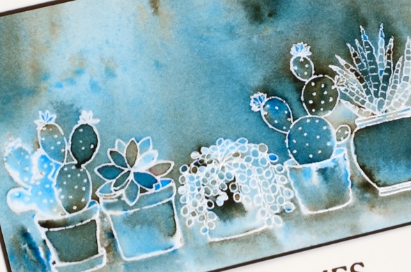
I thought it was very cool the way all those leaf shapes in the second from left cacti turned out different colours. This is why I love playing with paint powders.
Supplies
Stamps: happy together, tranquility

Paper: hot pressed watercolour, neenah natural white, brown
Inks: versamark, vintage sepia

Paint: blue bister (available in USA from ‘I Brake for Stamps’ and in Ottawa from ‘Crop A While’)
Also: clear embossing powder












