
Flower perch
Posted: May 9, 2018 Filed under: flower perch | Tags: Faber-Castell Albrecht Durer Watercolour pencils, Penny Black stamps, Ranger Distress inks 15 Comments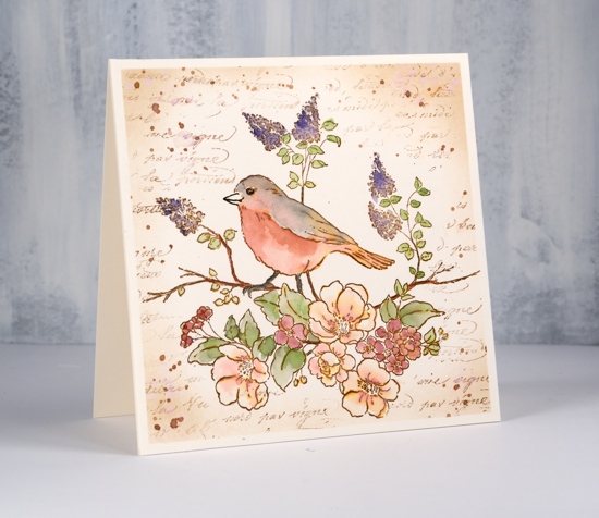
I have a tried and true colouring method for you today. I know I have shared this technique before but it’s a favourite of mine so here it is again! I even have a video where I demonstrate this technique with a different stamp.
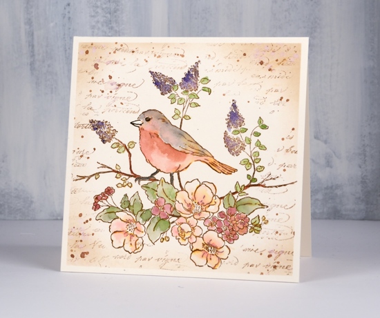
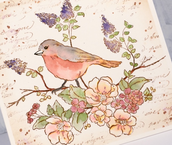
I stamped the ‘flower perch’ image in vintage photo and did all the painting with watercolour pencils. I used a damp brush to pick up colour from the pencil leads. When I paint onto the stamped image the colour from the pencils mixes with the vintage photo ink giving everything a brown tinge.
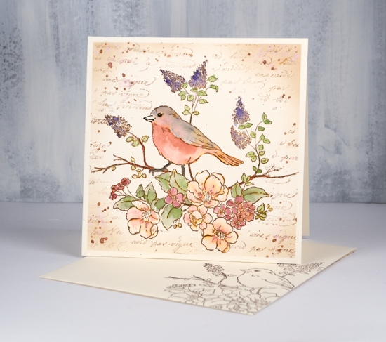
After I had completed the bird and branch I decided to add the script stamp to the back ground. I avoided the bird by placing post it notes here and there and by only pressing part of the stamp onto the panel each time. I can’t remember if I had taped the panel down at the beginning or whether I did it just before adding the script. Either way I had tape around the edges which enabled me to mask a plain frame around the panel when I sponged the border and splattered vintage photo ink here and there. I even remembered to stamp an envelope to match!
Supplies
Stamps: flower perch 40-593, script 40-470


Paper: hot pressed watercolour paper

Ink: vintage photo distress ink, vintage sepia versafine ink


Pencils: Faber-Castell Albrecht Dürer watercolour pencils (178, 190, 191, 195, 131, 187, 174, 141, 233)


Such a delicate and pretty card. Your gentle colouring is amazing. Great technique love the background text stamping, the blended frame and the splats…x
Thank you; glad you like the technique. I do keep returning to it.
I love the colors and the softness of this card. Beautiful!
This is a gorgeous card Heather and I adore the way the sepia tones give a slight tint to all the colours you use which unites it so prettily. This is a beautiful PB image and perfect for this time of year. x
Gorgeous creation!
I love this one, Heather.
Wow, just gorgeous!
Just beautiful! In your supply list you have vintage sepia Versafine ink. Did you stamp with it or use the color to paint the bird?
Thank you Sherry. As I wrote the blog post I did wonder to myself whether I should explain where I used the versafine…
I only used it on the envelope; all the rest of the stamping was done with distress ink so I could blend it.
I forgot to mention how much I just love your water coloring techniques!!
Wow that is just gorgeous, love the vintage feel it gives to it!
The soft tones in this card bring back memories of times when the world was a more gentle and embracing place. Outstanding use of color that touches my heart. Heather you do awesome work. Thank you so much!
Thank you Suzy for your sweet comment. The vintage effect does remind me of old cards and wrapping paper my mother might have saved years ago.
Love these soft, vintage colors, Heather! What a beautiful card! I just watched the video again and so enjoyed it! Now to give it a try.
Thank you Bonnie for your lovely comment. It is a fun technique to use with any outline stamp; I’m looking forward to seeing your take on the technique.