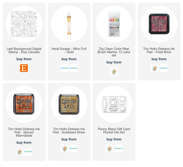
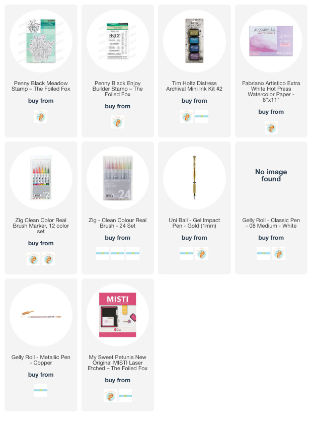
Leaf Background Stamp
Posted: September 12, 2023 Filed under: Echidna Studios, leaf background | Tags: Echidna Studios, Fabriano Watercolour Paper, Kuretake Zig clean color real brush markers, Ranger Distress inks 3 Comments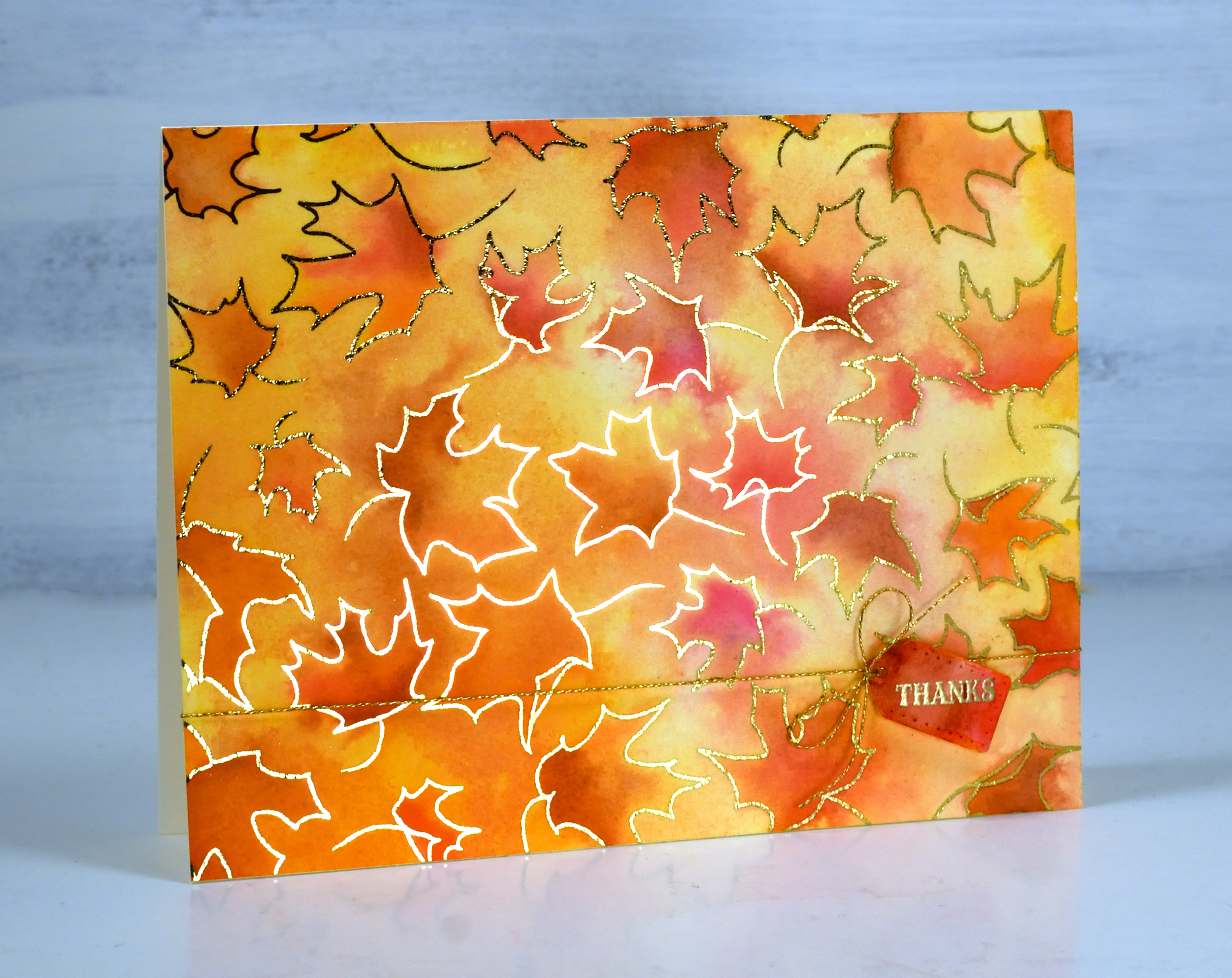
Just because I’m posting an autumn leaf card doesn’t mean I have given up on summer. If you know me you know I hold on until the end. But just in case you would like to be prepared here is a simple but eye-catching card to use during fall or especially for thanksgiving. The leaf background is a single digital stamp from Echidna Studios printed on watercolour paper then foiled with gold foil.
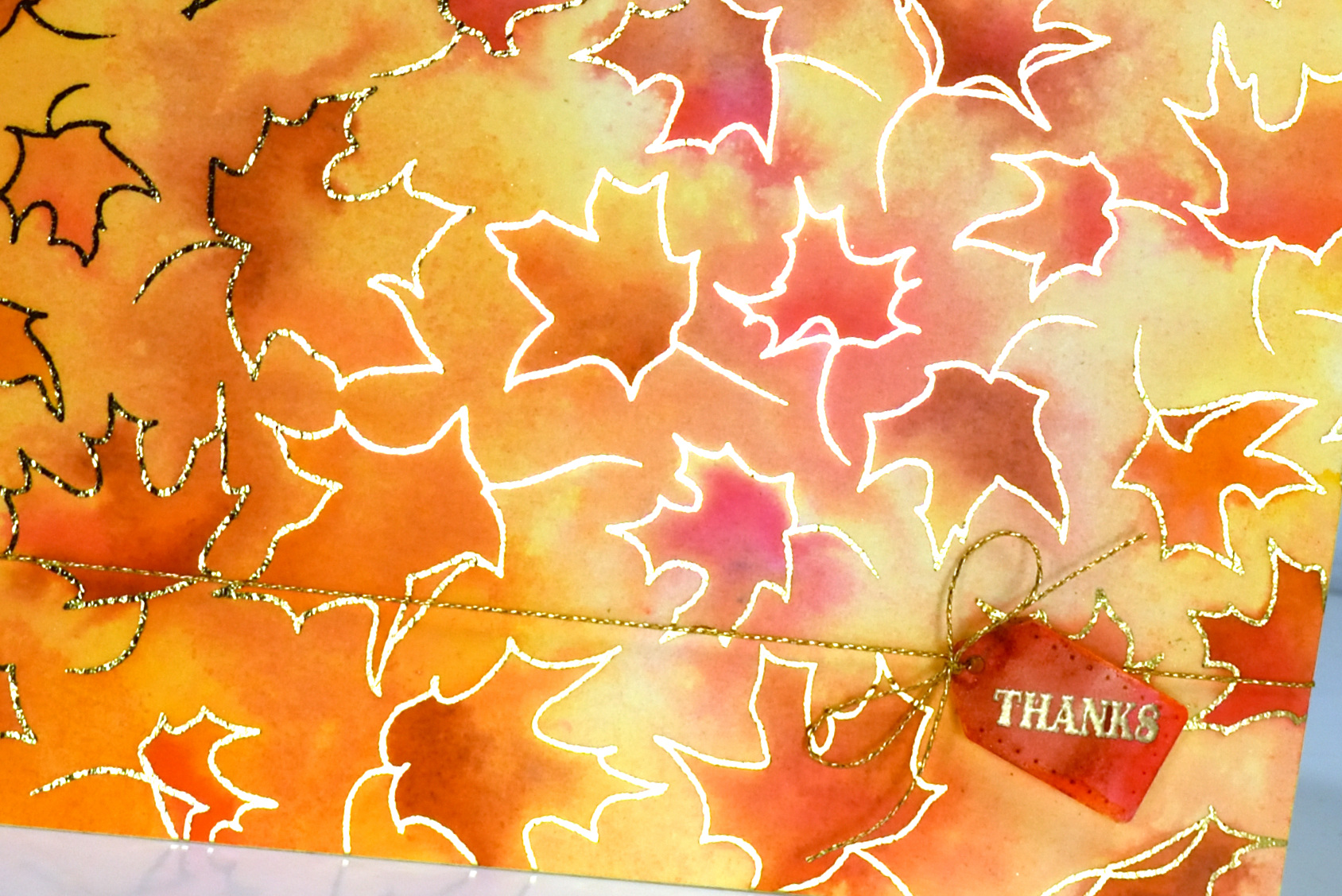
It is always hard to photograph a foiled card but somehow I managed to get quite a bit of the foiled shine in this photo. I watercoloured with fired brick, spiced marmalade and scattered straw distress inks and added some extra depth with zig real brush markers.
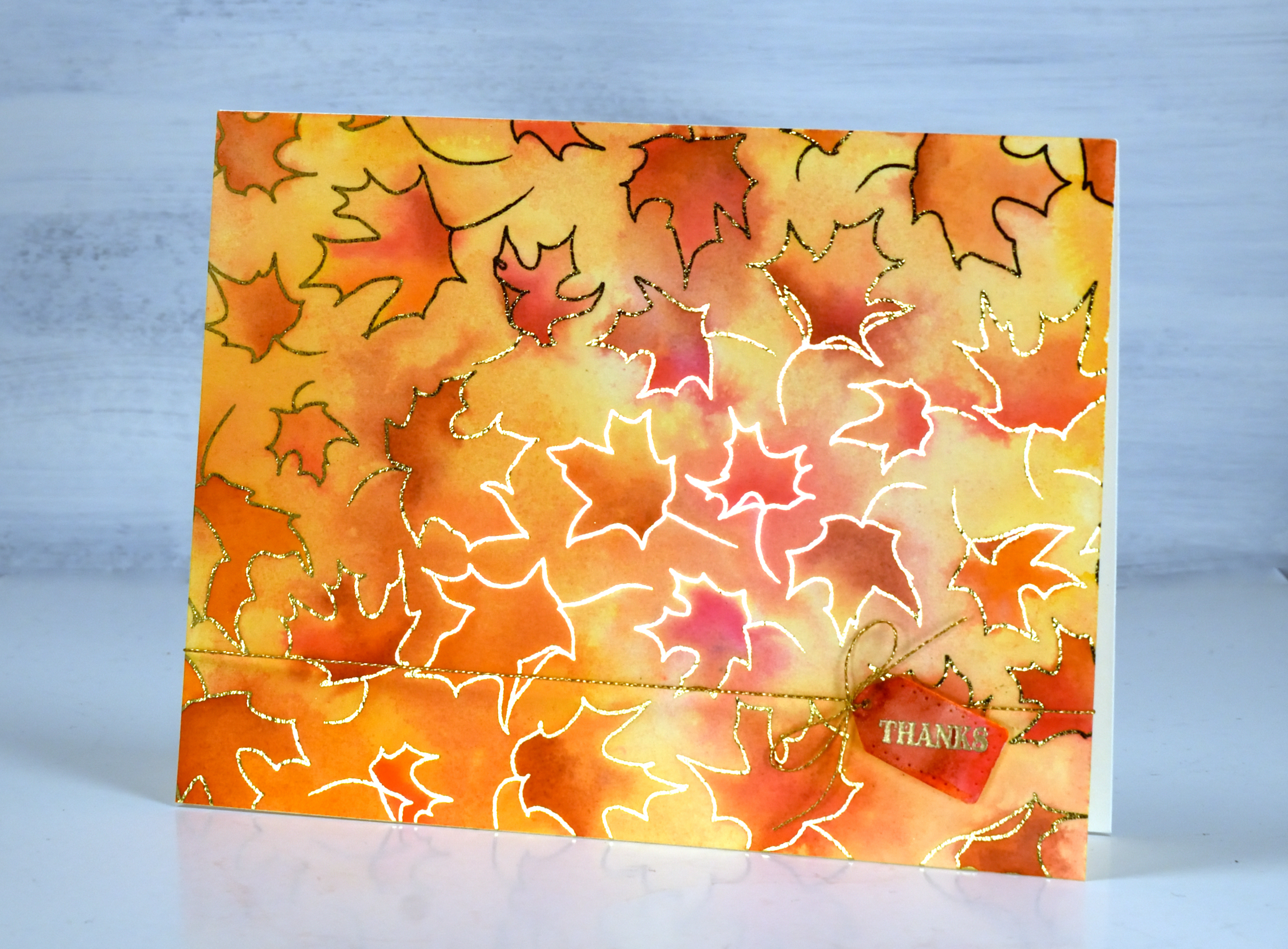
The little tag is from the Penny Black ‘gift card pocket die set’ paired with both a gold sentiment and cord to add even more shine. As I’ve mentioned before you can print the digital stamps any size you want so you could have larger leaves to colour or teeny tiny ones!
(Compensated affiliate links from Foiled Fox & Scrap n Stamp)
Late summer flowers
Posted: September 11, 2023 Filed under: Penny Black, sun kissed | Tags: Fabriano Watercolour Paper, Penny Black stamps 4 Comments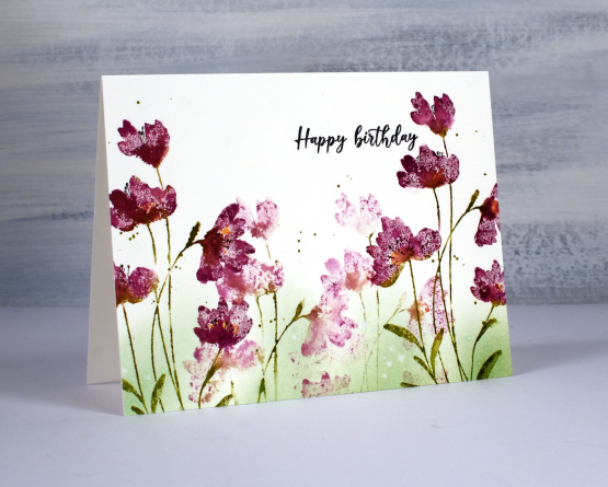
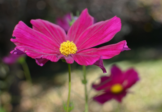
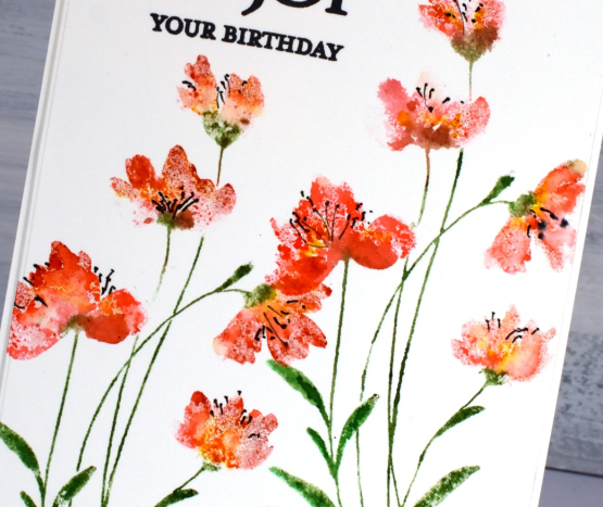
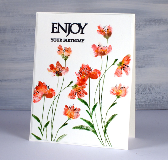
As you know I am often inspired by the season outside my window. My garden has been blooming for most of the summer but after the regular rainfall dried up I’m afraid I didn’t step in and keep it watered so the late summer display is not very impressive. I also stopped deadheading the flowers because the mosquitos have been vicious. Excuses, I know but one cosmos has been quietly growing all summer and is now tall and blooming so it is the inspiration for today’s card. The stamp featured in this card is Penny Black’s ‘sun kissed‘ which I used with a different colour scheme a few months ago.
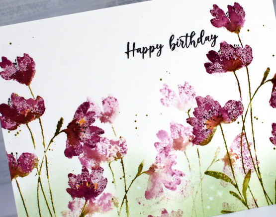
I worked in a stamp positioner so I could add second layers or ink or water where necessary. The cosmos in my garden is close to the colour of seedless preserves ink so that is what I used to ink the flower heads and peeled paint distress ink for the stems and leaves. After inking the stamp I spritzed lightly with water before stamping on hot pressed watercolour paper. If I wanted more ink I would wipe the stamp and reapply but if I wanted more blending I would spritz the stamp again and restamp. Before cleaning the diluted ink off the stamp completely I stamped it in another spot to get the soft background flowers.
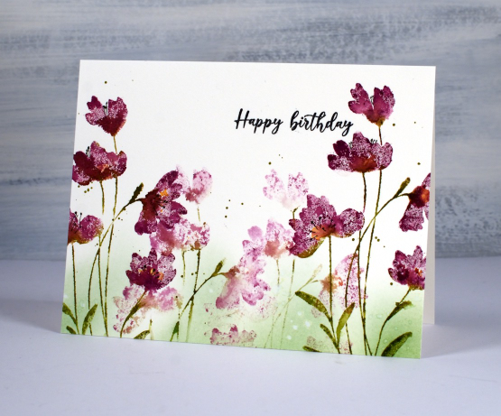
While the ink was still drying on the flowers I added some drops of wild honey ink to the centres of a few flowers. When everything was dry I using a blending brush to add peeled paint in to the base of the design. I splattered some green ink around the flowers and some water drops over the blending. To finish the card I stamped the sentiment from PB ‘birthday humor‘ in black and drew some black stamen with a fine tip pen.
Here is the inspiration flower from my garden.
My blog features affiliate links to the following companies. If you buy through these links I receive a small commission at no extra cost to you.
The Foiled Fox, Scrap’n’Stamp and Ecstasy Crafts (Ecstasy Crafts offers a discount code heathertecs10 you can use for a 10% discount at checkout)
Seaside
Posted: June 23, 2023 Filed under: Penny Black, seaside, Stamped Landscapes | Tags: Fabriano Watercolour Paper, Penny Black stamps, Ranger Distress inks 9 Comments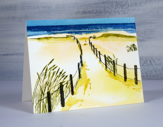
This image brings back so many memories for me. I love the ocean and beach so approaching the water down a sand covered path makes me very happy. I spent my first ten years in Tasmania and we had beach holidays at St Helens. After we moved to Canberra our family would go to Bateman’s Bay then in later years Bateau Bay and Port Macquarie. When I visit my Dad on the Central Coast we will sometimes walk along Soldiers Beach or just drive there to watch it during a storm.
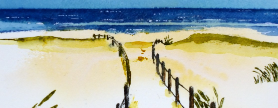
To create a sandy background I swiped a piece of hot pressed watercolour paper through some smooshed yellow inks. It gave an uneven coverage which I left to dry before stamping. Using a stamp positioner I stamped first the fence posts in grey and brown then inked and stamped the grasses with a couple of green markers. I stamped the sea in uncharted mariner(of course) then the shadows in the sand with fossilized amber.
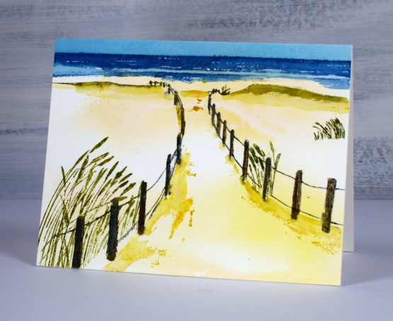
The initial stamping on hot pressed watercolour paper is always a bit patchy so I keep the panel in the positioner so I can restamp certain areas to build up depth of colour. I also use a paintbrush or markers to add colour directly to the panel. I painted the sky with broken china ink and finally added white dots to the ocean with a white gel pen. Now if I could just get to the ocean as easily as stamping the ocean…
(Compensated affiliate links from Foiled Fox & Scrap n Stamp)
Meadow
Posted: June 9, 2023 Filed under: meadow, Penny Black | Tags: Fabriano Watercolour Paper, Penny Black stamps, Ranger archival inks 8 Comments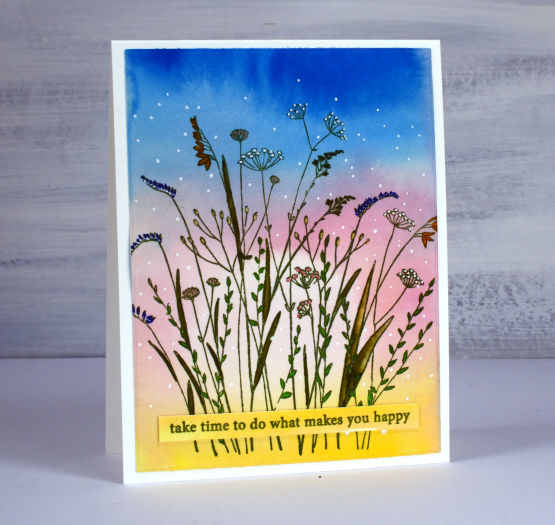
I have what I call a pile of possibility in my workroom consisting of panels that could be made into something. The smaller ones are housed in a shoebox; there are watercolour backgrounds, stamped and coloured panels, alcohol ink panels and hand painted experiments. This panel has sat in the box for years unstamped but looking very much like a sunset. I can’t remember whether it was painted with watercolour paints or swiped with watercolour inks. I imagine the pale centre circle was dabbed out with a brush or paper towel but I really can’t be sure.
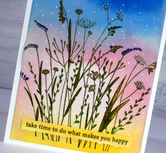
I stamped the Penny Black ‘meadow’ stamp on the panel with peeled paint archival ink then coloured inside the leaves with zig clean color real brush markers. I added spots and dots to the flowers and sky with gel pens, a white, a gold and a copper.
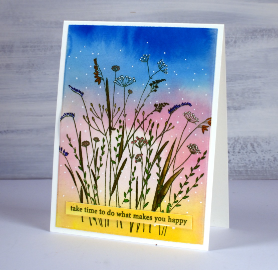
I stamped a sentiment from the PB ‘enjoy builder’ set on a left over strip. Hope you can take some time to do what makes you happy this weekend. Here are a couple of suggestions. (wink)


(Compensated affiliate links from Foiled Fox & Scrap n Stamp)
Good Day Bouquet
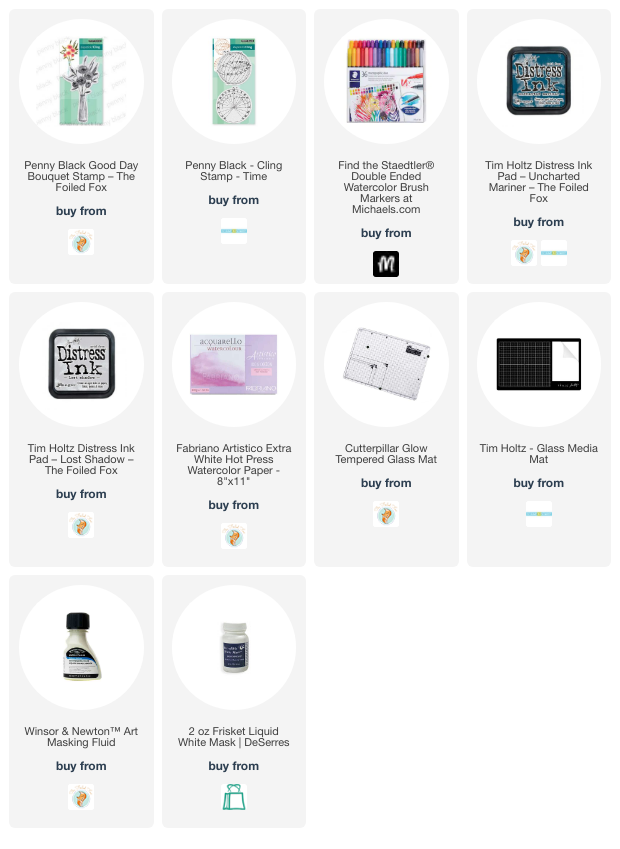
Posted: June 7, 2023 Filed under: good day bouquet, Penny Black, Time | Tags: Fabriano Watercolour Paper, Penny Black stamps, Ranger Distress inks, Staedtler watercolour brush pens 3 Comments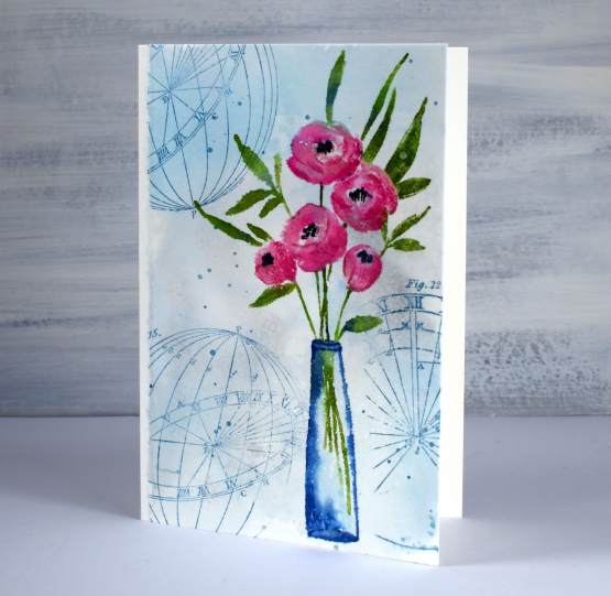
Good day bouquet is a pretty vase stamp from Penny Black. I used a strip of hot pressed watercolour paper and kept the deckled edge which is on the large sheets I buy then cut into smaller pieces for card panels and other projects. I smooshed uncharted mariner and lost shadow distress inks on my glass mat, diluted it with water then swiped the watercolour panel through the ink. There was a fine splatter of masking fluid on the panel which is most noticeable on the side of the vase.
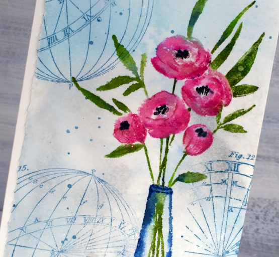
I chose to use water-based brush markers to colour the stamp. As the distress markers are being discontinued I have been testing out alternatives for inking stamps. Water-based markers can be helpful in inking small areas on a stamp. For the flowers, leaves and stems I used Staedtler water-based markers; the pack I bought has 36 colours so I was able to use three different pinks for the flowers and a couple of greens for the stems. I used uncharted mariner for the vase and then later for the ‘time’ stamps I added to the background. When I ink my stamps with markers I spritz the stamp before pressing it onto the panel and sometimes blend the stamped image with water also. I inked the centres of the flowers with black, then after stamping used the small tip end of the black marker to add more detail.
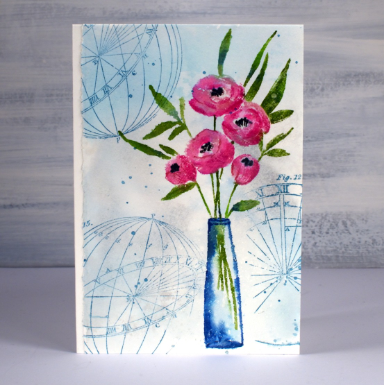
To finish I added some water splatter which I dabbed away with a paper towel and some ink splatter because you know I love to splatter! If you are in Ottawa don’t forget you have the opportunity to pick up some crafty bargains this weekend at the Saturday garage sale, details below.
(Compensated affiliate links from Foiled Fox & Scrap n Stamp)
Vintage Beetle
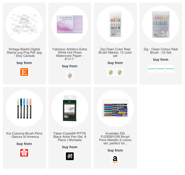
Posted: June 5, 2023 Filed under: vintage beetle | Tags: Echidna Studios, Fabriano Watercolour Paper, Kuretake Zig clean color real brush markers 3 Comments
Isn’t she a beauty? This digital stamp ‘vintage beetle‘ is one from a new set in the Echidna Studios etsy store. My daughter took a photo of a VW beetle convertible recently and turned it into this digi stamp. There is stamp in the set. I haven’t coloured it yet but it is a cute rear view.
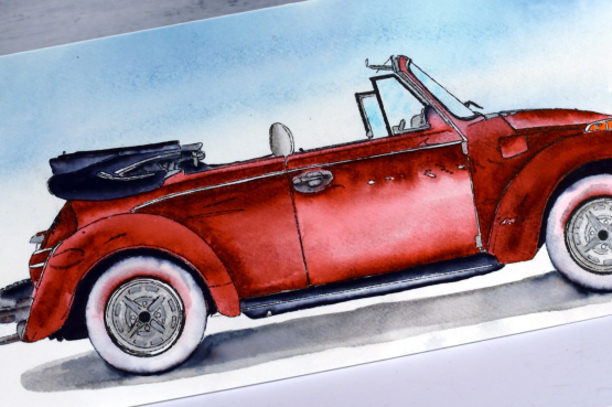
I rarely make slimline cards but this stamp definitely called for one. I think it would make a delightful fathers’ day card. It isn’t fathers’ day until September in Australia which has caught me off guard many times! I printed the car on hot pressed watercolour paper using the ‘manual feed’ and ‘heavyweight settings’ that pop up on the computer. I then created a very soft watercolour background by smooshing lost shadow and uncharted mariner ink on my glass mat, spritzing it with water to dilute and move it then swiping my watercolour panel through the ink.
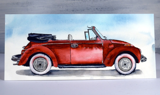
I used mainly Zig clean color real brush pens to watercolour the car along with Kuretaki metallic silver on the hubcaps and black Koi coloring brush pen for the black watercoloured sections. For some fine black lines I use F-C Pitt artist pens. I do have a weakness for markers, especially waterbased ones so it was good to put some to work on this card.
Just between you and me I am pretty pleased with the way it turned out and would now like to take a little drive in one! Hope your Monday is off to a good start.
(Compensated affiliate links from Foiled Fox & Scrap n Stamp)
Sun Kissed
Posted: May 15, 2023 Filed under: Penny Black, sun kissed | Tags: Fabriano Watercolour Paper, Penny Black stamps, Ranger Distress inks 5 Comments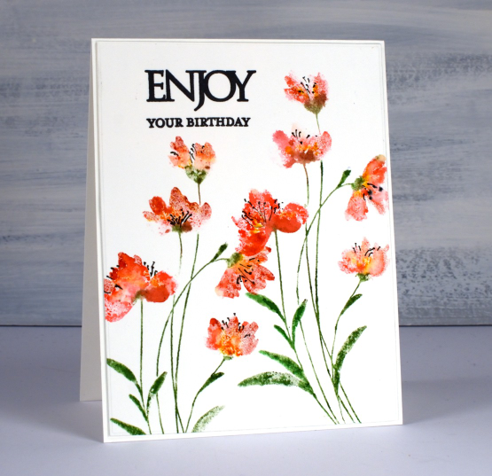
These breezy flowers are from the new Penny Black release. The stamp is called ‘sun kissed‘ and I have stamped it twice on this card. I used both distress markers and ink pads to ink the stamp; I know the markers are being discontinued but while I have them I will keep using them.
I inked the flowers with barn door and worn lipstick, spritzed the stamp lightly then stamped on hot pressed watercolour. Often I follow this step by blending the ink on the petals with a damp paintbrush. I decided not to do that this time as I liked the soft ‘impressionistic’ look of the uneven coverage. I inked and stamped the stems with mowed lawn then added some fossilized amber to some of the flowers.
I added fine lines and dots to each flower head with a fine black marker then added a sentiment from the PB ‘Enjoy builder set’. The builder sets include one or two large solid stamps then a range of phrases or words to stamp adjacent to the large word. Once again I decided not to add any background blending or shading. I like the simple clean look of the stem and flowers on white and it gives me a chance to get to know the stamp before combining it with other stamps or techniques.
(Compensated affiliate links from Foiled Fox & Scrap n Stamp)
Hollyhock Heaven Indeed!
Posted: May 11, 2023 Filed under: hollyhock heaven, how sweet, Penny Black | Tags: Fabriano Watercolour Paper, Penny Black stamps, Ranger Distress inks 9 Comments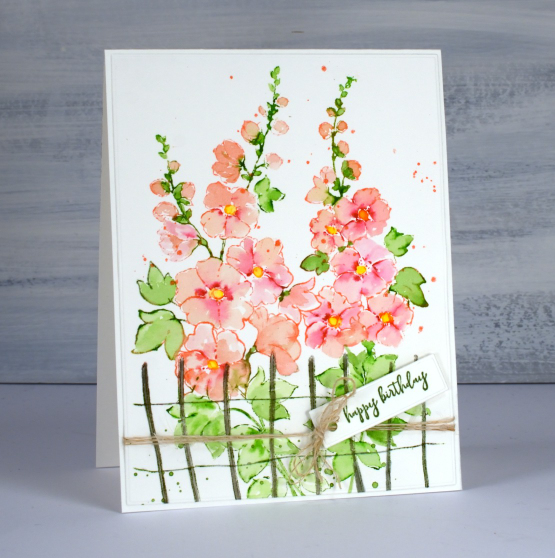
This is the stamp I didn’t know I’d been waiting for until I saw it in the new Penny Black release! Hollyhocks are such beautiful flowers. I don’t have any in my garden so obviously I need some on my cards!
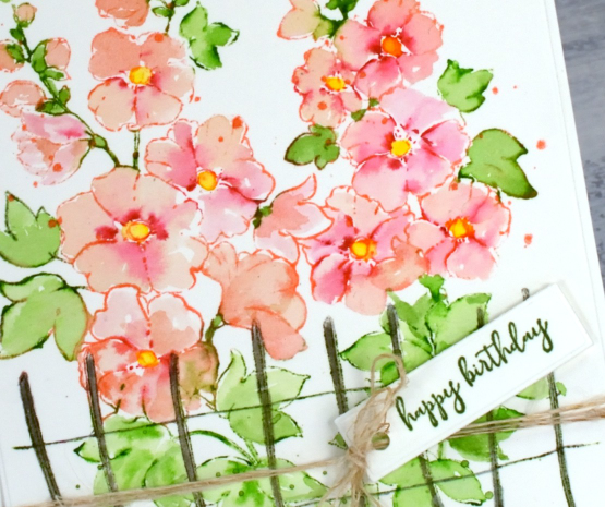
As usual I worked in the stamp positioner with hot pressed watercolour paper. I first inked the centres of the open flowers with a dark red zig clean color brush marker, spritzed with water and stamped. Next I inked the stems and leaves at the top of the image with a green zig marker and stamped. I used saltwater taffy distress ink to ink all the flowers wiping ink off where I could see there were leaves. This is a bit of a tricky step but a bit of green in the wrong place can usually be diluted and dabbed off with paper towel. I blended all the petals with a paintbrush pulling the dark red ink into the paler pink. When stamping the lower leaves with mowed lawn distress ink the fence ended up green so I went over that with some hickory smoke ink and a paintbrush. When I was sure the flower petals were dry I added yellow to the centres just like my reference photo. To finish I splattered some green and taffy ink, added a little greeting from the PB ‘how sweet!’ set and tied some twine to fit in with the little fence.
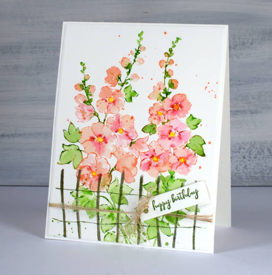
Isn’t this stamp a stunner? I can’t wait to try other colours and pair it with other florals.
Now back to my gel printing class; it’s not going to publish itself!
(Compensated affiliate links from Foiled Fox & Scrap n Stamp)
Close-up Blooms
Posted: May 10, 2023 Filed under: bud & bloom, Echidna Studios | Tags: Echidna Studios, Fabriano Watercolour Paper, Kuretake Zig clean color real brush markers, Penny Black stamps 6 Comments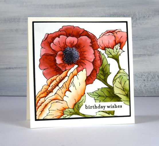
You’ve seen this digital stamp once before on my blog but it is much bigger this time. I printed it on hot pressed watercolour paper at a size that would fill the square card front. The set is called ‘bud & bloom‘ and this is just one of the three images in the set.
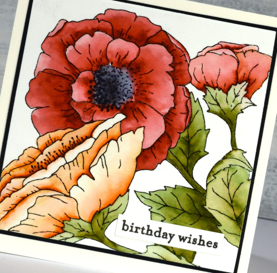
A bigger image fills the card front beautifully and is easier to colour. I enjoyed colouring this one while relaxing on the couch. I used zig clean color real brush pens which are highly pigmented. I was able to add intense colour to one side of the petals then blend it out with a waterbrush. It is easy to add a bit more ink if needed or add a different colour just by touching the tip of the brush pen to a wet area on the petal. The zig pens are easy to control and mine are lasting very well.
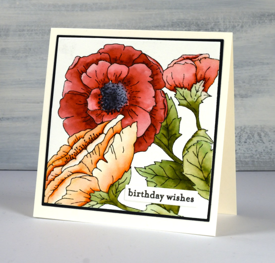
This time I kept the background clean and added a little Penny Black sentiment. If you haven’t visited the Echidna Studios etsy store lately pop over and see what’s new. There are a bunch of new stencil designs ready for cutting from a plastic film for stenciling or from cardstock to add to a card front.
(Compensated affiliate links from Foiled Fox & Scrap n Stamp)
The World is a Garden
Posted: April 28, 2023 Filed under: Art Journal, daisy delight, Darkroom Door, eyes, Handmade book, sketched alphabet | Tags: Art Journal, Darkroom Door stamps, Fabriano Watercolour Paper, Ranger Distress inks 4 Comments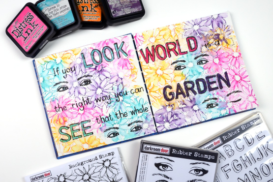
Do you recognise this set? It is the Darkroom Door ‘Eyes’ set I featured on a journal page a couple of weeks back. For this journal page I used a smaller pair of eyes and also one eye from the closed eye stamp so I could create a ‘wink’!
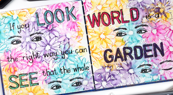
The background is stamped loosely with four bright distress inks and the DD ‘daisy delight’. When I say stamped loosely I was not looking for complete images so I inked sections of the stamp with a couple of inks then stamped on the journal page. I did the same again with a different pair of inks until I had filled both pages. Because distress inks react so well with water and my pages are cold pressed watercolour paper it was easy to blend the petals with a wet paintbrush. Where the inks overlapped I got some nice blends; there were a few muddy blends but overall look is of a garden bed of daisies which is what I wanted.
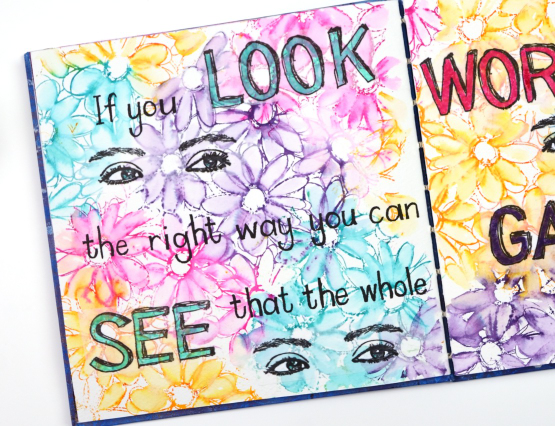
No surprise that I did not have the whole design planned out from the beginning so I had to work out the best way to add the eyes without disturbing the very dilutable flowers I had already watercoloured. I ended up stamping them on tissue paper and gluing them down with a gluestick so as to not add more liquid to the background. I also stamped the large letters for the quote on tissue paper using the DD ‘sketched alphabet’ stamp set. Having the eyes and the words stamped on tissue made it easy to play with the arrangement until I was happy with it. The smaller words making up the quote I wrote by hand with a black marker.

The quote is from ‘The Secret Garden’ by Frances Hodgson Burnett, a book I enjoyed reading as a child and a parent.
Just a quick question for you, did you try reading the quote straight across the two pages or did you see it went down the left then up to the right? Just wondering because I didn’t even think of both options when I was laying it out.
(Compensated affiliate links from Foiled Fox & Scrap n Stamp)