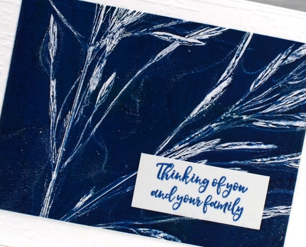
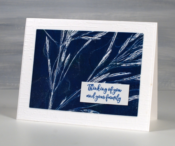
Grass Print Sympathy cards
Posted: August 28, 2024 Filed under: Alexandra Renke, gel press | Tags: Alexandra Renke, gel press, gel printing, gelli plate 2 Comments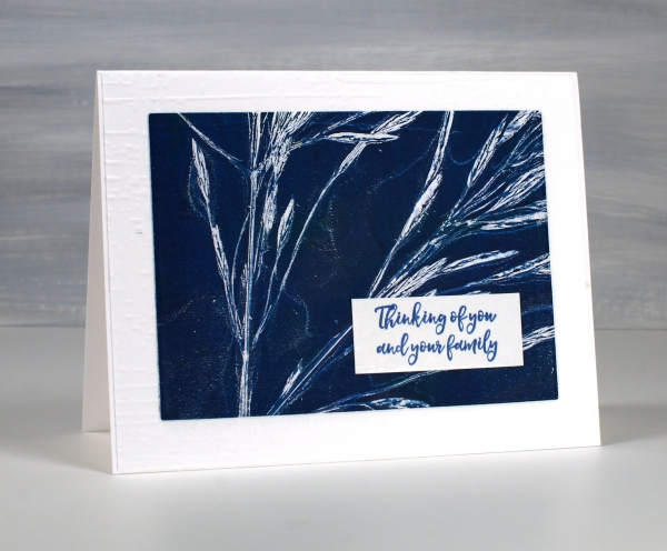
As I mentioned in my last post life has been busy with different crafting lately (children’s crafts for camp) so I am sharing more botanical gel prints from earlier in the summer.

I filmed a short video for this one; it’s the same process I used with the lacy leaves but this time with long stalks of grass.
It is good to pick the grass before it gets too dry, that way the seeds don’t separate from the stalk and end up in the paint or on the print.

Once again I turned the 5″x 7″ print into sympathy cards and embossed a background for both cards using the ‘exposed brick’ embossing folder from Stampin Up. For the card above I cut tags using lovely stitched edge tag dies from Alexandra Renke.
As summer is drawing to a close I will mention that I keep the grasses and flowers that I have used for gel printing for a few more months. The layers of paint hold them together making it possible to continue to do botanical gel printing for a little longer.
This post includes affiliate links from Foiled Fox. If you buy through these links I receive a small commission at no extra cost to you.
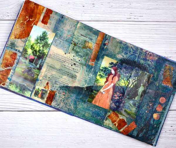
Girl in the Garden Journal Page
Posted: June 18, 2024 Filed under: Alexandra Renke, Art Journal, Darkroom Door, gel press, global postmarks, mandala | Tags: Alexandra Renke, Art Journal, collage, Darkroom Door stamps, gel press, gel printing 4 Comments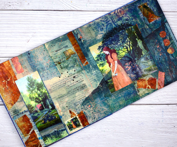
Although I made this page a month or so back; it is an appropriate theme for right now. We are in the ‘garden days’. My back garden is looking colourful and I love wandering out there each day to see what is growing, blooming or falling over!

This page began as a collage of book page pieces. I didn’t have a plan but wanted a base. I used pages from an old novel, an old atlas, sewing instructions, sheet music and other scraps to cover the double page spread in my 7″x7″ handmade journal. Months passed before I came back to do more.
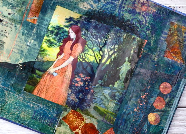
Before adding colour I painted some off white paint over the collaged pages. You might think the calendar image was the inspiration for the pages but bronze and the teal gel prints came first. Both prints were on tissue paper and were most likely made as I picked up extra paint around a primary design. As they were on tissue paper they revealed some of the print underneath when glued to the journal pages. I added ink through an Alexandra Renke mandala stencil.
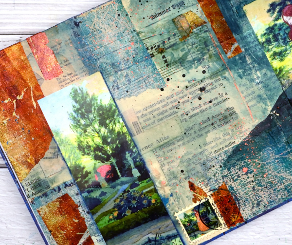
At this point I went looking for pictures to add to the colourful abstract pages and this one from a calendar co-ordinated well. It is from an old art calendar and is a detail from Eugene Grasset’s painting ‘Young Girl in a Garden’. I used some liquid watercolours to extend the painting onto my journal pages, made a faux stamp, added some splatter and stamping then let it all dry. Sometimes I’m not sure when a journal page is finished but I think this one is.
Birches on Kraft
Posted: March 9, 2022 Filed under: Alexandra Renke, Art Journal | Tags: Alexandra Renke, Art Journal 10 Comments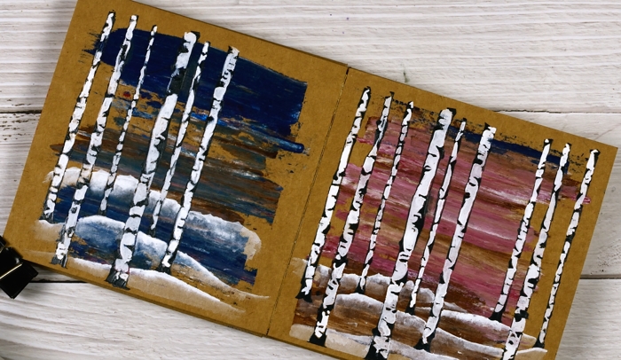
These two pages began as ‘clean up’ pages after completing pages in another art journal. I had some pink and brown paints left over and also some blue with brown. I used an old key card to lift the excess paint and swiped it onto the pages in my 6×6 kraft journal.
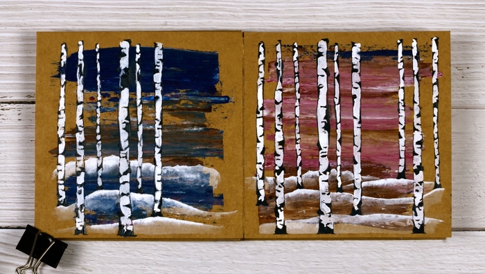
I didn’t have a plan straight away but a few weeks later I pulled out an Alexandra Renke stencil which I’d never used and decided to do a couple of simple landscape pages.
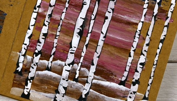
The stencil exposes only the edges of the birch trees which I wanted to be black so I mixed some black gesso with some black texture paste to make it thicker then spread it through the stencil onto the painted pages. Once it dried I painted the white spaces first with white gesso but it wasn’t opaque enough so I used Dr Ph Martin’s Bleedproof white paint.
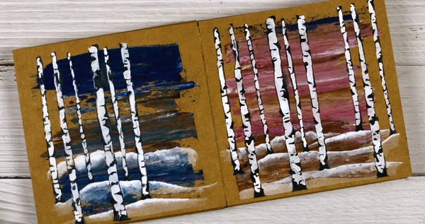
After completing the trees I painted some snow covered hills with the same white paint and diluted them with water to reveal the land underneath. This is the opposite technique to my usual watercolour technique where I paint the shadows or hills and dilute the tops.
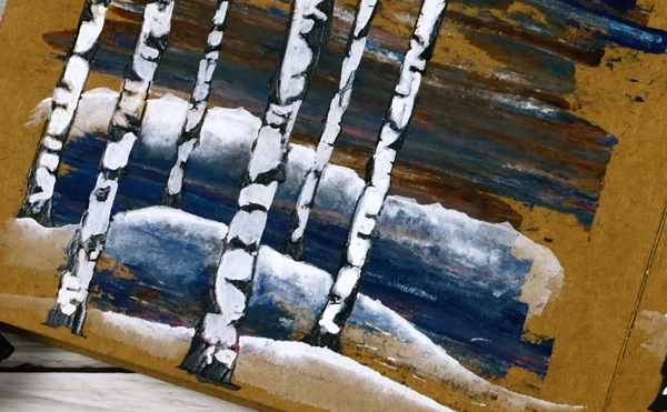
So far I have tried distress sprays, gel pens, acrylic paints and texture paste on the kraft pages. As long as I include some light colours in my designs the brown background words really well. Next experiment? Collage, stamping or maybe coloured pencils.
Supplies
(Compensated affiliate links used when possible)
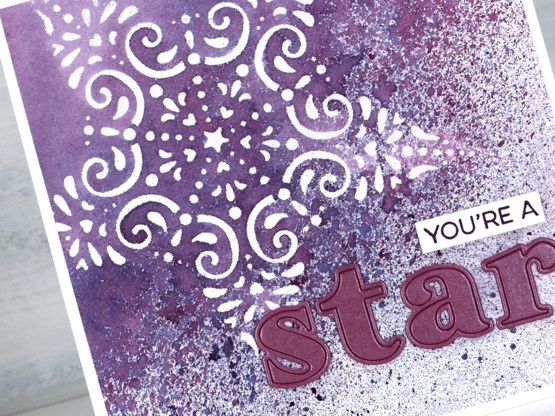
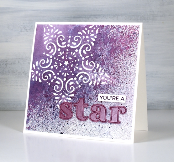
You’re a star
Posted: February 19, 2021 Filed under: Alexandra Renke, Heather lowercase die set, My Favorite Things, ornamental star stencil, Pink Fresh studio, YAY for you | Tags: Alexandra Renke, My Favorite Things, Pink Fresh studio, Ranger Distress stains 7 Comments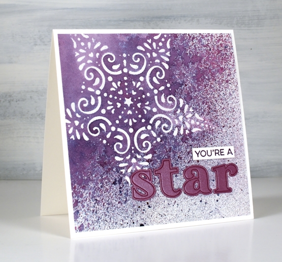
I’ve been wanting to work with some of my new stencils and the CAS Mix Up challenge is currently a embossed stencil challenge so I got to work. I taped the Alexandra Renke ornament star stencil to a piece of hot pressed watercolour paper and started sponging some versamark ink through the stencil. I soon switched to just squishing the versamark ink pad directly on the stencil as that was faster. I embossed the star in clear powder then put the panel in a box so I could spray some stain over it without decorating myself or my desk.
I sprayed seedless preserves, faded jeans and speckled eggs distress stains over the panel from 20-30cm away and ended up with a pretty speckled panel. I wanted to make the spotted sprayed area transition from speckled to solid so I painted water over one edge then spritzed water next to the painted area which achieved my goal leaving some of the panel barely touched by water. It took quite a while to dry and impatient me did smudge some of the speckles but they are underneath the die cut letters now so no harm done.
I applied tape to the back of a piece of co-ordiating cardstock then cut the letters s,t,a,r out using the ‘Heather lowercase alphabet’ die set from Pink Fresh studio. I searched through my stamps and dies to find a sentiment I could alter to say ‘you’re a’ and ended up using part of a stamp from the MFT ‘Yay for You’ set stamped in versafine monarch ink.
When I was doing the spray over embossing step I realised this stencil is probably going to pair up with spray stains again in an art journal page, the speckled effect over the lacy star is just so pretty.
I’m excited to participate in a challenge again, it has been a while! There is still time to get involved if, like me you have stencils that are waiting patiently to be the star or even the background of a card.
Supplies
(Compensated affiliate links used when possible)
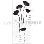
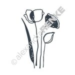
Alexandra Renke Poppies
Posted: January 28, 2019 Filed under: poppy flower dies, poppy flower stamps | Tags: Alexandra Renke, Penny Black stamps 4 Comments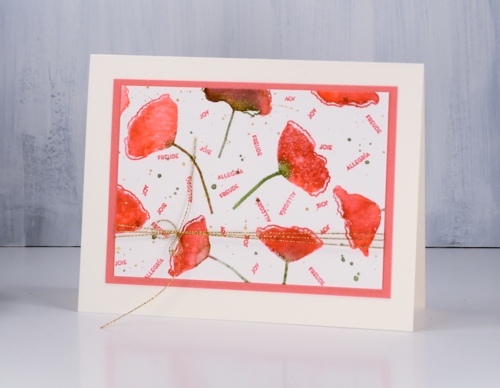
After making a gift set of cards with the ‘blissbloss’ stamp I was inspired follow the same process with another stamp set. This time I used Alexandra Renke’s pretty poppy stamp set and her poppy dies. I used Catherine Pooler inks for the watercolour effect on the poppies and for the tiny sentiments.
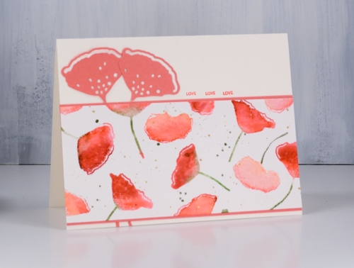
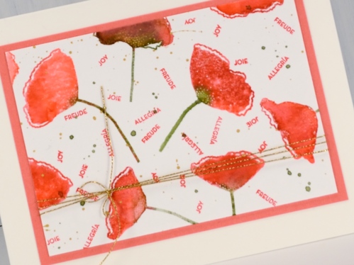
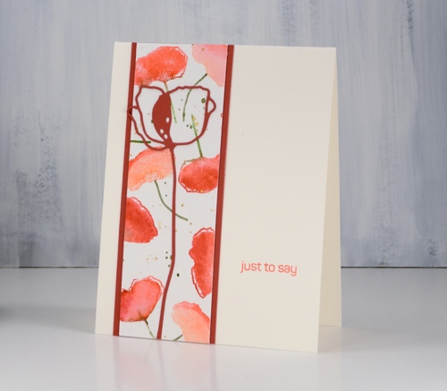
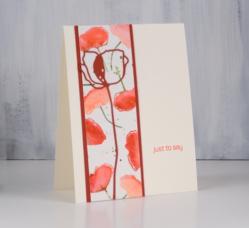
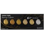
I started with a 10″x7″ panel of hot pressed watercolour paper. There are five poppy stamps in the set so I positioned them randomly over the panel while in the stamp positioner. I inked the petals first in samba ink then dabbed some rockin’ red ink on the sides or edges but not covering the whole flower. I spritzed then stamped. I wiped off the stamps then inked the stems in eucalyptus ink and stamped again. I moved the panel and repeated the process to fill the panel with poppies. In order to get even spacing I had to clean and reposition the stamps a couple of times but eventually I had the panel covered. At this point I changed my mind and crowded in a few more flowers in a couple of areas using the CP bellini ink along with CP samba to make paler poppies. I added some eucalyptus ink splatter and some gold splatter using one of the gansai tambi gold paints then called it complete.
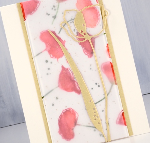
To create the cards I cut some panels to 5 ½” so they would stretch the length or height of the card and used co-ordinating cardstock to frame and mat the panels. I also cut several poppies using the Alexandra Renke poppy flower dies in light peach, dark peach and light gold cardstock. I don’t have a formula for creating five cards from the panel; basically I played with ideas until they looked ok!
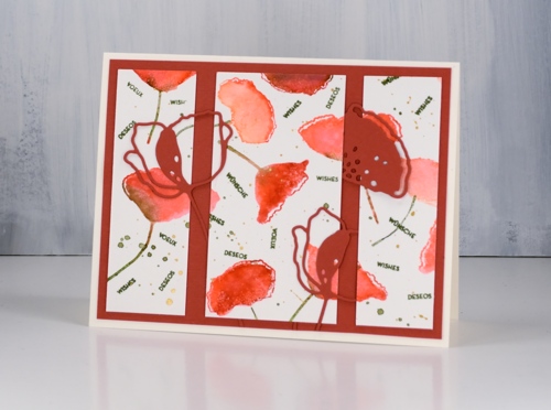
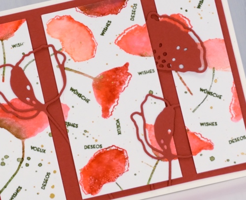
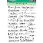
The poppy stamp set has the same seven sentiments in English, French, German and Spanish so I stamped sentiments on a few of the panels using the same word in four languages to fill spaces between the poppies. On one card I needed a larger sentiment so I used a Penny Black stamp from the ‘happy snippets’ set.
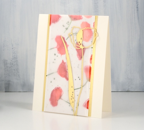
I used light weight vellum over one of the watercolour panels to soften the colours and make the die cuts stand out.
I’m hoping to sell cards at a market in the not too distant future so having a few gift sets might be a good idea.
Supplies
Stamps: poppy flower set (Alexandra Renke)
Dies: poppy flower dies (Alexandra Renke)
Cardstock: hot pressed watercolour, Neenah cream, light weight vellum, light gold, dark peach, light peach

Inks: samba, rockin’ red, bellini, eucalyptus (Catherine Pooler)


Paint: gansai tambi starry colours
Also: stamp positioner, diamond glaze, gold cord
Sparkle stencil birthday
Posted: December 3, 2018 Filed under: mandala | Tags: Alexandra Renke, distress oxide inks, WOW embossing powders 7 Comments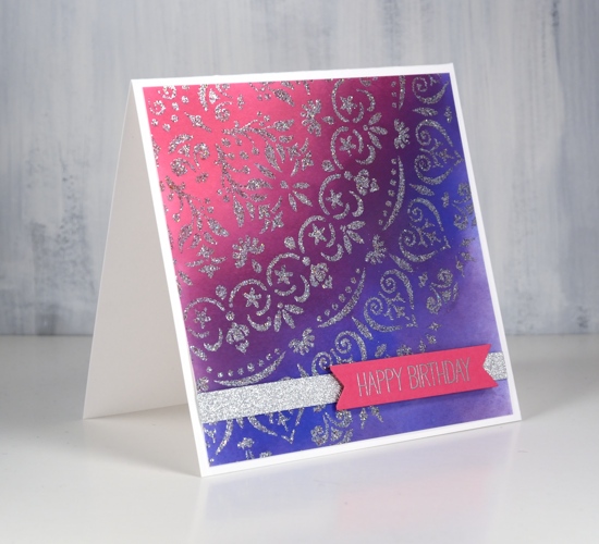
I know what you are thinking. What could have inspired me to create a sparkly pink and purple birthday card? A sweet five year old girl! She loves texture so I am hoping the raised glitter embossing, surprisingly silky sparkle ribbon and the raised sentiment will also appeal.
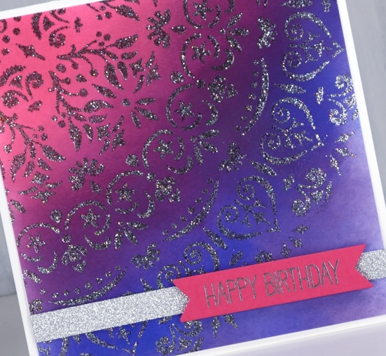
I used a beautiful quarter circle stencil by Alexandra Renke which I am looking forward to using on future projects. I blended four colours of distress oxide inks on neenah solar white cardstock first as I wanted to add the glittery embossing powder over the top. I made sure the ink was totally dry and also used a powder tool before pressing versamark ink through the stencil onto the panel. The embossing powder is WOW fairy dust which is very silvery and sparkly despite what my photos show.
I wrapped the panel with a bit of silky smooth glitter ribbon brought home from France by my partner in craft, embossed the MFT sentiment in silver powder and popped it up over the ribbon. All the product names are linked below. I realize this may not seem like a little girl card, after all there are no princesses, unicorns or cute animals. Since my children became grownups I haven’t really made many child cards. Do you make cards for children? What sets them apart from your other cards?
Supplies
Stencil: mandala (AR)

Stamp: birdie brown greetings galore

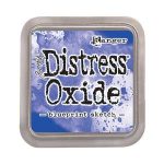
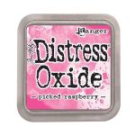
Inks: blueprint sketch, picked raspberry, dusty concord, seedless preserves distress oxide inks & versamark
Also: Ranger silver embossing powder, WOW fairy dust embossing powder, silver ribbon