
Pretty Paper Neighbourhood & a Wreath
Posted: November 16, 2018 Filed under: Alexandra Renke, neighbourhood border, starry night, whirl wreath | Tags: Alexandra Renke cardstock, Penny Black creative dies, Penny Black stamps, Ranger Distress inks, Tsukineko Versafine inks 6 Comments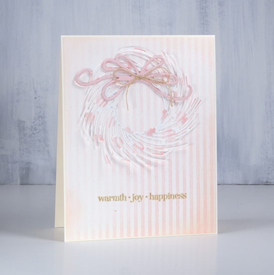
It’s all soft and subtle on the blog today. I have two projects featuring the beautiful Alexandra Renke cardstock the Foiled Fox recently started carrying in their store. The weight of the cardstock is somewhere between a good quality printer paper and a piece of cardstock. There is definitely enough weight to die cut nicely.
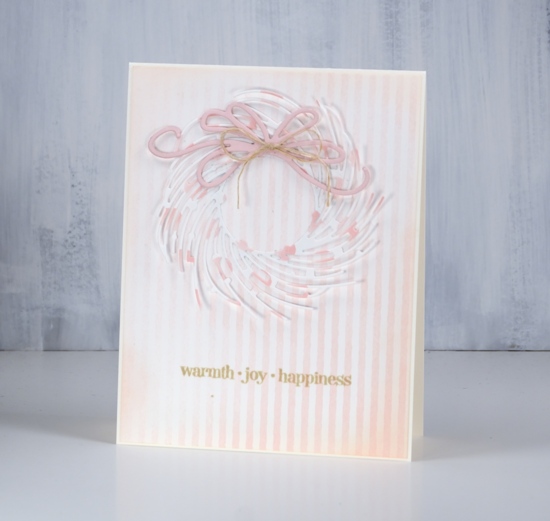
I chose the elegant ‘whirl wreath’ by Penny Black and cut one out of ‘pink dots’ cardstock. I attached it around the centre circle with adhesive but left the branches unattached ( so I will be careful putting it in a envelope) The background is ‘rose stripes’ which matches the pink dots perfectly. I cut the bow out of a piece of cardstock from my stash and layered a few together to give it some extra weight. I blended around the edge of the striped panel with tattered rose distress ink and attached everything to a cream cardbase.
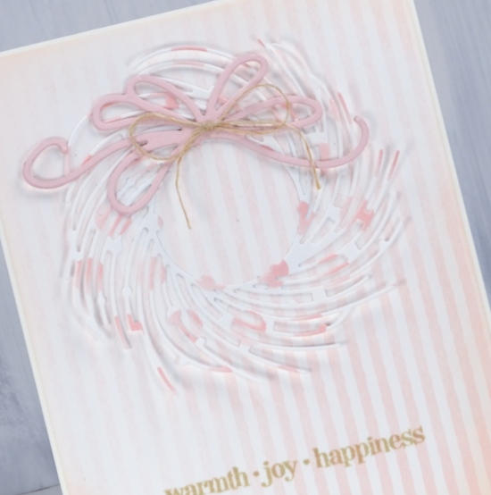
I chose to add a natural twine bow to the die cut bow then had to co-ordinate the sentiment with antique linen distress ink.
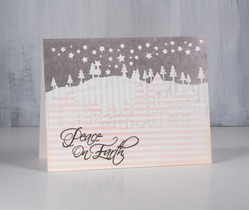
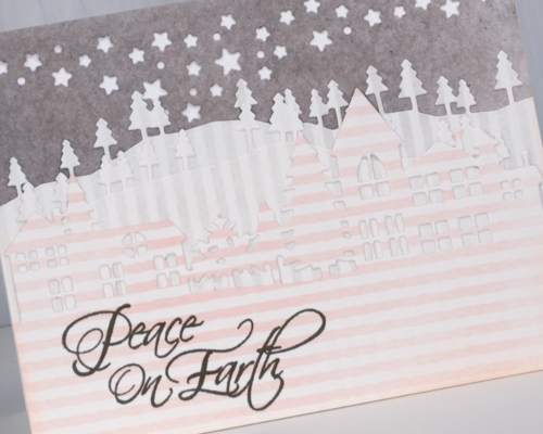
For my little neighbourhood card I use three patterns of Alexandra Renke cardstock, the rose stripes, gray stripes and medium mud watercolour. I know it is hard to see the details of the die cuts in my photo but in real life the pink striped neighbourhood is clear against two lines of gray striped trees in front of a gray mud starry sky.
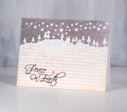
I have been wanting to try a white on white layered die cut scene and I probably still will but chose to try it with these pretty papers first. The neighbourhood is layered over two layers of trees cut with the ‘trees and hills’ dies which are layered over a gray piece cut with the starry sky night die attached directly to a white card base.
I featured some of the subtle colours and patterns from Alexandra Renke today but I do have some bold patterns and solids to share another day.
Have a great weekend.
Supplies
Stamps: Christmas sentiments, winter days (PB)


Dies: whirl wreath, neighbourhood border, starry night die, trees & hills die set (PB)


Cardstock: Alexandra Renke medium mud watercolor, gray stripes, rose stripes & Neenah solar white, cream, pink


Inks: tattered rose, antique linen distress ink, smokey gray versafine ink


Also: hemp twine
Mittens
Posted: November 13, 2018 Filed under: Christmas mittens | Tags: Faber-Castell Albrecht Durer Watercolour pencils, Faber-Castell Polychromos Colour Pencil, Penny Black stamps, Ranger Distress inks, WOW embossing powders 7 Comments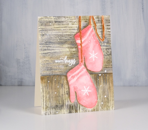
I have mentioned Kathy Racoosin’s 30 day colouring challenge a few times lately. It is definitely a no stress, no fuss, no obligation challenge which I have participated in before. Kathy, would be the first one to tell you there is no preparation necessary and I agree. However, I am enjoying it more this time around because I did do a little stamping in advance. I sat down at my work table a few days before the challenge began and stamped a bunch of images. I embossed some, stamped some in waterbased dye ink and a few in waterproof black ink. I basically created a little stack of images I could reach for and colour when I had the chance. It has helped me to be more involved this time. Sometimes I work on a panel until it is finished, other times, as in the case of these mittens, I colour it bit by bit or mitt by mitt!

I stamped the red mittens on hot pressed watercolour paper in worn lipstick distress inks and the cord in rusty hinge distress ink. I painted over the stamping with water to blend the pink ink to a smoother colour and to soften the stark white of the stripes. I added shading and little lines on the edges of the mittens and texture to the cord with watercolour pencils.

I decided the red mittens would be hanging against a wall or fence outside so I stamped and cut a mask of the mittens, covered them and stamped the woodgrain stamp from the PB set ‘tall timbers’ first one way then again at right angles in weathered wood and frayed burlap distress inks. As with the mittens I blended over the stamping with water and added extra colour from watercolour pencils especially around one side of the mitts to look like shadow. To finish the panel I stamped some snowflakes on the mitts, a sentiment and also splattered some embossing fluid before embossing it all with white powder.

I followed a similar process with the blue mittens but stamped them initially in three blue distress inks (broken china, salty ocean and chipped sapphire). I blended the stamping with water then, when it was dry, added details with coloured pencils. I wanted them to look knitted so I drew a pattern to look like rib at the cuffs then some lines and shading on the rest of the mitts.
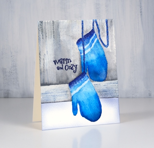
Once again I added a woodgrain background this time by masking the lower portion of the panel before stamping the woodgrain from the PB ‘inspiring’ set then more masking to stamp it horizontally across the card. The sentiments for both cards are from the PB ‘smile all season’ set.
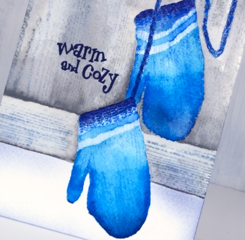
Warm & cosy wishes everyone!
Supplies
Stamps: Christmas mittens, inspiring, tall timbers, smile all season


Paper: hot & cold pressed watercolour paper, neenah cream


Inks: worn lipstick, rusty hinge, broken china, salty ocean, chipped sapphire, frayed burlap, weathered wood, hickory smoke


Also: white embossing powder
.
Pencils: Albrecht Durer watercolour pencils, Polychromos pencils (Faber Castell)
.
Lantern
Posted: November 9, 2018 Filed under: winter branches, Xmas sprigs | Tags: Penny Black stamps, Ranger Distress inks, Ranger Distress stains 8 Comments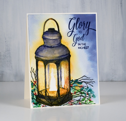
This little light of mine is the ‘lantern’ stamp from Penny Black paired with the ‘Xmas sprigs’ and ‘winter branches’ for added interest. I worked on this panel over several days leaving it in the MISTI the whole time so I could add a bit anytime I was waiting for something else to dry. I definitely made use of the MISTI to build up colour without loosing much detail from the stamp.
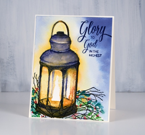
The panel is cold pressed watercolour paper; you can see a bit of texture in the yellow areas. I began by stamping the whole lantern in scattered straw distress ink. Next I stamped all but the very centre around the flame with wild honey ink, after than spiced marmalade ink and finally rusty hinge ink, each time leaving more of the centre of the stamp un-inked so the brightest ink was central and the darkest around the edges. At this point I hadn’t done any blending, it was all just stamped. I switched to a chipped sapphire marker and began stamping the details of the lantern and blending them with a wet paintbrush. Dark blue over all the orange tones looked almost black. I stuck with the chipped sapphire marker and kept adding detail, blending, then letting it dry before doing any more. I added detail and shadow to the lantern by painting with chipped sapphire ink then dried the panel before blending the warm tones inside the lantern.
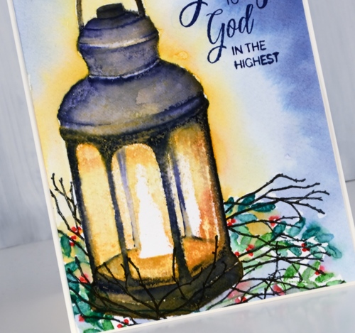
I stamped some foliage around the lantern after positioning a mask over it. I stamped a leaf stamp from the Xmas sprigs set in mowed lawn and pine needles distress inks then dotted some small berries with a candied apple distress marker. I added some winter branches stamped in versafine black then coloured with a fine black micron pen.
I wasn’t sure whether to try adding background colour at this point; It can be a bit risky. I painted scattered straw stain around the lantern and chipped sapphire stain around the edge of the panel then blended some water in between the colours because I didn’t want the yellow and blue mixing to create a strange green light! And it worked better than expected. The final detail was a sentiment in dark blue from the ‘holy night’ set.
Thanks for dropping in today. Enjoy your weekend.
Supplies
Stamps: lantern, Xmas sprigs, winter branches, holy night (PB)


Inks: scattered straw, wild honey, spiced marmalade, rusty hinge, mowed lawn, pine needles, chipped sapphire distress inks & nocturne versafine clair, majestic blue versafine


Markers: chipped sapphire, candied apple distress markers, micron pen


Paper: cold pressed watercolour paper, neenah cream cardstock
Stains: chipped sapphire, scattered straw


Also: MISTI, masking paper


Oh What Fun!
Posted: November 7, 2018 Filed under: elf stocking, holly sprig | Tags: Alexandra Renke cardstock, Faber-Castell Albrecht Durer Watercolour pencils, Penny Black stamps, Ranger Distress inks 11 Comments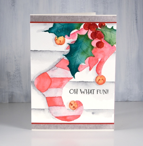
I was surprised how much fun I had colouring this stocking stamp. I worked on it on Saturday afternoon when it was wet and dreary outside; I lit a fire in my fireplace and brought colouring supplies up from my workroom so I could have a comfy cosy afternoon of colouring inspired by Kathy Racoosin’s 30 day colouring challenge.
Before colouring I’d used a stamp positioner to stamp the holly sprig stamp first in pine needles, mowed lawn and festive berries distress ink. I blended the leaves with a wet brush and let them dry. I cut a mask to cover the holly branch then stamped the stocking over the top in worn lipstick distress ink. Other than painting the leaves straight after they were stamped, all the other stamping was a base for watercolour pencil colouring.
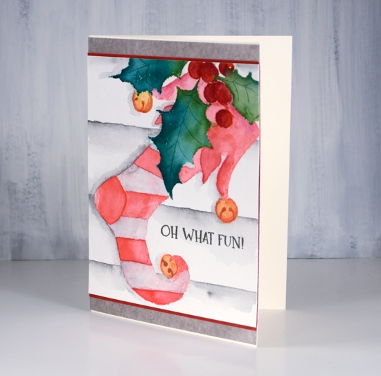
Because my base stamping was pink I decided to stay with a red and white colour scheme. I used a couple of red watercolour pencils and a paint brush to do half the stripes and the decorative top of the stocking. Rather than colour with the pencils straight on the watercolour panel, I picked up pigment from the pencils with a wet brush and painted over the stamping. I toyed with the idea of red and purple stripes but I’m glad I chose a very pale earth green which blended with the pink ink to look pale pink. I messed up a stripe at the top but I’m hoping the recipient won’t notice that!
For the berries I used darker red pencils and the bells a mustard and a rusty brown pencil. I added a background by ruling a few lines in medium grey watercolour pencil then blending and painting more grey below each line. I painted a grey shadow to the left of the stocking and leaves.
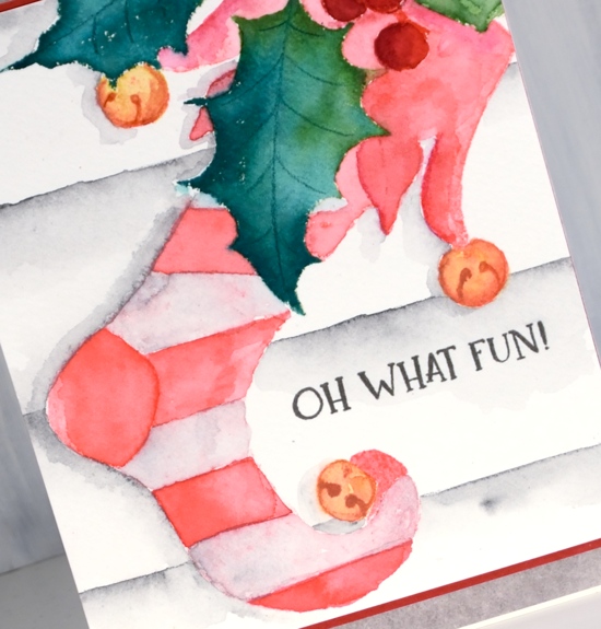
As usual I gave no thought to a sentiment until all my painting was completed and then of course I wasn’t sure where to put a sentiment or whether to have one at all. I hadn’t really paid attention to the size of my panel either so I had to do some creative matting to turn it into a card that would fit into the size of envelope I had. So as you can see, no, I don’t plan all the details of my cards in advance!
Supplies
Stamps: elf stocking, Christmas sentiments


Paper: Neenah cream, hot pressed watercolour, red, Alexandra Renke mud

Inks: pine needles, mowed lawn, worn lipstick distress inks, festive berries distress marker & smokey gray versafine ink


Pencils: Faber Castell Albrecht Dürer watercolour pencils
Tools: MISTI, T-ruler, masking paper

Winter Joy
Posted: November 6, 2018 Filed under: Winter Joy | Tags: Penny Black stamps, Ranger Distress inks, WOW embossing powders 3 Comments
More poinsettias to share today. These ones are from the Penny Black transparent set ‘winter joy’. I embossed several poinsettias in gold and did some loose colouring with distress inks inside the poinsettias then decided to paint a warm antique linen background with a little red added in.
Distress inks are easy to use as watercolour paints. I just press my ink pads onto my glass mat or an acrylic block then pick up the ink with a paint brush. I can add water to make a paler colour or work with undiluted ink.
You can see in the close up how loose I kept the painting both inside and outside the petals. What you can’t see so well is the pretty shine of the gold embossing and the gold twine. I’d like to try painting a white poinsettia for a change; it is a bit more of a challenge though to work out how to add colour even though I want it to appear white. If I have success I’ll be showing you.
Supplies
Stamps: winter joy, Christmas sentiments

Inks: versamark, forest moss, antique linen, barn door, wild honey, tulip red versafine clair


Paper: hot pressed watercolour, neenah cream
Also: metallic gold rich embossing powder, glass mat, gold cord


Simple and elegant poinsettias
Posted: November 5, 2018 Filed under: Christmas poinsettia, xmas poinsettia cut out | Tags: Alexandra Renke cardstock, Kuretake Zig clean color real brush markers, Penny Black creative dies, Penny Black stamps, WOW embossing powders 4 Comments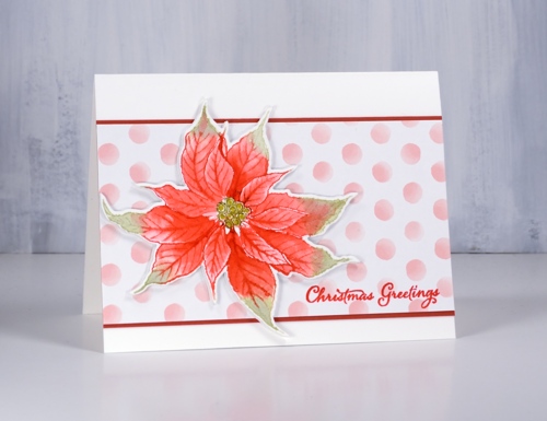
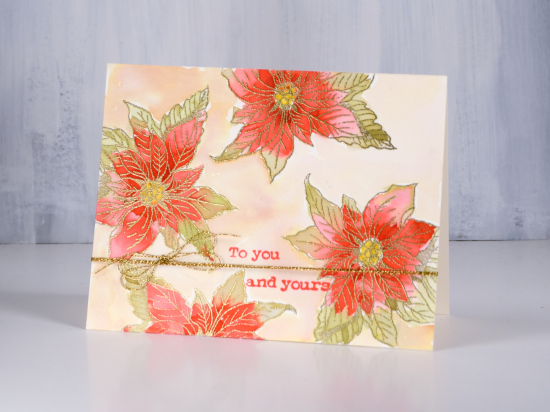
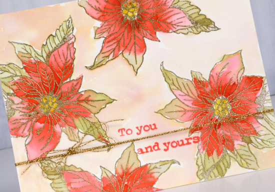
Today’s cards show two different looks from the Penny Black ‘Chrismtas poinsettia’ stamp. The first is simple distress ink colouring popped up on a fun polka dot background and the second is a bit more elegant with bold colouring inside a gold embossed image. I stamped this first poinsettia in festive berries and shabby shutters distress inks on hot pressed watercolour paper then blended the ink with water to fill the petals. If I needed extra ink for shadows and depth I picked it up from my glass mat which acted as a palette.
When I inked the stamp I wiped off the festive berries ink from the centre of the stamp so I could add peeled paint ink with a distress marker. After I had done all the blending I coloured the circles in the centre of the flower with a gold gel pen. My favourite part of the card though is the polka dot paper; it is so pretty. It is just one of a series of papers by Alexandra Renke. The Foiled Fox sent me some Alexandra Renke papers to try out and they are lovely. I will share more of them with you in the coming weeks. The weight is between paper and cardstock so it die cuts well but doesn’t add too much bulk when you layer it.
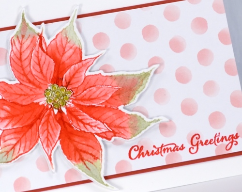
I cut my poinsettias out with the co-ordinating die but they wouldn’t be too hard to cut by hand, especially if you have fussy cutting skills (which I don’t). I matted the polka dot panel in red and added a sentiment from ‘festive snippets’ in versafine crimson red.
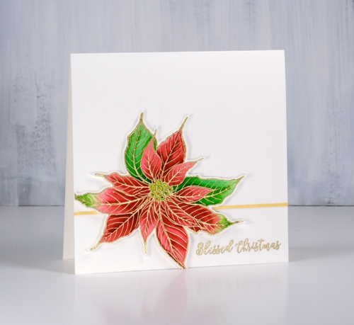
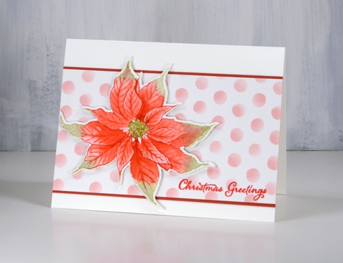
I embossed my second poinsettia in gold powder then coloured with zig clean color real brush markers. As I often do I used two reds and two greens, colouring first with the light marker then adding the darker colour at one end before blending with water to fill the petals.
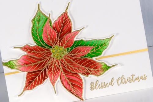
I applied adhesive to a strip of gold cardstock then trimmed it even narrower to position behind the popped up poinsettia. I embossed a sentiment in the same gold embossing powder used for the flower.
I am continuing to participate in Kathy Racoosin’s 30 Day colouring challenge. If you want some colouring inspiration pop over to her blog and check out her tutorials and link up. Let me know if you are participating.
Supplies
Stamps: Christmas poinsettia, festive snippets (PB)


Dies: xmas poinsettia cut out (PB)

Paper: hot pressed watercolour paper, Alexandra Renke pink dots, gold shimmer, red cardstock

Ink: festive berries, shabby shutters distress inks, , versamark, versafine crimson red


Markers: clean color real brush markers, peeled paint distress marker


Also: metallic gold rich embossing powder, glass mat
Stamping is for the birds part 3
Posted: November 1, 2018 Filed under: robin's christmas | Tags: Penny Black stamps, Ranger Distress inks 3 Comments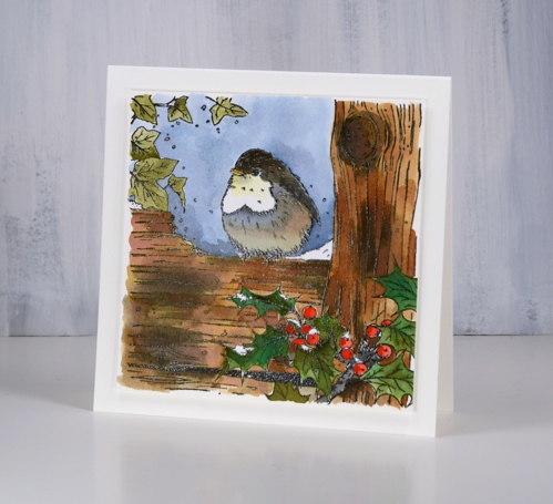
I’m continuing my ‘stamping is for the birds’ theme with this sweet stamp from Penny Black, ‘robin’s Christmas’. I think this one might be my favourite but there will be one more tomorrow so you can reserve judgement if you like. I stamped in versafine clair nocturne ink on hot pressed watercolour paper then embossed in clear powder. I had my distress inks at hand so I decided to use them as watercolour paints pressing the ink pads face down on my glass mat as I needed them. I used a few browns plus black for the wood, two greens for the holly, bundled sage for the ivy, candied apple and festive berries for the berries, fossilized amber for the beak and just below the beak. I used browns and black for the bird diluting them to get grey and pale browns.
I took care to keep ink off the little spots of snow, painted the background sky in stormy sky ink then added some clear wink of stella to the snow for a little sparkle. I ended up going without a sentiment and popped the whole panel up on foam for a subtle shadow.
This is my first piece of colouring for Kathy Racoosin’s 30 day coloring challenge. Kathy is a colouring wizard who regularly runs colouring challenges on her blog and instagram. It is a no pressure, drop in when you can, as detailed or simple as you like type of challenge. The idea is to do some colouring each day for 30 days. Kathy provides tons of tips and inspiration sharing her incredible tips and techniques and giving away prizes along the way. Check out her blog for more details or her IG @kathyrac . I’ll be sharing my colouring here and on IG and hope to see some of yours along the way.
Supplies
Stamp: robin’s christmas

Inks: versafine clair nocturne, vintage photo, walnut stain, black soot, festive berries, candied apple, forest moss, pine needles, stormy sky, bundled sage, fossilized amber


Paper: hot pressed watercolour paper
Also: glass mat, clear embossing powder, white wink of stella pen
![]()

Stamping is for the birds part 2
Posted: October 31, 2018 Filed under: A Bright Tomorrow, gift card pocket, Peerless watercolours, winter lookout | Tags: Peerless Transparent Watercolors, Penny Black creative dies, Penny Black stamps, Tsukineko Versafine inks 5 Comments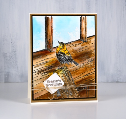
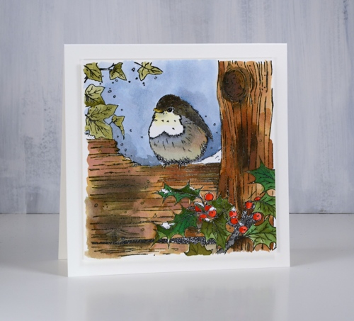
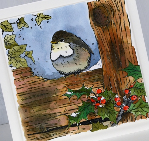
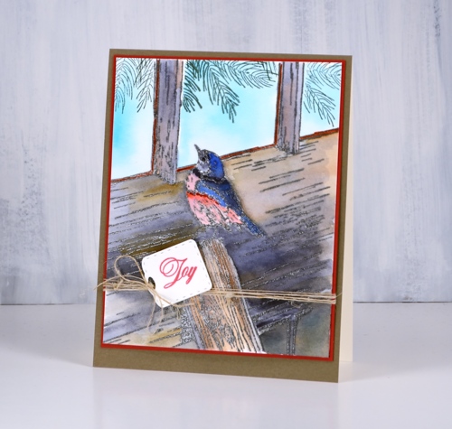
The second installment of my ‘stamping is for the birds‘ series features the Penny Black stamp ‘Winter lookout’ with a little bird on the outside looking in. I have seen a few other beautiful cards using this stamp and wish I had added a little foliage but there is always next time. Take a look at this gorgeous card by Susie Lessard.
I stamped in versafine clair nocturne ink and embossed in clear powder then painted the bird and all the wood with my peerless watercolours. To create variation in the wood I painted with several browns and some warm mustard yellow as well. Once I had finished the woodwork I had to decide how I would do the window. I chose frosty patterns like we often get on our windows in winter so I used the delicate snowflake stamp from the PB set, ‘A bright tomorrow’ to emboss in clear powder. When I painted pale blue into the window area it resisted the snowflake shapes.
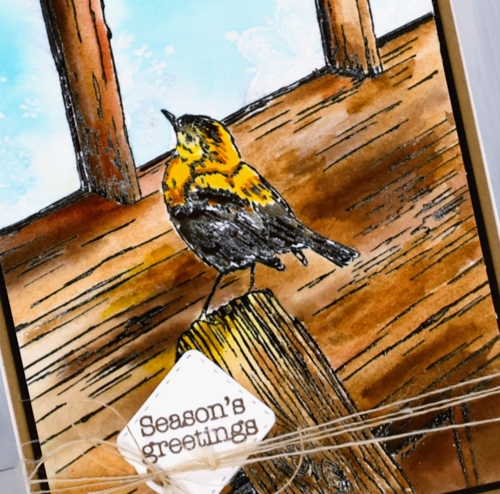
I tried a second colour scheme embossed in versafine smokey grey, featuring greys and blues and stamped some pine branches inside the windows as if garlands were hanging there.
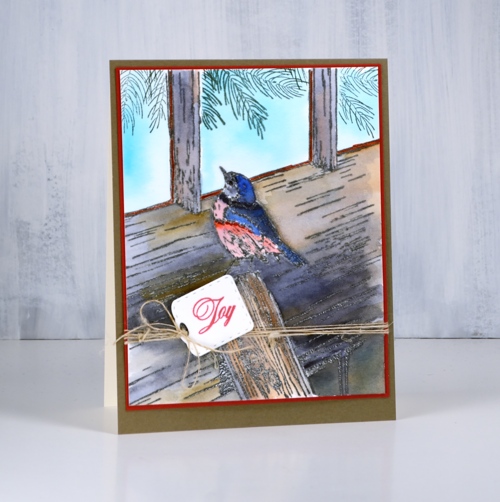
I finished both cards with co-ordinating mats and sentiments stamped on little tags from the ‘gift card pocket’ die set. I think I have only once made a gift card pocket but I often use the little tags and banner dies from the set. I added some finer details to both cards with black and brown markers once the painting was all finished as sometimes embossing does not preserve all the definition.
Supplies
Stamps: winter lookout, a bright tomorrow, festive snippets, joy of peace (PB)


Die: gift card pocket (PB)

Ink: versamark, nocturne versafine clair, morning mist versafine clair, northern pine memento


Paper: hot pressed watercolour, neenah cream, neenah black, kraft, red, olive green


Paint: peerless watercolours

Also: clear embossing powder, brown marker, black marker, twine
![]()
Stamping is for the birds part 1
Posted: October 30, 2018 Filed under: cheerful christmas, Peerless watercolours | Tags: Peerless Transparent Watercolors, Penny Black creative dies, Penny Black stamps 4 Comments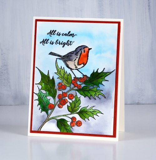
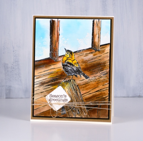
This week my blog is all about the bird stamps! It is a bit of a departure for me but there are some sweet birds flitting around my workroom so I decided to paint a few. This one from Penny Black is called ‘cheerful Christmas‘ and I’ve painted it with a robin in mind. The image is stamped in black, embossed in clear then painted with peerless watercolour paints. I kept my colour scheme fairly simple, a couple of greens for the leaves, a couple of reds for the berries and bird, a grey for the bird and background then some pale blue. I die cut the red mat with the elegant stitching dies from Penny Black and added a sentiment from the festive snippets set.
Peerless paints come in a very convenient format and provide beautiful blendable colour. I tend to forget them for a while and then binge on them with one project after another. They will be back with another bird tomorrow. You can see how I set up my peerless palette here
This little bird reminds me of a Ladybird book I had as a child called ‘The Wise Robin‘. I just had a hunt for it on our bookshelves and found it. The pictures in the book are all paintings and quite lovely. Then I did an online search for it and found it was published in 1950, sold for 2/6 but is listed for $72.51! I flicked through the book to remind myself of the story; the robin ends up in the house on the Christmas tree and delights the family with a song. Of course my experience when a bird has come into the house has never been delightful but that need not get in the way of a cute story!
Supplies
Stamps: Cheerful Christmas

Dies: elegant stitching

Paper: hot pressed watercolour, neenah cream, red
Ink: versafine clair nocturne
Paint: peerless watercolours
Also: clear embossing powder
![]()
Holly Garlands
Posted: October 26, 2018 Filed under: garlands | Tags: Kuretake Zig clean color real brush markers, Penny Black stamps, WOW embossing powders 7 Comments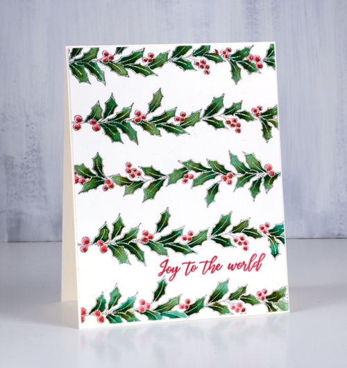
Before I talk about this ‘neat and tidy’ card I want to thank you, my readers, for your responses to my previous post of two wreaths, a neat and a messy one. Most of you preferred the artsy(messy) wreath although there was still some appreciation for the neat one. It was great to read what you thought and why the messy one appealed. Thanks for taking the time to leave me a message.
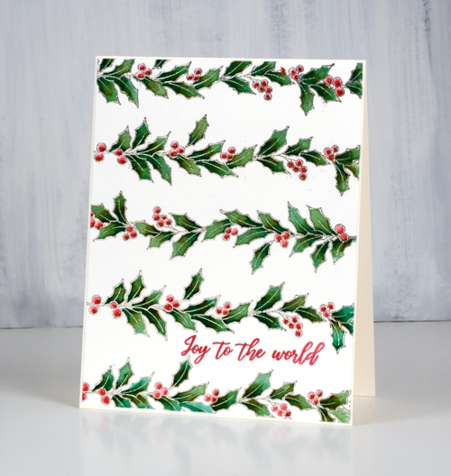
This neat little panel of holly took quite some time to colour, maybe this is why I don’t often paint inside small detailed images. The holly stamp from the PB set ‘garlands’ is embossed in platinum embossing powder then coloured with three zig clean color real brush pens. I coloured the leaves with the olive and the green pen then blended with water. I use a wine pen to colour the berries and also blended them with water for a bit of shadow. I like the finished panel but won’t be doing this style too often!
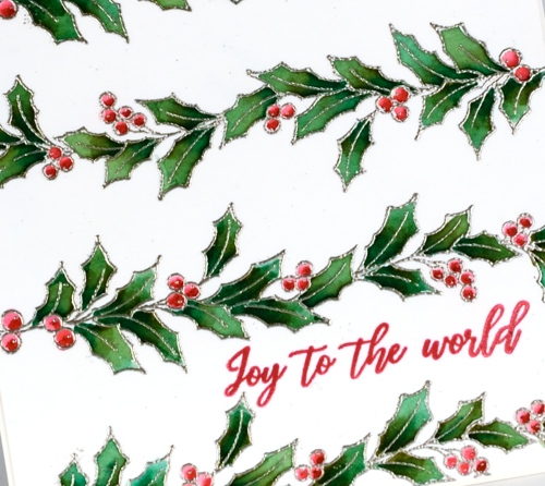
I tried to finish the card with a bright red die cut sentiment but it did not get along with the patterned background so I just snuck in a little red stamped sentiment instead. Hope you have a great weekend and I’ll be back next week to show you why ‘stamping is for the birds’!
Supplies
Stamps: garlands, Christmas sentiments

Paper: hot pressed watercolour, neenah cream
Ink: silver encore ink, versafine clair glamorous
Markers: zig clean color real brush markers
Also: WOW platinum embossing powder


