
Inspiration and Conversation
Posted: February 24, 2026 Filed under: Hand painted, sennelier watercolours | Tags: Fabriano Watercolour Paper, Hand painted, sennelier watercolours 18 Comments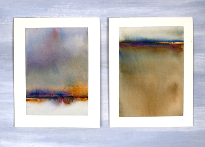
Today I wanted to have a bit of a chat with you, my readers, and especially take a few sentences to tell you how much I appreciate you. Some of you I have met but many of you I have not. Despite not having met in person I feel that we have formed a community and it is a very friendly and generous one. I took a break from the blog last year for several months and when I returned I was very encouraged by the comments and messages I received. Yes, it was nice to be missed, but more importantly it was lovely to see people engaging in discussion about techniques and materials. Many of you are kind enough to say you learn from my posts; I am so glad you do, but I also learn from you when you take the time to suggest products, methods and artists to check out.
Some of you have told me it is not as straight forward to comment these days. I’ve noticed this and I’m not sure why. I really enjoy hearing from you and read every comment and message I receive.
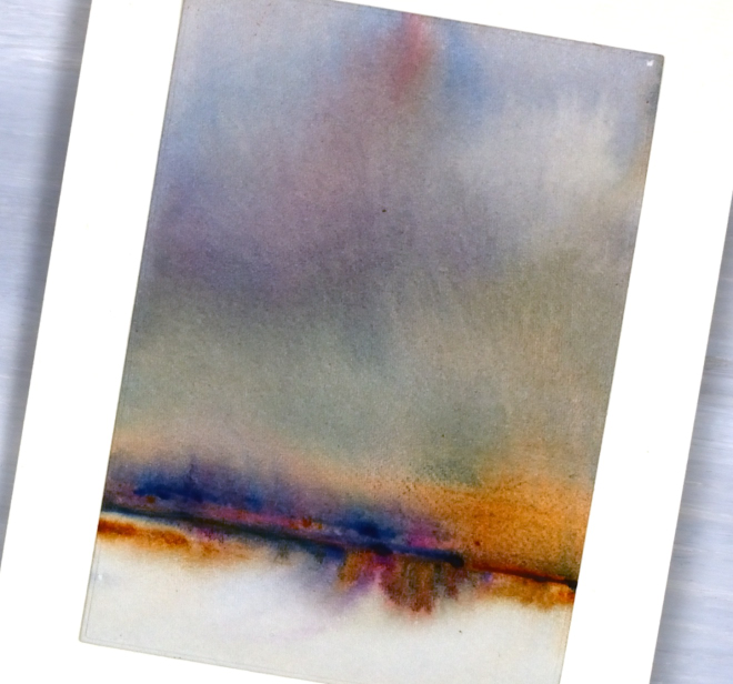
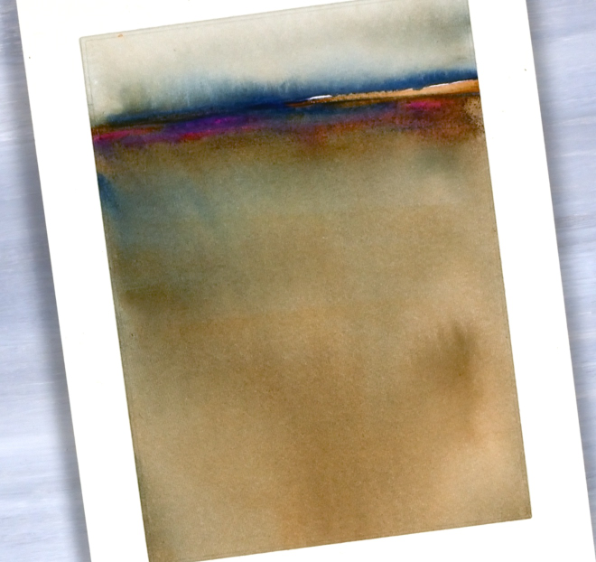
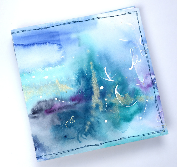
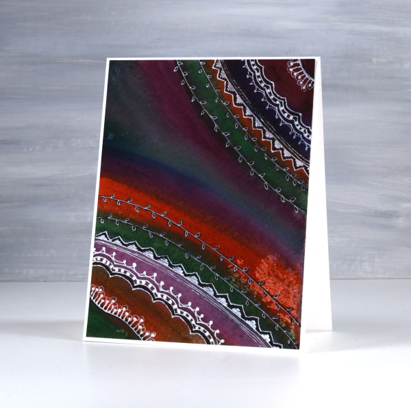
Today’s cards are inspired by the art of Claudia Drexhage. I encourage you to check out her website or instagram as her paintings are stunning and you will see where I got the idea for today’s abstract landscapes. I have only dipped my little toe into this technique but hopefully I’ll go in further in the future. One thing I find interesting about it is the way the abstract landscape can be seen one way and also turned upside down. I can’t remember which way I painted these panels originally but when I turned them into cards this week I decided I liked one with a big sky and the other with a big foreground. What do you think?
Thank you again for dropping in today and being part of this community. I look forward to seeing a few of you soon at some artsy get-togethers I am hosting but for those who don’t live close I look forward to seeing your inspiring creations if you share them on the interwebs or hearing from you in the comments or contact me button. Your encouragement and friendship mean a lot to me!
Handpainted blooms
Posted: October 28, 2025 Filed under: Hand painted | Tags: Fabriano Watercolour Paper, Hand painted 3 Comments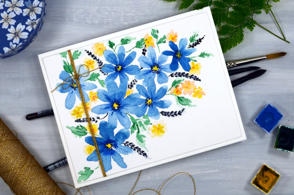
I’ve been putting together some gift collections of cards, no overarching theme, just a selection with greetings or blank options. To do so I’ve raided my stash of panels or as I’ve called it before, my ‘pile of possibilities’!

This handpainted watercolour panel was in the pile and I couldn’t say how long it’s been there; long enough that I can’t remember which paints I used. It is on cold pressed watercolour paper and I added some gold cord wrapped around several times before I attached it to a card base
Initially it was going to be a portrait oriented card as shown above and below but when photographing it I turned it on its side and quite liked it that way too. What do you think? There is no sentiment so the person who receives the gift set can make the final decision.
Stripes & Daisies
Posted: May 16, 2025 Filed under: Hand painted, Tim Holtz, Watercolour, wild flowers #1 | Tags: Fabriano Watercolour Paper, Hand painted, Tim Holtz 2 Comments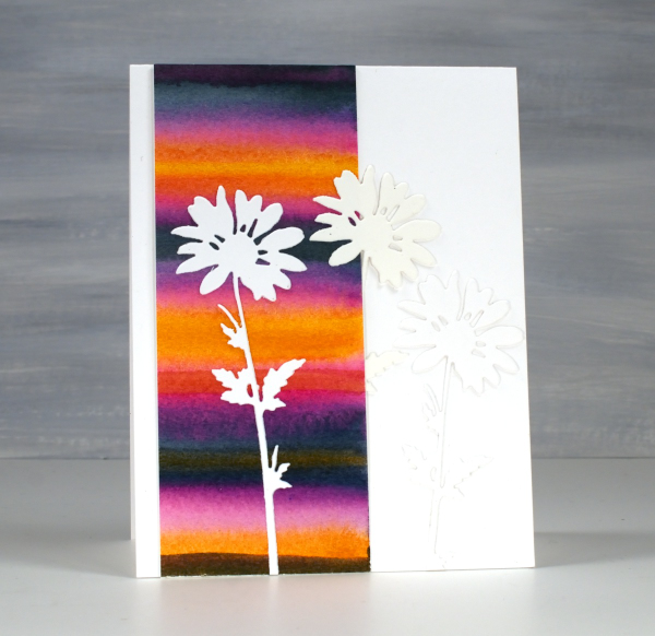
Back in February, I posted a pile of watercolour possibilities; you can see them here. The very bright strip on this card is one of the panels I painted during a watercolour technique class. I didn’t note down the exact paint colours but it would have been a limited palette of only 3 or 4. My guess is a yellow, a blue and a pink.
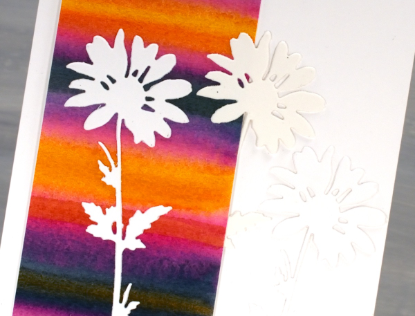
I used only half the painted panel on this card which means I can make another card or decorate the envelope. The background is so bright I liked crisp white daisies on top, it was a bit like putting together a summer outfit. The daisies were cut with Tim Holtz wildflowers dies and it looks like I cut 2 from white and one from cream cardstock. When I added the photos to this post I thought, ‘oh no! Did I add a cream daisy in?’ I pulled out the actual card and the daisies are indeed all white. Sadly the angle and lighting when I took the photo seems to be suggesting otherwise.
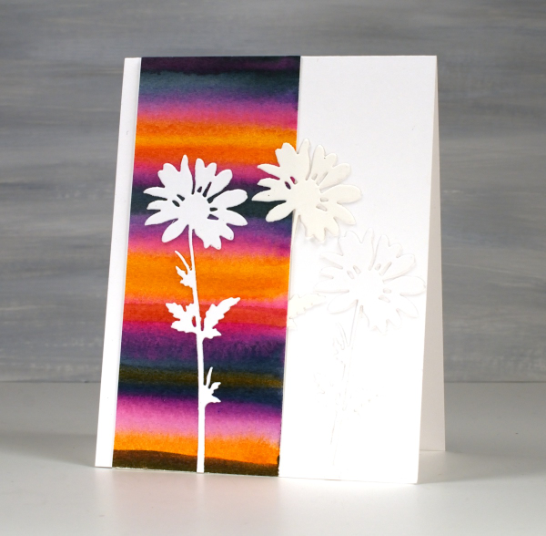
To just have one daisy was too stark so I added the other two to create a little more texture but no competing pattern or colour. I might put a sentiment on when I send it or I might not; we will see. Thank you for all your lovely messages about my Dad’s birthday and the card I made. The community of people who read my blog are so thoughtful; I always love hearing from you.
The 90th birthday card
Posted: May 14, 2025 Filed under: Hand painted, Heather lowercase die set, Pink Fresh studio, Watercolour | Tags: Fabriano Watercolour Paper, Hand painted, Pink Fresh studio 8 Comments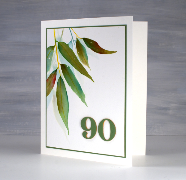
As some of my readers guessed when I was away recently I was visiting my family in Australia. One of the reasons to be there in April was my dad’s 90th birthday. Late March/early April ended up being a lovely time to be in NSW where the sun shone and the temperature hovered around the mid 20s! It was also a good time to be out of Ottawa where there were several ice storms and 15cm of snow more than once!
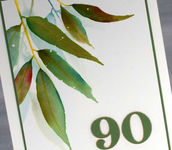
We celebrated Dad’s birthday with a lovely afternoon tea gathering attended by friends from recent years and years gone by, along with many family members including a brand new great grand daughter! We had an afternoon of food, fun and fellowship with songs, speeches, photos, a quiz and a slideshow. It really was a special occasion.
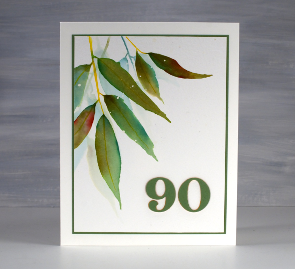
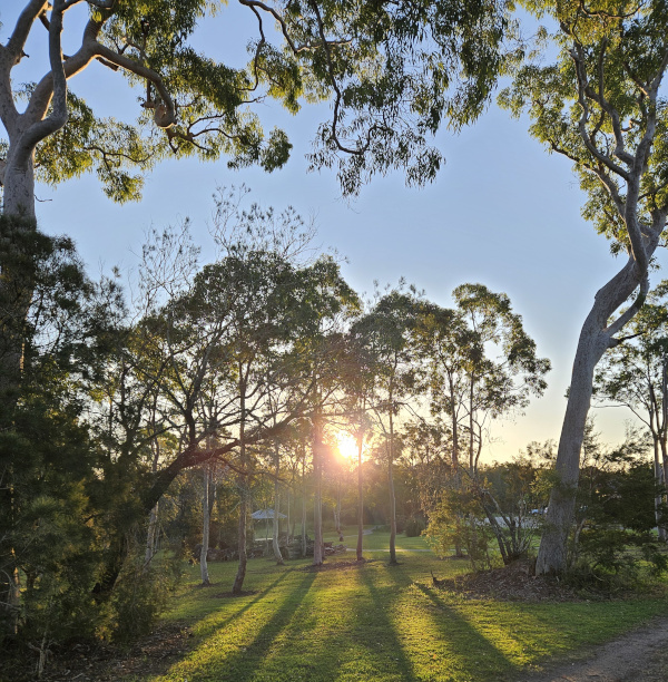
For his birthday card I painted some eucalyptus leaves (as I also did for the invitation) and added a die-cut 90 in co-ordinating colours. By the time I left to go home the sideboard in his living room was covered in cards and not a duplicate among them. How lovely to see so many of his friends and family celebrating with him or sending kind greetings for the occasion. And here’s another sunset photo taken close to Dad’s home.
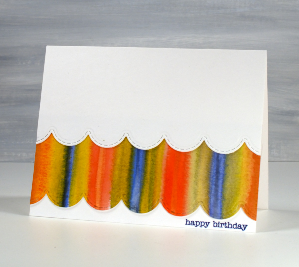
Strips & Stripes
Posted: March 5, 2025 Filed under: border collection, Hand painted | Tags: Hand painted, Penny Black creative dies, Penny Black stamps 1 Comment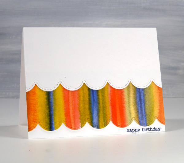
Amongst my recent watercolour panels there are quite a few with stripes. I was colour mixing and playing with wet into wet technique as I painted stripe over stripe to fill the panels.
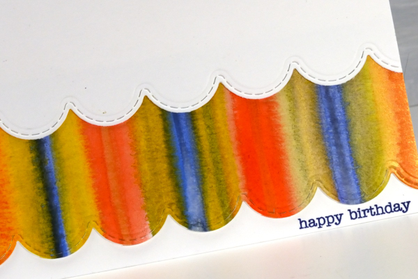
I could have die cut a scalloped strip to add on top of the card front but I liked the layered look which reminds be a bit of carnival tents so I added first the painted strip, then over the top a scalloped piece of white. The scallop die is from the Penny Black set, ‘border collection’ and the sentiment from the ever faithful PB ‘snippets’ set.
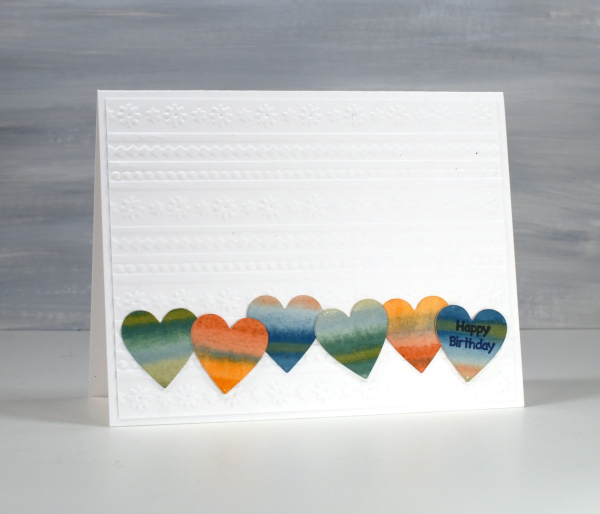
The heart themed card below is the same layout with a couple of variations. As you can see I still used a striped panel but die cut some hearts from it and lined them up to span the card front.
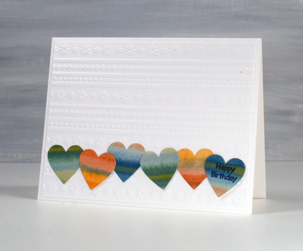
Although the hearts looked cute in a row, the white card front looked too plain so I added an embossed panel as the background to add texture and interest without adding more colour.
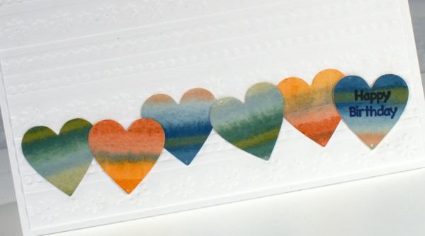
The little happy birthday is from Darkroom Door, once again I used a small sentiment; I do have a soft spot for tiny text.
These two are examples made for my upcoming in-person card design class which still has a few available spots in it.
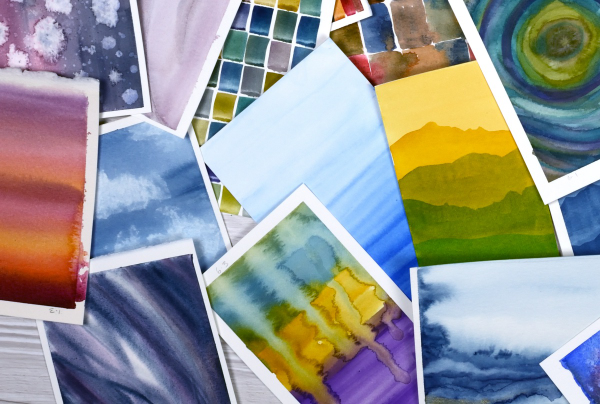
Pile of Watercolour Possibilities
Posted: February 27, 2025 Filed under: Classes, Hand painted, sennelier watercolours, Watercolour | Tags: Canson watercolour paper, Classes, Fabriano Watercolour Paper, Kuretake Gansai Tambi watercolour paints, sennelier watercolours 7 Comments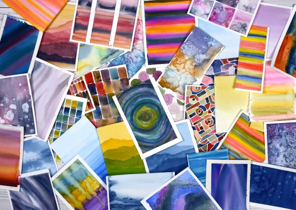
After teaching a couple of watercolour classes lately I have amassed quite the pile of panels. They are full of potential for card making. As well as painting separate panels I’ve also been creating abstract or background watercolours in a couple of art journals.
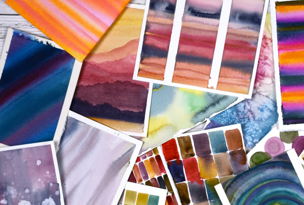
The purpose of the exercise has been two-fold. The main plan was to revisit a range of watercolour techniques in order to share them with others in classes. Additionally I chose to work small so we could complete quite a few practice pieces during class leaving us with ‘card sized’ panels to turn into cards later if we wished.
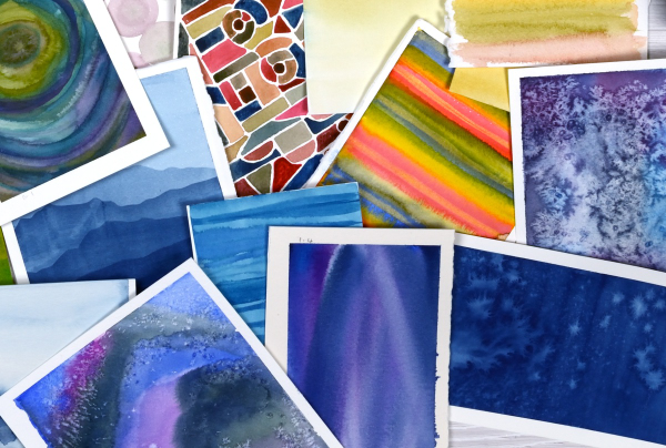
I have enjoyed the preparation and the classes so much that I have almost 100 panels on hand! My next in person class is going back to basics in regard to card making. I will cover assembly tips and tricks as well as design principles in order to create balanced and beautiful card layouts. It is exciting to have all these panels around just waiting to be transformed into cards.
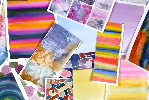
As you can imagine I also have piles of gel prints, alcohol ink panels, collages and patterned papers that could be turned into cards. It’s rather nice to have all these options…
Whimsy and Watercolour
Posted: February 24, 2025 Filed under: Classes, Hand drawn, Hand painted, sennelier watercolours, Watercolour | Tags: Classes, Fabriano Watercolour Paper, sennelier watercolours 3 Comments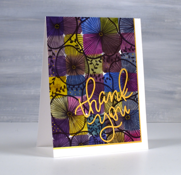
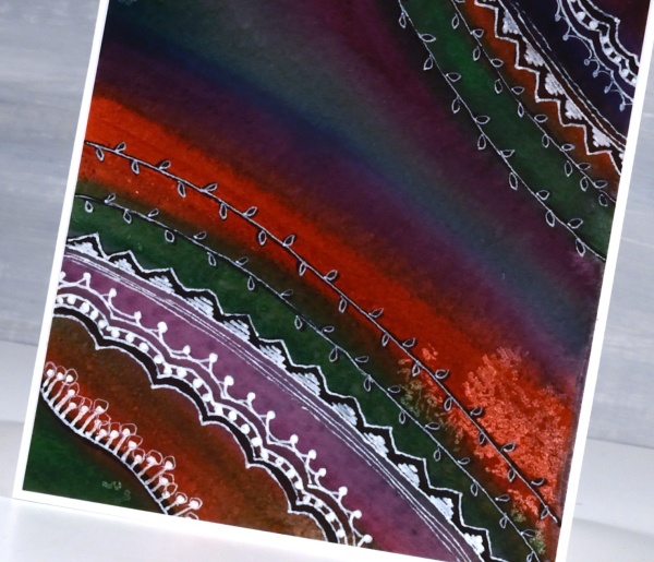
As I mentioned in January I have been playing with watercolour techniques then adding whimsical doodles over the top. Today’s card is another example. I switched the order in the title of the blog post because the whimsy has over powered the watercolour in this panel even though both elements are still obvious.
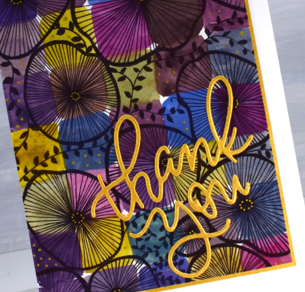
I used only three paint colours to paint the squares on the watercolour paper, some touching while wet, resulting in soft blends. All the colours you see were mixed from the same three paints – a blue, a pink and a mustard. The doodling was done with a black fine tip pen and a gold gel pen.
Even though the gold details from the gel pen are a minor part of the design they were the catalyst for choosing a gold mat and sentiment. In my upcoming in-person class I am teaching design principles and assembly techniques for card making and this thank you card is one of my examples. ( I wish I could remember who makes that pretty thank you die, but I’m not sure)
A New Handmade Book
Posted: February 7, 2025 Filed under: Finetec paints, Hand painted, Handmade book, sennelier watercolours | Tags: Fabriano art journal, Fabriano Watercolour Paper, Handmade book, sennelier watercolours 6 Comments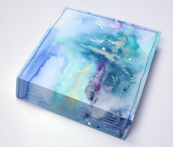
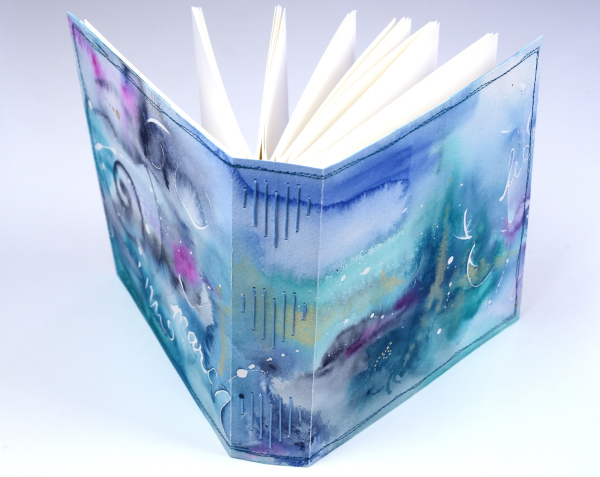
I’ve completed another challenge with Ali Manning in her Handmade Book Club. I have written before about Ali’s wonderful teaching. The most recent class was no exception. It was called ‘Valentine Palooza’ as a nod to the February timing and the cute heart binding on the spine of the book. The Handmade Book Club offers some free classes, some short challenges open to non-members (I have now done four of these) and a monthly or yearly membership ( something I would like to join at some point).
For this most recent challenge I chose to use cold pressed watercolour paper for the cover and hot pressed watercolour paper for the signatures. I watercoloured the cover in a loose abstract style over the top of some masking fluid words and squiggles. As I write this I realise I didn’t take any photos of the inside cover. Both the back and front covers fold over to make the cover more sturdy so my watercolour patterns continue inside.
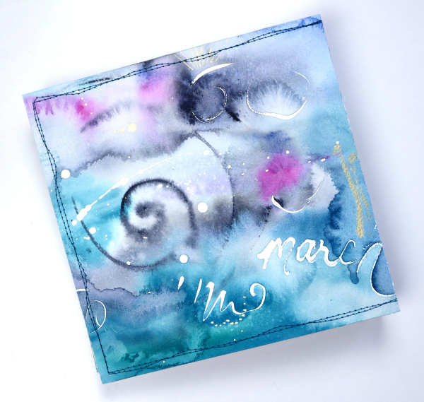
This cover was inspired by Tiffany Sharpe’s lovely stitched and watercoloured cover. I made my book 7″x7″ which was different to the rectangular examples in the workshop but all the steps are the same once you work out your dimensions. I have now made three 7×7 watercolour journals and like the page size for art journalling.
I’m playing with watercolour techniques a lot at present in preparation for my upcoming in person class on Watercolour Techniques. You will see some of the technique samples turned into cards eventually and some will be the base for future journal pages. You can see the other books I have made here: Mixed Media Journal, Coptic Journal, a second Coptic Journal, and Scrappy Journal.
Watercolour and Whimsy
Posted: January 17, 2025 Filed under: Hand drawn, Hand painted, Moda Scrap | Tags: Hand drawn, Hand painted, sennelier watercolours 6 Comments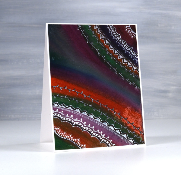
Last year I taught a class called watercolour and whimsy. The watercolour part focused on colour mixing and how to limit your palette and get cohesive results. The whimsy part included stenciling and doodling. The truth is we spent most of our time on the watercolour leaving little time for the whimsy.
I have gone back to my panels to finish the doodling details. Most were done on cold press watercolour paper with a mix of pan paints and tube paints. For each panel I chose several colours that would not necessarily look great together straight out of the pan/tube but with some mixing ending up looking like they were born to be together. This first one is a favourite. I love the way a deep green, a purple, an orangey red and a blue ended up looking so good together.
I did most of the doodling with a white gel pen with some black sharpie underneath here and there for more contrast. I have more cards to share made as part of the same class. The watercolour colour mixing part of the process is very relaxing and enjoyable. I haven’t added sentiments to either of these cards but I can add one before sending if I wish.

On the panel above and below, I painted again with a limited palette but touched each brush stroke to a previous stroke so that colours flowed into each other. The result was blends, watermarks and harder lines.
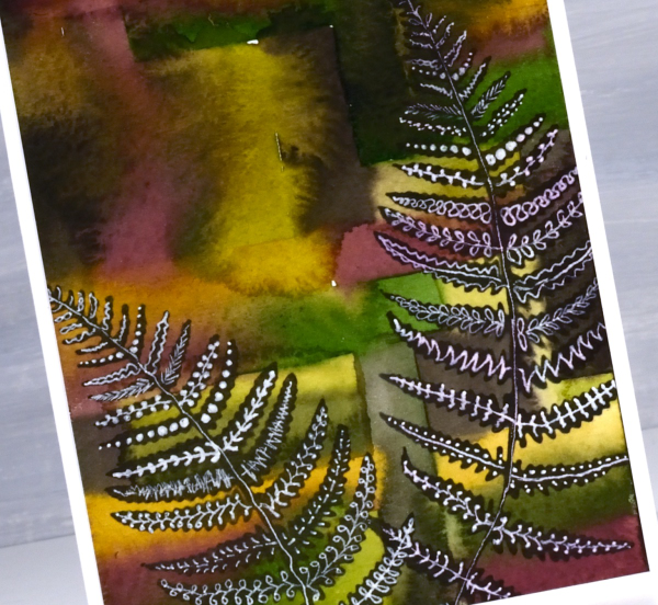
To add some whimsy I blended black ink through fern stencils. They are homemade stencils created die-cutting into grafix stencil film with dies from the Moda Scrap ‘fern die set‘.
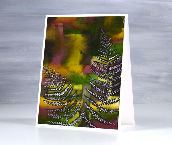
Once the black ink was dry I doodled different patterns on the fronds with white gel pens. This post includes affiliate links from Foiled Fox. If you buy through these links I receive a small commission at no extra cost to you.
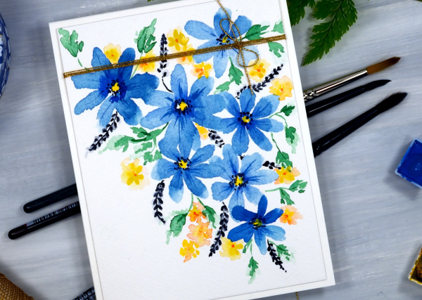
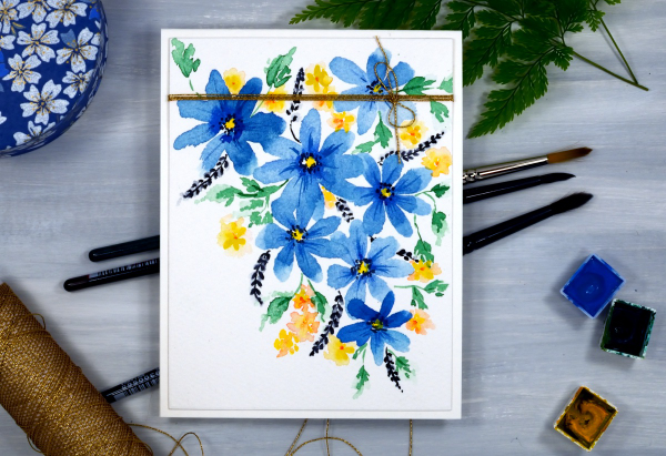
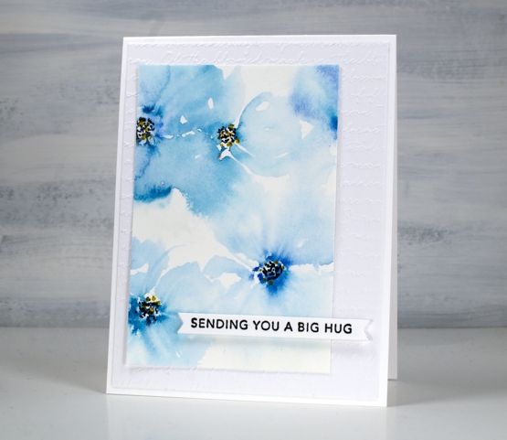
Blue Florals
Posted: May 12, 2022 Filed under: Hand painted, scripty, sennelier watercolours, Stampin Up, Taylored Expressions | Tags: Hand painted, sennelier watercolours, Staedtler watercolour brush pens, Stampin Up, Taylored Expressions 17 Comments
I spent a little while painting florals the other day. My watercolour paints were on my table so I painted two precut card panels with a few blues. I started the flowers on both cards by putting five little dabs of paint in a circle then blending them out with a wet paint brush. After blending I added dots to the centres with black and yellow markers.

Both the bold and the soft florals looked ok but the leaves I’d added didn’t work. I set the panels aside, happy that I had practised but not planning to use either pieces. When I came back to them a day or so later I did some extreme cropping which took out the leaves I didn’t like and left me with some nice blends and a configuration which had some balance.

Even if I had not cropped them and put them on cards the exercise was worthwhile. Even after years of making, practising and learning I still have the niggling feeling that everything I work on should ‘work out’! I know it is unrealistic and I am getting better at spending time practising and playing just to grow and enjoy.
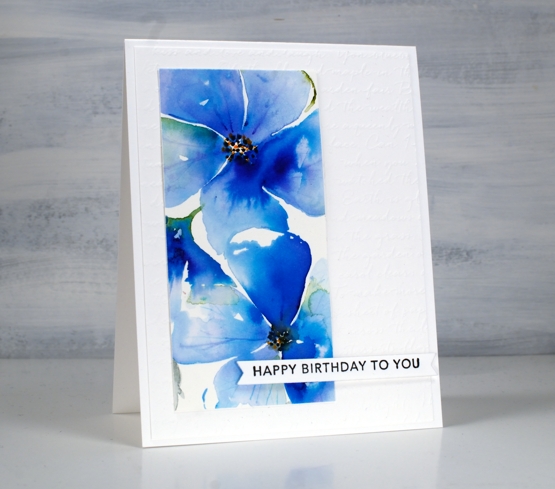
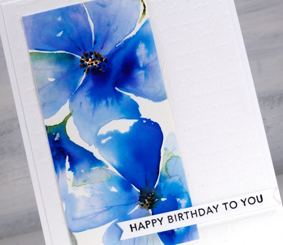
The pale blue ‘washy-er’ panel is my favourite but I love the colours in both. After cropping them I added them to an embossed panel (SU scripty) and popped up some Taylored Expressions sentiments over the top.
Supplies
(Compensated affiliate links used when possible)


