Powdered snowflakes
Posted: January 20, 2017 Filed under: All is Bright, Color Burst, Soft Grace | Tags: color burst, Penny Black stamps 19 CommentsThe keyword for the January challenge over at CAS watercolour is snowflake and there are a few days left to participate. I have very simple looking cards to share but they are not quite so simple to make. There is a bit of trial and error involved in order to avoid a colourful mess. To create these two little cards I used what I like to call the ‘water stamping technique’. I stamped with only water then lightly sprinkled colorburst powder over the water stamped image. I left it alone to dry then shook off any extra powder that hadn’t been activated by the water.

The problem comes when you have too little or too much water. Too little gives you an incomplete image, too much and you get a mess! I applied water to my stamp with a paint brush rather than a spritzer and stamped on watercolour paper. It’s a fun technique to try and won’t really deplete your supply of materials too much!
Supplies:
Stamps: All is bright, Soft Grace (PB)
Paint: Colorburst watercolor powder (Ken Oliver)
Cardstock: hot pressed watercolour paper
Love you still
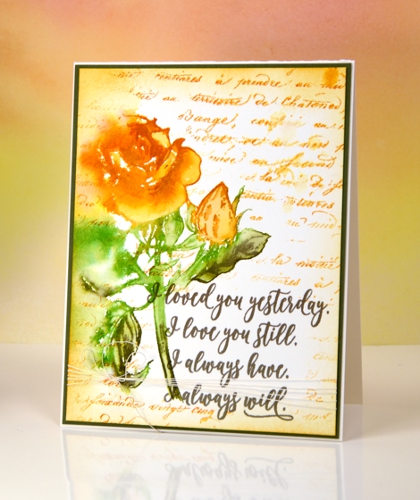
Posted: January 19, 2017 Filed under: Penny Black, Red blush | Tags: Penny Black stamps, Ranger Distress inks, Ranger Distress stains, Tsukineko Versafine inks 4 CommentsToday I am featuring another new stamp from the ‘Follow your Heart’ release, this rose stamp is called ‘red blush’ something I did not realise when I designed my yellow and orange card!
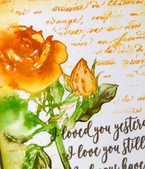
I used a stamp positioner for this card so I could create a watery image initially but still be able to add some definition over the top once the first stamping had dried. I began by spritzing water down the left hand side of the panel. I inked the rose with wild honey, peeled paint and forest moss distress stain then stamped it and let the colour blend into damp area of paper. Where the stamp had hit dry paper I used a paint brush to blend colour into the petals, stem and leaves. I let the panel dry before inking and stamping the right hand side of the rose again to add definition. I stamped the sentiment next in vintage sepia ink.
At this point in my creative process I decided to add script background around the rose and sentiment so I masked both with post-it notes and stamped the stamped in wild honey distress ink and lightly spritzed a couple of places. I also sponged wild honey distress ink around the edges then matted the panel in olive green and added some cotton thread wrapped around the bottom of the panel and secured with a bow.
Thank you for stopping by to see my ‘Follow your heart‘ projects. You might have noticed that my projects this week were not strictly Valentine cards more cards that could be given to loved ones any time. Do you make and give Valentine cards?
Supplies
Stamps: Red blush, Forever & Always , Script(PB)
Ink: forest moss, wild honey, peeled paint distress stains, wild honey distress ink (Ranger) versafine vintage sepia ink (Tsukineko)
Also: cotton thread
Paper: hotpressed 100% cotton watercolour paper, olive green cardstock
Be Mine
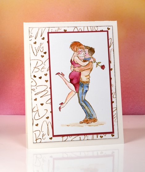
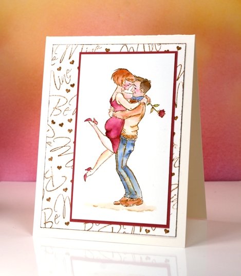
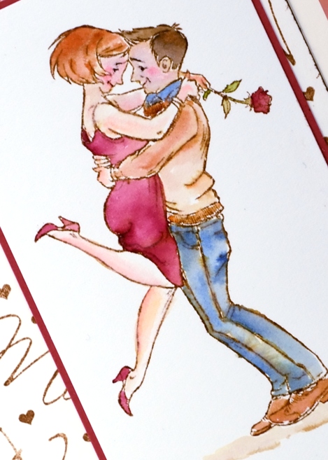
Posted: January 17, 2017 Filed under: a rose, Peerless watercolours, with affection | Tags: Peerless Transparent Watercolors, Penny Black stamps, Ranger Distress inks 4 CommentsThis cute little couple is a new stamp from Penny Black called ‘the rose’. I stamped it in vintage photo distress ink then watercoloured it with peerless watercolour paints. I like the muted look of the vintage photo ink combined with the paint from the peerless palette.
I kept the design pretty simple by adding only ground under their feet but no extra background images or colour. Instead I made my own patterned panel by stamping the ‘be mine’ sentiment along with a tiny heart repeatedly in vintage photo ink. The tiny heart is cut from a row of five included in the ‘from the heart’ set. It was ideal for filling in little gaps around the words.
Pop over to my youtube channel to see how I set up my peerless palette.
Supplies:
Die: A Rose, With Affection, From the Heart
Paints: Peerless watercolors
Cardstock: hot pressed watercolour paper, neenah natural white, red cardstock
Ink: vintage photo distress ink
Forest – Casology 231
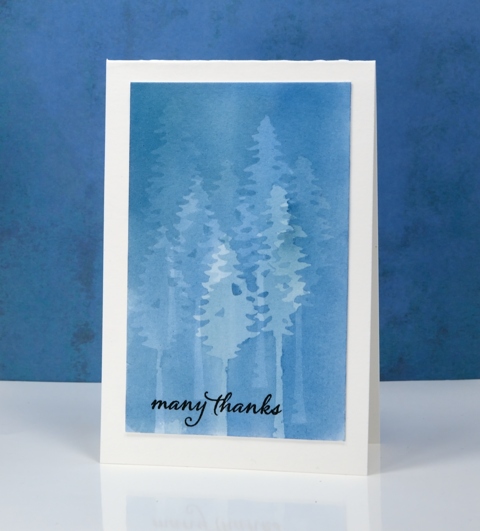
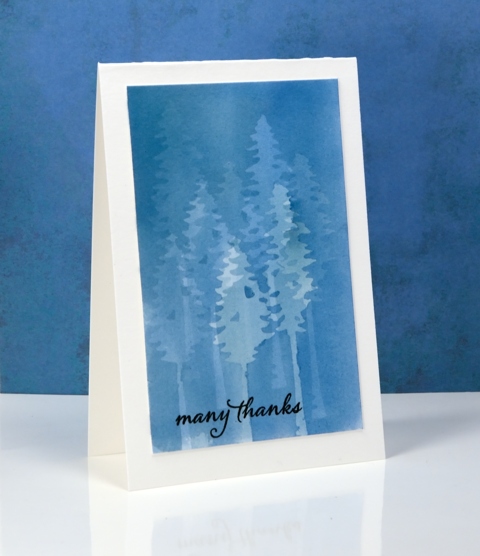
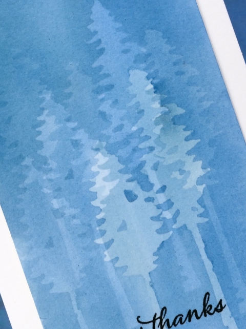
Posted: January 11, 2017 Filed under: tall trees | Tags: Penny Black creative dies, Penny Black stamps 29 CommentsMy subtle forest is an experiment in masking. I painted the panel a month back and it was sitting in the pile of possibilities. When I saw what the Casology challenge theme was this week I thought of this panel straight away. To paint this misty forest I use the PB ‘tall trees’ dies to cut masks from frisket film. Frisket film is a removable plastic film used for masking when painting and drawing. I positioned the two tree masks then painted a pale blue wash over the trees, let it dry then repositioned the masks. I repeated this process numerous times to create my forest. With each wash the panel became a darker shade of blue and the previously masked trees received some colour also. Having two different tree dies added a little bit of shape and height variety.
I’m sorry once again that I can’t remember which paint I used. I don’t think it matters too much; I would use any of my watercolour mediums and keep it fairly diluted so I could keep adding layers. I was careful to let it dry thoroughly between each addition of paint so there would be no blurry edges. I also pressed the frisket masks down very carefully so the paint wouldn’t creep under the edges. I finished the card simply by adding a black sentiment and a natural coloured card base.
It’s an interesting technique which I haven’t finished playing with…
My blue forest works for the City Crafter challenge this week too.
Supplies
Stamps: Happy Snippets (PB)
Dies: Tall Trees (PB)
Ink: Versafine onyx black ink (Tsukineko)
Paper: hot pressed watercolour paper
Paint: watercolour paint of some kind??
Also: grafix frisket film extra tac
Magnolia
Posted: January 7, 2017 Filed under: The Unfolding | Tags: Penny Black stamps, Tsukineko Memento inks 20 CommentsI thought I’d share a spring bloom even though it will be a long time before we see any around here. We are experiencing serious winter weather right now; we’ve got plenty of snow, plenty of ice and plenty of cold! I’m sure I will be creating more wintry scenes in the weeks ahead because although cold outside, it is also beautiful.
To create this watercoloured magnolia I inked the ‘unfolding’ stamp with memento markers, spritzed the stamp and stamped on cold pressed watercolour paper. I used a brush to blend colour within the petals and stems and to splatter some ink over the stamped image. Creating such a loose print meant that the sepals on the stamp were lost so I drew them on after the stamping dried.

Supplies:
Stamps: The Unfolding (PB)
Inks: potter’s clay, espresso truffle, cantaloupe, rose bud memento inks (Tsukineko)
Cardstock: Fabriano 100% cotton cold pressed watercolour paper, coordinating cardstock for mats
New Year Landscape
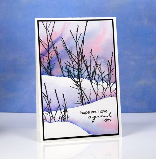
Posted: December 31, 2016 Filed under: Skyward, Stamped Landscapes | Tags: Peerless Transparent Watercolors, Penny Black stamps, Tsukineko Versafine inks 15 CommentsThe scene on today’s card is not unlike what I see around Ottawa. Sometimes the sky is bright blue; it usually means the temperature is very cold. The landscape is covered in white but the trees tend to be a mix of black, grey and sometimes brown, the deciduous ones that is. I splattered masking fluid over a piece of watercolour paper to create the look of falling snow; if the sky had been darker it could have looked like either snow or stars. I then used Peerless watercolours to add colour. I began by painting a line of water across my panel; that line became the edge of the background snowbank. I picked up grey paint and added it to the water then brown so the colours spread and feathered. I added more water above the grey and brown then started painting blue from the top of the panel slowly pulling it down and diluting it with water. I didn’t want the blue to mix with the grey and brown so I kept the edge of both colours diluted with water and tipped my panel towards the top so colour would move upward not down.
I positioned a mask lowered down the panel then stamped the bare branches in versafine onyx black. Once the ink was dry I removed the mask and painted colour behind the stamping extending to the right hand edge to look like another snow bank. To finish I removed the masking fluid, added a sentiment, matted the panel and attached it to a card base.
I wish you all a happy new year and look forward to sharing with you here in 2017. Thank you so much for dropping in to see what I’ve been creating.
Supplies
Stamps: Skyward, Holiday Snippets (PB)
Ink: Versafine onyx black ink (Tsukineko)
Paper: hot pressed watercolour paper, brown cardstock
Paint: cobalt blue, neutral tint, mahogany brown (Peerless watercolours)
Batik style background
Posted: December 29, 2016 Filed under: heart string, Peacock Feather | Tags: Brusho, Penny Black creative dies, Penny Black stamps, WOW embossing powders 4 Comments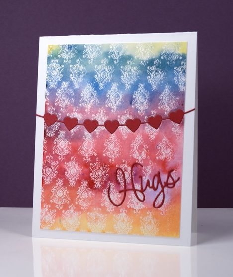
The emboss resist method creates pretty backgrounds especially when painted in a rainbow of colour. I used three primary colours overlapping them to end up with the yellow, orange, red, purple, blue and green. I stamped the peacock feather pattern in versamark and embossed in clear powder on watercolour paper and the slight texture of the watercolour paper combined with the very fine detail of the stamp meant that I did not get a perfect impression. Once I added the colour over the top I noticed that it looks very much like a batik fabric print.
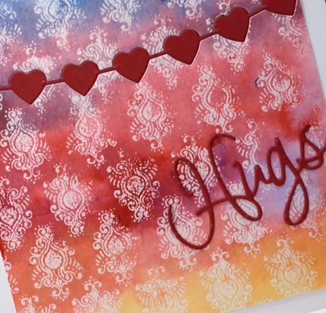
I trimmed the panel then used the heart string die to cut the piece in two. With the same die I cut a string of red hearts then attached the panel to a card base inlaying the red hearts but attaching the die cut word on top of the panel.
Supplies
Stamps: Peacock Feather (PB)
Dies: heart string, love expression (PB)
Ink: versamark (Tsukineko)
Paint: yellow, prussian blue, crimson brusho (Colourcraft)
Paper: hotpressed 100% cotton watercolour paper, red cardstock, Neenah solar white cardstock
Also: WOW clear embossing powder
The Yellow House
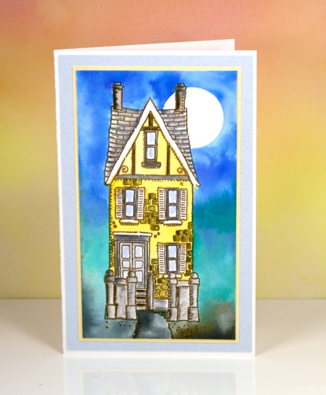
Posted: December 28, 2016 Filed under: Brusho, Victorian home | Tags: Brusho, Faber-Castell Albrecht Durer Watercolour pencils, Penny Black stamps, Tsukineko Versafine inks 3 CommentsI painted the yellow house a while ago using brusho watercolour powders for both the background and the house. In the background I let the brusho do what it does so well, blend from colour to colour. The house I was more finicky about. I stamped the house in vintage sepia versafine ink, a pigment ink that would not bleed when I started adding watercolour paints over it. I used a small paintbrush and brusho in a palette to paint the house in yellow and grey. After it dried I used watercolour pencils to add shading to columns, steps, roof tiles and bricks. I let that dry before adding a circle mask in the top right corner to create the moon in the blended blue sky. By dampening the paper before adding colour I was able to blend softly from blue to green to grey.
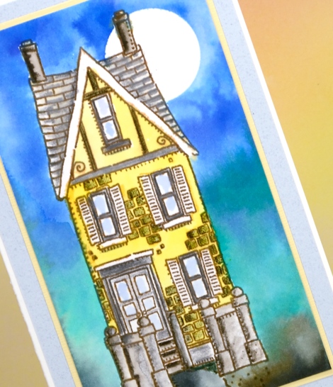
I matted in yellow and grey just like I might if framing a painting . The stamp is long and thin so the card is too. When I was making this panel a friend of mine was making one too. She didn’t end up with such a tall thin card because she added a car beside the house which looked very cute!
Supplies:
Stamps: Victorian Home (PB)
Ink: vintage sepia versafine ink (Tsukineko)
Paper: 100% cotton hot pressed watercolour paper, co-ordinating cardstock for mats
Paint: brusho ultramarine, lemon, emerald green, black (Colourcraft)
Pencils: sepia, pine green, cold greyIV Albrecht Durer watercolour pencils (Faber Castell)


