
Alexandra Renke Poppies
Posted: January 28, 2019 Filed under: poppy flower dies, poppy flower stamps | Tags: Alexandra Renke, Penny Black stamps 4 Comments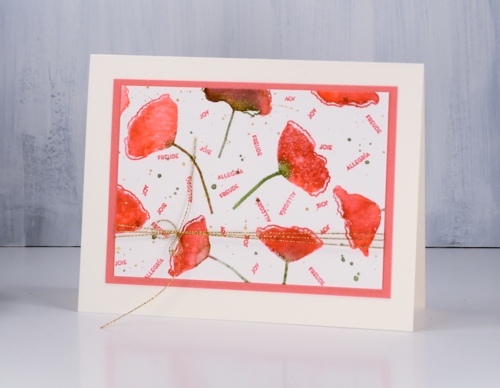
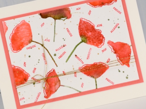
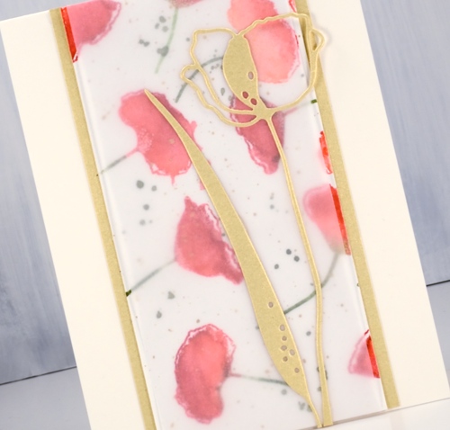
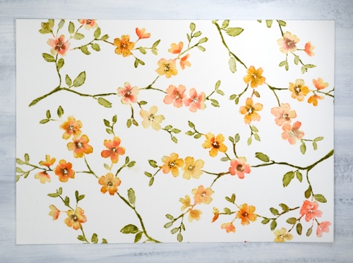
After making a gift set of cards with the ‘blissbloss’ stamp I was inspired follow the same process with another stamp set. This time I used Alexandra Renke’s pretty poppy stamp set and her poppy dies. I used Catherine Pooler inks for the watercolour effect on the poppies and for the tiny sentiments.
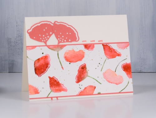
I started with a 10″x7″ panel of hot pressed watercolour paper. There are five poppy stamps in the set so I positioned them randomly over the panel while in the stamp positioner. I inked the petals first in samba ink then dabbed some rockin’ red ink on the sides or edges but not covering the whole flower. I spritzed then stamped. I wiped off the stamps then inked the stems in eucalyptus ink and stamped again. I moved the panel and repeated the process to fill the panel with poppies. In order to get even spacing I had to clean and reposition the stamps a couple of times but eventually I had the panel covered. At this point I changed my mind and crowded in a few more flowers in a couple of areas using the CP bellini ink along with CP samba to make paler poppies. I added some eucalyptus ink splatter and some gold splatter using one of the gansai tambi gold paints then called it complete.
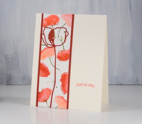
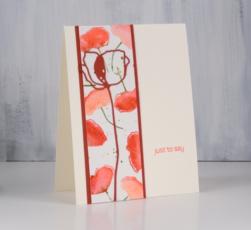
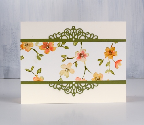
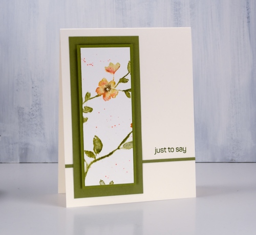
To create the cards I cut some panels to 5 ½” so they would stretch the length or height of the card and used co-ordinating cardstock to frame and mat the panels. I also cut several poppies using the Alexandra Renke poppy flower dies in light peach, dark peach and light gold cardstock. I don’t have a formula for creating five cards from the panel; basically I played with ideas until they looked ok!
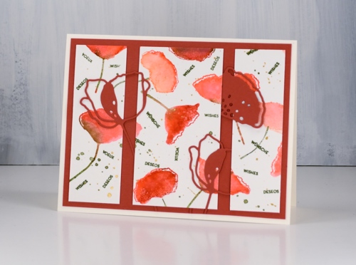
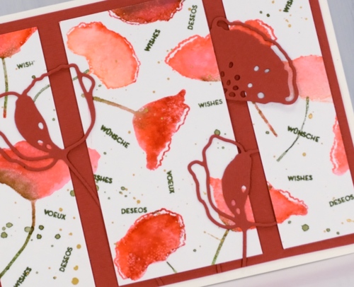
The poppy stamp set has the same seven sentiments in English, French, German and Spanish so I stamped sentiments on a few of the panels using the same word in four languages to fill spaces between the poppies. On one card I needed a larger sentiment so I used a Penny Black stamp from the ‘happy snippets’ set.
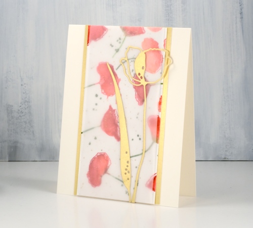
I used light weight vellum over one of the watercolour panels to soften the colours and make the die cuts stand out.
I’m hoping to sell cards at a market in the not too distant future so having a few gift sets might be a good idea.
Supplies
Stamps: poppy flower set (Alexandra Renke)


Dies: poppy flower dies (Alexandra Renke)

Cardstock: hot pressed watercolour, Neenah cream, light weight vellum, light gold, dark peach, light peach


Inks: samba, rockin’ red, bellini, eucalyptus (Catherine Pooler)


Paint: gansai tambi starry colours

Also: stamp positioner, diamond glaze, gold cord


Blissful blossoms
Posted: January 18, 2019 Filed under: blissful blossoms, royal swirl | Tags: Penny Black creative dies, Penny Black stamps, Ranger Distress inks 14 Comments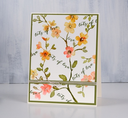
It is hard to believe I haven’t inked this pretty stamp before now. I made up for it by repeat stamping on a large panel to make into a set of cards. I put the 10″x 7″ hot pressed watercolour panel in my stamp positioning tool and ended up stamping PB ‘blissful blossoms’ four times.
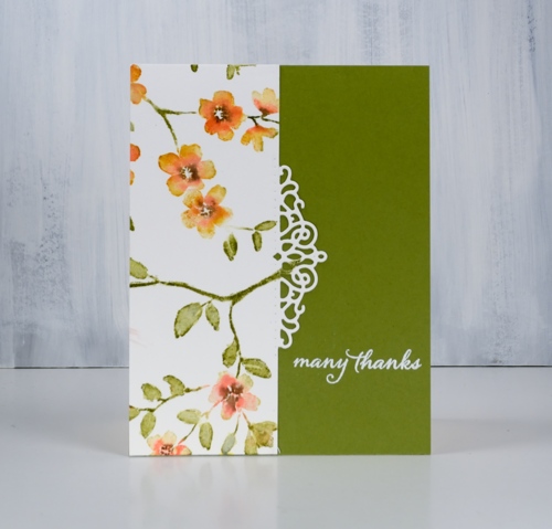
Each time I stamped I followed the same order. First I inked the whole stamp in scattered straw distress ink and dabbed some wild honey and abandoned coral ink here and there on the flowers, spritzed it with water. After stamping I cleaned the stamp, then inked all the stems and leaves in peeled paint ink, spritzed and stamped again. I kept partially inking with markers, spritzing and stamping until the flowers were well coloured. Before moving the panel and stamp to do another print I blended over the stamping with a paint brush and water.
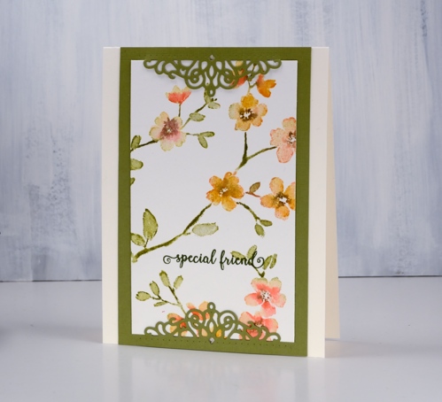
I repeated the process three more times to fill the panel. I was able to orient the stamp so the stems and flowers filled the space and looked like one big patterned panel.
Once the panel was done I had to decide how to divide it for different designs. I could have done four of the same card but no, I wanted to come up with a few options. I pulled out a pretty PB die, a PB sentiment set and some green cardstock to create a set of five cards.
The decorative die does not cut right across, it cuts out the scroll work but scores either side for folding. On several of the cards I cut on the score line for a border instead of a fold.
By double matting and popping up the panel even the last scrap became a card. All the sentiments are from the handy dandy ‘happy snippets’ set.
Supplies
Stamps: blissful blossoms, happy snippets (PB)


Dies: pop on a fold -royal swirl (PB)

Inks: scattered straw, dried marigold, abandoned coral, peeled paint, versamark, shady line versafine clair


Markers: peeled paint, dried marigold, abandoned coral, ground espresso

Cardstock: hot pressed watercolour, neenah cream, olive green

Also: Stamp positioner, white embossing powder, linen twine

Snow forest
Posted: January 4, 2019 Filed under: A Pocket Full, snow forest | Tags: Catherine Pooler inks, Penny Black creative dies, Penny Black stamps 6 Comments
Snowy scenes and thank you cards will keep on popping up on the blog. This one made with the PB stamp, ‘snow forest’, was very simple to make. I put the stamp in the stamp positioner then inked part of it in Catherine Poolers ‘icing on the cake’ ink, stamped then randomly inked in ‘over coffee’, stamped and finally the same with ‘eucalyptus’ ink. With the whole image stamped I blended the larger distinct tree trunks with water to get the watercolour effect.
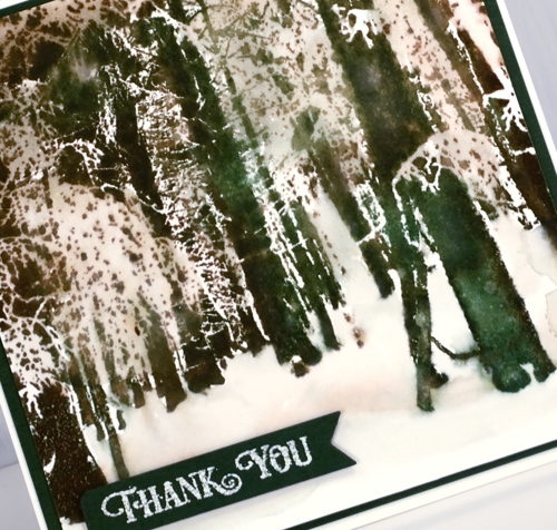
I ended up painting over some areas, not all, with water also which softened the contrasts but still left light and dark areas. I pressed the three inks onto my glass mat so I could pick up ink to paint the snowy forest floor.

To complete the card I matted in dark green cardstock and die cut a banner for the sentiment. I embossed the sentiment with weathered white powder which gives an antique, and I think, snowy effect.
Supplies
Stamps: snow forest, banner sentiments


Dies: a pocketfull

Inks: eucalyptus, icing on the cake, over coffee (Catherine Pooler), versamark


Paper: hot pressed watercolour, green cardstock
Also: MISTI, weathered white embossing powder, glass mat


Home through the birches
Posted: January 2, 2019 Filed under: birches, Spread Cheer | Tags: Penny Black stamps, Ranger Distress stains, Tsukineko Versafine inks 11 Comments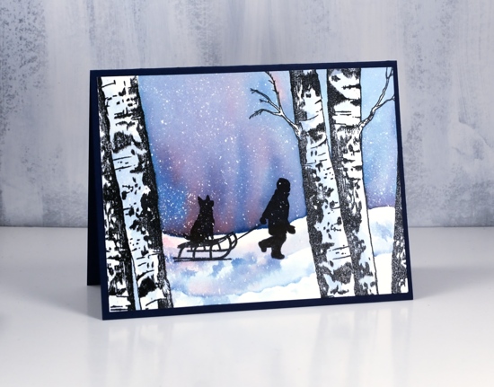
I really enjoy creating winter scenes and today’s card features stamps that lend themselves very well to scenic stamping. I used the PB ‘birches’ stamp and the boy from an older PB set, ‘spread cheer’. I began by embossing the large birch stamps on either side of a panel of hot pressed watercolour paper in versafine clair nocturne ink and clear powder. Next I splattered masking fluid over the panel to later look like snow.
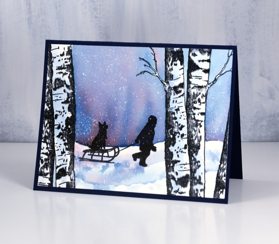
I painted water across the panel from left to right skipping the tree trunks, added distress stains, faded jeans and barn door, then blended the colours to create a winter sky. I painted some diluted blue stain on the tree trunks for a bit of shadow then let everything dry. I stamped the boy and his dog in nocturne inks several times to get a very solid black image over the embossing and stain that was already on the panel. After the black ink dried I painted some shadow with the same stains used for the sky.
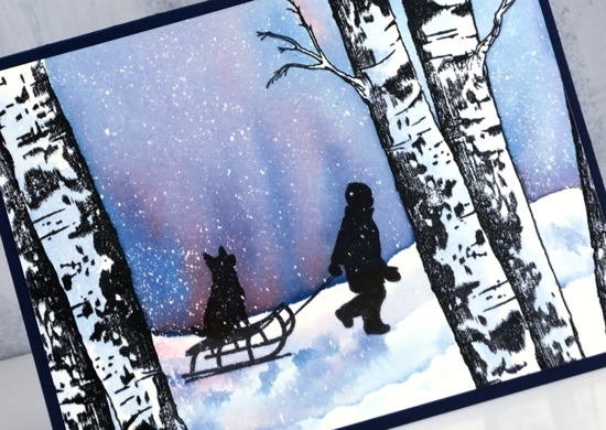
Once all the ink was dry I removed the masking fluid to reveal all the little dots of snow. I trimmed the panel to fit on a navy card base (although it looks black in the photos) and will add a white insert for writing my message inside.
Supplies
Stamps: birches, spread cheer (all PB)


Inks: nocturne versafine clair,

Stains: faded jeans, barn door


Paper: hot pressed watercolour paper, navy cardstock
Also: embossing powder, masking fluid, MISTI
![]()

Tweet wreath
Posted: December 31, 2018 Filed under: tweet wreath | Tags: Catherine Pooler inks, Penny Black creative dies, Penny Black stamps, WOW embossing powders 15 Comments
Appropriately my final card for the year is a thank you card. Thank you readers for dropping in here so regularly. Thank you for leaving me encouragement in the comments or by contacting me privately. Thank you to those who used my affiliate links to the Foiled Fox online store. Thank you to those who recommended my blog to a friend. Thank you to everyone who clicked over to the classes page and signed up for one of my classes in Ottawa or Toronto; creating with you is such a treat. I have made wonderful friends through classes and through this blog.
I will be making thank you card for a few weeks yet. Donations have continued to come in for the Dressember campaign against modern day slavery and my fundraising page stays active until the end of January. I am less than $300 away from my goal!

I used Catherine Pooler inks on the ‘tweet wreath’ from Penny Black. In the stamp positioner I dabbed a green ink on the wreath, spritzed it lightly with water, stamped then dabbed a different green in random places and repeated until the wreath was all green. I dried the watercolour panel and cleaned the stamp before inking the outline leaves and berries with a versamark pen. I stamped again and embossed the versamarked lines with gold embossing powder.

I pressed the CP inks onto my glass mat so I could pick up colour with a paint brush to paint inside the outline leaves and berries. The berries are CP peppermint scrub ink. To finish off the card I added double sided adhesive sheet to the back of some shimmery red cardstock then cut out the PB ‘so many thanks’ die. The large four word die looked too much inside the wreath so I trimmed off the lower half and just used two words. To add some shimmer to the berries I coloured over them with clear wink of stella pen. I matted the panel with the same shimmery red cardstock and, because it needed a little something, I added a gold cord bow.
Happy New Year!
Supplies
Stamps: tweet wreath

Dies:

Inks: eucalyptus, green tea, spruce, peppermint scrub inks (Catherine Pooler), versamarker


Paper: hot pressed watercolour, shimmer red
Also: MISTI, metallic gold rich embossing powder, clear wink of stella pen, glass mat, stick-it adhesive

![]()

Christmas red or white
Posted: December 28, 2018 Filed under: Christmas red | Tags: Penny Black stamps, Ranger Distress inks, Ranger Distress stains 13 Comments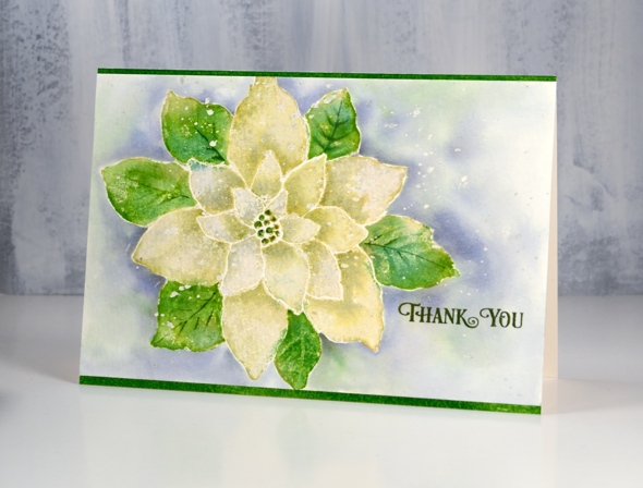
Ever since I received this stamp way back when the weather was warm, I wanted to try it as a ‘white poinsettia’ rather than the traditional red. The first card I made with it was red and when I used it in my Christmas class we stamped it red but now as a Christmas thank you I’ve made it white, or to be precise a yellowish, greenish white! I am sharing it over on the Foiled Fox blog today also. Make sure you pop over there to see enjoy all the beautiful wintry cards they have shared lately. Scroll back to see three gorgeous poinsettia cards made by Shauna Todd posted during December.
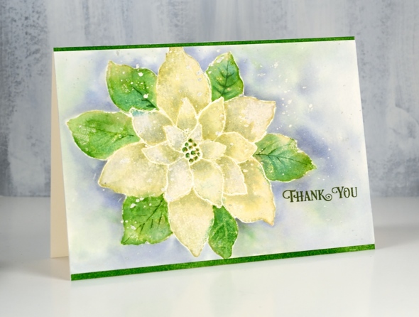
To create my ‘white’ poinsettia I stamped the whole ‘Christmas Red’ stamp from Penny Black in shabby shutters distress ink on hot pressed watercolour paper (which I had splattered with masking fluid earlier). With the stamp in the MISTI I inked the outer leaves with mowed lawn distress ink and stamped again. Shabby shutters ink is a pale green to start with so when I diluted it by blending with water I was able to make it a little paler. I blended one petal at a time and dabbed it with a paper towel while it was wet to remove more colour. Before the petals dried I picked up some extra shabby shutters ink off my glass mat and added some shadow where the petals were overlapped by another. I blended the leaves with water also and when they were dry added some definition with a fine brush and mowed lawn ink. I stamped the centre with mowed lawn ink and added some gold with a wink of stella pen.
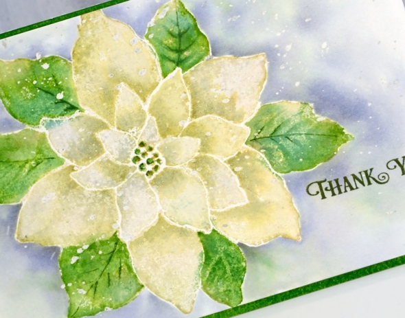
Once the flower was dry I painted around the edges with water then dropped in weathered wood distress stain and blended it to surround the whole image. I also dropped in some green ink here and there while the background painting was wet. When everything dried I removed the masking fluid and added clear wink of stella to all the petals to give them some shimmer. I stamped the ‘thank you’ from the PB ‘banner sentiments’ set in versafine clair shady lane ink. I am very happy to be making thank you cards as I have close to thirty donors to thank so far in my Dressember campaign raising money for the fight against human trafficking.
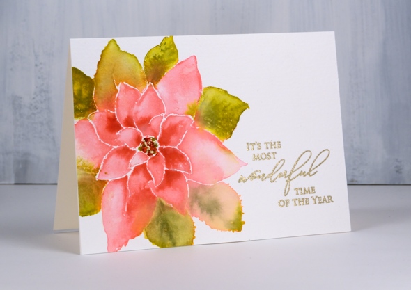
I am adding my pink and green poinsettia to the post just for interest and comparison. I used a similar process to the one described above but kept the background white as a base from some gold embossing. Thank you for dropping in today.
Supplies
Stamps: Christmas Red, banner sentiments (PB)

Inks: shabby shutters ,mowed lawn distress inks, versafine clair shady lane ink


Stain: weathered wood distress stain

Paper: hot pressed watercolour paper, neenah natural white
Also: gold wink of stella, clear wink of stella, masking fluid

![]()
Tools: MISTI, glass mat
Simple and Elegant
Posted: December 21, 2018 Filed under: lighting the way, three kings | Tags: Alexandra Renke cardstock, Penny Black stamps, WOW embossing powders 8 Comments
At this time of year any Christmas card making I’m doing has to be pretty simple and straightforward. But that doesn’t mean it can’t still be elegant or eye catching. I paired metallic embossing with richly coloured papers for these three nativity cards.
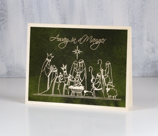
These papers from Alexandra Renke are solid colour but with the variation of a watercolour wash. They have enough interest to look like a sky but not fight with the detail of the picture stamps from Penny Black.

I always have a bit of a task matching a gold cardstock with gold embossing powder. On the top card the gold embossing powder on the dark red appeared to be an ‘old gold’ so I matted with a dark gold. On the last card I used a light gold card with the same embossing powder. The middle card features platinum embossing and a platinum mat around the deep green paper.
I hope you are further along than I with your Christmas card sending but as I say most years, December 25 is the first day of Christmas, there are twelve in total so I still have time to get my cards sent!
Supplies
Stamps: lighting the way, peaceful season, three kings (PB)


Paper: Alexandra Renke dark green, red and scarlet papers


Cardstock: neenah natural white, platinum shimmer, gold shimmer, pale gold shimmer
![]()
Ink: versamark ink
Embossing powder: gold metallic rich, platinum

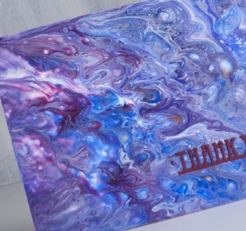
Paint pouring or string painting?
Posted: December 18, 2018 Filed under: paint pouring | Tags: paint pouring, Penny Black creative dies, Penny Black stamps, Yupo Paper 9 Comments
I have seen a little bit of chat in comments about my recent paint pouring panels. Are they what we know as paint pouring or are they string painting? I am a newbie at this so I’m not the best one to ask. I do have one more string painting panel for you today along with what is known as a ‘dirty pour’. I thought both turned out rather nice and this is just adding to my desire to try all these methods again plus a few more techniques I have found on the interwebs.
The string paint pouring panel above was completed with just the two colours, a base of deep pink paint on a yupo panel then a piece of string dipped in white paint, laid in twists and turns on the wet panel then carefully dragged off leaving a trail of paint behind it.
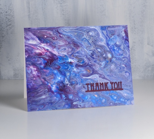
This second panel is a ‘dirty pour’ created when several colours are poured into a cup together, cup is turned upside down onto the yupo panel then lifted to let the paint escape in all directions. A little tilting this way and that can change the size and shape of the pattern but really I didn’t do much; the magic just happened. I also didn’t do much to turn the panels into cards, a tiny sentiment stamped in monarch versafine clair ink on the top card and a stacked die-cut sentiment on the second card.
I know I keep mentioning this but I would like to thank my card making, blog reading friends for supporting me in the Dressember campaign this year. I am wearing a dress every day this month and my fundraising total is steadily moving towards the $1800 goal I have set for myself. Readers of this blog have blown me away with their involvement. The money raised world wide will be given in grants to organizations doing amazing work in the locating, rescuing and empowering of human trafficking victims. If you would like to give to this life changing work visit my campaign page here. If you would like to check and see the daily dresses, I’m posting them on Pinterest and Instagram. I’m sending out cards to all my donors so one of today’s cards could be yours!!
Supplies
Paper: heavy weight yupo (legion), neenah solar white cardstock, purple cardstock


Stamp: snippets (PB)

Die: deco frame (PB)

Also: stick it adhesive sheets (for the little die-cut)
More skies & dies
Posted: December 6, 2018 Filed under: berry flourish, Brusho, deer in tree, holly flourish, winter berry branch | Tags: Brusho, Penny Black creative dies, Penny Black stamps 4 Comments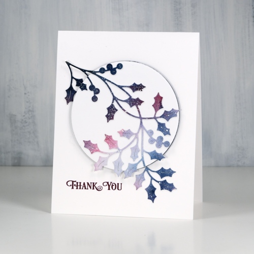
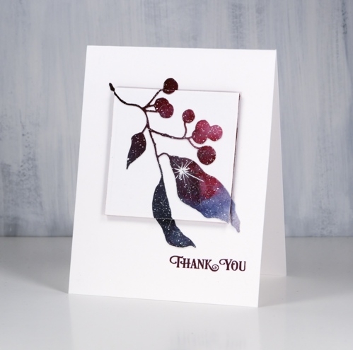
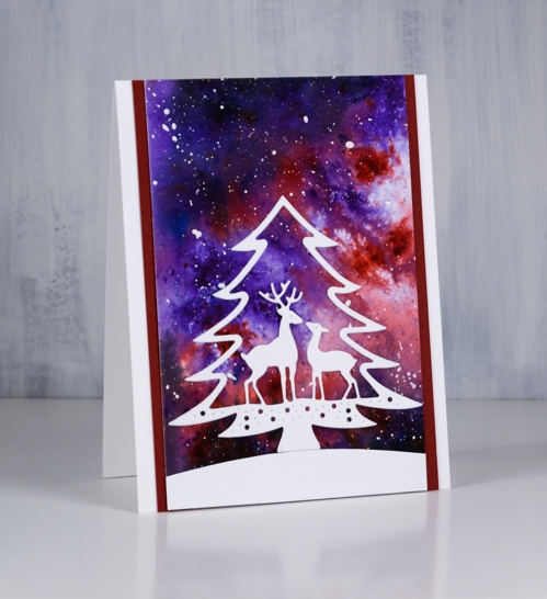
I have a few more simple Christmassy cards to share; these ones are kind of the opposite to the ones in the previous post. I had a large watercolour galaxy panel with white splatter (aka ‘stars’) all over it. I die cut three branches from the panel to pop up on three white card bases.
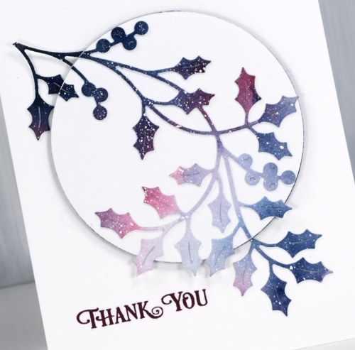
I realise now it would have been a good idea to take a photo of the panel before I cut it up. It was a panel I painted with brusho a while ago, a mix of blues and pinks, light in the centre and dark around the edges with white paint splattered over the whole thing. The holly is a PB die called ‘holly flourish’, the mistletoe is ‘berry flourish’.
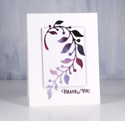
After I had die cut all three branches I chose a shape die a little smaller than each of the branches so some foliage would hang over the edge. I die cut a shape from neenah solar white cardstock and from coloured adhesive backed foam. The foam pieces that pop up the white panels are either burgandy or navy to co-ordinate with the paint colours.
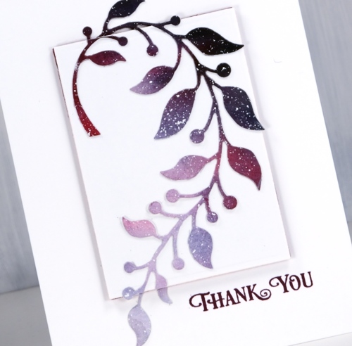
To assemble the cards I first glued the die cut to the white cardstock shape then snipped off and saved any bits hanging over the edge. Next I adhered the white panel to the foam and then all to the white card base. Once the popped up panel was in place I stuck the snipped off bits directly onto the card base lining them up with the rest of the die-cut.
I made all these cards into thank yous. I’m hoping to need many as I am once again participating in Dressember, and will be sending hand made cards to all who donate to the campaign. If you are new to my blog you might not know that I have twice before taken on the challenge of wearing a dress every day in December as part of a worldwide campaign to raise funds for and awareness about the fight to end modern day slavery. If you are interested in donating I have set up a CAMPAIGN PAGE and I am posting photos on pinterest and instagram just so you can check up on me to make sure I’m wearing a dress each day! I have written a little more about Dressember on my other (sadly neglected) blog, Sentient.

This last branch die is called ‘winter berry branch’ also from Penny Black. The sentiment is from the ‘banner sentiments’ set and is stamped in chianti versafine clair ink.
And now a bonus card made with my last watercolour sky piece. I matted it on two sides with burgandy cardstock then cut a snow bank and the ‘deer in tree’ die from neenah solar white cardstock. It is a pretty die but would the deer be standing in a tree? I think not!
Supplies
Stamps: banner sentiments (PB)
Dies: holly flourish, berry flourish, winter berry branch, deer in tree (PB)


Ink: chianti versafine clair ink

Cardstock: hot pressed watercolour paper, neenah solar white, burgandy cardstock
Paint: brusho, white gesso


Also: on point gule

Winter Tree
Posted: November 28, 2018 Filed under: xmas poinsettia cut out | Tags: Penny Black creative dies, Penny Black stamps, Ranger Distress inks, Ranger Distress stains 15 Comments
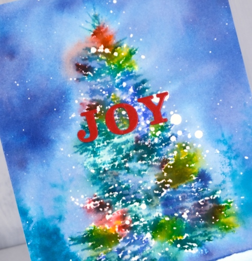
It is hard to believe I haven’t shared this beautiful tree stamp already. It is a large rubber cling stamp called winter tree and it looks snow laden when stamped. It is a very detailed tree but my treatment has it looking a little more impressionistic. To create the card above I lay the tree stamp on my cold pressed watercolour paper and positioned masking paper around the edges of the stamp. When I lifted the stamp there was a tree shaped space exposed.

I splattered masking fluid over the panel so there were lots of drops in the shape of a tree. When I removed the masking paper I splattered a few more drops of masking fluid around the tree. I placed the panel and stamp in my stamp positioner and dotted distress stain on the stamp. For this tree I used mustard seed, mermaid lagoon, pine needles and blueprint sketch. I stamped a couple of colours at a time until the tree was completely stamped albeit in a loose and watery way. To fill in the background I wanted the same colours but more diluted so I put stain on my glass mat so I could pick it up with a paint brush.

I painted around the tree with water touching the edges of the tree with the paintbrush so the colour would bleed into the sky. To fill the sky I picked up extra colour from my glass mat. When all the paint was dry I removed the masking fluid and added a die cut sentiment and a matching mat.

I followed the same process for the second card but used hot pressed watercolour paper and more colours of distress stain. I also stamped a few trees in the background using a tree from the ‘prancers‘ set and peacock feathers distress ink.

When snow completely covers our Christmas lights the colour does look a bit blurry shining through the snow. That’s what these cards remind me of.
Not that there are any Christmas trees or lights up around here yet. There are members of this family with strong feelings about Christmas decorations!
Supplies
Stamps: winter tree, prancers

Stains: mustard seed, blue print sketch, peacock feathers, pine needles


Die: merry Christmas (PB)


Paper: cold pressed watercolour paper, deep blue cardstock


Tools: MISTI, T ruler, stick-it adhesive, glass mat


