
Stripes & Daisies
Posted: May 16, 2025 Filed under: Hand painted, Tim Holtz, Watercolour, wild flowers #1 | Tags: Fabriano Watercolour Paper, Hand painted, Tim Holtz 2 Comments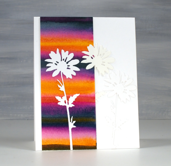
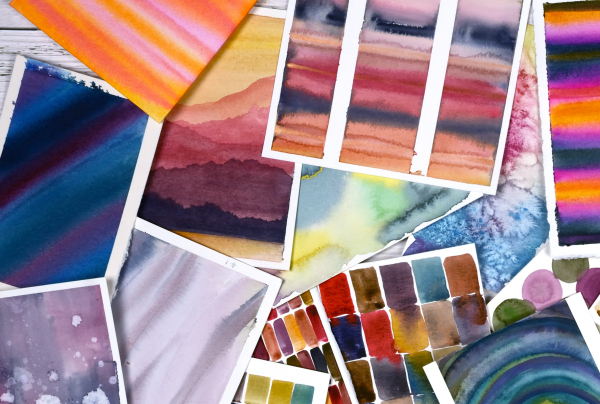
Back in February, I posted a pile of watercolour possibilities; you can see them here. The very bright strip on this card is one of the panels I painted during a watercolour technique class. I didn’t note down the exact paint colours but it would have been a limited palette of only 3 or 4. My guess is a yellow, a blue and a pink.
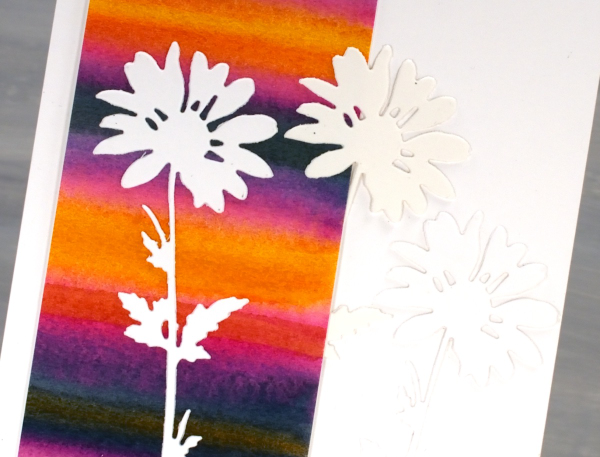
I used only half the painted panel on this card which means I can make another card or decorate the envelope. The background is so bright I liked crisp white daisies on top, it was a bit like putting together a summer outfit. The daisies were cut with Tim Holtz wildflowers dies and it looks like I cut 2 from white and one from cream cardstock. When I added the photos to this post I thought, ‘oh no! Did I add a cream daisy in?’ I pulled out the actual card and the daisies are indeed all white. Sadly the angle and lighting when I took the photo seems to be suggesting otherwise.
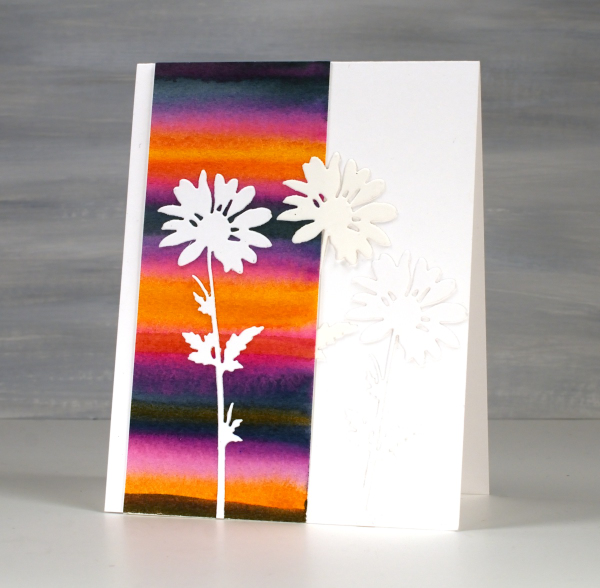
To just have one daisy was too stark so I added the other two to create a little more texture but no competing pattern or colour. I might put a sentiment on when I send it or I might not; we will see. Thank you for all your lovely messages about my Dad’s birthday and the card I made. The community of people who read my blog are so thoughtful; I always love hearing from you.
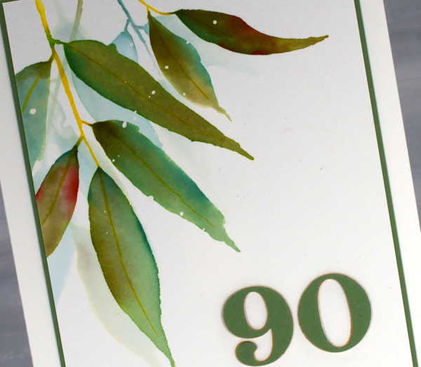
The 90th birthday card
Posted: May 14, 2025 Filed under: Hand painted, Heather lowercase die set, Pink Fresh studio, Watercolour | Tags: Fabriano Watercolour Paper, Hand painted, Pink Fresh studio 8 Comments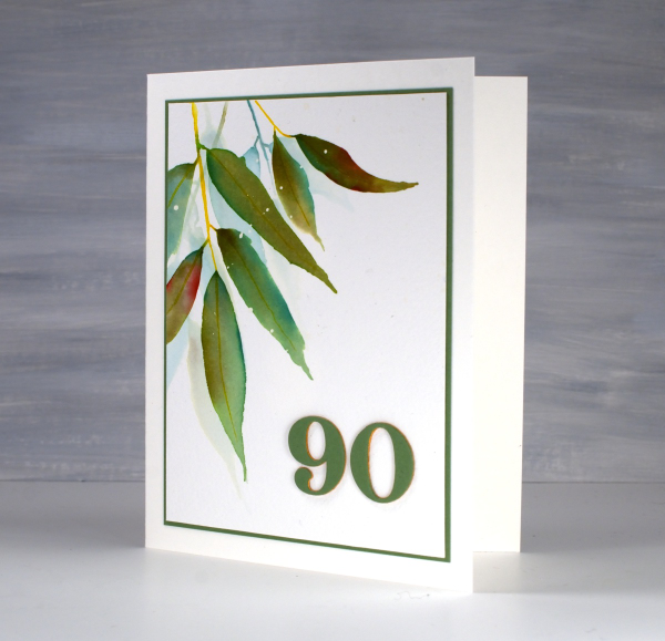
As some of my readers guessed when I was away recently I was visiting my family in Australia. One of the reasons to be there in April was my dad’s 90th birthday. Late March/early April ended up being a lovely time to be in NSW where the sun shone and the temperature hovered around the mid 20s! It was also a good time to be out of Ottawa where there were several ice storms and 15cm of snow more than once!
We celebrated Dad’s birthday with a lovely afternoon tea gathering attended by friends from recent years and years gone by, along with many family members including a brand new great grand daughter! We had an afternoon of food, fun and fellowship with songs, speeches, photos, a quiz and a slideshow. It really was a special occasion.
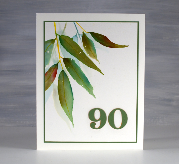
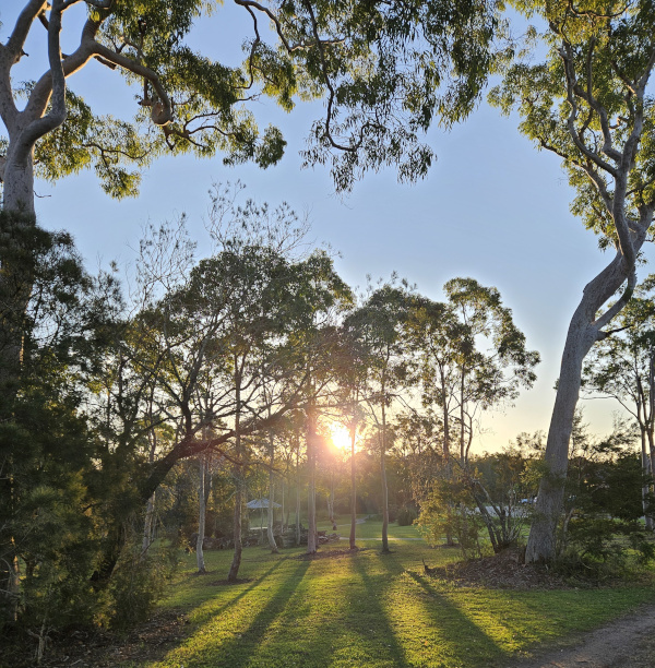
For his birthday card I painted some eucalyptus leaves (as I also did for the invitation) and added a die-cut 90 in co-ordinating colours. By the time I left to go home the sideboard in his living room was covered in cards and not a duplicate among them. How lovely to see so many of his friends and family celebrating with him or sending kind greetings for the occasion. And here’s another sunset photo taken close to Dad’s home.
The Tulip Mix
Posted: May 12, 2025 Filed under: AALL & Create, Echidna Studios, tulip background, Watercolour | Tags: AALL & Create, Echidna Studios, Fabriano Watercolour Paper, sennelier watercolours 5 Comments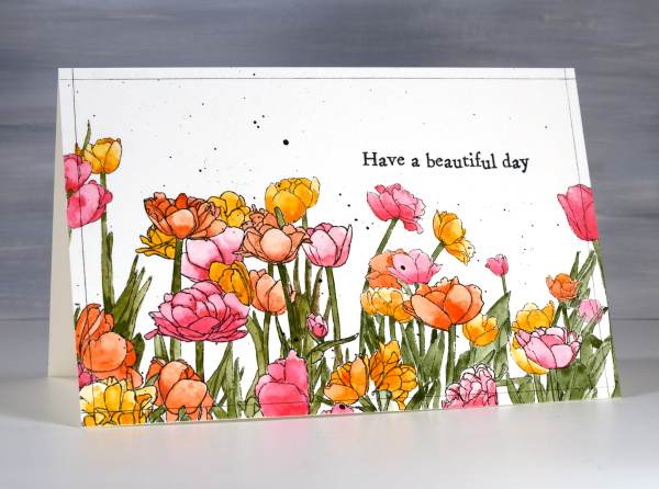
The tulip festival officially started here in Ottawa on Saturday but definitely not in my yard. There are potential blooms on a few lonely tulips but nothing looking showy or colourful yet. It doesn’t matter how many I plant, most do not shown up the following year! The tulips on today’s card are from Echidna Studios, the ‘tulip background digital stamp‘ printed on hot pressed watercolour paper.
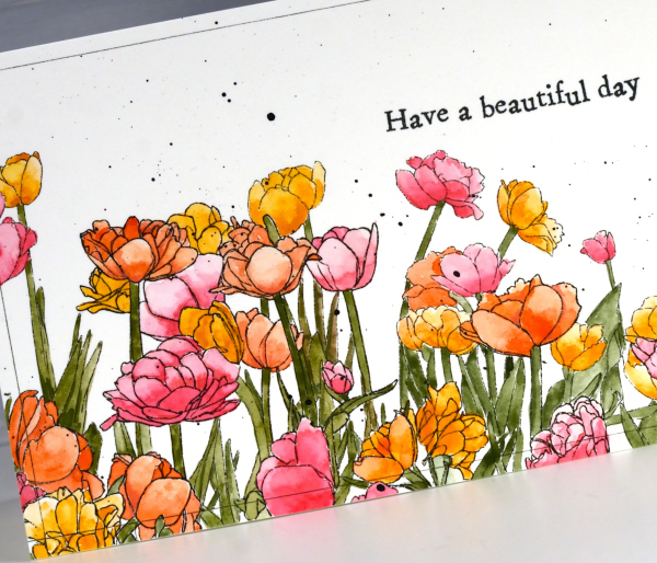
I used a limited palette of Sennelier watercolour paints, creating a pink, an orange and a yellow from a mix of opera pink and gold ochre. The green stems and leaves were mix of greenish umber and prussian blue. I’ve been painting patterns and experiments in one of my handmade art journals so the paints were already on the table and in the palette.
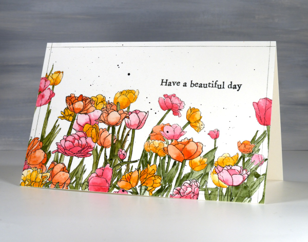
To finish the design I splattered black paint, stamped an Aall & Create sentiment and ruled very fine black lines around the border with the a .01 micron pen. I hope you do have a beautiful day!
Delicate florals on Watercolour
Posted: May 9, 2025 Filed under: Delicate Florals, Penny Black, Watercolour | Tags: Fabriano Watercolour Paper, Penny Black stamps, sennelier watercolours, Tsukineko Versafine inks 3 Comments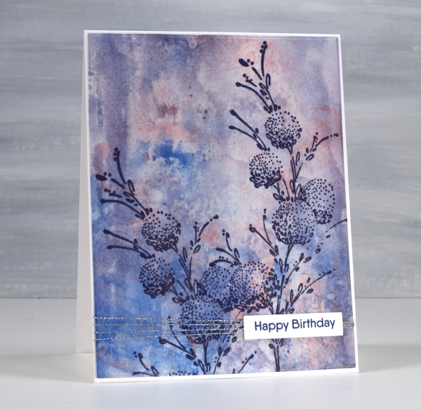
I have another floral stamp over a watercolour background; I don’t think I will ever tire of the combination. This background was created using a very different method to the previous card posted. Whereas the last one required careful blending of paint colours this one was definitely abstract and unpredictable. I randomly painted watercolours on a piece of clear acetate then smooshed it onto a piece of watercolour paper.

It took a few smooshings to start to build up pattern and depth of colour but eventually I had something I liked. Along the way I spritzed water to help the paint move and tilted the panel this way and that to spread it from one area to another. I didn’t like it when I first began but after several repetitions with the smooshing I could see it working as a pretty background.

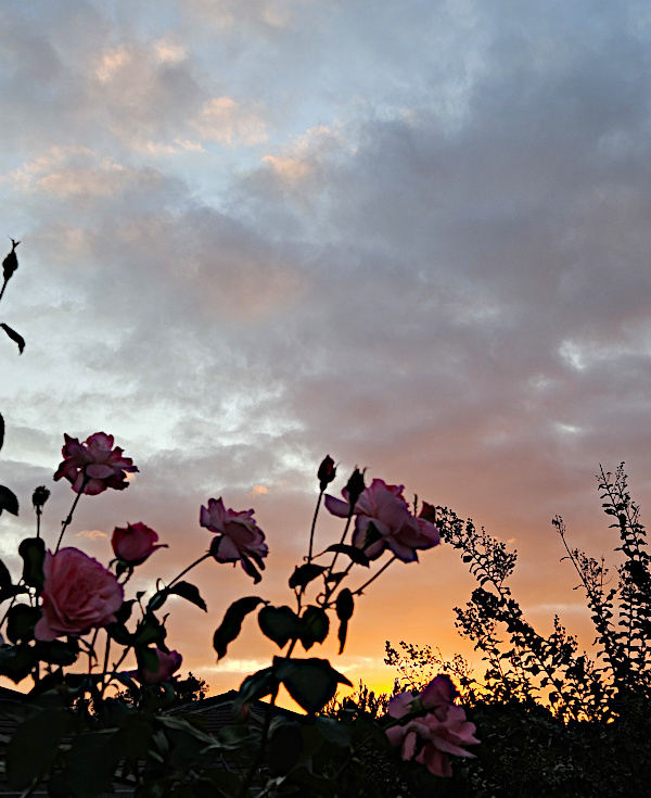
Once again I chose a Penny Black stamp, ‘delicate florals’ as the focal point over the background, this time choosing dark blue ink because I love the matchy-matchy! If you compare with the previous card you can see I added visual interested once again with a horizontal line down low on the card. It doesn’t get in the way but it leads the eye from left to right. While I was away I enjoyed the roses still blooming in my Dad’s garden. The tallest bush gave some foreground interest to yet another sunset photo.
Sunset Grasses
Posted: May 7, 2025 Filed under: Nature's Paintbrushes, Penny Black, sennelier watercolours | Tags: Fabriano Watercolour Paper, Penny Black stamps, sennelier watercolours 5 Comments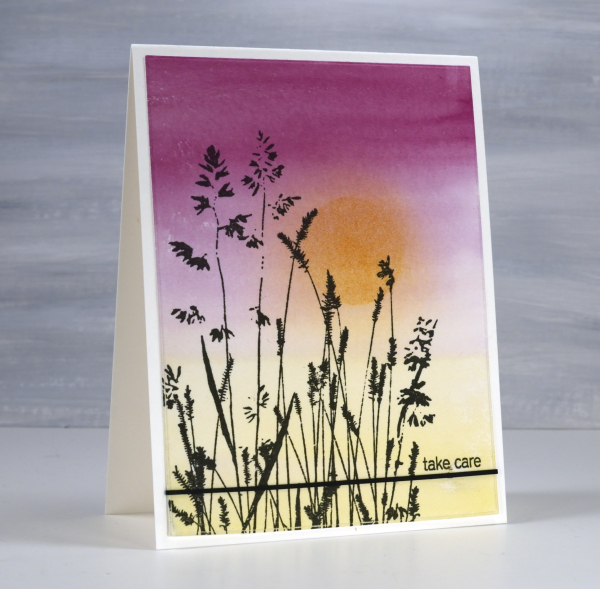
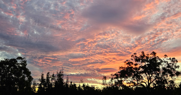
I have been away from my workroom, paints, stamps, papers and computer. I thought I might have shared a few blog posts while I was away but instead I took in the beauty of my surroundings snapping oodles of sunset photos along with other lovely scenery and dear faces. Now that I am back at home I will share some cards interspersed with occasional photos taken while away.
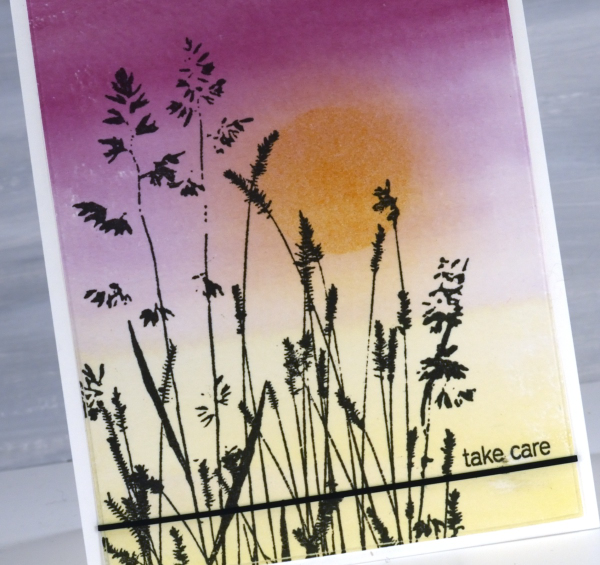
It’s been over a month since my last post which included snowflakes but before that one I was sharing cards made from watercolour panels. I ended last year and began this year wrapped up in colour mixing. I am still doing it and the result is quite the pile of panels ready to be stamped, die-cut or collaged into cards. This panel is an example of a gradation from one colour to another. I painted yellow from one end, deep pink from the other and blended them only slightly in the middle. When I picked the panel out of the pile I blended some darker yellow ink over the top through a circle post-it stencil then blended the edges once the stencil was removed.
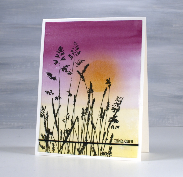
The lovely Penny Black ‘nature’s paintbrushes’ was a simple addition along with a thin strip of cardstock and a tiny sentiment from the PB ‘snippets’ stamp set. Thanks for dropping by despite how quiet it’s been her lately!
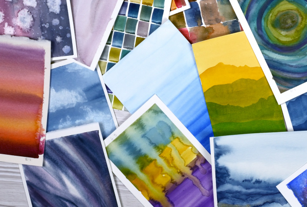
Pile of Watercolour Possibilities
Posted: February 27, 2025 Filed under: Classes, Hand painted, sennelier watercolours, Watercolour | Tags: Canson watercolour paper, Classes, Fabriano Watercolour Paper, Kuretake Gansai Tambi watercolour paints, sennelier watercolours 7 Comments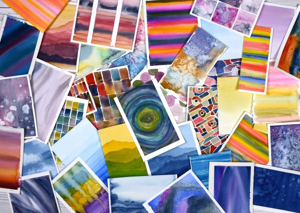
After teaching a couple of watercolour classes lately I have amassed quite the pile of panels. They are full of potential for card making. As well as painting separate panels I’ve also been creating abstract or background watercolours in a couple of art journals.
The purpose of the exercise has been two-fold. The main plan was to revisit a range of watercolour techniques in order to share them with others in classes. Additionally I chose to work small so we could complete quite a few practice pieces during class leaving us with ‘card sized’ panels to turn into cards later if we wished.
I have enjoyed the preparation and the classes so much that I have almost 100 panels on hand! My next in person class is going back to basics in regard to card making. I will cover assembly tips and tricks as well as design principles in order to create balanced and beautiful card layouts. It is exciting to have all these panels around just waiting to be transformed into cards.
As you can imagine I also have piles of gel prints, alcohol ink panels, collages and patterned papers that could be turned into cards. It’s rather nice to have all these options…
Whimsy and Watercolour
Posted: February 24, 2025 Filed under: Classes, Hand drawn, Hand painted, sennelier watercolours, Watercolour | Tags: Classes, Fabriano Watercolour Paper, sennelier watercolours 3 Comments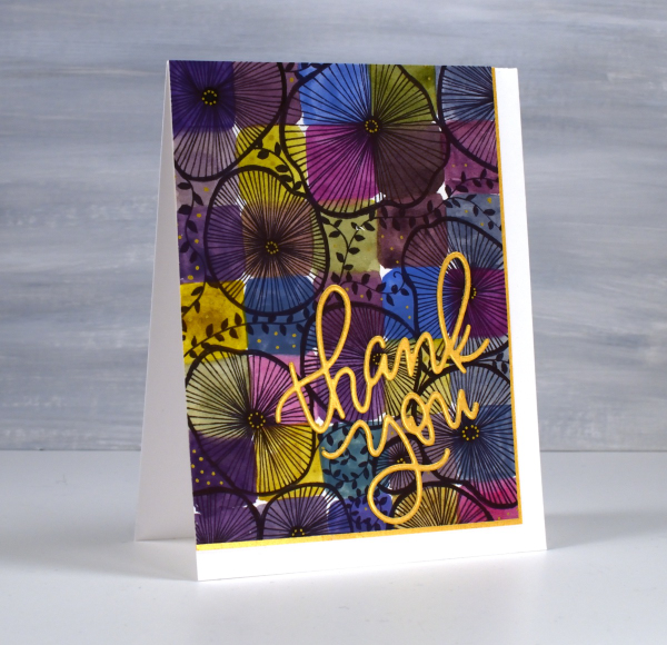
As I mentioned in January I have been playing with watercolour techniques then adding whimsical doodles over the top. Today’s card is another example. I switched the order in the title of the blog post because the whimsy has over powered the watercolour in this panel even though both elements are still obvious.
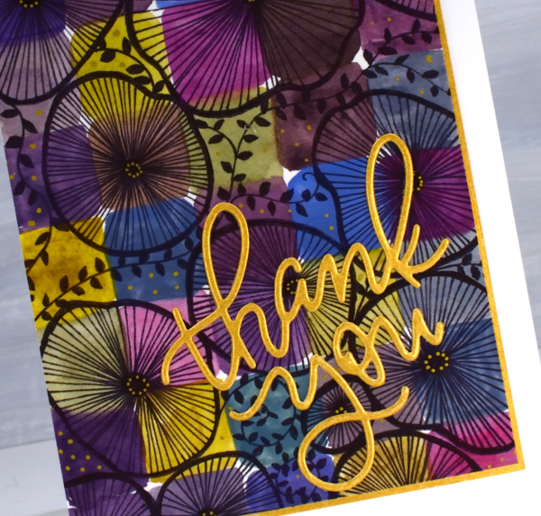
I used only three paint colours to paint the squares on the watercolour paper, some touching while wet, resulting in soft blends. All the colours you see were mixed from the same three paints – a blue, a pink and a mustard. The doodling was done with a black fine tip pen and a gold gel pen.
Even though the gold details from the gel pen are a minor part of the design they were the catalyst for choosing a gold mat and sentiment. In my upcoming in-person class I am teaching design principles and assembly techniques for card making and this thank you card is one of my examples. ( I wish I could remember who makes that pretty thank you die, but I’m not sure)
A New Handmade Book
Posted: February 7, 2025 Filed under: Finetec paints, Hand painted, Handmade book, sennelier watercolours | Tags: Fabriano art journal, Fabriano Watercolour Paper, Handmade book, sennelier watercolours 6 Comments
I’ve completed another challenge with Ali Manning in her Handmade Book Club. I have written before about Ali’s wonderful teaching. The most recent class was no exception. It was called ‘Valentine Palooza’ as a nod to the February timing and the cute heart binding on the spine of the book. The Handmade Book Club offers some free classes, some short challenges open to non-members (I have now done four of these) and a monthly or yearly membership ( something I would like to join at some point).
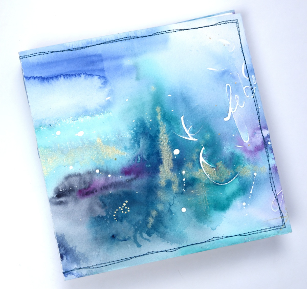
For this most recent challenge I chose to use cold pressed watercolour paper for the cover and hot pressed watercolour paper for the signatures. I watercoloured the cover in a loose abstract style over the top of some masking fluid words and squiggles. As I write this I realise I didn’t take any photos of the inside cover. Both the back and front covers fold over to make the cover more sturdy so my watercolour patterns continue inside.
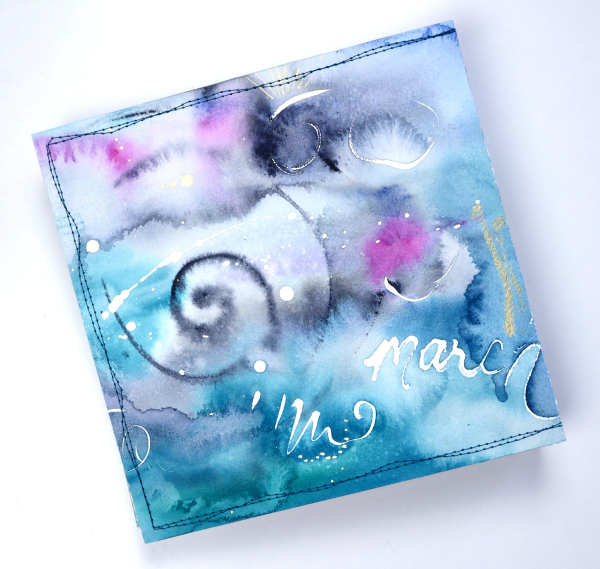
This cover was inspired by Tiffany Sharpe’s lovely stitched and watercoloured cover. I made my book 7″x7″ which was different to the rectangular examples in the workshop but all the steps are the same once you work out your dimensions. I have now made three 7×7 watercolour journals and like the page size for art journalling.
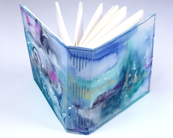
I’m playing with watercolour techniques a lot at present in preparation for my upcoming in person class on Watercolour Techniques. You will see some of the technique samples turned into cards eventually and some will be the base for future journal pages. You can see the other books I have made here: Mixed Media Journal, Coptic Journal, a second Coptic Journal, and Scrappy Journal.
The bookshelf card
Posted: January 28, 2025 Filed under: Hand drawn, Watercolour | Tags: Fabriano Watercolour Paper, Hand drawn, Hand painted 2 Comments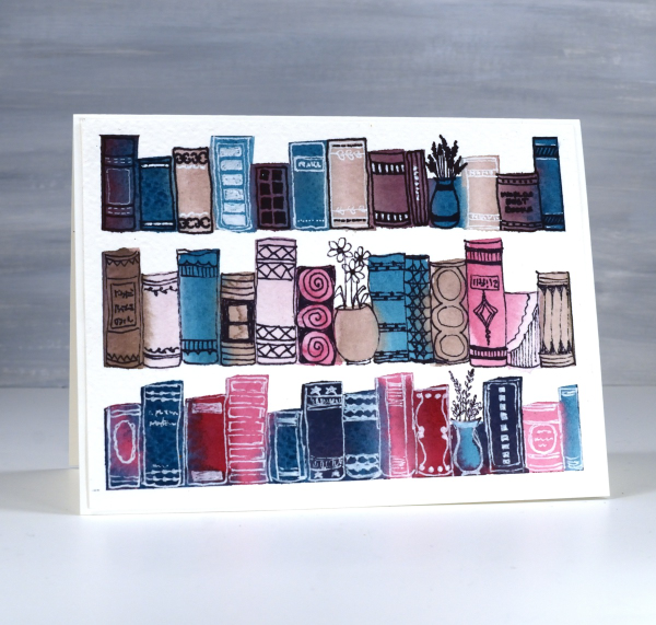
Last year I taught a workshop called ‘Watercolour & Whimsy’ where we experimented with colour mixing in art journals and on watercolour panels, some of which we turned into cards later. This panel began very simply as I mixed three or four paints to make a range of different colours. Because I stuck with a few paints I knew they would all look cohesive on the panel.
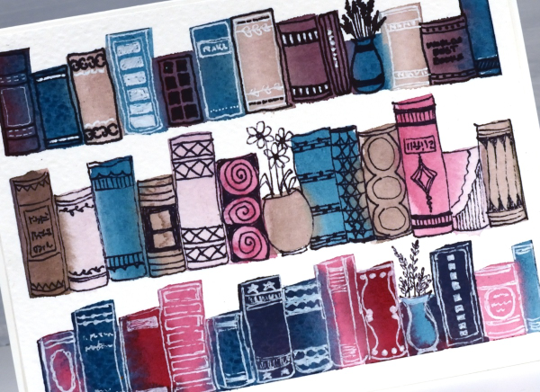
I used a half inch flat brush to paint rough rectangles in lines. I was inspired by schlemmer.art but where she turned her rectangles into houses, I turned mine into books!
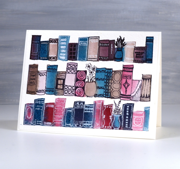
I used a black fine tip pen and a white gel pen to decorate the book spines and turned three paint strokes into vases instead of books. A simple idea to paint, a relaxing theme to doodle and something I will definitely try again.
2 for 1 with Delicate Pines
Posted: November 20, 2024 Filed under: delicate pines, Finetec paints, Penny Black | Tags: Fabriano Watercolour Paper, Finetec artist mica watercolour paint, Penny Black stamps, Ranger Distress inks 4 Comments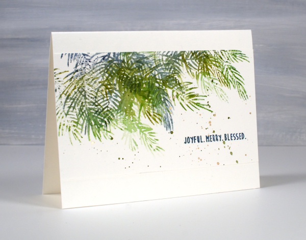
Although I don’t tend to make exactly the same card in large numbers I do like a quick and simple way to make a few similar cards at the same time. To create these pine needle cards I started with a watercolour panel larger than an A4 card. It was about 5¾” x 6″ and I placed it in the stamp positioner with the long side tucked right against the long side of the positioner.
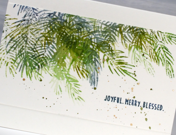
Using the two of the three Penny Black ‘delicate pines‘ stamps positioned to stamp along the top edge of the panel I inked them with a few green and blue distress inks. Before stamping I spritzed the stamp lightly so the different greens would blend on the stamp and then on the paper. I then moved the stamps around so I could use the third stamp and get some overlapping branches. Without moving the stamps I turned the watercolour panel 180° and repeated the stamping steps. The panel ended up with a border of pine branches on each side. I cut the panel in half and trimmed the sides so I had two 5½” x 3″ panels to add to card bases.

I finished off both panels with a sentiment from the PB ‘jolly snippets‘ set and some green and gold splatter. Simple yet pretty. Today’s post features affiliate links to The Foiled Fox. If you buy through these links I receive a small commission at no extra cost to you.


