
Hey You
Posted: March 13, 2017 Filed under: Brusho, burst of blooms | Tags: Brusho, Penny Black creative dies, Penny Black stamps 8 Comments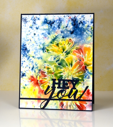
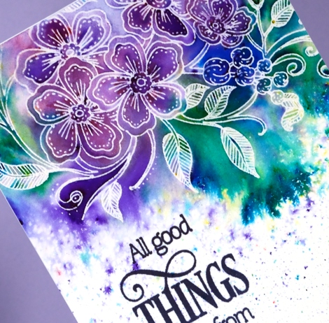
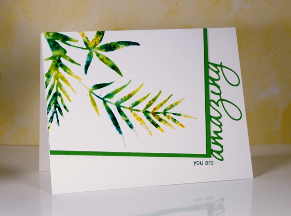
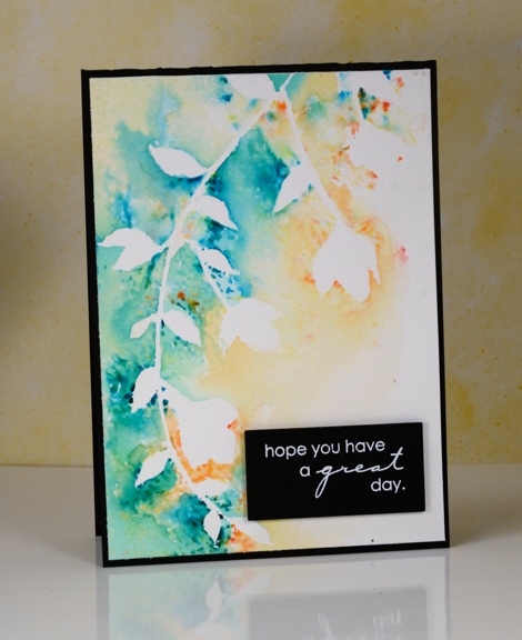
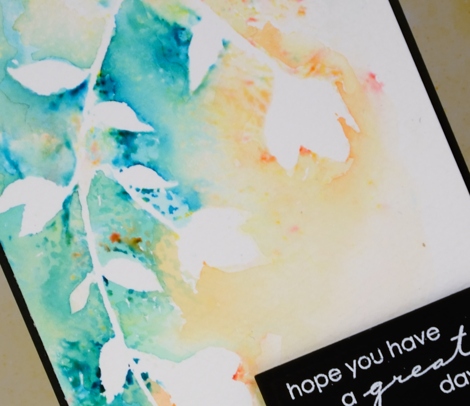
Does this remind you of batik fabric? Having created and purchased batik fabrics over the years that’s what I immediately thought of when I finished this panel. There were a few techinques in play to get this effect. Maybe you find it a little messy, or maybe bright and happy. The main technique is emboss resist so I will just mention for any Toronto readers I will be teaching my Watercolour Resist class in Toronto on April 8th, the details are on my Upcoming Classes page.
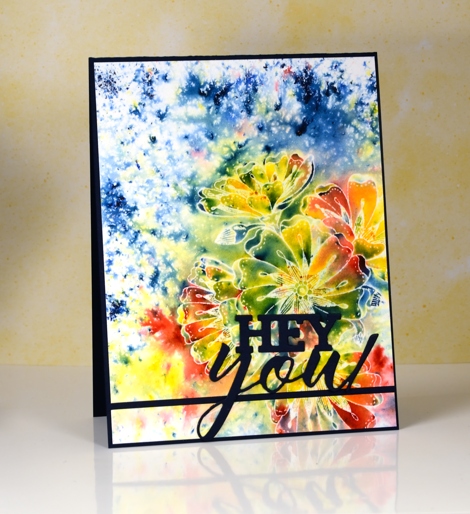
I started by embossing the ‘burst of blooms’ stamp in clear powder on hot pressed watercolour paper. Next I sprinkled red, yellow and blue brusho (colours listed below) and spritzed water from above. Once the paint had activated and the colours spread a little I dabbed them with a paper towel to remove excess liquid and dried with a heat tool .
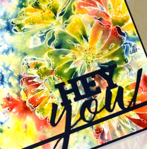
To mimic batik more closely I ironed the panel face down into a few pieces of printer paper to melt and remove the embossing powder but leave the white outlines. I mounted the panel on a navy card base but sliced a section off at the bottom to split the panel and make a line for the die cut sentiment to sit on. I haven’t used this card yet but I can make it a birthday, graduation or just hello card by adding the right words inside.
Supplies
Stamps: burst of blooms (PB)
Dies: you enjoy(PB)
Ink: versamark (Tsukineko)
Paint: lemon, prussian blue, scarlet brusho (Colourcraft)
Paper: hotpressed 100% cotton watercolour paper, Neenah patriot blue cardstock
Also: WOW clear gloss superfine embossing powder
A Moment in Time
Posted: February 23, 2017 Filed under: A moment in time, Brusho | Tags: Brusho, Fabriano Watercolour Paper, Penny Black creative dies, Penny Black stamps 13 Comments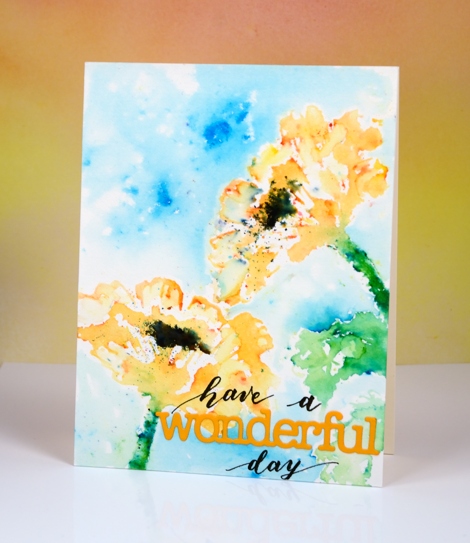
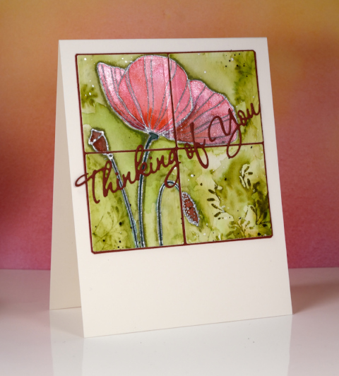
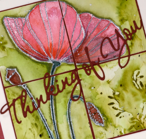
So far this week I have shared three new brushstroke stamps from Penny Black and three different techniques for ‘painting’ with them. I say painting because that really is what I do with brushstroke stamps; I choose a water soluble medium and apply colour in such a way as to create the look of watercolour painting. Today’s card was done using my ‘stamping with water’ technique. I put the pretty, new stamp, A Moment in Time, in my MISTI and painted water on it. As I applied the water with a paint brush I noticed it was beading rather than spreading over the rubber. I realised it was a brand new stamp and needed a little bit of prepping before I used it. I don’t always do this because sometimes the first coat of ink will do the prep for me. I keep a piece of fine sandpaper on hand (it is very fine and has been used many times so it does not damage the stamp at all) to rub gently across the surface of the rubber, then I simply clean with some stamp cleaner. Another way to prep the surface is to use an eraser to rub all over the stamp before cleaning with stamp cleaning solution.
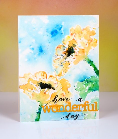
Once I had prepped the surface of the stamp I was able to coat it with water and stamp it on a piece of hot pressed watercolour paper. I could see the watery poppy image on my panel so it was simple to sprinkle brusho powder in the right place, gamboge over the flower head and leaf green over the stem. I watched and waited as the brusho activated then added more water to the stamp and stamped again. I moved my panel so I could stamp another poppy and followed the same procedure. Once the brusho powder stopped reacting I dried the panel with a heat tool, tapped off excess brusho powder and used a paint brush to fill in a few petals. I added a leaf using the same technique then a few droplets of water in the centre of the poppies and some black brusho where I had made it damp. I dried the whole panel before creating a sky by sprinkling some turquoise brusho then spritzing it. I wanted to protect the poppies from coming in contact with too much water so I painted water around the edges then pulled the turquoise colour into the water keeping some areas light while letting others be more intense.
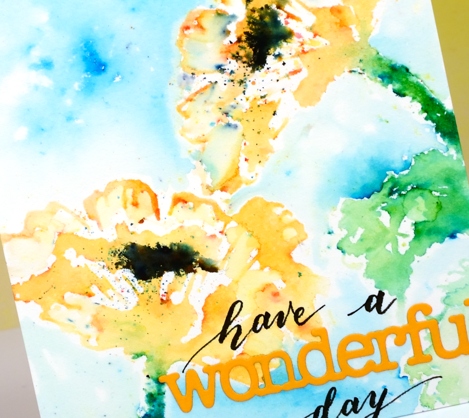
I finished the card off with the ‘wonderful’ die cut and some handlettering to complete my sentiment. I have received some lovely comments in the last week or so and I want you to know how much I appreciate them. I have read the requests for videos also and hope to get onto some as soon as my class prep is up to date. Thank you for visiting, commenting and making my day!
Supplies
Stamps: A moment in time (PB)
Pens: Fudenosuke brush pen hard tip (Tombow)
Paint: gamboge, leaf green, black & turquoise brusho (Colourcraft)
Die: Awesome (PB)
Paper: hot pressed watercolour paper (Fabriano) orange cardstock, neenah natural white cardstock
Falling florals
Posted: February 15, 2017 Filed under: Brusho, Gladsome | Tags: Brusho, Penny Black stamps, WOW embossing powders 22 Comments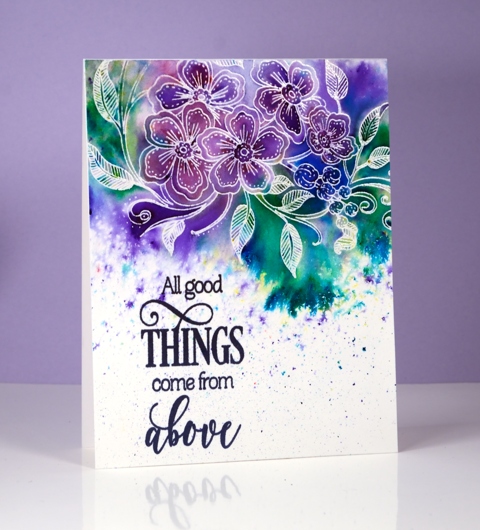
Today’s card features one of the new colouring book style images from Penny Black. I chose to let brusho powders do the colouring for me. I embossed the stamped image off the top of the watercolour paper using versamark and clear embossing powder. I taped down the top and sides of the panel to prevent warping when I added water to it. With brusho you can add water first or powder first. For this panel I started by sprinkling powder over the embossed panel; I was selective in where I sprinkled it so I would get purple flowers and green leaves but I knew there would be soft blending between the colours anyway. I spritzed from above and from the side to spread the colour down beyond the stamping.
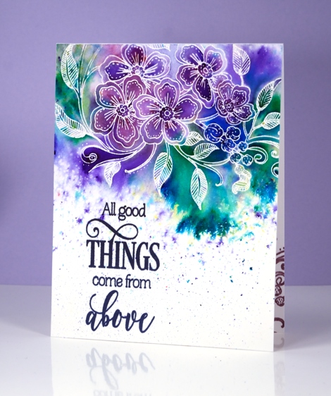
I did do a little touching up with a paintbrush where the colour hadn’t completely filled a section but I really didn’t need to alter much.
Once the panel was dry I trimmed it and added a sentiment then attached it to a cardbase. I also added a print of the stamp inside the card in violet ink and on an envelope as well.
The new release from Penny Black is appropriately called Bliss and is now available in the online shop and browsable in the online catalogue. There are so many gorgeous new stamps and dies in this release; drop in again tomorrow when I share some more.
Supplies
Stamps: Gladsome, All great things (PB)
Ink: versamark, versafine imperial purple (Tsukineko)
Paint: purple, ultramarine, emerald green, violet brusho (Colourcraft)
Paper: fabriano hot pressed watercolour paper
Also: WOW clear embossing powder
Red Blush
Posted: February 13, 2017 Filed under: Red blush | Tags: Brusho, CAS, Penny Black stamps 20 Comments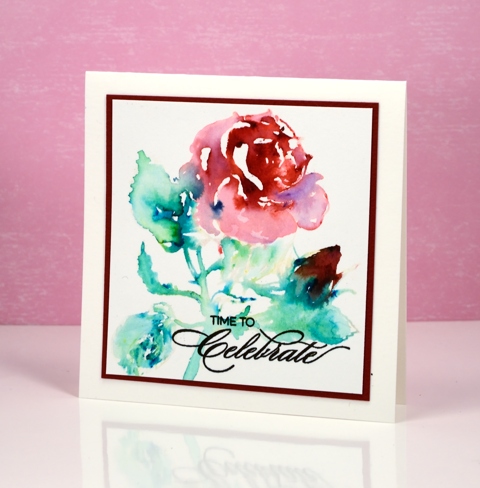
I am participating in the CAS watercolour challenge again this month and as it turns out I have used exactly the same technique as last month. I really didn’t set out to do that but sometimes cards just emerge from experimentation more successful that expected! The theme of the challenge this month is ‘Love’ so a red rose fits in nicely along with a reminder to celebrate, perhaps Valentine’s day or an anniversary.

I used the water stamping technique to create this image and I almost didn’t continue with it after the initial application of brusho powder. I stamped the rose with water then sprinkled crimson brusho over the flower and bud area and emerald green over the leaves and stems. This technique can create a mess but it can also give you a loose watercolour representation of the stamp. Once the colours started reacting with the water I used a brush to move some colour into areas that needed more and a paper towel to remove colour where there was too much.
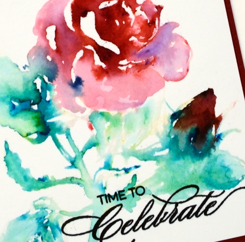
All that colour in the rose is from crimson brusho, which you can see is a mix of different colour crystals. The darkness of the bud is a mix of crimson and emerald green. Initially I thought it was going to be a dirty brown but it has enough red tones to resemble the way the colour of a bud is often darker than the full blown rose. Thanks for dropping by; make sure you check out all the ‘Lovely’ inspiration over at CAS Watercolour challenge
Supplies
Stamps: Red blush, Heartfelt (PB)
Ink: versafine onyx black ink (Tsukineko)
Paint: crimson & emerald green brusho (Colourcraft)
Paper: hotpressed 100% cotton watercolour paper, red cardstock
Stencilled breeze
Posted: January 27, 2017 Filed under: Brusho, CAS, Fresh Breeze | Tags: Brusho, CAS, Penny Black creative dies, Penny Black stamps 7 Comments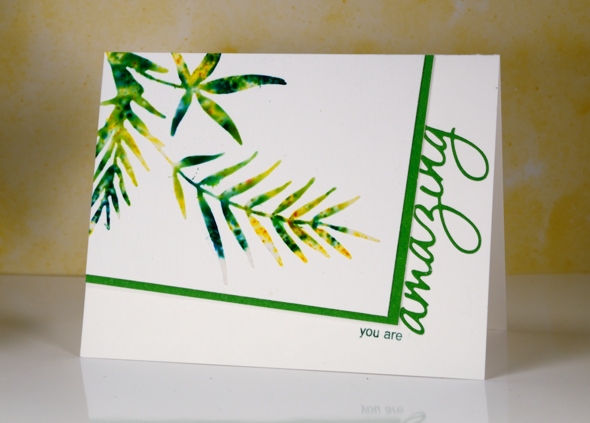
Earlier this week I posted a card made out of a leftover, the negative print from a stencil used for watercolouring. Today’s card is a positive print made through a stencil (not using the same stencil as the earlier card). I created the stencil for this card myself by die-cutting the shape from a piece of stencil plastic. You could use an old plastic folder as long as it is not too thick for your die cutting machine to handle. The die I used is ‘fresh breeze‘ from Penny Black. I taped my home made stencil to a piece of cold pressed watercolour paper and spread moulding paste over it, keeping the layer fairly thin with a palette knife. Next I sprinkled yellow and green brusho powder over the stencil then spritzed with water to activate the brusho. Too much water and it seeps under the stencil, not enough and the brusho doesn’t activate. Once the brusho appeared a little blurry I removed the stencil and let the panel dry for quite some time.
I chose the angled rectangle layout and messed it up by attaching the panel upside down on my card base. I had to cut it out of the cardbase and attach it to a new one so it is a tad bulky under the stencilled panel! I matted in green and trimmed off the top of the die cut word so it would appear to be attached to the mat. I inked just two words on a sentiment stamp so I could turn it into a phrase.
I’m going to add this one over at the Sweet Stampin’ Dies and Punches challenge. Thanks for dropping by.
Supplies:
Stamps: Heartfelt (PB)
Die: Fresh Breeze , OMG (PB)
Inks: Cottage ivy memento (Tsukineko)
Paint: Brusho (Colourcraft)
Paper: Canson 100% cotton cold pressed watercolour paper, green cardstock
Also: moulding paste
Poppy quarters
Posted: January 25, 2017 Filed under: Poppy Time, Twirls | Tags: Brusho, liquid metals, Penny Black creative dies, Penny Black stamps 5 Comments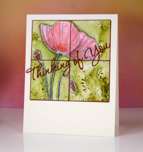
This poppy panel was left as an extra from a class I taught last year. I didn’t want to create the class card again so I divided the poppy image into quarters using square dies.
I layered the quarters on a burgandy mat and also die cut a sentiment which matched the deepest red in the poppy, seed pod and bud. The poppy itself was embossed in silver then painted with a mix of brusho and liquid metals so it has a shimmery look when tilted to the light. The green background was made by stamping one of the ‘twirls’ stamps in peeled paint distress stain then painting over it to dilute and spread the green around the poppy.
Won’t be long now before the poppies appear, only four or five months!
Supplies
Stamps: Poppy Time, Twirls (Penny Black)
Die: Wishes (PB) Shapeabilities squares (Spellbinders)
Inks: versamark (Tsukineko) peeled paint distress stain (Ranger)
Paints: brusho (Colourcraft) platinum liquid metal (Ken Oliver)
Cardstock: Fabriano cold pressed watercolour paper, Red cardstock
Also: silver embossing powder
Stencil negative
Posted: January 24, 2017 Filed under: Brusho, Promenade, Uncategorized | Tags: Brusho, Penny Black stamps, Penny Black stencils 14 Comments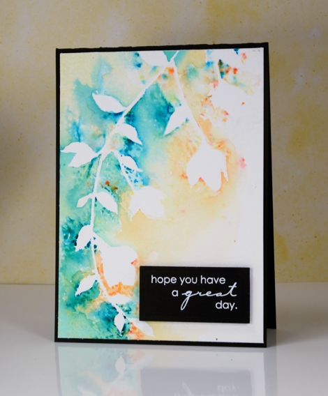
The technique I have to share today is one of those ‘don’t waste all that pretty paint’ techniques. Sometimes I will be creating something and paint or ink ends up all over a mat, stamp or in this case, a stencil after the initial project is completed. Rather than simply rinse the ink or paint off it is usually worth taking a print or swiping a piece of paper through the excess paint to pick up all the pretty.
I was creating panels using the Penny Black stencil, promenade, along with molding paste and brusho paint. Once I had finished sprinkling brusho over the stencil and paste, I spritzed with water before removing the stencil. The stencil was covered in diluted brusho so I pressed it onto a piece of cold pressed watercolour paper and this patterned piece was the result. Incidentally I also made two cards with the stencilled shape on them but they did not photograph well at all. They look fine in real life!
I like the ‘negative’ print from the stencil enough that I might just create a negative print as a technique on its own. But then would I end up with a pretty ‘positive print’ as a by product of my creating!?!
This post was brought to you from my ‘pile of possibilities‘.
Supplies:
Stamps: Amazing (PB)
Stencils: Promenade (PB)
Inks: Versamark(Tsukineko)
Paint: Brusho (Colourcraft)
Paper: Canson 100% cotton cold pressed watercolour paper, Neenah epic black
Also: white embossing powder
Batik style background
Posted: December 29, 2016 Filed under: heart string, Peacock Feather | Tags: Brusho, Penny Black creative dies, Penny Black stamps, WOW embossing powders 4 Comments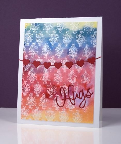
The emboss resist method creates pretty backgrounds especially when painted in a rainbow of colour. I used three primary colours overlapping them to end up with the yellow, orange, red, purple, blue and green. I stamped the peacock feather pattern in versamark and embossed in clear powder on watercolour paper and the slight texture of the watercolour paper combined with the very fine detail of the stamp meant that I did not get a perfect impression. Once I added the colour over the top I noticed that it looks very much like a batik fabric print.
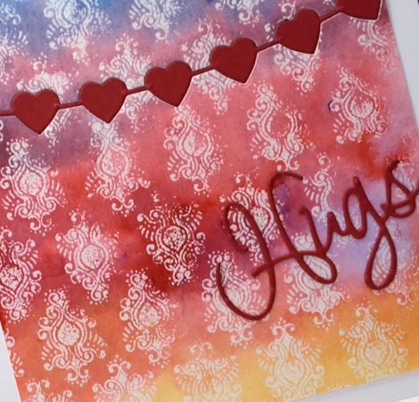
I trimmed the panel then used the heart string die to cut the piece in two. With the same die I cut a string of red hearts then attached the panel to a card base inlaying the red hearts but attaching the die cut word on top of the panel.
Supplies
Stamps: Peacock Feather (PB)
Dies: heart string, love expression (PB)
Ink: versamark (Tsukineko)
Paint: yellow, prussian blue, crimson brusho (Colourcraft)
Paper: hotpressed 100% cotton watercolour paper, red cardstock, Neenah solar white cardstock
Also: WOW clear embossing powder
The Yellow House
Posted: December 28, 2016 Filed under: Brusho, Victorian home | Tags: Brusho, Faber-Castell Albrecht Durer Watercolour pencils, Penny Black stamps, Tsukineko Versafine inks 3 Comments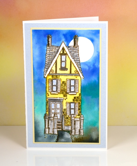
I painted the yellow house a while ago using brusho watercolour powders for both the background and the house. In the background I let the brusho do what it does so well, blend from colour to colour. The house I was more finicky about. I stamped the house in vintage sepia versafine ink, a pigment ink that would not bleed when I started adding watercolour paints over it. I used a small paintbrush and brusho in a palette to paint the house in yellow and grey. After it dried I used watercolour pencils to add shading to columns, steps, roof tiles and bricks. I let that dry before adding a circle mask in the top right corner to create the moon in the blended blue sky. By dampening the paper before adding colour I was able to blend softly from blue to green to grey.
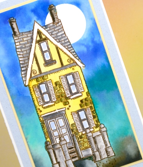
I matted in yellow and grey just like I might if framing a painting . The stamp is long and thin so the card is too. When I was making this panel a friend of mine was making one too. She didn’t end up with such a tall thin card because she added a car beside the house which looked very cute!
Supplies:
Stamps: Victorian Home (PB)
Ink: vintage sepia versafine ink (Tsukineko)
Paper: 100% cotton hot pressed watercolour paper, co-ordinating cardstock for mats
Paint: brusho ultramarine, lemon, emerald green, black (Colourcraft)
Pencils: sepia, pine green, cold greyIV Albrecht Durer watercolour pencils (Faber Castell)
You warm my heart
Posted: December 22, 2016 Filed under: CAS, crystal trio, What's in your cup | Tags: Brusho, Penny Black creative dies, Penny Black stamps 4 Comments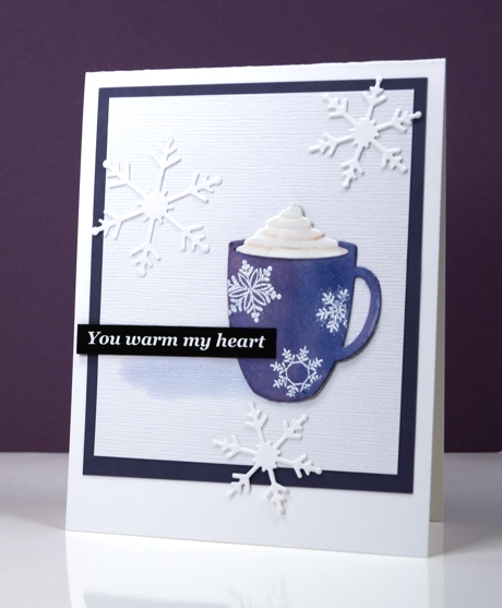
This message is definitely for you my blog readers; you really do warm my heart with all the kind encouragement you leave in the comments. I have been working on a Valentine themed class for January 2017 and the cute little die-cut cup is one of the stars of the new class. I settled on classic red & white for the Valentine class but not before painting quite a few cups in other colours. This little blue cup with its snowflakes is just right for a day which started with snowfall and ended with a blue sky.
I die cut the cup out of watercolour paper then painted it with blue brusho watercolour paint. To give the cup some shape I painted some purple over the blue on the left hand side. Once it was dry I embossed the snowflakes over the top and added the whipped cream die cut piece. I attached the cup to a textured white panel and painted a pale shadow beside the cup then added snowflakes, a sentiment and a purple mat to frame it.
I’ve been making gingerbread today following my usual pattern of burning the first tray and half the second before settling on a shorter cooking time.
Supplies
Stamps: season’s gifts (PB) note: I printed the sentiment on my computer; it’s not a stamp
Dies: crystal trio, what’s in your cup (PB)
Inks: versamark (Tsukineko)
Paper: hot pressed watercolour papers (Fabriano),white linen textured cardstock, purple cardstock, black cardstock
Also: brusho watercolour crystals (Colourcraft), white embossing powder


