
Sweetheart
Posted: January 18, 2017 Filed under: Uncategorized 6 Comments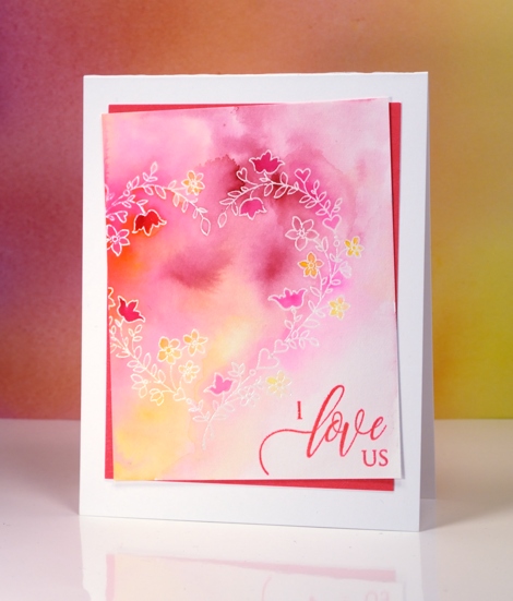
I’m featuring another pretty stamp from the Penny Black ‘Follow your heart‘ release today. This one is appropriately named sweetheart; don’t you think those delicate little flowers are sweet? I used the emboss resist technique to make the heart appear white on a pink, yellow and orange background.
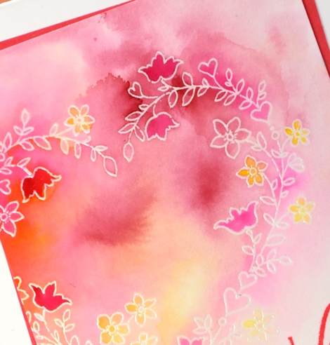
I started by stamping the heart on watercolour paper in versamark then embossed in clear powder. I used peerless watercolours to paint over the embossed image diluting with water and blending the colours as I added them. I kept it fairly soft then used more intense colour to highlight a few of the flowers. I chose hot pink to frame the panel and stamp the sentiment which co-ordinated with the brightest areas on the watercoloured panel. I ended up offsetting the panel from the frame, a technique I’ve seen others do successfully, and I quite like it. I noticed as I played with the positioning that it worked best when the pink mat was centred and the painted panel offset not the other way round.
Supplies:
Stamps: Sweetheart, Forever & Always (PB)
Cardstock: hot pressed watercolour paper, hot pink cardstock
Ink: versafine
Paint: Peerless transparent watercolors
Also: WOW clear embossing powder
Be Mine
Posted: January 17, 2017 Filed under: a rose, Peerless watercolours, with affection | Tags: Peerless Transparent Watercolors, Penny Black stamps, Ranger Distress inks 4 Comments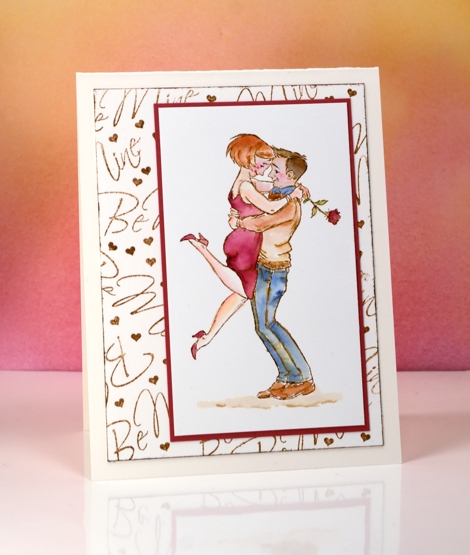
This cute little couple is a new stamp from Penny Black called ‘the rose’. I stamped it in vintage photo distress ink then watercoloured it with peerless watercolour paints. I like the muted look of the vintage photo ink combined with the paint from the peerless palette.
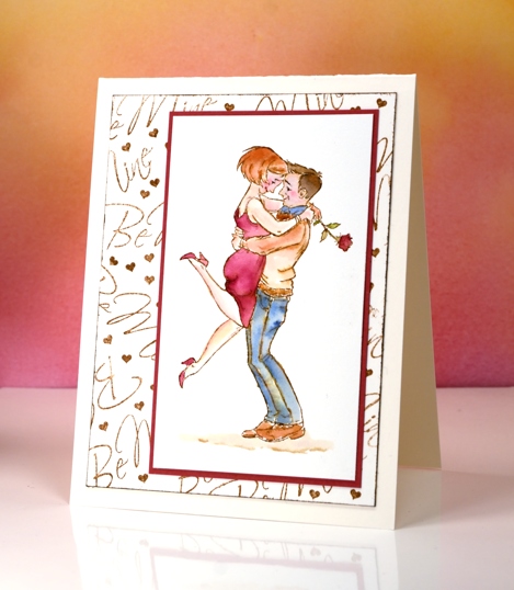
I kept the design pretty simple by adding only ground under their feet but no extra background images or colour. Instead I made my own patterned panel by stamping the ‘be mine’ sentiment along with a tiny heart repeatedly in vintage photo ink. The tiny heart is cut from a row of five included in the ‘from the heart’ set. It was ideal for filling in little gaps around the words.
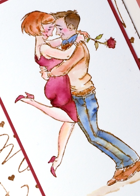
Pop over to my youtube channel to see how I set up my peerless palette.
Supplies:
Die: A Rose, With Affection, From the Heart
Paints: Peerless watercolors
Cardstock: hot pressed watercolour paper, neenah natural white, red cardstock
Ink: vintage photo distress ink
Butterfly Heart
Posted: January 16, 2017 Filed under: butterfly heart pop out, CAS | Tags: Peerless Transparent Watercolors, Penny Black creative dies 7 Comments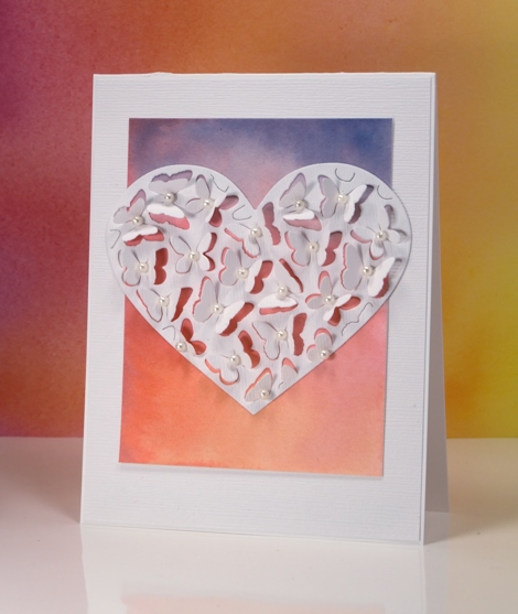
If you have visited the Penny Black blog lately you will know about the new Follow Your Heart release, if not I will be sharing some of new dies and stamps over there and here on my blog this week. Because the butterfly heart pop out die only partially cuts the butterflies you can fold up the wings to reveal whatever is underneath. I tossed up whether to cut the heart out of the watercolour panel or white but decided to have the watercolour panel peeping through the wings and framing the heart. I painted the gradated panel with yellow, pink then blue blending each colour into the one beside it. I attached the coloured panel to a linen textured white panel and cut the heart out of the same textured white cardstock.
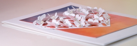
I bent all the butterfly wings up before gluing the heart onto the watercolour panel so I wouldn’t accidentally glue any wings flat. Once the heart was firmly attached I glued a seed pearl in the centre of each butterfly and attached the whole panel to a white card base. If I were to mail this one I would probably need a box-type envelope so I think it might end up being a hand delivered card.
Supplies:
Die: Butterfly Heart Pop Out (PB)
Paints: Peerless watercolors
Cardstock: hot pressed watercolour paper, neenah solar white, textured white
Also: white seed pearls
Mid winter sky
Posted: January 12, 2017 Filed under: Color Burst, Into the sky | Tags: color burst, liquid metals, Penny Black stamps, Tsukineko Versafine inks 13 Comments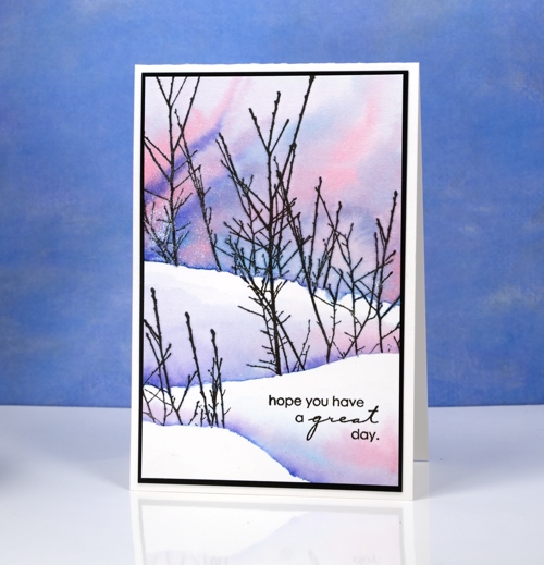
The sky has been very pretty around dusk lately, not the deep colours in today’s card but a soft apricot glow on the horizon along with yellows, pinks and blues. I used Colorburst powders to create this sky and the shadows between the snow banks. First I positioned a torn post-it mask across the watercolour panel and stamped the ‘into the sky’ branches over the mask. I removed the mask and repositioned it lower down and stamped some more branches on the right then finally placed the mask even further down the panel and stamped the tips of the branches on the left, all in versafine black ink.
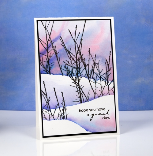
Once the ink was dry I painted the sky in the top portion of the panel making sure I kept the paint above the bottoms of the branches. I tilted the panel to let the pinks and blues mix into patterns and new shades. I did the same behind the remaining branches but did not paint right up to the top of the snow bank above.
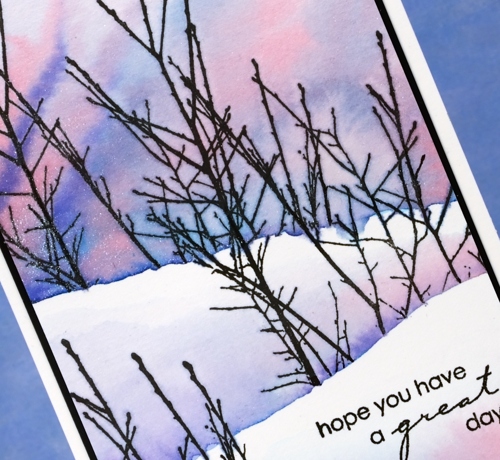
I mixed the paint powders in a palette and added platinum liquid metal for a little shimmer and sparkle. I hope the beauty around you inspires you today.
Supplies:
Stamps: Into the sky, Amazing (PB)
Paints: Alizarin Crimson, Indigo & Ultramarine Blue Colorburst powders (Ken Oliver)
Inks: Versafine onyx black ink (Tsukineko)
Cardstock: hot pressed watercolour paper, neenah epic black cardstock
Also: Platinum Liquid Metal (Ken Oliver)
Forest – Casology 231
Posted: January 11, 2017 Filed under: tall trees | Tags: Penny Black creative dies, Penny Black stamps 29 Comments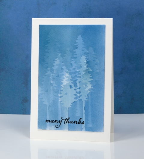
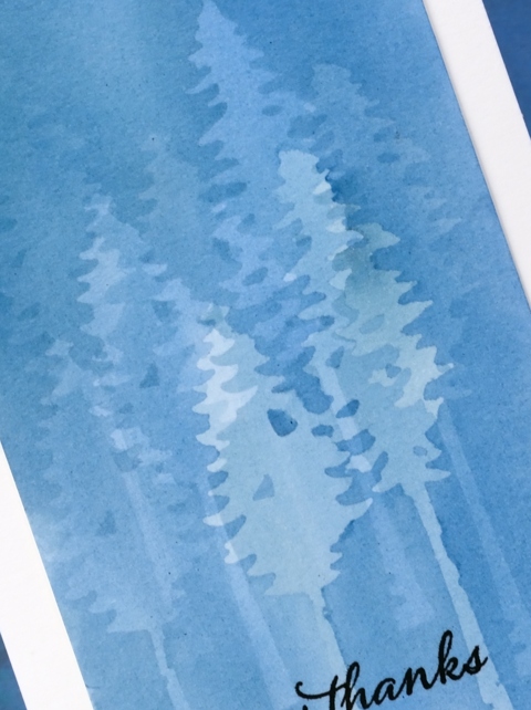
My subtle forest is an experiment in masking. I painted the panel a month back and it was sitting in the pile of possibilities. When I saw what the Casology challenge theme was this week I thought of this panel straight away. To paint this misty forest I use the PB ‘tall trees’ dies to cut masks from frisket film. Frisket film is a removable plastic film used for masking when painting and drawing. I positioned the two tree masks then painted a pale blue wash over the trees, let it dry then repositioned the masks. I repeated this process numerous times to create my forest. With each wash the panel became a darker shade of blue and the previously masked trees received some colour also. Having two different tree dies added a little bit of shape and height variety.
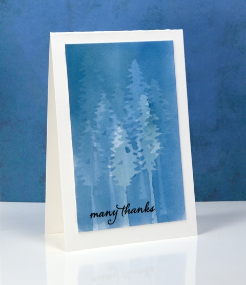
I’m sorry once again that I can’t remember which paint I used. I don’t think it matters too much; I would use any of my watercolour mediums and keep it fairly diluted so I could keep adding layers. I was careful to let it dry thoroughly between each addition of paint so there would be no blurry edges. I also pressed the frisket masks down very carefully so the paint wouldn’t creep under the edges. I finished the card simply by adding a black sentiment and a natural coloured card base.
It’s an interesting technique which I haven’t finished playing with…
My blue forest works for the City Crafter challenge this week too.
Supplies
Stamps: Happy Snippets (PB)
Dies: Tall Trees (PB)
Ink: Versafine onyx black ink (Tsukineko)
Paper: hot pressed watercolour paper
Paint: watercolour paint of some kind??
Also: grafix frisket film extra tac
Magnolia
Posted: January 7, 2017 Filed under: The Unfolding | Tags: Penny Black stamps, Tsukineko Memento inks 20 Comments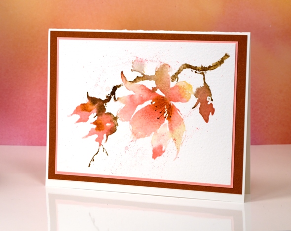
I thought I’d share a spring bloom even though it will be a long time before we see any around here. We are experiencing serious winter weather right now; we’ve got plenty of snow, plenty of ice and plenty of cold! I’m sure I will be creating more wintry scenes in the weeks ahead because although cold outside, it is also beautiful.
To create this watercoloured magnolia I inked the ‘unfolding’ stamp with memento markers, spritzed the stamp and stamped on cold pressed watercolour paper. I used a brush to blend colour within the petals and stems and to splatter some ink over the stamped image. Creating such a loose print meant that the sepals on the stamp were lost so I drew them on after the stamping dried.

Supplies:
Stamps: The Unfolding (PB)
Inks: potter’s clay, espresso truffle, cantaloupe, rose bud memento inks (Tsukineko)
Cardstock: Fabriano 100% cotton cold pressed watercolour paper, coordinating cardstock for mats
New Year Landscape
Posted: December 31, 2016 Filed under: Skyward, Stamped Landscapes | Tags: Peerless Transparent Watercolors, Penny Black stamps, Tsukineko Versafine inks 15 Comments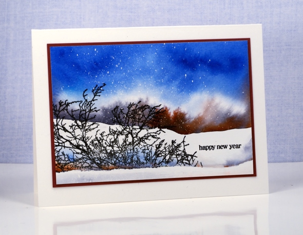
The scene on today’s card is not unlike what I see around Ottawa. Sometimes the sky is bright blue; it usually means the temperature is very cold. The landscape is covered in white but the trees tend to be a mix of black, grey and sometimes brown, the deciduous ones that is. I splattered masking fluid over a piece of watercolour paper to create the look of falling snow; if the sky had been darker it could have looked like either snow or stars. I then used Peerless watercolours to add colour. I began by painting a line of water across my panel; that line became the edge of the background snowbank. I picked up grey paint and added it to the water then brown so the colours spread and feathered. I added more water above the grey and brown then started painting blue from the top of the panel slowly pulling it down and diluting it with water. I didn’t want the blue to mix with the grey and brown so I kept the edge of both colours diluted with water and tipped my panel towards the top so colour would move upward not down.
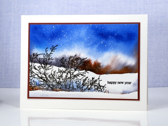
I positioned a mask lowered down the panel then stamped the bare branches in versafine onyx black. Once the ink was dry I removed the mask and painted colour behind the stamping extending to the right hand edge to look like another snow bank. To finish I removed the masking fluid, added a sentiment, matted the panel and attached it to a card base.
I wish you all a happy new year and look forward to sharing with you here in 2017. Thank you so much for dropping in to see what I’ve been creating.
Supplies
Stamps: Skyward, Holiday Snippets (PB)
Ink: Versafine onyx black ink (Tsukineko)
Paper: hot pressed watercolour paper, brown cardstock
Paint: cobalt blue, neutral tint, mahogany brown (Peerless watercolours)
Batik style background
Posted: December 29, 2016 Filed under: heart string, Peacock Feather | Tags: Brusho, Penny Black creative dies, Penny Black stamps, WOW embossing powders 4 Comments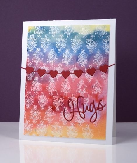
The emboss resist method creates pretty backgrounds especially when painted in a rainbow of colour. I used three primary colours overlapping them to end up with the yellow, orange, red, purple, blue and green. I stamped the peacock feather pattern in versamark and embossed in clear powder on watercolour paper and the slight texture of the watercolour paper combined with the very fine detail of the stamp meant that I did not get a perfect impression. Once I added the colour over the top I noticed that it looks very much like a batik fabric print.
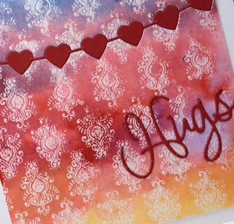
I trimmed the panel then used the heart string die to cut the piece in two. With the same die I cut a string of red hearts then attached the panel to a card base inlaying the red hearts but attaching the die cut word on top of the panel.
Supplies
Stamps: Peacock Feather (PB)
Dies: heart string, love expression (PB)
Ink: versamark (Tsukineko)
Paint: yellow, prussian blue, crimson brusho (Colourcraft)
Paper: hotpressed 100% cotton watercolour paper, red cardstock, Neenah solar white cardstock
Also: WOW clear embossing powder
The Yellow House
Posted: December 28, 2016 Filed under: Brusho, Victorian home | Tags: Brusho, Faber-Castell Albrecht Durer Watercolour pencils, Penny Black stamps, Tsukineko Versafine inks 3 Comments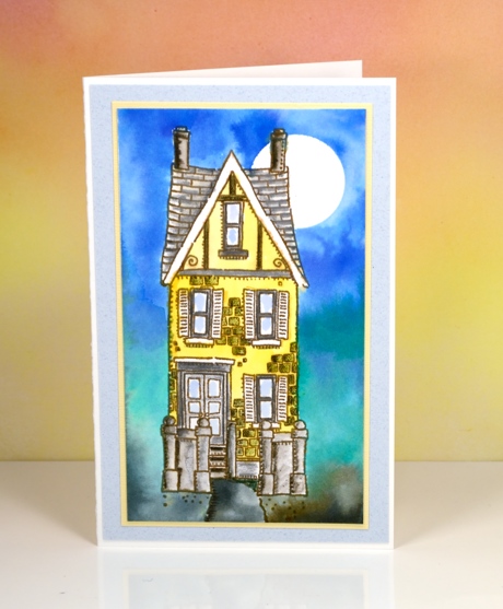
I painted the yellow house a while ago using brusho watercolour powders for both the background and the house. In the background I let the brusho do what it does so well, blend from colour to colour. The house I was more finicky about. I stamped the house in vintage sepia versafine ink, a pigment ink that would not bleed when I started adding watercolour paints over it. I used a small paintbrush and brusho in a palette to paint the house in yellow and grey. After it dried I used watercolour pencils to add shading to columns, steps, roof tiles and bricks. I let that dry before adding a circle mask in the top right corner to create the moon in the blended blue sky. By dampening the paper before adding colour I was able to blend softly from blue to green to grey.
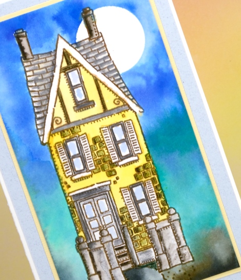
I matted in yellow and grey just like I might if framing a painting . The stamp is long and thin so the card is too. When I was making this panel a friend of mine was making one too. She didn’t end up with such a tall thin card because she added a car beside the house which looked very cute!
Supplies:
Stamps: Victorian Home (PB)
Ink: vintage sepia versafine ink (Tsukineko)
Paper: 100% cotton hot pressed watercolour paper, co-ordinating cardstock for mats
Paint: brusho ultramarine, lemon, emerald green, black (Colourcraft)
Pencils: sepia, pine green, cold greyIV Albrecht Durer watercolour pencils (Faber Castell)
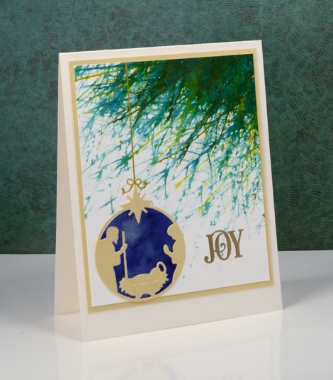
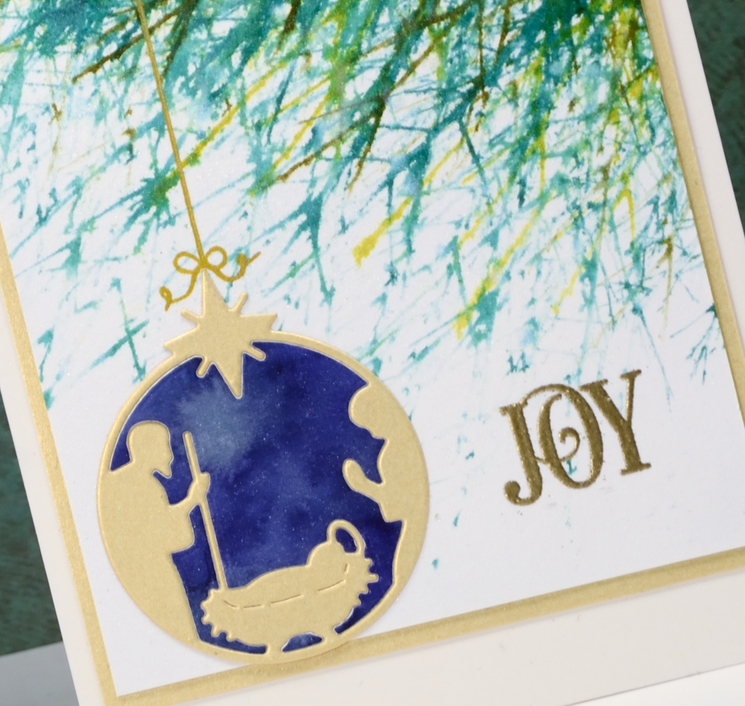
Joy
Posted: December 24, 2016 Filed under: Into the sky, manger | Tags: color burst, liquid metals, Penny Black creative dies, Penny Black stamps, Ranger Distress stains, WOW embossing powders 13 Comments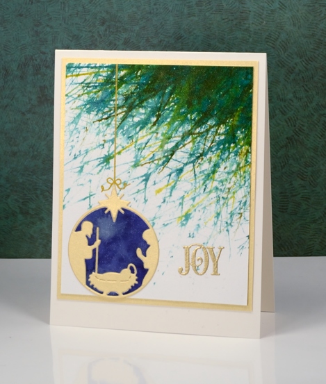
Joy to the world! The Lord is come;
Let earth receive her King;
Let every heart prepare him room,
And heaven and nature sing.
No more let sins and sorrows grow,
Nor thorns infest the ground;
He comes to make his blessings flow
Far as the curse is found.
He rules the world with truth and grace,
And makes the nations prove
The glories of his righteousness,
And wonders of his love,
And wonders of his love,
And wonders, wonders, of his love.
Supplies
Stamps: Into the sky, Joy filled (PB)
Die: manger (PB)
Paints: indigo, terre verte colorburst & Platinum liquid metal(Ken Oliver)
Ink: Encore gold ink(Tsukineko) evergreen bough, pine needles, crushed olive, forest moss distress stains ( Ranger)
Paper: hot pressed Fabriano watercolour paper, shimmer gold paper
Also: metallic rich embossing powder (WOW)


