
Runway inspired challenge
Posted: August 9, 2013 Filed under: CAS, Every Happiness, Glory of Modesty | Tags: Penny Black creative dies, Penny Black stamps, Tsukineko Memento inks 5 Comments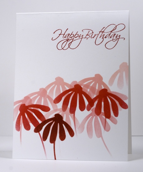
This week the Penny Black design team has been playing along with the current Runway Inspired Challenge.

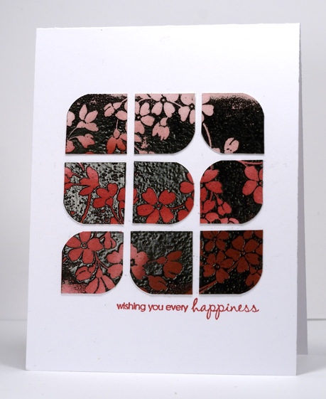
My top card was made by sponging through a couple of masks cut with the blissful die and three different memento inks (listed below). The popped up tiles on the card below were made using the emboss resist method and the same three inks.
Supplies:
Stamps: Glory of modesty, Every Happiness, Flourish Birthday (PB)
Inks: Memento Angel Pink, Love Letter, Rhubarb Stalk & Versafine Onyx Black (Tsukineko)
Dies: Bashful, Black embossing powder
One stamp three ways
Posted: August 6, 2013 Filed under: Berry Branch, Stamped Landscapes | Tags: Penny Black stamps, Tsukineko Memento inks 17 Comments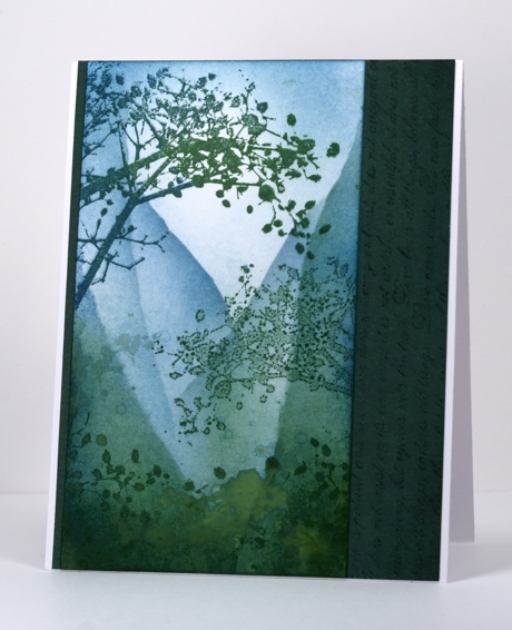
I think this berry branch stamp was the first Penny Black stamp I owned. I love the way it comes in from the side with all the twigs, berries and leaves. Sometimes I want to balance a design with a branch facing the other way and, as I don’t have one of those blank rubber stamps for creating a mirror image, I tried something else. I stamped the branch in a mix of teal and green in the upper left hand corner. I re-inked the stamp and stamped it on the plastic imaging sheet I use with my stamp positioner and stamped the sheet onto the card panel. The image is much paler when stamped this way. The third way I stamped the berry branch was by painting water onto it and stamping it onto the sponged colour. This creates a ghostly watery image.
The steep hills were created by sponging over a torn post-it note mask several times. I also flicked some water droplets and green ink droplets around too. The panel is matted with PB Sea Breeze mix & match cardstock with the 1 Corinthians Love chapter text stamped on it.
Supplies:
Stamps: Berry Branch, Love Chapter (PB)
Inks: Memento Teal Zeal, Summer Sky, Cottage Ivy, Northern Pine (Tsukineko)
Cardstock: Sea Breeze mix & match cardstock
Golden days
Posted: August 1, 2013 Filed under: CAS, Irises | Tags: CAS, Penny Black stamps, Tsukineko Memento inks 11 Comments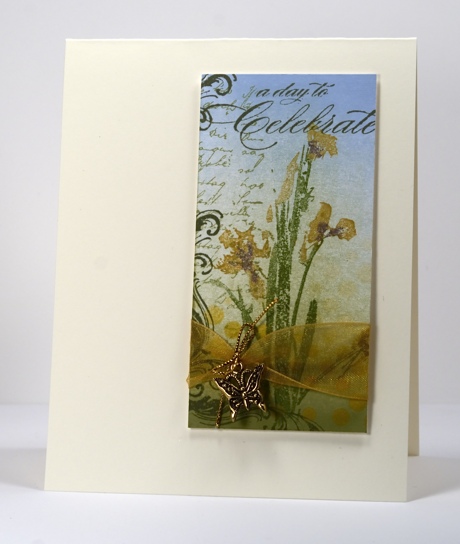
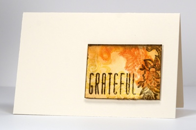
Although it is a little dreary and wet today we have been enjoying beautiful days of sunshine lately so a golden theme seemed appropriate.
The little panel started out as a bigger experimental panel onto which I brayered blue and green ink. I then coloured the iris stamp with markers spritzed it, then stamped. I added some script on the left, some flourishes around the edges and finally a sentiment. Once trimmed I had to decide where and on what sized card I would place the panel. I played around with a landscape orientation for quite a while but it just wasn’t working for me so I settled on popping up the panel on a portrait oriented card base instead. You will probably realize that adding a charm is a first for me but I really liked the gold accents in the ribbon, charm and cord. They helped highlight the summer feel of the panel.
Hope you are enjoying some sunshine too.
Supplies:
Stamps: Gratitude, Irises, Letter Background PB)
Inks: Memento Summer Sky, Cantaloupe, Grape Jelly, Pistachio, Olive Grove, Bamboo leaves & Versamark (Tsukineko)
Also: Gold organza ribbon, gold cord, butterfly charm from Lorraine’s stash
Floral tiles
Posted: July 28, 2013 Filed under: CAS, Hillflowers 7 Comments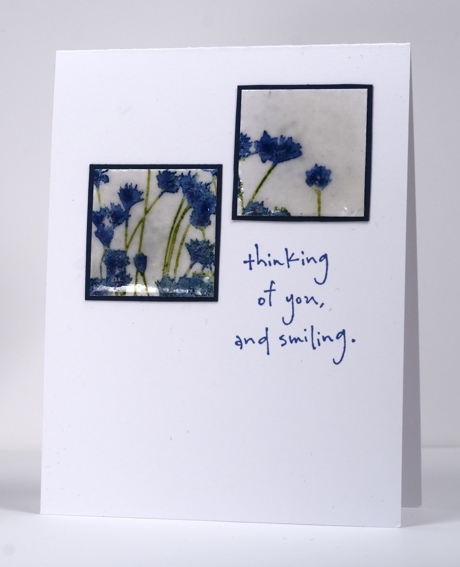
Today’s card is one of those evolving cards that you really don’t need to know the history behind. Yes it did start out as a whole panel with the hillflowers on it. Yes, there were more tiles, five to be exact. But this is how it ended up. Two tiles make a strange layout I know but if you think of the sentiment as filling the third square then it balances a little better.
I inked the stamp with markers and as I was looking for more of a cornflower blue I used both the Danube blue and the Paris dusk markers for the flowers and Bamboo leaves for the stems. I spritzed water on the stamp to blend the blues a little. Once the panel had been cut into tiles I stamped the versamark pad onto the tile and then embossed with a glassy/coarse embossing powder. I had to do it a couple of times to get good coverage. The tiles are matted with a thin navy cardstock.
Thanks for dropping by.
Supplies:
Stamps: Hill flowers , …Smiling PB)
Inks: Memento Danube Blue, Paris Dusk, Bamboo leaves & Versamark (Tsukineko)
Also: Thick enamel like clear embossing powder
Beat the Heat with Water(colour)
Posted: July 24, 2013 Filed under: Floral Applique, Hot Rod, Lace Trims, Social Butterfly, Summer Fun, Watercolour | Tags: Penny Black stamps, Tsukineko Memento inks 10 Comments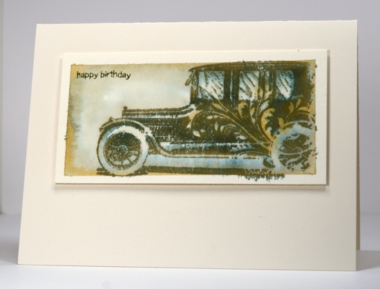
There is a new challenge running at on the Penny Black blog inviting you to share your summer stamping for a chance to win some stamps.

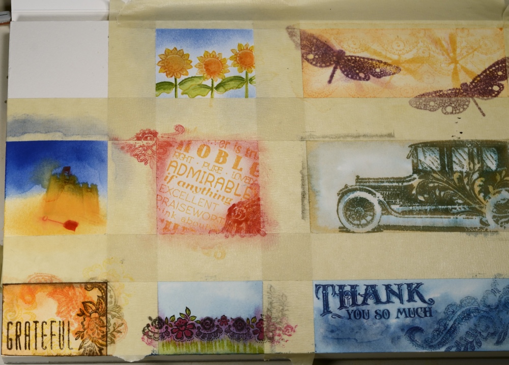
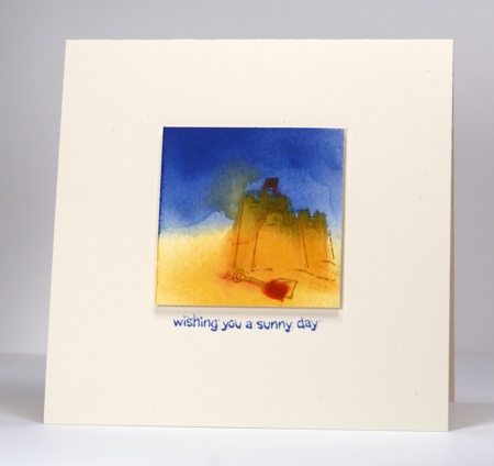
We have had a long stretch of hot weather here in Ottawa and one of the coolest places in the house is my basement craft area. The best way to cool down and beat the heat is to head for the water so I created a one page watercolour sample sheet. I used masking tape to make nine mini panels but next time I think I’ll use painter’s tape as the masking tape ripped the surface of the paper in a few places. I worked on two or three panels at a time and ended up with six out of nine that I wanted to make into cards.
The hot rod panel above was created by wetting the panel first then stamping the car image with Memento Olive Grove ink. The ink began to bleed immediately separating into two pigments, a green and an orange. I increased the amount of orange by adding a little Memento tangelo ink with a paintbrush here and there.
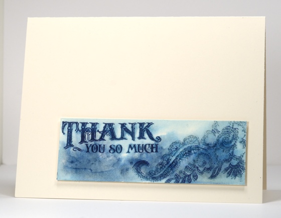
The panel below was also created by stamping onto wet paper. In order to have soft blended images as well as sharp ones I stamped with both Memento ink and Versafine. The memento is a water soluble dye ink whereas the Versafine is oil based.
You will see some of the panels have a border left by the tape but others were cropped right to the edge of the water coloured panel.
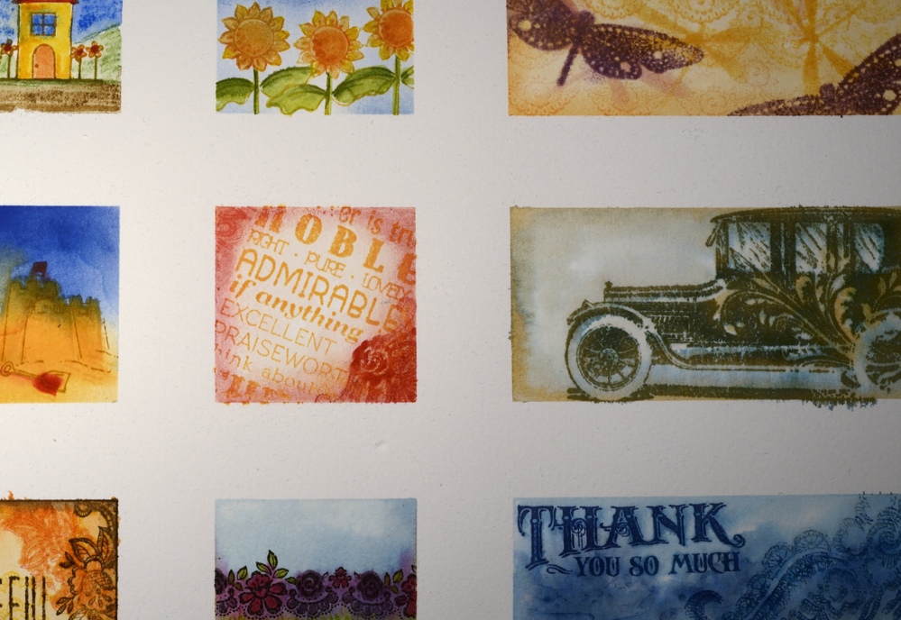
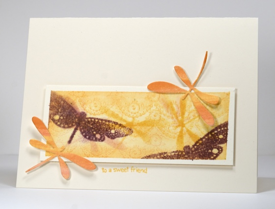
To create the dragonfly panel below I wet the paper with a yellow wash made using memento cantaloupe, this time stamping with a lace trim stamp. When the panel was dry I sponged through a die-cut mask of a dragonfly before stamping the dragonflies. I die cut a couple of watercoloured dragonflies to add to the border of the panel.
I also created a couple of tiny scenes using the cute little stamps from the Summer Fun set
One of my panels was very small so I made a mini card.
Supplies:
Stamps: Floral Applique, Sentimental, Hot Rod, Lace Trims, Summer Fun, Life’s Messages (PB)
Inks: A selection of Memento ink pads and markers & Versafine inks (Tsukineko)
Dies: Flutters
Cardstock: Portofino 100% cotton 140lb hotpressed watercolour paper
Blue shining through
Posted: July 23, 2013 Filed under: Hillflowers, Leaves, Maidenhairs, Stamped Landscapes, Winter Berries | Tags: Faber Castell gelatos, Penny Black stamps, Tsukineko Memento inks 27 Comments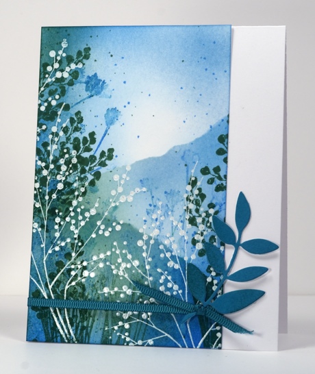
“Time for a scenic card,” I thought as I browsed through my art inspiration board for ideas. The delicate white branches and stems in this piece of art were my starting point. I embossed winter berries in clear and then coloured the hill flowers stamp with the spearmint and the blueberry gelatos, spritzed it and stamped it over the embossing. Next came the Maidenhairs leaves in green and sponging in blues and green. I t was only after I had sponged the perimeters that I decided to create some hills using a torn post-it note mask. Finally I flicked blue and green ink around and a few drops of water here and there. The drops remind me of the tiny insects which sometimes swarm and are not always detected until one is in my eye or down my throat! I thought about adding a sentiment but opted for some die cut leaves instead.
Enjoy your day;, I’ll be back tomorrow with my take on Beating the Heat
Supplies:
Stamps: Maidenhairs,Winter berries, Hill flowers PB)
Inks: Memento Bahama Blue, Summer Sky, Cottage Ivy & Versamark (Tsukineko)
Dies: Leaves
Also: Clear embossing powder, teal ribbon from Lorraine’s stash, Faber Castell gelatos
Five Butterflies
Posted: July 20, 2013 Filed under: CAS, Damask Pattern, Dies, Dots, Tagged | Tags: CAS, Penny Black creative dies, Penny Black stamps, Tsukineko Memento inks 11 Comments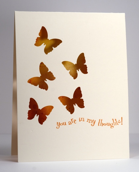
I tried for a while, recently, to make five butterflies work on a card and finally gave up and settled on three. With the help of the sketch from CAS(e) this Sketch #37 I managed to create a five butterfly card.
I have seen some wonderful cards lately where a die cut image reveals all the colour and pattern happening underneath so I decided to give it a try.
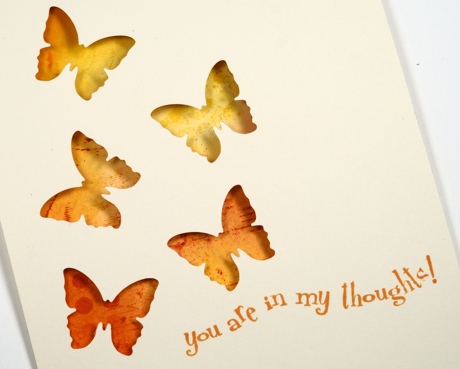
I cut my butterflies first using the butterfly die from the Tagged set , then masked an area inside the card to line up with what would be revealed through the butterflies. The collage pattern I created in the masked area is a combination of the damask pattern background and the music background along with sponging in warm yellow and orange tones. A dots mask die cut from a post-it note was sitting on the desk so I sponged a few dots through that too although I admit they weren’t entirely necessary!
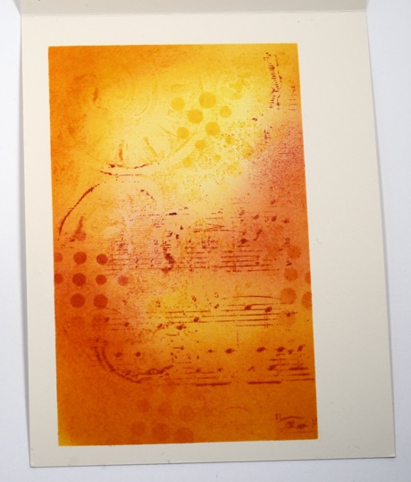
The sentiment just seemed like the right one to choose with those butterflies weaving through the air like that.
Where will I write the greeting on this card I wonder?
Supplies:
Stamps: Damask Pattern, Music Background, In my Thoughts (PB)
Inks: Memento Tangelo, Love letter, Dandelion, Cantaloupe (Tsukineko)
Dies: Dots, Tagged
Three square layout
Posted: July 18, 2013 Filed under: Background Stamps, CAS, Delicate Florals | Tags: Fabriano Watercolour Paper, Penny Black stamps, Tsukineko Memento inks 13 Comments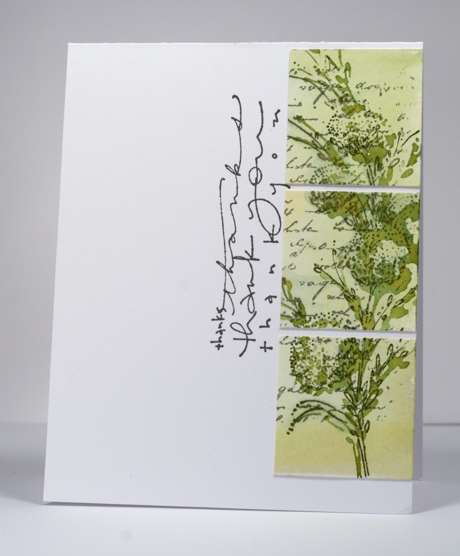
Quite some time ago I stamped the spray of round blooms from the Delicate Florals set on water colour paper. I stamped it three times in different colours and with different amounts of water added each time. The panel has been sitting around waiting for further inspiration. I sliced off the green section of the panel yesterday because I was inspired by this card of Sarah’s. I really like the squares lined up on the extreme right and the sideways sentiment. I didn’t cut my squares quite as small as Sarah because I wanted as much of the image as I could fit.
It’s been a while since I stamped the panel but I think it might have gone something like this:
1. paint a green wash on the watercolour paper
2. ink stamp in green and stamp onto the green wash while it is still damp
3. add letter background in grey
4. when dry stamp the branch in grey slightly offset from the green image.
Supplies:
Stamps: Delicate Florals, Letter Background, Thanks, thanks (PB)
Inks: Memento Bamboo leaves, Pear Tart, London Fog & Versafine Smoky Grey (Tsukineko)
Cardstock: Fabriano 100% cotton hot pressed watercolour paper
OLW 149 Closet inspiration
Posted: July 17, 2013 Filed under: CAS, Lace Trims, OLW | Tags: Penny Black stamps, Tsukineko Memento inks 15 Comments
This week’s One Layer Wednesday Challenge is to make a card inspired by a piece of clothing in your closet or a piece of clothing pinned on Pinterest. I happen to believe that one can never have too many white blouses; I love white blouses and if they have a bit of lace or embroidery on them all the better! I don’t have a photo of one of mine but here are a couple pinned on my All Dressed Up board on Pinterest.


To create the card above I embossed the lace trim in white on ivory cardstock then sponged a little Versamagic ” Wheat” and Memento ” Angel Pink” over the embossing to highlight it. The sentiment does not show up too well in the photo but it is there on the top right saying “On Your Special Day” which would work for a wedding or bridal shower.
OLW149Rules
1. A one-layer card is defined as a single layer of card stock folded in half. No other layers of paper allowed.
2. Make a card inspired by a piece of clothing. It could be the fabric that inspires or the colours, the shape or even a small element on the clothing. Feel free to include an inspiration pic in your post if you like.
3. Post your card somewhere online and link back to it here using the InLinkz button on the sidebar. If linking to a blog post, please be sure to link to the specific post and not your blog’s home page.
4. The most important rule of all…HAVE FUN!

Vintage collage
Posted: July 16, 2013 Filed under: Background Stamps, Collage cards, Delicate Florals, Watercolour | Tags: Faber Castell gelatos, Penny Black stamps, Tsukineko Memento inks 21 Comments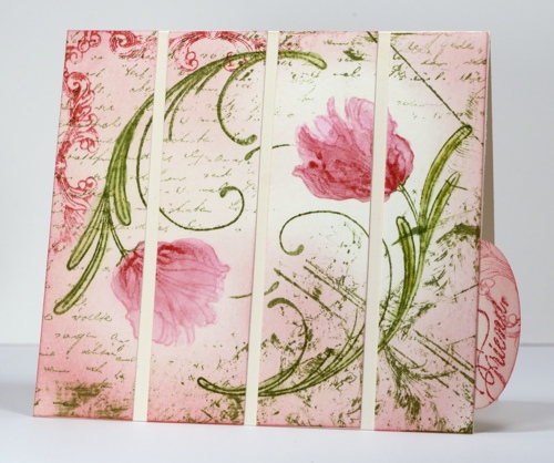
Once again I hesitate to try and describe the process involved in creating this card because it is a combination of experiments and errors!
I started with a large piece of watercolour paper on which I was stamping all the flowers from the Delicate Florals set and experimenting with ways to colour them. The tulips above were stamped with Memento Angel Pink and Bamboo leaves. I then did the colouring with gelatos. I made a little watercolour paint by colouring with the gelato on a plastic sheet then blending in some water. I also picked up colour directly from the gelato with an aqua painter as well as applying gelato onto the tulip then blending. At this point I had a circle made from two tulips and no plan in place. I cut it into a square, masked the tulip flowers and added the letter background. I think it was about this point that I tipped over the bamboo leaves ink pad onto the panel creating some of those random lines you see on the right hand side. (It was also around then that I knocked tomorrow’s OLW card over onto an inked stamp and ruined it but that’s another story.)
So after dragging the edge of the ink pad over the panel a few times to add more vintagy effects I decided to add a little corner of Divine Pattern and a whole lot of pink sponging. Almost happy by this time I settled on one more element: one corner of the frame stamp. The panel was a square but I decided not to make a square card; instead I sliced it up and laid it out on a 5½” x 4¼” cardbase. Even after spacing it out there was still empty space which didn’t look quite right so I created the oval tab, slipped it under the last panel and decided to make a smaller card with the tab sticking out.
Thanks for dropping by; I will be back tomorrow with hopefully my fourth and final attempt at this week’s One Layer Wednesday challenge card.
Supplies:
Stamps: Delicate Florals, Letter Background, Divine Pattern, With Florish, Eloquence (PB)
Inks: Memento Bamboo leaves, Angel Pink, Love letter
Cardstock: Fabriano 25% cotton hot pressed watercolour paper,
Also: Faber Castell gelatos


