
Brusho Hearts
Posted: January 5, 2016 Filed under: All my hearts, Brusho, Love & Hugs, Love is growing, Triple love | Tags: Brusho, Penny Black creative dies, Penny Black stamps 13 Comments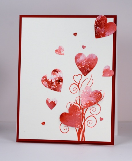
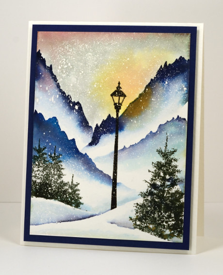
‘Tis the season for creating Valentine cards but the fresh snow outside my window is calling me to keep creating snowy scenes! New stamps and dies however, were calling from inside my craft room so red, pink and hearts it is. The new release from Penny Black is full of love, hearts and sweet wishes and is available in the online store now.
I created a red and pink panel with brusho then die cut a bunch of different sized hearts using three different dies. Aren’t those tiny ones cute? I popped up two of the hearts on fun foam and attached the others directly onto the stamped panel.
What are you creating in the new year?
Supplies:
Stamps: Love & Hugs (PB)
Dies: Triple love, Love is growing, All my hearts (PB)
Mediums: Brusho powders, Versafine Satin red ink
Cardstock: Hotpressed Fabriano watercolour paper, Neenah chili red
Also: white fun foam
My Favourites from 2015
Posted: December 30, 2015 Filed under: Bister, Brusho, Hand drawn, Hand lettered, Penny Black, Stamped Landscapes | Tags: Penny Black creative dies, Penny Black stamps 17 CommentsThank you for your response to the viewer’s top ten from 2015 and thank you for the encouragement to keep sharing here. I love reading your comments and visiting your blogs and I am hoping to respond to your comments more in the coming year because I enjoy the conversations that develop from time to time. Sometimes they are about techniques and products but often they are about memories, traditions and experiences. It is great getting to know you better.
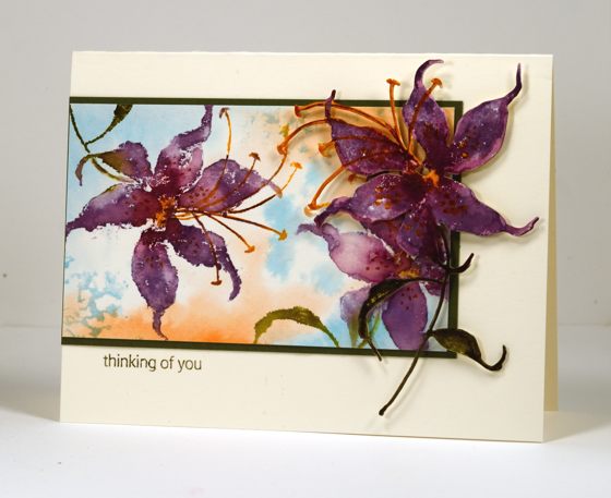
I whittled my favourites down to 10 but there were a few more I wanted to include. The pink one I shared yesterday was a favourite but it already made one list! The cards included below are in the order I originally posted them and a click on the photo will take you to the original post.
This one is a favourite for what is happening in the background as well as the foreground.
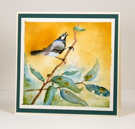
I used a die cut mask for this one and managed to make the leaves look like eucalyptus which of course reminded me of Australia.

I worked on this one in portrait orientation then once I was finished realised it looked better landscape.

I love Queen Anne’s Lace so it is not surprising to find some in my top 10.

This is just one of those watercolours that worked above and beyond my hopes and I will never manage to do the same again! My mother has grown roses this colour so that made it extra special.

A simple design and some bister made me happy. (and of course you can never have too many tree stamps!)
After I had created quite a few bister cards I borrowed some brusho and the love affair with watercolour powders continued. “Finding” a garden in a random pattern of brusho was so very satisfying.

One of my goals this year was to paint more from scratch. I felt like I had not done much but when I looked through this year’s posts I saw some that were entirely my own design, like the one above, as well as some where I combined some stamping with some hand painting as in the one below.
My recent series ‘Stamping the stories’ struck a chord with many of you and I enjoyed the conversations it generated about favourite stories.
I only just posted this one but it is definitely a favourite. I will be doing more with this vintage colour scheme and hand lettering in 2016 so stay tuned.
Thanks for indulging me as I shared some of my favourites. They certainly represent some of the techniques and products I have enjoyed this year as well as some of the subjects I love to include in my projects.
Blue Stars
Posted: November 27, 2015 Filed under: Brusho | Tags: Brusho, Penny Black stamps, Tsukineko Versafine inks 8 Comments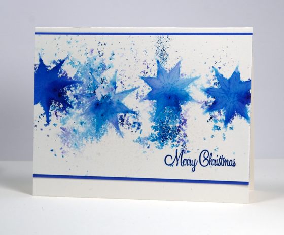
The Brushos are still sitting on my desk for easy access allowing me to create more pretty patterns. Blue happens to be my favourite colour so I was quite happy the blends and patterns happening on this panel. To create these blue stars I stamped in water then sprinkled some brusho over the water. I used a paintbrush to fill the stars with brusho blues and a spritzer to spread the colour outside the outlines. When I was almost finished painting I spritzed with blue pearl-ex spray to add some shimmer and sheen. The sentiment is stamped in two blues, something I do when I don’t have the exact match in ink.
Supplies:
Stamps: Soft Grace, Yuletide Greetings (PB)
Inks: Versafine majestic blue and deep lagoon (ImagineCrafts/Tsukineko)
Cardstock: Canson 100% cotton hot pressed watercolour paper, blue cardstock
Also: Brusho watercolour powder, Interference blue pearl-ex spray
Stamping the Seasons: Summer
Posted: November 24, 2015 Filed under: Brusho, Joy to All, On the Town, Stamped Landscapes | Tags: Brusho, Penny Black stamps 3 Comments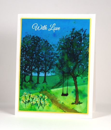
It’s a little ironic to be posting the summer tree on the day I woke up to the first snowfall this season! Let’s just consider this scene a happy memory or if you are in the southern hemisphere a glimpse of what may already have arrived. I worked with Brushos again to create this scene; I might return to the bister for the fall one. I began by taping down my watercolour panel and painting the sky in mix of several blues. While that dried I painted the paler green strip then finally the darker green hill. I let it all dry before stamping several trees on the left hand side and the tree from ‘Joy to all’ on the right hand side. I sprinkled green brusho over the empty branches and spritzed to add water. Between spritzing and painting with a brush I filled out the trees with a couple of green tones. The odd little flowers at the front I drew onto the stems which I stamped with the twig stamp. Finally I painted a path and added a white sentiment.
I haven’t done the autumn scene yet but watercolour powders seem to be the perfect medium for blend of colours I see in fall so I’m looking forward to that one. The rest of the Penny Black design team are sharing their ‘stamping the seasons’ projects on the blog this week and next.
Supplies:
Stamps: Joy to All, On the town, Special Wishes (PB)
Inks: Versamark, Memento Rich Cocoa, Cottage Ivy (ImagineCrafts/Tsukineko)
Cardstock: Canson 100% cotton hot pressed watercolour paper, yellow cardstock, Neenah solar white
Also: Brusho watercolour powder , white gel pen, white embossing powder
All is calm under a brusho sky
Posted: November 9, 2015 Filed under: Brusho, Gleeful | Tags: Brusho, Canson watercolour paper, Penny Black stamps, Tsukineko Versafine inks 13 Comments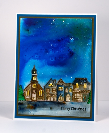
I have painted quite a few expansive coloured skies lately. On Saturday I taught the last of my Merry & Bright class which included a bister night sky over a die cut tiny town. As I demonstrated the technique all of my skies were different and class participants also created unique and beautiful skies. Today’s card is similar in layout to the class card but instead of bister I used brusho and instead of die cutting I painted the little street with the help of a stamp from the ‘Gleeful’ set. I stamped the town first in versafine vintage sepia then added brusho and water to the sky area. I didn’t need to use much because the powder is so potent. I blended the blue and green with a brush and painted right up to the roof tops then let it dry. I used brown, blue, green and yellow brusho to paint the buildings and trees then finished the foreground with black brusho which separates into several colours. I added a tiny sentiment in versafine onyx black, removed the masking fluid to reveal stars then matted with a couple of co-ordinating colours.
Thanks for dropping by; I hope you have a great week.
Supplies:
Stamps: Gleeful, Holiday Snippets (PB)
Mediums: Brusho powders, Versafine Onyx Black ink
Cardstock: Hotpressed Canson watercolour paper, Neenah avon brilliant white, brown and teal cardstock
Brusho Northern lights
Posted: November 7, 2015 Filed under: Brusho, Prancers, Stamped Landscapes, Watercolour | Tags: Brusho, Penny Black stamps 10 Comments
I have another brusho card to share today with a different look. I blended all the colour on this panel rather than leave the speckled patterns of the previous cards. The brusho colours are intense so I didn’t use much to create this sky. I sprinkled some blue, green red and purple over a panel splattered with masking fluid, then blended with water as I would with other watercolour paints. I stamped the trees and sentiment in black then, once the ink was dry I removed the masking fluid to reveal a scattering of stars or perhaps snow.
Supplies:
Stamps: Seasons Wishes, Prancers (PB)
Mediums: Brusho powders, Versafine Onyx Black ink
Cardstock: Hotpressed Canson , Neenah Solar White, Epic Black
Hide, Seek and Paint with Brusho
Posted: November 5, 2015 Filed under: Brusho, Hand drawn, Hand lettered | Tags: Brusho, Fabriano Watercolour Paper, Hand lettering 11 Comments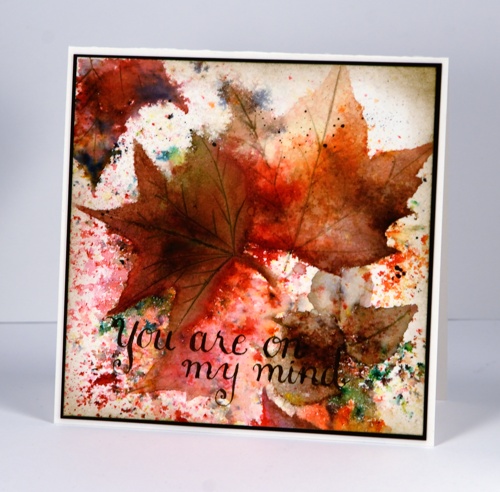
The brusho magic continues as I said it would! I keep referring to it as magic because you really don’t know what is going to appear when you spritz water and add the brusho powders. How much water, how much powder, which you do first, how much you continue to add – all these factors will affect the outcome. The unpredicability of the medium did make my live brusho periscope yesterday a little nerve wracking but I still enjoyed myself with those who were able to join me live. It will be available for a bit longer on Katch. (wish you could fast forward through the clumsy beginning; I promise it gets better!)
My process for arriving at the finished leaf card involved several steps beginning with the random scattering of warm toned powders plus a little green. I spritzed, sprinkled powder and repeated until I had pretty patterns appearing then I left it; I walked away and went and ran errands so there was no temptation to fiddle with it before it dried. When I returned I looked for leaf shapes or sections of leaves that had occurred randomly in the panel, then enhanced and completed those shapes. The painting step did take quite a while and involved stopping and starting. I tried to move the existing colour on the panel with a brush as much as possible but sometimes added a bit more brusho where needed. There were two small brown leaves that emerged in the bottom right hand corner so I painted a couple more to make a little pile. I add veins to one leaf with a craft knife then added brown paint which settled in the cuts but it turned out darker than I wanted so I switched to a watercolour pencil to add the veins to the other leaves.
The sentiment is hand drawn with pen and ink, something I have been practising lately. Unfortunately it is not easy on my hands so I can’t do too much. I did learn traditional calligraphy years ago so some of the concepts are familiar and others are new and tricky!
You may have heard that Jennifer McGuire is hosting a Share Handmade Kindness Campaign during November at present and challenging card makers to send their cards out and make a difference to someone’s day. I don’t need the reminder to do the handmaking but the actually sending through the mail is a challenge I am taking on; I want to get this card in the mail today! Susan Raihala is challenging us to make and send Gratitude cards right now also. And if you’re forging ahead with your Christmas cards don’t forget the Caring Hearts card drive.
Thanks for dropping by. There will be a break from the Brusho tomorrow while Gansai Tambi paints take the stage instead.
Supplies:
Medium: Brusho powders & Faber Castell Albrect Durer watercolour pencils, Brown ink
Cardstock: Hotpressed Fabriano paper, Epic Black Neenah cardstock
Brusho is in the house!
Posted: November 4, 2015 Filed under: Brusho | Tags: Brusho, Kuretake Zig clean color real brush markers 14 Comments
When I started experimenting with bister powders there was perhaps a slight overload of bister projects here on the blog. I am still really enjoying the colours, the texture and watching the magic when the bister reacts with water, but I have some Brusho in the house now and I have to say it is also much fun. Blog readers and some of my class members have been asking whether I prefer Bister, Brusho or Colorburst. I am happy to be undertaking the creative research to answer that question.
All that to say; I’ll be sharing Brusho projects for the next few days! Today’s brusho experiment involved a little magic, some searching and painting. Sandy Allnock used this technique a while back but I can’t find the technique on her blog which makes me wonder whether it was a periscope. (Here is a link to a post where she shared a wonderful amount of information about working with Brusho and Colorburst)
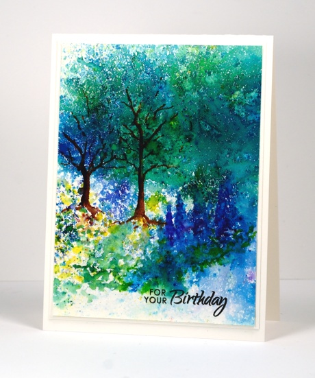
I started by creating a random pattern of colour with Brusho powders. I sprinkled some of my favourite colours on watercolour paper then spritzed with water. I waited, watched the magic, added some more powder, more water and watched more magic. I did several different panels then went to bed. The next day I worked out how to use my panels. This one was a speckly one because I did not move the colour around with a brush while the panel was wet; I just let it dry. The result is lots of little coloured shapes and feathery patterns. Because of the concentration of blues and greens at the top of the panel I decided to turn that area into trees by painting on some branches and trunks. 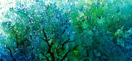
The blue speckles to the right looked a bit like delphiniums so I added more paint with a brush and some extra definition with a zig brush pem. I also painted leaves at the base of the delphiniums with more green brusho. I was working with patterns of colour already on the panel and adding more definition with sprinkles of powder, a wet brush and a few zig clean color real brush pens. This is only part of the panel; perhaps I will pull a picture out of the left over scrap too.
To finish I added a sentiment, then matted with watercolour paper and added it to a watercolour card base.(you know I am all about the matchy-matchy!)
Supplies:
Stamps: Special Wishes (PB)
Paint: Brusho powders & Zig clean color real brush pens
Cardstock: Hotpressed Canson & Fabriano paper
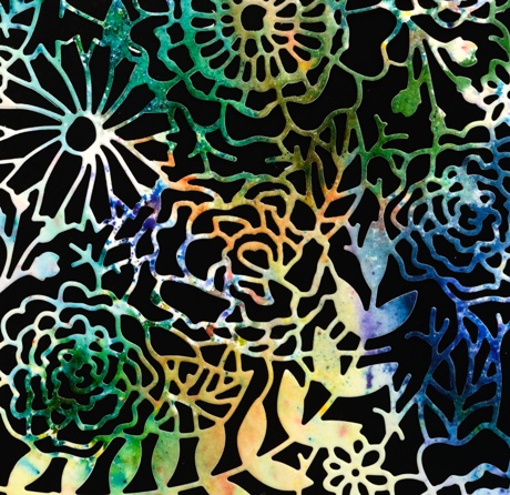
Brusho in the garden
Posted: July 28, 2015 Filed under: Brusho | Tags: Brusho, Fabriano Watercolour Paper, Penny Black creative dies 6 Comments
I tried out yet another watercolour powder recently when I got together with some arty crafty friends. Brusho seems to be similar to Color Burst and has a lovely range of bright colours. The panel featured on the card above was cut from one of my first experiments. I sprinkled green, blue, orange and yellow brusho powders on watercolour paper then spritzed and tilted the paper to let the colours blend a little. I did walk away (to eat chips) and let it dry alone. You can see some sections of the paper remained without colour.
The multicoloured panel seemed a good match for the intricate garden die I had not used before now. I tried backing it with green and white but the contrast of the black card base was the most effective.
Supplies:
Stamps: Snippets (Penny Black)
Inks: Brusho watercolour powders
Cardstock: Fabriano cold pressed watercolour paper
Creative die: In the garden (Penny Black)


