Virtual Coffee
Posted: May 4, 2020 Filed under: brick wall, coffee time, Darkroom Door, handwritten script, Stencils, World Map | Tags: Darkroom Door stamps, Darkroom Door stencils, Ranger Distress inks 4 Comments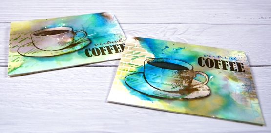
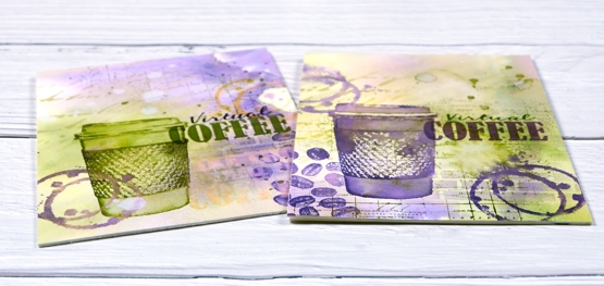
I posted a coffee themed card using the Darkroom Door ‘coffee time’ set recently which prompted a request for a pack of coffee themed cards. These ones are on their way to Australia, and were made with the addition of the word ‘virtual’ because, well, you know why. I rarely do multiples and when I do they are never exactly the same. This time I did four of one colour scheme with the cup and saucer stamp from Darkroom Door’s ‘coffee time’ set and then four more in a different colour scheme a little more like my original coffee card featuring the take out cup from the same set.
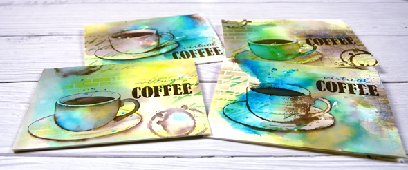
The nice thing about making multiples is starting with a large panel to create the background. I used hot pressed watercolour paper for both sets and splattered masking fluid over the panel first. I like the addition of some random white spots and shapes from a masking fluid splatter but often I wish I’d done more when I remove it from the finished project. To create the cards above I smooshed ground espresso, salty ocean and crushed olive distress inks on my glass mat. I spritzed water over the inks until they were spread over a large area then placed the watercolour panel over the top and moved it around to soak up random coloured patterns. When I turned the panel over there were blotches of each colour along with blends and blank areas. I did some further spritzing and picking up of colour until I was satisfied with the coverage. Once the panel was dry I cut it into four pieces and used both the DD handwritten script and brick wall stencils to add pattern in the same three distress inks. I used blending brushes to apply the ink which gave me soft blends that faded away into nothing at the edges.

Next I add coffee cups and coffee stains in ground espresso ink. I blended ink inside the cup on some panels but on others I added more ink outside the cup to darken the negative space. It is hard to describe my process with the cups as I did each one differently and kept playing with the three inks until I was happy with the results. On a couple of the panels I added a partial print of the world map stamp. With all the artsy stuff done I just needed to add the ‘virtual coffee’ label. The word ‘coffee’ is part of one of the word stamps from the set so I masked, stamped and embossed then wrote the word ‘virtual’ above and embossed that. I was interested to see I could write the words with a papermate flair pen and then if I covered it with clear embossing powder straight away I could get the shiny embossed effect. I do have clear embossing pens but it is impossible to see what I’ve written with a clear pen!
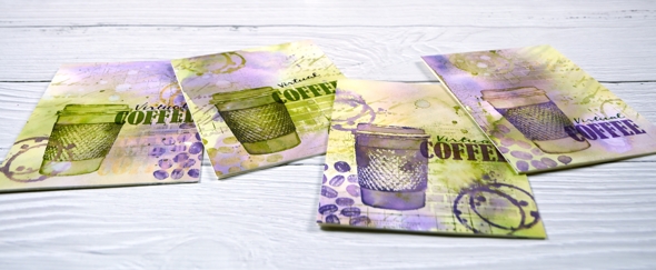
I also did four more cards with the takeaway cup stamp using much the same technique and a peeled paint/scattered straw/dusty concord colour scheme. I added a few stamped coffee beans to these ones; the ‘coffee time’ set is a very cool collection of stamps.
Thanks for joining me for ‘virtual coffee’ today. I hope your week is off to a good start.
Supplies
Pencil colouring on kraft paper
Posted: May 1, 2020 Filed under: Alluring, Coloured pencil, Penny Black, Tutorial | Tags: Faber-Castell Polychromos Colour Pencil, Penny Black creative dies, Penny Black stamps, Tutorial, video 11 Comments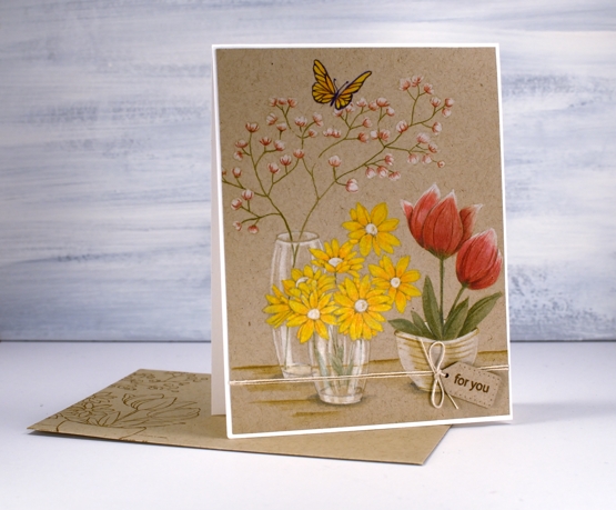
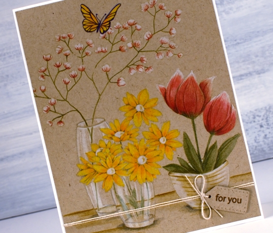
I’ve been doing some coloured pencil work, nothing too fancy but definitely satisfying to see it come together. I filmed as I coloured so you can see how I approached each flower as well as the glass vases. I don’t often complete a whole card with coloured pencils, I’m more likely to bring them in at the end to add details and shading but this time they are took the starring role. I like the look of pencil on kraft paper too, I find it a bit less intimidating than bright white paper.
It took me a long time to finish the colouring so I’m sure you won’t be surprised to hear I didn’t include every last second of footage. I sped it up and chopped it up so it wouldn’t be too long but I made sure to include my process for each element. I even did one part more than once!?! but I’ll tell you about that during the video. Towards the end of the video I referred to colouring wizard Kathy Racoosin, if you haven’t checked out her blog and wonderfully instructive youtube channel, make sure you do.
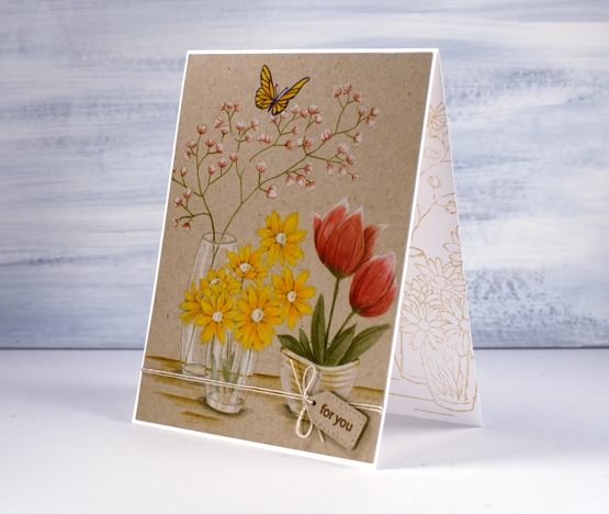
As you can see I stamped a print on a matching envelope and on the inside of the card too. It is always best to do this while the stamp and inks are still on the table, buy you already knew that didn’t you?
When I showed this one to my daughter she absolutely made my day by saying it reminded her of story books she would read and reread as a child because she enjoyed the illustrations so much!
Supplies