
Three Trees
Posted: July 8, 2014 Filed under: CAS, Splendor | Tags: CAS, Fabriano Watercolour Paper, Penny Black stamps, Ranger Distress stains, Tsukineko Memento inks 14 Comments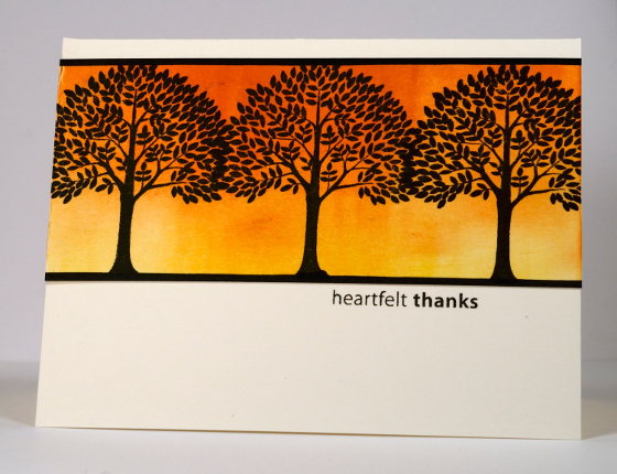
When I was strolling past a homewares store in a trendy part of town the other night I saw lampshades featuring tree silhouettes with branches connecting around the cylindrical shade. I don’t have a picture but I did translate the idea into two different cards. The one above features a brayered background which I did in Memento Dandelion and Tangelo first and black trees stamped in Versafine Onyx Black over the top. I drew the borders with a black marker then trimmed the panel.
In the version below I inked the stamp with peeled paint, mustard seed and vintage photo distress stains, spritzed it with water then stamped on watercolour paper. I ran the distress stain along the top and bottom of the panel to create the border and pulled some colour from the trees and border with a waterbrush into the blank spaces to make them less stark.
It was fun to use the same basic layout and concept but change a few things for a different mood and message. The top one seems formal and the one below a little more relaxed.
Supplies:
Stamps: Splendor, Amazing!, Friendship (PB)
Inks: Versafine Onyx Black & Vintage Sepia, Memento Dandelion, Tangelo & Tuxedo Black (Tsukineko) Peeled Paint, Mustard Seed & Vintage Photo Distress Stains (Ranger)
Cardstock: Fabriano 100% cotton hot pressed watercolour paper, Neenah Natural White 110lb cardstock
One-Layer Simplicity Challenge #7: Wave the Flag
Posted: July 1, 2014 Filed under: CAS, Maple Leaf, One-Layer Simplicity challenge | Tags: Fabriano Watercolour Paper, Penny Black stamps, Ranger Distress stains 6 Comments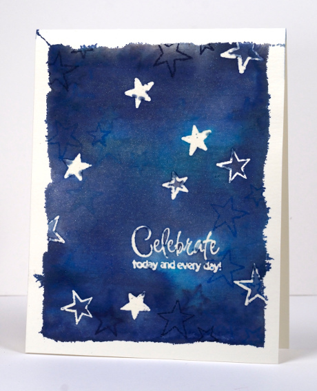
I am hosting the July challenge at One Layer Simplicity. In honour of Canada Day (July 1st) and American Independence Day (July 4th) I decided to make the challenge about flags. I want you to take a look at your country’s flag and find some inspiration there. It could be the colours, the layout, the patterns or the images. I created two cards because I have lived my life in two countries. I was born and raised in Australia and lived there for the first 35 years of my life. I married my Australian husband and both my daughters were born there. When they were 4 & 6 our family moved to Canada and seven weeks after we arrived my son was born. We have lived here ever since which will be 14 years next month. The card above is inspired by the Southern Cross on the Australian flag. I miss seeing the Southern Cross when I look up into the sky at night.


I cut a card base from watercolour paper as I planned to make it quite wet with distress stains and water. To frame the stars I tore the edge off some masking tape and taped the card base to a cutting mat. Once taped I stamped stars of different sizes and the sentiment in versamark then embossed with clear powder. I swiped three blue distress stains across the watercolour paper filling the whole space with colour. To blend it I spritzed a generous amount of water mixed with pearl-ex powder. You can see the sparkle of the pearl-ex powder below. After the panel had dried a little I stamped some more stars, this time in blue inks. When dry I removed the tape and ironed the panel embossed side down onto computer paper to melt and remove the embossing.

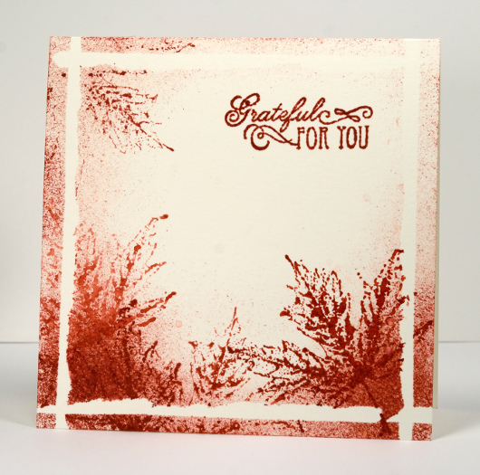
My second card is inspired by both the colour and the image on the Canadian flag. The beauty of the maple trees in autumn is something I look forward to every year. To create my second card I used the torn off bits of masking tape to make a narrow torn frame around the square front below. I then sponged red ink around the borders and stamped a maple leaf several times over the sponging. I can’t wait to check out your flag inspired cards and see how many countries end up being represented in our challenge
Supplies:
Stamps: Hello Winter , Sweet Wishes, To You, Foliage Fancy, Maple Leaf (PB)
Inks: Versamark (Tsukineko) Chipped Sapphire, Tumbled Glass, Broken China Distress Stains and Chipped Sapphire, Salty Ocean and Fired Brick distress inks (Ranger)
Cardstock: Fabriano 100% cotton hot pressed watercolour paper
Also: clear embossing powder, Pearl Ex
The reason why
Posted: June 26, 2014 Filed under: After Glow, Bamboo Branch | Tags: Fabriano Watercolour Paper, Penny Black stamps, Ranger Distress stains, Tsukineko Radiant Neon inks 21 Comments
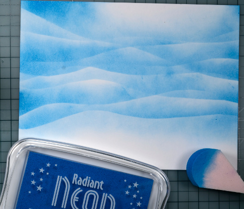
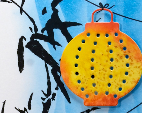
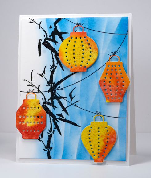
June has been a busy month for our family leaving very little time for stamping and cardmaking. Today I finally made it back to my craft table and found a watercoloured panel from a class I taught a few weeks ago. To create the panel I taped a piece of watercolour paper down and wet the whole panel. I then painted distress stains onto the wet surface and tilted the panel to let the colours run and blend. While it was still wet I sprinkled salt over the panel resulting in the patterns you see below. For the class we stamped over the patterns but I decided this leftover panel would be perfect for the little lanterns from the “After Glow” die cut set.
I used Radiant Neon Electric Blue ink to create the background below. My intention was to create an abstract sky so I used a wavy mask cut from masking paper and sponged over it numerous times. When I started arranging the lanterns I changed my mind about the sky and turned the blue panel on its side and added bamboo as a side border.
I added strings for the lanterns with Pitt Artist Pens and popped up the lanterns with dimensional tape. I found a sentiment I wanted to add but there was no room on the front so I will add it inside.
Supplies:
Stamps: Bamboo Branch (PB)
Dies: After Glow (PB)
Inks: Versafine Onyx Black, Radiant Neon Electric Blue (Tsukineko) Barn Door, Spiced Marmalade, Mustard Seeds Distress stains (Ranger)
Markers: Pitt Artist Pen (Faber Castell)
Cardstock: Neenah Classic Crest Avon Brilliant White 110lb smooth , Fabriano 100% cotton hot pressed watercolour paper
Even though I have not been making cards over the last week or so I have been busy creating. My daughter went to her prom last night in a dress I made for her. The bodice is a pale pink textured brocade and the skirt is four layers of tulle over satin. I did enjoy sewing again but perhaps I should allow a little more than 12 days next time I take on a formal gown!
Stamp & Doodle
Posted: May 28, 2014 Filed under: Floral Tapestry, Tutorial | Tags: Fabriano Watercolour Paper, Penny Black stamps, Ranger Distress stains, Tutorial 16 Comments
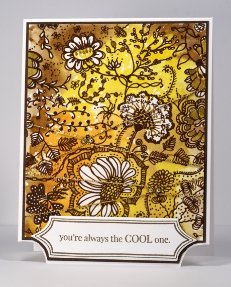
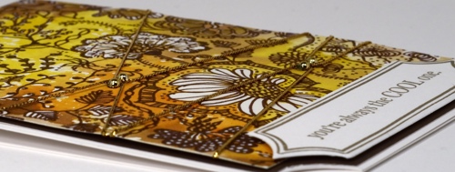
I created this card from a stamped panel that was sitting around on my work table waiting for inspiration. I stamped the “Floral Tapestry” background stamp in Distress stains on watercolour paper. After stamping once I spritzed the stamp and stamped again on another piece of paper, then did it again so I had several panels sitting around, each one a little paler than the previous one. I think this one was the palest panel but it still had plenty of colour and the negative images of the flowers and leaves were clear enough to doodle around. If you watch the video you will see my doodling process. I did not have a plan; I just defined the flower shapes and added leaves, twirls and squiggles in and around them. When I was almost finished I decided a few gold highlights would be nice so I added them with a Wink of Stella pen.
I trimmed the floral panel and criss-crossed some gold cord over it. I added two gold half pearls in each place where the cord crossed and stuck the cord down with glossy accents. The cord did not want to stay in place but with a little pressure on top it finally did! After die-cutting the banner I decided to trim the dark brown mat and cardbase to co-ordinate.
Supplies:
Stamps: Floral Tapestry, Amazing! (PB)
Dies: Triple Banner (PB)
Inks: Versafine Vintage Sepia (Tsukineko) Vintage Photo, Spiced Marmalade, Mustard Seeds Distress stains (Ranger)
Cardstock: Neenah Classic Crest Avon Brilliant White 110lb smooth , Fabriano 100% cotton hot pressed watercolour paper
Six Tulips
Posted: May 12, 2014 Filed under: CAS, Efflorescence, Watercolour | Tags: CAS, Fabriano Watercolour Paper, Penny Black stamps, Ranger Distress stains 9 Comments
I am continuing with my Tulip Festival theme, an idea inspired by a regular visitor to Bits & Pieces. (Thanks, Karen) On this card I have a watery array of tulips stamped with distress stains on watercolour paper. Distress inks are designed to react with water and each other which makes them great for blending on flowers, patterns, backgrounds etc. I inked the tulips on the stamp with Victorian Velvet first then added a touch of Barn Door at the base of each bloom. I inked the buds and stems with Crushed Olive and stamped on watercolour paper. I then used a waterbrush to blend the two colours together. To frame the panel I diluted some Tumbled Glass distress stain and painted around the edges pulling the colour into the centre and diluting it further to fade it out. Finally I flicked red and green inks over the panel, attached it to the card base and added a sentiment.
I haven’t visited any of the tulip beds yet but I did drive by the canal yesterday and saw there were plenty in bloom. Are they blooming where you are?
Supplies:
Stamps: Efflorescence, Amazing (PB)
Inks: Versafine Spanish Moss (Tsukineko) Barn Door, Crushed Olive, Victorian Velvet, Tumbled Glass Distress stains (Ranger)
Cardstock: Neenah Classic Crest Avon Brilliant White 110lb smooth, Fabriano 100% cotton hot pressed watercolour paper
Golden Blooms
Posted: May 6, 2014 Filed under: CAS, One-Layer Simplicity challenge, Petal Power | Tags: Penny Black stamps, Ranger Distress stains, Tsukineko Memento inks 19 Comments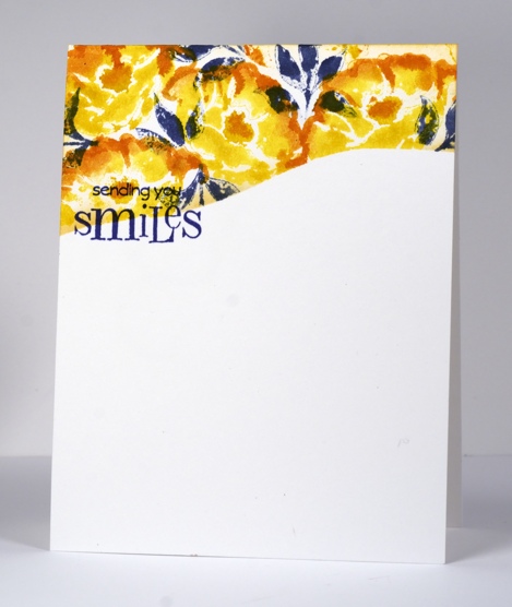
After years of avoiding yellow and orange tones in clothes and fabrics I am really enjoying using their bright warmth in stamping these days. I especially like the combination of yellow, orange and navy. I know leaves are rarely navy but orange and navy are opposite on the colour wheel so they create a contrasting stable colour scheme. I chose three colours to participate in this week’s Less is More challenge and the layout is inspired by the CAS(E) this sketch for the week. I just realized I can link up with our current One Layer Simplicity Challenge also to use flowers on a one layer card.
I cut a curved mask to cover the lower two thirds of the card base then chose three stamps from the transparent set Petal Power. I inked the solid petal stamp with mustard seed distress stain and added spiced marmalade along the petal edges. I then inked the co-ordinating outline stamp with just spiced marmalade on the top edge and stamped over the blooms. I stamped a few leaves in chipped sapphire distress stain and added the sentiment in Memento Paris Dusk.
Supplies:
Stamps: Petal Power, Sweet Wishes (PB)
Inks: Memento Paris Dusk (Tsukineko) Chipped Sapphire, Spiced Marmalade, Mustard Seeds Distress stains (Ranger)
Cardstock: Neenah Classic Crest Solar White 110lb smooth
One Layer Poppy
Posted: May 3, 2014 Filed under: One-Layer Simplicity challenge, Poppy Time, Sun Catcher | Tags: CAS, Fabriano Watercolour Paper, Penny Black stamps, Penny Black stencils, Ranger Distress stains, Tsukineko Memento inks 20 Comments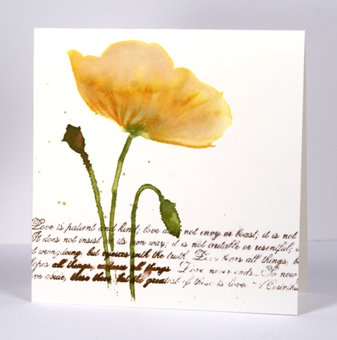
The new One Layer Simplicity Challenge is to make a card with flowers on it. There is already a gorgeous array of floral inspiration on the blog and you have until May 24th to add yours. The current Mod Squad challenge is to make a one-layer card so my poppy card meets the criteria there also.
To create this watery poppy I positioned the ‘Sun Catcher Stencil’ then painted the flower head in water. While it was very wet I added both Mustard Seed and Victorian Velvet Distress stains to the water and blended them with a paintbrush. I used the co-ordinating ‘Poppy Time’ stamp to stamp the stems, bud and seed head then used a paintbrush to immediately fill them with distress stains. By this stage the poppy head had dried a bit so I inked some of the stamp with ink to add a few veins to define the petals. I added the verses from 1 Corinthians in a mix of Memento ink and distress stain allowing some to blur and some to bleed. The piece of watercolour paper already had two ink drops on it so I carefully added a few more rather than going overboard with the flicking technique I have been using lately.
Thanks for dropping by. I hope you enjoy the rest of your weekend.
Edited to add: If you are interested in an “Introduction to Stamping” class there are a few spaces left in the class I am teaching at “Crop-A-While” in Orleans on Thursday May 8th. Please click on the store link for more details and contact the store to register.
Supplies:
Stamps: Poppy Time, Love Chapter (PB)
Stencil: Sun Catcher
Inks: Memento Rich Cocoa (Tsukineko) Vintage Photo, Mustard Seed, Victorian Velvet, Peeled Paint Distress Stains & Wild Honey, Peeled Paint Distress inks (Ranger)
Cardstock: Fabriano 100% cotton hot pressed watercolour paper
Backgrounds in Bloom
Posted: May 2, 2014 Filed under: Floral Tapestry, Hooray | Tags: Penny Black creative dies, Penny Black stamps, Ranger Distress stains 11 Comments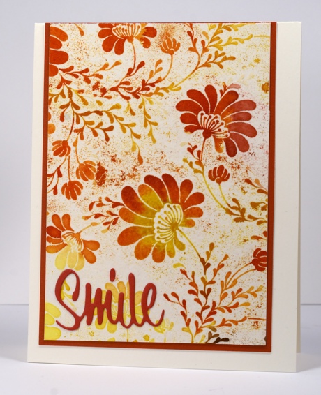
I have made several cards with this pretty background stamp lately and there are more to come. For this one I tried something new, a technique I saw on Jennifer McGuire’s blog and in a few other places too. To begin I stamped the background stamp on watercolour paper with versamark ink then embossed with clear embossing powder. Next I applied several different distress stains taking care to blend them in some places and keep them separate in others. I then spritzed the whole panel with water and let it dry naturally. Finally I placed the panel between two pieces of printer paper and ironed all the embossing off. The effect reminds me of batik, something I did a lot of in high school. I added the “Smile” die cut in the same “Fall festival” cardstock as the mat.
Background stamps have been the feature all week on the Penny Black blog so if you are looking for inspiration pop on over.
Cheryl has set us a new challenge on the One Layer Simplicity blog which will be a delight to try. Go and take a look.
Supplies:
Stamps: Floral Tapestry (PB)
Dies: Hooray (PB)
Inks: Versamark (Tsukineko) Vintage Photo, Spiced Marmalade, Barn Door, Mustard Seeds Distress stains (Ranger)
Cardstock: Neenah Classic Crest Natural White 110lb smooth , Fabriano 100% cotton hot pressed watercolour paper, PB Fall festival mix & match paper
Umbrellas
Posted: April 27, 2014 Filed under: April Showers, Watercolour | Tags: Penny Black stamps, Ranger Distress stains 24 Comments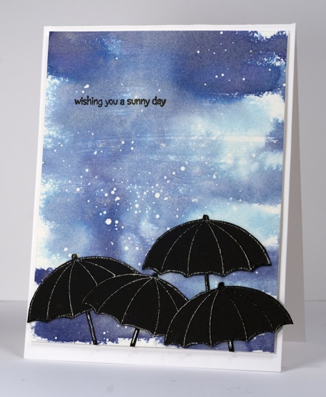
The snow is practically gone here and the rain has come. The latest challenge at The Card Concept is to use an umbrella. I dreamed up a little idea last week but it has taken me until today to get it finished, only just in time to enter it in the challenge. The inspiration from the design team is incredibly varied and creative; definitely go and visit if you haven’t already. I decided to make a water colour sky with the distress stains and pearl-ex spray I have been playing around with lately. I flicked a little masking fluid over the panel before adding any colour then, when it was dry, swiped three blue distress stains back and forth across the piece of watercolour paper. To blend the blue distress inks I generously spritzed water with pearl-ex in it over the whole panel. It had plenty of time to dryas I took days to get back to it. I embossed four little umbrellas in black and added the sentiment in black before popping the panel up on dimensional tape. Because my background was swiped painted I am also linking to the City Crafter Paint it challenge.
I tried taking photos at several different angles to capture the shimmer of the pearl-ex but it wasn’t easy. The best example I have is the close up below. It really does have a pretty shimmer when it catches the light.

Supplies:
Stamps: April Showers, Summer Fun (PB)
Inks: Versafine Onyx Black (Tsukineko) Chipped Sapphire, Tumbled Glass, Faded Jeans Distress Stains (Ranger)
Cardstock: Neenah Brilliant White 110lb smooth , Fabriano 100% cotton hot pressed watercolour paper
Also: black detail embossing powder, Pearl Ex, Masking fluid
Sapphire Tapestry
Posted: April 26, 2014 Filed under: CAS, Floral Tapestry | Tags: Fabriano Watercolour Paper, Penny Black stamps, Ranger Distress stains 17 Comments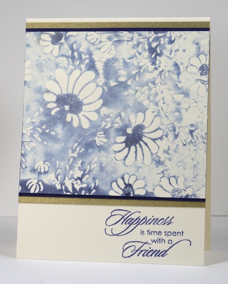
When I recently created these two cards I was so taken with Chipped Sapphire distress stain and the Floral Tapestry stamp I kept it out on my work table and kept playing with it for several days. The panel above was created by inking the stamp with distress stain then spritzing it with water that had pearl ex mixed into it. The water reacted with the stain and the pearl ex created a lovely sheen that is unfortunately not apparent in the photo. The sheen has a gold tint so I matted with dark blue and gold cardstock. (a little hint for those who are all about the ‘matchy-matchy’ like I am: if you do not have the exact colour cardstock to pair with your stamping you can apply the ink you are trying to match to a similar coloured cardstock or even white cardstock)
When I stamped this image in the spritzed distress stain the first impression was much darker and some of the flowers were getting lost in all the stain. This panel was made from the second impression. I find that I can often do two or three impressions when I have inked a stamp with distress stain because a little spray of water spreads and dilutes the stain left on the stamp.
Do you have a favourite ink colour at present? Blue happens to be my favourite colour anyway but at different times and in different seasons I reach for other colour favourites in my artistic endeavours.
Supplies:
Stamps: Floral Tapestry, Gratitude (PB)
Inks: Memento Paris Dusk (Tsukineko) Chipped Sapphire Distress Stains (Ranger)
Cardstock: Neenah Classic Crest Natural White 110lb smooth , Fabriano 100% cotton hot pressed watercolour paper, PB Periwinkle mix & match paper, gold card


