
Sapphire Tapestry
Posted: April 26, 2014 Filed under: CAS, Floral Tapestry | Tags: Fabriano Watercolour Paper, Penny Black stamps, Ranger Distress stains 17 Comments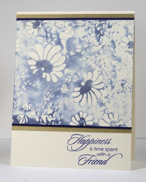
When I recently created these two cards I was so taken with Chipped Sapphire distress stain and the Floral Tapestry stamp I kept it out on my work table and kept playing with it for several days. The panel above was created by inking the stamp with distress stain then spritzing it with water that had pearl ex mixed into it. The water reacted with the stain and the pearl ex created a lovely sheen that is unfortunately not apparent in the photo. The sheen has a gold tint so I matted with dark blue and gold cardstock. (a little hint for those who are all about the ‘matchy-matchy’ like I am: if you do not have the exact colour cardstock to pair with your stamping you can apply the ink you are trying to match to a similar coloured cardstock or even white cardstock)
When I stamped this image in the spritzed distress stain the first impression was much darker and some of the flowers were getting lost in all the stain. This panel was made from the second impression. I find that I can often do two or three impressions when I have inked a stamp with distress stain because a little spray of water spreads and dilutes the stain left on the stamp.
Do you have a favourite ink colour at present? Blue happens to be my favourite colour anyway but at different times and in different seasons I reach for other colour favourites in my artistic endeavours.
Supplies:
Stamps: Floral Tapestry, Gratitude (PB)
Inks: Memento Paris Dusk (Tsukineko) Chipped Sapphire Distress Stains (Ranger)
Cardstock: Neenah Classic Crest Natural White 110lb smooth , Fabriano 100% cotton hot pressed watercolour paper, PB Periwinkle mix & match paper, gold card


Some great tips in this post, Heather, and a beautiful card!
Regarding your question about colour, orange was my favorite as a child (in the 70’s–you should have seen my bedroom!). As an adult I leaned more towards blue and green, but now that I’m older yet, all those warm tones are appealing again (marmalade, terracotta, mango).
Purple was my favourite in the 70’s! It’s funny that you mentioned marmalade because I have never really liked orange much until I used the spiced marmalade distress stain. The colour is so warm and rich, it changed my mind.
Thus is gorgeous! I love the colour and the effect you created. 🙂
The results of your technique turned out beautiful. Thanks for the instructions. Will have to try it. Edna
Simply beautiful – thanks for the tip about the pearl ex. This is so pretty with the gold matting. TFS & Hugs
Beautiful as always. I love coming to your blog.
Simply gorgeous. Helpful remarks noted too. Thank you Heather. You are a real STAR.
Wish I could see the shimmer!!!! It is Gorgeous in your photo, but I bet it would knock your socks off with the shimmer!!!
Hugs,
Jan
I agree that chipped sapphire is a beautiful blue, and looks so good on this card. My favourite colour happens to be red, and I find it so difficult to find a really great, true red for my eye — in inks, at least. 😉
You’re right about the reds; many are too pink or too orange to really pass as a true red.
Lovely watercolor effect. Pretty in blue, wish I could see the shine, bet it is lovely. 🙂 I like blue a lot but lately I’ve been using pinks and shades of purple.
Heather, this card is so beautiful.
This is gorgeous!
It takes my breath away it is gorgeous!
This is so pretty! Really appreciate your hint about using stamping the image more than once. I agree that the 1st one can be overpowering!
Gorgeous creation and many thanks for the tip too Karen x
Lovely card. I have to ask if the Pearl-Ex becomes permanent just mixing it with water. I bought some Pearl-Ex a long time ago but after reading that it had to be used with a fixative I pushed it to the back of a shelf and have never used it. I know that Ranger’s Perfect Pearls does become permanent with just water so now I’m wondering if they have changed the Pearl-Ex since I haven’t looked into it in years.