
Blossom in December
Posted: December 9, 2015 Filed under: Delicate Blossoms | Tags: Fabriano Watercolour Paper, Penny Black stamps, Ranger Distress stains, Tsukineko Memento inks 17 Comments
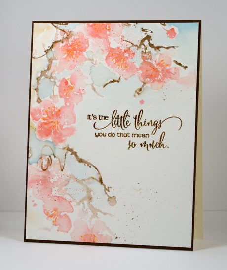
I made this card back in spring when there was blossom on the trees here; now they are bare and everything is looking a bit drab outside. I worked wet into wet with distress stains to ink the stamp. Once the stain was dry I added definition to the flower centres with a marker. I added a bit of loose background colour and some splatter then finished it off with a brown sentiment and narrow mat.
Despite posting a very unChristmassy card I have progressed in my seasonal decorating. Not only do I have a wreath up but the sideboard and mantle now feature red berry garlands and candles instead of thanksgiving cards and my son’s October birthday cards! I don’t usually have a tree up before Dec 15 because I love to keep it up for a while after Christmas. I should go outside and snip some greenery considering the temperatures are way above zero. Are you decorating?
I am still receiving lovely feedback about my ‘stamping the stories‘ series including a few requests for more. I really did enjoy making those cards and definitely have more favourites to inspire me so perhaps I will continue in 2016. I wouldn’t necessarily need to restrict the books to fantasy next time; that way ‘Anne’ could be featured. Way back in my childhood I would never have thought I would one day be living in Canada just like Anne with an ‘e’.
Supplies:
Stamps: Heartfelt, Delicate Blossoms (PB)
Inks: Worn Lipstick, Spun Sugar, Vintage Photo, Tumbled Glass Distress Stains (Ranger) Espresso Truffle, Rich Cocoa, Cantaloupe Memento markers (Tsukineko)
Cardstock: Fabriano 100% cotton hot pressed watercolour paper, Neenah Natural White, Dark brown
Stamping the stories: The Lion, the Witch and the Wardrobe
Posted: December 5, 2015 Filed under: Prancers, Stamped Landscapes, Uptown | Tags: Fabriano Watercolour Paper, Penny Black stamps, Ranger Distress stains 25 Comments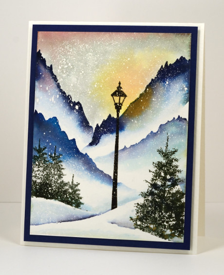
This scene is from a book, a whole series in fact, that is well loved by our family. I read the books to the children; they read them once they were able. We listened to the radio theatre series from Focus on the Family and when the movies came out we watched them. We knew the books so well that we were quite nitpicky about the movies but we enjoyed them despite the deviations from the original. If there is someone who does not recognize this little vignette, the series is the Chronicles of Narnia by C.S. Lewis. For those who recognised it straight away, which is your favourite Narnia story? My son’s favourite is ‘The Horse and his Boy, my older daughter’s ‘The Lion, the Witch and the Wardrobe, my younger daughter’s, ‘The Magician’s Nephew’ and for me ‘The Dawn Treader’ but ‘Last Battle’ is a close second. You see there is something for everyone. If you haven’t read them, get on it!
When the story begins it is ‘always winter but never Christmas’ in the magical land of Narnia. The white witch has made it so. Lucy meets Mr Tumnus the faun under the lamp post you see in the scene above. I painted it with distress stains over a generous splatter of masking fluid and used the ‘oh so useful’ trees from the ‘Prancers’ set in the foreground. I followed this card up with an art journal page because it was so much fun to paint.
This is the last of my stamping the stories cards; it has been fun to share them. Thank you so much for visiting and joining in the conversations.
Stamping the stories cards: Mary Poppins, Wind in the Willows, Peter Pan, Lord of the Rings
Supplies:
Stamps: Prancers, On the town (PB)
Inks: Chipped Sapphire, Mahogany, Scattered Straw, Salty Ocean, Iced Spruce distress stains (Ranger), Northern Pine, Versafine Onyx Black (ImagineCrafts/Tsukineko)
Cardstock: Fabriano 100% cotton hot pressed watercolour paper, Neenah patriot blue
Also: Winsor & Newton masking fluid
Stamping the stories: Wind in the Willows
Posted: December 3, 2015 Filed under: Sprigs, Stamped Landscapes | Tags: Fabriano Watercolour Paper, Penny Black stamps, Ranger Distress stains, Tsukineko Versafine inks 12 Comments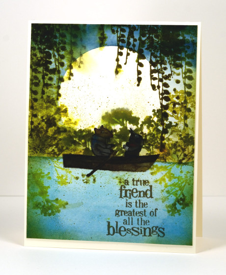
I was surprised how much I enjoyed this book. I don’t think I read it as a child; it was later when training to be a primary school teacher, reading all the classics and designing lessons and such. I am not that keen on animal books but this one is a delight; Ratty and Mole are such appealing characters. I read it to my children from a beautifully illustrated edition (Michael Hague once again) given to me by my Nanna on my 21st birthday. Some of the double page illustrations are incredible watercolours which surprise you with their intricate details.
I initially had the boat moored by the river bank with no Ratty and Mole in it but my daughter said I had to put them in. I did not have any suitable stamps so I had to paint them myself. Unlike the talented Sandy Allnock I do not find animals easy to paint or colour, let alone draw! I found an E. H. Sheppard illustration to assist me and did my best. I’m glad the moon is behind them; they are legitimately dark and shadowed. I realise the boat is backwards; I was so caught up in adding Ratty and Mole I put the oars in the wrong hands, ahem, paws!
Anyway, back to the beginning, I started by painting the river then positioned a large circle mask cut from frisket film before painting the sky. I removed the mask and stamped the foliage and spritzed it so it would bleed a little into the surrounding area. I let everything dry before I painted the boat and its inhabitants. I think the sentiment was just the right one for Ratty and Mole.
What are your favourite fantasy books? Do you even enjoy fantasy? Books about other worlds and magic lands have always intrigued me. I know Wind in the Willows isn’t another world or a magical tale but the animals do talk and go messing about in boats so you do have to use your imagination a little bit.
Supplies:
Stamps: Sprigs, Friendship (PB)
Inks: Forest Moss, Crushed Olive, Peeled Paint distress (Ranger), Versafine Spanish Moss (ImagineCrafts/Tsukineko)
Cardstock: Fabriano 100% cotton hot pressed watercolour paper, Neenah Classic Crest Natural White 110lb smooth
Also: Gansai Tambi paints, Grafix extra tack frisket film
Sunset Tree
Posted: October 28, 2015 Filed under: Joy to All | Tags: Penny Black stamps, Ranger Distress stains, Tsukineko Versafine inks 14 Comments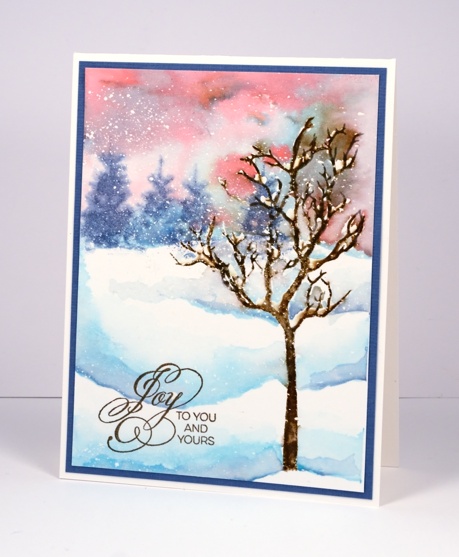
Last week Penny Black released the Winter Romance collection of stamps and dies. I went for a romantic sunset look on today’s card and used the new tree from the transparent set ‘Joy to All’. (At the same time I stamped the tree on several different panels and used different colouring techniques so you will be seeing it again before too long.)
I began with a panel splattered with masking fluid taped to a board to prevent it from warping once it got wet. I stamped the tree stamp with brown ink then, when it was dry, painted some masking fluid above some of the branches where snow would accumulate. I used pink and blue distress stains to paint both the sky and snow drifts then stamped the trees on the horizon while the sky was still wet so they would be look soft and distant. Some of the brown ink did bleed into the sky as I painted which doesn’t bother me but if you wanted to prevent that you could stamp the tree with pigment ink .
Supplies:
Stamps: Joy to All, Season’s gifts (PB)
Inks: Tumbled Glass, Worn Lipstick distress stains, Vintage Photo, Stormy sky distress inks (Ranger) Vintage SepiaVersafine ink (Tsukineko)
Cardstock: Canson 100% cotton hot pressed watercolour paper, Kazzazz blue cardstock
Also: Winsor & Newton masking fluid
Filigree Tree
Posted: October 24, 2015 Filed under: Christmas story, Filigrees | Tags: Penny Black stamps, Ranger Distress stains 8 Comments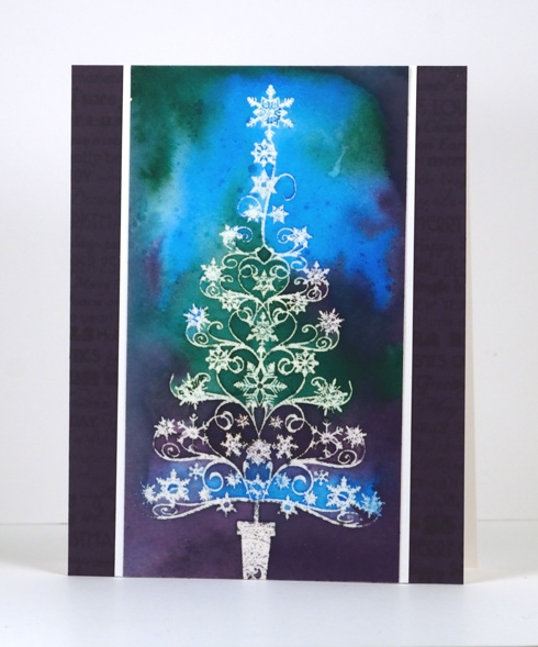
It’s time to break the blog silence with some emboss resist and a pretty filigree tree. I created this card quite some time ago and it has been sitting around waiting its turn. The filigree tree was embossed with clear embossing powder on watercolour paper. The surrounding colour is distress stain painted on and tilted to blend. Once it was dry I added some clear wink of stella to the central sections of the tree for a little sparkle. I then ironed the panel which both flattened it and melted the embossing powder into a piece of printer paper. It doesn’t look that different to an embossed image but surface is smooth so it looks deceivingly clever 😉 To complete the card I added a white mat and a purple border. I also used a large Christmas word background to stamp a tone on tone pattern on the purple cardstock.
If you have been thinking about Christmas cards already you might be interested in participating in the Caring Hearts Card drive. You can find the relevant details here. There are contact details for getting involved in USA, Canada and Australia on Vera Yate’s blog.
Thanks for dropping in; have a great weekend.
Supplies:
Stamps: Filigrees, Christmas Story (PB)
Inks: Salty Ocean, Pine Needles, Dusty Concord distress stains inks (Ranger) Versafine ink (Tsukineko)
Cardstock: Canson 100% cotton hot pressed watercolour paper, Neenah solar white, purple cardstock
Also: clear embossing powder, clear wink of stella
Warm toned leaves
Posted: October 16, 2015 Filed under: Bister, Lush & Lavish | Tags: Bister, Fabriano Watercolour Paper, Penny Black creative dies, Penny Black stamps, Ranger Distress stains 4 Comments
Here are the warm toned leaves I promised in contrast to the cool toned ones I posted a few days ago. Ottawa is enjoying fabulous colours this year; the yellows appeared first but now the orange and reds have joined in and they really are amazing.
Today’s loose and somewhat messy card reminds me of a leaf pile; we have had some pretty impressive ones over the years. Once again I created my panel in a couple of layers, starting with some orange toned leaves stamped onto wet watercolour paper. The leaf images bled in all directions creating the blurry shapes you see in the background. When they were dry I stamped with reds and browns and used a brush to fill in the leaves. I also sprinkled brown bister which ended up separating into black and brown with a few red and blue spots as well. When it was all dry I splattered some gold dots over the panel with a wink of luna pen. To complete the card I cut the ‘thank you’ sentiment out of both the panel and a piece of red cardstock so I could do an inlay to match the mat.
Are you raking leaves or have you yet to start like us?
Supplies
Stamps: Lush & Lavish (Penny Black)
Dies: Stylish Gratitude (Penny Black)
Inks: Rusty Hinge, Mustard Seed, Spiced Marmalade, Barn Door distress stains (Ranger)
Cardstock:Fabriano hot pressed 100% cotton hot pressed watercolour paper
Also: Gold wink of luna pen, brown bister powder
Thanksgiving mini cards
Posted: October 12, 2015 Filed under: Filigree Foliage | Tags: Canson watercolour paper, Penny Black stamps, Ranger Distress stains, Tsukineko Versafine inks 9 Comments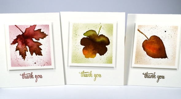
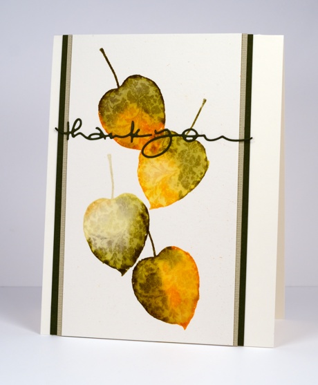
Happy Thanksgiving to all the Canadians; chances are you are enjoying leaves in pretty colours like I am these days. I keep reaching for the filigree leaves set at the moment because it has six lovely leaves which can be stamped simply to feature the pretty filigree patterns or used as I have here to stamp an outline which can be painted for a more realistic leaf look.
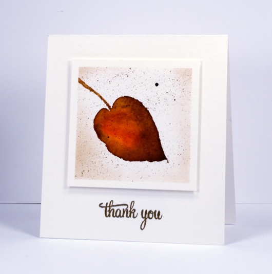
My process for creating these three mini cards was as follows. I masked a square on cold pressed watercolour paper then inked the leaf stamps with two or three distress stains. I stamped then used a paintbrush to blend the colour and fill the leaf. Where necessary I added water but I worked quickly enough to mainly just move the stain. When the leaf dried I splattered some stain over the top and once that dried sponged a little ink around the perimeter to frame the leaf. (I did film myself on periscope using this technique and these stamps. Please be aware that the quality on periscope is not like youtube but you can get the idea of this process at the beginning of the broadcast)
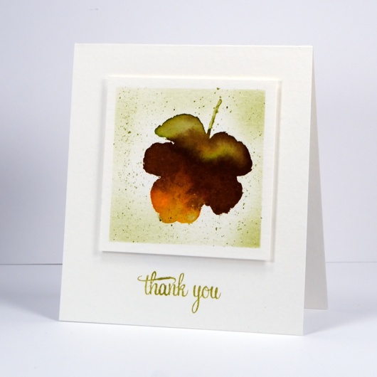
Each card is 4″x4.5″ and the squares have 2 7/8″ sides and are popped up on fun foam.
I stamped the sentiment with versafine inks rather than distress because they do such a good job with fine lines.
I hope you are having a wonderful day; thanks for visiting.
Supplies
Sunset Forest
Posted: October 6, 2015 Filed under: Nature's Friend, Stamped Landscapes | Tags: Penny Black stamps, Ranger Distress stains 8 Comments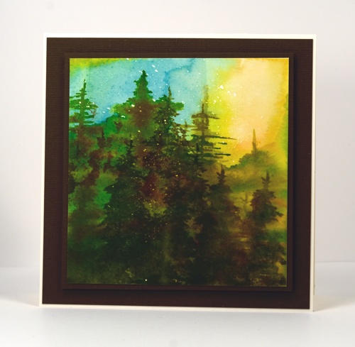
I completed this forest scene months ago but left it unposted. I showed it to a friend recently and she encouraged me to share it here. It is an example of a ‘no card left behind’ project. I was showing my friend how I did the lake on this card. It took us both a few attempts to get our backgrounds looking the way we wanted and the panel below was one of my cast-offs because of the water bloom under the shoreline trees. I pulled the panel out again at a later date and turned it on its side and made the shoreline trees one tall tree instead. I used both painting and stamping to fill the panel with trees. There was a bit of fiddling around with the tree stamp and the layers but I kept adding until it looked forest like! The little white flecks are of course, masking fluid.
So you see you should not throw things away immediately after you ‘mess them up’; set them aside perhaps and come back another day to take a second look. Flip it upside down or 90° just in case you have a lake you can turn into a forest!

Supplies:
Stamps: Nature’s Friend (PB)
Inks: Crushed Olive, Forest Moss, Dried Marigold, Broken China distress stains & Vintage Photo, Forest Moss distress ink (Ranger)
Cardstock: Brown cardstock, Fabriano 100% cotton hot pressed watercolour paper
Also: Winsor & Newton masking fluid
Watercoloured leaves the distressing way
Posted: September 30, 2015 Filed under: Filigree Foliage, Wishes | Tags: Penny Black creative dies, Penny Black stamps, Ranger Distress inks, Ranger Distress stains 18 Comments
Watercolour and autumn were made for each other were they not? I went for a run this morning and there were deep red maple leaves lying on the path looking like mini masterpieces. I kept wanting to pick them up and bring them home to inspire some painting. I did not want to carry them however and there will be thousands (I am not kidding) in my yard over the next 6-8 weeks (again, not kidding).
I did a periscope comparing painting leaves with distress stains, ink pads and markers this morning. These cards use the same techniques I demonstrated on the video. The first one is my favourite distress technique, stamping with stains then moving the stain with a paintbrush to fill the stamped image. I added fine splatter to the leaves on this one but kept the next one fairly clean.
I used the same ‘stamp then paint and blend’ technique for the second card but inked the stamp with ink pads. The main difference is less liquid on the stamp and an image that soaks into the watercolour paper more quickly. The result once blended with water is similar but more of the stamped outline remains. Using markers gives a similar result to inkpads but transfers even less liquid on the stamp. With markers however you can apply colour to small areas of the stamp and have a more detailed and intricate colour result.
To finish I matched cardstock to the stamping for mats and die cut sentiments.
Supplies

Home, sweet home
Posted: September 29, 2015 Filed under: Sweet Home, Uptown | Tags: Penny Black stamps, Ranger Distress stains 7 Comments
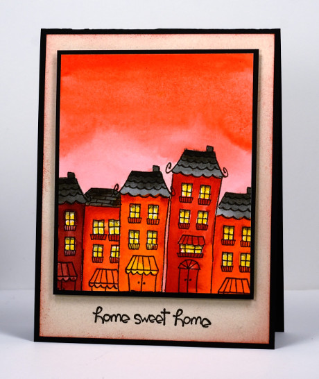
I stamped all the houses for this little street with the same stamp. To make them look different I masked and changed the amount of stamp I used. It was possible to make it taller by drawing an extra window and a different doorway. I watercoloured with distress stains then added some extra shading with markers and pencils. To keep it all co-ordinated and warm toned I painted a very orange sky and sponged an orange edge on the natural cardstock mat.
Supplies
Stamps: Uptown, Sweet Home (Penny Black)
Inks:Ripe Persimmon, Aged Mahogany, Spiced Marmalade, Barn Door, Worn Lipstick, Fired Brick, Black Soot distress stains or inks (Ranger), Versafine Onyx Black (Tsukineko)
Cardstock:Fabriano 100% cotton hot pressed watercolour paper, Neenah Epic Black 100lb cardstock, Natural flecked cardstock
Also: Fabercastell watercolour pencils


