
Stamping is for the birds part 3
Posted: November 1, 2018 Filed under: robin's christmas | Tags: Penny Black stamps, Ranger Distress inks 3 Comments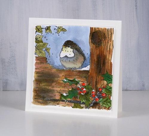
I’m continuing my ‘stamping is for the birds’ theme with this sweet stamp from Penny Black, ‘robin’s Christmas’. I think this one might be my favourite but there will be one more tomorrow so you can reserve judgement if you like. I stamped in versafine clair nocturne ink on hot pressed watercolour paper then embossed in clear powder. I had my distress inks at hand so I decided to use them as watercolour paints pressing the ink pads face down on my glass mat as I needed them. I used a few browns plus black for the wood, two greens for the holly, bundled sage for the ivy, candied apple and festive berries for the berries, fossilized amber for the beak and just below the beak. I used browns and black for the bird diluting them to get grey and pale browns.
I took care to keep ink off the little spots of snow, painted the background sky in stormy sky ink then added some clear wink of stella to the snow for a little sparkle. I ended up going without a sentiment and popped the whole panel up on foam for a subtle shadow.
This is my first piece of colouring for Kathy Racoosin’s 30 day coloring challenge. Kathy is a colouring wizard who regularly runs colouring challenges on her blog and instagram. It is a no pressure, drop in when you can, as detailed or simple as you like type of challenge. The idea is to do some colouring each day for 30 days. Kathy provides tons of tips and inspiration sharing her incredible tips and techniques and giving away prizes along the way. Check out her blog for more details or her IG @kathyrac . I’ll be sharing my colouring here and on IG and hope to see some of yours along the way.
Supplies
Stamp: robin’s christmas

Inks: versafine clair nocturne, vintage photo, walnut stain, black soot, festive berries, candied apple, forest moss, pine needles, stormy sky, bundled sage, fossilized amber


Paper: hot pressed watercolour paper

Also: glass mat, clear embossing powder, white wink of stella pen

![]()

Majestic Mountains
Posted: October 29, 2018 Filed under: majestic mountains, Stamped Landscapes, yuletide greetings | Tags: Darkroom Door stamps, Ranger Distress inks, Ranger Distress stains, Tsukineko Versafine inks 7 Comments
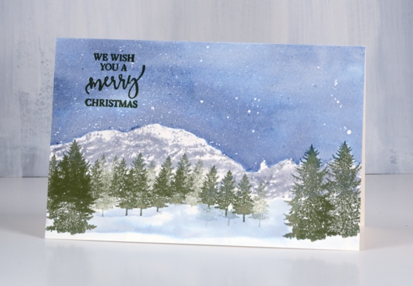
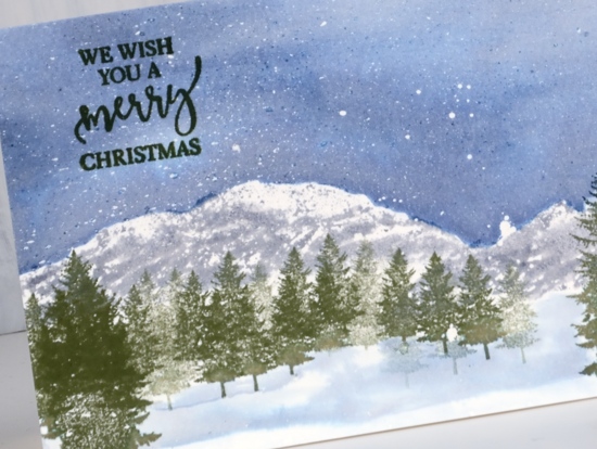
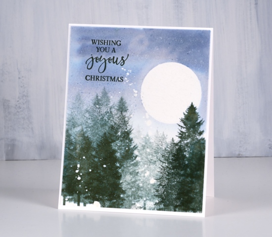
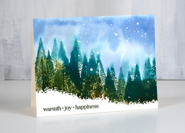
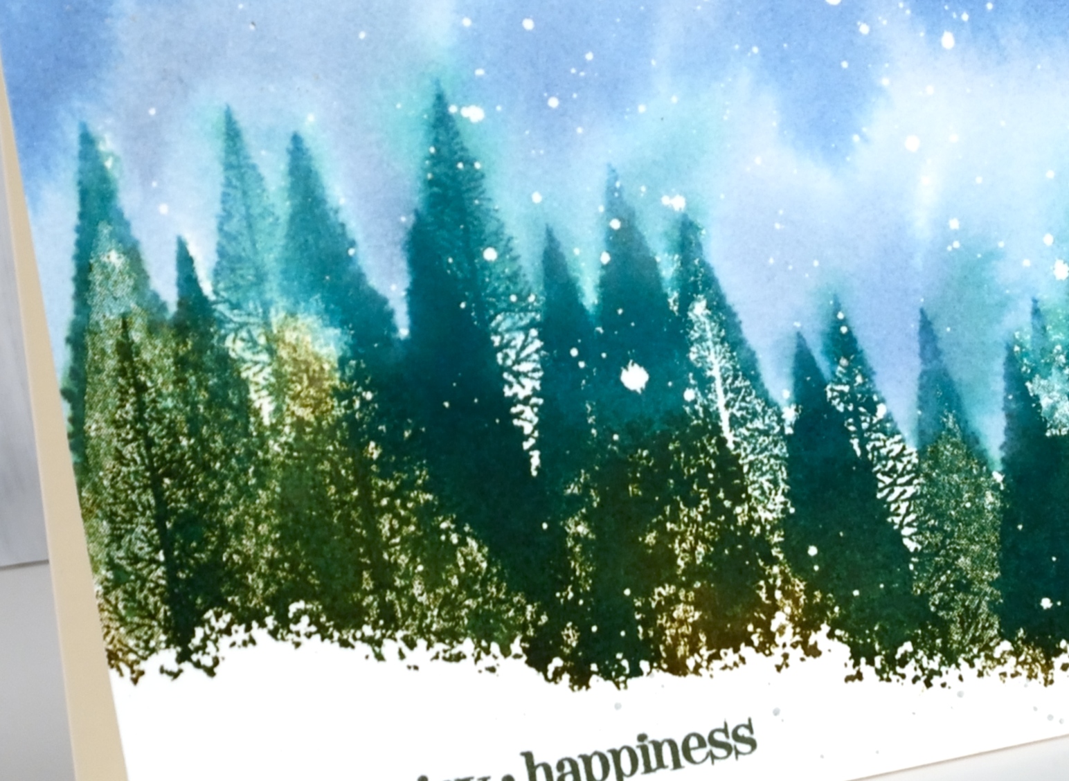
I have a few wintry landscapes to share today featuring stamps from the beautiful new ‘majestic mountains‘ set by Darkroom Door. This set includes three mountains, six sentiments (not featured on these cards) and – happy sigh – four trees! You can find step by step instructions on the Darkroom Door blog. I usually list all the ingredients at the end of the post but today I have included links throughout my descriptions.

On the card above I first splattered masking fluid over cold pressed watercolour paper and let it dry. I placed a torn post-it note mask across the panel then stamped the mountain several times in weathered wood distress ink so the base of the stamp overlapped the post-it. I painted the sky in dusty concord and tumbled glass distress stains then added a small amount of mustard seed stain close to mountain edges. I dried the panel then placed another torn post it note across below the base of the mountains.This was so I could stamp the trees in chipped sapphire distress ink but not have all the trunks showing. Because I was working on cold pressed watercolour paper the tree images were not solid so I used water to blend the ink. I dried the trees then painted a line of weathered wood distress stain along base of trees to create a snow bank and some shadows in the foreground. I removed the masking fluid and added a sentiment from the new Yuletide Greetings Stamp Set in chipped sapphire ink.
For this second card I once again splattered masking fluid but over hot pressed watercolour paper. Instead of using a post it note I partially inked the mountain stamp in weathered wood distress stain so the bases of the mountains were uneven, then stamped across the lower half of the wide panel. I picked a small tree and stamped repeatedly in front of the mountains in memento olive grove ink including second generation stamping to fill the space. Then I switched to large trees in olive grove ink overlapping some of the small trees.
I painted the sky in stormy sky distress stain taking care to paint to the edge of mountains and tree tops then dried it completely. I removed the masking fluid and chose another sentiment from the Yuletide Greetings to stamp in versafine olympia green ink.
On my last card I wanted a big winter moon so I cut a circle mask from frisket film and attach to a hot pressed watercolour panel then splattered masking fluid over the panel. I painted water over whole panel then added some stormy sky distress stain keeping the colour darkest in the top half. While panel was still damp I stamped a large tree in memento northern pine ink repeatedly using first and second generation stamping for dark and lighter images. I removed the moon mask and stamped one more tree to overlap the moon. I dried the panel completely then removed the masking fluid. I used another sentiment from the Yuletide Greetings Stamp Set in versafine olympia green ink.
This is going to be another of those lovely year round sets but I think it will be all wintry scenes from me for a while. I love having new trees to play with and those mountain stamps make it easy to fill in a simple background. Even though it is still October it has been snowing for the last 24 hours! It’s not going to stay though, definitely not!

Stamps: majestic mountains, yuletide greetings (Darkroom Door)


The rest of the supplies are linked throughout the post. I use affiliate links to the Foiled Fox online store. For no additional cost to you I receive a small commission when you use my links to shop at the Foiled Fox
Birches
Posted: October 18, 2018 Filed under: birches, peaceful winter | Tags: Penny Black stamps, Ranger Distress inks 11 Comments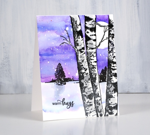
Oh look another tree stamp! I created a wintry scene with the new ‘birches’ stamp and older ‘peaceful winter’ set from Penny Black. I began by stamping the birches stamp in black and embossing it in clear powder. I die cut a circle from frisket film to mask the moon and pressed it down firmly in the top right corner then splattered masking fluid over the panel. Frisket film and masking fluid (sometimes called liquid frisket) are used to mask areas when watercolouring; the film is plastic with an adhesive back and the fluid is gummy when it dries. You should be able to remove them easily after all your painting is dry.
I placed some masking tape across the birch trunks then stamped the distant trees stamp from the ‘peaceful winter’ set in nocturne ink. The distant trees gave me a horizon line above which I painted my distress ink sky. I pressed both wilted violet and blueprint sketch inks onto my glass mat, added a little water and painted the sky. By letting the ink dry slightly between applications I was able to get some darker ‘dried’ lines in the sky. Once the sky dried I removed the moon mask.
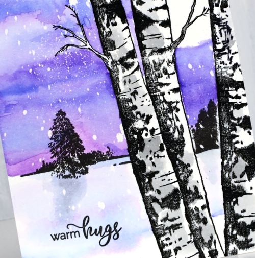
I decided to add some shadow to the birch trunks by painting diluted black soot ink here and there. I used the same colours but more diluted to add some shadow in the foreground snow. Once the ink dried I removed the masking fluid, added a sentiment from the ‘smile all season’ set and immediately thought of someone who would like this colour scheme.
Supplies:
Stamps: birches, peaceful winter, smile all season (all PB)


Inks: nocturne versafine clair, wilted violet, blueprint sketch, black soot distress inks


Paper: hot pressed watercolour paper
Also: glass mat, clear embossing powder, masking fluid, frisket film
![]()

When a plan goes awry
Posted: October 17, 2018 Filed under: Christmas berries, dancing daisies, gift card pocket, winter branches | Tags: Penny Black creative dies, Penny Black stamps, Ranger Distress inks 10 Comments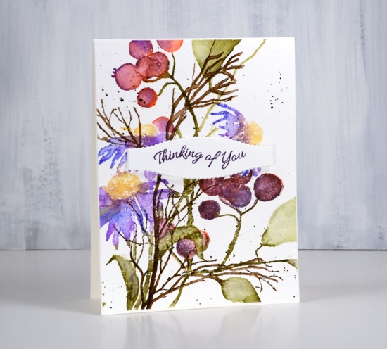
Today’s card was the result of a thought I had after making a Christmas themed card featuring the berries seen on this one. The Penny Black berry stamp is called ‘Christmas berries’ so it is hardly surprising that I made a Christmas card with them but I wanted to see if I could put them to use in a non-Christmas card too.
I started by stamping the dancing daisies in blue, purple, green and yellow (they were all distress inks and I will make a guess at them in the list below but once again I didn’t write them down). After stamping I blended the petals and leaves with water and a paint brush. I masked the daisies as I had saved masks from a previous project, stamped the berries in pinky, purply colours so they wouldn’t look Christmassy and blended again with water.
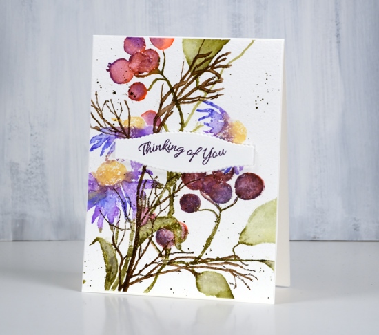
Finally I added some ‘winter branches’ in brown ink. This is where my plan started to unravel. I didn’t want to mask all those berries and flowers to put the winter branches in the background so I stamped them over the top and blended them with a paintbrush also. With the blending they became more prominent than I wanted; without the blending they looked badly stamped because I was working on textured cold pressed watercolour paper.
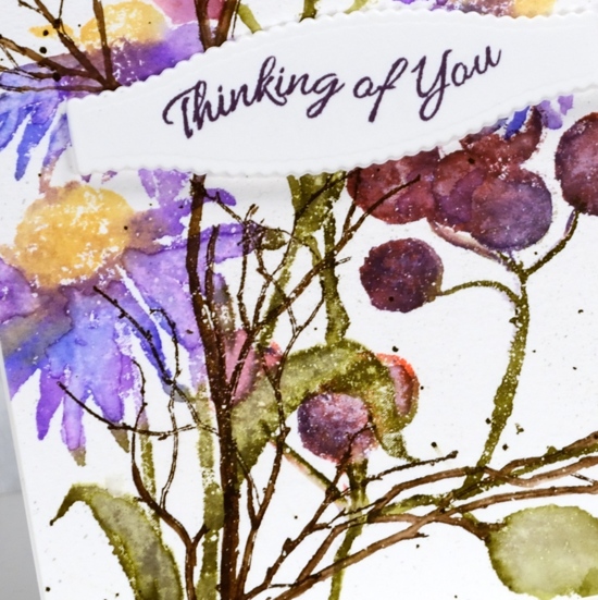
I finished off the panel with some dark brown splatter then moved onto another project undecided whether to turn this one into a card or not. When I came back to this panel later I decided to break up the dominance of the brown winter branches with a sentiment panel. I used a die from the gift card pocket set to cut a decorative shape from hot pressed watercolour paper and adhesive backed foam then stamped a sentiment from the banner sentiments set. I ended up liking the idea and the colours of this card but it’s not my best layout.
Supplies
Stamps: dancing daisies, Christmas berries, winter branches, banner sentiments (all PB)


Inks: blueprint sketch, dusty concord, fossilized amber, forest moss, festive berries, gathered twigs distress inks & monarch versafine clair


Paper: cold pressed watercolour paper, hot pressed watercolour paper

Die: gift card pocket (PB)

Tools: adhesive backed foam, Misti


An apple a day
Posted: October 11, 2018 Filed under: apples | Tags: Penny Black creative dies, Penny Black stamps, Ranger Distress inks 6 Comments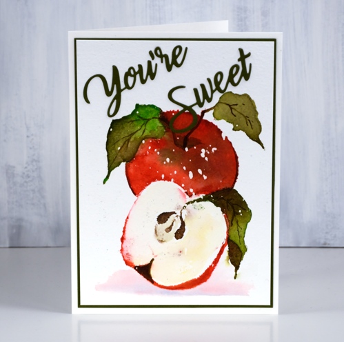
Today’s card cannot guarantee you the health benefits of an actual apple but I hope it brings a smile. I stamped and painted it with distress inks and I’m sorry to say I didn’t record the colours. I was attending an all day crop and teaching a few mini classes during the day. My table was set up with inks and stamps and watercolour paper and I came and went from classroom to table resuming my card panels whenever I returned to my table. My best guess would be festive berries, mowed lawn, vintage photo, forest moss, gathered twigs and squeezed lemonade. Maybe I should tell you my process instead because apples come in a range of colours; there is no wrong answer! I used my stamp positioner and worked one colour at a time. I inked the apples in red and wiped any red ink off the leaves before stamping then I used water and a paintbrush to blend all the stamped ink to cover the apple skin. While the area was wet I dropped in some green ink to create some variation and shadow. I dried the red before inking all the leaves in the two greens, stamped and blended them with a paint brush also. I inked the stems in brown and stamped them over the leaves. Once the leaves were dry I also used some brown or maybe forest moss ink to paint the veins back on the leaves. I stamped the centre of the cut apple with brown ink and painted some onto the shadow at the bottom of the apple also. The flesh of the apple looked a bit too stark so I painted some yellow and blended a bit of the red from the edge into the white area as well.
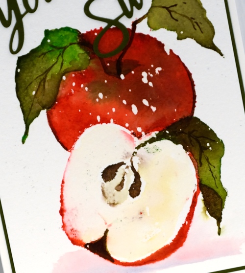
You’ve probably noticed my apple looks like it is in a snow storm. I worked on cold pressed watercolour paper splattered with masking fluid, probably not entirely necessary for a close up apple image but I’m claiming artist’s licence. I had splattered masking fluid over a batch of cold pressed panels in preparation for the all day crop as I was planning to work mainly on snow scenes. When I went to assemble the card I thought the apple needed a bit of shadow to ground it so I painted some diluted festive berries and chipped sapphire ink because they were in reach on my desk. As is often the case for me, I left any thoughts of a sentiment until the end. After a search through my sentiment dies I settled on ‘you’re sweet’ then matted the panel in the same green cardstock.
Do you have an apple a day? I usually do but sometimes there are peaches or mangoes or nectarines that distract me from the humble apple.
Supplies
Stamps: apples

Die: you’re sweet

Inks: festive berries, mowed lawn, vintage photo, forest moss, gathered twigs, squeezed lemonade distress inks


Paper: cold pressed watercolour paper, green cardstock
Tools: stamp positioner, masking fluid
.
Fall floral
Posted: October 5, 2018 Filed under: Brusho, radiant | Tags: Brusho, Penny Black stamps, Ranger Distress inks 15 Comments
I still have a few flowers in my garden but it’s getting sparse in out there. The leaves have started falling but not with any real commitment yet. I chose an autumn colour scheme and kept my paint choices to a minimum. I used brusho ost blue, yellow and crimson brusho and did some mixing to get all the variation you see in the card.
I stamped the large floral image from the PB set ‘radiant’ in antique linen distress ink. It’s a pale water soluble ink which is perfect for watercolouring. I used a palette with my brusho paints for this card, dropping some brusho into a well then adding water. As I was using a circular palette I left spaces between the crimson, yellow and ost blue paint so I could create mixed colours in the spaces. I painted the small flowers yellow first then while the paint was wet dropped some orange (mixed from crimson and yellow brusho) onto the petals to show detail and shadow. The large flower is painted in a dark mixed orange. The leaves are painted with greens mixed from yellow and ost blue. The stamp set includes solid flower centres to be stamped after painting. I used the large one in the large flower but couldn’t find the smaller one so I dotted black ink with a marker. Later my dad found that tiny missing stamp which made me happy.
The sentiment is from the perspective set; I only inked part of it to get the exact wording I wanted. To finish off I matted with a rust cardstock and attached to a natural white card base.
Enjoy your weekend. Happy Thanksgiving, my Canadian friends.
Supplies
Stamps: radiant 30-481 (PB), perspective 30-460


Inks: antique linen distress ink, versafine clair nocturne ink


Paper: cold pressed watercolour paper, neenah natural white, rust cardstock

Paint: Brusho

Pine Forest
Posted: October 4, 2018 Filed under: pine forest | Tags: Penny Black stamps, Ranger Distress inks, Ranger Distress stains, Tsukineko Versafine inks 5 Comments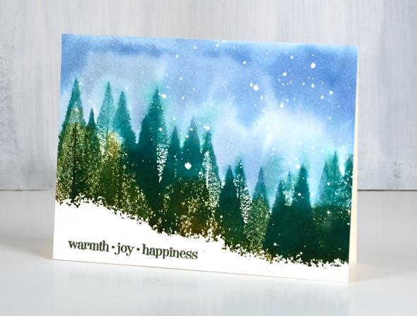
As I’ve said before, you can never have too many tree stamps! This one is a beauty from Penny Black. I used three green inks plus a spritz of water on the stamp; you can’t see all the detail in the trees but the mix of solid and delicate lines makes for a lot of texture. I used forest moss, pine needles, evergreen bough distress inks stamped onto cold pressed watercolour paper which I had splattered masking fluid on earlier.
After stamping the trees I painted the sky in chipped sapphire and stormy sky stains. I painted in amongst the trees so there is some green bleeding into the blue sky. I don’t let that bother me; it adds to the loose artsy feel.
Once the panel was dry I removed the masking fluid to reveal dots of snow and added a sentiment in versafine ink.
I am thankful you stopped by today.
Supplies
Stamps: pine forest 40-638(PB), Christmas sentiments 30-504(PB)


Inks: forest moss, pine needles, evergreen bough distress inks & chipped sapphire, stormy sky distress stains & Olympia green versafine ink


Paper: cold pressed watercolour paper
Also: masking fluid
Turnabout leaves again
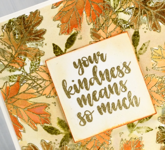
Posted: October 3, 2018 Filed under: thankful leaves turnabout | Tags: Concord & 9th, Ranger Distress inks, Ranger Distress stains, WOW embossing powders 16 Comments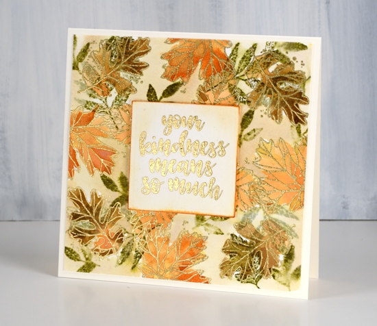
In creating this card I didn’t quite follow the directions properly for a turnabout stamp. I didn’t attach my piece of watercolour paper to a 6’x6″ square of cardstock but my piece was close to 6″ so it wasn’t a waste of paper. (It is worthwhile to watch one of the Concord & 9th videos explaining how the turnabout stamps work. You know, if all else fails read the instructions, ha!) I also chose not to ink all the leaves on the turnabout stamp so as to feature the line images more than the solid ones. I inked the line images in versamark, stamped, rotated the watercolour panel and repeated. Once I had oriented the panel in all four directions I embossed all the line leaves in gold powder. I also inked some of the small leaves in forest moss distress ink. I used distress inks pressed onto my glass mat as paint to fill in all the embossed leaves.
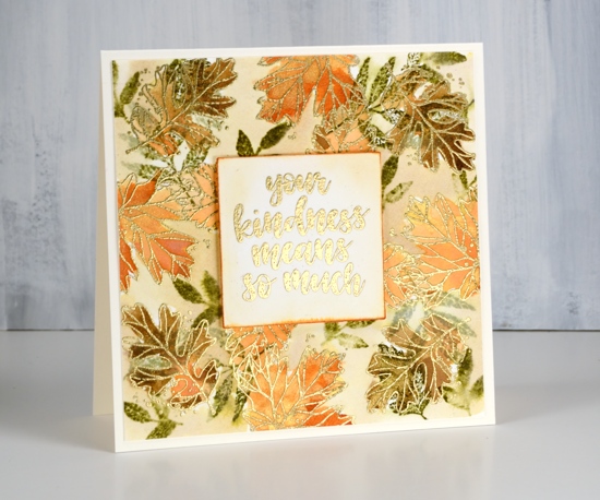
As I hadn’t stamped all the images on the turnabout stamp I had a bit of space between leaves so I loosely painted antique linen distress stain around the leaves. I stamped one of the sentiments included in the set on a square of hot pressed watercolour paper, painted some antique linen around it and dragged the edges across a rusty hinge distress ink pad to frame the panel.
Rusty hinge is my current fave distress ink colour. I have been through a few favourites which remain in my top ten. Chipped sapphire is a long time favourite; it is deep blue after all. Spiced marmalade changed my mind about orange; I used to pick it last. Stormy sky is such a beautiful grey blue and gets along with all the colours. Forest moss tends to be the colour of all my leaves; I have to remind myself that leaves come in light green and bright green too. Seedless preserves is the prettiest deep pink around, dark or diluted it’s a winner. What are your favourite ink colours? Let me know; I might have to add to my collection.
I’m so thankful you dropped in today; take care.
Supplies
Stamps: thankful leaves turnabout stamps

Inks: forest moss, dried marigold, rusty hinge distress inks, versamark


Stain: antique linen distress stain

Paper: hot pressed watercolour, neenah natural white
Tools: cutterpillar glass mat, misti stamping positioner
Also: gold embossing powder, Ken Oliver gold liquid metal

Thankful for you
Posted: September 24, 2018 Filed under: thankful leaves turnabout | Tags: Concord & 9th, Ranger Distress inks 39 Comments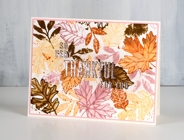
I have joined forces with the Foiled Fox this week to celebrate gratitude. We have so much to be grateful for we thought it would be fun to share some of those thoughts in the blog posts and comments.

I have gratitude themed cards for you this week and the Foiled Fox is giving away a $25 gift certificate to three of our readers who leave a comment here on my blog and/or on the Foiled Fox blog telling us something they are grateful for. It does not have to be related to art and craft at all. You have until the end of Friday, October 5th to add a comment to any of this week’s gratitude posts. We will randomly choose a winner from each gratitude post and announce them on Tuesday, October 9th.
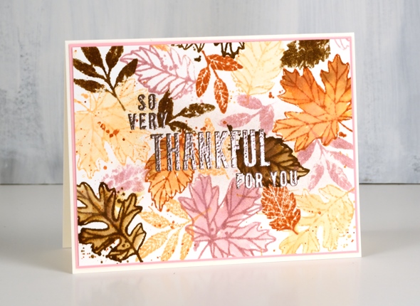
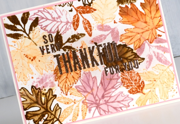
I am thankful for the beauty around me. My blog posts often reflect the natural world I see outside. I love to include flowers, trees and scenery including those crisp snowy scenes I stamp and paint in the colder months. Today’s card is in anticipation of all the colourful leaves I will enjoy in the months to come. They are beginning to turn now but it goes on for weeks and there is quite the range of colours from all the trees in my yard. I don’t generally get pink leaves though, so you are going to have accept some artistic licence on today’s colour choices. This card was created using the Concord & 9th ‘thankful leaves turnabout stamp set’. The set includes a large stamp designed in such a way that you stamp it once on a 6″x6″ panel, rotate it 90°, stamp again and repeat until it has been stamped four times. The end result is a panel filled with leaves but with just enough overlap to look attractive not crowded. If you don’t want a 6″x6″ finished panel you can trim it down or just attach your smaller panel to a 6″x6″ piece of scrap cardstock for stamping and rotate the whole thing.
You can read my whole process for this card over on the Foiled Fox blog and enter the giveaway by leaving a comment here or there telling us one thing you are thankful for. I’m looking forward to hearing from you.
Supplies
Stamps: thankful leaves turnabout stamps
Inks: Victorian velvet, dried marigold, rusty hinge, gathered twigs, versamark

Paper: hot pressed watercolour, neenah natural white, pink cardstock

Tools: cutterpillar glass mat, misti stamping positioner
Also: rose gold embossing powder
.
Painting with painted prints
Posted: September 18, 2018 Filed under: painted prints | Tags: My Favorite Things, Ranger Distress inks, WOW embossing powders 15 Comments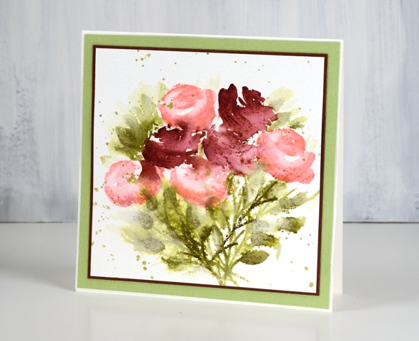
When I was working with the painted prints set a few weeks back I kept experimenting and came up with a process that uses only one of the stamps in each co-ordinated set of 2 or 3 layered stamps. The stamps are designed to work in 2’s or 3’s; you usually stamp the larger stamp first then the smaller ones over the top.
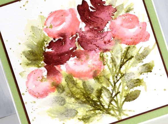
Instead for these cards I worked with the second stamp of each layering combo. I stamped in distress ink and used a brush and water to blend the stamping into a fuller shape. This gave me light and darker shading on each flower. I stamped and restamped the leaves and stems to get dark, medium and light green tones. A little spritz of water over the leaves made the colour bleed into the paper a bit more then I finished it off with some green splatter. The inks used in the card above were worn lipstick, aged mahogany, forest moss and shabby shutters.
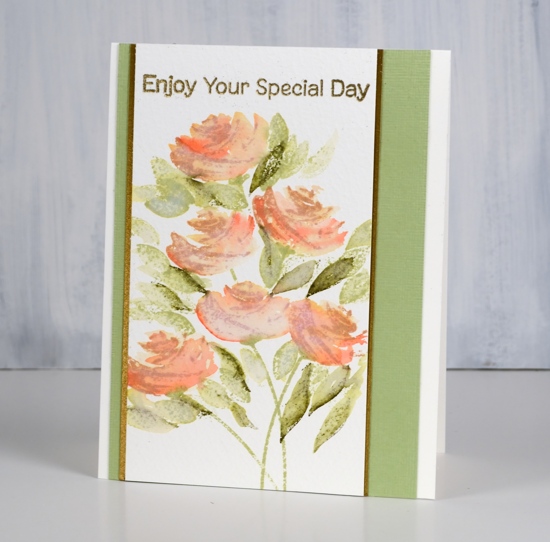
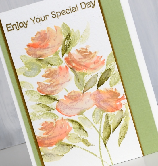
This second rose card I completed the same way but didn’t fling quite so much water around. The inks were tea dye for the stamping of the rose (the second layer stamp) and abandoned coral for blending over the top. Once again the leaves and stems were forest moss and shabby shutters. To make it just that little bit fancier I matted with a dark gold cardstock and embossed the sentiment with gold powder.
The technique described here is the one I used for the tulips in the previous post. Layering stamps are very clever but I am happy to also have worked out a loose looking un-layered technique to try with them; you know I like blending everything with water!
Supplies
Stamps: painted prints, fluttering friends (MFT)


Inks: worn lipstick, aged mahogany, shabby shutters, forest moss, mowed lawn, tea dye, abandoned coral, versamark


Paper: cold pressed watercolour paper, shimmer antique gold cardstock, pale green cardstock, burgandy cardstock,
![]()
Also: metallic gold rich embossing powder


