
Turnabout leaves again
Posted: October 3, 2018 Filed under: thankful leaves turnabout | Tags: Concord & 9th, Ranger Distress inks, Ranger Distress stains, WOW embossing powders 16 Comments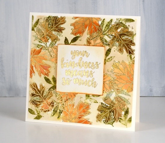
In creating this card I didn’t quite follow the directions properly for a turnabout stamp. I didn’t attach my piece of watercolour paper to a 6’x6″ square of cardstock but my piece was close to 6″ so it wasn’t a waste of paper. (It is worthwhile to watch one of the Concord & 9th videos explaining how the turnabout stamps work. You know, if all else fails read the instructions, ha!) I also chose not to ink all the leaves on the turnabout stamp so as to feature the line images more than the solid ones. I inked the line images in versamark, stamped, rotated the watercolour panel and repeated. Once I had oriented the panel in all four directions I embossed all the line leaves in gold powder. I also inked some of the small leaves in forest moss distress ink. I used distress inks pressed onto my glass mat as paint to fill in all the embossed leaves.
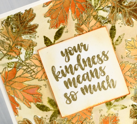
As I hadn’t stamped all the images on the turnabout stamp I had a bit of space between leaves so I loosely painted antique linen distress stain around the leaves. I stamped one of the sentiments included in the set on a square of hot pressed watercolour paper, painted some antique linen around it and dragged the edges across a rusty hinge distress ink pad to frame the panel.
Rusty hinge is my current fave distress ink colour. I have been through a few favourites which remain in my top ten. Chipped sapphire is a long time favourite; it is deep blue after all. Spiced marmalade changed my mind about orange; I used to pick it last. Stormy sky is such a beautiful grey blue and gets along with all the colours. Forest moss tends to be the colour of all my leaves; I have to remind myself that leaves come in light green and bright green too. Seedless preserves is the prettiest deep pink around, dark or diluted it’s a winner. What are your favourite ink colours? Let me know; I might have to add to my collection.
I’m so thankful you dropped in today; take care.
Supplies
Stamps: thankful leaves turnabout stamps

Inks: forest moss, dried marigold, rusty hinge distress inks, versamark


Stain: antique linen distress stain

Paper: hot pressed watercolour, neenah natural white


Tools: cutterpillar glass mat, misti stamping positioner


Also: gold embossing powder, Ken Oliver gold liquid metal


Hi. I love the colours you used today. I also like forest moss. I like how yellow bleeds out of it when I use the stain on wet paper. I like blueprint sketch and aged mahogany as stains. The aged mahogany seems much more brown as an oxide. If you are still doing thanks, I’m grateful for Tim Holtz!
Yes, I love the colours that separate into different pigments. Memento ‘northern pine’ does that in a way that is beautiful for pine trees.
Thanks for the autumn inspiration for something different with a set I love.
It is a fun set and I quite like the mix of solid and outline images in it.
What a beautiful Autumn card! Today the colors you chose are my favorites – seriously, my faves can change on any given day!
Yes, my faves change too, or perhaps my list just expands!
Beautiful card. Thank you, Heather, for teaching me so long ago about Forest Moss for my leaves’ most natural color.
Forest moss is my green in the distress inks and Northern pine in the memento inks!
Stunning card, Heather! Like Christine, I too am thankful for the creative genius of Tim Holtz. Mowed lawn, iced spruce and peacock feathers are among my faves, along with the ones you mentioned!
Thank you Mary Ann. Yes,despite their funny names I think the distress colour range is very good.
I love those three colours you have used for your gorgeous leaves which are complemented perfectly by the sentiment topper with the Rusty Hinge round the edges. I don’t have any of those colours but I have recently bought Peeled Paint and Crushed Olive to go with my Bundled Sage and Mowed Lawn, and I do love Peacock Feathers, Mermaid Lagoon and Salty Ocean. I think I must get Chipped Sapphire too as it does give a beautiful night sky being a bit more intense than the Faded Jeans I have. To be honest my favourites seem to change with the seasons. x
Thank you Pat for your kind comment. I was surprised how much I liked crushed olive when I bought it and of course with a name like salty ocean I knew I would like that one!
What a beautiful card, Heather! Your leaves are painted so beautifully and I love the gold embossing that makes this card so elegant! I think I use Peeled Paint, Mustard Seed and Picked Raspberry more than any of the other colors but there are so many beautiful shades that it’s hard to choose!
Love your beautiful autumn leaves. Wonderful coloring.
This is wonderful. Those glimpses of gold make it look like a pile of leaves in a jewelry store. So much to entice the eye.
WOW, this is BEAUTIFUL!