
Bethlehem Skyline
Posted: November 30, 2023 Filed under: Bethlehem skyline, cricut, Echidna Studios, Penny Black, Silent Night | Tags: cricut, Echidna Studios, Minc, Penny Black stamps, sennelier watercolours 9 Comments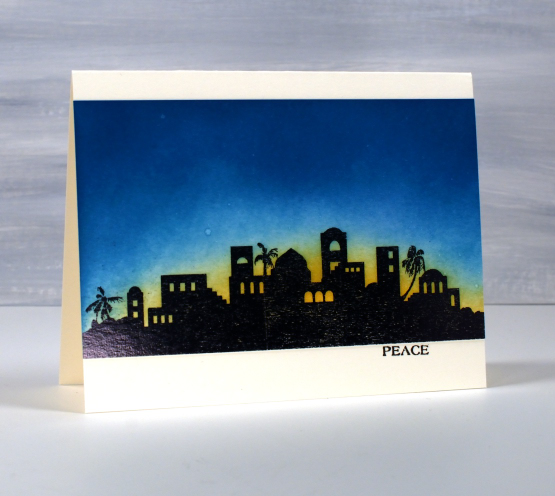
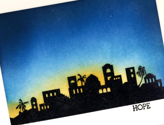
Today’s post is another long one full of photos. I hope you enjoy seeing the different styles and techniques applied to the new Echidna Studios digital set ‘Bethlehem Skyline‘. I requested this image and I think my daughter did a beautiful job with her design. The set includes a black silhouette and an outline image featured further down this blog post.
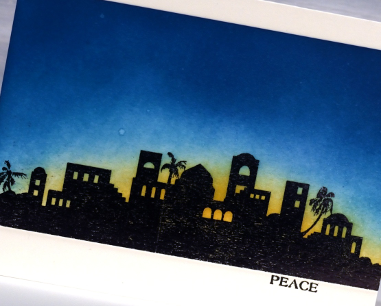
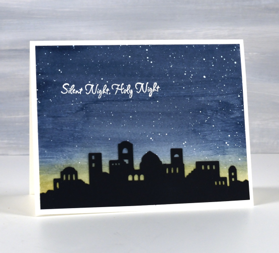
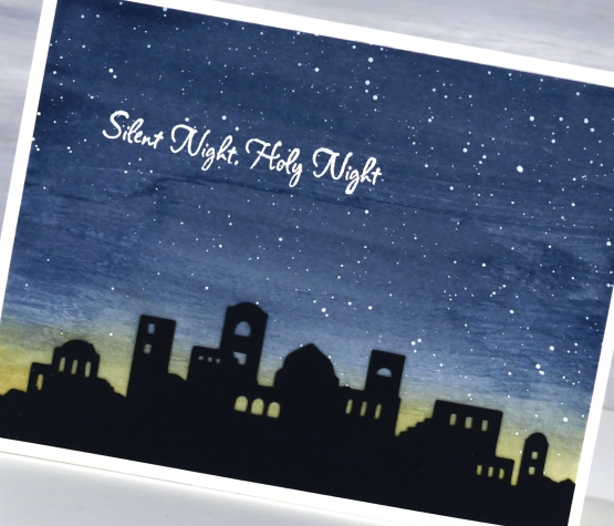
To create these first two cards I printed the silhouette image on white cardstock then foiled over the top with black foil. Using blending brushes I blended first scattered straw distress ink then broken china, and finally uncharted mariner for the deep blue sky. I wanted the colours to blend into each other but I didn’t want too much green where the blue and yellow met so I went carefully in that area.
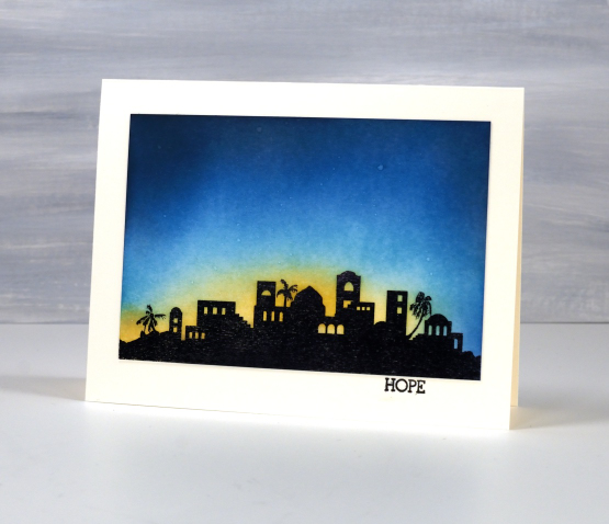
The sky was dark but I wanted a bit darker so blended just a bit of black soot ink around the edges and top of the panel. You might have noticed the image is the same but a different size in each card; that’s the beauty of a scalable digital image. To add stars to the blended sky I spritzed a fine spray of water on the panel and then dabbed it dry with a paper towel. The stars are subtle but they are there. The words Hope and Peace are once again from the PB ‘holiday snippets’ set.
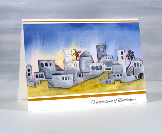
The next style of card features a cut out of the Bethlehem skyline once again using the digital svg file but cut from black cardstock with the cricut. After cutting the silhouette a couple of times we realised the trees were too small for a card sized cut out so added a tree-less image to the set.
I painted a blue and yellow sky with Sennelier watercolour paints then, once dry splattered white acrylic ink over the blue area. When that was dry I attached the black silhouette and embossed a sentiment from the PB set, ‘silent night’.
When cutting the silhouette from black cardstock I also cut a larger one which I have wrapped around cylindrical glass vase. I put a candle inside the vase and lit it but I am not sure whether the candle is bright enough. I am going to keep experimenting and if I can get a good photo I will share it here on the blog. I think the image would look great cut from vinyl and attached to a wooden panel as a nativity sign. Oh the possibilities!
The final card features the other image in the set, an outline of the Bethlehem skyline. I printed it on hot pressed watercolour paper then painted over the buildings with liquid frisket to mask them. The masking made it possible to paint the sky with wet watercolour layers of blue, pink and yellow while preserving the town to paint after the sky dried. To get the soft bleed of pink and yellow into blue I set the panel upside down on the top edge to dry so gravity helped me get the glowing light effect.
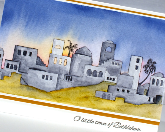
I used a mustard yellow to paint the foreground but it was too bright so I added some of the same blue from the sky to give it some shadow. With both the sky and ground completed I removed the liquid frisket(masking fluid) and painted the buildings with Payne’s grey.
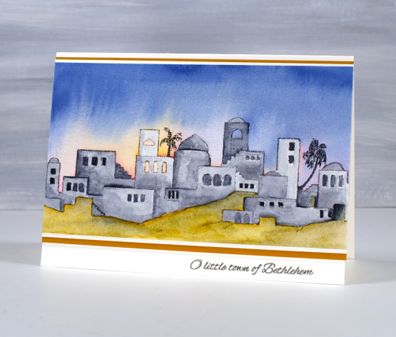
I finished the card with a mat of white then a mat of mustard brown and a little PB sentiment in versafine clair ‘morning mist‘ ink. Thanks for reading this far. I hope you enjoyed my different techniques with this lovely image. I think you’ll be seeing it again; its a new fave!
Today’s post features affiliate links to the following companies. If you buy through these links I receive a small commission at no extra cost to you. The Foiled Fox & Scrap’n’Stamp
Belle
Posted: May 21, 2018 Filed under: A Pocket Full, belle, Foiling, Zigs & zags | Tags: Kuretake Zig clean color real brush markers, Minc, Penny Black creative dies, Penny Black stamps, WOW embossing powders 4 Comments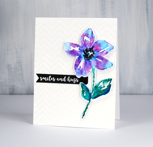
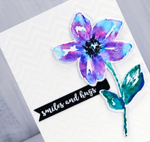
The zigs & zags stencil has popped up again today as a background for this die cut and watercoloured flower. I applied deco transfer gel directly to my card base (neenah solar white 110lb) then ran it through my minc with white foil. The result is a subtle chevron background. I wanted my flower to match the white card base exactly so I used the same neenah solar white which meant I did not add much water at all when blending my zig pens after stamping. I used a mix of blue, pink and purple and a blue/green combo on the leaves and stem then just a damp brush to blend with water. I made sure the blending was dry before stamping the black centre several times then used the co-ordinating die to cut out the flower plus a white foam one to pop it up over the background.
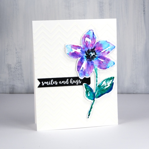
The little black banner was die cut with one of the dies from the PB ‘pocket full’ die set. I have pulled out all my little label, banner and tag dies from different sets and grouped them together so I can quickly cut the right size for a sentiment. This sentiment from the handy ‘banner sentiments’ set is embossed in white powder.
Supplies
Stamps: belle, banner sentiments
Die: belle cut out, a pocket full

Stencil: zigs & zags
Paper: neenah solar white, neenah epic black

Markers: kuretake zig clean color real brush pens pink, blue, violet, cobalt blue, green, black
Also: transfer gel, white foil, foam, minc, white embossing powder
![]()
fantastic
Posted: April 20, 2018 Filed under: Alcohol Ink, curved stitch | Tags: Foiling, Minc, Penny Black creative dies, Ranger Alcohol Ink 7 Comments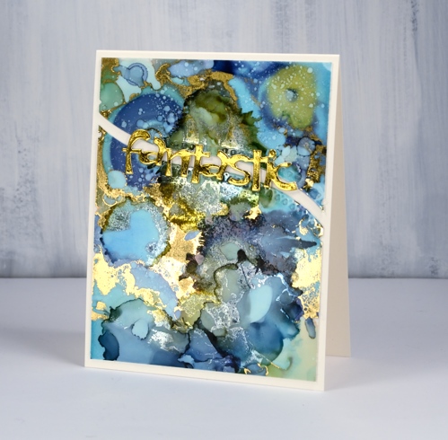
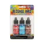
Not long ago I learnt from a couple of friends that foil will stick to some alcohol inks. I posted a card at that time and continued to experiment with foil and alcohol ink panels. If the alcohol ink sitting on the yupo paper is a little sticky the foil will stick more readily than if the inks are long dried. I ran today’s panel through my minc not long after I’d created it and a lot of gold foil stuck. Foil doesn’t stick to all colours of alcohol ink and I’m sorry to say I have not done exhaustive testing to know which ones work. I just layer on some foil, run it through the minc and see what I get!
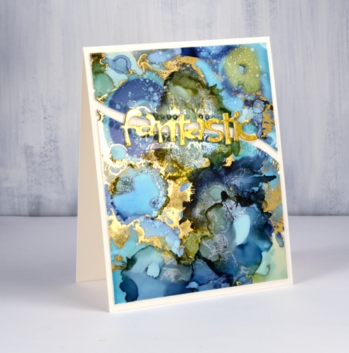
I was pretty happy with what I got this time there were some really pretty gold highlights, but a few more than I wanted. I decided to see whether I could add alcohol ink over the top of the foiling just to tone some of the gold down a little. I was pleasantly surprised to see the gold foil change to a dull silver when it came in contact with the ink. It is definitely hard to photograph the results but my blue and green panel has gold highlights as well as subtler silver patterns.
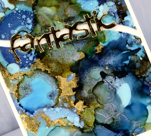
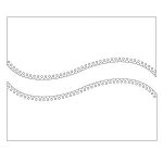
To turn my panel into a card I backed the yupo with white cardstock then cut it in two using the curved stitch die from Penny Black. I stacked some gold die-cuts to make the word ‘fantastic’ look a little more fantastic and added it all to a natural card base. I think this one might turn up as a graduation card this June.
Supplies
Dies: curved stitch, fantastic

Inks: ranger alcohol inks aqua, willow, denim
Paper: yupo, neenah solar white, neenah natural white, gold foil
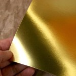
Also: gold foil, minc, rubbing alcohol
Pencil tulips
Posted: February 23, 2018 Filed under: tulip bouquet | Tags: Faber-Castell Polychromos Colour Pencil, Minc, Penny Black creative dies, Penny Black stamps, Prismacolor pencils 7 Comments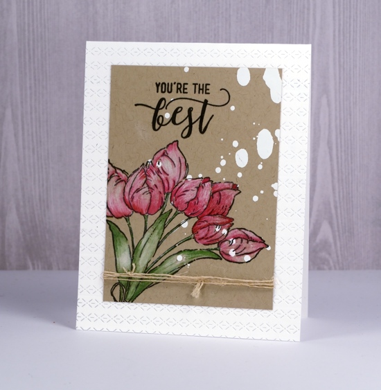
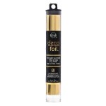
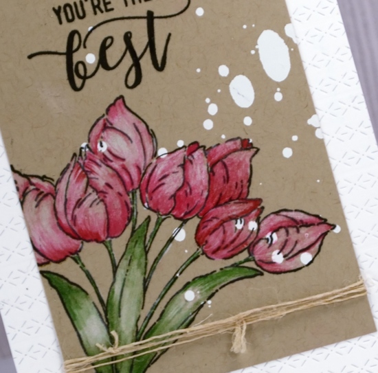
I had fun with a few new techniques and products when creating this card. Those white spots on the kraft cardstock are not paint splats even though they look a bit like I spilt something on my panel. I sprayed some minc reactive mist onto a kraft panel then ran it through the minc with white foil. I realise I could have used white gesso or paint but the thing I like about the foiling in this instance is that it has no texture or bulk so stamping over it was easy.
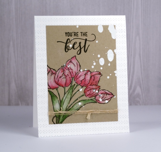
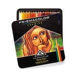
I stamped the Penny Black ‘tulip bouquet’ stamp in the corner and part of a sentiment from the PB ‘choose happy’ set both in versafine onyx black ink then started colouring. Since I began teaching my pencil colouring technique class I have had pencils within reach most of the time. I grabbed a couple of prismacolor pinks, a green and a polychromos white to colour the tulips and leaves. The antique hemp twine seems to be popping up on quite a few cards too; it’s not too thick to knot or tie in a bow and it blends in with most colour schemes and especially kraft cardstock. To add a little interest to my white card base I gave it an all-over texture treatment by running it through the die-cutting machine several times with the new ‘rows of stitches’ die from Penny Black.
I really enjoyed reading the responses to my last card – the one with the clever black brusho design. Some of you have already experienced the joy of black brusho and others are now wanting to try it. I’d love to see your creations if you do try it; please leave me a comment or use the contact me option.
Supplies
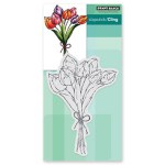
PB Stamps: tulip bouquet, choose happy

PB Die: rows of stitches
Ink: versafine onyx black ink
Paper: kraft
Pencils: prismacolor 925, 930, 911, polychromos 101
Also: minc reactive mist, white foil, minc

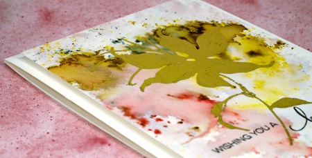
Gild the Lily
Posted: August 24, 2015 Filed under: Bister, Foiling, Sun fire | Tags: Bister, Canson watercolour paper, Minc, Penny Black creative dies 11 Comments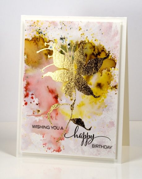
I have something new to share today. There has been something of a Midas situation happening in my craft room. I brought home a Heidi Swapp Minc machine last week and warned my family that anything not nailed down was about to be foiled! It turns out their possessions are safe for now as I am currently experimenting with different ways to use the machine to do the type of foiling I want to do. I will share more over the weeks to come but I will say for starters that the Minc does a beautiful job.
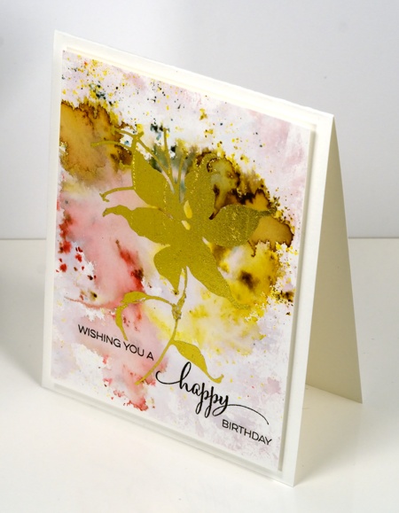
As you know I have recently dived into watercolour powders and all the experimentation with them has resulted in a surplus of watercolour panels just sitting around waiting to be made into things. I pulled out one of those abstract panels and foiled a gold lily onto it using the ‘sun fire’ die from Penny Black. I am still learning and making mistakes so I won’t go into the how-to for today’s card but as I nail down the techniques that work for me I will share them here.
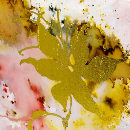
Prepare yourself for a little more shimmer and shine around here!
Supplies:
Stamps: A Sweet Day (PB)
Creative Dies: Sun fire (PB)
Inks: Bister watercolour powders
Cardstock: Canson 100% cotton hotpressed watercolour paper
Also: gold foil


