
Imagine
Posted: March 15, 2015 Filed under: Dies, Watercolour | Tags: Fabriano Watercolour Paper, Kuretake Gansai Tambi watercolour paints, Penny Black creative dies 57 Comments
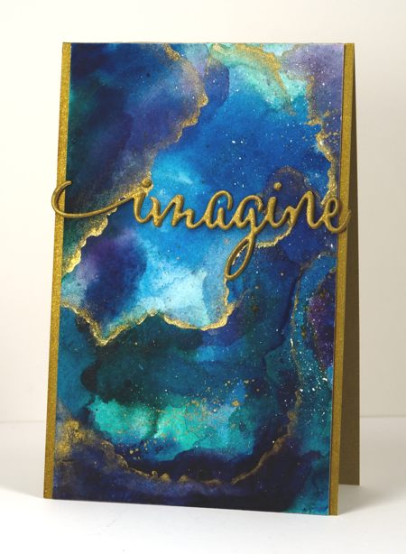
I am enjoying my new watercolour paints and have watched some recent watercolour videos by the very talented Sandy Allnock. She has been playing around with the same paints (Kuretake Gansai Tambi) and posted a video last week where she created a faux glass panel inspired by vase she saw. I used some of the same techniques and made a faux marble panel. I painted blues, greens and purples on a piece of watercolour paper and let them blend. I dried them with a heat tool then added more layers leaving some pale and others dark and intense. When I was happy with the colours I painted some thin lines of gold onto the panel and blended them out on one side with a very wet paint brush. This gave me a soft edge and a hard edge I also splattered some gold paint over parts of the panel. The piece on the card above is less than half the watercoloured panel so I have some more to play around with another day.
For the sentiment I stacked four diecuts of the word ‘imagine’ each with ‘stick it’ adhesive on the back to make them easier to stick together. The gold cardstock I used was slightly duller than the gold paint so I brightened it up with my gold wink of stella pen. I did the same with the sides of the card base so it would all match. I am thinking it might make a good graduation card.

Supplies
Creative Dies: Envision (PB)
Cardstock: Fabriano 100% cotton hot pressed watercolour paper, gold cardstock
Also: Kuretake Gansai Tambi watercolour paints 38, 50, 55, 56, 62, 66, 91 and gold wink of stella brush
Sweet Visit
Posted: March 6, 2015 Filed under: Sweet Visit, Watercolour | Tags: Fabriano Watercolour Paper, Penny Black stamps, Tsukineko Memento inks 20 Comments
It is always a thrill to see a hummingbird suspended in mid-air to take some nectar. I have never been successful in getting a good photo so I’m settling for a stamped and painted one. I have played with this stamp three times now. The first time I was happy with result but in a momentary lapse of reason stamped a sentiment in such a way as to render it pretty unappealing (I’ve saved it in case I get a brainwave for fixing it). The second one worked fairly well and will be in the Dirty Dozen gallery later this month. But this one is my fave. The other two panels had one bird and one flower; I think it makes way more impact with one bird on a panel full of flowers. But, enough of the comparisons with cards you haven’t even seen.
I started with the flowers at the bottom keeping in mind that I wanted the bird in the top right hand corner so I had to leave space. The three main flowers were inked with Memento markers, as seems to be my current habit, spritzed with water then stamped on watercolour paper. I blended the stamping with a waterbrush adding extra colour here and there. When the flowers were dry I used a marker to define the veins in the petals and the stigma. To create the paler background flowers I spritzed the stamp again without re-inking, stamped on scrap then stamped the remaining watery ink on the paper. I blended with a waterbrush to make the images even less distinct than they already were. The bird was also inked with markers, spritzed, then stamped and blended on the paper. To finish I splattered some pink, orange and green around the flowers. Sometimes when I want a bit of splatter I grab a watercolour pencil the same colour as the ink I’ve used and splatter that for more intense colour.
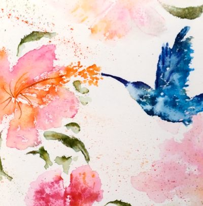
To finish the card I popped it up on a textured watercolour paper card base. I tried a narrow blue mat but it wasn’t needed; the little sentiment in blue ties in with the bird. I am linking up with the Spring Blooms challenge at the Inspiration Journal and the Spring is coming challenge at the Artistic Stamper.
(Please don’t be mad but this one was almost a video…I just got all inspired and started creating without turning on the camera! Soon, I promise.)
Supplies:
Stamps: Sweet visit, snippets(PB)
Inks: Nautical Blue, Bahama Blue, Danube Blue, Paris Dusk, Olive Grove, Bamboo Leaves, Desert Sand, Rose Bud, Tangelo, Potter’s Clay Memento markers (Imagine Craft/Tsukineko)
Cardstock: Fabriano hot pressed watercolour paper, Demco cold pressed watercolour paper
Also: Faber Castell Albrecht Durer watercolour pencils
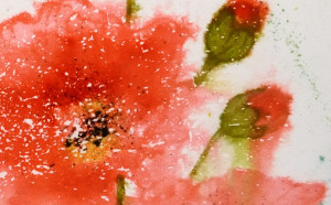
More fresh poppies
Posted: February 15, 2015 Filed under: Fresh | Tags: Fabriano Watercolour Paper, Penny Black stamps, Ranger Distress stains 14 Comments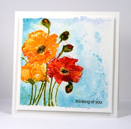
When I posted the first card made with the ‘fresh’ stamp I mentioned another watercolour panel where I painted the same stamped poppies but had created a different effect. Once again I stamped the image with several different distress inks and then painted inside the petals by pulling colour from the outline as well adding extra stain with a paintbrush. I worked a petal at a time so I could preserve some of the stamped outlines of the image. If I had spritzed with water at this point I could have ended up with a loose image like the pink one I posted first, but who knows; watercolour is an unpredictable technique. I painted the blue background after the poppies had dried to restrict the bleeding from the petals and stems into the background.
CAS-ual Fridays has a ‘Must Love Watercolor’ challenge at the moment so I will link there and also at the Crafting Cafe where the challenge is to use your favourite technique. Not too hard to guess what that is…
Have a great week
Supplies:
Stamps: Fresh , Snippets (PB)
Inks: Peeled Paint, Barn Door, Spiced Marmalade, Scattered Straw, Tumbled Glass, Broken China distress stains (Ranger), Memento Tuxedo Black, Bamboo Leaves inks (Imagine Craft/Tsukineko)
Cardstock: Fabriano 100% cotton hot pressed watercolour paper
Also: Winsor & Newton masking fluid
Sweet, fresh poppies
Posted: February 14, 2015 Filed under: CAS, Fresh | Tags: Fabriano Watercolour Paper, Penny Black stamps, Ranger Distress stains, Tsukineko Memento inks 17 Comments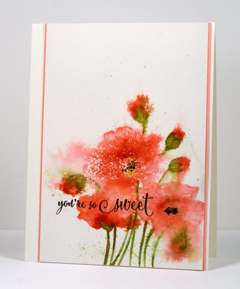
‘Fresh’ is one of the new slapstick cling stamps from the Penny Black “Bring on the Happy” release. I have been chasing deadlines all week so yesterday after getting all my ‘dirty dozen’ projects finished I pulled this nbus stamp out. I created two separate panels in different colour schemes using slightly different techniques. I started both the same way by stamping on watercolour paper in distress stain. Because distress stain is a liquid the stamp does not always ink up evenly but once stamped it does stay moist for longer than it would with the average dye ink. This gives me longer to pull colour from the stamped outline in to fill the petals, stems and buds (or whatever image I’m stamping). As you see in the stamp image below this is an outline stamp and I began by painting each petal, blending the colour with water to create light and dark shades within the petals. Although you wouldn’t know it to look at it now all the colouring was inside the lines!
At this point I chose to go for a much freer look and spritzed the flowers with water several times. I waited until the image was almost dry before adding a little yellow and finally black to the poppy centres. You have probably guessed already that the white specks and spots were made by splattering masking fluid on the paper before I began.
I trimmed the panel so all that white at the top could to balance all that colour at the bottom. The current sketch from CAS(E) this sketch helped me position my sentiment and then I played around with the pink mat for a little while before settling on a very narrow strip on each side. I will turn my other panel into a card in the next few days so you can see the more controlled ‘inside the lines’ approach.
Supplies:
Stamps: Fresh , Sprinkles and Smiles (PB)
Inks: Worn Lipstick, Peeled Paint, Festive Berries, Scattered Straw distress stains (Ranger), Memento Tuxedo Black, Bamboo Leaves inks (Imagine Craft/Tsukineko)
Cardstock: Fabriano 100% & 25% cotton hot pressed watercolour paper, Coral Reef mix & match paper (PB)
Love, love, love
Posted: February 6, 2015 Filed under: Heartfelt, Poise | Tags: Fabriano Watercolour Paper, Penny Black creative dies, Penny Black stamps, Tsukineko Memento inks 5 Comments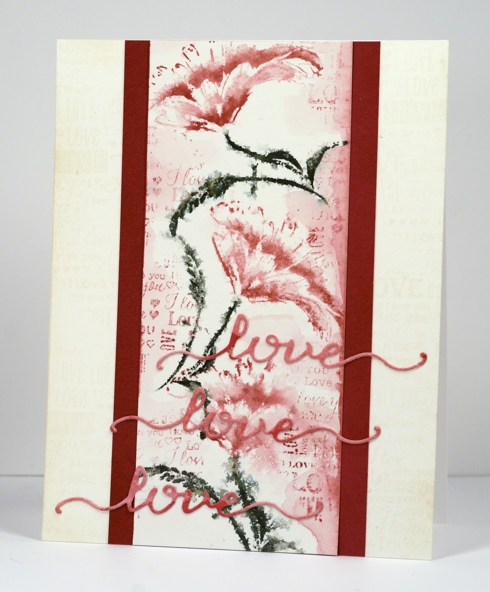
I have another brushstroke stamp featured on today’s card coloured in a loose watery style using Memento markers. To begin I taped a piece of watercolour paper to a cutting mat with painter’s tape. I inked the ‘Poise’ stamp with Memento Northern Pine, Rhubarb Stalk and Love Letter markers, spritzed it and stamped it onto the watercolour panel. I stamped two more flowers to fill the panel then spritzed lightly to let the colour bleed and blend.
For added texture and background I applied Memento Love Letter ink to the heart stamp from ‘So Very Much’ set and stamped down either side of the panel to create partial imprints of text. With a waterbrush I added some diluted Love Letter ink to the edges of the panel, blurring some of the text as I went. For a darker red I diluted Rhubarb stalk ink in the same way.
On a scrap of watercolour paper I painted Rhubarb Stalk and Love Letter ink, spritzed it to blend then dried it with a heat tool so I could cut three “loves” using the die from the ‘Heartfelt’ set. The watercolour panel is matted with Coral Reef mix & match paper then attached to a Neenah Natural White card base. Once again I stamped parts of the heart stamp in Wheat versamagic ink down both sides of card base front.
Supplies:
Stamps: Poise, So Very Much(PB)
Creative Dies: Heartfelt (PB)
Inks:Memento Northern Pine, Rhubarb Stalk, Love Letter markers & Versamagic Wheat chalk ink (Imagine Craft/Tsukineko)
Cardstock: Fabriano hotpressed 100% cotton watercolour paper, Coral reef mix & match paper, Neenah Natural White cardstock
Pop pop poppies
Posted: February 5, 2015 Filed under: Pop pop poppy | Tags: Fabriano Watercolour Paper, Penny Black creative dies, Penny Black stamps, Ranger Distress stains 12 Comments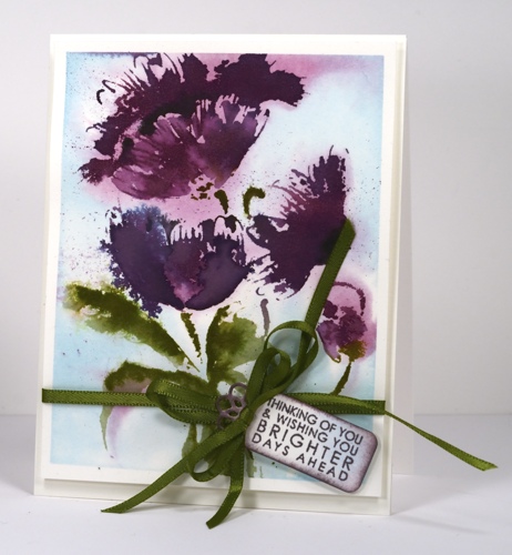
Today’s card features the new brushstroke stamp ‘Pop Pop Poppy’. All this week the new brush stroke stamps are the stars on the PB blog. Yesterday Jill Foster shared a video showing how to make her gorgeous watercolored card with this stamp.
I began by masking the watercolour panel with painter’s tape to create a border. I then painted water over the whole panel and inked the poppy petals with seeded preserves distress stain and the leaves with peeled paint distress stain. When I stamped it on the wet paper the colour bled into the surrounding area. I added tumbled glass distress stain with a paintbrush. I dabbed away a few dark areas of colour to leave areas of muted purple, blue and green on the panel as background colour. When the stain was almost dry I re-inked the petals with seeded preserves, and stamped again for a defined image. Using a stamp positioning tool I stamped the petals then the leaves with peeled paint and finally the flower centres with memento tuxedo black ink. I splattered a little seeded preserves stain over the panel as I like to do.
The little tag was cut using a die from the ‘flower tags’ set. I sponged the edges with seeded preserves ink then stamped a sentiment from ‘pretty petals’ in the same ink. To finish it all off I tied some ribbon around the panel and a bow on the tag before popping up the whole panel on a watercolour paper card base.
Supplies:
Stamps: Pop Pop Poppy, Pretty Petals (PB)
Creative Dies: Flower tags
Inks: Seedless Preserves, Dusty Concord, Bundled Sage, Tumbled Glass distress stains (Ranger), Memento Tuxedo Black ink (Imagine Craft/Tsukineko)
Cardstock: Fabriano 100% & 25% cotton hot pressed watercolour paper
Also: Green satin ribbon
Winged things 2
Posted: January 28, 2015 Filed under: CAS, Swirling Wings | Tags: Fabriano Watercolour Paper, Penny Black creative dies, Ranger Distress stains 12 Comments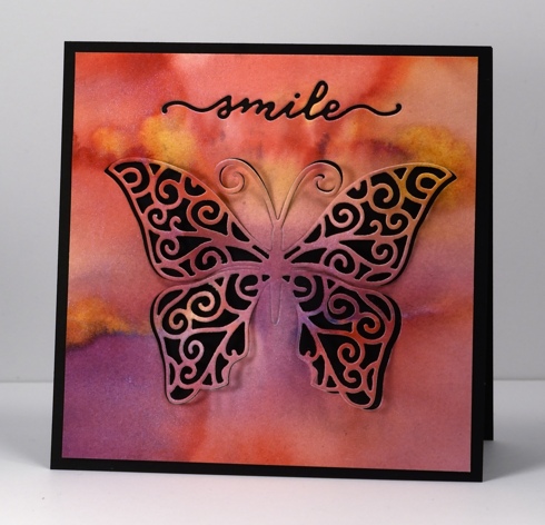
Today I have another card featuring the gorgeous new ‘swirling wings’ die from the Penny Black “Bring on the Happy” release. The panel you see on the card above is the where the inlaid coloured pieces on yesterday’s card came from. I started with a wet piece of watercolour paper and dropped several colours of distress stain onto the paper and let them blend with each other. I also sprayed some pearl-ex spray over the colours to help them blend and give it all a glimmery sheen. When I cut the butterfly I cut from one side, then the other without going all the way to the middle. That way I was able to keep the body of the butterfly attached but lift and curve the wings. I used the cute little ‘smile’ die from the ‘heartfelt set’ to add sentiment. Mounting it on a black card base seemed the perfect way to show off both the colour and the lacy swirls.
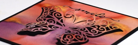
Supplies:
Creative Die: Heartfelt, Swirling Wings(PB)
Inks: Dusty Concord, Victorian Velvet, Ripe Persimmon, Spiced Marmalade, Scattered Straw distress stains (Ranger)
Cardstock: Fabriano 100% cotton hot pressed watercolour paper, Neenah Epic Black cardstock
Also: Pearl-ex spray made with interference blue pearl-ex and water
Demure but sparkly
Posted: January 26, 2015 Filed under: Demure, Stitched Edges | Tags: Fabriano Watercolour Paper, Penny Black creative dies, Penny Black stamps, Ranger Distress stains 21 Comments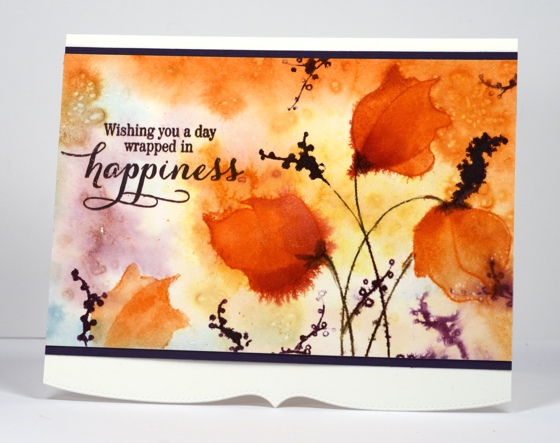
Are you ready for some brand new Penny Black prettiness? The new release is being revealed today on the Penny Black blog, facebook and website and there will be projects on the design team members blogs featuring new products for the new few weeks.
I first played with the new stamps around Christmas, finishing up several cards before the new year so they could travel off to CHA and join in the fun there. I am happy to be sharing some of those cards over the next week, especially as I have been too sick and too behind to do any new stamping lately. I can’t believe January is drawing to a close and I have only posted two new cards on my blog this year!
Before I got sick I did manage to create a few new cards but you will need to pop over to Splitcoaststampers.com to view them. The reason they are there and not here is quite exciting; I was invited to join the Dirty Dozen and began my six month term on January 15. I feel very honoured to involved with such a talented and committed group of artists and look forward to doing all sorts of fun things with Splitcoast in the months to come. Many projects will be featured here on my blog but each month the Dirty Dozen fills a themed gallery with projects available to fan club members only so there will be six new cards from me there each month. January’s theme is “All Cooped Up” and believe it or not I came up with six cards for the theme despite not owning a single chicken stamp!
But back to the card at hand. This one was my favourite from the eight I created for CHA. It is hard to see in the photo but it is covered in shimmery sparkliness. I began by wetting the watercolour panel and dropping Victorian Velvet, Ripe Persimmon and Tumbled glass distress stains into the water. I also sprinkled Camargue salt onto the wet areas to create patterns as it dried. All the little dots in the background were created by the salt absorbing moisture and colour. You can try it with any salt you have on hand but different salts will give you different results. When the background was dry I stamped the flowers in Spiced Marmalade distress ink, the stems in Peeled Paint and the little seeds in Dusty Concord. I used both Spiced Marmalade and Ripe Persimmon stains to paint the flower heads, spritzing with pearl-ex spray here and there to make the colour bleed and shimmer. The sentiment and mat strips do look black in the photo but they are both purple to co-ordinate with the seed heads. See that cute little shaped edge? There are two new edge dies in the “Bring on the Happy” release and I hope they will be the first of many. That edge does add that certain something don’t you think?
Oh, Happy Australia Day!
Supplies:
Stamps: Demure, Sprinkles and Smiles (PB)
Inks: Dusty Concord, Victorian Velvet, Ripe Persimmon, Spiced Marmalade, Tumbled Glass distress stains (Ranger)
Creative Dies: Stitched Edges (PB)
Cardstock: Fabriano 100% cotton hot pressed watercolour paper, purple cardstock
Warm wishes for a cold winter’s day
Posted: January 3, 2015 Filed under: CAS, Stamped Landscapes, Watercolour, Winter Song | Tags: Fabriano Watercolour Paper, Penny Black stamps, Ranger Distress stains 35 Comments
These birch trees are my favourite element of the intricate Winter Song stamp so I decided to isolate them for a scene of their own. I inked them with a weathered wood distress marker and left the rest of the stamp uninked. Weathered wood is a pale grey which is perfect for painting and drawing over the top. As usual I stamped on Fabriano hot pressed watercolour paper. The background colour is distress stains painted on with a waterbrush. I defined the edges and markings on the trees with a black marker, painted some grey shading on the trunks then added the sentiment in black. I am fussy about the cardstocks matching so I mounted this panel on a thin burgandy card then made the card base from cold pressed watercolour paper which is the same colour as the panel but adds some texture.
Thank you for the kind Christmas wishes left on my blog and in my inbox. I appreciated them all. I hope your new year is off to a good start; mine has been pretty busy with a bunch of stamping and creating I can’t share with you just yet!
Supplies:
Stamps: Winter Song, Joy Filled (PB)
Inks: Barn Door, Dusty Concord, Victorian China, Aged Mahogany, Weathered Wood distress stains (Ranger) Tuxedo Black memento marker (Imagine Craft/Tsukineko)
Cardstock: Fabriano 100% cotton hot pressed watercolour paper, Strathmore cold pressed watercolour paper, burgandy cardstock
A little bird
Posted: December 9, 2014 Filed under: CAS, No Card Left Behind, Winter Song | Tags: Fabriano Watercolour Paper, Penny Black stamps, Ranger Distress stains, Tsukineko Memento inks 11 Comments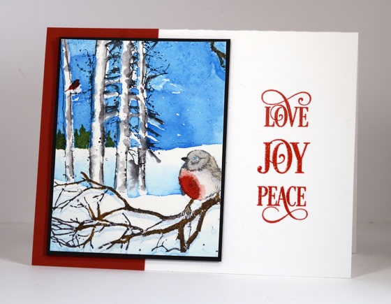
Do you recognise this little scene? It is a portion of the large “Winter Song” scenic stamp. I was experimenting with ways to the colour the stamp back when I made this card. I wasn’t happy with the whole panel but cropping it gave me a smaller scene I could work with. Coming up with a layout that worked I’m sure took me as long as the original painting. I tried portrait but really wanted landscape orientation. A partial red mat didn’t overwhelm the panel and the words provide balance and carry the red highlights across the card. It wasn’t until I was searching for a sentiment that I realized that these three word stamps positioned in the right order have built in framing. It only took me about ten practices off the card base to get the positioning right!. I embossed them in clear powder so they have a pretty shine.
I guess I should mention how I coloured the panel. It was weeks ago so I am guessing a bit. I stamped the whole scene in memento summer sky first; you can see it at the base of the panel looking a bit like a shadow. The summer sky ink served as a guide so I could paint the scene with distress stains. I selectively inked the stamp to restamp after the painting, adding brown to the lower branches and black for the birch trees.
Thanks for dropping by.
Supplies:
Stamps: Winter Song , Joy Filled (PB)
Inks: Memento Summer Sky, London Fog, Rich Cocoa, Versafine & Satin Red (Tsukineko) Barn Door, Broken China, Peeled Paint
Cardstock: Fabriano 100% cotton hot pressed watercolour paper, Neenah Avon Brilliant White 110lb, Neenah Chili Red 100lb


