
Hidden Lane
Posted: August 31, 2015 Filed under: Hidden Lane, Stamped Landscapes | Tags: Bister, Canson watercolour paper, Faber-Castell Albrecht Durer Watercolour pencils, Penny Black stamps 6 Comments
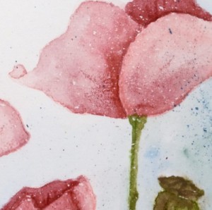
Hidden Lane is a new scenic stamp which easily will transition from season to season. I chose autumn for my first stamping with it but I know I will reach for it when creating wintry and perhaps spring scenes also. I did the colouring for this little scene with several different mediums; the sky and grass were painted with watercolour paints, the trees and foreground were a combination of distress stains and bister and final details were added with watercolour pencils. The watercolour paper had been splattered with some masking fluid which gives the whole scene a slightly aged look. I think the sentiment which was probably intended for Christmas works equally well for Autumn which is a wonderful time of year and very beautiful where I live. Not that I’m wishing for it; as I’ve said before summer can stay as long as it likes!
Supplies:
Stamps: Hidden Lane, Season’s Gifts (PB)
Inks: Vintage photo, Spiced Marmalade, Pine needles, Crushed Olive, Dried Marigold distress stains (Ranger)
Cardstock: Canson 100% cotton cold pressed watercolour paper, brown cardstocks
Also: Faber Castell Albrecht Durer watercolour pencils, Bister, masking fluid
Winter Sunset
Posted: August 13, 2015 Filed under: Etched Branches, Prancers, Stamped Landscapes | Tags: Faber-Castell Albrecht Durer Watercolour pencils, Fabriano Watercolour Paper, Penny Black stamps 11 Comments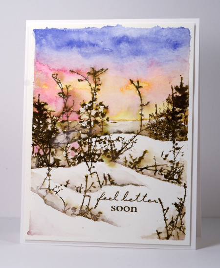
I have another wintry scene today created back in January when it really did look like this outside! I used painter’s tape to mask the edges of the watercolour panel then frisket film to mask the snow while I painted the sky with colour picked up from my watercolour pencils. I stamped some trees before moving the frisket mask down to create more snow banks. Before I moved the frisket film each time I added twigs and scrub in the snow banks by stamping parts of the ‘Etched Branches’ stamp. Frisket film is a plastic film which is waterproof and sticky on one side making it perfect for masking with wet mediums like watercolour.
Occasionally I am asked in classes what to do when paint seeps under the masking tape around the edges of a panel. You can see it did so in a few places on the one above. Often I will do nothing and it will have some uneven edges to add to its uniqueness. If it looks too messy or unbalanced I sometimes trim or add a die cut to cover the offending area.
Don’t forget to keep checking the PB blog if you are interested in the new products from the ‘Especially for You 2015’ release. There are new cards everyday and a chance to win some new stamps and dies.
Supplies:
Stamps: Etched Branches, Amazing, Prancers (PB)
Inks: Walnut stain distress ink (Ranger)
Cardstock: Fabriano 100% cotton hotpressed watercolour paper
Also: Faber Castell Albrecht Durer watercolour pencils, Graffix frisket film
Church on a hill
Posted: June 1, 2015 Filed under: Watercolour | Tags: Faber-Castell Albrecht Durer Watercolour pencils, Fabriano Watercolour Paper, Kuretake Gansai Tambi watercolour paints 20 Comments
This year marks twenty five years of ministry for the pastor of our church. He arrived in Ottawa shortly before we did in 2000 and our families have been friends ever since. His wife asked me if I would make a card for the occasion with a church on it. I looked through my stamps but the only church stamp was a snowy scene which was mainly trees with a snow laden church in the distance. As we are pretty happy to finally be free of snow I decided against using that stamp. I attempted a painting instead and found several church images as inspiration then combined elements from a few and set my church on a tree filled hillside. Rather than obscure some of the scene I printed the words on vellum and wrapped it round the painted panel. I used my gansai tambi watercolour paints for most of the painting then switched to watercolour pencils to add finishing touches.
Supplies
Cardstock: Fabriano 100% cotton hot pressed watercolour paper, Neenah Natural White 110lb cardstock, Neenah Epic Black cardstock, rust cardstock, vellum
Also: Kuretake Gansai Tambi watercolour paints, Faber-Castell Albrecht Durer watercolour pencils
Blossoms
Posted: May 16, 2015 Filed under: Delicate Blossoms | Tags: Faber-Castell Albrecht Durer Watercolour pencils, Kuretake Gansai Tambi watercolour paints, Penny Black stamps 17 Comments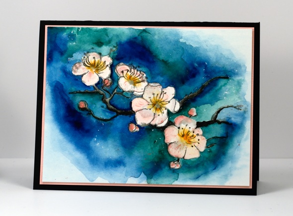
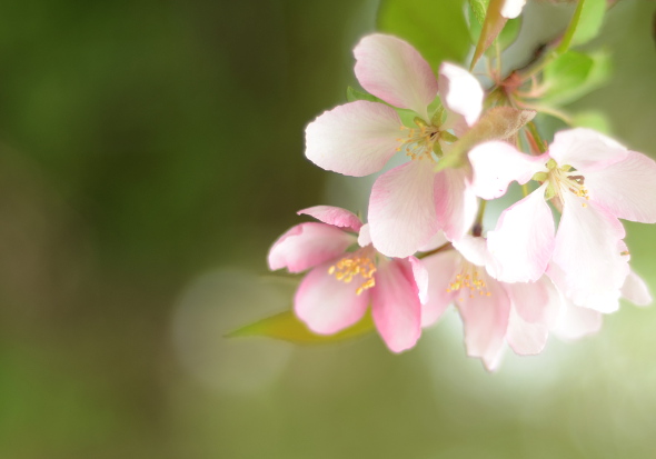
I have been wanting to create a white floral panel by relying on the background colour to frame the white petals. It’s hard!
I was inspired by this lovely watercolour painting by Maria Stezhko. I stamped the Delicate Blossoms stamp in memento London Fog grey to get a pale image then painted blues and greens around the petals using the Kuretake Gansai Tambi watercolour paints. The colours on the flowers are a combination of the same paints and Faber Castell Albrecht Dürer watercolour pencils. I also added some fine black lines with a Prismacolor Premier fine line marker.
In my backyard I am enjoying the real thing.
Bird on a branch
Posted: April 17, 2015 Filed under: Happy News, Watercolour | Tags: Faber-Castell Albrecht Durer Watercolour pencils, Fabriano Watercolour Paper, Kuretake Gansai Tambi watercolour paints, Penny Black creative dies 13 Comments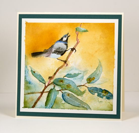
Last week I posted a card featuring negative painted leaves and mentioned a second card made at the same time. Both cards were inspired by gum leaves. This is the card I created using a negative mask cut from frisket film with the ‘happy news’ die. When I cut the bird and branch image out of the frisket film I used a piece that would cover most of my watercolour panel. I obviously didn’t think too much about where I was positioning it because I ended up with the bird balancing oddly on the diagonal branch. I think it would have been more natural if the branch was closer to horizontal but it still seems to work.
The frisket film works well masking watercolour paint but some does seep underneath. Fortunately on this panel the only seepage was around the leaves not the bird. I painted a layer at a time and let the colour dry in between to avoid getting the panel too wet. The paint is gansai tambi watercolour with some details done in watercolour pencils. I completed most of the painting before removing the mask. With the mask off I painted some extra leaves then worked with the green and blue seepage around the leaves to create the impression of more foliage in the background. Once the leaves were totally dry I scratched a spine into each leaf with a sharp knife.
At this point I wanted to create some contrast to make the bird pop a little more but I didn’t want to paint a fiddly background around all the edges. Instead I cut another ‘happy news’ mask from masking paper and positioned it directly over the painted bird (which was totally dry) I then sponged the golden colour using memento peanut brittle ink. Once I had good coverage I pressed a damp paper towel into the sponging to give it more of a watercoloured texture.
This is a technique I will play around with more because I have many dies and they make great outlines for watercolouring. Getting a negative and positive mask from each die cut means double the possibilities.
My dad celebrated his 80th birthday this week and hopefully this card has arrived in Australia and been opened by now. He and my mother check out the cards on my blog regularly and my dad drops hints from time to time that he would like to see some Australian scenes. I definitely had eucalyptus leaves in mind when I painted this scene but I can’t say that the bird resembles any particular Australian bird. (If the card hasn’t arrived yet Dad, you’re getting a sneak peak!)
Supplies
Creative Dies: Happy News (PB)
Inks: Memento Peanut Brittle ink (Tsukineko)
Cardstock: Fabriano 100% cotton hot pressed watercolour paper, Neenah Natural White 110lb cardstock, teal cardstock
Also: Kuretake Gansai Tambi watercolour paints, grafix extra tack frisket film, Faber-Castell Albrecht Durer watercolour pencils
Pink Poppies
Posted: March 9, 2015 Filed under: Blooming tags, Sprigs | Tags: Faber-Castell Albrecht Durer Watercolour pencils, Penny Black creative dies, Penny Black stamps 18 Comments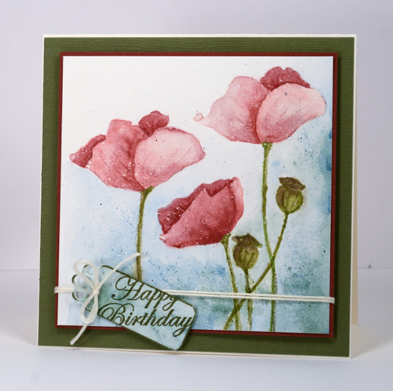
Last week I posted several loosely watercoloured cards. The poppies on today’s card were painted with more precision and there was no spritzing to make the colours blend and bleed. I worked on a watercolour block which I had splattered with a fine mist of masking fluid. The end result with such a fine mist could represent snow but I think it could pass for rain too. I have had snow fall on my daffodils and tulips but the poppies are pretty safe! Once the masking fluid was dry I inked the poppy image from ‘blooming garden‘ with memento angel pink and new sprout markers. The colours are fairly pale so I had an outline to work with but not so dark that it would be noticeable after I had added all the colour. For this one I used my watercolour pencils as paints. I do this by picking up colour from the lead of the pencil with a waterbrush then painting with it. For the poppies I used colour from three pink pencils (listed below), for the stems and seed heads two greens and a brown then a blue and a green for the background.
I didn’t want both of the tall poppies to look exactly the same so I altered the petals a bit on the left hand one. When I checked a photo of seed pods to choose my colours I saw many were quite round so I fattened mine up a little. When the poppies and seed heads had dried I drew some veins and ridges with the watercolour pencils.
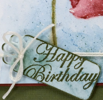
To create the little tag I painted a scrap of watercolour paper with the same colours I had used on the background of the main panel, die cut a ‘flower tag’, then stamped the sentiment from the ‘sprigs’ set across it. To complete the card I matted the panel with a narrow red mat, tied the tag on with embroidery floss, popped the panel up on a wider green mat and attached it to a cream card base.
As you know I love doing the loose watery images but I also find it quite satisfying to work slowly to paint a more formal image.
Kathy Racoosin is doing a 30 day coloring challenge at present which inspired me to do pull out my pencils.
Supplies:
Stamps: Blooming Garden, Sprigs (PB)
Creative Dies: flower tags (PB)
Inks: Memento Angel Pink, New Sprout, Olive Grove markers (Tsukineko)
Cardstock: Fabriano 100% cotton hot pressed watercolour paper, Neenah Classic Crest Natural White 110lb smooth, pink and green cardstock
Also: Albrecht Durer watercolour pencils medium flesh 131, dark red 225, indian red 192, night green 155, pine green 267, olive green 173, moss green 168, apple green 170(Faber-Castell), Cream embroidery floss
Dressember
Posted: December 2, 2014 Filed under: CAS, Watercolour | Tags: Dressember 2014, Faber-Castell Albrecht Durer Watercolour pencils, Penny Black stamps 5 Comments
Today’s post is quite different from my normal posts for two reasons. Firstly, there is a person stamped and coloured on my card; that rarely happens! Secondly, and more importantly, this post is to let you know about a non-stamping challenge I have taken on during the month of December hoping to raise funds for a very important cause. The fact that the girl on the stamp is in a dress is significant. I have joined in “Dressember 2014” which challenges me to wear a dress every day in December. I am aiming to raise awareness and funds for the International Justice Mission which works all over the world to rescue thousands, protect millions and prove that justice for the poor is possible. The heart of Dressember is dignity for all women so I thought I would share it with my readers, all of whom I appreciate for their support and kind comments, their interest in paper crafts and the enjoyment I get from being part of such a great online community.
I have created a fundraising page. on the Dressember site, just click HERE to visit, look around and, if you are able, donate to the cause. Money raised around the world during Dressember will help stop human trafficking. I will be providing occasional updates on my other blog, Sentient, as well as posting my daily dress on Pinterest and Instagram.
Perhaps there will be more dress cards during December; I could do with the practice! The one above is my second attempt and I had difficulty knowing how to finish it as a card. You can’t tell in the photo but it is matted in a dark blue/gold paper which does co-ordinate with her dress. I even tried a few sequins but they didn’t make the final cut. The image is stamped in Memento Angel Pink and coloured with water colour pencils.
Thanks for visiting today, I appreciate you taking the time to read about a different interest of mine.
Supplies:
Stamps: Reflection (PB)
Inks: Memento Angel Pink (Imagine Crafts/Tsukineko)
Pencils: Albrecht Durer watercolour pencils (Faber Castell)
Cardstock: Fabriano hotpressed watercolour paper, dark gold paper, Neenah solar white
Also: gold wink of stella pen
Inch by Inch 5: Christmas Village
Posted: November 21, 2014 Filed under: Frame, Gleeful | Tags: Faber-Castell Albrecht Durer Watercolour pencils, Penny Black creative dies, Penny Black stamps 6 Comments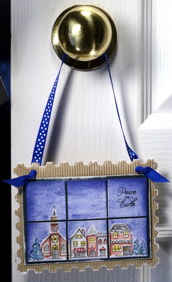
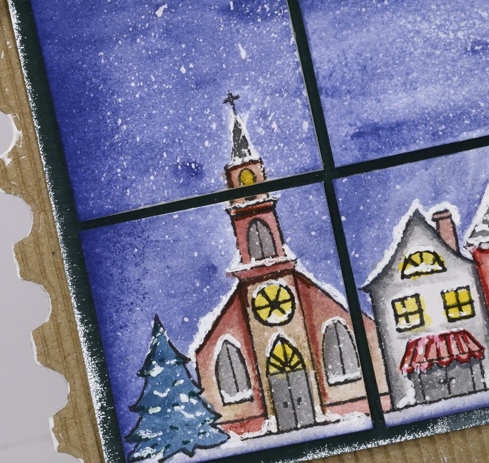
I hope you have enjoyed the Inchie Arts projects this week. My final one (for now) is a door handle decoration, a little panel with a winter scene on six 1.5″ squares.
To create this panel I began by splattering masking fluid on six squares then, when the fluid had dried I placed them edge to edge in a 2×3 array on masking paper to hold them together while I stamped and coloured. I stamped the village from the transparent set, “Gleeful” on an array of tiles in versafine onyx black. Using a waterbrush I picked up blue from a watercolour pencil to paint the sky. With a selection of watercolour pencils I coloured and blended the buildings and trees in the stamped image. Once the watercolouring had dried I rubbed off all the masking fluid to reveal the ‘falling snow’. I used ultrafine sharpie markers to highlight some features on the fillage and a clear wink of stella pen to make the windows glisten. With a white gel pen I drew snow on roofs, window trim and around doorways to finish off the picture.
To assemble the decoration I cut a corrogated cardboard base using the ‘Frame’ die and a green mat for the squares then painted the frame edges with white gesso and the green card with wedding dress luxe ink. I mounted the art squares on the green with a small margin between each square then finished it off with a blue and white polka dot ribbon.
Make sure you visit the Penny Black and the Inchie Arts blogs for more Inchie inspiration and for a chance to win some stamps and art squares.
Supplies:
Stamps: Gleeful (PB)
Creative Dies: Frame and Pattern (PB)
Inks: Versafine Onyx Black (Imagine Crafts/Tsukineko)
Pencils: Albrecht Durer watercolour pencils (Faber Castell)
Cardstock: Green cardstock, Natural corrogated cardstock, Inchie Arts 1.5″ white square
Also: Winsor & Newton masking fluid, polka dot ribbon, white gesso, white gel pen, clear wink of stella pen, ultrafine sharpies
Inch by Inch 4: Vintage Skyline
Posted: November 20, 2014 Filed under: Skyline, Stamped Landscapes | Tags: Faber-Castell Albrecht Durer Watercolour pencils, Inchie Arts, Penny Black stamps 16 Comments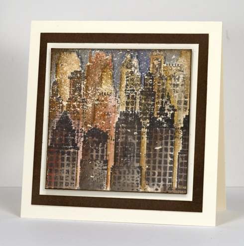
From a snowscape to a vintage cityscape my Inchie experiments continue. I never would have guessed when I first saw this skyline stamp that it would become such a favourite. Working on a 3″square splattered with masking fluid, I stamped ‘Skyline’ several times, never a full impression just the top of the buildings and without reinking so that the foreground images were darker than the background. I added colour with several earth tone watercolour pencils layering and blending colour until I was happy with the values and shadows. I mixed a blue and green to make a dark colour for the sky then added brown over the top to make it more muted. Finally I removed the masking fluid to reveal the cream flecks which I think make it look like an old damaged photo.
Deciding what to turn it into was difficult. I would have liked to create a notebook but time was not on my side so I made a card. I tried a patterned background, a portrait oriented and a landscape oriented rectangular card and two different sentiments before deciding less was once again more. Don’t forget more inchie arts inspiration on the Penny Black and the Inchie Arts blogs.
Supplies:
Stamps: Skyline (PB)
Inks: Memento Rich Cocoa (Imagine Crafts/Tsukineko)
Pencils: Albrecht Durer watercolour pencils (Faber Castell)
Cardstock: Neenah Natural White 110lb cardstock, Inchie Arts 3″ cream square, Penny Black mix & match Sticks and Stones paper
Also: Winsor & Newton masking fluid
Winter Song
Posted: October 22, 2014 Filed under: Watercolour, Winter Song | Tags: Faber-Castell Albrecht Durer Watercolour pencils, Fabriano Watercolour Paper, Penny Black stamps 10 Comments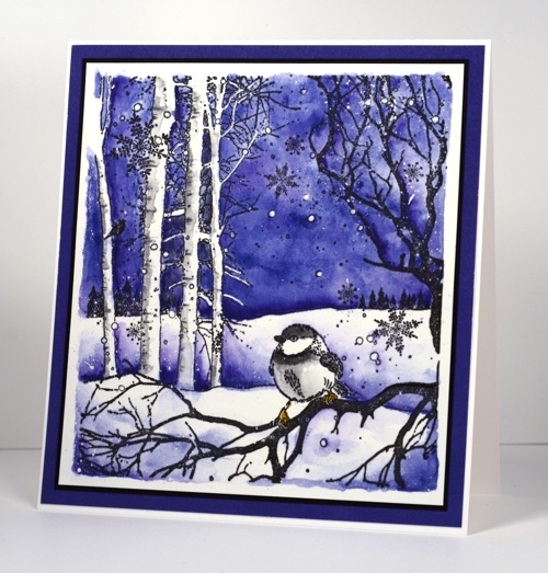
It’s a winter watercolour week on the Penny Black blog and here is my contribution. This little scene works well as a watercolour with all that sky needing colour. I decided on a limited palette of blue, purple, black and grey with just a touch of mustard on the chickadee’s feet.
I started by stamping “Winter Song” on watercolour paper in versafine onyx black, a pigment ink which won’t bleed when I start adding water. Next I splattered some masking fluid on the paper and let it dry. Using an Indianthrene Blue #247 watercolour pencil colour I shaded all the sky area then blended the colour with a water brush. I tried to avoid colouring in the little white circles but some were too small. Next I started adding Delft Blue #141 by taking colour from the pencil tip with a waterbrush. Using the same colour and brush, I painted above the snow banks blending from dark to light up the panel. I also added both blues to the bottom of the panel with a brush. I painted the bird with colour from black #99, medium grey #97 and gold ochre #183 pencils. The trees on the left hand side looked too flat so I painted shading on one side of tree trunks with colour from medium grey # 97 pencil.
When all the watercolouring was dry I rubbed off the masking fluid and used a white gel pen to draw in any tiny branches or circles that were painted over. I matted with black, then periwinkle cardstock and attached it to a white card base to create a 5″x 5.5″ card. You can’t see in the photo but I did add a little shimmer to the snowflakes with a clear wink of stella pen.
Supplies:
Stamps: Winter Song (PB)
Inks: Versafine Onyx Black (Tsukineko)
Pencils: Albrecht Durer Watercolour pencils Indianthrene Blue #247, Delft Blue #141, Black #99, Medium grey #97 , Gold ochre #183 (Faber Castell)
Cardstock: Penny Black Periwinkle mix & match paper, Fabriano 100% cotton hot pressed watercolour paper, Neenah Natural White 110lb cardstock, Black
Also: Winsor & Newton masking fluid, Signo white gel pen, clear Wink of Stella pen


