
Snow tipped twigs
Posted: October 19, 2016 Filed under: Brusho, Into the sky | Tags: Brusho, Penny Black stamps 10 Comments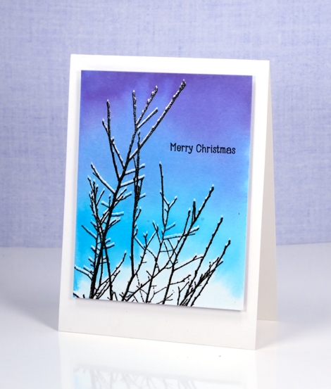
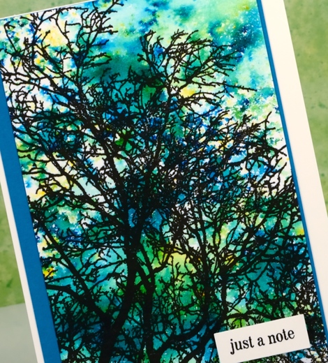
I have another brusho sky to share today. On Monday I explained how sometimes I paint the sky first, other times the images are done first. To create the appearance of snow on these twigs I had to stamp the twigs first. I used the misti and stamped the ‘into the sky’ stamp in versamark first then moved the watercolour panel up ever so slightly and stamped the twigs again in versafine onyx black. I then embossed with clear powder so the images would resist the paint when I added the sky over the top.
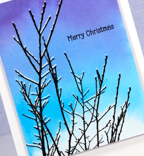
I used three colours of brusho to create the gradated sky leaving a bit of white at the bottom like a cloud. I finished the card by adding a simple sentiment and popping it up on a white card base.
Supplies
Stamps: Into the sky, Holiday snippets (PB)
Paints: Purple, Turquoise, Ultramarine brusho (Colourcraft)
Ink: Versafine onyx black ink(Tsukineko)
Paper: hot pressed Fabriano watercolour paper
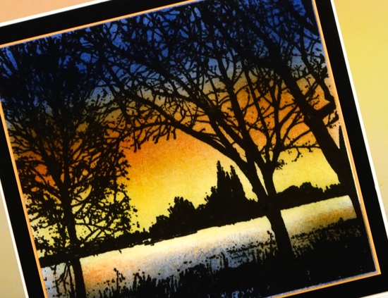
Sunset Rendezvous
Posted: October 17, 2016 Filed under: Brusho, Rendezvous | Tags: Brusho, Penny Black stamps 8 Comments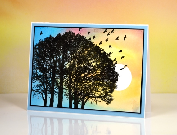
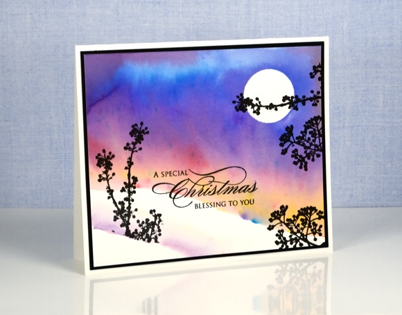
When making scenes like this one I sometimes create the background first then decide what to add to the foreground. Other times I stamp my images and add the sky after. For this one I positioned a moon punched from masking tape on a piece of watercolour paper then painted colour over the whole panel using brusho powders. I can’t remember but it is likely that I intended the panel to be portrait orientation with the moon in the top right corner.
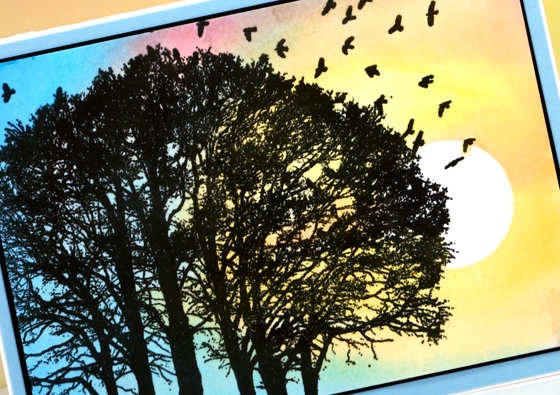
I decided instead to make the masked circle appear to be the sun going down so the light around it is yellow and pink with blue on the far left. Once the paint dried I stamped the tree stamp in versafine onyx black ink to complete the sunset scene.
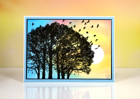
I didn’t add a sentiment as it is the kind of card I could use for any number of occasions. Once I pull it out to use it I can add a small sentiment in the bottom right corner if I wish.
I’m in Australia at present visiting my family; I’ll be posting some photos from time to time on my other blog, Sentient and on instagram
Supplies
Stamps: Rendezvous (PB)
Ink: Versafine onyx black ink, (Tsukineko)
Paint: crimson, yellow, cobalt blue, turquoise brusho (Colourcraft)
Paper: hot pressed Fabriano watercolour paper, Neenah Epic black cardstock, blue cardstock
Also: masking tape
Peerless skies
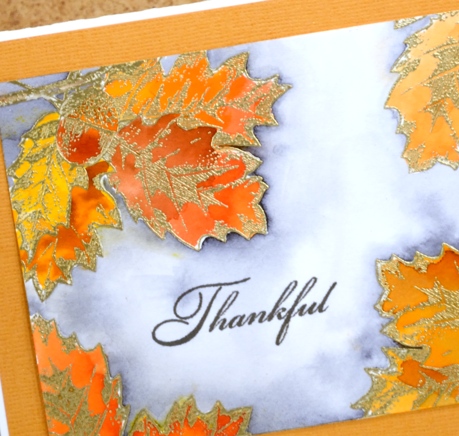
Posted: October 11, 2016 Filed under: Chapels, Woodland Beauty | Tags: Peerless Transparent Watercolors, Penny Black creative dies, Penny Black stamps, WOW embossing powders 8 Comments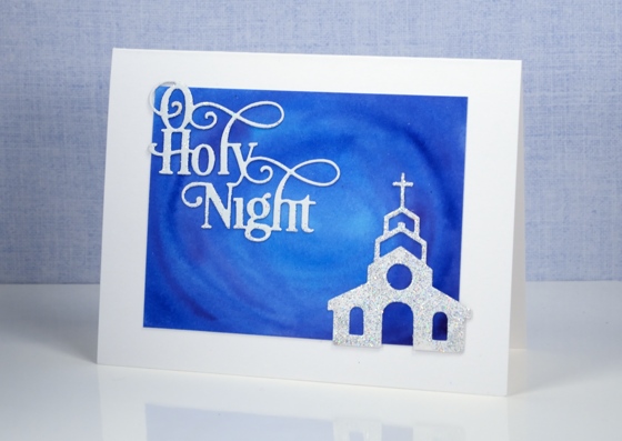
Yesterday I posted the first card painted with my new Peerless Watercolour paints along with a video showing how I organized my paints into a palette. The cards I have today feature deep blue skies also painted with Peerless watercolours.
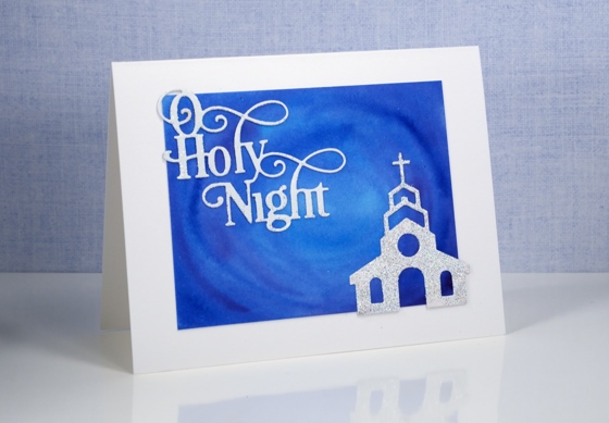
Peerless watercolours are unusual as the paint is concentrated in a dry sheet of cardstock. To use it you have to add water to the cardstock. I am only just beginning to use mine but I am already impressed by the intensity of the colour and the ease with which they blend. For both these cards I used a mix of blues and purples and blended them on the watercolour panel. I was happy with the mix of colour as I painted but was even more impressed when I returned to the panels after they had dried and saw how they colours had continued to blend resulting in soft smooth variations.
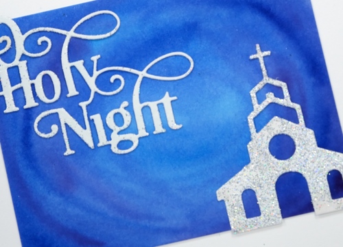
I kept the design simple as far as elements were concerned but fancy when it came to texture and sparkle. I embossed both the sentiment and church with WOW Diamond white embossing glitter giving a second coat to the church for maximum bling. I can’t imagine the circumstances under which a church would be so sparkly but it looked so pretty against that sky I had to let it bling!
I was far more traditional with this card adding a sentiment and tree in black ink.
I added a little interest by stamping the tree on both the card base and the feature panel which is popped up on a layer of foam.
I received my peerless watercolour paints from the kind people at The Foiled Fox online store. The store has a wonderful mix of art, paper craft and calligraphy supplies and in my opinion they are carrying all the cool stuff! They also have a blog showcasing their own design team and guests from around the world.
Supplies
Stamps: Woodland beauty, Holy Night (PB)
Dies: Chapels, O Holy Night
Ink: Versafine onyx black (Tsukineko)
Paint: Peerless watercolours
Paper: hot pressed Fabriano watercolour paper
Also: WOW diamond white embossing glitter
Peerless Watercolours and a video
Posted: October 10, 2016 Filed under: Grateful, Peerless watercolours | Tags: Peerless Transparent Watercolors, Penny Black stamps, WOW embossing powders 16 Comments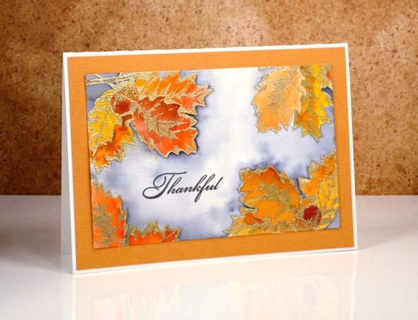
I have something new to share today, new to me that is. The Peerless paints have been around since 1885! Shauna from The Foiled Fox sent me the Peerless watercolour paints and they are beautiful. As the trees outside are turning stunning colours it seemed the perfect theme for my first peerless project. To read all the details about this card pop over to The Foiled Fox blog and read my guest post. Scroll down below to see how I set up a palette for my peerless paints.
Peerless watercolours are embedded in dry sheets. You touch the dry paint with a wet brush to pick up colour. To see how I set up my paints so I could access all the colours on one fold out palette, watch the video below.
Supplies
Forest grove
Posted: October 7, 2016 Filed under: gift card pocket, Serenity, Snowy Grove, Stamped Landscapes | Tags: Fabriano Watercolour Paper, Penny Black creative dies, Penny Black stamps, Ranger Distress inks, Ranger Distress stains 7 Comments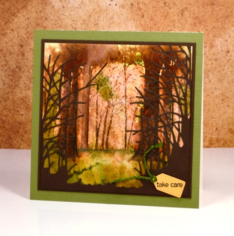
As you might know I use hot pressed watercolour paper 90% of the time because it is smooth and takes stamping so well, giving me a complete images. Occasionally, however, I like to pull out some cold pressed or even more occasionally some rough watercolour paper because the texture gives a whole different look. The labels hot, cold and rough, when attached to watercolour papers refer to the way the paper is pressed. Hot is flattened with heat and pressure making it the smoothest of all three. Cold is flattened with pressure but not heat and rough is flattened with less pressure than cold, making it the most textured of the three types.
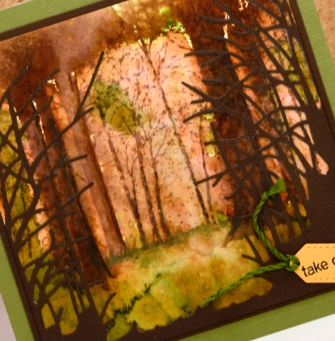
I stamped the ‘snowy grove’ stamp on cold pressed paper in vintage photo ink. I then used the image as a starting point for painting some of the trees more distinctly. In some cases I joined a few trunks together with extra ink to create wider trees. I painted some foliage plus the forest floor with crushed olive and peeled paint distress stains and spritzed with water to blend and blur both the ground and the canopy. I cut the ‘serenity’ die from brown cardstock to add some framing and give the impression of looking into a grove of trees. The tiny tag is cut with the ‘gift card pocket’ die.
The trees around here still have plenty of green on them but we are beginning to see gorgeous colour too. Have a great weekend and Happy Thanksgiving Canadians!
Supplies:
Stamps: Snowy Grove, Snippets (PB)
Dies: Serenity, gift card pocket
Inks: vintage photo, crushed olive, peeled paint distress inks & stains(Ranger)
Cardstock: Cold pressed watercolour paper, brown cardstock, green textured cardstock
Wish for peace and happiness
Posted: October 6, 2016 Filed under: Scarlet Majesty | Tags: Penny Black stamps, Ranger Distress stains, Tsukineko Versafine inks 12 Comments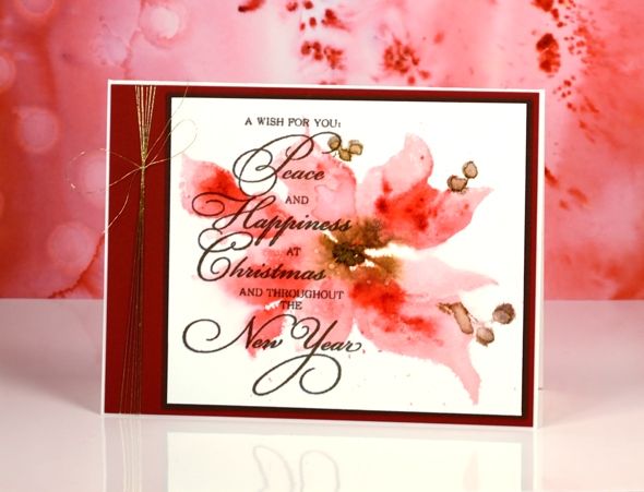
I shared a more defined version of this pretty poinsettia recently, painted in vintage tones. Today’s card features a looser image in pinks with a few touches of brown. As is often the case when I am after a watery softy image I used distress stains applied directly to the stamp. I started with worn lipstick and gathered twigs stains on the stamp and some water drops on my watercolour panel. The image was soft and some of the edges bled when the water droplets blurred into the petals.
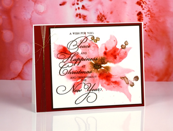
Next I added marker in darker colours to the stamp then pressed it onto the still wet panel. Once it dried I splattered a few water droplets over the petals. I did like the soft look of it at this stage but it wasn’t until I added the sentiment over the top that I felt it was finished. Do you sometimes stare at a project because you know it still needs something but you’re not sure what? (if all else fails in these circumstances I add the letter background stamp!)

I would usually be hesitant to cover so much of an image with text but the contrast of dark and light as well as blurred and sharp seemed to work. To complete the card I added both brown and burgandy mats plus a little gold thread.
Supplies:
Stamps: Scarlet Majesty, Yuletide Wishes (PB)
Inks: Versafine Vintage Sepia ink (Tsukineko) worn lipstick, gathered twigs distress stains, festive berries, gathered twigs, ground espresso distress markers(Ranger)
Cardstock: Fabriano 100% cotton hot pressed watercolour paper, red cardstock, brown cardstock
Also: Clear wink of stella brush pen, Gold thread
On the lake
Posted: October 4, 2016 Filed under: On the lake | Tags: Penny Black stamps, Tsukineko Memento inks 12 Comments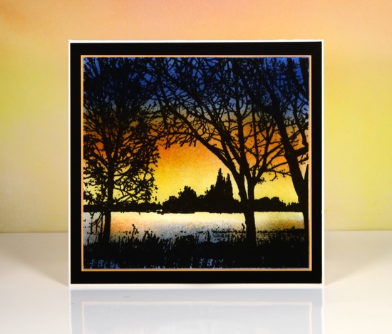
All this week and next Penny Black is sharing sneak peeks of the new ‘Festive Wishes’ release. As usual there are beautiful stamps and dies, some which don’t need to be reserved only for Christmas. The stamp featured above, On the Lake, can be used all year round.
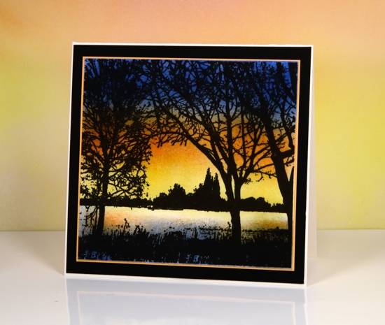
To create this sunset scene I stamped in versafine onyx black ink on neenah solar white cardstock. I used a misti so I could stamp several times to get a solid black image. Once the ink was totally dry I sponged blue at the top, orange then yellow above the trees. I then sponged some yellow and orange over the water and blue from the edge of the water to the bottom of the panel. It has been a while since I sponged a scene; some of you might remember I used to do it all the time!
There are more teasers on the Penny Black blog and a chance to win some product from the new release.
There is also a new One Layer Simplicity Challenge hosted by the artistic Karen Dunbrook.
Supplies
Stamps: On the lake (PB)
Ink: Versafine onyx black ink, Memento Dandelion, Tangelo and Danube blue ink(Tsukineko)
Paper: Neenah solar white paper, Neenah epic black cardstock, orange cardstock
Skyward
Posted: October 3, 2016 Filed under: Brusho, Skyward | Tags: Brusho, Fabriano Watercolour Paper, Penny Black stamps 8 Comments
You know how much I like tree stamps, so you can imagine how delighted I was to see this delicate branch silhouette appropriately called ‘Skyward’. I created a thank you card I’ll be linking to Susan Raihala’s Gratitude Campaign
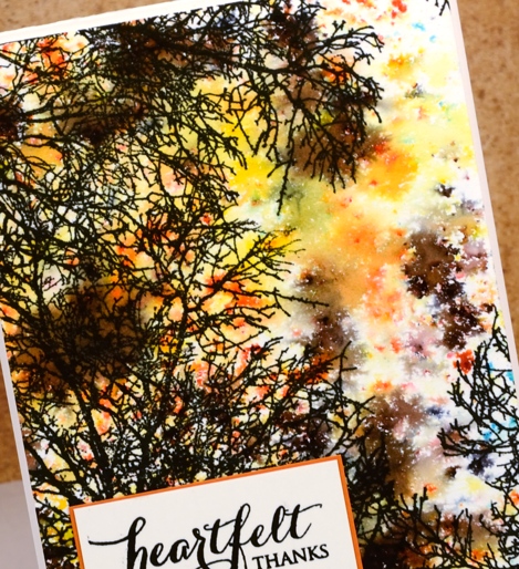
I chose to keep my design simple by adding colour with brusho. I sprinkled gamboge, lemon and dark brown brusho on a piece of watercolour paper, spritzed with water then dried it immediately with a heat tool. By limiting the amount of water and drying it quickly I was able to halt the blending of the colours. The resulting bursts of colour do a good impression of fall foliage, I think. I wanted the branches to almost fill the sky so I stamped twice overlapping some of the branches.
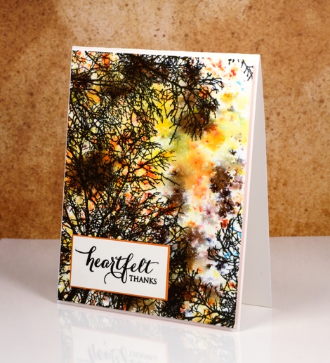
For the second card I used the same technique but went for a summer look. It is not clear whether my colour is sky or foliage so I am happy for it to be both.
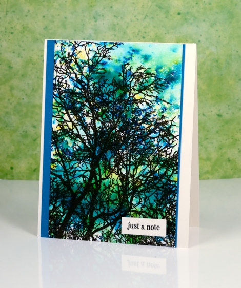
You would think I had used blue brusho but I sprinkled leaf green, sea green and lemon. I love the way brusho is never one single colour but a mix of different coloured powders; it’s different every time.
Supplies
Stamps: Skyward, Snippets, Heartfelt (PB)
Ink: Versafine onyx black ink (Tsukineko)
Paper: hot pressed watercolour paper, orange cardstock, teal cardstock
Paint: gamboge, lemon, dark brown, sea green, leaf green brusho powder
Northern winter sky
Posted: September 30, 2016 Filed under: Brusho, Nature's Gifts, Stamped Landscapes, Woodland Beauty | Tags: Brusho, Fabriano Watercolour Paper, Penny Black stamps 17 Comments
Some times watercolour paint does the work for you. I added a few stamped branches to turn this pretty sky into a scene but really, the blended colours were almost enough by themselves.
I did have a basic plan but the blending was magic that happened when I walked away. I positioned a frisket film mask in the top right then sprinkled four colours of brusho on the panel of watercolour paper. Using a wet brush I blended the colours creating a hard edge at the bottom and adding water to the upper part of the panel. Once I had wet the whole upper area I tilted the panel so the colour blended from yellow to pink to purple and blue. At this point I had to go and teach a mini class so I was gone for an hour.

When I returned my panel was dry and all blended in the pretty pattern you see above – magic! I added the berry branches here and there, an extra shadow for a snow bank and a sentiment.
Supplies
Stamps: Woodland Beauty, Nature’s Gifts, Festive Cheer (PB)
Ink: Versafine onyx black ink (Tsukineko)
Paper: hot pressed watercolour paper, Neenah epic black paper
Paint: Violet, ultramarine, crimson, yellow brusho powder
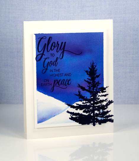
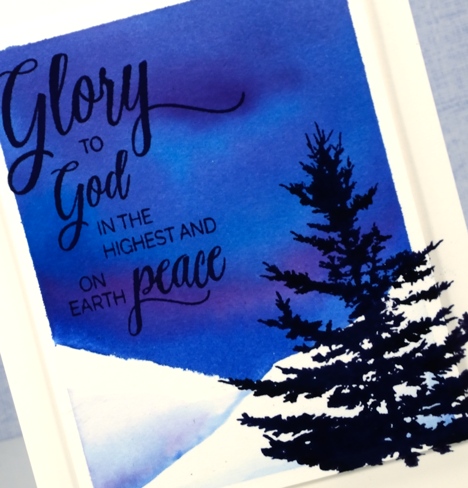
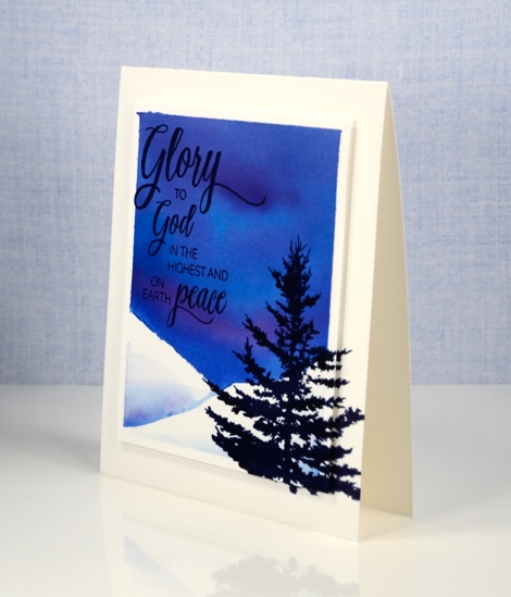
Wintry Trail
Posted: September 29, 2016 Filed under: Wintry Trail | Tags: Penny Black creative dies, Penny Black stamps, Ranger Distress stains, Tsukineko Versafine inks 14 Comments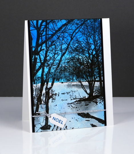
The new ‘Wintry Trail’ stamp from Penny Black is one that you can add a lot of colour step by step or a little colour behind black silhouette stamping. I chose the silhouette style for this winter scene. I painted a deep blue sky and a paler snowy or icy ground. As I painted I intended the ‘ground’ to be covered in snow but as I look at the photos I think it looks a little like the ice of a frozen pond reflecting the colour of the sky.
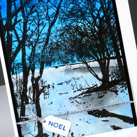
I have seen skies as blue as this one while ski-ing in the Gatineau hills. The contrast of snow and trees is dramatic and beautiful. To make my version I stamped the scenic stamp on hot pressed watercolour paper in versafine onyx black ink. I painted the sky first in turquoise and cobalt blue brusho and let that dry. I used a more diluted turquoise and diluted black brusho to paint the ‘ice’ and shadows. You can see there are little dots of white over the panel which means I started by flicking masking fluid over the panel.
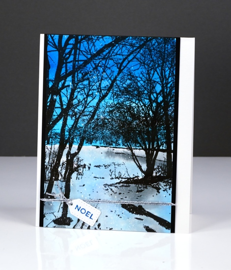
The tiny tag is from the Gift Card Pocket die set and was just the right size for one wee word!
Thank you so much for all the lovely comments about this week’s winter watercolours. I’m glad you enjoyed them and would love to hear if you tried any of the same techniques.
Supplies
Stamps: Wintry Trail, Holiday Snippets (PB)
Dies: Gift Card Pocket
Ink: Versafine onyx black ink, blue lagoon ink (Tsukineko)
Paper: hot pressed watercolour paper, Neenah epic black paper
Paint: Turquoise, Cobalt Blue, Black brusho powder
Also: Daler Rowney masking fluid, Silver cord


