
Winter celebration
Posted: November 22, 2016 Filed under: Stamped Landscapes, Woodland Beauty | Tags: Fabriano Watercolour Paper, Penny Black stamps, Ranger Distress inks, Tsukineko Versafine inks 10 Comments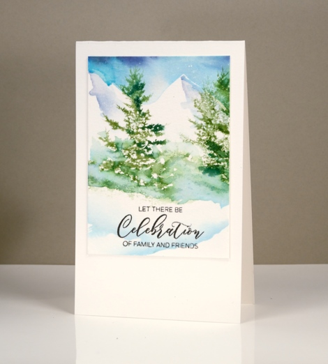
The tree from the ‘woodland beauty’ set has definitely become a favourite of mine. (It features in my next Christmas card class this weekend and one spot just opened up) I started by painting a blue and purple sky over some masking fluid specks. I used the same blues to paint shadows over the mountains.
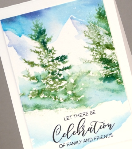
To create this little winter scene I stamped the tree in a mix of two greens and added water to blend the greens and add the shadow to the snow. To make the snowbank below the trees I partially inked the trees so the trunks weren’t stamped then painted some blue ink around the branches and as a sharp edge below the branches.
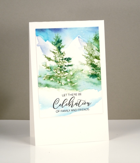
I painted some more pale blue snow banks then used part of a sentiment stamp to finish the panel. I’ve been back in Canada for over a week now and the snow has indeed come to Ottawa!
Supplies
Stamps: woodland beauty, festive cheer
Inks: versafine onyx black (Tsukineko), forest moss, pine needles distress markers (Ranger)
Paper: hot pressed watercolour papers (Fabriano), green cardstock
Paint: brusho watercolour crystal paint
Also: masking fluid
Gods blessings
Posted: November 16, 2016 Filed under: Skyline, Woodland Beauty | Tags: Brusho, Penny Black stamps, Ranger Distress inks 5 Comments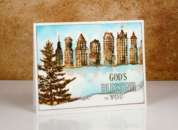
It’s time for a card with a vintage feel; you know they pop up here from time to time. I began with a watercolour panel splattered in a fine spray of masking fluid which results in tiny dots of white to represent snow. As with past cards in this style I used vintage photo distress ink which blends very nicely with water. The smoky black areas were added with black soot distress ink as well as an elegant writer pen. I can’t remember whether I stamped the buildings over a mask or just partially inked the stamp, either way the result made the skyscrapers appear to behind a snowbank. I blended the ink with a paintbrush above the snowbank and later, once the buildings were dry, painted the ice and sky with turquoise brusho.
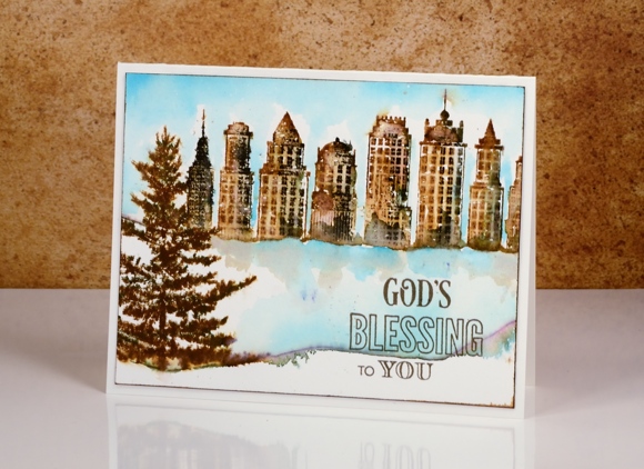
To frame the scene I ran the vintage photo ink pad around the edges of the panel then attached it to a cream card base.
Supplies:
Stamps: Skyline, Woodland Beauty, Holy Night(PB)
Inks: Versafine vintage sepia ink (Tsukineko) vintage photo, black soot distress inks (Ranger) Elegant Writer (Speedball)
Paint: Turquoise brusho
Cardstock: Fabriano cotton hot pressed watercolour paper
Tranquil in watercolour
Posted: November 11, 2016 Filed under: Tranquil | Tags: Penny Black stamps, Ranger Distress inks, Ranger Distress stains, Speedball elegant writer, Tsukineko Versafine inks 5 Comments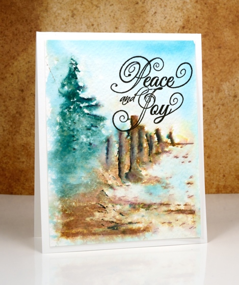
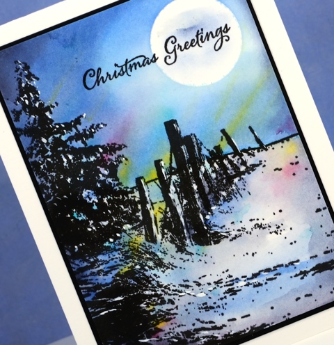
I’ve already posted two cards this week made with the scenic stamp, ‘tranquil’; this is my last one for now in a much looser watercolour style. On the previous two cards I stamped the image in versafine ink and it was sharp against a watercolour sky.
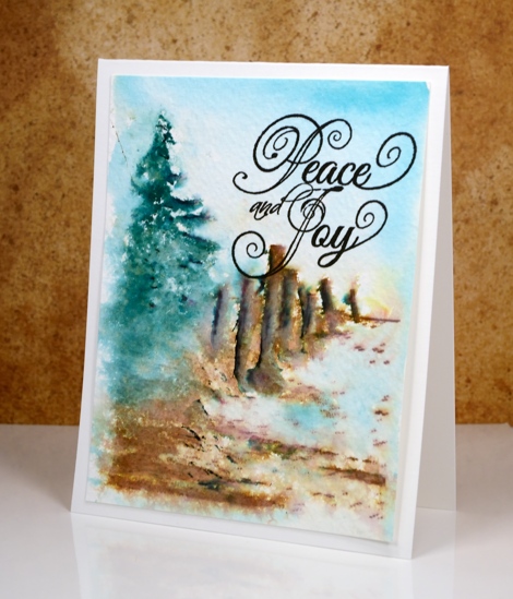
To create this scene I inked the tree in pine needles distress ink and the fence and ground in vintage photo distress ink and stamped it on cold pressed watercolour paper. I added shadows to the stamping with a black elegant writer pen then spritzed the panel with water to soften the whole image and let colours blend a little. I painted the sky with broken china distress stain to fill the rest of the panel, then added a sentiment in black ink.
Supplies
Stamps: Tranquil, Winter Joy (PB)
Ink: vintage photo, pine needles, broken china distress ink (Ranger) versafine onyx black ink (Tsukineko) elegant writer pen (Speedball)
Paper: cold pressed watercolour paper
Tranquil sky
Posted: November 9, 2016 Filed under: Tranquil | Tags: Dr Ph Martin Hydrus watercolor paints, Peerless Transparent Watercolors, Penny Black stamps, Tsukineko Versafine inks 6 Comments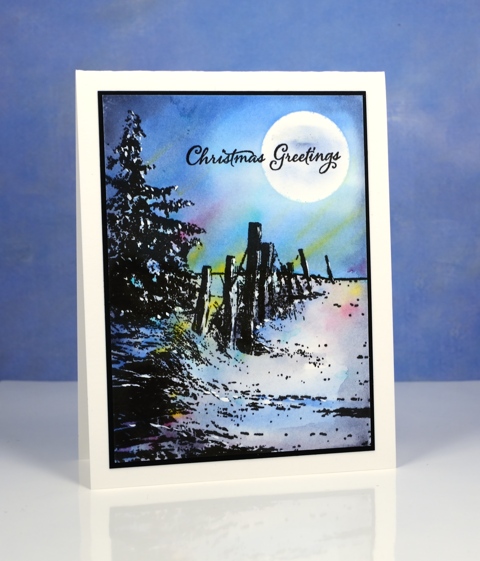
I’m very happy to be guest blogging over on the Foiled Fox blog again today so please pop over there for the details.
Tranquil snowy sky
Posted: November 7, 2016 Filed under: Tranquil | Tags: Dr Ph Martin Hydrus watercolor paints, Peerless Transparent Watercolors, Penny Black stamps 12 Comments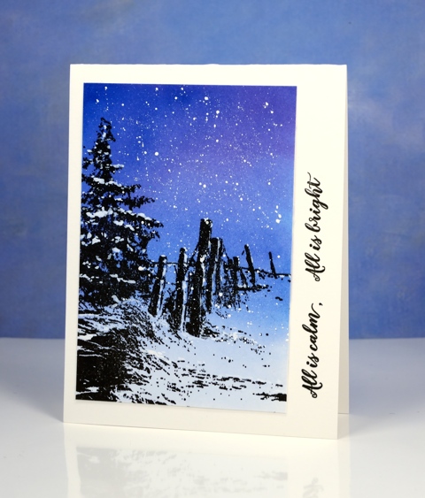
As I post this I am still in Australia but my husband mentioned there could snow this coming weekend – a welcome home present for me! By the time I return to Ottawa I will have been away for just over a month. I don’t get to Australia often so it really isn’t worth the time or money to travel all the way to Australia for a shorter time. I have completed several cards with this stamp each using a slightly different technique. The technique for today’s card is the most straight forward. I painted a graduated wash with Peerless watercolour paint. I began with deep blue at the top and diluted it as I approached the bottom of the panel.
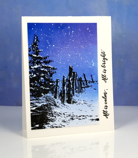
Once the background was dry I stamped the ‘tranquil’ stamp in versafine onyx black then let that dry. To finish it off I splattered white paint over the sky and painted some on the tree and fence posts.
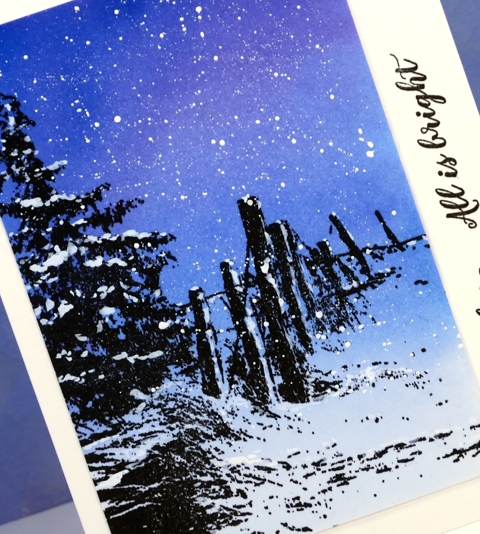
Once again I grabbed some stamps from the new ‘festive snippets’ set to add a sentiment.
Supplies
Stamps: tranquil, festive snippets
Inks: versafine onyx black (Tsukineko)
Paper: hot pressed watercolour papers (Fabriano)
Paint: Dr Ph Martin’s Bleedproof white paint
Stockings were hung
Posted: November 3, 2016 Filed under: Brick wall, Christmas stockings, Diamond pattern, Textures, Winter lantern | Tags: Penny Black creative dies, Penny Black stamps, Ranger Distress inks, Speedball elegant writer 8 Comments
…by the chimney with care. This is the last of my Winter Warmth series and the one that almost didn’t make the cut because I misjudged the size of the stocking! I created the whole background panel then pulled out the die to add the stocking only to find it was a tad larger than I’d remembered. My children assured me some stockings are so large they cover half the fireplace so I continued with the design.
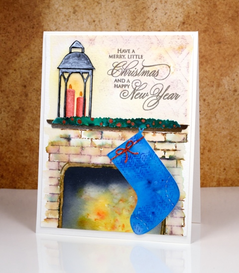
I created the background by stamping on cold pressed watercolour paper with distress inks. I first masked a space where the fireplace would be and a positioned a post-it across the panel where the mantel would end up. I stamped the brick wall stamp in brown and added darker tones with an elegant writer before blending with water. Above the mantel I stamped ‘diamond pattern and softened it with water. When I removed the post-it from the fireplace I used yellow, orange and black brusho to paint my ‘fire’. The lantern was done in two pieces just like I did on the ‘lakeside card‘ and yellow ink was added on the panel behind to make it glow.
The swag over the mantel is a strip of watercolour paper painted with green brusho then dotted with siren smooches ink. I attached it over a strip of painted brown paper cut to look like a mantelpiece. The stocking was cut with one of the ‘Christmas Stocking’ dies then stamped with a texture stamp so it looked like fabric. This one had a higher fiddliness factor than most of my cards which increased my respect for those of you who create far more intricate die-cut cards on a regular basis.
Thanks for visiting this week as I shared my Winter Warmth cards. I’ll be back next week with some more snowscapes.
Supplies
Stamps: brick wall, textures, diamond pattern, season’s gifts (PB)
Dies: winter lantern, Christmas stockings, little ornaments (PB)
Ink: vintage photo, fired brick, blueprint sketch, scattered straw, spiced marmalade distress inks (Ranger)
Paper: hot pressed watercolour paper, cold pressed watercolour paper, black cardstock
Paint: scarlet, ost blue, yellow, gamboge, black, dark brown, emerald green brusho powder, Finetec Artist Mica watercolour paint
Also: elegant writer pen, siren smooches ink
Baby, it’s cold outside
Posted: November 2, 2016 Filed under: Frosty day, What's in your cup | Tags: Fabriano Watercolour Paper, Penny Black creative dies, Penny Black stamps, Ranger Distress inks, WOW embossing powders 7 Comments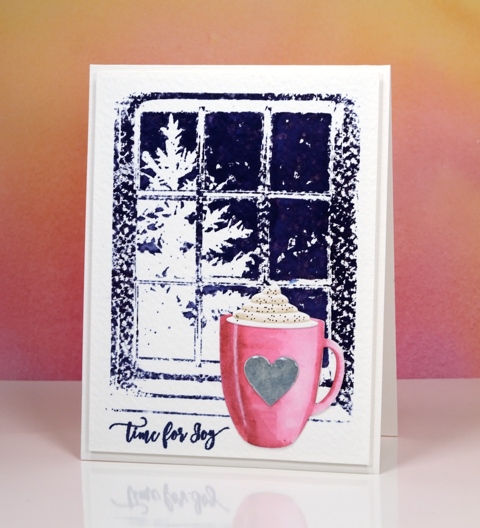
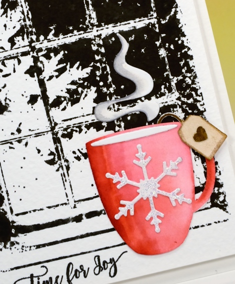
I’m continuing my ‘Winter Warmth’ feature with a cup of hot chocolate and a steaming cup of tea. I had fun creating a couple more scenes with simple watercolour backgrounds and die cut focal images in the foreground. On today’s cards the background is rough watercolour paper so the ‘frosty day’ stamped images were speckled all over until I used a wet paintbrush to blend the ink over the sky area.
I die-cut the cup using the ‘what’s in your cup?’ die set. This set comes with the cup, cream, steam, teabag plus more detail pieces. I cut the pieces out of hot pressed watercolour paper, coloured them with distress markers and blended the colour with water.
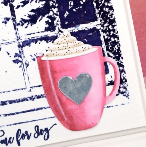
I added a silver heart, cream and cinnamon to the pink cup then attached them all to the background panel. Because the die set comes with all the cute little extras I decided to make a second card this time with a cup of tea.
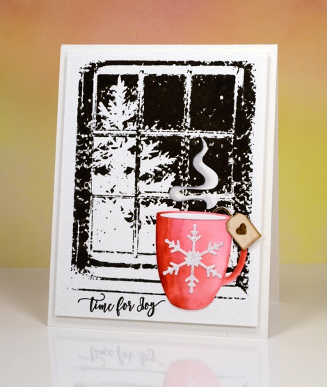
I stamped the background in black soot distress ink for this card and once again blended the sky area but left the rest textured.
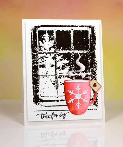
I coloured the cup with red distress inks then added a sparkly embossed snowflake, a teabag tag and some rising steam.
I have one more ‘winter warmth’ card to share tomorrow.
Supplies
Stamps: frosty day, festive snippets
Dies: what’s in your cup?
Ink: Chipped sapphire, black soot, festive berries, old paper, gathered twigs, picked raspberry, vintage photo, hickory smoke distress inks/markers (Ranger) Versamark, versafine majestic blue, imperial purple & onyx black (Tsukineko)
Paper: hot pressed watercolour paper, rough watercolour paper
Paint: Finetec Artist Mica watercolour paint
Also: Clear gloss embossing powder, Clear sparkle embossing powder
Light a candle
Posted: November 1, 2016 Filed under: On the lake, Winter lantern 9 Comments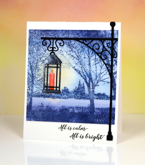
The second in my ‘Winter Warmth’ series again features a simple watercolour background with watercoloured die-cut images in the foreground. For yesterday’s card I stamped the background image on cold pressed watercolour paper so there would be a bit of texture showing through. It is even more evident in today’s card; stamping a solid image on cold pressed paper results in the speckled look of the lakeside scene. I inked the stamp in stormy sky distress ink all over and on a second stamping added chipped sapphire across both top and bottom. After stamping I used a wet brush to paint over the whole panel. This technique softens the scene and pulls colour from the stamped areas into the blank areas. While it was still wet I dabbed colour out of one area over the water so I could add a little yellow ink.
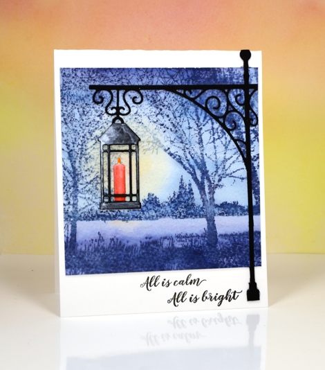
I used two separate die sets to create the lantern in the foreground. I cut the lantern using a die from the new set ‘winter lanterns’. I cut one from watercolour paper and one from black cardstock. The black one I painted with a thin coat of silver watercolour paint and clipped out the candle. The lantern cut from watercolour paper I coloured with distress markers then blended with water. I attached the black lantern over the watercoloured one so the candle appeared behind the black frame. I cut the lamp post from black cardstock using a die from ‘the gathering’ die set then trimmed it to fit the card base and overlap my painted background. Once again I used sentiments from ‘festive snippets’.
Thanks for dropping by.
Supplies
Stamps: on the lake, festive snippets
Dies: winter lantern, the gathering
Inks: Chipped Sapphire, Stormy Sky, Spiced Marmalade, Festive Berries distress inks (Ranger)
Paints:Finetec Artist Mica watercolour paint
Cardstock: hot and cold pressed watercolour papers, neenah epic black
Let it snow
Posted: October 31, 2016 Filed under: Skis 'n' sled, Woodland Beauty | Tags: Penny Black creative dies, Penny Black stamps, Ranger Distress inks, Tsukineko Memento inks 11 Comments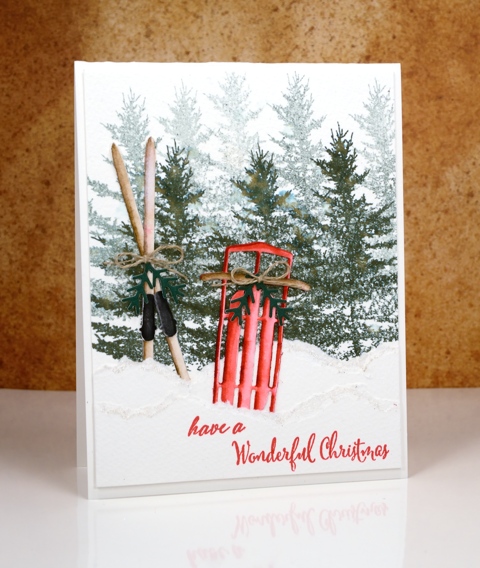
I am writing this post from sunny warm Australia while my Ottawa family is sending me photos of the snow that has already fallen. I have a series of ‘Winter Warmth’ posts this week featuring dies and stamps from the latest Penny Black releases. I chose to pair watercoloured die-cuts with watercoloured backgrounds to make some indoor and outdoor winter scenes. You might think that sledding or skiing is not a particularly ‘warm’ activity but consider the trudge up the hill with the sled or the energy expended cross-country skiing; you can end up quite heated!
I created my background forest on cold pressed watercolour paper by doing first and second generation stamping with memento northern pine ink. I then tore a few snow banks from the same paper and layered them in front of the trees.
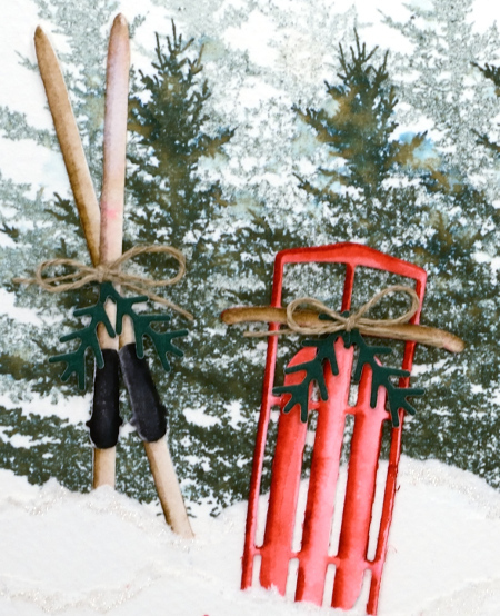
I die-cut the sled and skis from hot pressed watercolour paper then coloured them with distress markers, blending with water to get shadows and dimension. I added some die-cut greenery and a little twine bow to both the skis and the sled then tucked them in behind the torn paper snow banks. I added some clear wink of stella to the torn edges to make the snow banks glisten a little.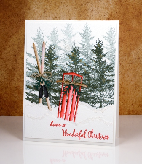
Supplies
Stamps: woodland beauty, festive snippets
Dies: Sled ‘n’ skies, winter lantern
Inks: memento northern pine, tuxedo black (Tsukineko), festive berries, gathered twigs distress markers (Ranger)
Paper: hot and cold pressed watercolour papers (Fabriano), green cardstock
Also: clear wink of stella, linen twine
Holly Stencilling
Posted: October 27, 2016 Filed under: CAS, Holly medley | Tags: Brusho, Penny Black creative dies, Penny Black stencils 4 Comments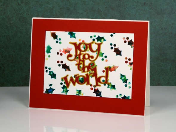
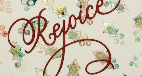
I have a couple more stencilled and watercoloured cards to share today. I used the same technique to create these panels as I did to make the ‘stained glass‘ panel shared earlier in the week.
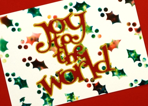
I began with the stencil taped to a piece of watercolour paper then spread molding paste over the stencil to fill all the little holly leaves and berries. While the paste was still wet I sprinkled brusho powder over the stencil then spritzed lightly with water. The water activates the brusho which spreads, blends and soaks into the paste. I removed the stencil and let the paste dry for quite a while before handling it. On the panel below I used a pearl paste instead of white to achieve a shimmery appearance. Water and colour did seep under the stencil in a couple of places but I trimmed the panel to utilise the best portion.
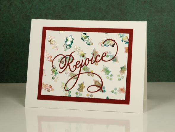
I finished the cards with die-cut sentiments and mats. To make the ‘Joy to the world’ sentiment pop I traced around it with a gold gel pen. You can see in the photo below the shimmer from the pearl paste. When I sprinkled the brusho over and spritzed, it really did not look good; it was more of a dirty mustard colour. Once it dried, though it looked pearly with shades of yellow, green and gold peeping through.
I apologize if I did not answer your questions about the last post; I’ve been travelling around a bit this week and visiting family in Canberra and Newcastle. When the choice was computer time or duplo with my delightful three year old great nephew, well really, there was no choice!
Supplies
Dies: Joy to the World, Rejoice(PB)
Stencil: Holly Medley (PB)
Paints: Red and green Brusho (Colourcraft)
Paper: Fabriano watercolour paper, red cardstock
Also: molding paste, texture luxe pearl paste, gold gel pen


