
Cow’s it going?
Posted: May 14, 2021 Filed under: Cow's it going?, Pink Ink Designs, Stampin Up, subtle | Tags: Fabriano Watercolour Paper, Pink Ink Designs, Stampin Up 18 Comments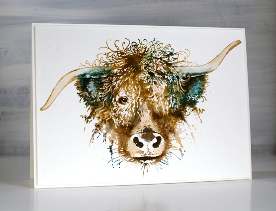
How much do you love this big highland cow? I hope you don’t mind this departure from my usual subject matter but there is something about this cow (and some other beauties from Pink Ink Designs) that amuses and inspires me! When I saw this stamp I knew it would make the perfect birthday card for someone I know who finds highland cows adorable. Although confused by my behaviour, Crop A While here in Ottawa ordered it for me and I’m so glad.
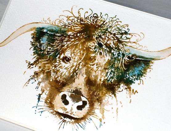
This card is stamped and painted with dye inks, classic kraft papertrey ink as a base colour then four distress colours to highlight, shade and add personality to the beautiful face and hair-do. I worked in a stamp positioner so I could add the colours bit by bit to build up the image. I did some painting and blending with a paint brush but kept white areas also as they add so much to the design.
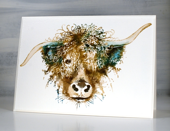
After I had completed the painting part I decided not to add anything more but instead ran the panel through the die cut machine inside the SU subtle embossing folder. If you look at the close up image you might just see the linen texture achieved. The ‘cow’s it going’ stamp set includes eleven smaller stamps along side this one including some distinctly Scottish ones so I’m looking forward to following that theme another time. My name is Heather after all, Heather McDonald originally!
Hope you are having a good hair day, like this cow obviously is!
Supplies
(Compensated affiliate links used when possible)

Garden fresh
Posted: April 28, 2021 Filed under: garden fresh, scripty | Tags: distress markers, Fabriano Watercolour Paper, Papertrey ink, Penny Black stamps, Ranger Distress inks, Stampin Up 7 Comments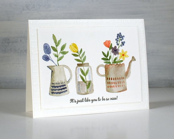
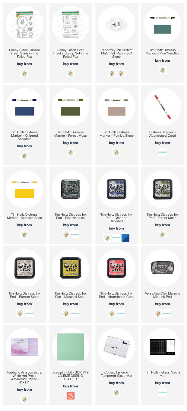
Inspiration for today’s card came from a watercolour artist I saw on Instagram. Her name is Garima Srivastava and she paints loads of florals sometimes in cute little jars and vases. I saw one of her paintings then pulled out the new Penny Black ‘garden fresh’ clear set to create my own little trio.
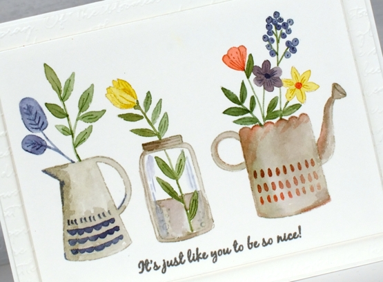
I stamped on hot press watercolour paper with Papertrey soft stone ink, a pale grey that works well for no line watercolour. To paint inside the outline images I used a mix of distress inks and markers, sometimes picking up smooshed ink off my glass mat, other times inking the stamp with a marker to add some definition.
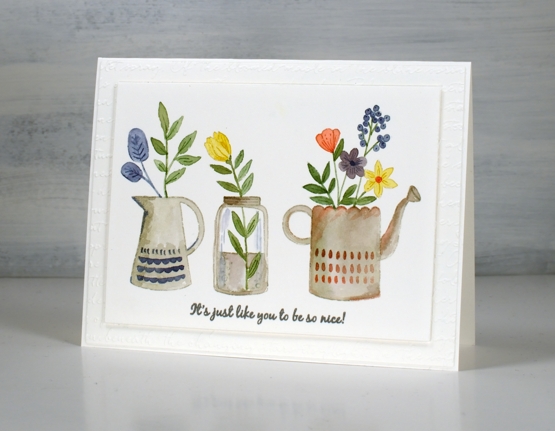
To finish the panel I stamped a sentiment from the new PB ‘ever thanks’ set in versafine clair morning mist ink then popped it up over the embossed mat made with one of my new embossing folders. (SU ‘scripty’). I’m looking forward to filling jars and jugs with flowers. Right now the daffodils are making a fine effort but a little too sparse to cut any for indoors.
Supplies
(Compensated affiliate links used when possible)
Secret Garden
Posted: May 13, 2020 Filed under: Papertrey Inks, Penny Black, secret garden, subtle | Tags: Papertrey ink, Penny Black stamps 10 Comments
Before I chit chat about today’s cards I just want to thank you for your feedback on my wreath card. I loved reading your kind words and thoughts on the sentiment question. In the end I left the front of the card sentiment free (I really didn’t want to mess it up!) and made a envelope out of watercolour paper onto which I will add roses and hand-lettering. When I do another wreath I will hand letter the sentiment first then proceed with the flowers, that way I won’t be afraid of messing up a finished wreath with a wonky letter. Now, back to our scheduled programming.
Last week I created a couple of abstract watercolour background panels to create coffee themed cards; I used the same approach for today’s floral cards. My method for creating the background was the same, I smooshed three colours of dye ink on my glass mat then spritzed them generously with water to make them move and blend a little. I had a large panel of hot pressed watercolour paper ready with some masking fluid already dotted over it. The colours I used were papertrey ink cubes lemon tart, enchanted evening and stormy sea (yellow, blue and grey).
I cut the panel into four and chose to work with stamps from the PB ‘secret garden’ clear set. My plan was to stamp the flowers in the same colours I used for the background, maybe use all three colours or just one or two. After fiddling around with some stamping I decided I liked just the flowers in the blue, stamped and restamped for paler impressions. I guess you’re not surprised I settled on blue, the lemon is very pretty but too pale to stand out and the grey was, well, not quite pretty enough.
Both floral stamps I chose had long skinny stems that I was able to rearrange on the lid of the MISTI to go in the directions I wanted. I did some water stamping too which just means misting the stamp with water and pressing it down on an inked area (the darker the better) and holding it there for a little longer than normal to let the water soak in then dabbing away the water to reveal a stamped ‘watermark’.
Once I had the flowers all stamped the panels still didn’t look quite finished so I turned to two elements I like to add when a card needs a little something. I used the PB ‘script’ stamp down the side of both panels in blue, grey and watermark then ran the panels through my diecutting machine with a rather cool embossing folder from Sizzix (sold by SU) called ‘subtle’. It gave the panels a canvas look. To add sentiments I used the ever useful ‘million thanks’ set and the lovely ‘SHE builder’ set both from Penny Black.
Supplies

Scene from my window
Posted: January 29, 2012 Filed under: Branch Out, CAS, Lovely as a Tree, Stamped Landscapes 44 Comments
The Less is More challenge this week is a sketch challenge. It just happens to be a sketch of a layout I use fairly often so I was once again keen to play along. We have had ice, snow, rain, snow, freezing rain, snow…etc this week which, while treacherous for walking around, is very pretty to look at. When I got up yesterday the sun was not quite up but there was a line of yellow on the horizon and the rest of the world was snow laden and bluey grey.
This card is my attempt to recreate the scene. I must say the scene was way more beautiful but it was fun to have a go. I masked the sides first and then stamped a row of trees in the background, the trees from Lovely as a Tree in the middle ground and the tree from Branch Out in the foreground. I embossed the black trees and then drew the snow on the branches with a versamarker before embossing a second time. I added the colour by sponging and masking.
Thank you for all your lovely comments about the Berry Branch set of cards I made. I know there were several questions about how I made the winter card. I will try and do a tutorial soon or failing that at least give you some instructions – stay tuned!
Supplies:
Stamps: Thank You Kindly, Branch out, Lovely as a Tree (SU)
Inks: Versafine Onyx Black, Not Quite Navy,Going Gray, Summer Sun
Cardstock: MFP Snow Storm Smooth Heavy
Also: white e.p.
Snowy New Year
Posted: January 10, 2012 Filed under: Holiday Sampler, Lovely as a Tree 6 Comments
As my Christmas card count was very low this year I have made a few New Year cards for people I still want to send a greeting to. This one features Marina Mist, an SU colour I just purchased and really like. I masked the hill, embossed the trees and snowflakes in clear and then brayered the sky. I’ll definitely use this technique again; I like the crispness of one colour with white.
Have a great day.
Supplies:
Stamps: Lovely as a Tree, Teeny Tiny Messages, Holiday Sampler
Inks: Versamark, Marina Mist
Cardstock: MFP White
Also: Clear e.p.
Snow laden tree
Posted: January 4, 2012 Filed under: CAS, Lovely as a Tree, Stamped Landscapes 25 Comments
Crafty Creations Challenge is aiming to warm things up with a heat embossing challenge. I chose to emboss a very chilly scene. We have discovered since living in Canada that the sunny days which look so beautiful in winter are the coldest days despite the sun!
The large tree is the only part of the card heat embossed. I stamped the tree once in versamark then restamped ever-so-slightly lower in black before embossing in clear. The result is snow laden branches as seen in the close up below.

Thanks for dropping by today.
Supplies:
Stamps: Lovely as a Tree, All Year Cheer, small tree stamp from Embassy Arts
Inks: Versamark, Basic Black, Marina Mist, Bashful Blue
Cardstock: MFP White
Also: Clear e.p.
Watercolour leaves
Posted: December 29, 2011 Filed under: CAS, With Gratitude 18 Comments
There is plenty of snow outside now but I have slipped back into a fall colour scheme to try out this technique. I painted the word in masking fluid with a small paintbrush on watercolour paper. I then used two leaves from With Gratitude, a few colours and a water spritzer to dampen both the stamp and the paper. I sponged a bit of brown and green before peeling off the masking fluid.
This is a second card for the Just One Word challenge at Less is More.
Supplies:
Stamps: With Gratitude (SU)
Inks: Summer sun, Certainly Celery, Wild Wasabi, Close to Cocoa, Old Olive
Cardstock: MFP Watercolor card
Also: Windsor & Newton Masking fluid
Last minute tags
Posted: December 27, 2011 Filed under: Baroque Motifs 7 Comments
These are my last minute tags, inspired by, but nowhere near as gorgeous as, the ones featured here.

Supplies:
Stamps: Baroque motifs, PSX pine bough, Embassy arts trees
Inks: Bashful Blue, Basic Black, Chocolate Chip, Garden Green
Cardstock: confetti white, confetti cream
Those snow scenes I love to do…
Posted: December 22, 2011 Filed under: Branch Out, CAS, Stamped Landscapes 12 Comments
A couple of posts ago I featured a snow scene I did for the Less is More snow challenge. I love creating snow scenes but that one I entered in the challenge was not the first one I did that day. It was the fourth. The first three are featured in this post. All of them are ok, but they were not quite what I was after. Snow scenes can be a little tricky at times. In the one above you will see I managed a strange yellowy tinge in the sky; wrong sponge I think.
In the one below the tiny words in the sentiment are a little hard to read and the shadow on that tree? Well, it is hardly a shadow; I could have planned that a little better.

The card below suffered from a restamping of the foreground tree which didn’t really match up; I must have moved the positioning tool. To salvage it I used an embossing pen to draw snow on the branches but it is still a bit messy.
All that to say: sometimes it takes a few attempts before I come up with the scene I am after, but those attempts can often be used, as is, or with a little creative alteration.

Enjoy your day, still no snow here, but now we have plenty of ice!
Supplies:
Stamps: Many Merry Messages, Branch out,
Inks: Versafine Onyx Black, Taken with Teal, Bashful Blue, Versamark, Basic Black
Cardstock: MFP Snow Storm Smooth Heavy
Also: Winsor & Newton masking fluid, white e.p.


