
Sketching over Scarlet Majesty
Posted: November 13, 2024 Filed under: Penny Black, Scarlet Majesty | Tags: Fabriano Watercolour Paper, Penny Black stamps, Ranger Distress inks 4 Comments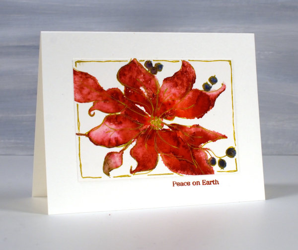
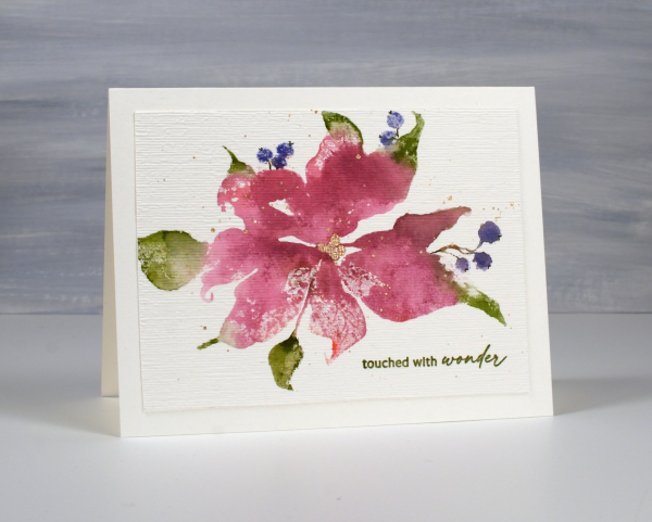
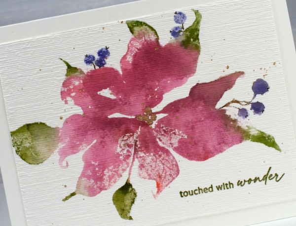
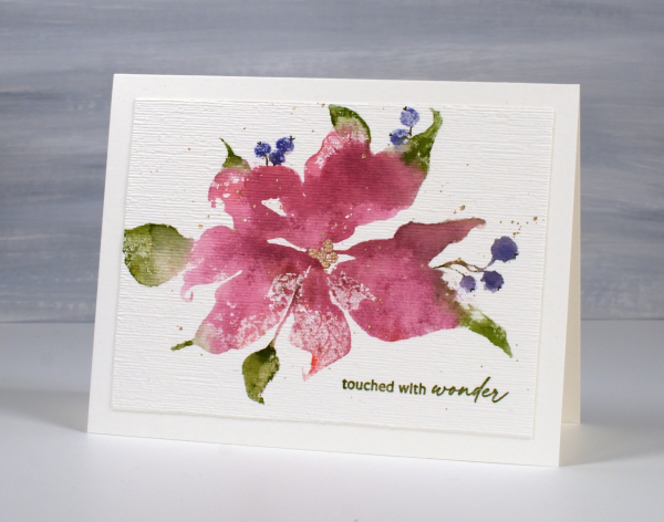
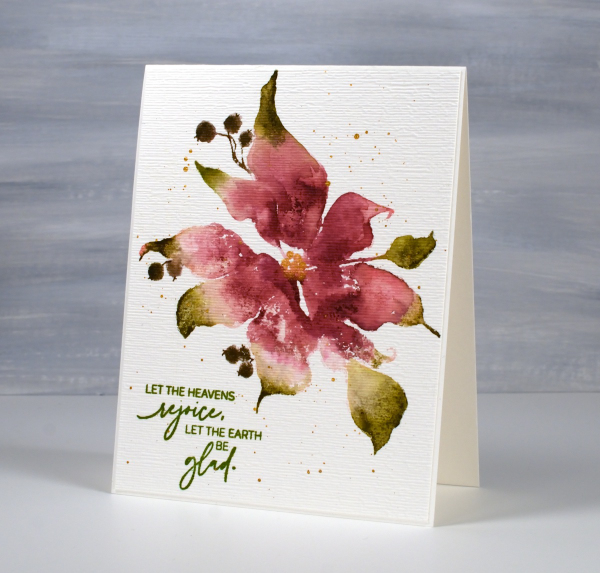
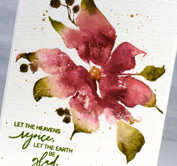
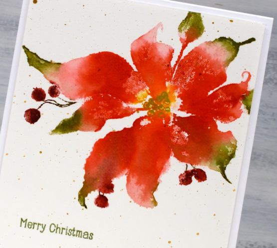
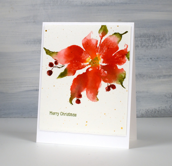
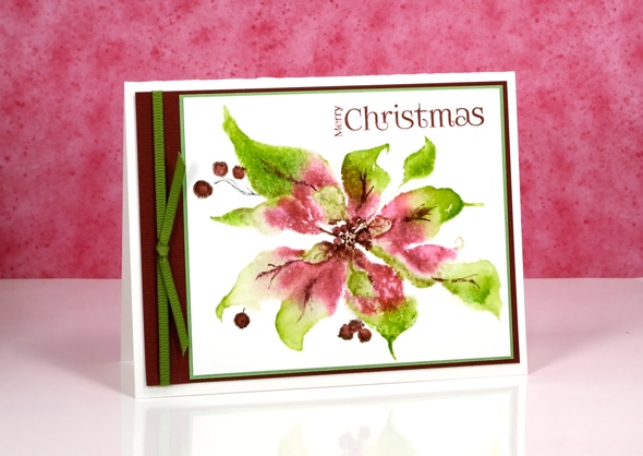
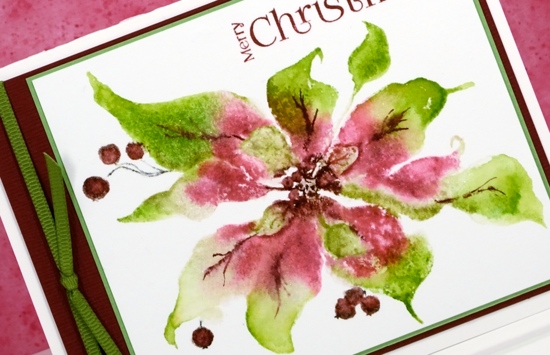
When I posted cards made with the scarlet majesty stamp last week I mentioned a technique I had used to define the petals a little more. Today’s cards feature the sketched outlines I added after stamping. As with my previous cards I inked the stamp with distress inks or other water-based dye ink. I spritzed the stamp before stamping which creates a loose watercolour look on the image. I like the loose image but admit that some of the definition of the petals is lost. With the image on the stamp (and packaging) as my guide and some artistic license I drew around petals, berries and leaves with a gold gel pen. I didn’t try to stay exactly on the edge of the stamping but close. For the red poinsettia I also drew a rough frame around the image.
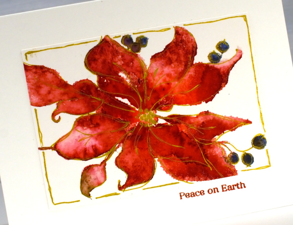
I added a small sentiment below the panel in a matching ink. On the red panel above I didn’t try to keep leaves green and petals red; everything is red. On the pink poinsettia below I used a few more distress inks in my initial loose watery impression.
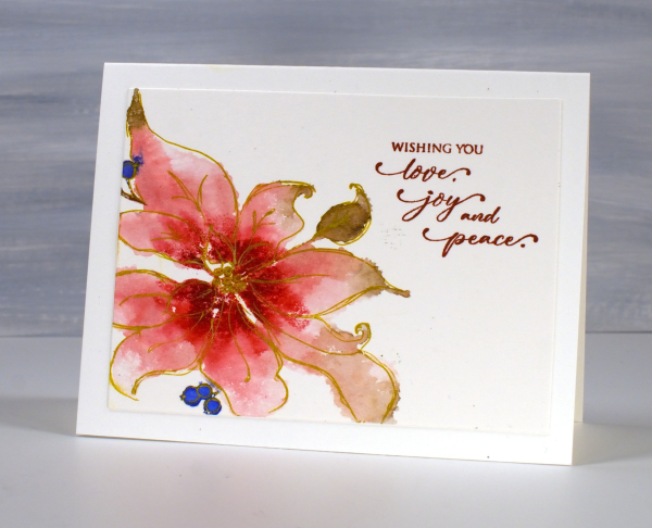
Once again I stamped on hot press watercolour paper inking the stamp with small distress ink cubes and markers. Once the image was dry I used the gold gel pen to sketch the outline. If you look too closely you will see blobs and ink outside the lines but I quite like the overall gold edged effect.
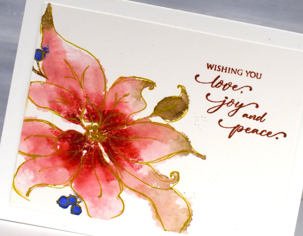
One tip if you try this technique but find yourself trying to be too precise. Hold the gel pen further down the barrel than you normally would and move faster than usual drawing your lines. That way you should achieve a loose sketchy style that pulls the very watery stamped image into better focus.
Hope you’re having a great day. I now need to write some international Christmas cards; it is time to put them in the mail!
Pink Majesty
Posted: November 4, 2024 Filed under: Finetec paints, Penny Black, Scarlet Majesty, Stampin Up, subtle | Tags: distress markers, Fabriano Watercolour Paper, Finetec artist mica watercolour paint, Papertrey ink, Penny Black stamps, Ranger Distress inks 10 Comments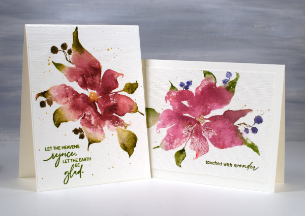
Today’s cards feature the beautiful Penny Black stamp, ‘scarlet majesty‘ but as the title suggests, I have chosen pinks over scarlet for the ink colours. I worked on Fabriano hot pressed watercolour paper in my stamp positioner.
I inked most of the petals with a pink ink then added darker ink with more of a burgandy such as aged mahogany. I use a mix of small cube ink pads and markers to ink the stamp. The leaves were inked with peeled paint and the berries a purply blue such as chipped sapphire. Before stamping I spritz the stamp so the inks can move a little. I stamp the first impression then decide whether more ink is needed, more water or often some blending with a paintbrush and water.
I don’t remember fiddling much with this panel as I liked the watery blends and the paler veins showing through here and there. I painted the centre of the poinsettia with gold finetec paint and of course added some splatter.
The sentiment is from PB ‘jolly snippets‘ and the texture from the retired SU ‘subtle’ embossing folder.
I used the same technique on this second card but used darker inks for leaves, petals and berries. My guess is aged mahogany, forest moss and a dark brown which was possibly made by mixing the first two. (I don’t always take note of my ink colours)
I think ‘scarlet majesty’ is a stunning stamp; I like the curl at the ends of the petals. Here are a few more cards made with it. I will admit that it is tricky to ink because you can’t always see where to try and define edges. I have another post coming up where I handle this issue by adding lines after stamping. I’ll share that soon. The sentiment this time came from the PB set, ‘promise of hope’.

Today’s post features affiliate links to The Foiled Fox. If you buy through these links I receive a small commission at no extra cost to you.
Scarlet Majesty
Posted: October 26, 2023 Filed under: Finetec paints, Penny Black, Scarlet Majesty | Tags: distress markers, Fabriano Watercolour Paper, Finetec artist mica watercolour paint, Penny Black stamps, Ranger Distress inks 7 Comments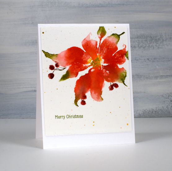
Penny Black has released a lovely selection of poinsettia stamps over the years but this one might just be my favourite (don’t tell the others). The endearing feature on this image is those curly ends on the petals. I just love how whimsical they look. This pretty poinsettia is called ‘scarlet majesty‘ and I have featured it in years gone by.
You might have noticed that I don’t have pictures of the products used in my projects at the end of my blog posts anymore. I decided to return to just linking to products in the written text of the post. Many of the links will still be affiliate links and when clicked will take you straight to one of the three stores where I earn affiliate income. Some of the links won’t be affiliate links, they will just be for your convenience.
To create this panel I worked in a stamp positioner so I could work on one or two parts of the stamp at a time rather than try and get it right in one go. I used a couple of red distress inks to stamp the petals but wiped ink off the tips so I could ink them with green ink. I gave the stamp a spritz to get the inks moving and after stamping, blended from red to green with a paint brush. I also used some yellow ink in the centre of the poinsettia and later drew the seeds over the top with a gold gel pen.
To ink those sweet little berries I switched to water-based markers. Once dry I splattered gold paint over the panel and added a little sentiment from the PB ‘holiday snippets’. As is my preference I worked on Fabriano hot pressed watercolour paper.
Thanks for dropping by today. I appreciate your support and love to read the kind messages you leave in the comments.
Today’s post features affiliate links to The Foiled Fox. If you buy through these links I receive a small commission at no extra cost to you.
Pink & Green Poinsettia
Posted: November 29, 2016 Filed under: Scarlet Majesty | Tags: Penny Black stamps 21 Comments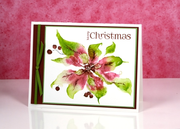
I’m not sure that poinsettias ever appear to be quite this pink but I have artist’s licence so here is a bright pink and green poinsettia. I stamped and painted this one way back in September and was pretty careful to note down colours and products with all the projects I was working on before I went to Australia. Somehow though, I can’t find my list for this one.
I used the MISTI so I could ink with pink first (maybe Victorian velvet or worn lipstick dsitress stain) then ink with green (mowed lawn distress stain??) and finally with aged mahogany distress stain. Once the petals were dry I added details with an aged mahogany distress marker.
It is entirely possible that I did not do this with distress stains at all; sorry, I’m just not sure. I did mat the panel with green then with burgandy making it a four-layer card which, for me, is a little unusual just like the colour scheme.
Supplies:
Stamps: Scarlet Majesty, Joy filled(PB)
Inks: not sure but my guesses are listed in the description above.
Cardstock: Fabriano 100% cotton hot pressed watercolour paper, green cardstock, burgandy cardstock
Wish for peace and happiness
Posted: October 6, 2016 Filed under: Scarlet Majesty | Tags: Penny Black stamps, Ranger Distress stains, Tsukineko Versafine inks 12 Comments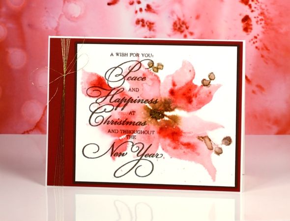
I shared a more defined version of this pretty poinsettia recently, painted in vintage tones. Today’s card features a looser image in pinks with a few touches of brown. As is often the case when I am after a watery softy image I used distress stains applied directly to the stamp. I started with worn lipstick and gathered twigs stains on the stamp and some water drops on my watercolour panel. The image was soft and some of the edges bled when the water droplets blurred into the petals.

Next I added marker in darker colours to the stamp then pressed it onto the still wet panel. Once it dried I splattered a few water droplets over the petals. I did like the soft look of it at this stage but it wasn’t until I added the sentiment over the top that I felt it was finished. Do you sometimes stare at a project because you know it still needs something but you’re not sure what? (if all else fails in these circumstances I add the letter background stamp!)

I would usually be hesitant to cover so much of an image with text but the contrast of dark and light as well as blurred and sharp seemed to work. To complete the card I added both brown and burgandy mats plus a little gold thread.
Supplies:
Stamps: Scarlet Majesty, Yuletide Wishes (PB)
Inks: Versafine Vintage Sepia ink (Tsukineko) worn lipstick, gathered twigs distress stains, festive berries, gathered twigs, ground espresso distress markers(Ranger)
Cardstock: Fabriano 100% cotton hot pressed watercolour paper, red cardstock, brown cardstock
Also: Clear wink of stella brush pen, Gold thread
Vintage poinsettia
Posted: September 22, 2016 Filed under: gift card pocket, Scarlet Majesty | Tags: Faber-Castell Albrecht Durer Watercolour pencils, Penny Black creative dies, Penny Black stamps, Ranger Distress inks, Tsukineko Versafine inks 8 Comments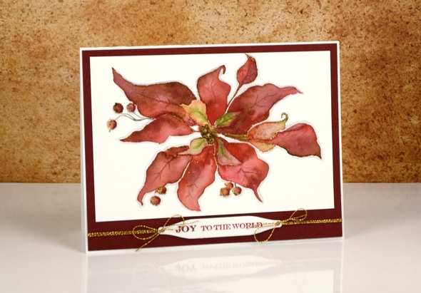
Today’s card is a contrast to the sparkly bright poinsettias earlier in the week. I returned to a style I have featured on the blog several times this year, a vintage appearance. To achieve the aged look I stamp first in vintage photo distress ink then blend the stamped ink with watercolour pencils. I worked one petal at a time and used a wet paintbrush to pick up colour from the pencils. I chose a couple of reds, and a light green for the petals and a dark brown for the berries. Once the whole image was painted I coloured around the edge with a grey pencil to help ‘lift’ it off the page a little.
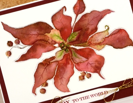
I matted the panel with textured burgandy cardstock and added a sentiment on one of the handy tags from the gift card pocket die (a set that gives you way more than just a gift card pocket; its full of tabs, tags, flowers, scalloped shapes…).
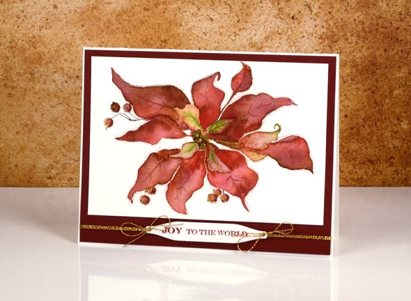
As I finished editing this post it occurred to me that the vintage look on my poinsettia does give it a bit of a ‘dried up ‘cos I didn’t get watered look’. Now, how would I know that look I wonder?
Supplies:
Stamps: Scarlet Majesty, Holiday Snippets (PB)
Dies: Gift Card Pocket
Inks: Versafine Crimson Red ink (Tsukineko) vintage photo distress ink(Ranger)
Cardstock: Fabriano 100% cotton hot pressed watercolour paper, Burgandy textured cardstock
Also: Faber-Castell Albrecht Durer watercolour pencils, Gold cord


