
Gentle Breeze Tags
Posted: May 15, 2015 Filed under: Gentle Breeze, Tagged | Tags: Penny Black creative dies, Penny Black stamps, Ranger Distress stains 10 Comments
The new Penny Black release, Sunshine and Smiles, is now available. Jill Foster has been sharing beautiful projects on the PB blog all week. My card today features the new stamp, Gentle Breeze. I inked the stamp with distress stains and markers, spritzed it with pearl-ex spray then stamped on watercolour paper. I did this a couple of times on a large panel and added some splatter here and there with a paint brush. When the panel was finished I couldn’t decide on the orientation or whether to add a sentiment, a die-cut or a mat; I tried several things without satisfaction. Finally I tried a curved edge cut which ended up looking no good at all but left me with a strange shaped panel from which I managed to cut two tags. I added a little texture stamping, a sentiment and ended up with a CAS card. Speaking of CAS cards make sure you check out Penny Black’s second blog, Simplicity at its best; there is all kinds of cleverness shared over there. And, before I end off, don’t forget there is the ‘Blossom’ challenge in progress at One Layer Simplicity.
Supplies:
Stamps: Gentle Breeze, Textures, Heartfelt (PB)
Creative Dies: Tagged (PB)
Inks: Scattered Straw, Spiced Marmalade, Forest Moss distress stains (Ranger) Northern Pine memento ink (Imagine Craft/Tsukineko)
Cardstock: Fabriano 100% cotton hot pressed watercolour paper, Neenah Natural White 110lb cardstock
Also: Twill tape
Irises
Posted: May 13, 2015 Filed under: Allegro | Tags: Penny Black stamps, Tsukineko Memento inks 7 Comments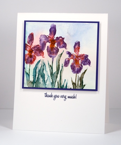
These little irises are a bit of a contrast to the large floral brushstroke stamps Penny Black released a few months ago. The iris is from a transparent set called Allegro and is one of six flowers in the set. I used a selection of distress and memento markers to ink the stamp and watercolour paints to create a soft wash in the background. I spritzed the stamp before stamping and also used a brush to blend colours on paper once stamped. I think I prefer working on a slightly larger scale but it was an interesting exercise to see how much detail I could get on such a little watercoloured scene.
There are brand new stamps and dies on the PB blog this week with give-aways! I hope to feature them here on Bits & Pieces very soon.
Supplies:
Stamps: So Lucky, Allegro (PB)
Inks: Forest Moss, Pine Needles, Spiced Marmalade, Barn Door, Distress Markers(Ranger) & Grape Jelly memento marker, Imperial Purple versafine ink (Tsukineko)
Cardstock: Fabriano 100% cotton hot pressed watercolour paper, Neenah Avon Brilliant white, Purple cardstock
Also: Kuretake Gansai Tambi watercolour paints
Roses and wishes
Posted: May 12, 2015 Filed under: Efflorescence, Stitched Edges, Wishes | Tags: Fabriano Watercolour Paper, Penny Black creative dies, Penny Black stamps, Ranger Distress stains 5 Comments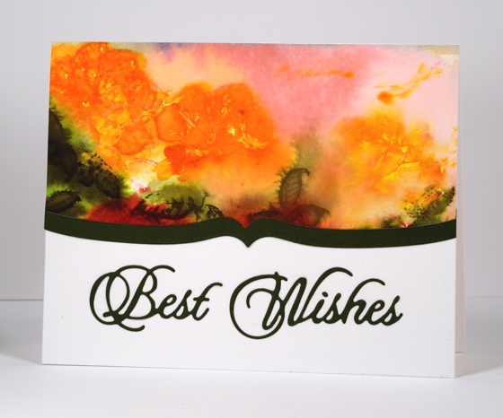
Today’s card is the one which produced the pretty coloured baby wipe that made the previous card possible. The watery rose panel above was initially much larger and there were red roses down below the orange ones. I used the wipe which ended up covered with orange, pink and green stain to clean off the rose stamp after each impression. I can’t really give you a play-by-play for this panel because I just kept on stamping, spritzing, painting and blotting until I ended up what you see above. There is a fine line between a soft blurred floral design and and a mess of washed out colour which some of you might think I have definitely stepped over (hehe) but I like the way the roses bleed into the background and the leaves bleed into the roses.
I cropped the red roses out because they were not so pretty then added a shaped border cut with one of the ‘stitched edge’ dies. I put ‘stick it’ adhesive on the back of the green cardstock before I cut the ‘best wishes’ sentiment which makes it very easy to attach to the card base.
Supplies:
Stamps: Efflorescence (PB)
Creative Dies: Stitched Edges, Wishes (PB)
Inks: Ripe Persimmon, Worn Lipstick, Forest Moss, Festive Berries, Spiced Marmalade distress stains (Ranger)
Cardstock: Fabriano 100% cotton hot pressed watercolour paper, Green paper, Neenah Avon Brilliant White 110lb cardstock
Love is..
Posted: May 10, 2015 Filed under: Love Chapter, To You | Tags: Fabriano Watercolour Paper, Penny Black stamps, Ranger Distress stains 12 Comments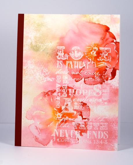
Although not designed as a Mother’s day card this one featuring the well known passage from 1 Corinthians 13 would be perfect to give my Mother as she has modeled the characteristics listed in this passage throughout her life. It could also work for a wedding or a special friend.
This panel was a very experimental one. I stamped the verse stamp from ‘Love Chapter’ in clear powder on cold pressed watercolour paper. I was aiming for an incomplete impression so I wiped off a bit of versamark before I stamped. I set aside the embossed panel while I worked on another panel using a single stamp but many distress stains. Each time I reinked the stamp I wiped the distress stain off on a baby wipe. The baby wipe ended up being quite saturated with pinks, yellows and greens but in quite a pretty, not muddy way. I lay the stained wipe over my embossed panel then soaked it with water so the colours transferred to the paper.
The large flower stamp is from the transparent set ‘To You’. I inked it with red, orange and pink stains, spritzed it with water then stamped over the embossing. Before it could dry I used a damp brush to draw the colours into the petals.
I hope you are having a happy Mother’s day. I am feeling well fed and well loved by my sweet family.
Supplies:
Stamps: Love Chapter, To You (PB)
Inks: Forest Moss, Ripe Persimmon, Spiced Marmalade, Worn Lipstick, Festive Berries Distress Stains(Ranger) & Versamark (Tsukineko)
Cardstock: Fabriano 100% Cotton cold pressed watercolour paper, Neenah Avon Brilliant white, Burgandy cardstock
Also: Clear embossing powder
Tulip Festival
Posted: May 7, 2015 Filed under: Blooming Garden, Watercolour | Tags: Fabriano Watercolour Paper, Kuretake Gansai Tambi watercolour paints, Penny Black creative dies, Penny Black stamps, Ranger Distress stains 12 Comments
The Tulip Festival officially starts in Ottawa tomorrow, but as you can imagine the tulips have started celebrating ahead of the opening ceremonies. I decided to create a couple of tulip displays myself but on paper not in the garden. I do have two tulips in bloom which would make the ratio of blooming tulips to planted bulbs quite similar to yesterday’s sad daffodil ratio.
I worked on both these panels at the same time on the same piece of watercolour paper. They were only separated by a piece of masking tape which explains why there are little splatters of red on the panel below even though I intended to keep that one clean and white. When I finished these panels I was a bit ho-hum about them; they were ok but not exactly what I had hoped. Adding mats and sentiments made the difference. The one below had a blue watercolour border that I ended up cutting off to add a red border and sentiment instead. The blue border was too soft on an otherwise crisp contrasting card. On the one above the border was created by the tape so I decided not to add another colour cardstock for the sentiment but remove it with a die cut instead leaving a subtle but readable cream coloured sentiment.

Both cards were stamped and painted with distress stains over ‘masking fluid-splattered’ hot pressed watercolour paper. The top one got the extra spritz and splatter treatment at the end to make the tulips explode a little whereas the lower one was left with the colour inside the lines.
Supplies:
Stamps: Blooming Garden(PB)
Creative Dies: Many Thanks, For You (PB)
Inks: Mowed Lawn, Festive Berries, Ripe Persimmon distress stains (Ranger)
Cardstock: Fabriano 100% cotton hot pressed watercolour paper, Neenah Classic Crest Natural White 110lb smooth, Neenah chilli cardstock
Also: Stick it adhesive sheets, dimensional adhesive, Kuretake Gansai Tambi watercolour paints
Daffodils
Posted: May 6, 2015 Filed under: Daffodil Dance | Tags: Fabriano Watercolour Paper, Penny Black stamps, Ranger Distress stains 8 Comments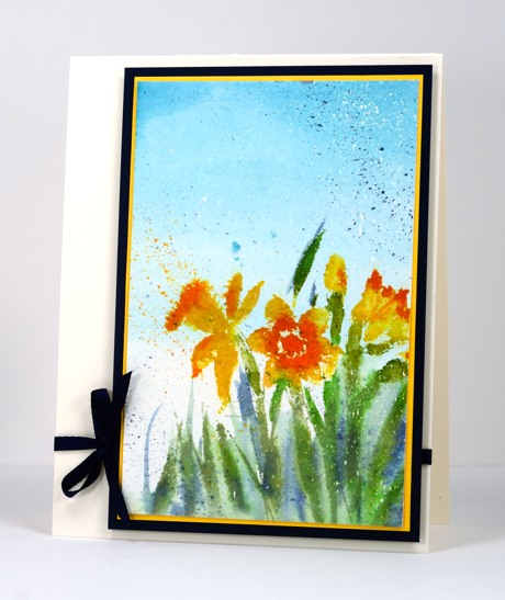
I have daffodils happily blooming in my backyard. Last count there were ten, which is a little short of the 100 bulbs I have planted in the back garden over the years! Who knows what happened to the rest of them? Daffodils are such a happy flower; each year I debate whether to leave them in the garden to enjoy or bring them inside. I usually leave them where they are, after all there aren’t many so they should stick together. We have had really nice weather this week and it is getting hotter by the end of the week so that bodes well for the tulip festival starting on Friday.
Daffodil Dance is a brushstroke stamp so it works well with distress stains. I used the colours listed below and stamped on a piece of watercolour paper already splattered with masking fluid. The mat and ribbon trim are navy to co-ordinate with the chipped sapphire stain but it looks black in the photo.
Have you checked out the One Layer Simplicity challenge this month? The theme is Blossom and the link up is displaying some gorgeous blooms.
Supplies:
Stamps: Daffodil Dance (PB)
Inks: Scattered Straw, Spiced Marmalade, Broken China, Chipped Sapphire, Mowed Lawn, Bundled Sage Distress Stains (Ranger)
Cardstock: Fabriano hot pressed watercolour paper, Neenah natural white & patriot blue
Also: Winsor & Newton masking fluid, Navy ribbon
May Flowers
Posted: May 5, 2015 Filed under: Gentle Whisper, Watercolour | Tags: Penny Black stamps, Ranger Distress stains 15 Comments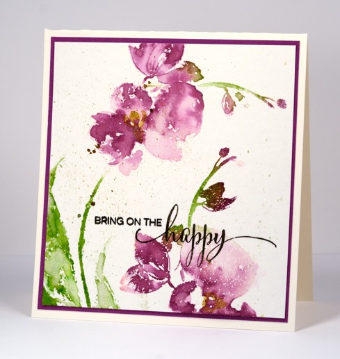
April showers bring May flowers so they say. There are a few peeping up in my garden but not a lot to show for the April showers yet. The tulip festival starts in Ottawa next week so hopefully we’ll have plenty of flowers by then. I have been running by the canal where some of the tulip displays have been planted and last time I looked the bulbs had pushed up some green leaves but I couldn’t see buds. But enough about tulips I have orchids today stamped with the lovely big ‘gentle whisper’ stamp. I only stamped part of the image so I could fit in a second bloom and a bit of leaf.
The paper is cold pressed watercolour paper for a change. I know I always say it is best to stamp on hotpressed watercolour paper because it is so smooth but with a big brushstroke stamp like this one cold pressed worked just fine. I inked the stamp with distress stains, spritzed it with water then stamped on paper which already had a fine splatter of masking fluid over it. I blended some of the distress stain with water and a paintbrush adding some more colour here and there to create more dimension. I used a gold wink of stella to highlight the centres of the orchids then splattered a fine mist of green, purple and gold before adding the sentiment in black.
You will find May Flowers on the Penny Black blog all week as design team members share their projects.
Supplies:
Stamps: Gentle Whisper, Sprinkles & Smiles (PB)
Inks: Seeded Preserves, Worn Lipstick, Mowed Lawn, Bundled Sage distress stains (Ranger) Versafine Onyx Black (Imagine Craft/Tsukineko)
Cardstock: Canson cold pressed watercolor paper, PB Fuschia Fantasies mix & match paper, Neenah Natural White cardstock
Also: Winsor & Newton masking fluid, gold wink of stella pen
Revisiting Pink & Grey
Posted: May 4, 2015 Filed under: CAS, Flutters 8 Comments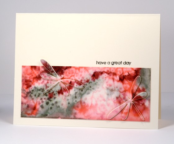
I am the guest muse on Sovushka Slavia blog today. Sovushka Slavia blog is dedicated to CAS cardmaking and Project Life. It has 1325 followers in Russia, Ukraine, Belarus, United States, Germany, Kazakhstan and other countries. The challenge is to CASE my card below from a few years ago.
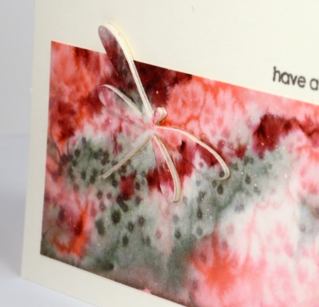
I didn’t set out to CASE it quite so closely but I ended up keeping the colour scheme, the motif and the layout, I just the changed the technique. I created the watercolour panel first but letting distress stains blend on wet watercolour paper. I added some salt and let it dry. I die-cut two dragonflies then trimmed the panel so that one dragonfly would reach over the border. I stacked several layers below each dragonfly to pop them up above the panel.
I hope you check out the Sovushka Slavia blog, the design team’s cards and maybe add a CASE of your own to the link up.
Supplies:
Stamps: Snippets (PB)
Creative Dies: Flutters (PB)
Inks: Iced Spruce, Spun Sugar, Worn Lipstick, Aged Mahogany Distress Stains (Ranger) Versamark, Versafine smokey grey (Tsukineko)
Cardstock: Canson cold pressed watercolour paper
Also: Winsor & Newton masking fluid, salt
OLS 16 Blossom
Posted: May 1, 2015 Filed under: Delicate Blossoms | Tags: Penny Black stamps, Ranger Distress stains 10 Comments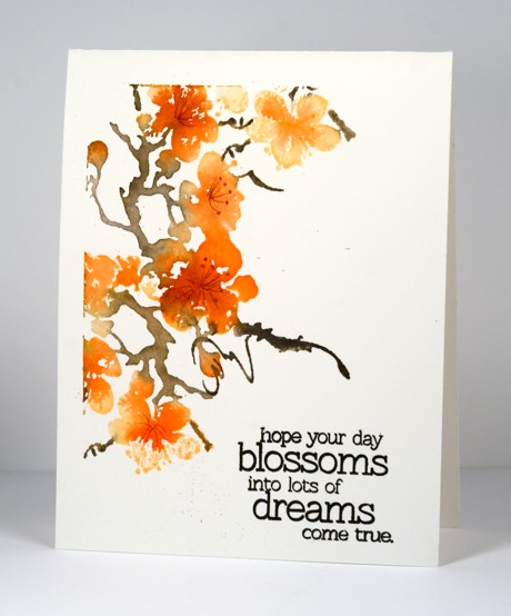
It is my turn to host the One Layer Simplicity challenge this month. Just in case you’ve never visited the OLS challenge or played along, the challenge is hosted by a design team of five, the challenges go live on the first of the month, continue until the 24th, then we create a details post to highlight some details on a few cards that caught our eye. As the name suggests the cards have to be ‘one layer’ and we like to keep them ‘simple’. This month I have a key word to challenge you: BLOSSOM. It just so happens that the founder of our challenge, Susan Raihala is also know as Lateblossom so you can choose to be inspired by blossom, the word or Lateblossom, the card maker.
I inked up my ‘delicate blossoms’ stamp with distress ink and distress stain, added the branch details with a black marker, spritzed the stamp then pressed it onto watercolour paper. When it was dry I added the tiny stamen details with a marker and stamped the sentiment in black. I hope you get inspired to join us over at One Layer Simplicity this month
Supplies:
Stamps: Friendship, Delicate Blossoms (PB)
Inks: Ripe Persimmon Distress Stains, Dried Marigold distress inkpad, Black soot distress marker (Ranger) Potter’s Clay Memento marker (Tsukineko)
Cardstock: Fabriano 100% cotton hot pressed watercolour paper
Flowers on a wall
Posted: April 28, 2015 Filed under: You & Me | Tags: Penny Black stamps, Tsukineko Memento inks 16 Comments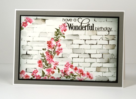
This little spray of flowers is from the transparent set ‘You & Me’. I inked it with memento markers, spritzed it with water then stamped on watercolour paper. I realized when teaching recently that I have not been specifying a distance between the stamp and spritzer. It probably depends a little on the spray coming out of your spritzer so you will need to experiment. I have found that any spritzing from closer than 6 inches soaks the stamp too much and I end up with a pool of water on my paper instead of a blended image. I inked the flowers with memento rose bud and dotted the centres with rhubarb stalk; the leaves were done with memento olive grove. After stamping them I used a paint brush to round out some of the flowers and add more colour here and there.
I added the brick wall after stamping the flowers and did it in two steps. I inked the brick background stamp with memento London fog ink then added some darker colour with an espresso truffle marker. I wiped ink off part of the stamp so I could stamp to the right then repeated the process to the left. Any areas that needed filling in I did with a paint brush or marker. The sentiment fitted into a bare patch in the brick work.
Thanks for dropping by.
Supplies
Stamps: Brick Wall, You & Me, Sprinkles & Smiles (PB)
Inks: Memento rose bud, rhubarb stalk, olive grove, espresso truffle markers, London fog ink pad & Versafine onyx black (Imagine Crafts/Tsukineko)
Cardstock: Fabriano 100% cotton hot pressed watercolour paper, grey, black, white cardstock


