
Batik style background
Posted: December 29, 2016 Filed under: heart string, Peacock Feather | Tags: Brusho, Penny Black creative dies, Penny Black stamps, WOW embossing powders 4 Comments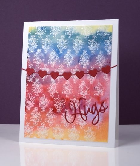
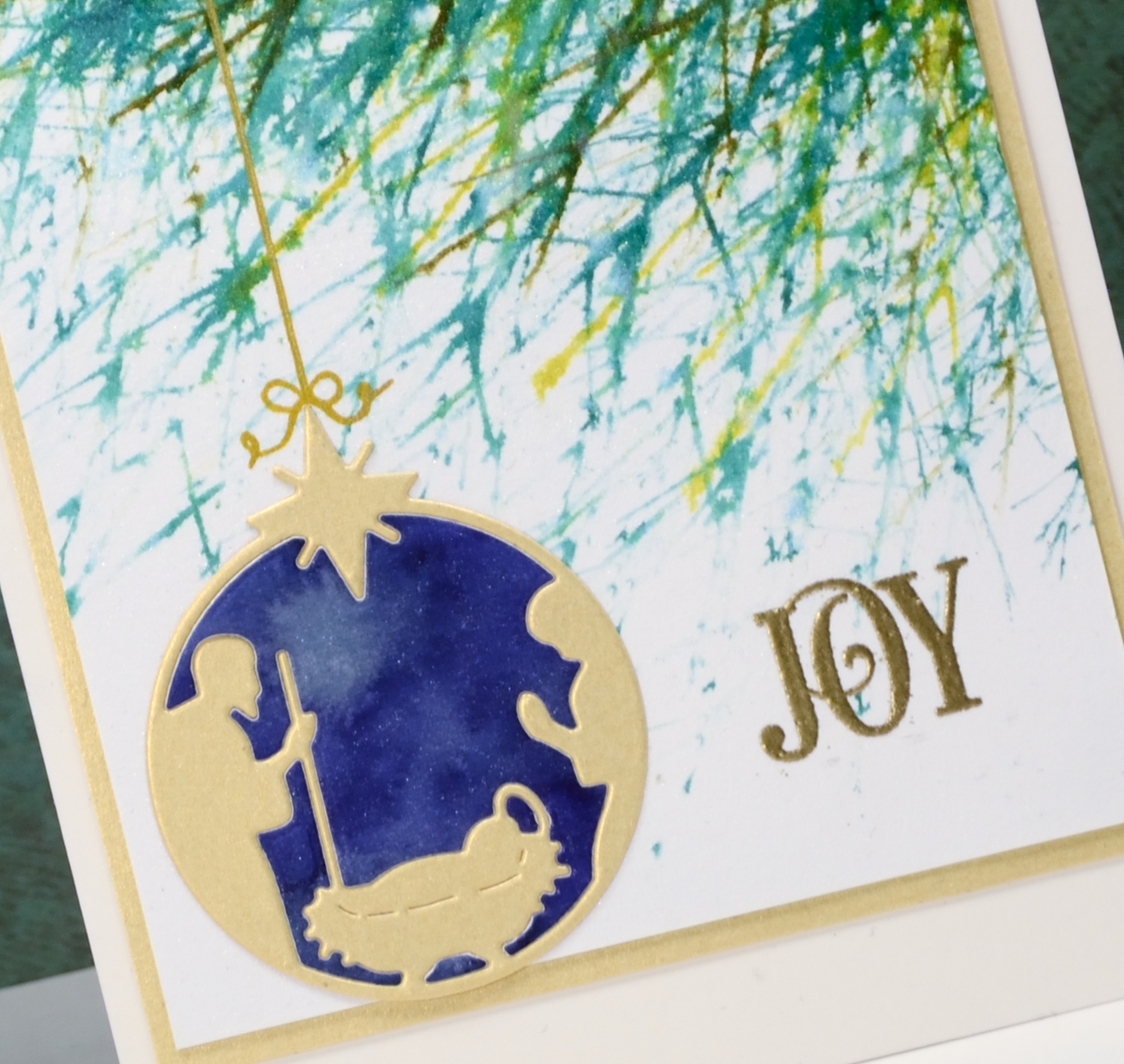
The emboss resist method creates pretty backgrounds especially when painted in a rainbow of colour. I used three primary colours overlapping them to end up with the yellow, orange, red, purple, blue and green. I stamped the peacock feather pattern in versamark and embossed in clear powder on watercolour paper and the slight texture of the watercolour paper combined with the very fine detail of the stamp meant that I did not get a perfect impression. Once I added the colour over the top I noticed that it looks very much like a batik fabric print.
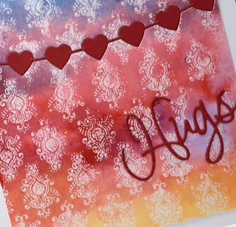
I trimmed the panel then used the heart string die to cut the piece in two. With the same die I cut a string of red hearts then attached the panel to a card base inlaying the red hearts but attaching the die cut word on top of the panel.
Supplies
Stamps: Peacock Feather (PB)
Dies: heart string, love expression (PB)
Ink: versamark (Tsukineko)
Paint: yellow, prussian blue, crimson brusho (Colourcraft)
Paper: hotpressed 100% cotton watercolour paper, red cardstock, Neenah solar white cardstock
Also: WOW clear embossing powder
Joy
Posted: December 24, 2016 Filed under: Into the sky, manger | Tags: color burst, liquid metals, Penny Black creative dies, Penny Black stamps, Ranger Distress stains, WOW embossing powders 13 Comments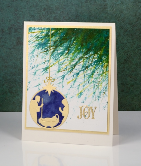
Joy to the world! The Lord is come;
Let earth receive her King;
Let every heart prepare him room,
And heaven and nature sing.
No more let sins and sorrows grow,
Nor thorns infest the ground;
He comes to make his blessings flow
Far as the curse is found.
He rules the world with truth and grace,
And makes the nations prove
The glories of his righteousness,
And wonders of his love,
And wonders of his love,
And wonders, wonders, of his love.
Supplies
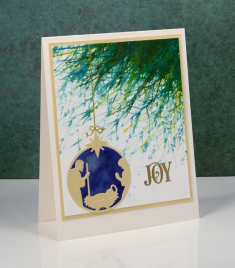
Stamps: Into the sky, Joy filled (PB)
Die: manger (PB)
Paints: indigo, terre verte colorburst & Platinum liquid metal(Ken Oliver)
Ink: Encore gold ink(Tsukineko) evergreen bough, pine needles, crushed olive, forest moss distress stains ( Ranger)
Paper: hot pressed Fabriano watercolour paper, shimmer gold paper
Also: metallic rich embossing powder (WOW)
Winter Cheer
Posted: December 23, 2016 Filed under: Nature's Silhouettes, Stamped Landscapes | Tags: Kuretake Zig clean color real brush markers, Penny Black stamps, Tsukineko Versafine inks, WOW embossing powders 4 Comments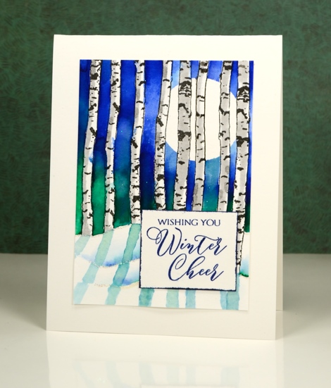
I used the versatile birch trunk stamps from the ‘Nature’s Silhouettes’ set for this card stamping them over a hill shaped mask at the bottom and bending them this way and that so no two trees looked the same. After stamping them I positioned a circle mask for the moon and painted masking fluid over all the tree trunks. I used zig clean colour real brush markers for the blue sky and green foliage in the background; I rarely use the zig markers but whenever I do I resolve to get them out more often. The colours are so vibrant and the blending so easy. Once the sky was completed I removed all the masks and added grey to the trunks.
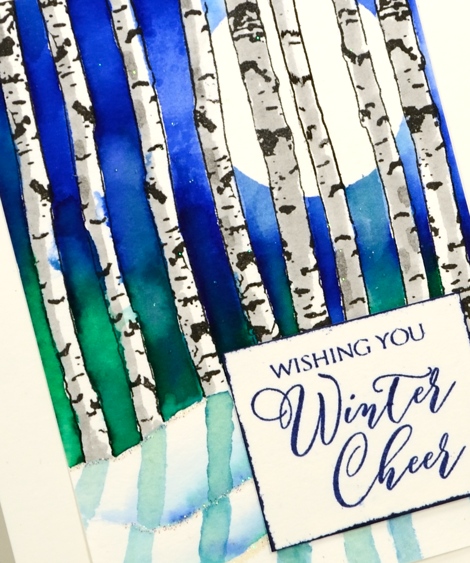
I wanted shadows in the snow but with paler tones than the background so scribbled some colour on a palette and diluted it to paint a shadow for each tree. There is a little line of sparkly embossing along the snow banks to make them glisten. The sentiment may or may not be positioned where it is to hide something; I’ll let you draw your own conclusions!
Enjoy Christmas Eve.
Supplies:
Stamps: Nature’s Silhouettes, Yuletide wishes (PB)
Markers: Zig clean color real brush markers green, blue, light gray (Kuretake), Versamarker
Inks: Versafine onyx black ink, Majestic blue(Tsukineko)
Cardstock: hot pressed watercolour paper
Also: clear sparkle embossing powder
Baby, it’s cold outside
Posted: November 2, 2016 Filed under: Frosty day, What's in your cup | Tags: Fabriano Watercolour Paper, Penny Black creative dies, Penny Black stamps, Ranger Distress inks, WOW embossing powders 7 Comments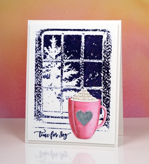
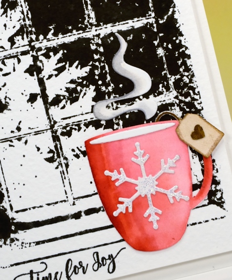
I’m continuing my ‘Winter Warmth’ feature with a cup of hot chocolate and a steaming cup of tea. I had fun creating a couple more scenes with simple watercolour backgrounds and die cut focal images in the foreground. On today’s cards the background is rough watercolour paper so the ‘frosty day’ stamped images were speckled all over until I used a wet paintbrush to blend the ink over the sky area.
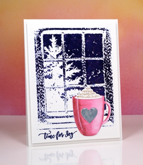
I die-cut the cup using the ‘what’s in your cup?’ die set. This set comes with the cup, cream, steam, teabag plus more detail pieces. I cut the pieces out of hot pressed watercolour paper, coloured them with distress markers and blended the colour with water.
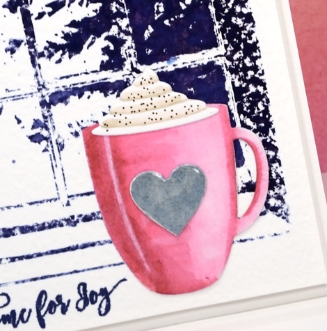
I added a silver heart, cream and cinnamon to the pink cup then attached them all to the background panel. Because the die set comes with all the cute little extras I decided to make a second card this time with a cup of tea.
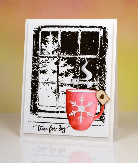
I stamped the background in black soot distress ink for this card and once again blended the sky area but left the rest textured.
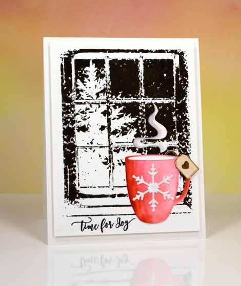
I coloured the cup with red distress inks then added a sparkly embossed snowflake, a teabag tag and some rising steam.
I have one more ‘winter warmth’ card to share tomorrow.
Supplies
Stamps: frosty day, festive snippets
Dies: what’s in your cup?
Ink: Chipped sapphire, black soot, festive berries, old paper, gathered twigs, picked raspberry, vintage photo, hickory smoke distress inks/markers (Ranger) Versamark, versafine majestic blue, imperial purple & onyx black (Tsukineko)
Paper: hot pressed watercolour paper, rough watercolour paper
Paint: Finetec Artist Mica watercolour paint
Also: Clear gloss embossing powder, Clear sparkle embossing powder
Peerless skies
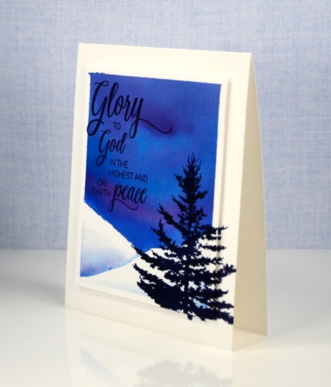
Posted: October 11, 2016 Filed under: Chapels, Woodland Beauty | Tags: Peerless Transparent Watercolors, Penny Black creative dies, Penny Black stamps, WOW embossing powders 8 Comments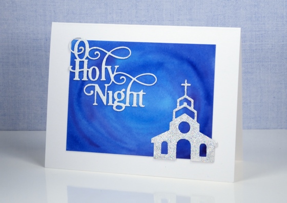
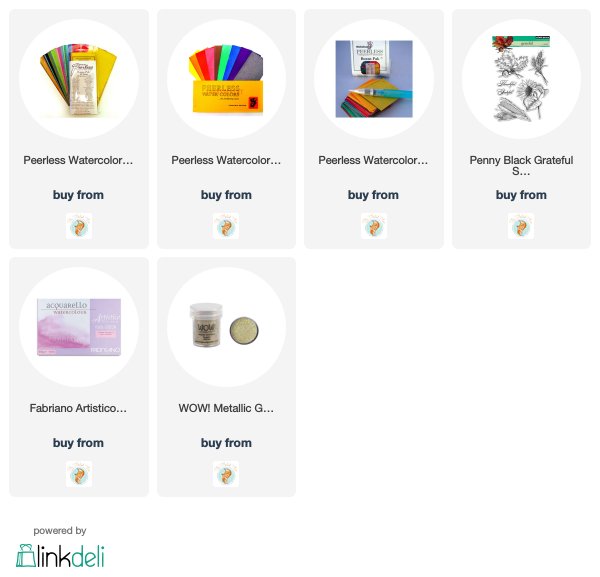
Yesterday I posted the first card painted with my new Peerless Watercolour paints along with a video showing how I organized my paints into a palette. The cards I have today feature deep blue skies also painted with Peerless watercolours.
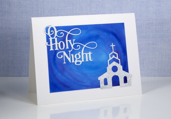
Peerless watercolours are unusual as the paint is concentrated in a dry sheet of cardstock. To use it you have to add water to the cardstock. I am only just beginning to use mine but I am already impressed by the intensity of the colour and the ease with which they blend. For both these cards I used a mix of blues and purples and blended them on the watercolour panel. I was happy with the mix of colour as I painted but was even more impressed when I returned to the panels after they had dried and saw how they colours had continued to blend resulting in soft smooth variations.
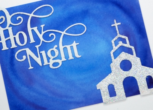
I kept the design simple as far as elements were concerned but fancy when it came to texture and sparkle. I embossed both the sentiment and church with WOW Diamond white embossing glitter giving a second coat to the church for maximum bling. I can’t imagine the circumstances under which a church would be so sparkly but it looked so pretty against that sky I had to let it bling!
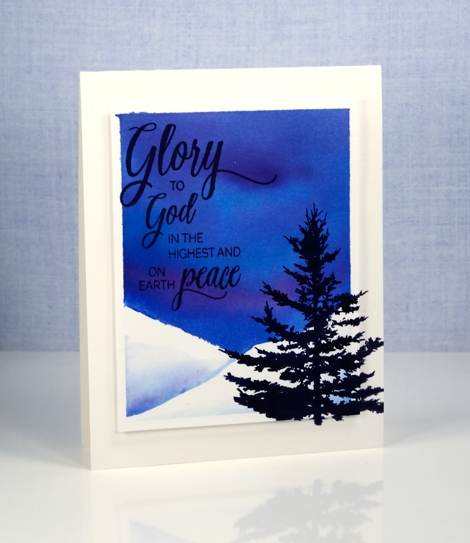
I was far more traditional with this card adding a sentiment and tree in black ink.
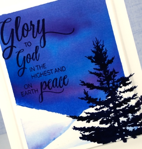
I added a little interest by stamping the tree on both the card base and the feature panel which is popped up on a layer of foam.
I received my peerless watercolour paints from the kind people at The Foiled Fox online store. The store has a wonderful mix of art, paper craft and calligraphy supplies and in my opinion they are carrying all the cool stuff! They also have a blog showcasing their own design team and guests from around the world.
Supplies
Stamps: Woodland beauty, Holy Night (PB)
Dies: Chapels, O Holy Night
Ink: Versafine onyx black (Tsukineko)
Paint: Peerless watercolours
Paper: hot pressed Fabriano watercolour paper
Also: WOW diamond white embossing glitter
Peerless Watercolours and a video
Posted: October 10, 2016 Filed under: Grateful, Peerless watercolours | Tags: Peerless Transparent Watercolors, Penny Black stamps, WOW embossing powders 16 Comments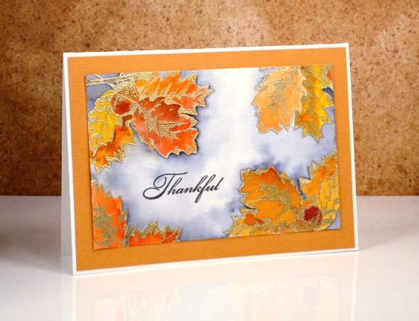
I have something new to share today, new to me that is. The Peerless paints have been around since 1885! Shauna from The Foiled Fox sent me the Peerless watercolour paints and they are beautiful. As the trees outside are turning stunning colours it seemed the perfect theme for my first peerless project. To read all the details about this card pop over to The Foiled Fox blog and read my guest post. Scroll down below to see how I set up a palette for my peerless paints.
Peerless watercolours are embedded in dry sheets. You touch the dry paint with a wet brush to pick up colour. To see how I set up my paints so I could access all the colours on one fold out palette, watch the video below.
Supplies
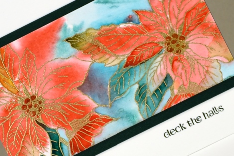
Golden Poinsettias
Posted: September 20, 2016 Filed under: Red Star, Winter Joy | Tags: Penny Black stamps, Ranger Distress stains, WOW embossing powders 15 Comments
As the title of this post suggests I embossed the poinsettia stamp from the ‘Winter Joy’ transparent set in gold. I also added gold wink of stella to the centres of some of the poinsettias. The colour painted in and around the poinsettias is distress stain. I kept the look loose and fluid by painting wet into wet.
On the card below I began by inking the ‘red star’ stamp in red and green stain then stamping it onto the wet panel. Some of the colour ended up in the poinsettias, some outside. I used a paintbrush to paint the same stains into the petals to make the colour more intense.
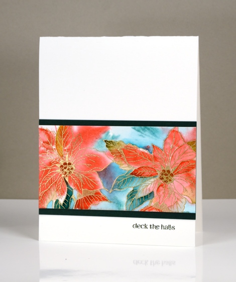
I’m not sure that the camera picked up the gold and shiny factor as much as it could have; it’s pretty in real life.
Supplies:
Stamps: Winter Joy, Holiday Snippets, Red Star, (PB)
Inks: Versamark, Versafine Olympia Green & Satin Red (Tsukineko) pined needles, crushed olive, festive berries, barn door distress stainsRanger)
Cardstock: Fabriano 100% cotton hot pressed watercolour paper, green cardstock, red cardstock
Also: WOW metallic gold rich embossing powder, gold wink of stella brush marker


