
Forest grove
Posted: October 7, 2016 Filed under: gift card pocket, Serenity, Snowy Grove, Stamped Landscapes | Tags: Fabriano Watercolour Paper, Penny Black creative dies, Penny Black stamps, Ranger Distress inks, Ranger Distress stains 7 Comments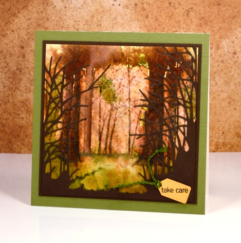
As you might know I use hot pressed watercolour paper 90% of the time because it is smooth and takes stamping so well, giving me a complete images. Occasionally, however, I like to pull out some cold pressed or even more occasionally some rough watercolour paper because the texture gives a whole different look. The labels hot, cold and rough, when attached to watercolour papers refer to the way the paper is pressed. Hot is flattened with heat and pressure making it the smoothest of all three. Cold is flattened with pressure but not heat and rough is flattened with less pressure than cold, making it the most textured of the three types.
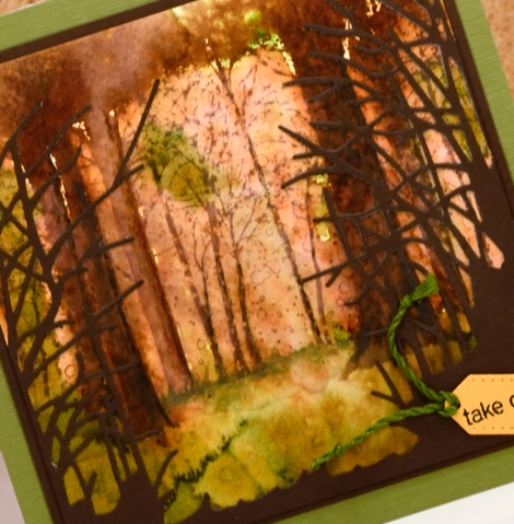
I stamped the ‘snowy grove’ stamp on cold pressed paper in vintage photo ink. I then used the image as a starting point for painting some of the trees more distinctly. In some cases I joined a few trunks together with extra ink to create wider trees. I painted some foliage plus the forest floor with crushed olive and peeled paint distress stains and spritzed with water to blend and blur both the ground and the canopy. I cut the ‘serenity’ die from brown cardstock to add some framing and give the impression of looking into a grove of trees. The tiny tag is cut with the ‘gift card pocket’ die.
The trees around here still have plenty of green on them but we are beginning to see gorgeous colour too. Have a great weekend and Happy Thanksgiving Canadians!
Supplies:
Stamps: Snowy Grove, Snippets (PB)
Dies: Serenity, gift card pocket
Inks: vintage photo, crushed olive, peeled paint distress inks & stains(Ranger)
Cardstock: Cold pressed watercolour paper, brown cardstock, green textured cardstock
Wish for peace and happiness
Posted: October 6, 2016 Filed under: Scarlet Majesty | Tags: Penny Black stamps, Ranger Distress stains, Tsukineko Versafine inks 12 Comments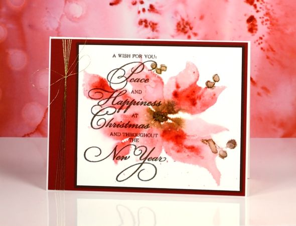
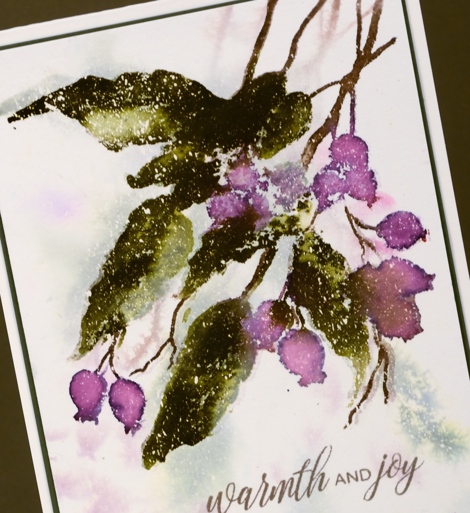
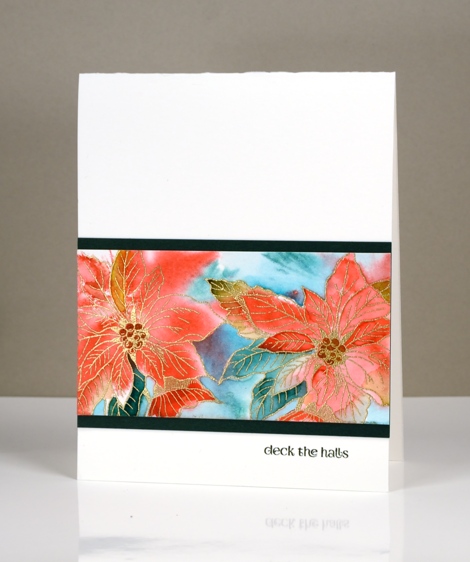
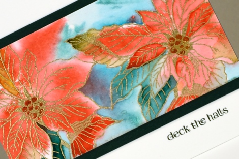
I shared a more defined version of this pretty poinsettia recently, painted in vintage tones. Today’s card features a looser image in pinks with a few touches of brown. As is often the case when I am after a watery softy image I used distress stains applied directly to the stamp. I started with worn lipstick and gathered twigs stains on the stamp and some water drops on my watercolour panel. The image was soft and some of the edges bled when the water droplets blurred into the petals.
Next I added marker in darker colours to the stamp then pressed it onto the still wet panel. Once it dried I splattered a few water droplets over the petals. I did like the soft look of it at this stage but it wasn’t until I added the sentiment over the top that I felt it was finished. Do you sometimes stare at a project because you know it still needs something but you’re not sure what? (if all else fails in these circumstances I add the letter background stamp!)

I would usually be hesitant to cover so much of an image with text but the contrast of dark and light as well as blurred and sharp seemed to work. To complete the card I added both brown and burgandy mats plus a little gold thread.
Supplies:
Stamps: Scarlet Majesty, Yuletide Wishes (PB)
Inks: Versafine Vintage Sepia ink (Tsukineko) worn lipstick, gathered twigs distress stains, festive berries, gathered twigs, ground espresso distress markers(Ranger)
Cardstock: Fabriano 100% cotton hot pressed watercolour paper, red cardstock, brown cardstock
Also: Clear wink of stella brush pen, Gold thread
Wintry Trail
Posted: September 29, 2016 Filed under: Wintry Trail | Tags: Penny Black creative dies, Penny Black stamps, Ranger Distress stains, Tsukineko Versafine inks 14 Comments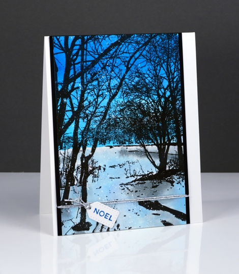
The new ‘Wintry Trail’ stamp from Penny Black is one that you can add a lot of colour step by step or a little colour behind black silhouette stamping. I chose the silhouette style for this winter scene. I painted a deep blue sky and a paler snowy or icy ground. As I painted I intended the ‘ground’ to be covered in snow but as I look at the photos I think it looks a little like the ice of a frozen pond reflecting the colour of the sky.
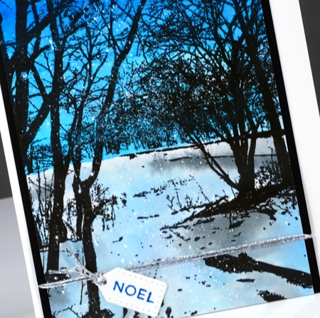
I have seen skies as blue as this one while ski-ing in the Gatineau hills. The contrast of snow and trees is dramatic and beautiful. To make my version I stamped the scenic stamp on hot pressed watercolour paper in versafine onyx black ink. I painted the sky first in turquoise and cobalt blue brusho and let that dry. I used a more diluted turquoise and diluted black brusho to paint the ‘ice’ and shadows. You can see there are little dots of white over the panel which means I started by flicking masking fluid over the panel.
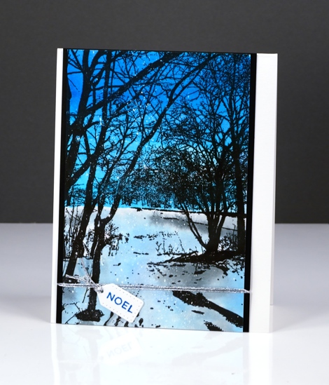
The tiny tag is from the Gift Card Pocket die set and was just the right size for one wee word!
Thank you so much for all the lovely comments about this week’s winter watercolours. I’m glad you enjoyed them and would love to hear if you tried any of the same techniques.
Supplies
Stamps: Wintry Trail, Holiday Snippets (PB)
Dies: Gift Card Pocket
Ink: Versafine onyx black ink, blue lagoon ink (Tsukineko)
Paper: hot pressed watercolour paper, Neenah epic black paper
Paint: Turquoise, Cobalt Blue, Black brusho powder
Also: Daler Rowney masking fluid, Silver cord
Twinkling twigs
Posted: September 28, 2016 Filed under: Into the sky | Tags: Penny Black stamps, Ranger Distress stains, Tsukineko Versafine inks 14 Comments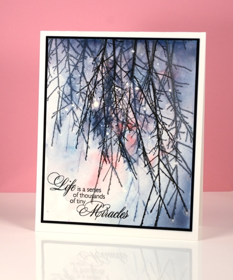
When I saw this ‘Into the Sky‘ stamp, I immediately thought of an inspiration pic I had found a while back. It just so happens that my first use of this stamp does not have the twigs reaching into the sky but quite the opposite.
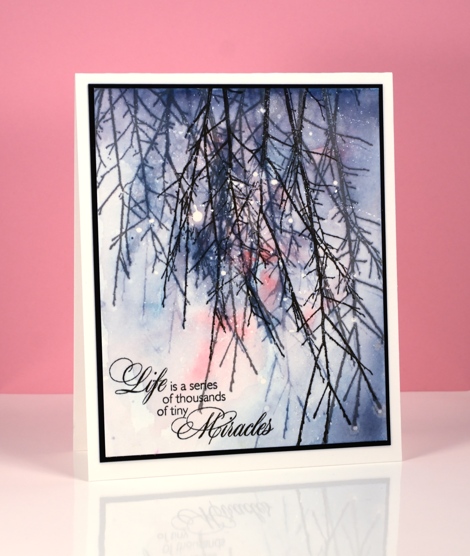
I pulled out one of my panels splattered with masking fluid then stamped the twig stamp multiple times in weathered wood and stormy sky stains. To turn the stamped images into soft background I painted water over the stamping which softened both the twig image and the colour. Next I painted worn lipstick, weathered wood and stormy sky stain over the whole panel keeping bottom left corner light and graduating to darker colour in the opposite corner. Once that dried I stamped ‘into the sky’ again in Versafine onyx black and smokey gray inks so I would have some sharp foreground images over the blurred background twigs. I knew I would have some bright white dots when I removed the masking fluid but I wanted some light dots on the tips of the twigs also to look like water drops. To create those dots I used a paintbrush to add little drops of water at the end of twigs; I let the water sit and absorb some stain colour for a minute then dabbed with a paper towel.
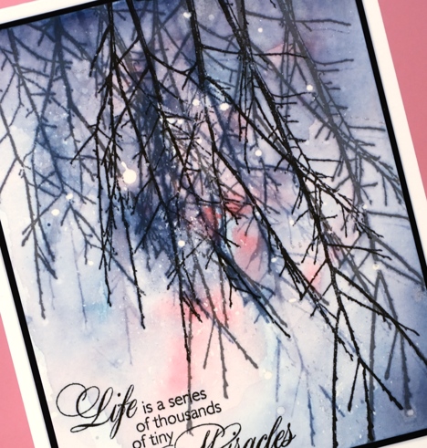
I finished it off with some splatters of platinum liquid metal to add sparkle here and there. I wasn’t sure whether I wanted a sentiment or not but I looked through a stack of options and decided the tiny miracles phrase worked, both the words and the shape of the stamp.
Supplies
Stamps: Into the sky, Season’s Gifts(PB)
Paints: Platinum liquid metal (Ken Oliver)
Ink: Versafine onyx black and smokey gray ink(Tsukineko), worn lipstick, weathered wood, stormy sky distress stains (Ranger)
Paper: hot pressed Fabriano watercolour paper, Neenah Epic black cardstock
Berry Kissed
Posted: September 27, 2016 Filed under: Berry kissed | Tags: Penny Black stamps, Ranger Distress inks, Ranger Distress stains 11 Comments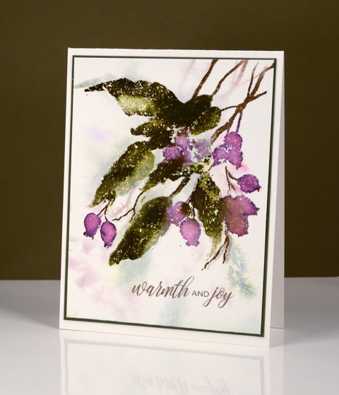
This pretty new berry stamp doesn’t have to be saved for winter cards; I’ve already used it in fall colours and could see it popping up in a spring bouquet also. Even today’s card, which I will use at Christmas time, is not in traditional red and green.
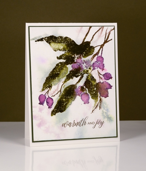
I began with a watercolour panel splattered with masking fluid. If you are wondering how I splatter masking fluid I have a video on my youtube channel showing my method. I taped the panel to a firm surface and painted water over the whole area. I inked the stamp with milled lavender and bundled sage distress stains then stamped onto the wet paper. The colours immediately diluted and once dry I was left with pale shadowy background images. I inked the stamp again, this time with ground espresso, seedless preserves and forest moss distress markers. I stamped over the shadowy background then painted extra forest moss distress stain onto the leaves to create dimension. Once the ink dried I removed the masking fluid, added a partial sentiment in brown and a dark green mat.
Supplies:
Stamps: Berry kissed, Festive Cheer (PB)
Inks: Versafine Vintage Sepia ink (Tsukineko) milled lavender, bundled sage, forest moss distress stains, seedless preserves, forest moss, ground espresso distress markers (Ranger)
Cardstock: Fabriano 100% cotton hot pressed watercolour paper, olive green cardstock
Also: masking fluid
Lamplit
Posted: September 26, 2016 Filed under: Cones & berries, Woodland Beauty | Tags: Penny Black stamps, Ranger Distress stains 10 Comments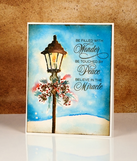
Today I have a ‘vintagy’ lamp-post card to share. ‘Vintagy’ because it is a different to my recent ‘vintage watercolour’ cards; it has more colour. My vintage style cards are often brown + black + one more colour but this one still looks a little old despite its red, blue, green and yellow inks.
I worked on a hot pressed watercolour paper panel with some masking fluid splattered over it. I stamped the lamp post in black and brown distress inks then blended the colours with a paintbrush on the paper. Before stamping I wiped the ink off the candle inside the lamp so I could use lighter ink later to paint it later. To create the swag decorating lamp I stamped the end of a branch from the woodland beauty set in gathered twigs distress ink. I drew red berries with a barn door distress marker and painted little pine needles in, yes, ‘pine needles’ distress stain then drew the candle in smokey gray and spiced marmalade distress markers.
To give the sky some depth I used three blue stains to paint around the lamp, leaving a small snowy hill white at the bottom of the panel. I blended some of the orange from the candle flame with water to fill the lamp and surrounding area. The edges are sponged in ‘vintage photo; and the sentiment stamped in vintage sepia all in keeping with my goal of a vintagy card!
It’s winter watercolours on the blog each day this week so I’ll see you tomorrow with some berries.
Supplies:
Stamps: Cones & Berries, Woodland Beauty, Yuletide wishes (PB)
Inks: Versafine Vintage sepia ink (Tsukineko) tumbled glass, broken china, salty ocean, pine needles distress stains, barn door, spiced marmalade distress markers, vintage photo, black soot distress inks (Ranger)
Cardstock: Fabriano 100% cotton hot pressed watercolour paper
Also: masking fluid
Golden Poinsettias
Posted: September 20, 2016 Filed under: Red Star, Winter Joy | Tags: Penny Black stamps, Ranger Distress stains, WOW embossing powders 15 Comments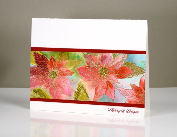
As the title of this post suggests I embossed the poinsettia stamp from the ‘Winter Joy’ transparent set in gold. I also added gold wink of stella to the centres of some of the poinsettias. The colour painted in and around the poinsettias is distress stain. I kept the look loose and fluid by painting wet into wet.
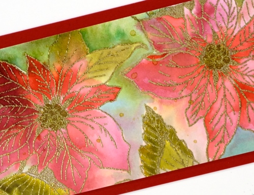
On the card below I began by inking the ‘red star’ stamp in red and green stain then stamping it onto the wet panel. Some of the colour ended up in the poinsettias, some outside. I used a paintbrush to paint the same stains into the petals to make the colour more intense.
I’m not sure that the camera picked up the gold and shiny factor as much as it could have; it’s pretty in real life.
Supplies:
Stamps: Winter Joy, Holiday Snippets, Red Star, (PB)
Inks: Versamark, Versafine Olympia Green & Satin Red (Tsukineko) pined needles, crushed olive, festive berries, barn door distress stainsRanger)
Cardstock: Fabriano 100% cotton hot pressed watercolour paper, green cardstock, red cardstock
Also: WOW metallic gold rich embossing powder, gold wink of stella brush marker
Berry Thankful
Posted: September 12, 2016 Filed under: Berry kissed | Tags: Penny Black stamps, Ranger Distress stains 11 Comments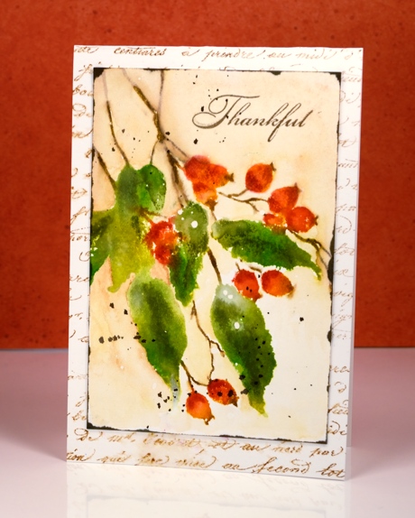
These berries are from the new Magic of the Season release but the season does not necessarily have to be winter. I have given a autumn feel to my card today to link in with the Canadian Thanksgiving season in October. I paired the ‘berry kissed’ stamp with the ‘script’ background stamp and stuck with green, orange and brown colour choices.
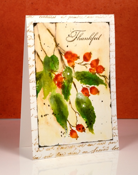
I began with a piece of hot pressed watercolour paper splattered with masking fluid. (The white dots on the leaves are a result of the masking fluid) I inked the stamp with crushed olive, mowed lawn and barn door distress stains then stamped it with the misti. I let that layer dry then inked the stamp again this time with markers so I could be more selective about where I put the colours. After stamping I blended the dark and lights with a wet paintbrush creating some shadow and dimension on the image. I painted around the image using a watercolour pencil as my ‘paint’. Once the panel was dry I splattered some dark brown stain and and swiped the edges with stain also.
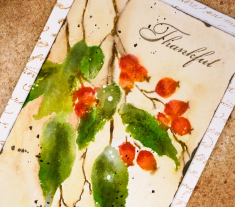
I stamped the script stamp onto the card base in vintage photo ink and blended some areas with water.
Supplies:
Stamps: Berry kissed, Grateful, Script(PB)
Inks: Versafine Vintage Sepia ink (Tsukineko) mowed lawn, crushed olive, barn door, gathered twigs distress stains, vintage photo, spiced marmalade, barn door, peeled paint distress markers (Ranger)
Cardstock: Fabriano 100% cotton hot pressed watercolour paper
Also: masking fluid
It’s how you look at it
Posted: September 8, 2016 Filed under: Berry Bevy | Tags: color burst, Penny Black stamps, Ranger Distress stains 16 Comments
I have three similar cards to share today with only slight differences in technique and layout. My initial plan was to have the branch on each card pointing in a different direction but I ended up with two upward facing. I would have peeled it off and turned it around but lately, in the interests of not having my cards fall apart when handled, I have started attaching watercolour paper with sookwang tape on one side and regular adhesive on the other sides. Once you press that sookwang tape down you cannot pull it back up again. The card looked fine as it was so I left it that way. You can see in the card above I have the branches going side ways and below I have them reaching upwards.

On all three cards the branches are embossed. I used the misti to stamp first in versamark ink then moved the panel down a millimetre and stamped again but in versafine onyx black. I embossed in clear powder which covered the black branch and the versamark just above the branch. It’s a technique I have been using for years to get a little layer of snow on trees and branches but the misti does make it a whole lot easier. On some of the panels it looks like a layer of snow, on others it looks like the light of the moon.

The blues and purples on the middle card were painted in distress stain. On the other two cards I used Colorburst powders.

There are a few other subtle differences. I splattered masking fluid before embossing on the top panel, after embossing on the middle panel and not at all on bottom panel. Embossing powder sticks to masking fluid so it really is better to sprinkle it after embossing but it still ended up working the other way. The moon was masked with a frisket film circle.
Next time you are stamping something twiggy or branchy, even flowery, try turning it 90° and see what you think.
Supplies
Stamps: Prancers, Berry Bevy (PB)
Ink: Versafine onyx black ink, versamark (Tsukineko) chipped sapphire, salty ocean, seedless preserves distress stain(Ranger)
Paper: hot pressed watercolour paper, Neenah solar white paper
Paint: Indigo, Merlot, Crimson Colorburst powder
Also: Daler Rowney masking fluid, Grafix frisket film, WOW clear embossing powder
Down the Lane
Posted: September 2, 2016 Filed under: Down the lane | Tags: Penny Black stamps, Ranger Distress inks, Ranger Distress stains, Tsukineko Versafine inks 14 Comments
Thank you for all the lovely feedback you gave me about the tree cards. I hope the images and information inspire you to create some scenes of your own. Today’s card has the scene created already; all I did was decide on a colour scheme.
I chose some early fall colours, a bit like we will see very soon around here. The plants by the path are still green but the trees are getting a warm yellow tinge to them. To keep the definition of the detailed image I stamped first in versafine vintage sepia ink, then over the top with distress vintage photo ink. The versafine is a pigment ink so doesn’t bleed when I add water. The distress ink is very reactive with water so I was able to pull some brown tones into the surrounding area with a wet paint brush. I painted some blue, green and yellow over the sky, plants and trees using distress stains.
Supplies
Stamps: Down the Lane, April Showers (PB)
Die: Gift card pocket (PB)
Ink: Versafine vintage sepia ink, (Tsukineko) mustard seed, tumbled glass, broken china, mowed lawn distress stain & vintage photo distress ink(Ranger)
Paper: hot pressed watercolour paper
Also: linen thread


