
Vintage snow covered
Posted: September 19, 2017 Filed under: dressed in snow, snow covered | Tags: Penny Black stamps, Ranger Distress inks 8 Comments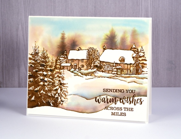
I have a sweet little snowy scene to share today, done in a vintage style with distress products. Distress inks are designed to react with water so they are perfect for this type of project. I did all the stamping in vintage photo distress ink then blended afterwards. Even if the ink has dried you can still blend and dilute it with water. To create this little scene I used two stamps. The foreground trees on the left hand side are part of the ‘dressed in snow’ stamp. I inked the trees and the edge of the snowbank with vintage photo ink, made sure I wiped away ink that ended up on any other parts of the stamp then stamped it on hot pressed watercolour paper. I then positioned the house scene from the ‘snow covered’ set further up the panel on the right and stamped that in vintage photo also.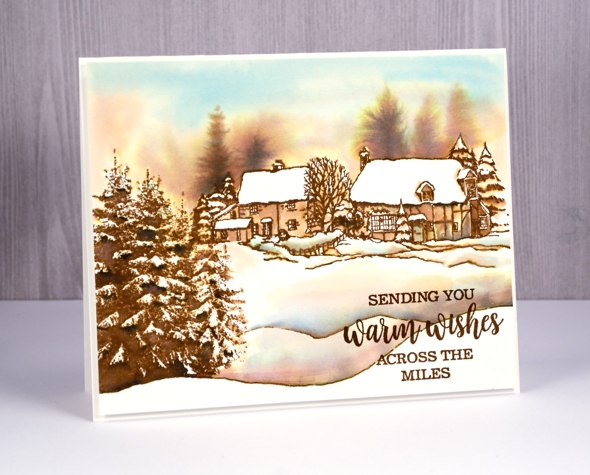
My plan in painting this scene was to blend the brown along with some blue and black into the areas that were not snow covered and leave the snow with little or no blended colour. I pressed some broken china, vintage photo and black soot distress inks onto an acrylic block to use as watercolor paint. I used a round watercolour brush with a good point and painted water along the top of the roofs and trees so that some brown ink bled out of the lines. I painted water into the whole sky area adding some extra brown and blue inks to fill the sky. I also painted over the dark areas on the evergreen trees and added a little black ink but left the ‘snow’ untouched. While the sky area was still damp I dropped in some brown ink to look like trees in the background. I used a small round watercolour brush to paint the houses, using water to blend the stamped ink but also adding a little extra brown or even black for shadows and extra depth. To add extra snow banks and extend the stamped ones I used the bullet tip of the vintage photo marker then blended more colour above the lines for shadows.
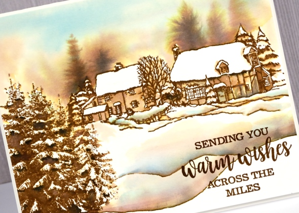
I always like to send a few snowy scenes to my Australian friends and family who are enjoying a summer Christmas so I chose an appropriate sentiment from the ‘joy & happiness’ set.
Supplies
Stamp: Dressed in Snow, snow covered, joy & happiness (PB)
Inks: vintage photo, tumbled glass, black soot distress inks (Ranger)
Paper: Hot pressed watercolour paper (Fabriano)
Peaceful sunset
Posted: September 18, 2017 Filed under: peaceful moment | Tags: Penny Black stamps, Ranger Distress stains, Tsukineko Versafine inks 11 Comments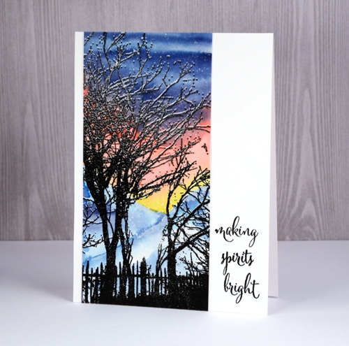
I’ve employed one of my favourite techniques to create this wintry scene. I used the same technique for years to create a thin layer of snow on branches but it is so much easier now with stamp positioning tools like the misti.
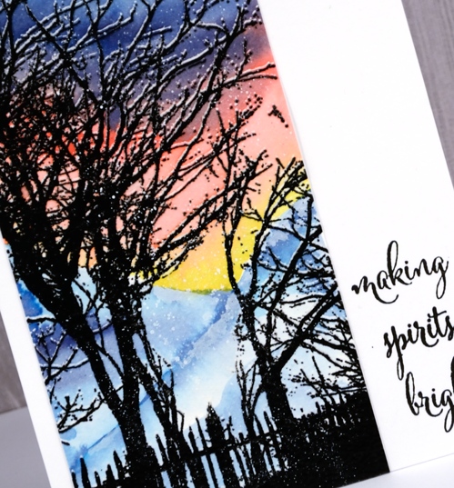
If you take a close look you can see the branches have a thin white line above the black silhouette. I created that layer of snow by stamping the ‘peaceful moments’ stamp once in versamark ink (which is clear) then I move my watercolour paper panel up ever-so-slightly (no more than 1mm) and stamped it again in versafine onyx black. With the image stamped twice I then embossed in clear powder so both the clear and the black inking would resist watercolour paint when added over the top.
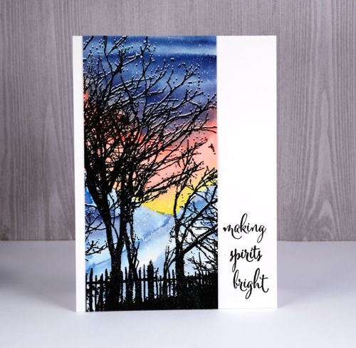
I painted the lowest part of the sky in a ‘V’ shape with scattered straw distress stain, blended in some worn lipstick distress stain then finally some tumbled glass and chipped sapphire stain. I let the sky dry completely before painting the mountains with a tumbled glass and chipped sapphire stains. Once that was dry I splattered a fine mist of white paint over the scene. As the stamp is tall and thin I decided to turn a horizontal sentiment into a vertical one by stamping one word at a time, another task made easier with a stamp positioning tool.
Supplies
Supplies
Stamps: peaceful moment, full of merriment (PB)
Paper: solar white cardstock (Neenah), hot pressed watercolour paper
Ink: versamark, versafine onyx black (Tsukineko)
Stains: scattered straw, worn lipstick, tumbled glass, chipped sapphire distress stains (Ranger)
Also: clear embossing powder, bleed proof white paint
Dazzling
Posted: September 15, 2017 Filed under: Dazzling | Tags: Penny Black stamps, Ranger Distress stains 12 Comments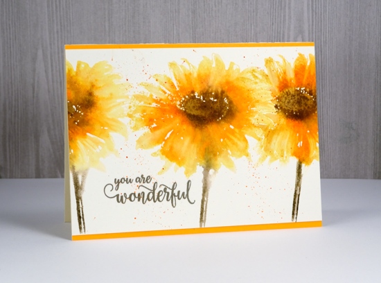
I have some happy flowers to share today. I stamped them with distress stains for a loose watercolour look.
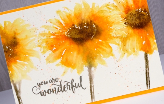
Using a yellow and an orange stain I inked the petals and stamped one flower at a time. To overlap the flowers so that one appeared in front of the other I wiped stain off parts of the stamp before stamping next to the previous image. While the stain was still a little damp on the paper I inked only the centres of the flowers in brown and the stems in green then stamped over the yellow and orange. That way I was able to get soft blends but not lose too much definition.
You can see in my two examples I have varied the amount of colour and the amount of time between adding colours. When all the stain was dry I added some splatter around and over the flowers.
I added framed one panel with some orange cardstock and left the other filling the whole card base.
I think they are rather cheery.
Supplies
Stamps: dazzling, special thoughts (PB)
Stains: mustard seed, spiced marmalade, forest moss, vintage photo
Ink: versafine olympia green
Paper: hot pressed watercolour paper
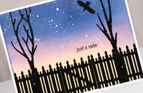
Over the fence
Posted: September 10, 2017 Filed under: beneath the birches, picket fence | Tags: Penny Black creative dies, Penny Black stamps, Ranger Distress stains 13 Comments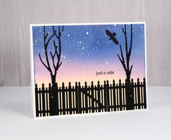
This card was inspired by one included in my August class; that one was more of a lakeside silhouette where this one is a little less rustic. I began with a piece of watercolour paper splattered with masking fluid. Once it was dry I taped it down to prevent warping and painted the whole panel with distress stains. I wanted the sky to look star-filled but it could just as easily be snow-filled. I die cut birches and a picket fence and then a sad thing happened. My die cutting machine sits on top of a cube storage cabinet which is quite good because I don’t have to bend to use it and it makes me get up from my work table and move around. The cube storage cabinet houses a lot of my supplies and sits flush against the wall. Apparently not so flush that a die can’t fall down behind it. So let me just say you won’t be seeing those birch trees on a card any time soon. To retrieve the die I will need to empty a lot out of my cabinet and that’s just not going to happen right now!
Glad I got this little card made though.
Supplies
Dies: picket fence, beneath the birches (PB)
Stamps: just a note (PB)
Inks: scattered straw, chipped sapphire, worn lipstick distress stains (Ranger) versafine onyx black (Tsukineko)
Paper: hot pressed watercolour paper (Fabriano), epic black & solar white cardstock (Neenah)
Peace & Love
Posted: September 5, 2017 Filed under: Brusho, dressed in snow | Tags: Brusho, Penny Black stamps, Tsukineko Stazon inks 7 Comments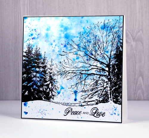
I have another brusho sky to share, this time a backdrop for this lovely new scenic stamp from Penny Black. I was playing with this stamp all morning as I worked on designs for my October class. We won’t be making this card but the stamp is in the line up. I used three colours of brusho powder on photo paper and the speckly, spotty effect of the brusho did all the work in creating a snowy sky. I used jet black stazon to stamp the image and sentiment. I have found it easier to ink the stamp and lay the photo paper down onto the stamp and press the back of the paper rather than the other way round. It is also possible with such a large stamp to peel one side of the panel up to check ink coverage, re-ink if necessary, then press down again without moving the other half of the panel. (thanks, Liliuska for that tip).
When I was making this card it was easy to make a few and of course each one is different; some have quite stormy skies, other more serene. I finished off the card with a thin black mat and a simple black sentiment.
Supplies
Stamps: dressed in snow, peace and love (Penny Black)
Paper: glossy photo paper (Kirkland) epic black cardstock, solar white cardstock (Neenah)
Ink: black stazon (Tsukineko)
Paint: turquoise, violet, cobalt blue brusho (Colourcraft)
Winter’s forest
Posted: August 30, 2017 Filed under: winter's forest | Tags: Penny Black stamps, Ranger Distress stains, Tsukineko Versafine inks 9 Comments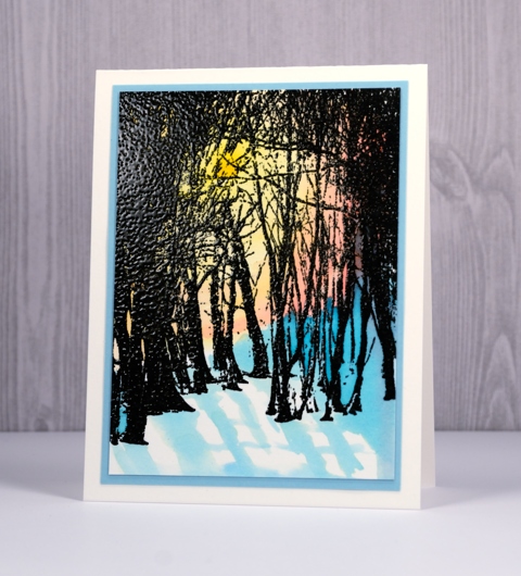
I have new tree stamp to introduce to you today. You know how I feel about tree stamps. I kept the technique quite straightforward for this card but I’m looking forward to trying a few more of my favourite mediums ie. distress stains, inks and markers, memento inks and my new favourite for photo paper – stazon. On this sunlit panel I used versafine onyx black with a clear embossing powder. Embossing the image first made it possible to keep all the trees are dark silhouettes when I painted the sunset behind. I used distress stains and a wet on wet technique to blend yellow into pink then blue. I kept the foreground white for snow then painted some shadows loosely on the watercolour paper.
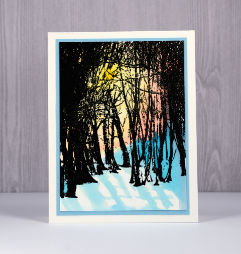
The stamp is called ‘winter’s forest’ but I know it will be just as handy as spring, summer and autumn’s forest! I had a very relaxing time away last week and enjoyed painting a few pages from Kristy Rice’s Summer Cutting Garden watercoloring book. None of the pages are quite finished but I plan to share them with you soon.
Supplies:
Stamps: winter’s forest (Penny Black)
Inks: broken china, scattered straw, worn lipstick distress stains (Ranger) versafine onyx black (Tsukineko)
Cardstock: hot pressed watercolour paper, aqua cardstock
Also: clear embossing powder
Santa’s Visit
Posted: August 21, 2017 Filed under: Santa's visit | Tags: Penny Black creative dies, Penny Black stamps, Tsukineko Memento inks 3 Comments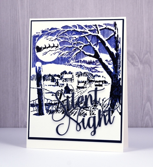
I think this quiet little scene is going to be a popular one this Christmas. It looks so peaceful and pretty, just like it does around here after a fresh snowfall (which will be welcome in four months time and not before!) I kept my colour scheme simple for this one and stamped first in Paris Dusk memento ink. I then did some blending with a wet brush over the scene to solidify the image a bit before adding black ink. I did some partial inking of the stamp to get shadows on parts of the trees and houses.
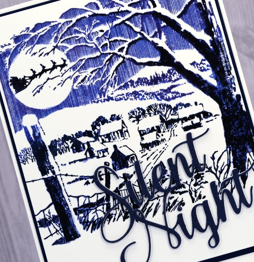
I wasn’t sure about the navy blue die cut sentiment because it does get a bit lost. In real life however it is popped up on a couple of white layers and sparkled with a clear wink of stella pen so I let it stay!
I am currently lakeside and away from my workroom and internet for a week. I decided to take only this book and these supplies for a little artsy down time.
Supplies
Stamps: Santa’s visit (PB)
Die: Blessed night (PB)
Inks: Paris dusk, Tuxedo black memento inks (Tsukineko)
Cardstock: hot pressed watercolour paper (Fabriano), navy cardstock
Also: clear wink of stella brush pen, stick it adhesive
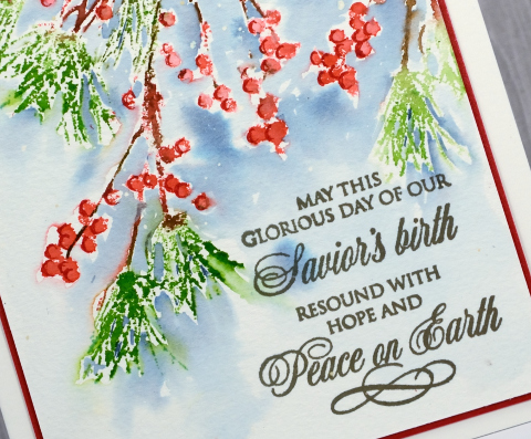
Holly Sprig
Posted: August 18, 2017 Filed under: holly sprig | Tags: Penny Black creative dies, Penny Black stamps, Ranger Distress stains 9 Comments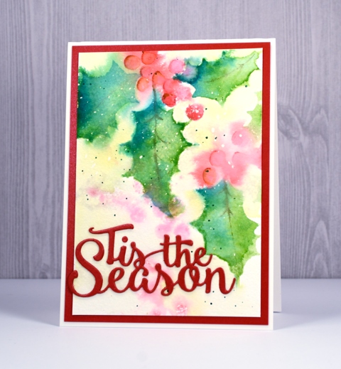
I have another new brushstroke stamp to feature today and I’ve used one of my favourite mediums to colour it: distress stains. I began as in my previous card with a panel already splattered with masking fluid. I painted a pale yellow wash over the panel then dried it. I inked the ‘holly sprig’ stamp with peeled paint and festive berries distress stains, spritzed the water colour panel and stamped. Because the panel was wet the images bled into the surrounding area giving me blurry background images. I dried the panel before stamping the foreground images in the same colours along with pine needles stain for some variation in the leaf colour.
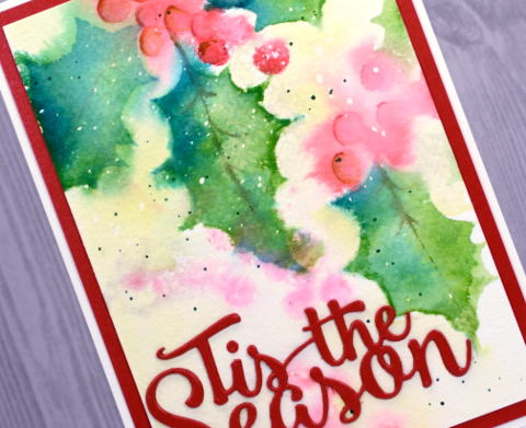
After the panel dried I added some definition to the berries and leaves with distress markers and some green splatter. Finally I removed the masking fluid, die cut ‘Tis the Season’ from red cardstock and framed the panel with a matching red mat.
Supplies
Stamps: holly sprig (PB)
Die: tis the season
Inks: festive berries, peeled paint, pine needles, scattered straw distress stains & candied apple, peeled paint distress markers (Ranger)
Paper: hot pressed watercolour paper, red cardstock
Also: masking fluid
Berry Speckled
Posted: August 16, 2017 Filed under: Berry speckled, Uncategorized | Tags: Fabriano Watercolour Paper, Penny Black stamps, Ranger Distress inks, Ranger Distress stains 9 Comments
This branch, ‘berry speckled’, is definitely one of my favourites from the new Penny Black release ‘Be Merry‘. It is pretty on its own but will combine well with other Christmas foliage I’m sure. I decided to watercolour with it, and used a stamp positioning tool to help me add colours one at a time. I worked on hot pressed watercolour paper with masking fluid lightly splattered over it. First I inked the berries in festive berries distress stain and stamped them, next I did the pine needles in peeled paint distress stain and finally the twigs in gathered twigs distress marker. I dried all the initial stamping then added the background blue by painting water close to the edges of the stamping then adding stormy sky distress stain to the wet areas.
Once all the ink and stain was dry I added definition to the berries with a candied apple distress marker. I removed the masking fluid to reveal little white dots, added the sentiment in smokey gray versafine ink and matted the panel in red.
Supplies
Stamps: berry speckled, peace & love (PB)
Inks: festive berries, peeled paint, stormy sky distress stains & candied apple, gathered twigs distress markers (Ranger) smokey gray versafine (Tsukineko)
Paper: hot pressed watercolour paper, red cardstock
Also: masking fluid
Peaceful moment
Posted: August 14, 2017 Filed under: Brusho, peaceful moment | Tags: Brusho, Penny Black stamps 14 Comments
Brusho on photo paper can create really intricate patterns and soft blended backgrounds. I used the same few colours of brusho for the backgrounds on both cards but one was the first impression and the other a left over colour swipe. The first impression pattern was achieved by pressing the panel of photo paper down on top of the spritzed brusho. I didn’t move the panel from side to side just pressed it down into all the activated brusho. After lifting the panel and setting it aside I swiped another piece of photo paper through the remaining paint to pick up a soft blended look. There was not quite enough variation for my liking so I added a bit of blue brusho to the mat, spritzed and swiped again to get darker colour at the base of the panel.
I stamped the new ‘peaceful moment’ stamp over the brusho backgrounds in jet black stazon then added mats and sentiments to complete the cards. Make sure you check out the rest of the new products from the Penny Black releases along with the opportunities to win a spending spree.
Supplies
Stamps: peaceful moment, snippets, all great things, spiritual snippets
Paper: glossy photo paper (Kirkland) epic black cardstock, natural white cardstock (Neenah), yellow cardstock
Ink: black stazon, versafine onyx black (Tsukineko)
Paint: yellow, gamboge, leaf green, cobalt blue brusho (Colourcraft)


