
Peaceful moment
Posted: August 14, 2017 Filed under: Brusho, peaceful moment | Tags: Brusho, Penny Black stamps 14 Comments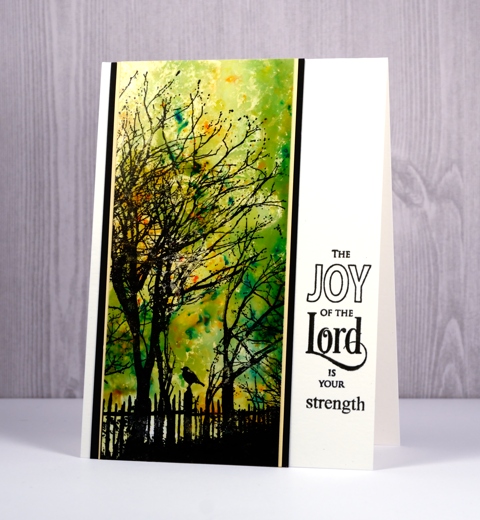
Brusho on photo paper can create really intricate patterns and soft blended backgrounds. I used the same few colours of brusho for the backgrounds on both cards but one was the first impression and the other a left over colour swipe. The first impression pattern was achieved by pressing the panel of photo paper down on top of the spritzed brusho. I didn’t move the panel from side to side just pressed it down into all the activated brusho. After lifting the panel and setting it aside I swiped another piece of photo paper through the remaining paint to pick up a soft blended look. There was not quite enough variation for my liking so I added a bit of blue brusho to the mat, spritzed and swiped again to get darker colour at the base of the panel.
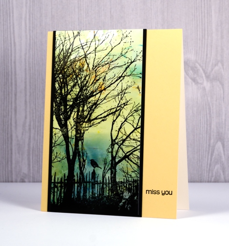
I stamped the new ‘peaceful moment’ stamp over the brusho backgrounds in jet black stazon then added mats and sentiments to complete the cards. Make sure you check out the rest of the new products from the Penny Black releases along with the opportunities to win a spending spree.
Supplies
Stamps: peaceful moment, snippets, all great things, spiritual snippets
Paper: glossy photo paper (Kirkland) epic black cardstock, natural white cardstock (Neenah), yellow cardstock
Ink: black stazon, versafine onyx black (Tsukineko)
Paint: yellow, gamboge, leaf green, cobalt blue brusho (Colourcraft)


Beautiful! Something magical happens when you work with Brusho!
So much going on in both of these. Beautiful.
WOWZER! These are beautiful!
Awesome backgrounds and a fantastic stamp! Beautiful cards xxx
Once again beautiful creations. Love both of them.
Okay…I CONFESS…I get discouraged by pigment powders! I have Color Burst sets…favorite hues of Bister as well as Brusho. I try…and come up with backgrounds that just ‘don’t work’…too dark, too occluded, too muddy! These beautiful cards make me want to pull them out and try again. I’ve tried different techniques but not laying the powders on the craft mat. Thanks once again for all the inspiration and encouragement and certainly for the “WOW” moment when I first see your new works of ART posted. ♥♥♥
Gorgeous cards Heather, and I love the combination of Brusho colours and the silhouette trees and the sweet little bird sitting on the fence work so well, and I especially love the second one where you have that bit of blue on the horizon and right behind the bird, just so atmospheric. x
Two wonderful cards Heather. Both images are very moving in those colours, especially the ‘Miss You’. I wanted to cry. Well done again.
Two very different but equally beautiful backgrounds, Heather! I hadn’t thought to use Brushos on photo paper, but after seeing this, I’m anxious to try!
Really nice!
On Mon, Aug 14, 2017 at 11:02 AM Heather Telford wrote:
> Heather posted: ” Brusho on photo paper can create really intricate > patterns and soft blended backgrounds. I used the same few colours of > brusho for the backgrounds on both cards but one was the first impression > and the other a left over colour swipe. The first impress” >
Both backgrounds are so pretty. Great idea to get a second piece with leftover ink. LOVE it on the yellow card base. xx
These are so eye catching…I love everything about them. I just discovered your art on pinterest & have started following you. Thank you for sharing your amazing talent!
These are both very beautiful. I think my favorite is the one with the softer background–maybe because I love yellow on cards.
Gorgeous cards and technique Heather. i prefet the soft colours in the 2nd card but both are gorgeous..loz