Watercolour Dandelions
Posted: March 7, 2013 Filed under: CAS, Tweet Tweet, Watercolour 26 Comments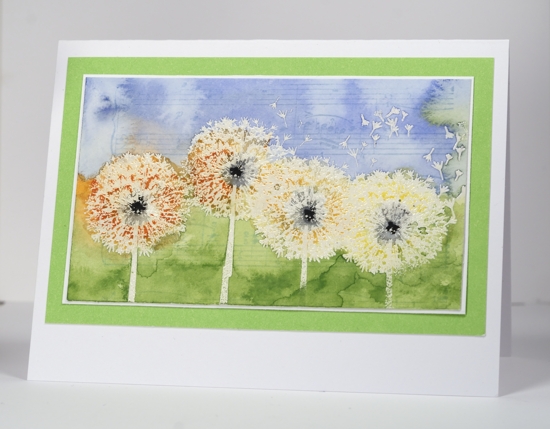
I am having a great time playing with watercolour and Penny Black’s flower and nature stamps. I definitely experience some frustration along the way but I feel like I am making progress all the same. At times I have gone too far in my watercolouring and the colours end up muddy but happily I also find sometimes I have not continued long enough and the addition of one more colour or a bit more colour intensity is all I need to complete my project. It is important to remember that watercolour paint(or pencils) always dry paler so if it already looks pale to you when it’s wet it is only going to get paler!
To create the row of dandelions I embossed four in a row with clear powder. I coloured the centres of the dandelions with dark grey pencils(all the pencils I used were watercolour), then around and below the dandelions with light green. I found the green needed to be much stronger so created a little green “paint” by mixing water and the lead of the green pencil. I painted this on blending with water as I went. I sponged the sky and dropped water onto it to create a cloudy effect. To make the dandelions pop a little more I coloured over them with orange and yellow pencils blending with water. At this point I noticed that the centres of the dandelions didn’t stand out enough so used a black marker to darken them. Last of all I added the music background but I am not sure that it was needed??
Both my recent watercolour cards have had no sentiment; there is a space for one on this card so I might add one when I decide who will receive it.
Speaking of sentiments there is a new One Layer Wednesday Challenge over on Susan’s blog.
Supplies:
Stamps: Tweet Tweet, Music Background (Penny Black)
Inks: Memento Summer Sky ink & black marker, Versamark (Tsukineko)
Cardstock: Fabriano 100% cotton hot pressed watercolour paper, Mix & Match cardstock
Also: Fabercastell watercolour pencils
Sweet Melody
Posted: March 6, 2013 Filed under: CAS, Sweet Melody, Watercolour 15 Comments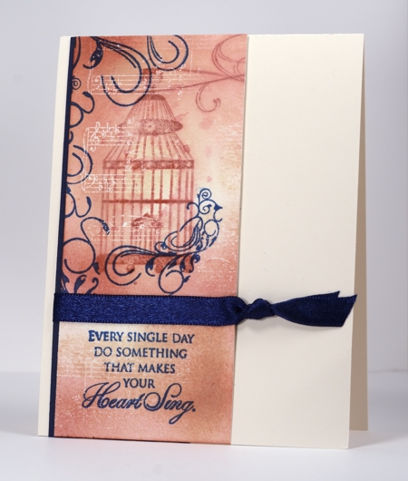
This is one of those cards which almost ended up in the discard pile but with some slicing and rearranging survived.
I began by embossing the music background stamp in clear powder but when I sprinkled the powder on I purposely missed some areas so the final image would be patchy. I then sponged Memento desert sand and rhubarb stalk over the panel. I stamped the bird cage in rhubarb stalk and immediately blended with water adding some ink droplets here and there. The bird, sentiment and flourishes around the perimeter are stamped in Versafine Deep Lagoon to create a contrasting colour scheme.
The panel I started creating was horizontal with the birdcage on the left and the sentiment on the right but when I’d finished stamping I didn’t like the layout. It was at this point I considered tossing it. Instead I sliced it in half and positioned one panel over the other, added a ribbon over the join and ended up with the layout you see here.
Thanks for visiting and thanks for leaving such encouraging comments. I am always happy to read that you have been inspired to try something you’ve seen here.
Supplies:
Stamps: Music Background, Eloquence, Sweet Melody
Inks: Memento Desert Sand & Rhubarb Stalk, Versafine Deep Lagoon, Versamark (Tsukineko)
Cardstock: Fabriano hotpressed watercolour paper,
Also: Navy satin ribbon, clear embossing powder
Spring Spritz
Posted: March 5, 2013 Filed under: Blooming Garden, CAS 11 Comments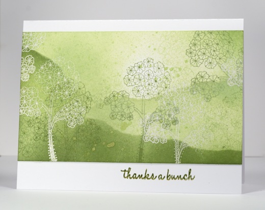
The air is feeling a bit spring like around here but with plenty of snow on the ground so I am not really in spring mode yet. This card, however is definitely a taste of spring with its fresh greens and white.
I have used this technique numerous times, usually in either a horizontal or vertical panel. I mask it first then emboss several of the floral images I’ve chosen in clear e.p. Then I stamp the image again in several shades of one colour, filling the space randomly. Next I sponge with the same inks usually leaving an area almost unsponged as this ends up looking like the source of light or some sunlight breaking through clouds. This time I decided to use a torn mask as I sponged to create the appearance of hills. Finally I spritzed some Tsukineko Fireworks spray in Bamboo Leaves which added some droplets and a shimmer. It was my first use of Fireworks spritzers and I think I sprayed a little more than just my card panel!
Supplies:
Stamps: Blooming Garden, A Bunch PB)
Inks: Memento New Sprout, Pear Tart, Bamboo Leaves & Versafine Olympia Green(Tsukineko)
Also: Tsukineko Bamboo leaves fireworks
Am I in the wrong place?
Posted: March 4, 2013 Filed under: Background Stamps, CAS, Designer Paper, Penny Black 11 Comments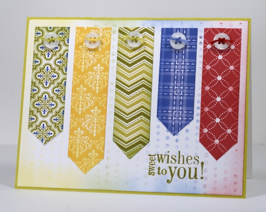
No you are not in the wrong place; I did make this three layer card which includes patterned paper, buttons and thread!
I have pinned and admired several cards which line up strips of patterned paper to make lovely designs.
A Christmas one, a Floral one and a similar idea
Mine is a little more patchwork looking as I didn’t stick with an analogous colour scheme. The background for my card is made with the stamp Dots in Space which I inked in red, blue, green and yellow then stamped once on another panel before making the muted impression you see above. I used the same inks to sponge the edge of the pennants and the background panel. I know the sentiment really needs a cupcake to go along with it but I liked the size and shape so it got the job. I’ll be back with more of my usual soon…
Supplies:
Stamps: Friendship, Dots in Space(Penny Black)
Inks: Memento Lady Bug, Bamboo Leaves, Dandelion, Danube Blue & Versafine Spanish Moss (Tsukineko)
Cardstock: Penny Black Mix & Match Papers Olive Grove, Madison Designer Paper
Watercolour Tulips
Posted: March 2, 2013 Filed under: Background Stamps, Blooming Garden, CAS, Penny Black, Watercolour 17 Comments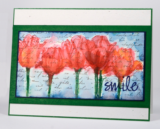
I have been having fun with watercolour techniques again. My inspiration for this panel came from at some beautiful paintings by Kristy Patterson where she has painted in watercolour over text. Often when I use the letter background stamp I use it only on sections of my panel or collage. This time I stamped it across the whole panel of watercolour paper first in Versafine Vintage Sepia which is waterproof. I switched to Memento inks for the tulips so I could blend the inks with as much water as necessary. My watercolouring method is a little different each time so it’s hard to describe. I started by painting water onto the panel then inking the tulip stamp in green and red before stamping it three times. I immediately blended some of the ink as it bled and pooled but also used red and orange watercolour pencils to add more colour and restamped the tulips a few times too. Once I was happy with the tulips I ran a nautical blue memento ink pad around the perimeter of the panel and immediately used water to pull the ink to surround the tulips.
Maybe you are already seeing tulips where you live; it will be a couple more months before we do!
Supplies:
Stamps: Blooming Garden, Letter Background, Edge to Edge (PB)
Inks: Memento Nautical Blue, Cottage Ivy, Love letter & Versafine Vintage Sepia, Majestic Blue (Tsukineko)
Cardstock: Fabriano 100% cotton hot pressed watercolour paper, Spring Meadow Mix & Match Papers
Also: Faber-Castell watercolour pencils
Birds at night
Posted: February 28, 2013 Filed under: Birds on wire, CAS, Stamped Landscapes 28 Comments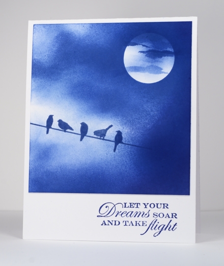
This card is inspired by a photograph taken by Luz Adriana Villa A and shared on flickr. I saw it on Pinterest.
The sky took a while to build up as I sponged from the outside in, with three blues. I used a little light blue at the beginning, the darkest blue at the end but the majority of the sponging was done with Memento Danube Blue. I positioned the moon mask first and stamped the birds before I did any sponging so that I could vary the depth of colour around the image. After I removed the moon mask I tore little strips out of the sticky part of a post-it note to create a very thin cloud like shape.
Supplies
Stamps: Birds on a wire, Free Flight (PB)
Inks: Memento Summer Sky, Paris Dusk & Danube Blue (Tsukineko)
Three Tile Layout
Posted: February 27, 2013 Filed under: Background Stamps, CAS, Glory of Modesty, Penny Black 15 Comments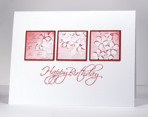
When I was creating the background stamp tutorial my first attempt was almost complete when I messed up the sentiment. No point letting those pretty flowers go to waste so I punched them out and used the three element in a row layout that Susan Raihala says is her all time favourite layout.
To see how I create that little extra dimension in my flowers check out my tutorial here.
Supplies:
Stamps: Glory of Modesty, Flourish Birthday, Letter Background(PB)
Inks: Memento Angel Pink, Love Letter, London Fog & Versafine Smokey Grey (Tsukineko)
Cardstock: Penny Black Mix & Match Papers Rose Garden
Background stamp tutorial
Posted: February 25, 2013 Filed under: Background Stamps, CAS, Glory of Modesty, Penny Black, Tutorial 38 Comments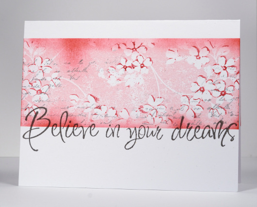
After creating a one layer card with the background stamp Glory of Modesty or GOM for short, I decided to use the same technique and let you in on one step I didn’t mention when I explained my process the first time. It is not a complex step at all, simply one which is easier to show than explain with words.
When I posted the card below my friend, Lindsey from Bashful Blogging commented that “the flowers really do seem on a slightly higher plane despite it being one layer”. I have created another card and a tutorial showing how to get your flowers to appear to be on a “higher plane”.

I used the same stamp because this technique works beautifully with this stamp but I changed my colour scheme and the size of the image panel.
Supplies:
Stamps: Glory of Modesty, Edge to Edge, Letter Background(PB)
Inks: Memento Angel Pink, Love Letter, London Fog & Versafine Smokey Grey (Tsukineko)
Black Damask
Posted: February 23, 2013 Filed under: Background Stamps, CAS, Damask Pattern, Queen Anne's Lace 18 Comments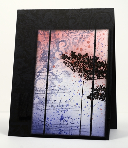
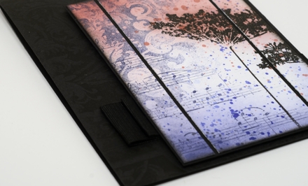
A few weeks back I used the damask background stamp to make a cup. I really hadn’t used the stamp much before that. After making the cup I noticed how elegant the detail in the stamp is and decided it was time to pull it out again. I also have some beautiful new ink colours from Tsukineko which I needed to play with.
I inked diagonally across the damask stamp with Versamagic Night Sky ink and stamped it on the panel. I then inked the music background, diagonally also, in order to fill the other half of the panel. It was only after I had stamped the music that I saw that I hadn’t worked out the whole upside-down and opposite side thing properly! I’m kind of glad I got it wrong though because I ended up liking the two backgrounds overlapping and it left me with a white space to stamp some flowers.
The flowers are stamped with versamark and embossed in black so they would resist the sponging and ink droplets added next. I sliced up the panel and matted in black and then looked for the right colour cardbase. White was too stark; black worked better but needed a little something on it. My intention was to emboss the damask background but once I had stamped it in Versafine Onyx black it showed up fine (possibly not in the photo). The wide grosgrain ribbon is pleated and stapled behind the popped up panel.
Supplies
Stamps: Damask Pattern, Queen Anne’s Lace, Music Background (PB)
Ink: Memento Rhubarb Stalk, Versafine Onyx Black & Versamagic Night Sky (Tsukineko)
Also: Black embossing powder
Tiles from a background stamp
Posted: February 22, 2013 Filed under: CAS, Glory of Modesty, Tree-mendous 24 Comments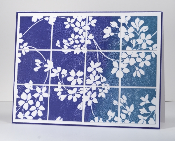
When I had this stamp out to make the birthday card I played around with a few different inks, papers and techniques. I know it is the size of a background stamp but I have stopped thinking of it as a background stamp as I am yet to use it in the background. It is such a pretty design it always gets to be the main event. When a stamp has a lot of blank un-patterned rubber on it, it can be hard to ink evenly so I played around a bit with inks and water to try and get past this issue. If you use a pigment ink it is juicier and will give you good coverage. I wanted to blend some colours on the stamp so I chose to use water soluble Memento dye inks instead.
I inked the stamp generously with Paris Dusk and Teal Zeal then spritzed it with water giving the water and ink a little time to blend before stamping the image on white card stock. The blank rubber part of the image is not solid colour but I quite like the texture created with some tiny air bubbles and ink pooling. I tried the large image on the card base but decided to cut it into tiles to add another element to the design.
Thanks for all your kind birthday wishes. My birthday is Sunday; my husband is exactly one week older and wiser than me!
Supplies:
Stamps: Glory of Modesty, (PB)
Inks: Memento Teal Zeal & Paris Dusk (Tsukineko)
Cardstock: Periwinkle Mix & Match Papers
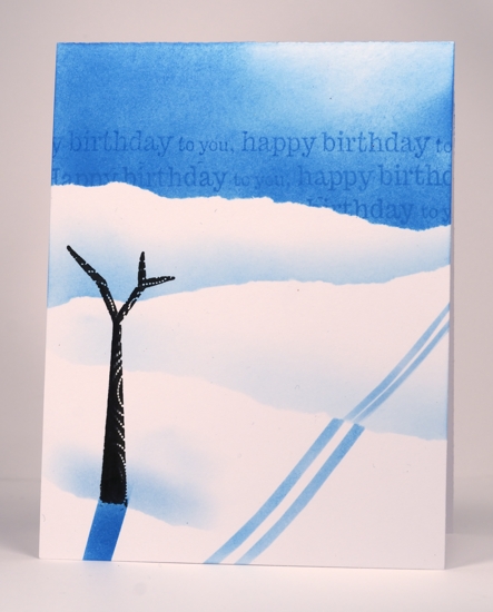
Several of you wanted to see the misunderstood birthday card I made for my husband so I have included it below. If you are as baffled as half my family were then you can mouse over the picture or click on it and you will see the photo title.
The aspects of this card I don’t like are:
the lack of branches on the tree. I am looking forward to using this stamp again with foliage
the sponged ski trails which aren’t very even
the sparse landscape. We don’t like skiing out in the open like that; it gets too cold but as I was stamping at the last minute one tree was all this card got. Sad that the cardmaker’s family’s cards get left to last!
Aspects of this card I do like:
the sentiment in the sky
the colouring on one side of the tree trunk