
Water washed text
Posted: May 7, 2013 Filed under: Background Stamps, Bliss, CAS, Penny Black 19 Comments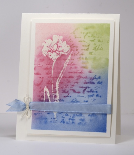
This is a quick experimental card which worked out. When working with watercolour you never know what might happen; the happenings were good this time.
I taped my watercolour panel to the table to avoid warping when wet then I stamped the flower in versamark. At this point I realized I should have embossed the flower before taping the paper to the table. Feeling a bit lazy I decided to move on without embossing and see what happened. I painted water onto the whole panel then inked the text stamp with three colours and stamped it onto the wet panel. The text bled nicely. (Hmm, ‘bled nicely” ?!) I dried it with a heat gun because I was impatient then sponged the same three colours over the text. At this point I didn’t know whether the versamark flower would still hold embossing powder but it was worth a try. I untaped the panel and embossed in clear powder. It worked so I added a little more sponging to highlight the flower and found some ribbon to match.
A happy experiment.
Supplies:
Stamps: Bliss, Letter Background (PB)
Inks: Memento Angel Pink, Rose Bud, Danube Blue, Bamboo Leaves & Versamark Tsukineko)
Cardstock: Fabriano 25% cotton hot pressed watercolour paper,
Also: Blue satin ribbon, ivory embroidery thread
Being Complementary
Posted: May 5, 2013 Filed under: Background Stamps, CAS, Damask Pattern, Love Chapter, Penny Black 18 Comments
This Damask stamp from Penny Black is such a beautifully detailed stamp I like to show it off rather than relegate it to background status. When I started making this card I embossed a couple of panels, one in clear and one in black then played around with both. The white image left by the clear embossing powder definitely created the look I was after; I will have to fiddle with the black a little more before I’m happy with it.
As I said I started by embossing in clear then sponged Memento Pistachio from one corner toward the centre and Love letter from the opposite corner. I darkened the green portion further with Olive grove and added a little definition with a Bamboo Leaves marker. I then sliced the side off my panel so that it would be predominantly green rather than half and half, matted it in green and added a ribbon. I didn’t have the correct green so I used a paler green and coloured it with a marker.
When that card was finished I didn’t want the little strip I cut off to go to waste so I set out to make a very minimal design with just the thin panel and a sentiment. But then I remembered the “Love” stamp which has elaborate fonts that remind me of damask and a second design was created.
The complementary colour scheme is inspired by the Less is More Challenge this week.

Supplies:
Stamps: Damask Pattern, Love Chapter, Happy Birthday (PB)
Inks: Memento Pistachio, Olive Grove, Love Letter & Versamark (Tsukineko)
Cardstock: Penny Black Mix & Match Papers Olive Grove
Also: Clear embossing powder, ribbon
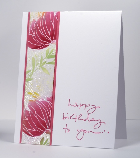
Pink blooms
Posted: April 1, 2013 Filed under: CAS, Sweetness 32 Comments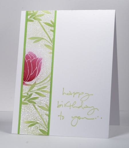
Today’s cards feature another of Penny Black’s pretty background stamps: Sweetness. I started by making a large floral panel triple the size of the panels you see here using almost the whole background stamp. I embossed the image with clear embossing powder. The coverage wasn’t 100% but I don’t mind that because it makes a batik-like effect. After embossing I sponged Memento Rosebud ink over the flowers varying the amount of colour and adding some with a marker. The leaves and stems are sponged with Memento New Sprout and you can see on the card below I also sponged a little Dandelion ink.
I played around with the large panel and a green mat, eventually deciding to slice the panel into three pieces to try and make it look a bit like a Chinese screen. The three panels were still too much for my clean and simple ways so I tried a single panel per card ending up with the two you see here. I didn’t have quite the right pink card stock to mat the card below so I used a lighter pink and sponged the edges with Rose bud ink.
Have a wonderful day.
Supplies:
Stamps: Sweetness, To You… (PB)
Inks: Memento Rose Bud, New Sprout, Dandelion & Versamark (Tsukineko)
Cardstock: Mix & Match cardstock rose garden & spring meadow
Also: Clear embossing powder
Fern birthday card
Posted: March 21, 2013 Filed under: Background Stamps, CAS, Penny Black, Schizeas 8 Comments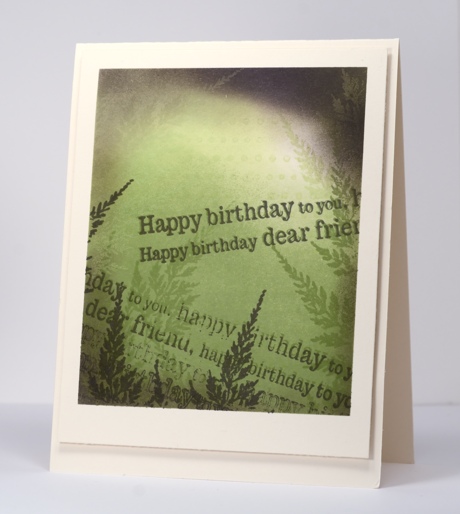
After playing around with sponging on tags the other day I decided to make my panel a bit larger and use the same technique. These colours are an unusual combination but made me think of rainforests with a bit of sun breaking through the canopy. If you look closely at the top right hand corner of the panel the green and purple inks have created a cool “photo negative” effect. I am going to play with that idea again for sure.
My process was pretty much the same as with the tags. I stamped the dot background in green, sponged in green then added fern stamps in green. I chose elderberry as my contrasting colour and added perimeter sponging, ferns and the sentiment several times to complete the panel. I did a little intentional restamping again for the out of focus effect; I am just messing with your eyesight!
This card works for the current Less is More challenge where we have to frame something on our card. I have framed both by masking the border of my image panel and by popping it up on the card base.
Supplies:
Stamps: Schizeas, Edge to Edge, Dots in Space PB)
Inks: Memento New Sprout, Bamboo Leaves, Elderberry (Tsukineko)
Shabby Chic tag cards
Posted: March 16, 2013 Filed under: Background Stamps, CAS, Cuttlebug, Love Chapter, Penny Black 10 Comments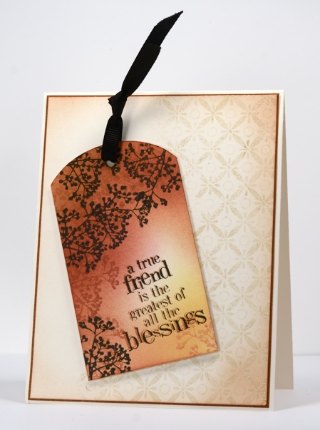
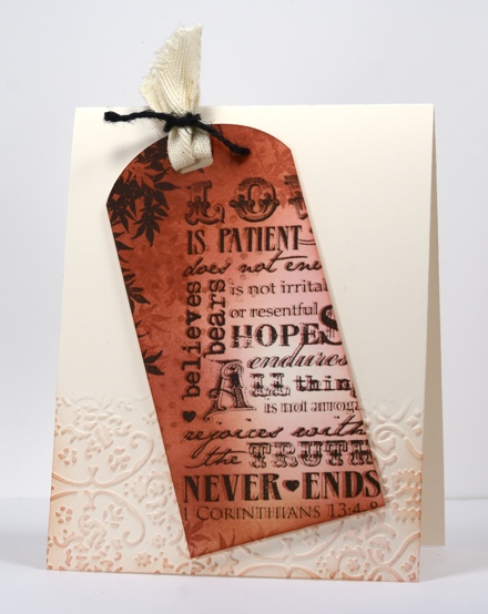
Today I have a couple of cards which developed as I stamped; I had a rough idea how I would do the tag above but nothing more than that. Once the first tag was finished I wanted to try the same technique with another text stamp. When both were finished I played around with layouts for quite a while before I settled on the ones you see here.
To create the tags I stamped the Dots in space background stamp then sponged three colours over most of the tag. Each tag has a branch motif which I stamped in brown tones first then black. The text stamps have an out of focus look intentionally; I stamped them first in Potter’s Clay then again in black but slightly offset from the first impression.
Both the tags were designed to feature but needed to be grounded on the card bases so I picked out a background stamp and an embossing folder. To ground the tag above I stamped part of the background stamp Indian Wheel in Wheat versamagic then embossed in clear powder before sponging the perimeter of the ivory panel in Memento Potter’s Clay. The tag below is grounded on the card base by an embossed panel created using a cuttlebug embossing folder which I sponged over lightly.
I do make tags from time to time but I rarely put a tag on a gift; I usually add a card in an envelope to a gift so these tags are more likely to get given this way than if they had remained as tags. What about you,do you make tags? Do you use them?
Supplies:
Stamps: Love Chapter, Friendship, Dots in Space, Indian Wheel, Tweet Tweet (PB)
Inks: Memento Potter’s Clay, Rhubarb Stalk, Dandelion, Angel Pink & Versafine Onyx Black & Versamagic Wheat (Tsukineko)
Cardstock: Mix & Match Grand Canyon
Also: Cuttlebug Folder Textile Texture, black ribbon, black twine
Spots and stripes
Posted: March 15, 2013 Filed under: Background Stamps, CAS 10 Comments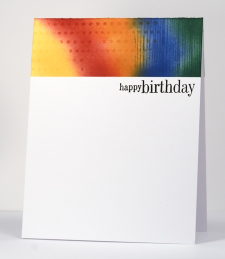
I am just going to make the deadline for this week’s Less is More challenge. I haven’t taken on many stamping challenges lately so I wanted to do this one. When I saw this dramatic card by Pamela, I knew I had my layout; I just needed to work out how to add the spots and stripes. I reached for my trusty background stamps including one I rarely pull out, the woodgrain stamp from the Penny Black slapstick cling set, Inspiring. I also used the new background Dots in Space. Both stamps were inked with Memento ink pads but markers would have worked well too. I used the same inks to sponge after stamping.
It took me two attempts to make this card! On my first try I had all the colour panel complete, then managed to stamp the sentiment straight also only to mess up the line of dashes! What line of dashes, you ask? It did not get invited back for my second attempt but if I had found the right little birthday silhoutte stamp to stamp over the colour panel on the left I might have done that.
Anyway, there you have it a colourful card for any age, male or female.
Supplies:
Stamps: Dots in Space, Friendship, Inspiring (PB)
Inks: Memento Love Letter, Tangelo, Dandelion, Cottage Ivy, Danube Blue & Versafine Onyx Black(Tsukineko)
Am I in the wrong place?
Posted: March 4, 2013 Filed under: Background Stamps, CAS, Designer Paper, Penny Black 11 Comments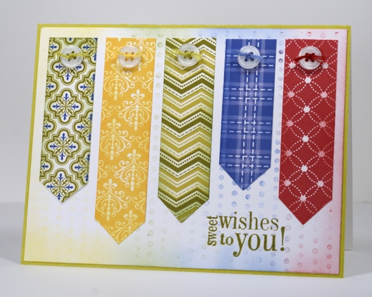
No you are not in the wrong place; I did make this three layer card which includes patterned paper, buttons and thread!
I have pinned and admired several cards which line up strips of patterned paper to make lovely designs.
A Christmas one, a Floral one and a similar idea
Mine is a little more patchwork looking as I didn’t stick with an analogous colour scheme. The background for my card is made with the stamp Dots in Space which I inked in red, blue, green and yellow then stamped once on another panel before making the muted impression you see above. I used the same inks to sponge the edge of the pennants and the background panel. I know the sentiment really needs a cupcake to go along with it but I liked the size and shape so it got the job. I’ll be back with more of my usual soon…
Supplies:
Stamps: Friendship, Dots in Space(Penny Black)
Inks: Memento Lady Bug, Bamboo Leaves, Dandelion, Danube Blue & Versafine Spanish Moss (Tsukineko)
Cardstock: Penny Black Mix & Match Papers Olive Grove, Madison Designer Paper
Watercolour Tulips
Posted: March 2, 2013 Filed under: Background Stamps, Blooming Garden, CAS, Penny Black, Watercolour 17 Comments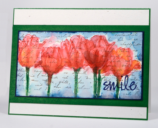
I have been having fun with watercolour techniques again. My inspiration for this panel came from at some beautiful paintings by Kristy Patterson where she has painted in watercolour over text. Often when I use the letter background stamp I use it only on sections of my panel or collage. This time I stamped it across the whole panel of watercolour paper first in Versafine Vintage Sepia which is waterproof. I switched to Memento inks for the tulips so I could blend the inks with as much water as necessary. My watercolouring method is a little different each time so it’s hard to describe. I started by painting water onto the panel then inking the tulip stamp in green and red before stamping it three times. I immediately blended some of the ink as it bled and pooled but also used red and orange watercolour pencils to add more colour and restamped the tulips a few times too. Once I was happy with the tulips I ran a nautical blue memento ink pad around the perimeter of the panel and immediately used water to pull the ink to surround the tulips.
Maybe you are already seeing tulips where you live; it will be a couple more months before we do!
Supplies:
Stamps: Blooming Garden, Letter Background, Edge to Edge (PB)
Inks: Memento Nautical Blue, Cottage Ivy, Love letter & Versafine Vintage Sepia, Majestic Blue (Tsukineko)
Cardstock: Fabriano 100% cotton hot pressed watercolour paper, Spring Meadow Mix & Match Papers
Also: Faber-Castell watercolour pencils
Three Tile Layout
Posted: February 27, 2013 Filed under: Background Stamps, CAS, Glory of Modesty, Penny Black 15 Comments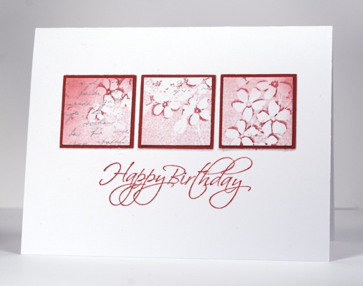
When I was creating the background stamp tutorial my first attempt was almost complete when I messed up the sentiment. No point letting those pretty flowers go to waste so I punched them out and used the three element in a row layout that Susan Raihala says is her all time favourite layout.
To see how I create that little extra dimension in my flowers check out my tutorial here.
Supplies:
Stamps: Glory of Modesty, Flourish Birthday, Letter Background(PB)
Inks: Memento Angel Pink, Love Letter, London Fog & Versafine Smokey Grey (Tsukineko)
Cardstock: Penny Black Mix & Match Papers Rose Garden
Background stamp tutorial
Posted: February 25, 2013 Filed under: Background Stamps, CAS, Glory of Modesty, Penny Black, Tutorial 38 Comments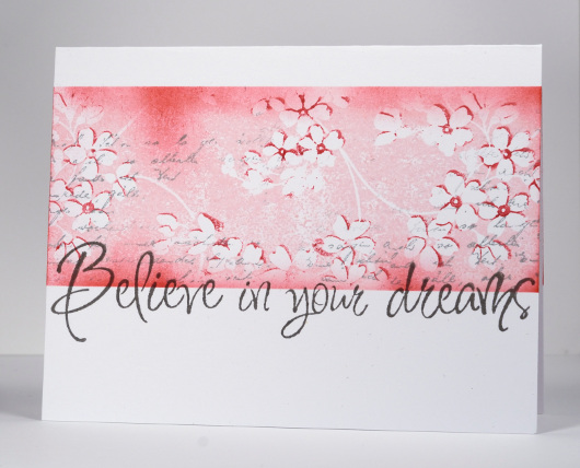
After creating a one layer card with the background stamp Glory of Modesty or GOM for short, I decided to use the same technique and let you in on one step I didn’t mention when I explained my process the first time. It is not a complex step at all, simply one which is easier to show than explain with words.
When I posted the card below my friend, Lindsey from Bashful Blogging commented that “the flowers really do seem on a slightly higher plane despite it being one layer”. I have created another card and a tutorial showing how to get your flowers to appear to be on a “higher plane”.

I used the same stamp because this technique works beautifully with this stamp but I changed my colour scheme and the size of the image panel.
Supplies:
Stamps: Glory of Modesty, Edge to Edge, Letter Background(PB)
Inks: Memento Angel Pink, Love Letter, London Fog & Versafine Smokey Grey (Tsukineko)


