
One stamp, two colours
Posted: July 21, 2015 Filed under: Bister, Queen Anne's Lace, Watercolour | Tags: Bister, Penny Black stamps, Ranger Distress stains 16 Comments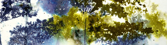
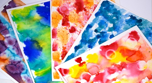
Continuing my experiments with bistre paint powders, I pulled out one of my favourite stamps and limited myself to a blue and green colour scheme. Below are all the results of my fiddling around with colours, water, repetitive stamping and order of operations. All the panels were splattered with masking fluid which really added interest on the most watery panels. Where the stains pooled and bled into each other the little masked dots break up the solid colour. Each was taped to a board with painter’s tape which created a masked border that I retained on all but one card.
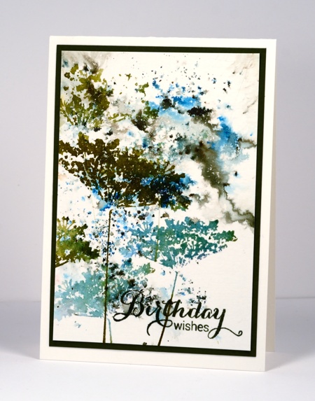
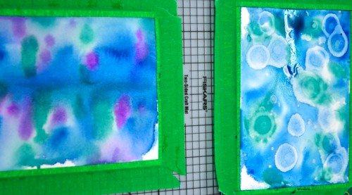
On the panel below I sprinkled both blue and green bister on dry watercolour paper then spritzed lightly, tilted it this way and that, then walked away. This is becoming my new watercolour mantra, ” Walk away, just walk away!” As I have said before it helps to have chips on hand to distract yourself from wanting to fiddle more with the painting that needs to dry. In this case I did not have chips but I did have four different panels to work on so as each one was set aside to dry I started the next. Once dry I stamped the Queen Anne’s Lace in a dark green and a mix of two blues to co-ordinate with the bister patterns. I stamped twice without re-inking in between so the lower images are a bit paler. I like the lacy airiness of the flowers on this one but it’s not my favourite.
There was more water involved in the panel below and some painting and sponging too in order to frame the scene. I began by stamping in pale green on a slightly damp panel. You can see those first pale images in the background. I then switched to darker colours and dropped some bister into the stamping. To fill the white background I used a paintbrush to pull both stain and bister into the spaces. I tried to be careful not to lose the definition of the flowers. When it was totally dry (walk away, just walk away) I sponged a bit more colour in the corners. I like the shadowy images behind the stronger ones on this panel but it is not my favourite.
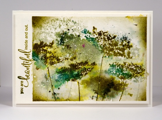
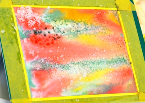
To be honest with you, below is the one that almost got tossed. I didn’t walk away and you can see all the murky green that resulted. I didn’.t want to give up however so I pulled out some scraps of dry wall tape I had used on another project and sprinkled bister powder over the tape, spritized water over the powders, let it dry a bit then sponged for more coverage. Not only does the grid add some interest, it leads the eye away from the murk. The other thing that saved this one is the mass of masking fluid flecks right in the centre adding light to the murk. You have probably guessed, not my favourite.
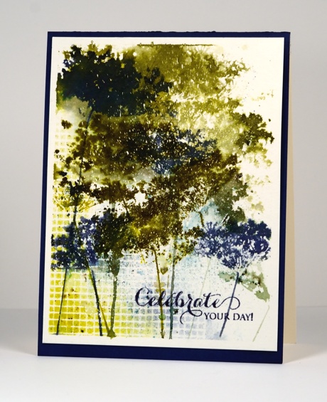
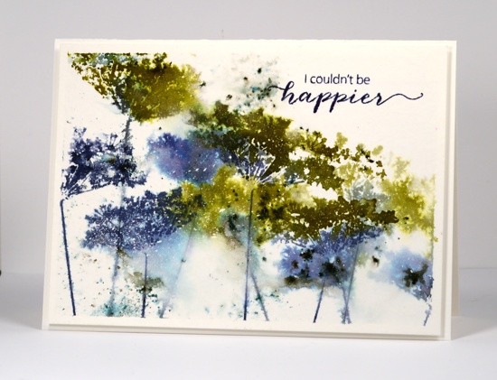
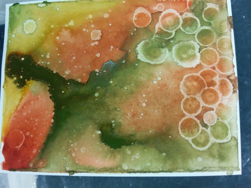
Which leaves us with this one. It has lots of blue, some nice bister bursts, both watery and defined stamping, some white flecks in appropriate places and I couldn’t be happier. Yes, it’s my favourite. Which one do you prefer?
Do you ever fiddle around with the same stamp and colours for several projects? It’s not quite making multiples but it is time efficient to use the supplies while they are all on the table.
Supplies:
Stamps: Queen Anne’s Lace, Happy Notes, Heartfelt, A Sweet Day (PB)
Inks: Bundled Sage, Forest Moss, Pine Needles, Crushed Olive, Chipped Sapphire, Evergreen Bough, Salty Ocean Distress Stains & Chipped Sapphire distress ink (Ranger) Spanish Moss, Majestic Blue & Olympia Green Versafine inks (Tsukineko)
Paint Powder: Blue and Green Bister
Cardstock: Canson cold pressed 100%cotton watercolour paper,
Also: Winsor & Newton masking fluid
Colour inspiration
Posted: July 20, 2015 Filed under: Watercolour | Tags: Kuretake Gansai Tambi watercolour paints, Ranger Distress stains 6 CommentsLast month I taught a class involving watercolour panels and die cut shapes. All the samples I demonstrated and all the cards and panels created by class members were different. I really enjoyed watching everyone choose colours to work with. I snapped a few photos as the paints dried.


I still have some panels waiting to be transformed into something new.
Pop, pop, poppy
Posted: July 1, 2015 Filed under: Pop pop poppy | Tags: Penny Black stamps, Ranger Distress stains 6 Comments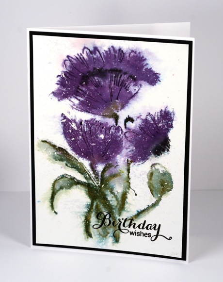
I created this panel a very long time ago and then didn’t use it. I think I had a bit of poppy overload earlier in the year so I didn’t feel like turning it into a card. I found it this week in a clean up and decided to add a sentiment and complete the card. All the little white flecks over the poppy indicate that I splattered masking fluid over the paper to begin, then I inked the stamp with distress stains. I am just guessing (‘cos I don’t remember) that I spritzed the stamped image to created the watery and feathery edges. I did let it dry before adding the black lines with a marker over the top of the purple petals. This poppy stamp is quite large so my card is a bit larger than usual also.
Thanks for dropping by.
Supplies:
Stamps: Pop Pop Poppy (PB)
Inks: Dusty Concord, Bundled Sage distress stains (Ranger), Memento Tuxedo Black, Northern Pine, Elderberry inks (Imagine Craft/Tsukineko)
Cardstock: Fabriano 100% cotton hot pressed watercolour paper
Also: Winsor & Newton masking fluid
Thank you flowers
Posted: June 17, 2015 Filed under: CAS, Poppy Pattern | Tags: CAS, Fabriano Watercolour Paper, Penny Black stamps, Ranger Distress stains 8 Comments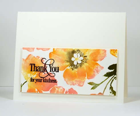
June is my last month as a member of the Dirty Dozen at Splitcoaststampers. I joined the team in January for my six month term. I have really enjoyed being part of the group and have been stretched by the monthly themes. Some of the themes saw me creating cards I would never have chosen to make otherwise which was a great exercise for me. It was also wonderful to see all the projects created by the rest of the ‘Dirty Girls‘. For the June theme I created a friendship card using the ‘poppy pattern’ background stamp. I turned a left over scrap into the card above.
As you might have gathered I love to ink my stamps with distress stains because the print I get is usually fluid and easy to blend. To stamp the panel above I used the misti and inked the stamp one stain at a time which enable the stains to blend on the paper as each colour was added. I have been enjoying pairing pinks with oranges lately, something I would never do if choosing what to wear, but a combination which I love on paper. I used a pink, a yellow and an orange stain on the flowers, one green for the leaves then added black to the flower centres once the yellow was almost dry. I don’t use my misti all the time but it is so very helpful with large background stamps which I rarely manage to stamp well the first time.
Supplies:
Stamps: Poppy Pattern, Heartfelt (PB)
Inks: Mustard Seed, Worn Lipstick, Spiced Marmalade, Peeled Paint distress stains & black soot distress marker (Ranger) Versafine Onyx Black (ImagineCrafts/Tsukineko)
Cardstock: Fabriano 100% cotton hot pressed watercolour paper
In the Garden: A Bird on a Branch
Posted: June 10, 2015 Filed under: Dancing Blooms, Winged Beauty | Tags: Penny Black creative dies, Penny Black stamps, Ranger Distress stains, Tsukineko Memento inks 8 Comments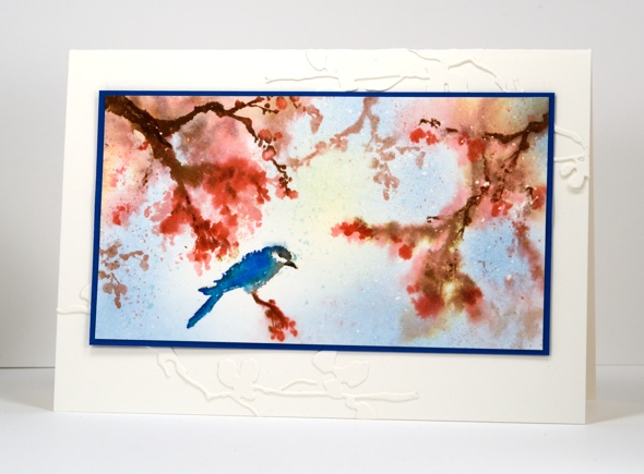
My ‘In the Garden’ mini-series continues today with even less botanical information than yesterday. I can tell you the stamp does in fact feature ‘a bird’ which I inked in blue because birds do come in blue and a branch which I inked in the fairly safe colours, pink and brown. If you are looking for accurate flora and fauna details you have come to the wrong place. I can however tell you how I created this little garden scene. The purpose of my mini-series is to show you some of the smaller floral stamps from the ‘Sunshine and Smiles’ release. Penny Black has brought out some fabulous large floral stamps this year but you can make beautiful cards with the little ones too.

The card above was made using two little slapstick cling stamps from the ‘Winged Beauty’ set. Two of the stamps have the same blossomy foliage so I used them repeatedly to fill the space adding the bird once at the end. I began with watercolour paper speckled with masking fluid. I wet the panel, inked the branches with distress stains and markers and stamped onto the panel. The colour bled out into the surrounding area. When the ink was almost dry I stamped the branches again achieving more defined results. I added the bird when the paper was dry and blended the colour on its feathers. To finish I added a few splatters and some blue and yellow sponging for the sky. I matted in blue cardstock and added a few die cut branches to the cardbase.
I finally filled our bird feeder and hung it in the back yard last week and I think the word is getting around again that there is seed to be had. Unfortunately the squirrels always end up hearing about the free food too and then it doesn’t last very long.
Previous ‘ In My Garden’ cards here and here.
Supplies:
Stamps: Winged Beauty (PB)
Creative Dies: Dancing Blooms (PB)
Inks: London Fog, Rich Cocoa, Baham Blue, Danube Blue, Tuxedo Black Memento Markers, Summer sky, Dandelion Memento ink (ImagineCrafts/Tsukineko) Festive Berries, Worn Lipstick distress stains (Ranger)
Cardstock: Fabriano 100% cotton hot pressed watercolour paper, Blue cardstock
In the Garden: Astilbe
Posted: June 9, 2015 Filed under: Floral & Feathers | Tags: Penny Black stamps, Ranger Distress stains 8 Comments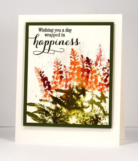
The second of my ‘in the garden’ flowers was harder to identify than the first. The stamp is a silhouette so I have to go by the shape rather than any details. It could be several plants but for the purposes of this post I am labelling it ‘Astilbe’ as seen in the photo here.
The technique for this one is smoosh, stamp, spritz and splatter with distress stains whereas yesterday’s was more controlled swipe, stamp, then paint. When using distress stains to ink a stamp you can’t guarantee an even coverage like you get with an ink pad; I like the unpredictable light and dark and the wetter and dryer areas too. You can’t see in this picture but some of the spritz was pearl-ex and water so there is a subtle gold sheen to the leaves and flowers.
Supplies:
Stamps: Floral & Feathers, Sprinkles & Smiles (PB)
Inks: Forest Moss, Ripe Persimmon, Aged Mahogany distress stains (Ranger) Versafine Onyx Black (ImagineCrafts/Tsukineko)
Cardstock: Fabriano 100% cotton hot pressed watercolour paper, Green cardstock
In the Garden: Magnolias
Posted: June 8, 2015 Filed under: Florets | Tags: Penny Black stamps, Ranger Distress stains 12 Comments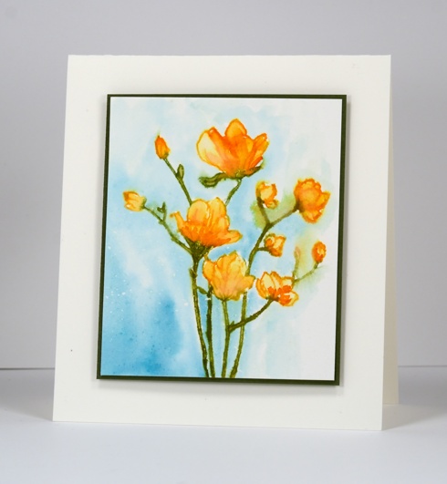
I have the first card in a mini-series of cards for you featuring smaller floral stamps. I’m starting with the branch of magnolia blooms from the ‘Florets’ transparent set. I used the technique shown in my watercolour with distress stains video tutorial where I ink the stamp directly with distress stains and markers then take advantage of the liquid nature of the stain to paint inside the petals and stems. I inked the stamp with a yellow and an orange distress stain as well as a green marker for the stems, stamped on watercolour paper then filled in all the petals with a paintbrush. When the image was almost dry I painted the blue background. I say almost because in places the stamped image bled into the background, an effect I quite like in moderation. I chose orange as my colour scheme without checking whether magnolias come in orange but apparently they do.
In my real life garden progress is being made this year primarily due to my daughter’s efforts while she is not yet working full time. She has done a ton of weeding, picked up some free plants at a plant swap and started putting some in. I have weeded then planted several herbs in hope of cooking with fresh not dried this summer. We even have a few tomatoes growing. Nothing like the garden efforts of my parents but it is something!
Supplies:
Stamps: Florets (PB)
Inks: Broken China, Spiced Marmalade, Scattered Straw distress stains & Forest Moss distress markers (Ranger)
Cardstock: Fabriano 100% cotton hot pressed watercolour paper, Green cardstock
Morning Glory
Posted: June 2, 2015 Filed under: Trumpet Song | Tags: Penny Black stamps, Ranger Distress stains 5 Comments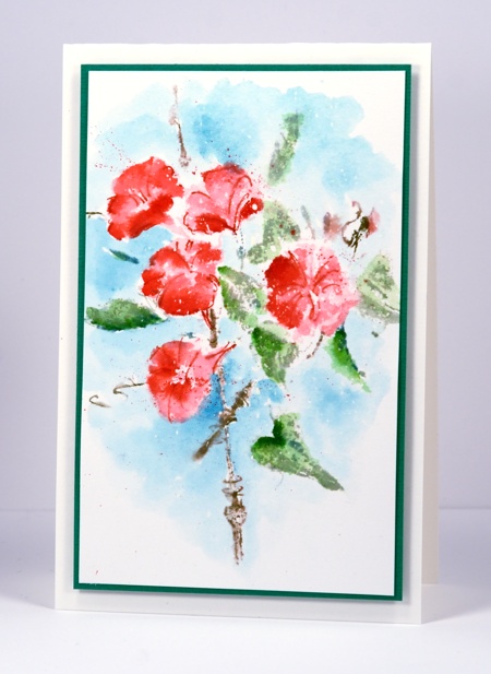
It seems like an age since I sat down and ‘played’ with stamps and ink. I pulled out the ‘Trumpet Song’ stamp to try it with distress stains. Last week’s card with the same stamp was done with Memento inks and retained more of the definition in the stamp. Using distress stains I lost some of the veins and details in the flowers and leaves so I painted some extra colour onto both then added some veins with the pen tip of the distress marker. The image was stamped on watercolour paper which had some masking fluid splatter on it (that’s what makes the tiny white dots). I painted some distress stain around the image fading it out with water at the edges.
Kathy Racoosin is doing her second 30 day Coloring Challenge during June so I hope to participate every few days at least. Although my method of colouring today is one of my favourite techniques I hope to take the challenge to use some techniques and mediums that I haven’t used in a while.

Supplies:
Stamps: Trumpet Song (PB)
Inks: Broken China, Barn Door, Worn Lipstick, Spun Sugar, Bundled Sage, Mowed Lawn distress stain, Pine Needles, Barn Door, Frayed Burlap distress markers (Ranger)
Cardstock: Fabriano 100% cotton hot pressed watercolour paper, Green textured cardstock
Also: Winsor & Newton masking fluid
Gentle Breeze
Posted: May 27, 2015 Filed under: Gentle Breeze | Tags: Penny Black stamps, Ranger Distress stains 10 Comments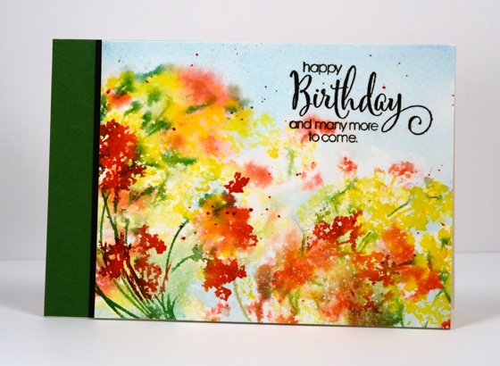
This week I am sharing projects featuring new products from the new Sunshine and Smiles collection. Today’s card features the ‘Gentle Breeze’ stamp I used with tags recently. For a change I stamped on cold pressed watercolour paper which has more texture to it. My piece of watercolour paper already had some fine splatters of masking fluid on it. I inked the stamp with distress stains, spritzed it, stamped once, spritzed again and stamped a second paler image. I then spritzed the paper which caused the colour to bleed even more into the background. When it was dry I stamped the image again creating a more defined image in the foreground. I used a marker to ink a few stems and stamped them over the blooms. When all was dry I flicked a few splatters here and there in red and green.
Supplies:
Stamps: Gentle Breeze, A Sweet Day (PB)
Inks: Festive Berries, Mustard Seed, Tumbled Glass,Evergreen Bough distress stains (Ranger) Cottage Ivy Memento Marker(Imagine Craft/Tsukineko)
Cardstock: Canson cold pressed watercolour paper, Green & Black cardstock
With love, my friend
Posted: May 22, 2015 Filed under: Delicate Florals, Watercolour | Tags: Fabriano Watercolour Paper, Kuretake Gansai Tambi watercolour paints, Penny Black stamps, Ranger Distress stains, Tsukineko Memento inks 17 Comments
I made this for a close friend of mine who unexpectedly ended up in hospital this week. I am pleased to say she should be home by now. I began by painting a background with blue and red watercolour paints which I left to dry completely. During the whole painting and and stamping process I had the panel turned vertically but when it came to make the card I preferred it in landscape orientation. I inked the brambles stamp in mustard seed distress stain, spritzed it then stamped. The flower heads of the ‘delicate florals’ stamp, I inked in barn door distress stain and the stems in memento espresso truffle marker, spritzed and stamped. The flower heads were quite watery so I let them dry and stamped again over the top to add some details. I ended up keeping the frame made by the tape placed around the panel and popping it up on a card base made from watercolour paper. I have mentioned before how the whole matchy-matchy thing is very important to me so sometimes the card base has to be exactly the same not just close which is what it would be if I used a different card stock.
Supplies:
Stamps: Delicate Florals, Gratitude, Bramble (PB)
Inks: Mustard Seed, Barn Door distress stains, Black Soot distress marker(Ranger) Expresso Truffle memento marker, Versafine Majestic Blue & Vintage Sepia (Imagine Craft/Tsukineko)
Cardstock: Fabriano 100% cotton hot pressed watercolour paper


