
Golden wildflowers
Posted: July 24, 2017 Filed under: Wildflowers Vol 2 | Tags: Brusho, Darkroom Door stamps, Ranger Distress inks, Tsukineko Versafine inks 6 Comments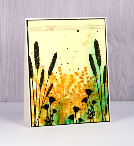
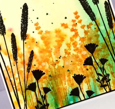
I made a bunch of cards with the Wildflowers Vol 2 set from Darkroom Door the other day. I had my distress oxide inks out and some brusho and alcohol ink backgrounds on hand to add flowers to. For this card I began with a soft brusho background of yellow and green then added distress ink flowers over the top. I spritzed after stamping to blur the images into each other.
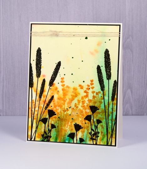
Once the coloured stamping dried I added black silhouettes to the foreground and sides to frame the panel, some dark green splatter and a black mat to finish it off.
Because the colours reminded me of a country scene I wrapped some rustic hemp twine around the panel before attaching it to a natural coloured card base.
Supplies
Stamps: Wildflowers vol 2 (Darkroom Door)
Inks: wild honey distress ink (Ranger), versafine onyx black ink (Tsukineko)
Paper: hot pressed watercolour paper (Fabriano)
Paint: yellow, leaf green brusho (Colourcraft)
Also: hemp twine
Dusk reflections
Posted: July 21, 2017 Filed under: African Trees, Stamped Landscapes | Tags: Darkroom Door stamps, Ranger Distress inks, Ranger Distress stains 18 Comments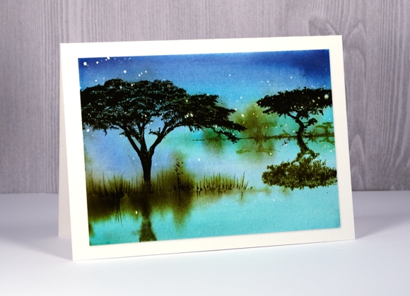
As I have said before, you can never have too many tree stamps! The African trees set from Darkroom Door not only has four lovely tree stamps but also five animals and a flock of birds. It’s a beautiful set that I am really enjoying trying with different colours and mediums. This time I wanted the feeling of dusk around the waterhole. I almost added an African deer to this scene but I had achieved the look I was after and didn’t want to risk spoiling it at the last minute (as I did with a new card yesterday. grrr)
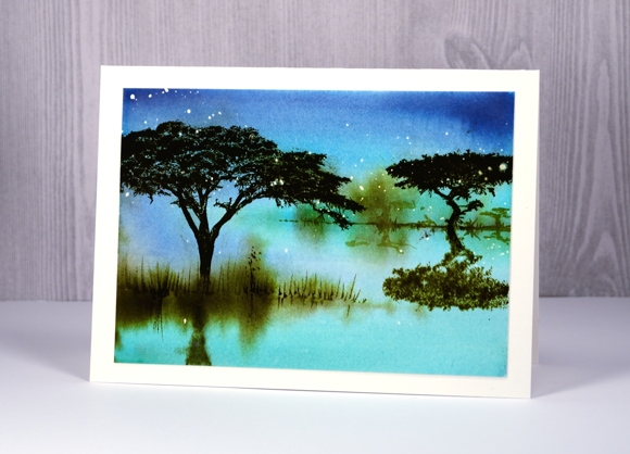
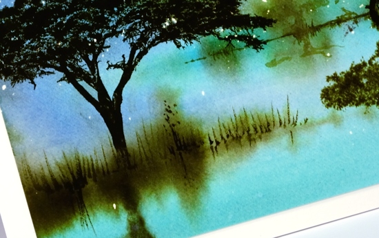
The scattering of stars was created with by splattering masking fluid on hot pressed watercolour paper before I started painting. Once it was dry I painted the sky and water in chipped sapphire, broken china and tumbled glass distress stains. I kept the panel wet so I could blend from colour to colour but dabbed up excess liquid at the sides. While the panel was still damp I painted two areas of grass with forest moss distress stain. I let the panel dry a bit more but not too much before stamping the reflections of both trees. To achieve the mirror stamped image I stamped it on a piece of acetate then pressed it onto the damp panel. When I was happy with all my soft edge images I dried the panel completely before adding the trees and grass that I wanted sharp. I used a stamp positioner to stamp the trees several times in forest moss distress ink then painted grass with a fine tipped brush.
Lastly I removed the masking fluid to reveal the little stars then mounted my panel on a piece of natural coloured cardstock.
Supplies:
Stamps: African Trees (Darkroom Door)
Inks: Distress tumbled glass, broken china, forest moss stains and inks (Ranger)
Cardstock: hot pressed watercolour paper
Also: Pebeo masking fluid
Lustrous
Posted: July 4, 2017 Filed under: Lustrous | Tags: Penny Black stamps, Ranger Distress inks, Tsukineko Versafine inks 9 Comments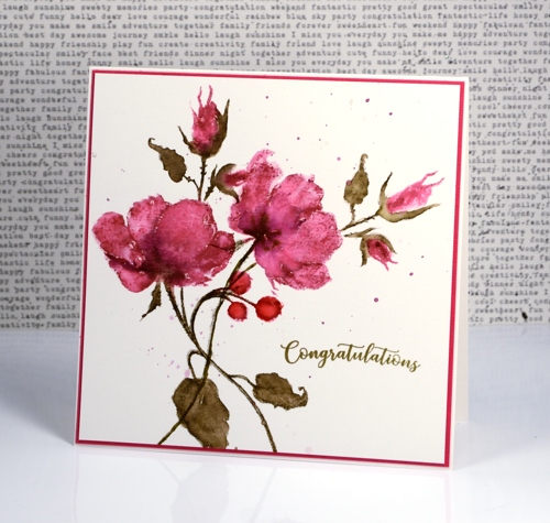
Thank you for your lovely feedback about yesterday’s flower lanterns. Today’s card features a different stamp from the Penny Black ‘Poetic’ release but a similar technique. Although I love working with distress stains, at times I go for the markers instead because I can apply colour to smaller sections with more accuracy. I used markers today beginning with a picked raspberry distress marker for the petals and buds and stamped on hot pressed watercolour paper using a stamp positioning tool. I blended the raspberry ink with water, let it dry then stamped again with raspberry but only where I wanted darker shading. To add even darker areas I painted seedless preserves distress stain directly on the roses and buds.
Once the roses were dry I switched to forest moss distress marker and inked the stems and leaves. After stamping I once again blended with water and added extra ink for definition and shading. Finally I stamped the rosehips with candied apple distress ink and blended them.
After completing one complete stamped image I decided to add more roses but this time leave out the rosehips and leaves. A stamp positioner makes this straightforward as I was able to ink only the parts I wanted to stamp and again build up my colour and shading in the same way as for the first roses.
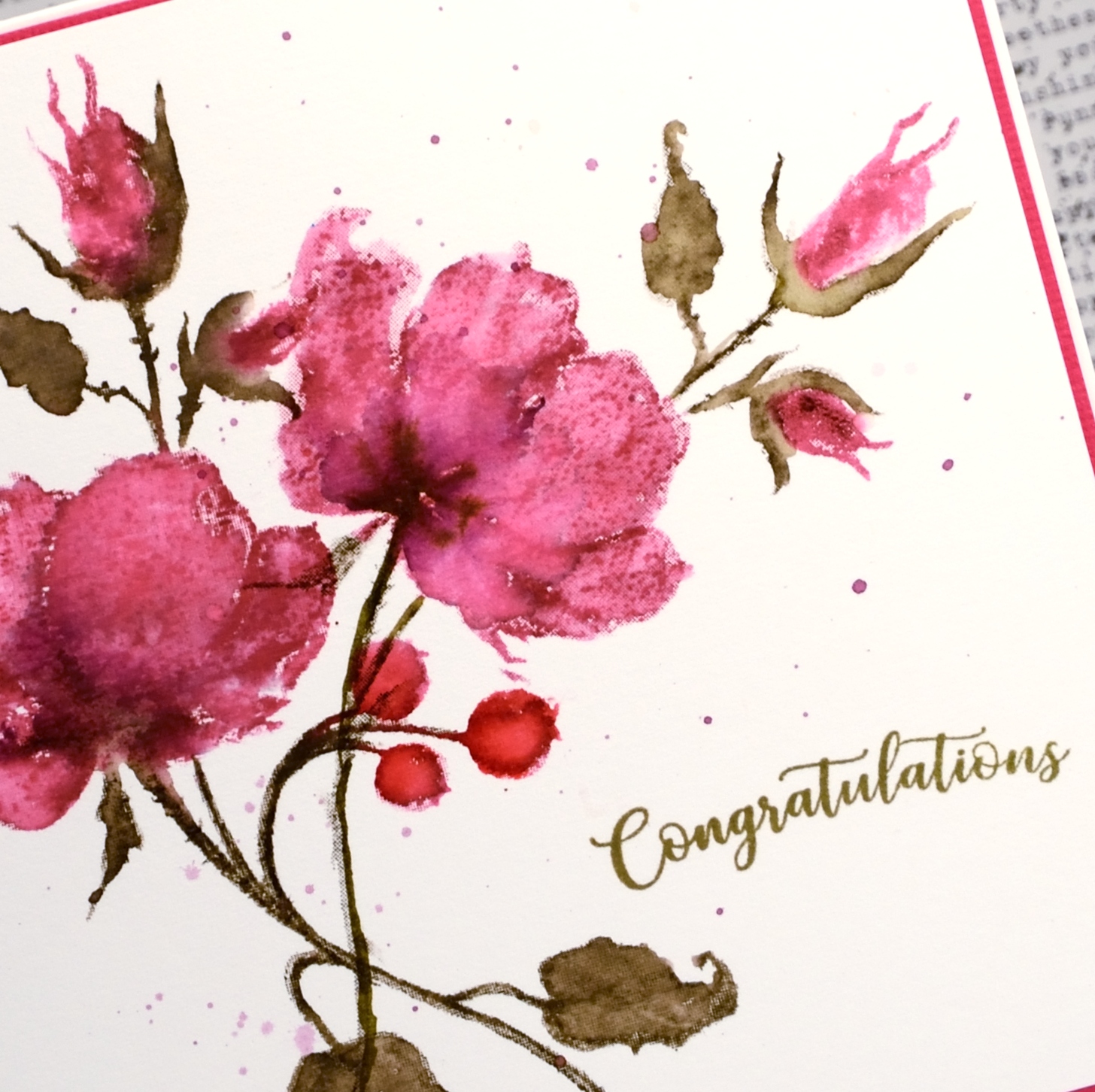
To finish the panel I splattered a mix of picked raspberry and seedless preserves ink over the panel then added a sentiment. I have mentioned before how important colour matching is to me and I wanted a forest moss coloured sentiment but I wanted to use the crisper versafine pigment ink to achieve it. Using the stamp positioner yet again I stamped congratulations in Spanish moss versafine then over the top in vintage sepia versafine and ended up with just the right shade of green.
I will be back tomorrow with some more brushstroke beauty from Penny Black’s Poetic release
Supplies
Stamps: lustrous, banner sentiments (PB)
Inks: picked raspberry, seedless preserves, forest moss, candied apple distress markers and stains (Ranger) Spanish moss & vintage sepia versafine ink (Tsukineko)
Paper: hot pressed watercolour paper, pink cardstock
Lanterns
Posted: July 3, 2017 Filed under: Flower lanterns | Tags: CAS, Fabriano Watercolour Paper, Penny Black stamps, Ranger Distress inks 8 Comments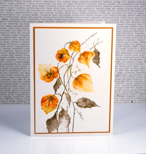
Flower lanterns is a new brushstroke stamp from Penny Black. I happen to have some dried flower lanterns in my craft room so I was able to keep my colours fairly accurate on this one. I love how delicate they look and enjoy the fact that most of my dried ones have kept their shape and colour for a few years now.
I painted these with the help of a stamp positioner to enable me to build up colour one step at a time. I started by stamping the flower heads in wild honey distress ink applied with a marker. This gave me a pale print of all the lanterns as a base for stamping and painting more colour. I continued to use distress markers to add spiced marmalade and rusty hinge ink. I stamped sections then blended with a damp brush slowly but surely adding colour until the lanterns took form. I switched to forest moss distress marker for the stems and leaves and also drew some veins onto the lanterns.
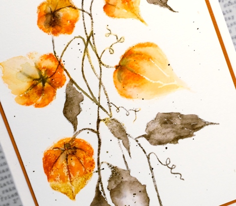
I finished with some splatter of forest moss ink over the panel and a rust coloured mat to frame it.
Supplies
Stamp: flower lantern
Inks: wild honey, spiced marmalade, rusty hinge, forest moss distress markers
Paper: hot pressed watercolour paper, rust cardstock
Full of glee
Posted: April 17, 2017 Filed under: full of glee | Tags: Penny Black stamps, Ranger Distress inks, Ranger Distress stains, Tsukineko Versafine inks 6 Comments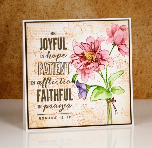
There is a lovely new batch of stamps and dies available from Penny Black; you can check out the catalogue here. My card today features a couple of the new stamps, full of glee and a scripture verse from the hope shines set.
I used my stamp positioner to stamp the ‘full of glee’ image on hot pressed watercolour paper. I started by inking only the pink petals with a Victorian velvet distress stain. I stamped that much, cleaned off the stain and inked the smaller flower in dusty concord, stamped, cleaned and moved onto the leaves and stems in peeled paint stain. Once the whole image was stamped I used a small watercolour brush and water to blend colour from the stamped image into the petals and leaves to fill them. If there was not enough colour I added some stain with the paint brush.
I let all the painting dry before adding scattered straw stain to the centre of the flower. To create the background I inked the full of glee stamp with tea dye distress ink and pressed it down randomly around the image then did the same with the text stamp from the footnotes set. I blended some of the ink with a damp paintbrush and added some splatter as well.
I finished the panel off with the sentiment stamped in versafine vintage sepia ink. I often switch to versafine ink when doing my sentiments as it is a pigment ink which gives a nice sharp print and sits on the paper rather than sinking into it as dye inks tend to do. I matted the panel and attached it to a natural coloured card base.
Supplies
Stamps: full of glee, hope shines, footnotes
Inks: scattered straw, peeled paint, Victorian velvet, dusty concord distress stains, tea dye distress ink (Ranger) versafine vintage sepia (Tsukineko)
Paper: hot pressed watercolour paper, brown cardstock
Pop out roses
Posted: April 11, 2017 Filed under: Pop out rose, Script | Tags: Brusho, Penny Black creative dies, Penny Black stamps, Ranger Distress inks 4 Comments
I’m a guest over at The Foiled Fox today sharing these die cut roses. This really was an easy card to make because the ‘pop out rose‘ die creates the lovely petals and brusho powders create the pretty colours. I used three different red brusho powders on watercolour paper and some leaf green brusho for the leaves. While the paper was still damp I sprinkled some salt over the panel to get subtle patterns.
The partial cuts in the roses make it possible to lift petals so I folded some up and kept others glued down when I attached the roses to the background panel. To make the background panel I stamped the ‘script’ stamp from Penny Black on cold pressed watercolour paper in tea dye distress ink then painted over the top with water. The result is a softly blurred background with splatters of ink to add to the aged look. Pop over to the Foiled Fox blog for more details and to see the products I have used on this card.
Thank you to the wonderful Foiled Fox team for having me back again; it’s always a pleasure.
Cherish
Posted: March 29, 2017 Filed under: Delicate silhouettes, first blush | Tags: Penny Black creative dies, Penny Black stamps, Ranger Distress inks, Ranger Distress stains 23 Comments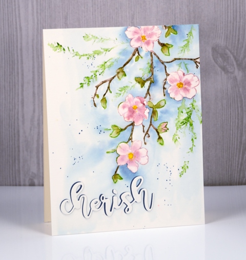
I have featured this stamp on cards a couple of times already but it is going to be one of those stamps that I reach for again and again. The flowers are perfect for a range of colouring techniques but pretty as an outline as well and the way the branch reaches across the panel is just so lovely.
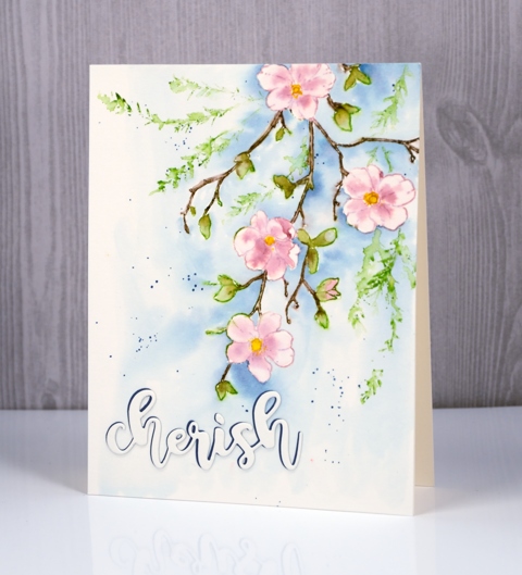
I pulled out some distress products for this design and the stamp positioner so I could build it up colour by colour. I started by stamping the flowers in Victorian velvet distress stain, then the leaves with peeled paint distress stains and finally the stems with gathered twigs distress marker. Once the design was all stamped I blended colour into the petals, some I was able to pull in from the outline stamping, but if it was too pale I picked up some stain on my brush and added it. I did the same with the leaves and used a very fine brush to paint over the stamped stems and twigs. I let everything dry thoroughly before painting the background in faded jeans distress stain ( I think ). I also splattered a little blue stain around the flowers.
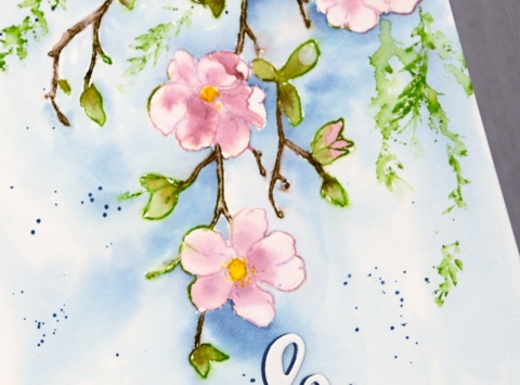
I wanted a little more foliage around the branch so I inked the leafy spray from ‘delicate silhouettes’ set in mowed lawn and pressed it around the spray then softened the stamping with a wet brush. I was in two minds whether to add a sentiment or not; I’m still not sure if I should have. But to keep it subtle I added it in the same watercolour paper with just a shadow of dark blue peeping out the side. If you have blossoms where you are I’m sure you are enjoying them; mine will appear eventually, I know!
Supplies
Stamps: delicate silhouettes, first blush
Inks: Victorian velvet, mowed lawn, peeled paint, mustard seed, faded jeans distress stains, gathered twigs distress marker
Die: forever friends
Paper: hot pressed watercolour paper (Fabriano), blue cardstock
Simple Pleasures
Posted: March 9, 2017 Filed under: first blush | Tags: Penny Black stamps, Ranger Distress inks 4 Comments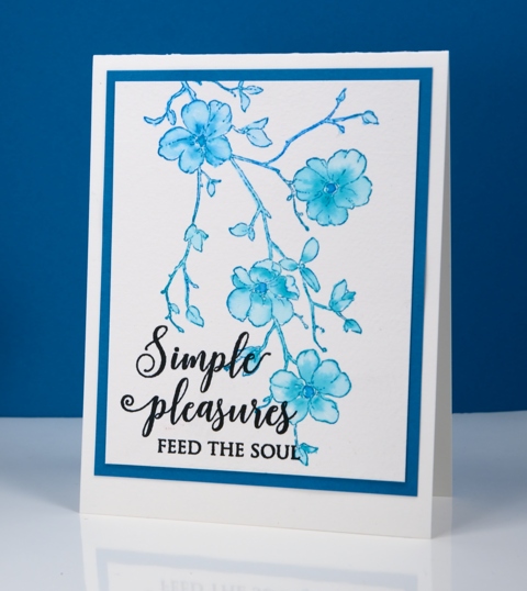
I’m back with a simpler take on the ‘first blush’ stamp. Sunday’s card incorporated masking and several colours, this one is the single stamped image inked and painted in two inks. I started with different inks at opposite ends of the stamp but once I started blending colour I decided to blend the blue and green over the whole image. I inked the stamp with peacock feather and salty ocean distress inks then painted inside the outline with water and a little additional distress stain. I have received a few questions recently asking why I use stain instead of ink. Painting with stain is like painting with liquid watercolour paints, the stains blend well with each other and with water. The ink refills are more concentrated and would need diluting before being used as paint. I often stamp with stain and blend the stamped image on the watercolour paper. I have a video showing the technique here
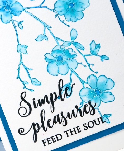
I found some co-ordinating cardstock to frame the panel and added a black sentiment.
Supplies:
Stamps: first blush, happy wishes (PB)
Cardstock: cold pressed watercolour paper, teal cardstock
Ink: versafine onyx black ink (Tsukineko) salty ocean, peacock feather distress inks (Ranger)
Love never gives up
Posted: March 8, 2017 Filed under: Garden Charmers | Tags: Penny Black stamps, Ranger Distress inks, Ranger Distress stains 4 Comments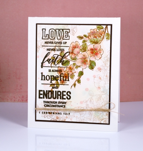
I`m happy to have some more colouring to share and another new PB stamp. I haven`t managed daily colouring for Kathy Racoosin’s 30day colouring challenge but I am enjoying it whenever I get the chance.
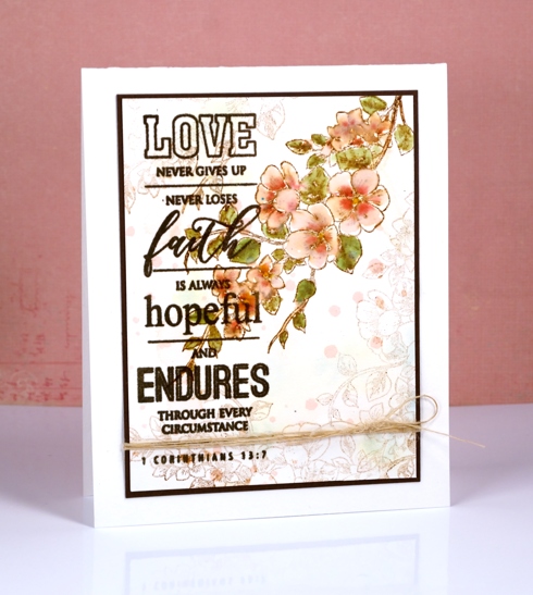
To begin this panel I splattered spun sugar and old paper distress stains over a piece of hot pressed watercolour paper, spritzed it, then dried it. Next I flicked droplets of spun sugar distress stain over the panel and dried them. I was after a vintage, slightly stained look. I used vintage photo distress ink to stamp the branch from the ‘garden charmers set’ then painted the flowers and leaves with the distress stains listed below. The vintage photo ink mixed with the pink and green stains to make it look aged. I then stamped the branch again but with second generation stamping to get paler images around the painted one. Finally I stamped and embossed the 1 Corinthians verse from the ‘All Great Things’ set.
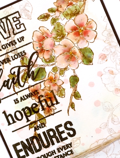
I finished the card with a dark brown mat and a piece of French hemp twine from the 1800’s!
Supplies:
Stamps: Garden Charmers, All Great Things(PB)
Inks: vintage photo distress ink, spun sugar, old paper & worn lipstick distress stains (Ranger) vintage sepia versafine ink (Tsukineko)
Cardstock: Hot pressed Fabriano watercolour paper, Olive Green cardstock
Also: clear embossing powder, vintage hemp twine
CAS watercolour challenge: Spring
Posted: March 2, 2017 Filed under: CAS, First waltz | Tags: CAS, Penny Black stamps, Ranger Distress inks 13 Comments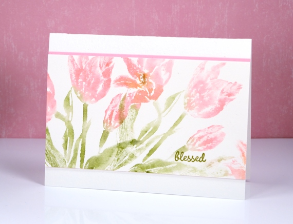
Back in January I was honoured to be ‘top pick’ of the CAS watercolour challenge. Today I am excited to be back as a guest designer for their March challenge.
Apparently spring has sprung in some places! I don’t expect to see tulips for a couple more months but that didn’t stop me from using the new ‘first waltz’ stamp from Penny Black to create my CAS project for the challenge.
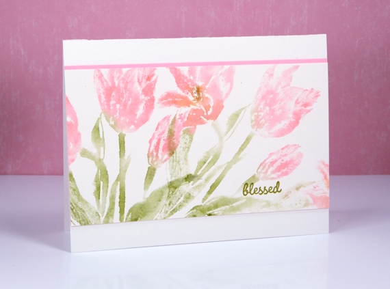
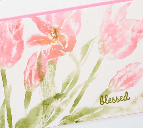
This tulip panel was created at the end of a morning of experiments. I wasn’t particularly happy with any of them but before I moved on to a different stamp I tried again with some second and third generation stamping and came up with these soft pink impressions. I inked my stamp with distress markers then stamped it on a piece of paper. Without reinking I spritzed the stamp and pressed it onto a hot pressed watercolour panel, again without reinking I spritzed and stamped again. The spritz of water was enough to dampen the ink remaining on the stamp and create a soft watery image. I did keep the original ‘first generation’ stamped image so that might turn up on the blog another day.
Make sure you check out the CAS Watercolour design team ‘Spring’ cards and you have 24 days to add one yourself
Supplies:
Stamps: First Waltz, Spiritual Snippets(PB)
Inks: worn lipstick, spiced marmalade, peeled paint, ground espresso distress markers (Ranger) versafine Spanish Moss (Tsukineko)
Cardstock: neenah natural white cardstock, fabriano hot pressed watercolour paper


