
Layouts and sketches
Posted: May 6, 2016 Filed under: Alcohol Ink, CAS, Dies | Tags: CAS, Penny Black creative dies, Penny Black stamps, Ranger Alcohol Ink 7 Comments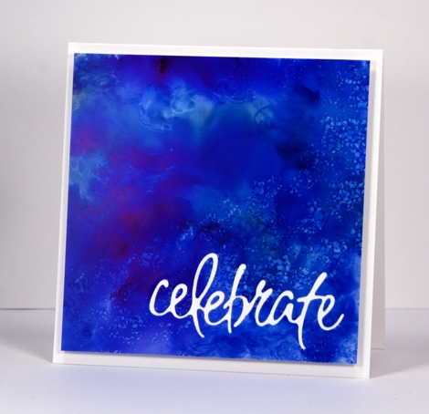
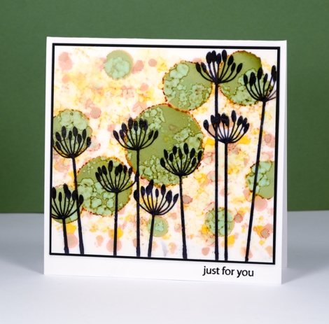
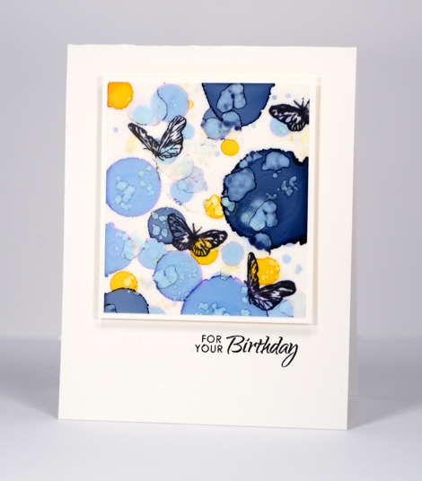
Recently I noticed how often my card designs involve a simple square or rectangle. Sometimes the panel is matted in black or a co-ordinating colour; other times it is popped up on the card base which creates a type of shadow mat. A matted panel with little embellishment is my most used layout. I’m not saying there is anything wrong with the matted panel approach; I often try to create a mini painting so framing it seems like an appropriate way to turn it into a card. However, there are many clever card makers who never default to the square or rectangular layout; each new card features angles, diagonal lines, curves, cutouts and all manner of creative designs. I’ve decided I need to mix things up a little in the sketch and layout area. Take the card above for example, the alcohol ink design reminded me of the ocean from beneath the surface with light above and bubbles all around. I really didn’t want to loose much of the blue pattern so I cut the sentiment out of the blue panel and popped it up. I like how it turned out but it was very much my usual style.
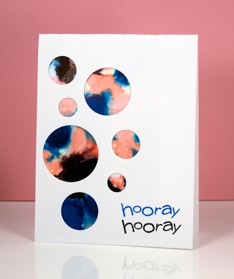
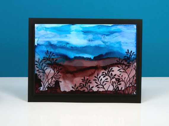
When I put this next card together I was working with a similar panel; the alcohol inks had done cool things creating a pattern I wanted to save if possible but not in yet another rectangular layout. By cutting a curve across the patterned yupo panel I was able to add some interest and bend a transparent sentiment stamp to hug the curve.

Once again I wanted to retain most of this warm toned alcohol ink design so I chose a cool new border die with curves that created a contrast with the angles of the stenciled pattern.
I have a board on pinterest where I am saving inspiration for new layouts. The card above was inspired by Paula Dobson’s bright happy card, pinned recently. Sketch challenges are another source of inspiration I hope to make use of more often. You may have noticed all the cards in this post were made from patterned panels, which of course, are easier to adapt to interesting layouts than pictures of real things! I may get adventurous and creative with my scenic or floral panels too, who knows?
Supplies:
Dies: Celebrations, Border Edges (PB)
Stamps: Happy Snippets, Sweet Wishes
Ink: Alcohol inks (Ranger) Versafine inks (Tsukineko)
Paper: Yupo paper, Neenah SolarWhite 110lb cardstock, Neenah Natural white cardstock
You’re Sweet
Posted: May 3, 2016 Filed under: Alcohol Ink, CAS, Dies | Tags: CAS, Penny Black creative dies, Ranger Alcohol Ink 5 Comments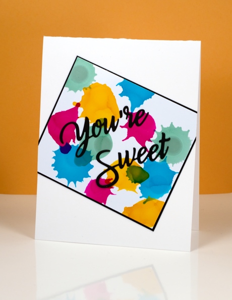
Earlier today I was admiring yet another fabulous card by Ardyth Percy-Robb, who is not only clever and creative, but also a faithful challenge participant. The card that caught my eye was for the May Pinterest Inspired Challenge featuring the image below:
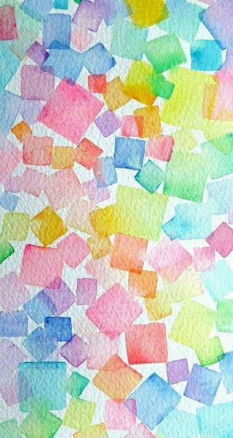
Even though I love watercolour and the image above is full of lovely soft blends and bleeds I chose to use my recent arty crush, alcohol inks. I dropped sunshine yellow, pool, raspberry and juniper one colour at a time so I could squirt air at each drop before it dried. You can see how some inks create a new colour when they intersect but others cover or push the other colour. I matted in black and attached my panel to the card base askew before adding a die cut sentiment.
Supplies:
Die: You’re Sweet (PB)
Alcohol Ink: sunshine yellow, pool, raspberry, juniper (Ranger)
Paper: Kirkland photo paper, Neenah SolarWhite 110lb cardstock, Neenah epic black cardstock
Land and sea
Posted: April 30, 2016 Filed under: Alcohol Ink, Twirls | Tags: Penny Black stamps, Ranger Alcohol Ink, Yupo Paper 11 Comments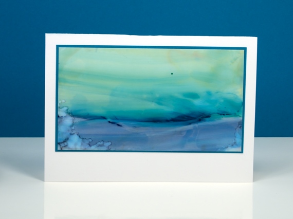
One of the techniques we been trying in my current alcohol inks class is the ‘landscape’ technique. I don’t think I could give you clear instruction on how I did these two scenes because it is still a lot of trial and error for me. The scene above involved some swiping the inks once they were on the yupo paper to get the horizontal sweeps of colour.
This one above features more lines of ink. When you lay down some ink then add some more beside it the second lot of ink pushes away first often creating a dark thick edge. These can end up looking like hills. Adding blending fluid into the ink you already have on your yupo washes it out somewhat creating paler areas. I am addicted to creating with alcohol inks right now so I will analyse my techniques a little more so my instructions might be clearer (and yes, I will try and make a video).
Believe it or not there is a video coming next week. I also noted the requests for videos on the roses and terraced lane cards. I’ll keep those in mind because I do appreciate my readers and their endless patience in waiting for video tutorials!
Supplies:
Stamps: Twirls (PB)
Alcohol Ink: stream, pool, stonewashed, currant, alcohol blending solution (Ranger) Jet Black archival ink
Paper: yupo paper, Neenah SolarWhite 110lb cardstock, Neenah Epic black 100lb cardstock
Out to Sea
Posted: April 27, 2016 Filed under: Alcohol Ink, CAS, Out to sea | Tags: CAS, Penny Black creative dies, Ranger Alcohol Ink 15 Comments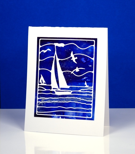
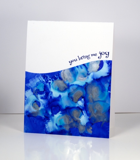
Is this not a stunning new die? I thought it was perfect to lay over my bright blue alcohol ink panel. Blue panels are the most challenging for me to photograph accurately. In real life there is more purple and the light blues are lighter. The speckled bits that conveniently look a bit like ocean spray or foam are silver accents. I created the panel by dropping some blue alcohol inks on yupo paper and blending. I added some silver alcohol ink and moved it around with extra blue ink and blending solution; the metallic inks don’t move much until another ink is added to them.
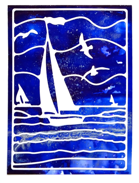
This die is also going to be beautiful over a watercoloured panel. If I am feeling patient and steady I might do the inlaid die technique but it really doesn’t need it; the overlay approach works just fine.
Supplies:
Die: Out to Sea(PB)
Alcohol Ink: denim, indigo, silver, alcohol blending solution (Ranger)
Paper: yupo paper, Neenah SolarWhite 110lb cardstock
Irises and blue
Posted: April 24, 2016 Filed under: Alcohol Ink, CAS, Love Art | Tags: CAS, Penny Black stamps, Ranger Alcohol Ink 13 Comments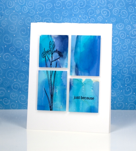
I am enjoying teaching a batch of Alcohol Ink classes at present and we have been having so much fun. The depth and impact of alcohol ink colour is quite something. I chose to use these two similar colour panels as background for iris stamps from the Love Art transparent set.
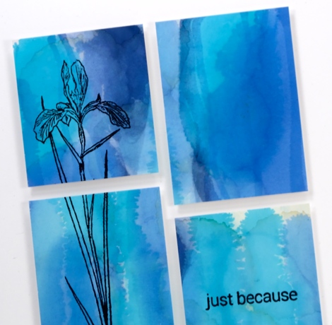
I blended a few blue alcohol inks on photo paper for these two panels. The circle pattern on the one below was achieved using a stencil. I dabbed through the stencil with blending solution to remove colour but also printed the stencil back onto the paper once it was covered in pale blue ink.
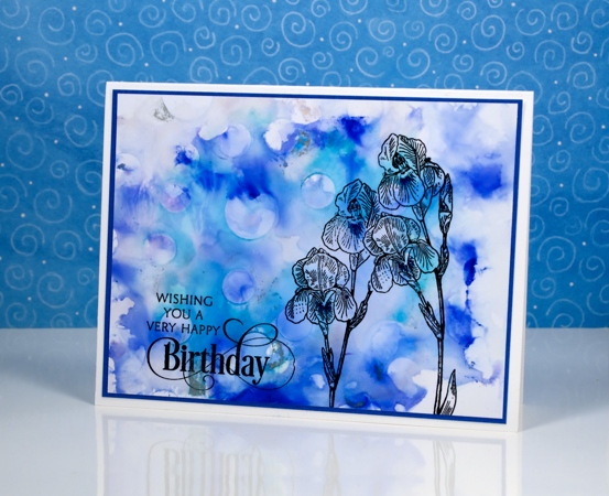
The sentiments and flowers are stamped in jet black archival ink.

I am just going to squeak this stencilled card into the second challenge at CAS Mix Up; there are twelve whole hours left to participate. The challenge this month is below; I used alcohol inks as my choice.

Supplies:
Stamps: Love Art, Special Thoughts, Snippets(PB)
Inks: Jet Black Archival (Ranger)
Alcohol Ink: pool, denim, indigo, alcohol blending solution (Ranger)
Paper: Kirkland photo paper, Neenah SolarWhite 110lb cardstock, Blue cardstock
Happy
Posted: March 17, 2016 Filed under: Alcohol Ink, CAS | Tags: CAS, Penny Black stamps, Ranger Alcohol Ink 15 Comments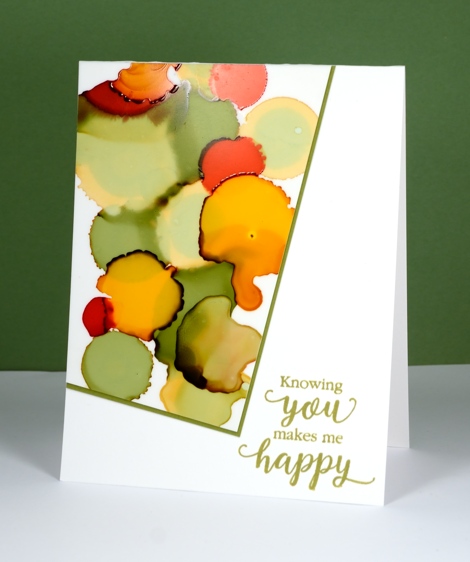
This new sentiment has appeared on a few of my cards already and will likely continue to do so. It is such a nice message and one I should send more often. This is one of my first alcohol ink experiments. I was just playing with the inks and ended up with an odd shape which did not immediately inspire me until I remembered this layout which is no doubt familiar to you; it is always popping up around the interwebs. I have been wanting to use if ever since I first saw it. I don’t know who first came up with the clever offset panel but I hope they feel proud whenever they see it on a card!
The inks I used were willow, pesto, poppyfield and honeycomb along with the blending fluid which lightened some of the colours. You can see both the pale and dark auras which appear around some of the inks. I am still using yupo paper for my creating, mainly because that is what I have and it works beautifully. I will get some glossy and photo paper to try out at some point. I have tried some doodling with my micron pens but nothing share-worthy yet.
Supplies:
Stamps: Sentiment Collection(PB)
Inks: Versafine Spanish Moss (Tsukineko)
Alcohol Ink: willow, pesto, poppyfield and honeycomb, alcohol blending solution (Ranger)
Paper: Yupo, Neenah Avon Brilliant White 110lb cardstock, green cardstock
Well Done
Posted: March 10, 2016 Filed under: Alcohol Ink | Tags: Penny Black creative dies, Ranger Alcohol Ink 9 Comments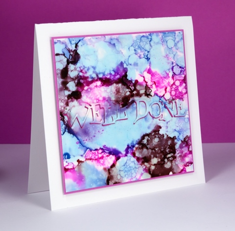
I am flitting back and forth between poppies and alcohol inks at present; I hope you don’t mind. Jane Clempson is continuing to create inspiring alcohol ink projects over on her blog so I have a list of techniques yet to try.
This one started out the same way many of my panels have with me dropping three colours randomly over the whole surface of the yupo paper. Once the colours settled and stopped jostling each other I started dropping blending solution here, there and everywhere. It made some pretty patterns but nothing I hadn’t tried before so I switched to splattering blending fluid over the panel with an old paintbrush. The droplets were smaller and more numerous and achieved the bubbly look you see here.
I was inspired to position my sentiment front and centre after seeing this card by Jane. I die cut the sentiment from both the patterned panel and a piece of pink fun foam (both with stick-it adhesive on the back) so I could position the fun foam in the space left by the die cut and then the inked die cut back on top of the fun foam. Looks simple described in print but in reality it drove me crazy working those fiddly little words into the fiddly little spaces with a fiddly little pair of tweezers! Cute effect though, don’t you think?
Supplies:
Dies: Well Done (PB)
Alcohol Ink: Stonewashed, Raspberry, Raisin & alcohol blending solution (Ranger)
Paper: Yupo, Neenah Solar White 110lb cardstock, Pink cardstock
Also: stick it adhesive, fun foam
You Rock
Posted: March 8, 2016 Filed under: Alcohol Ink | Tags: Penny Black creative dies, Ranger Alcohol Ink 7 Comments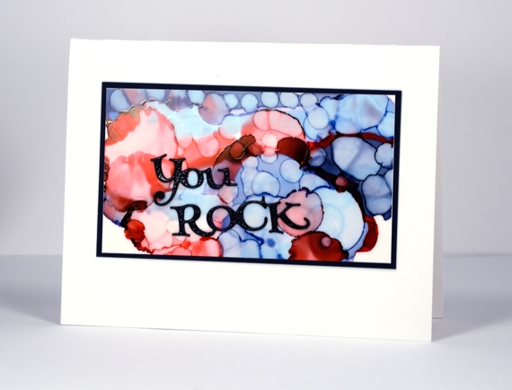
Oh these alcohol inks are so much fun! During an experimental session the other day I discovered I could blend over the top of a panel I did not like with blending solution which would not remove all the colour but would make it a soft blended background on which I could start a new design. The possibilities are seemingly endless.
This panel was done in two steps. I began by dropping two blues and a red on the yupo paper to create large circles. When the big circles had stopped mingling I used a Q-tip and some blending solution to add little circles over the top of it all. The finished effect reminds me of bokeh.
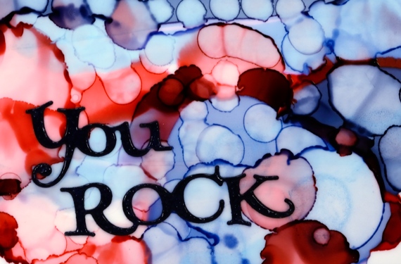
Although they might look black, the die cut sentiment and the mat are actually navy blue and the sentiment is embossed in clear powder to give it a glossy finish. I wouldn’t say I have settled on a favourite but I am liking these blues.
Supplies:
Dies: Well Done (PB)
Alcohol Ink: Denim, Stonewashed, Poppyfield, alcohol blending solution (Ranger)
Paper: Yupo, Neenah Solar White 110lb cardstock, Neenah patriot blue 100lb cardstock
Standing Ovation
Posted: March 7, 2016 Filed under: Alcohol Ink, Standing Ovation | Tags: Penny Black stamps, Ranger Alcohol Ink 13 Comments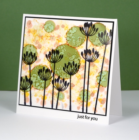
More alcohol ink fun to share today. The technique is similar to the one I shared last week but I mixed up the order a little on this one. You can see I have some pale colours in the background and bolder green circles in the foreground. I created the muted background first but putting a few drops of yellow and rust coloured alcohol ink on a felt applicator then dotting it all over the yupo panel. I then dropped the green ink to make larger circles; the green has a brown aura which matched nicely with my background. Once the green had stopped expanding I put some blending solution on a felt applicator and applied it all over the panel. The blending solution muted the background and created the cool blobby patterns on the green circles (you know, the ones that look like cells under a microscope!)
At this point I thought it looked a bit like a mass of flowers in a garden so I used the new ‘Standing Ovation’ stamp to add black silhouette images to the foreground. I matted in black and added a little sentiment on the white card base.
Supplies:
Stamps: Standing Ovation, Snippets (PB)
Inks: Archival jet black ink (Ranger) Versafine Onyx Black (Tsukineko)
Alcohol Ink: Rust, Willow, Honeycomb, alcohol blending solution (Ranger)
Paper: Yupo, Neenah Avon Brilliant White 110lb cardstock, Neenah epic black 100lb cardstock
Under the microscope
Posted: March 3, 2016 Filed under: Alcohol Ink, Flower Festival, Sunny Wishes | Tags: Penny Black stamps, Ranger Alcohol Ink, Yupo Paper 12 Comments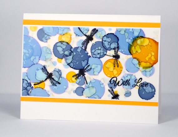
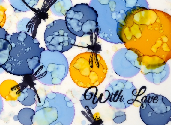
I have a new medium to play with and it is so much fun! I have been impressed by alcohol ink projects in the past but Jane Clempson has recently posted a wealth of wonderful inspiration on her blog so last time I was at Crop A While I picked up a few colours to get me started. Oh dear, Jane, I may need all the colours!
I created this pattern with two blues and a yellow then had fun adding all the little blots with blending solution. Once it was finished it looked a little like a microscope slide of a rare tropical disease! Add the dragonflies and I am wondering whether flies and disease is really something I want to feature on a card?? What do you think; does it say pretty patterns or tropical disease to you?
Microscopes aside, I like the colour mix, the pattern of blurry blots and just watching the magic happen. I have half a dozen more ‘experiments’ waiting to be turned into cards so stay tuned for more dots, blots, squirts and squiggles.
Supplies:
Stamps: Sunny Wishes, Flower Festival, Special Wishes (PB)
Inks: Archival jet black ink(Ranger)
Alcohol Ink: Denim, Stonewashed, Honeycomb, alcohol blending solution (Ranger)
Paper: Yupo, Neenah Avon Brilliant White 110lb cardstock, yellow cardstock


