
A Grevillea Challenge
Posted: September 5, 2018 Filed under: grevilleas | Tags: Darkroom Door stamps, Ranger Distress inks, Tsukineko Memento inks 17 Comments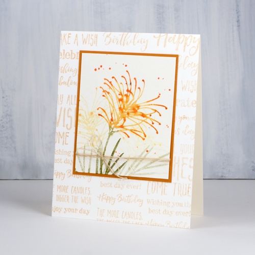
My father lives not too far from Darkroom Door in NSW, Australia. When I knew he was coming to visit this summer I asked him to pick up some new stamps and bring them over. Not only did he bring what I’d ordered he also studied the stamps and came up with a challenge for me. I completed the challenge a while ago but the busyness of our summer has meant that I am only now getting this post written. Below you will see my dad’s words then I will wrap up at the end.
The Grevillea is a beautiful Australian Native Plant found across the continent and popular in many home gardens. There are many varieties from low ground hugging varieties to shrubs both small and large, sparse and thick. Their flowers are both small, individual and delicate as well as thickly clustered with the appearance of large flower heads. The bright colour of their flowers covers most of the spectrum, attracting many birds, particularly colourful parrots and lorikeets seeking nectar from their flowers and camouflage protection amongst their leaves and branches They tolerate hot seasons, have low water needs in comparison to many plants and have an extended floral season. They are very popular in home gardens as well as parks and their native bushland settings. The grevillea is frequently portrayed on Australian greeting cards and seems to be popular in all seasons. The beautiful range of colour and form seems to relate to a range of sentiments for both personal and seasonal occasions.
The sentiment stamps from Darkroom Door demonstrate that a message, be it seasonal or personal, happy or sad, celebrating or apologizing, or much more, can be expressed in a great variety of ways.
My suggestion to Heather, or was it a stampers’ challenge, was that, before she cuts either of the new stamps into individual stamps, she design a card using at least two of the grevillea images and at least half the sentiment expressions from one of her new stamps. She has agreed to the suggestion and I am confident she will rise to the challenge. What follows is Heather’s response to her dad and her explanatory notes for you, her fellow stampers.
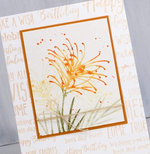
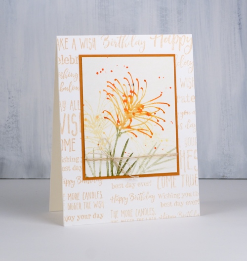
For this first card I based my colour choices on the grevillea juniperina sulphurea . I used distress inks and markers to ink first the flowers then the tips in scattered straw, wild honey and spiced marmalade. I stamped the main image and, without re-inking, stamped pale images behind. The leaves and stem are stamped in peeled paint, again first and second generation stamping. As stated in the challenge I kept the sentiment stamps together (they still are) and stamped the strip three times across the card base in memento desert sand ink. To finish I splattered some spiced marmalade stain, matted with a mustard cardstock and added some linen twine.
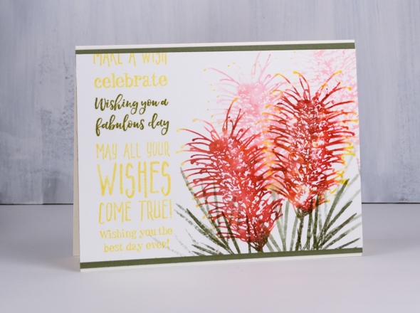
The colour scheme for this second grevillea card is based on the grevillea superb. This time I aimed to keep the tips of the petals yellow while the rest was red. I inked the whole flower in love letter and rhubarb stalk ink to fill the centre of the flowers with colour. Then, to preserve the tips I wiped ink off the ends of the petals and stamped. To finish the flower I added dandelion ink to the tips of the petals and stamped again. To get background images I spritzed the stamp and got a second generation image behind. For this one the leaves and stems were stamped in memento olive grove ink.
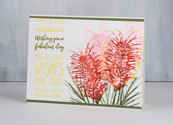
To make one sentiment stand out from the strip I first stamped the whole strip in dandelion ink then placed tape either side of the target words on the panel. I inked again with olive grove ink on the smaller section and stamped over the yellow.
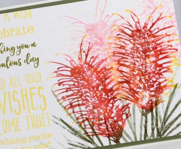
I chose an olive cardstock to frame the panel and finish the card.
I hope you enjoyed my response to my dad’s challenge. If you have kept stamps together for projects rather than separate them I would love to hear about or see your designs. I am also interested to see more colour schemes for the grevilleas. I’ve taken inspiration from a few different grevillea so far and have another couple of approaches to share later in the week!
Supplies
Stamps: grevilleas, happy birthday (DD)


Card 1 Inks: scattered straw, peeled paint, wild honey, spiced marmalade distress inks & markers, desert sand memento ink


Card 2 Inks: dandelion, love letter, rhubarb stalk, olive grove memento inks & markers


Paper: hot pressed watercolour paper, neenah natural white cardstock, green cardstock, mustard cardstock


Also: stamping platform, linen twine

Mesh stencil butterflies
Posted: September 3, 2018 Filed under: Butterflies, mesh | Tags: Darkroom Door stamps, Nuvo embellishment mousse, Ranger Distress inks, Ranger Distress stains 6 Comments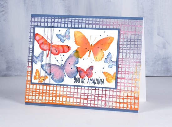
There is plenty of texture on today’s card, more than most of my projects. The pretty shimmer which is only just apparent in the photos is from Nuvo pure platinum embellishment mousse. I pressed it through the Darkroom Door mesh stencil onto watercolour paper. Once the mousse had dried I added distress stains over the mousse. It soaked into the paper but was easily polished off the mousse.
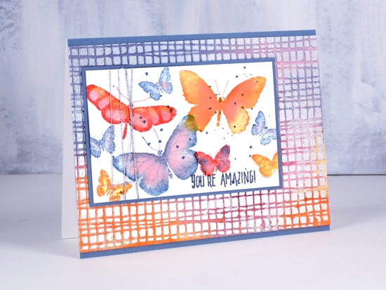
To create the butterfly panel I stamped with the same colour inks as previously used stains. After stamping the butterflies in one colour I blended with water and added drops of another colour to make them all all two tone. You can also see some dots of blue because I love a little splatter here and there.
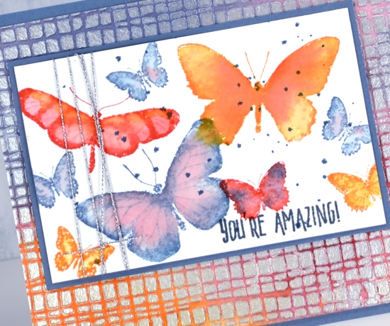
I completed the card with a sentiment, some silver cord and co-ordinating blue mats.
Supplies
Stamps: Butterflies, Thank you

Stencil: Small stencil mesh (DD)

Inks: spiced marmalade, festive berries, stormy sky distress inks


Stains: spiced marmalade, festive berries, stormy sky distress stains


Also: nuvo embellishment mousse, silver cord

Watercolour pencil cacti
Posted: August 30, 2018 Filed under: Happy together, Watercolour | Tags: Faber-Castell Albrecht Durer Watercolour pencils, Penny Black stamps, Ranger Distress inks 12 Comments
I’ve worked with this stamp before, last time with bister powder to colour it. It took longer with watercolour pencils but the process was quite relaxing. I used my tried and true Albrecht Dürer watercolour pencils from Faber Castell and limited my choices to light green, dark green, light blue, purple and brown.
I stamped the image from the PB ‘happy together’ set in crushed olive distress ink then used a paint brush with my watercolour pencils to add colour. I painted shadows in a mix of brown and purple then matted with some purple cardstock.
Now, help me out here, what is the right occasion for sending a cacti card??
Supplies
Stamps: happy together

Paper: hot pressed watercolour, neenah natural white, purple
Inks: crushed olive distress ink
,
Also: Albrecht Dürer watercolour pencils
Across town
Posted: August 28, 2018 Filed under: City stacks, City Stacks dies, Coloured pencil | Tags: Concord & 9th, Faber-Castell Polychromos Colour Pencil 5 Comments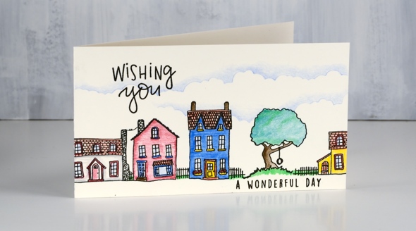
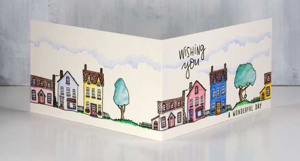
These little houses and trees came from the Concord & 9th ‘City Stacks’ set. I love the possibilities with this set. You can stamp a simple single house or a detailed layered scene. I decided to line my images in one long line extending across the front and back of the my card.
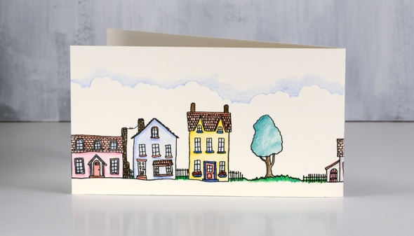
I stamped in versafine clair nocturne ink and did all my colouring with polychromos pencils. I used the co-ordinating dies to create masks to make the stamping easier when tucking those trees in amongst the houses. I also die-cut a cloud edge from cardstock as a guide for my pale blue pencil coloured clouds. I have a class coming up in September where we will be watercolouring these cute stamps to create some city scenes. Check it out on my Upcoming classes page.
Supplies
Stamps: City Stacks (Concord & 9th)

Dies: City Stacks die set (Concord & 9th)

Paper: hot pressed watercolour paper, masking paper

Ink: versafine clair nocturne

Pencils: Faber Castell polychromos
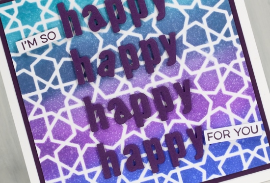
Happy, happy, happy
Posted: August 27, 2018 Filed under: geometric stars, YAY for you | Tags: distress oxide inks, My Favorite Things Leave a comment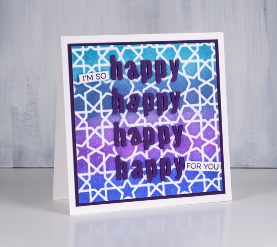
I posted some cards a couple of weeks back made with stencils from My Favorite Things. Here is another using the geometric stars stencil. I sponged oxide inks through the stencil onto neenah solar white cardstock (colours listed below). For a bit of shimmer I spritzed the panel with my blue pearl-ex mix (made by mixing ‘interference blue’ pearl-ex with water).
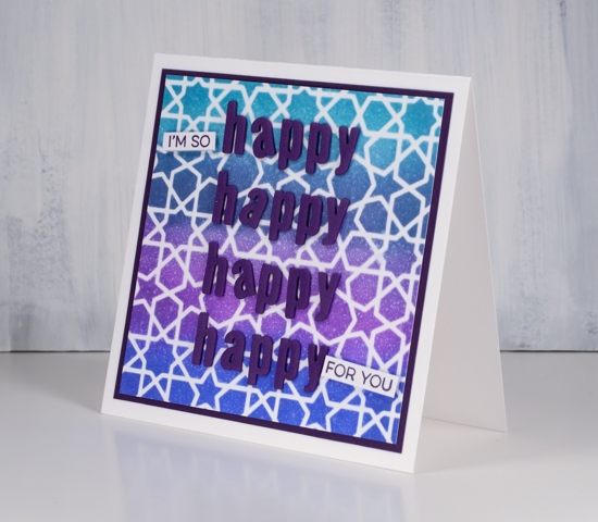
I matted with purple cardstock and die-cut 4x h, a, p, p, y using the ‘little lower case letters also from MFT. I stamped some words from the MFT Yay for you set to complete my enthusiastic sentiment.
Supplies
Stamps: Yay for you (MFT)

Stencils: geometric stars, (MFT)

Inks: dusty concord, peacock feathers, blueprint sketch, faded jeans distress oxides & monarch versafine clair


Paper: neenah solar white cardstock, purple cardstock

Also: cutterpillar glow premium, mini ink blending tool, mini ink blending foams, interference blue pearl-ex powder


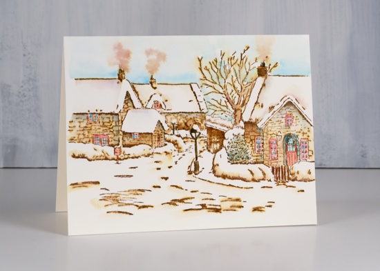
Peaceful village
Posted: August 23, 2018 Filed under: peaceful village | Tags: Faber-Castell Albrecht Durer Watercolour pencils, Penny Black stamps, Ranger Distress inks 10 Comments
This is the last of my vintage style watercolours (for now) and I think this one might be my favourite. I don’t have step by step photos for this one but the process is exactly the same as shown in the tranquil hamlet video I posted earlier this week.
I worked on hot pressed watercolour paper but stamped with walnut stain ink instead of vintage photo. The walnut stain ink is a darker brown so the whole scene is a little darker but still has the vintage sepia look to it. I stamped in a stamp positioner because there is a lot of detail in the stamp.
As with my previous vintage style scenes I blended the stamping with water which pulled colour into the interior of the buildings, trees and bridge. As I blended the walnut stain ink I also added colour from watercolour pencils, including blue, green, black, yellow and red. I was careful to blend colour right up to the edges of snowy areas so it would contrast with the bright white of the snow on roofs and hills.

Supplies
Stamp: peaceful village

Ink: walnut stain distress ink

Paper: hot pressed watercolour paper
Pencils: Faber Castell Albrecht Dürer Watercolour pencils
Tools: stamping platform
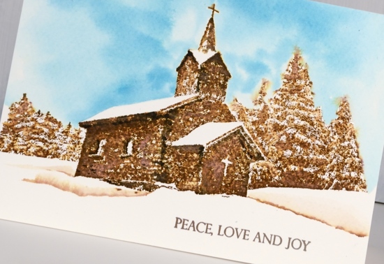
Winter Solace
Posted: August 22, 2018 Filed under: Stamped Landscapes, Watercolour, winter solace | Tags: Penny Black stamps, Ranger Distress inks 4 Comments
My vintage snowy scenes continue with this new Penny Black stamp ‘winter solace’. I kept it simple once again with vintage photo ink plus some black for shadows and some blue for the sky. The technique is similar to the one I shared in my recent video but because this is a more solid stamp it is necessary to blend the ink more carefully so as not to obscure the details in the stamp. I stamped in vintage photo distress ink on cold pressed watercolour paper.
Rather than use watercolour pencils to add extra colour, I pressed black soot, vintage photo and broken china onto my glass mat to use as needed.
When blending the vintage photo ink I dabbed with a damp paintbrush instead of blending. I didn’t want the ink to cover the walls of the church uniformly, instead I left areas white and added black for shadows wherever I thought there would be some.
I added black under the eaves, under the windows and on the corners.
I used a pencil to lightly draw a roof line to give me a guide for painting blue sky. I painted right up to the pencil line and edges of building with water then added broken china ink to fill sky. I dabbed the blue ink around the edges of the trees with the point of the brush.
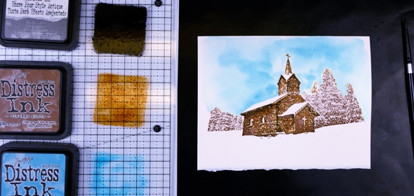
I blended water over the stamped sections of trees taking care to leave the white areas to look like snow.
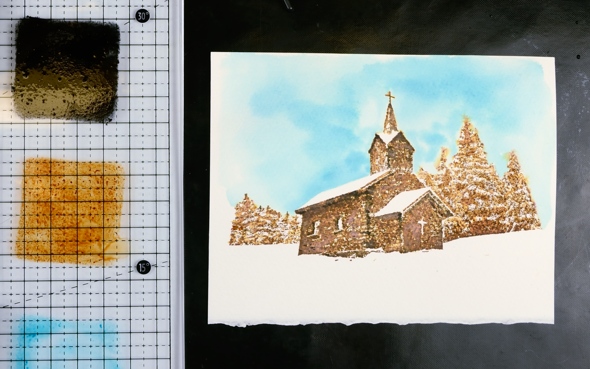
To add some snowbanks to the foreground I painted a few lines of vintage photo ink with a fine tip brush then blended them with water.
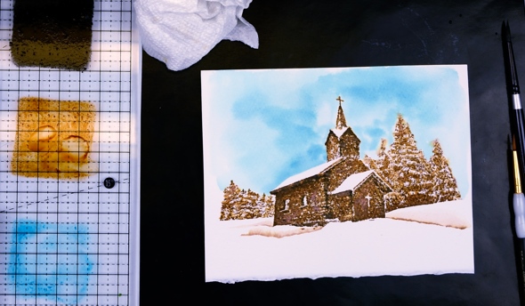
To complete the card I added a sentiment from the new ‘Christmas sentiments’ set.
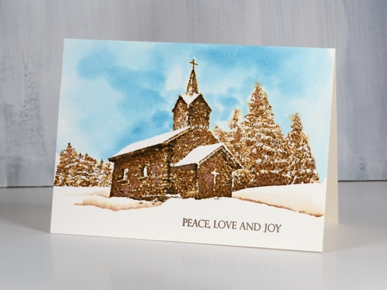
I’m looking forward to trying some other looks and colour schemes with this stamp.
Supplies
Stamps: winter solace, Christmas sentiments


Inks: vintage photo, black soot, broken china distress ink


Paper: cold pressed watercolour paper

Also: cutterpillar glass mat
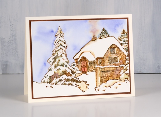
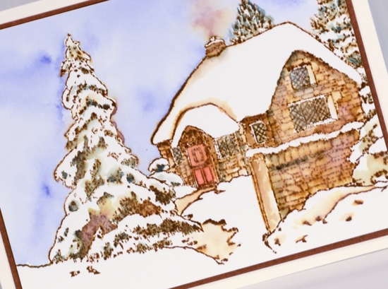
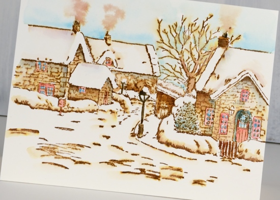
Snowy cottage
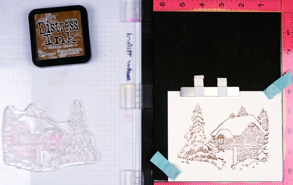
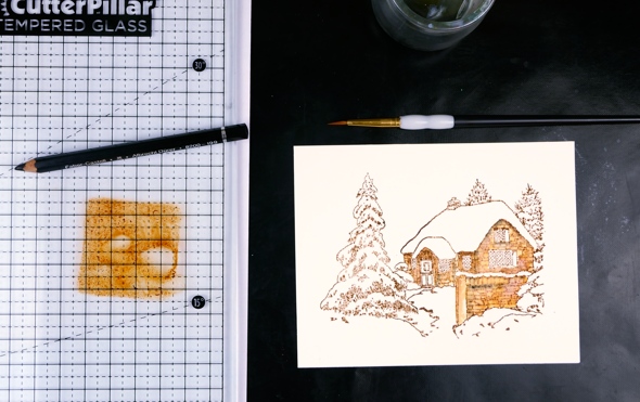
Posted: August 21, 2018 Filed under: snowy cottage, Stamped Landscapes | Tags: Penny Black stamps, Ranger Distress inks 4 Comments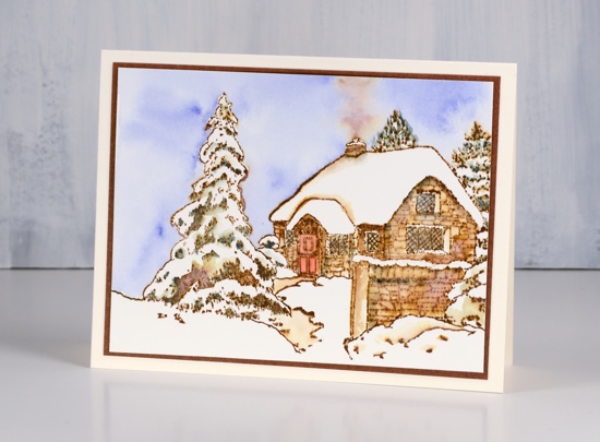
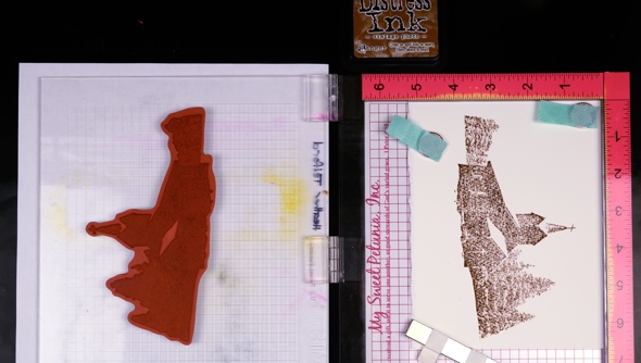
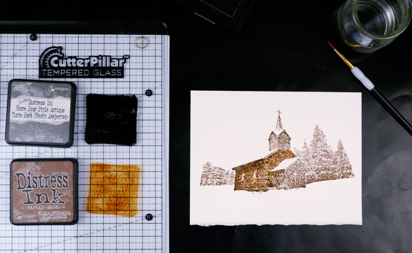
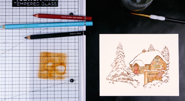
I’m continuing to feature stamps from the new Penny Black release. Today I have the second of my vintage style watercolours, this one stamped with a large clear stamp from the transparent set, Snowy Cottage. You can watch the video I posted yesterday to see the technique and refer to the step by step photos below to understand my process.
I used a stamp positioning tool to make sure the detailed stamp was fully printed on my hot pressed watercolour panel. I used vintage photo distress ink but other brown distress inks can give a similar vintage appearance.
I began by using a damp brush to blend the stamped ink over all the stonework of the cottage and wall. I picked up a bit of black off a watercolour pencil to add to any shaded areas.
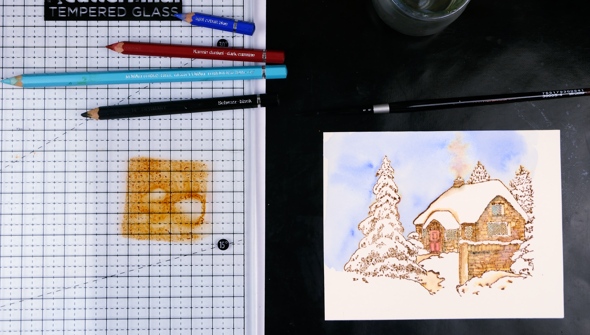
Next I added red to the door and blue to all the windows, again picking up colour from the tips of my watercolour pencils.
I used a darker blue to fill the sky with colour, painting first with water around the edges of the trees and roof then adding blue to the damp area so it would blend and move to fill the sky. While the sky was wet I picked up vintage photo ink on the paint brush and dropped it into the sky above the chimney.
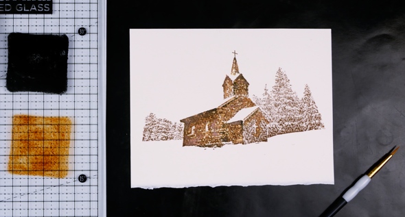
I also blended the areas adjacent to the snow to create contrast from snow banks to shadow. I picked up colour from a green pencil to add to all the trees, taking care to leave some areas white in each tree.
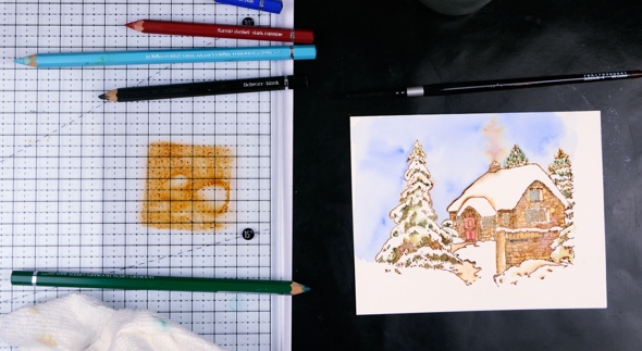
Finally I used a vintage photo distress marker to redraw the lattice on the windows.
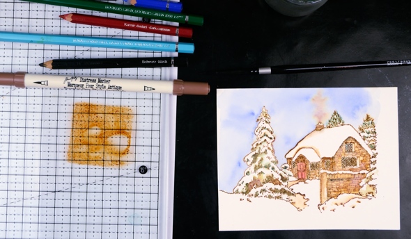
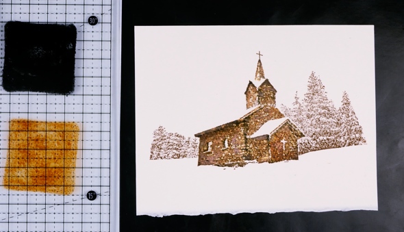
To complete the card I trimmed the panel then matted it with brown cardstock and added it to a natural white card base.
I hope you enjoyed my second vintage style scene, I’ll be back tomorrow with another.
Supplies
Stamps: Tranquil Hamlet

Ink: vintage photo distress ink
Paper: hot pressed watercolour paper, brown cardstock
Pencils: Faber Castell Albrecht Dürer Watercolour pencils
Tools: MISTI, Cutterpillar Glow premium

Tranquil Hamlet Video
Posted: August 20, 2018 Filed under: Stamped Landscapes, tranquil hamlet, Watercolour | Tags: Faber-Castell Albrecht Durer Watercolour pencils, Penny Black stamps, Ranger Distress inks 7 Comments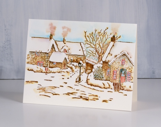
You’ve probably heard by now there is a new Penny Black release in town! Two actually, a big beautiful Christmas release and a fun fall release. The catalogues can be viewed here. I’ll be featuring vintage style snowy scenes all week here on the blog even though the sun is shining and the grass is green outside!
This lovely stamp called ‘Tranquil Hamlet’ is stamped in vintage photo ink and coloured with Faber Castell Albrecht Dürer watercolour pencils on hot pressed watercolour paper. Watch the video to see how
Thanks for dropping by; I’ll be back tomorrow with another snowy scene.
Supplies
Stamps: Tranquil Hamlet

Ink: vintage photo distress ink
Paper: hot pressed watercolour paper
Pencils: Faber Castell Albrecht Dürer Watercolour pencils (199, 159, 154, 151, 126)
Tools: stamping platform
.
Birthday prints
Posted: August 17, 2018 Filed under: happy birthday to you, painted prints | Tags: My Favorite Things, Ranger Distress inks, WOW embossing powders 5 Comments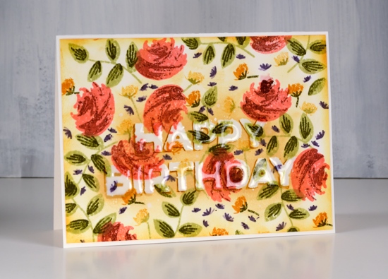
I’ve been playing around with the layering stamps from MFT ‘painted prints’ again. I had a bit of an idea in my head when I started but I changed it a couple of times along the way. It’s on hot pressed watercolour paper because at first I intended to add water. I began by stamping the roses in worn lipstick and added the second layer with stamped off aged mahogany.
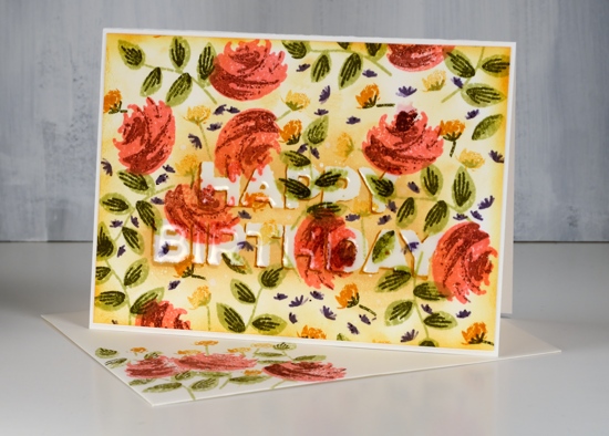
Next I did the leaves in shabby shutters with second layer in forest moss. I did the little yellow flowers with wild honey; some are dark some a light because I stamped them twice each time I inked, a first and a second generation print. I gave them little stems and with shabby shutters and forest moss.
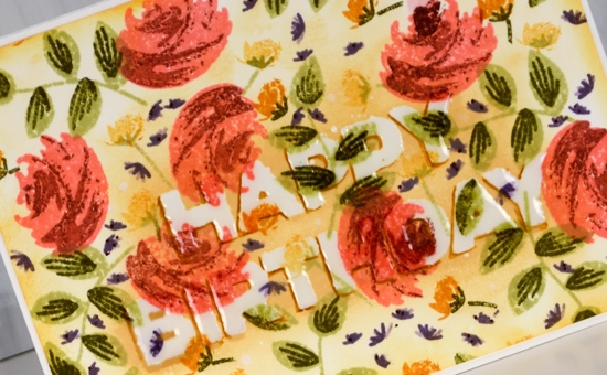
I filled it in with tiny dusty concord flowers stamped twice just slightly offset to get two-toned flowers in all the gaps. To make the half hidden sentiment I stamped with versamark and embossed twice with WOW clear ultra high powder. To make the clear embossed sentiment show up I sponged antique linen ink over it; that was a bit too subtle so I switched to wild honey. Still too subtle I grabbed the wild honey marker and drew some shadows around two edges of each letter.
‘Cos I was feeling fancy I made a matching envelope and stamped a great big ‘Happy Birthday to you’ inside the card. I discovered something cool to do with these stamps while I was making this card so there will be more to share another day. Thanks for dropping by.
Supplies
Stamps: paint prints, happy birthday to you


Inks: worn lipstick, aged mahogany, wild honey, scattered straw, dusty concord, shabby shutters, forest moss, antique linen distress inks, versamark


Paper: hot pressed watercolour paper
Also: WOW clear ultra high embossing powder
![]()


