
Black Damask
Posted: February 23, 2013 Filed under: Background Stamps, CAS, Damask Pattern, Queen Anne's Lace 18 Comments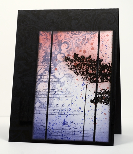
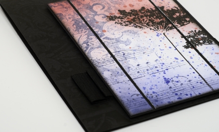
A few weeks back I used the damask background stamp to make a cup. I really hadn’t used the stamp much before that. After making the cup I noticed how elegant the detail in the stamp is and decided it was time to pull it out again. I also have some beautiful new ink colours from Tsukineko which I needed to play with.
I inked diagonally across the damask stamp with Versamagic Night Sky ink and stamped it on the panel. I then inked the music background, diagonally also, in order to fill the other half of the panel. It was only after I had stamped the music that I saw that I hadn’t worked out the whole upside-down and opposite side thing properly! I’m kind of glad I got it wrong though because I ended up liking the two backgrounds overlapping and it left me with a white space to stamp some flowers.
The flowers are stamped with versamark and embossed in black so they would resist the sponging and ink droplets added next. I sliced up the panel and matted in black and then looked for the right colour cardbase. White was too stark; black worked better but needed a little something on it. My intention was to emboss the damask background but once I had stamped it in Versafine Onyx black it showed up fine (possibly not in the photo). The wide grosgrain ribbon is pleated and stapled behind the popped up panel.
Supplies
Stamps: Damask Pattern, Queen Anne’s Lace, Music Background (PB)
Ink: Memento Rhubarb Stalk, Versafine Onyx Black & Versamagic Night Sky (Tsukineko)
Also: Black embossing powder
Tiles from a background stamp
Posted: February 22, 2013 Filed under: CAS, Glory of Modesty, Tree-mendous 24 Comments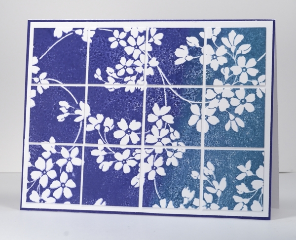
When I had this stamp out to make the birthday card I played around with a few different inks, papers and techniques. I know it is the size of a background stamp but I have stopped thinking of it as a background stamp as I am yet to use it in the background. It is such a pretty design it always gets to be the main event. When a stamp has a lot of blank un-patterned rubber on it, it can be hard to ink evenly so I played around a bit with inks and water to try and get past this issue. If you use a pigment ink it is juicier and will give you good coverage. I wanted to blend some colours on the stamp so I chose to use water soluble Memento dye inks instead.
I inked the stamp generously with Paris Dusk and Teal Zeal then spritzed it with water giving the water and ink a little time to blend before stamping the image on white card stock. The blank rubber part of the image is not solid colour but I quite like the texture created with some tiny air bubbles and ink pooling. I tried the large image on the card base but decided to cut it into tiles to add another element to the design.
Thanks for all your kind birthday wishes. My birthday is Sunday; my husband is exactly one week older and wiser than me!
Supplies:
Stamps: Glory of Modesty, (PB)
Inks: Memento Teal Zeal & Paris Dusk (Tsukineko)
Cardstock: Periwinkle Mix & Match Papers
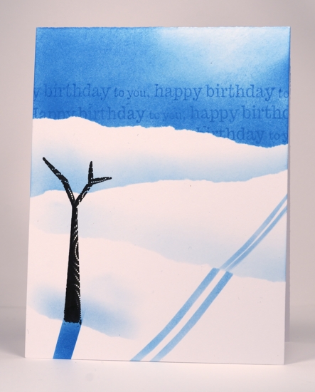
Several of you wanted to see the misunderstood birthday card I made for my husband so I have included it below. If you are as baffled as half my family were then you can mouse over the picture or click on it and you will see the photo title.
The aspects of this card I don’t like are:
the lack of branches on the tree. I am looking forward to using this stamp again with foliage
the sponged ski trails which aren’t very even
the sparse landscape. We don’t like skiing out in the open like that; it gets too cold but as I was stamping at the last minute one tree was all this card got. Sad that the cardmaker’s family’s cards get left to last!
Aspects of this card I do like:
the sentiment in the sky
the colouring on one side of the tree trunk
OLW 128 Feminine Birthday Card
Posted: February 20, 2013 Filed under: Background Stamps, CAS, Glory of Modesty, OLW 30 Comments
This one should not be a difficult challenge. Most of us do birthday cards for females all the time. It’s those masculine cards that are the tricky ones. I made a card for my husband’s birthday last week which is yet unposted because half the small survey of people I showed it to did not understand what the scene was meant to be! Including my husband…
Remember to keep it one layer, and use a few of your favourite things on it; that’s what I did. I masked; you know I like to do that. I inked the background stamp with blue, my favourite colour. I added the letter background stamp that I love over the top and did a little sponging in both teal and yellow.
OLW128 Rules
1. A one-layer card is defined as a single layer of card stock. No other layers allowed.
2. Make a one-layer birthday card for a female
3. Post your cards online and link to them using the InLinkz button at the end of this post. If you link to your blog, be sure to link to the specific post, not just your blog’s main page.
4. I may or may not have chosen this theme because I am having a birthday this week. Not of course that I am making myself a birthday card, but I might just be opening a few.

Supplies:
Stamps: Glory of Modesty, Edge to Edge, Letter Background(PB)
Inks: Memento Teal Zeal, Summer Sky, Dandelion (Tsukineko)
Trailing Beauty watercoloured
Posted: February 13, 2013 Filed under: Background Stamps, CAS, Penny Black 25 Comments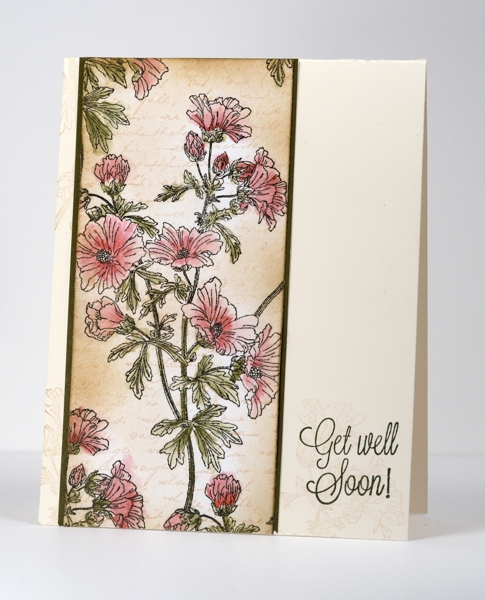
I think I have mentioned already how many lovely new background stamps there are in the new PB catalog. My card above features another one, Trailing Beauty.
I used watercolour pencils to colour the line design which I stamped in Versafine Onyx Black ink. I was not meticulous in either colouring or blending with water; there is plenty of ‘going over the lines’. I sponged the beige background, added the letter background and also stamped a very pale imprint of the floral stamp on the card base before adding the sentiment.

The fun continues with watercolouring inspiration from Jill today on the Penny Black Blog. They are ten days into the 20 consecutive days of inspiration, featuring stamps from the Take Flight catalog! And since they’re featuring 20 days of inspiration, they’re also giving away 20 NEW stamps to one lucky reader. I will be sharing two cards there tomorrow.
Thanks for visiting.
Supplies:
Stamps: Trailing Beauty, Letter Background, Eloquence (PB)
Inks: Versafine Onyx Black & Olympia Green, Memento Desert Sand & Potter’s Clay(Tsukineko)
Also: Faber-Castell watercolour pencils
Cardstock: Spring Meadows Mix & Match Papers
Watercoloured poppies
Posted: February 8, 2013 Filed under: Background Stamps, Blooming Garden, Penny Black, Watercolour 29 Comments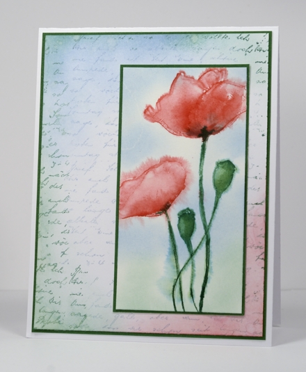
I love poppy images so I was excited to see two poppy stamps in the new Penny Black catalog. One is a wood-mounted stamp and the other, shown above, is part of the transparent set, Blooming Garden. I have painted poppies several times with watercolour paints so to try watercolouring with the stamp was my first thought.
I wet the watercolour paper, then stamped the poppy flowers in red and the stems and seed pods in green. The ink immediately ran and I blended and spread it with a brush adding a little more ink here and there with markers. When I was happy with the colour I sponged blue and green around the flowers and started playing with the layout.
It took me a while to come up with the layout you see above as I initially thought I’d mat the panel and put it on a white card base with a sentiment. I tried both portrait and landscape orientations but it wasn’t quite right. So, when in doubt reach for your absolute favourite background stamp! I inked the background with blue and green then added sponging and water droplets in the colours of the poppy panel.
The fun continues with inspiration galore on the Penny Black Blog. They are five days into the 20 consecutive days of inspiration, featuring stamps from the Take Flight catalog! The designers and contributors have LOTS in store for you. And since they’re featuring 20 days of inspiration, they’re also giving away 20 NEW stamps to one lucky reader.
Supplies:
Stamps: Blooming Garden, Letter Background (PB)
Inks: Memento Summer Sky, Cottage Ivy, Lady Bug stamp pads and markers (Tsukineko)
Cardstock: Fabriano 100% cotton hot pressed watercolour paper, Spring Meadow Mix & Match Papers
Beautiful Backgrounds
Posted: February 3, 2013 Filed under: Background Stamps, CAS, Penny Black 14 Comments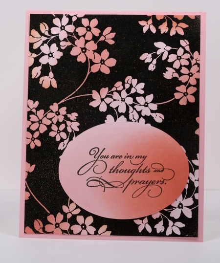
The new Penny Black catalog has so many lovely background stamps. The card above features one of my favourites, Glory of Modesty. To create this card I stamped the background stamp in black, embossed in black powder then sponged three different pink/apricot tones over the embossing. I cut an oval for my sentiment and sponged in the same tones before mounting the panel on Coral Reef Mix & Match cardstock.
Sorry it has been so quiet on Bits & Pieces this week. A combination of the expected and the unexpected has kept me from stamping and blogging. I was the organizer of a Girl’s Night Out fundraiser for my daughter’s violin ensemble last night which definitely took a large chunk of my time. Several girls including my younger daughter performed solos, I assisted a talented friend of mine in preparing delicious finger foods and another friend displayed and took orders for Silpada jewellery. The night, which sold out, was great fun; the girls played beautifully and were lovely waitresses and, from what I heard the guests had an enjoyable time.
This week I hope to have more cards to share featuring stamps from the new Penny Black catalog. To inspire you Penny Black is running a promotion called Take Flight Twenty on their blog for the next twenty days introducing dozens of new stamps and fabulous projects by the design team members.

Supplies:
Stamps: Glory of Modesty, Eloquence (PB)
Inks: Versafine Onyx Black, Memento Angel Pink, Lady Bug, Rhubarb Stalk (Tsukineko)
Also: Black embossing powder
Cardstock: Coral Reef Mix & Match Papers
CASology # 28
Posted: January 22, 2013 Filed under: Background Stamps, CAS, Penny Black 23 Comments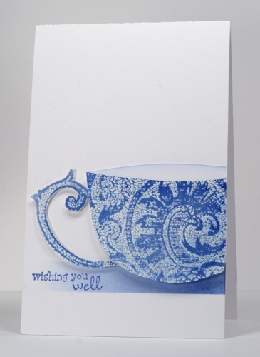
I am the guest designer at the CASology challenge blog this week. I felt honoured to be asked and said yes, not knowing what a challenge it would turn out to be! I keep saying that about challenges don’t I?
The cue card this week is…
I was already pretty sure, but a quick look through my stamps revealed a lack of ‘drink’ related images. Once again I had to think outside the box. The thought I came up with involved a Penny Black background stamp and the emboss resist technique. The background I chose is called Damask Pattern and reminded me of china cups. I stamped it in versamark and embossed in clear powder before sponging over the top with blue ink. As I was sketching a cup shape I noticed that the stamp already included the perfect handle shape in the design, so I cut that out determined to make it work as the handle of my cup. After much fiddling around with layout I settled on the design below which involved slicing off the side of the cup and popping it up over the sponged strip. I made this card narrower than usual so will enter it in the CAS-ual Fridays Long and Short challenge too. The size is 3½” x 5½”.
So check out the cards at CASology and get thinking, outside the box if necessary.
Supplies
Stamps: Wishes, Damask Pattern (PB)
Ink: Memento Danube Blue & Versamark (Tsukineko)
Also: Clear embossing powder
Watercoloured Background
Posted: January 21, 2013 Filed under: Background Stamps, Penny Black, Watercolour 3 Comments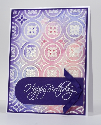
There is a new catalog from Penny Black out today. Pop on over to the Penny Black blog this week to check out the new stamps and maybe win some too. I am featuring one of the new background stamps, Roman Surround, in my card today with another watercolour method.
In yesterday’s card I wet the watercolour paper first before stamping. For this card I embossed the background image first and then wet the watercolour paper before adding and blending pinks, blues and purples. My inspiration came from this lovely card by Jennifer McGuire. Once again I was so happy with the background that I added very little, casing Jennifer’s layout to make a birthday card.
Supplies
Stamps: Flourish Birthday, Roman Surround(PB)
Ink: Versamark (Tsukineko)
Also: white and clear embossing powder, Faber Castell watercolour pencils, grosgrain ribbon
Cardstock: Purple Mountain mix & match cardstock
My unusual creative process
Posted: January 20, 2013 Filed under: Background Stamps, Penny Black, Social Butterfly, Watercolour | Tags: arts, CAS, Penny Black stamps 18 Comments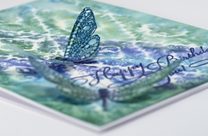
I visited my Handmade Cards board on Pinterest this afternoon for inspiration. However, the inspiration pic. and my finished card bear absolutely no resemblance to each other. I had a totally different design almost ready to put together when I decided to try and watercolour a background stamp, just in case I wanted a bit more going on in the card. (Unusual for me, I know) As it turned out I liked the background panel so much it became the main event, I tossed the other panel and kept only the little dragonflies from my original design.
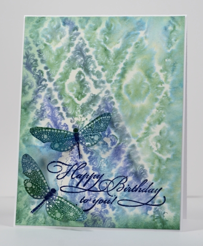
So, without mentioning the discarded process, here is how I made this card:
- dampened a piece of watercolour paper, inked the dragonfly stamp in blues and green and stamped it on the damp paper.
- when the dragonflies were dry I cut them out, added a little sponging and used a marker to darken their spines.
- stamped the dragon flies with a versamark pad to totally cover them then embossed with a thick glossy embossing powder, twice.
- to make the background panel, I wet a piece of watercolour paper (much wetter than for the dragonflies).
- I inked the background stamp randomly in the two blues and the green ink and stamped it onto the wet paper.
- when all was dry I trimmed the background panel, sponged the edges and embossed the sentiment.
- attached the background to the card base and the dragonflies with glue dots.
Not what I set out to create, and if I told you I my initial intention was to make a friendship themed card for the Less is More challenge you would just laugh wouldn’t you?
Supplies
Stamps: Special Time, Wall Paper Print, Social Butterfly (PB)
Ink: Memento Teal Zeal, Paris Dusk, Cottage Ivy and Versamark (Tsukineko)
Also: Thick Glaze embossing powder
Analogous collage
Posted: January 15, 2013 Filed under: Background Stamps, Berry Branch, CAS, Collage cards 22 Comments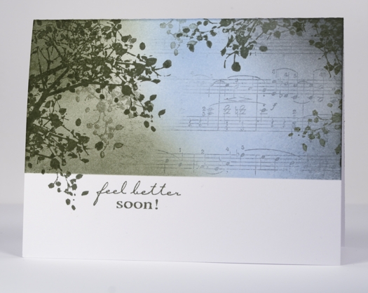
I have another collage card today, this one with a colour scheme more common in my work but probably not as striking as the previous contrasting scheme. An analogous colour scheme is one made up of colours side by side on the colour wheel. An analogous colour scheme works well for a sympathy or get well card because it is more soothing and harmonious than a contrasting one.
To create this card I positioned a mask across the lower third of the card and stamped the branch around the edges, lifting the mask once so a twig could fall below the line. I stamped a couple of times without re-inking to get that misty background look. I partially inked the music background in grey and stamped to the right of the panel then added the blue and green sponging with a little grey on the right.
My older daughter and I were discussing the sentiment; she felt that it always seems a little odd to send a card saying “get well soon” or “feel better soon” as it sounds like a command! As if someone wouldn’t feel better if they could. I guess it is probably short for “I hope you feel better soon”. That is the meaning behind this card made for my son’s writing class teacher who has fractured her wrist.
Supplies:
Stamps: Berry Branch, Music Background, Feel Better (Penny Black)
Inks: Memento London Fog, Summer Sky, Olive Grove (Tsukineko)


