
My unusual creative process
Posted: January 20, 2013 Filed under: Background Stamps, Penny Black, Social Butterfly, Watercolour | Tags: arts, CAS, Penny Black stamps 18 Comments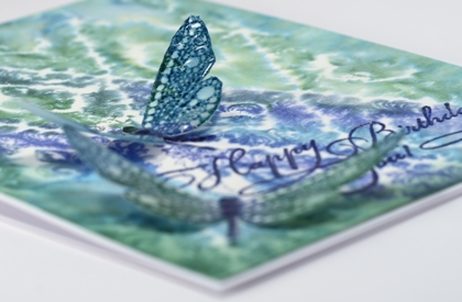
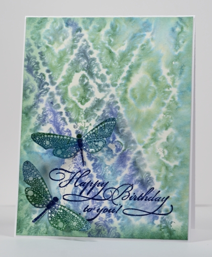
I visited my Handmade Cards board on Pinterest this afternoon for inspiration. However, the inspiration pic. and my finished card bear absolutely no resemblance to each other. I had a totally different design almost ready to put together when I decided to try and watercolour a background stamp, just in case I wanted a bit more going on in the card. (Unusual for me, I know) As it turned out I liked the background panel so much it became the main event, I tossed the other panel and kept only the little dragonflies from my original design.
So, without mentioning the discarded process, here is how I made this card:
- dampened a piece of watercolour paper, inked the dragonfly stamp in blues and green and stamped it on the damp paper.
- when the dragonflies were dry I cut them out, added a little sponging and used a marker to darken their spines.
- stamped the dragon flies with a versamark pad to totally cover them then embossed with a thick glossy embossing powder, twice.
- to make the background panel, I wet a piece of watercolour paper (much wetter than for the dragonflies).
- I inked the background stamp randomly in the two blues and the green ink and stamped it onto the wet paper.
- when all was dry I trimmed the background panel, sponged the edges and embossed the sentiment.
- attached the background to the card base and the dragonflies with glue dots.
Not what I set out to create, and if I told you I my initial intention was to make a friendship themed card for the Less is More challenge you would just laugh wouldn’t you?
Supplies
Stamps: Special Time, Wall Paper Print, Social Butterfly (PB)
Ink: Memento Teal Zeal, Paris Dusk, Cottage Ivy and Versamark (Tsukineko)
Also: Thick Glaze embossing powder
Autumn Tree
Posted: October 2, 2012 Filed under: Autumn Tree, Penny Black | Tags: arts 10 Comments
I took a slightly whimsical path with this tree and the panel came together by trial and error. I started by embossing the tree and colouring all the leaves and trunk with watercolour pencils. After blending all the pencil colouring with water the tree looked very alone so I started flicking orange, red and yellow water colour paint on the panel with a paintbrush. Flicking led to sponging and then sponging led to some letter background and the tree looked much happier. I chose not to add a sentiment as I haven’t decided on a purpose for this card yet. Could be a Thanksgiving card or maybe a fall birthday. The tree panel is matted in Penny Black Mix&Match ‘fall festival’ cardstock and popped up on a card base of the same colour.
I am now seeing these colours all around me and hope to get out with the camera soon to captures some of the beauty.
Supplies:
Stamps: Autumn Tree, Letter Background (Penny Black)
Inks: Memento Lady Bug & Tangelo, Versafine Vintage Sepia (Tsukineko)
Cardstock: Mix&Match fall festival
Also: Faber-Castell Water Soluble pencils, Clear E.P.


