
City skyline
Posted: October 14, 2013 Filed under: CAS, Downtown, Peace on Earth 6 Comments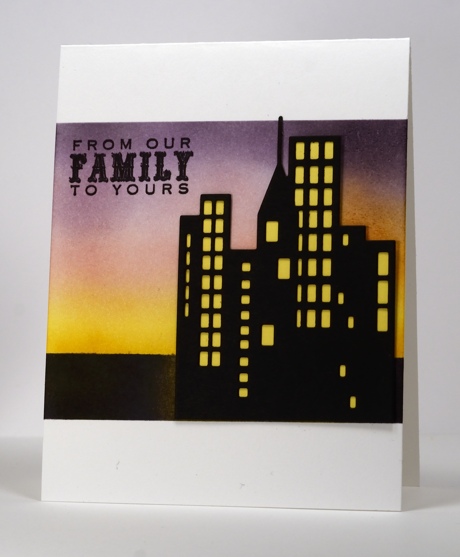
On the Penny Black blog this week you will see that the design team have been having fun with the new Christmas Dies. I chose to show off the ‘Downtown” die in front of a warm sunset. I die cut the downtown shape from black then hand cut a piece from yellow to place behind it. I masked the sky area and sponged yellow from the bottom up, sweet plum from the top down, a bit of angel pink in the middle and some elderberry on the top right. I then re-positioned the top mask down lower so I could sponge the dark area below the horizon in black.
Supplies:
Stamps: Peace on Earth (PB)
Creative Dies: Downtown (PB)
Inks: Memento Sweet Plum, Angel Pink, Dandelion, & Versafine Onyx Black (Tsukineko)
Blue flower by surprise
Posted: October 4, 2013 Filed under: CAS, Dazzling, So Blessed 7 Comments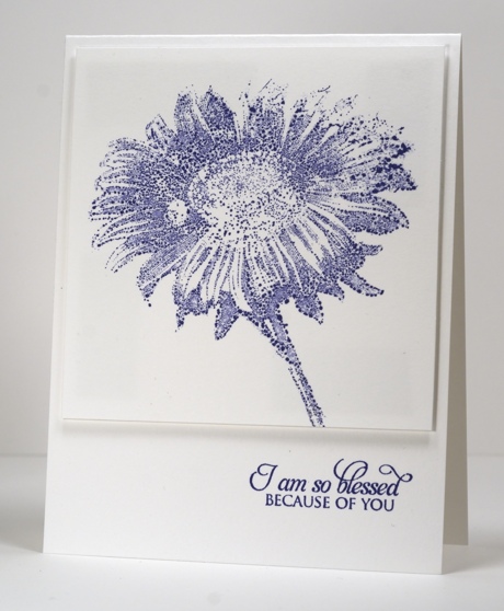
A while ago I hosted the One Layer Wednesday challenge with a one colour, one stamp, one sentiment card. (you can see it here). When I was working on that card I stamped the flower stamp, Dazzling on the plastic imaging sheet I use with my stamp positioning tool (stamp-a-ma-jig). I needed to use the tool to decide where to place the stamp on my one layer card. The image in blue ink stayed on the plastic sheet for days. The ink had formed into droplets almost immediately but had not dried up at all. After seeing it there untouched I decided to see what it would look liked stamped onto cardstock. The panel above is the result. The flower is basically the same but is made up of little ink droplets and the occasional air bubble. I thought it was quite a cool effect and shows that it is not always best to clean up straight away; inspiration may strike a few days later!
Supplies:
Stamps: So Blessed, Dazzling (PB)
Inks: Memento Paris Dusk (Tsukineko)
White berry collage
Posted: September 28, 2013 Filed under: Background Stamps, Berry Branch, CAS, Lace Trims, Winter Berries | Tags: CAS, Penny Black stamps, Tsukineko Memento inks 23 Comments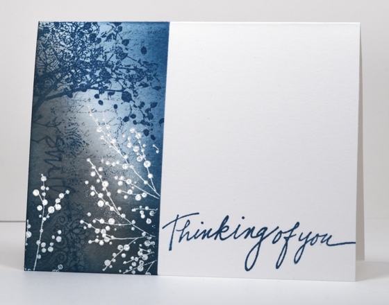
I made this one layer card weeks ago so I am no longer sure of my order of stamping. This is what I might have done:
- position a post-it note mask
- emboss winter berries in white
- sponge grey ink from bottom left hand corner and teal ink from top right hand corner but keep a centre strip paler to create a highlight area
- stamp letter background stamp in grey and lace border stamp in teal (lace stamp is probably patchy because I may have wiped some of the ink off on purpose.)
- stamp the word ‘smile’ and the berry branch in teal
I vaguely remember dropping a stamp on the panel at some point which almost made me toss the card. Sorry I can’t be more precise; I guess it really makes sense to write about the cards as soon as I make them!
I just realized that I can add this to Karen’s One Layer Wednesday challenge this week. It is a free for all so go and check it out
Supplies:
Stamps: Berry Branch, Lace Trims, Winter Berries, Letter Background, Edge to Edge (PB)
Inks: Memento Teal Zeal, London fog & Versamark (Tsukineko)
Also: white embossing powder
OLW 158 Fly away with me
Posted: September 18, 2013 Filed under: CAS, OLW, Soft Wings 13 Comments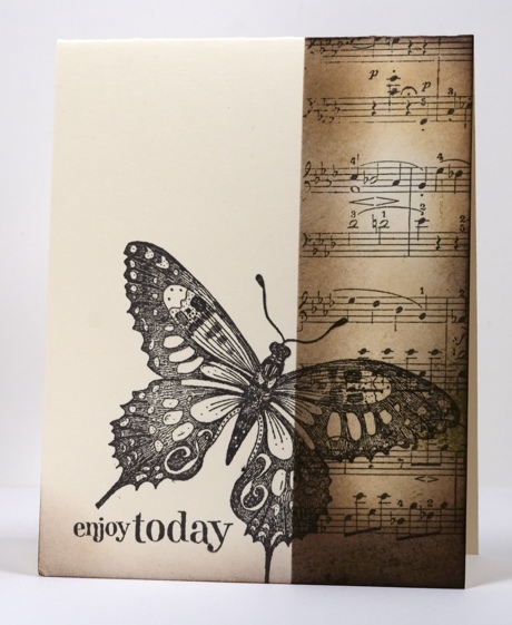
This week’s One Layer Wednesday challenge is to feature something with wings on your card. I chose this beautiful butterfly stamp and a palette of browns.
I masked the left hand side of the card front so I could sponge and stamp the right hand side. I have roughly used the rule of thirds for my stamped panel. The butterfly is stamped over both sides directing the eye from left to right. I also added a little sponging to the bottom edge in keeping with the vintage feel of the card.
OLW 158 Rules
1. A one-layer card is defined as a single layer of card stock folded in half. No other layers of paper allowed.
2. Make a card with wings on it. It could feature birds, butterflies, planes, mosquitos ; anything with wings.
3. Post your card somewhere online and link back to it here using the InLinkz button on the sidebar. If linking to a blog post, please be sure to link to the specific post and not your blog’s home page.
4. The most important rule of all…HAVE FUN!

Colourful Christmas Combo
Posted: September 16, 2013 Filed under: CAS, Christmas reds and greens 5 Comments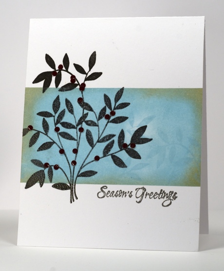
There is a colour challenge for you on the Penny Black blog at present. Penny Black has created five colour combos and would love to see your projects. There are three prizes and the challenge runs until September 27th.

I chose this colour combo along with the new wood mounted stamp, “Christmas Reds and Greens”. I stamped and embossed the branch in smokey grey then masked top and bottom so I could create an aqua background panel. The panel is sponged and stamped with Versamagic Sea Breeze & Sahara Sand. To add the rusty red colour I punched tiny dots from glossy card to be the berries on the branch.
Supplies:
Stamps: Christmas Reds and Greens , (PB)
Inks: Versamagic Sea Breeze & Sahara Sand, Versafine Smokey Grey (Tsukineko)
More silhouettes
Posted: September 15, 2013 Filed under: CAS, Tweet Tweet, Winter Sky 12 Comments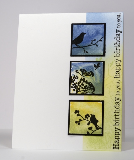
The challenge at CASology this week is Silhouette and I have managed to just squeak in with a card. Edited to add: I finished this post only to find that I didn’t squeak in; the collection just closed 😦 Oh well, here are the details anyway!
My original concept for this card changed several times but that is a story you have heard more than once from me. I started by making three watercoloured small square backgrounds using Memento inks and a square acrylic block. I pressed the acrylic block onto the ink pads to pick up ink then added a drop or two of water to blend the inks. I then stamped the acrylic block onto water colour paper and let it dry before adding the silhouette stamps in black. As a background to the three scenes I masked and sponged in paler tones and added a large silhouette stamp in green and the sideways sentiment in black.
I have used a vertical three square layout many times before but it is only recently that I have been choosing to place all the elements on the right rather than the left hand side. (I was inspired by this lovely card)
Here are a few using the left hand side layout: holly cards, ferns
A couple using the right hand side layout: i love you, green grasses
Do you have a preference? When I searched my blog for examples I found that a horizontal landscape oriented card with three tiles in the lower half of the panel is also a very common choice for me. eg. fern fronds
Supplies:
Stamps: Tweet Tweet, Season’s Wishes, Winter Sky, Edge to edge (PB)
Inks: Memento Dandelion, Bamboo Leaves, New Sprout, Danube Blue, Summer Sky & Versafine Onyx Black(Tsukineko)
OLW 155 Silhouettes
Posted: September 2, 2013 Filed under: Birds on wire, CAS, OLW | Tags: CAS, Penny Black stamps, Tsukineko Memento inks 23 Comments
I’m not too late to add a card to Karen’s One Layer Wednesday challenge. I actually have two, neither of which turned out as I imagined but both meet the criteria. I masked both cards with post-it notes leaving a one inch panel each time where I embossed the birds and sponged the sky.
On the card above I sponged over a torn mask repositioning and using different colours each time. On the card below I sponged over a straight edge then repositioned and sponged again several times to represent the sun’s rays.
One night I was sitting watching one of my son’s soccer games and there was quite a noise coming from nearby the field. When I looked to see what it was I saw hundreds of birds perched on electricity wires. It was an astounding sight.
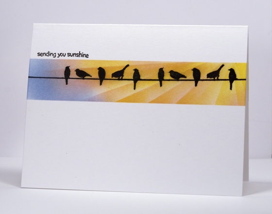
Supplies
Stamps: Birds on a wire, Summer Fun (PB)
Inks: Memento Summer Sky, Dandelion, Cantaloupe, Angel Pink & Versafine Onxy Black(Tsukineko)
Penny Black plays along with Less is More
Posted: August 31, 2013 Filed under: CAS, Floral Applique, Love Chapter 14 Comments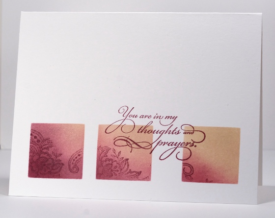
The Penny Black design team is playing along with the “Less is More” challenge this week which is to ‘use a stamp’ with the added suggestion of using watercolour too.
To use a stamp is not too much if a stretch for the Penny Black designers! I decided to limit my stamped area in keeping with the less is more guidelines. I punched squares out of a post it note to create a three square layout through which I sponged chalk inks. I stamped images from the floral appliqué set in chalk inks also. I had intentionally spaced my squares further apart on the right so I could place the sentiment in between the two squares.
As I was enjoying working with the chalk inks I used the same mask on a portrait oriented card switching the plum ink for a couple of blue inks. The colour scheme reminds me of the beach.

Supplies:
Stamps: Floral Applique, Sentimental, Love Chapter (PB)
Inks: Versamagic Perfect Plumeria & Wheat, Aegean Blue & Night Sky (Tsukineko)
Water Stamped Grasses
Posted: August 29, 2013 Filed under: Aspire, CAS, Watercolour | Tags: CAS, Penny Black stamps, Tsukineko Memento inks 14 Comments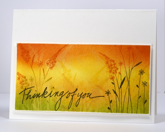
After stamping the Queen Anne’s lace with water I tried the technique again with a different stamp. I masked a rectangle then used ink to sponge the background with green, yellow and orange tones. I then painted water onto my stamp and stamped several times along the panel. You can see a clear water stamped impression on the left hand side but the others are less obvious. To finish I inked the same grass stamp in green and orange and stamped it several times before adding the sentiment
The card and the panel are cut from 140lb weight water colour paper.
By the way if you are looking for One Layer Wednesday this week Karen is hosting a Silhouette challenge which I hope to play along with soon.
Supplies:
Stamps: Aspire, Thinking of You (PB)
Inks: Memento Cantaloupe, Tangelo, Pear Tart, Olive Grove (Tsukineko)
Cardstock: Fabriano 25% cotton hot pressed watercolour paper


