
Thankful for you
Posted: September 24, 2018 Filed under: thankful leaves turnabout | Tags: Concord & 9th, Ranger Distress inks 39 Comments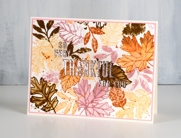
I have joined forces with the Foiled Fox this week to celebrate gratitude. We have so much to be grateful for we thought it would be fun to share some of those thoughts in the blog posts and comments.

I have gratitude themed cards for you this week and the Foiled Fox is giving away a $25 gift certificate to three of our readers who leave a comment here on my blog and/or on the Foiled Fox blog telling us something they are grateful for. It does not have to be related to art and craft at all. You have until the end of Friday, October 5th to add a comment to any of this week’s gratitude posts. We will randomly choose a winner from each gratitude post and announce them on Tuesday, October 9th.
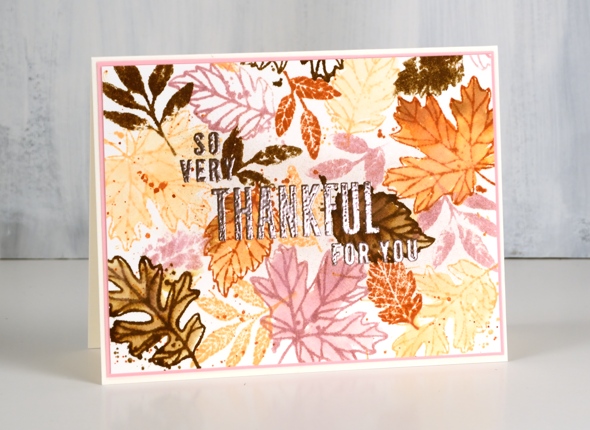
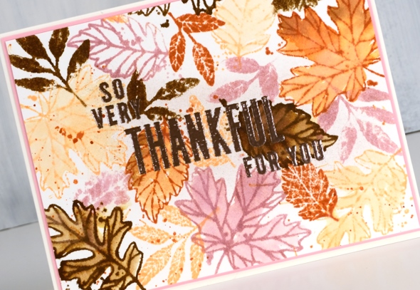
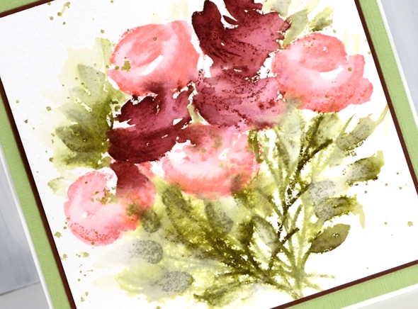
I am thankful for the beauty around me. My blog posts often reflect the natural world I see outside. I love to include flowers, trees and scenery including those crisp snowy scenes I stamp and paint in the colder months. Today’s card is in anticipation of all the colourful leaves I will enjoy in the months to come. They are beginning to turn now but it goes on for weeks and there is quite the range of colours from all the trees in my yard. I don’t generally get pink leaves though, so you are going to have accept some artistic licence on today’s colour choices. This card was created using the Concord & 9th ‘thankful leaves turnabout stamp set’. The set includes a large stamp designed in such a way that you stamp it once on a 6″x6″ panel, rotate it 90°, stamp again and repeat until it has been stamped four times. The end result is a panel filled with leaves but with just enough overlap to look attractive not crowded. If you don’t want a 6″x6″ finished panel you can trim it down or just attach your smaller panel to a 6″x6″ piece of scrap cardstock for stamping and rotate the whole thing.
You can read my whole process for this card over on the Foiled Fox blog and enter the giveaway by leaving a comment here or there telling us one thing you are thankful for. I’m looking forward to hearing from you.
Supplies
Stamps: thankful leaves turnabout stamps

Inks: Victorian velvet, dried marigold, rusty hinge, gathered twigs, versamark


Paper: hot pressed watercolour, neenah natural white, pink cardstock


Tools: cutterpillar glass mat, misti stamping positioner


Also: rose gold embossing powder
.
Grateful for everything
Posted: September 21, 2018 Filed under: grateful for everything | Tags: Concord & 9th, Dr Ph Martin Hydrus watercolor paints 9 Comments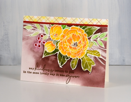
This gratitude themed card heralds the beginning of a gratitude focus on my blog for the coming week. Starting next Monday I will be collaborating with the Foiled Fox crew to celebrate gratitude. Before I dive into that collaboration though I thought I would share this card and issue an invitation to you, my wonderful readers. I am very thankful for those of you who pop in to see what I have been creating. Some of you have been visiting for years, others are new around here; some of you leave me a little encouragement from time to time in the comments section and others contact me with questions and feedback; I love hearing from you.
With gratitude as my focus over the next week and in fact next two weeks leading up to our Canadian Thanksgiving, I thought I would send out some cards to you, my readers. Thing is though, I’ll need to you supply an address if you would like to receive a card in the mail. Please don’t leave your address in the comment section, instead use the Contact Me button at the top of the page.

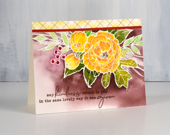
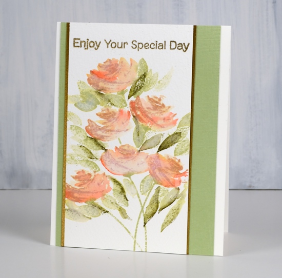
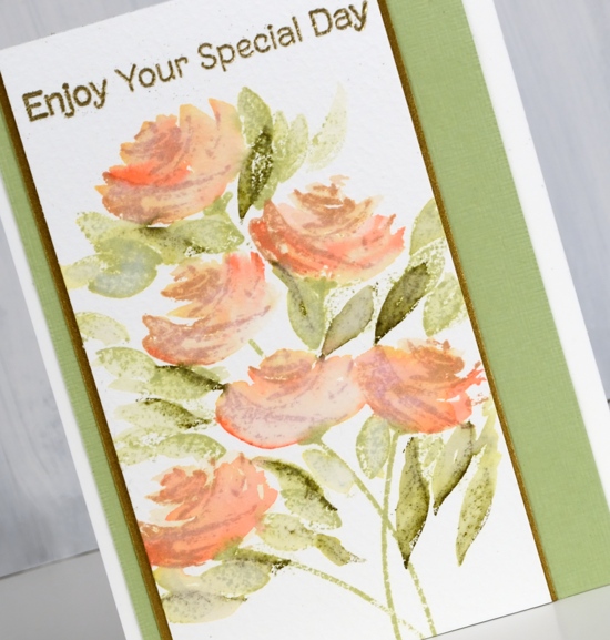
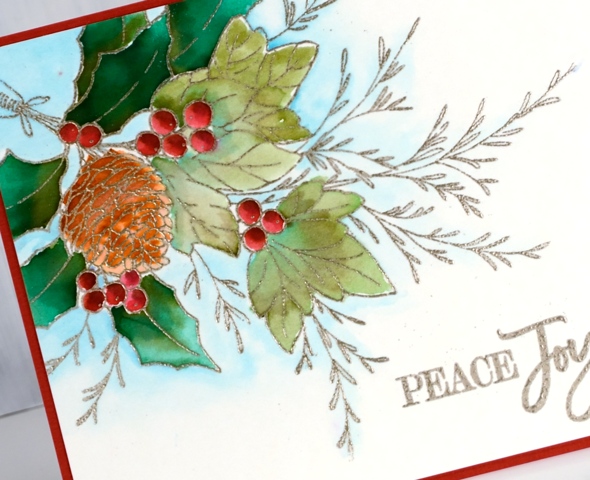
This lovely spray of flowers is from Concord & 9th; I have embossed it on hot pressed watercolour paper with clear powder. The bold colour is from Dr Ph Martin’s Hydrus inks. They are liquid watercolour inks and are very saturated. You don’t need much ink to get wonderful depth of colour; a little goes a long way and they mix beautifully to create new colours. I only used four colours to paint this panel but with a little mixing or diluting I was able to create an olive green and a pale green, a yellow and a couple of oranges as well as use the brown and red straight from the bottle.
To create a strip of co-ordinating plaid paper I used the plaid background stamped in memento dandelion ink for the yellow then added green and red ruled lines with distress markers. To divide the busy plaid strip from the busy floral panel I added a very thin strip of red cardstock. As usual I switched to versafine ink for the sentiment because it stamps fine lines so well. Isn’t that a sweet and thoughtful sentiment? I’m looking forward to sending it out to friends; maybe it will end up in your mail box.
See you next week for more gratitudinal fun! (is that a real word?)
Supplies
Stamps: grateful for everything, plaid background (C & 9)


Inks: versamark, versafine vintage sepia, dandelion memento ink & candied apple distress marker, peeled paint distress marker


Paint: Dr Ph Martins deep red rose, phthalo green, gamboge, Venetian brown


Paper: hot pressed watercolour paper, neenah cream, red cardstock
Also: T-ruler, glass mat, clear embossing powder, cutterpillar paper trimmer

![]()

Many Mandalas
Posted: September 19, 2018 Filed under: many mandalas | Tags: color burst, Concord & 9th 8 Comments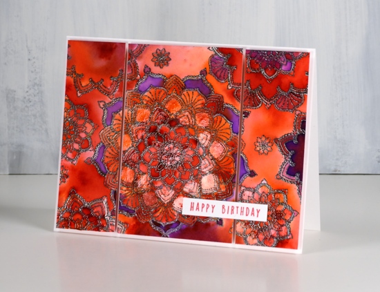
To be honest, I originally chose the ‘many mandalas’ stamp set for the range of sentiments rather than the mandalas. After taking a closer look I got inspired to stamp with the intricate circular designs and had a happy time creating a panel which I now want to turn into fabric! The stamps in this set are made of very fine lines so you can make very intricate designs with them. The set also has a guide for putting all the separate stamps together to make the intricate mandala you see in the centre of my card. That’s not one stamp; oh no; that is made from five separate stamps one inside another. Yes it is tricky to get them lined up (the guide helps with this) but having them as separate stamps means you can create an unending number of patterns. You can see from my card I have single or double patterns surrounding the central intricate design. Trust me; these stamps are fun.
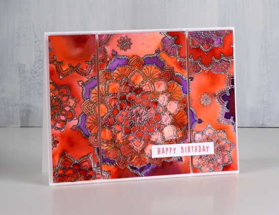
I stamped my design in versamark but I probably should have gone for a coloured ink (duh!) as I was embossing in gunmetal powder anyway. I stamped the individual mandala circle stamps one at a time on hot pressed watercolour paper and embossed after each stamping. If I had used a coloured pigment ink to see where I had stamped I probably could have stamped several before stopping to emboss with the gunmetal powder. After I’d done all my embossing I sprinkled tangerine, violet and fuchsia colorburst powders over the panel and spritzed with water. I try not to sprinkle too much the first time so I can see where each colour has fallen and then decide if I want to feature a colour in a particular place. You can see from the close up that I did concentrate some areas as violet, some as tangerine and others as a blend. To keep a section as one colour I started moving and adding colour with a paintbrush instead of sprinkling it from the bottle. I used my glass mat as a palette and mixed some of each colour on the mat so I could then paint it into sections on the panel. Once all the painting was done I dried the panel and painted diamond glaze over several of the mandalas. You can probably see a reflective shine on parts of the top two photos, that’s the glaze.
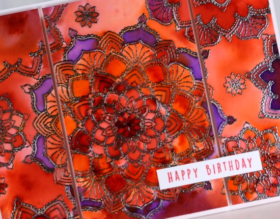
To complete the card I decided to slice the panel into three pieces and pop them up on foam on a white card base. I stamped the sentiment on white too in some versafine clair glamorous ink. Now if there was a way to turn this small panel into a nice big piece of fabric I think I would be making myself something to wear.
Supplies
Stamps: many mandalas (C&9th)

Inks: versamark, glamorous versafine clair

Paint: violet, tangerine, fuchsia colorburst powders


Paper: hot pressed watercolour paper, neenah solar white

Also: gunmetal embossing powder, glossy accents


Painting with painted prints
Posted: September 18, 2018 Filed under: painted prints | Tags: My Favorite Things, Ranger Distress inks, WOW embossing powders 15 Comments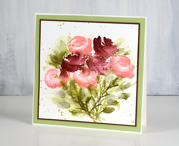
When I was working with the painted prints set a few weeks back I kept experimenting and came up with a process that uses only one of the stamps in each co-ordinated set of 2 or 3 layered stamps. The stamps are designed to work in 2’s or 3’s; you usually stamp the larger stamp first then the smaller ones over the top.
Instead for these cards I worked with the second stamp of each layering combo. I stamped in distress ink and used a brush and water to blend the stamping into a fuller shape. This gave me light and darker shading on each flower. I stamped and restamped the leaves and stems to get dark, medium and light green tones. A little spritz of water over the leaves made the colour bleed into the paper a bit more then I finished it off with some green splatter. The inks used in the card above were worn lipstick, aged mahogany, forest moss and shabby shutters.
This second rose card I completed the same way but didn’t fling quite so much water around. The inks were tea dye for the stamping of the rose (the second layer stamp) and abandoned coral for blending over the top. Once again the leaves and stems were forest moss and shabby shutters. To make it just that little bit fancier I matted with a dark gold cardstock and embossed the sentiment with gold powder.
The technique described here is the one I used for the tulips in the previous post. Layering stamps are very clever but I am happy to also have worked out a loose looking un-layered technique to try with them; you know I like blending everything with water!
Supplies
Stamps: painted prints, fluttering friends (MFT)


Inks: worn lipstick, aged mahogany, shabby shutters, forest moss, mowed lawn, tea dye, abandoned coral, versamark


Paper: cold pressed watercolour paper, shimmer antique gold cardstock, pale green cardstock, burgandy cardstock,

![]()
Also: metallic gold rich embossing powder

Painted tulips
Posted: September 15, 2018 Filed under: painted prints | Tags: My Favorite Things, Ranger Distress inks 8 Comments
My Favorite Things is having a competition to find some Card Design Superstars so I thought I would throw a card into the ring. This one is created with stamps from the ‘Painted Prints’ stamp set. I have another post coming on Monday which explains my process using the rose stamps from the same set. I pulled this card out of that post so I could enter it in the ‘Clean & Simple’ category of the competition.
I used distress inks for all the flowers, leaves and stems then switched to versafine for the delightful sentiment from the ‘All About You’ set.
Supplies
Stamps: painted prints, all about you (MFT)

Inks: dusty concord, milled lavender, forest moss, mowed lawn, abandoned coral, picked raspberry distress inks, shady lane versafine clair


Paper: cold pressed watercolour paper, olive green cardstock
Christmas berries
Posted: September 14, 2018 Filed under: Christmas berries | Tags: Penny Black stamps, Ranger Distress inks, Tsukineko Versafine inks 15 Comments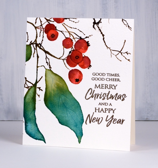
I’m hanging out on the Foiled Fox blog today, one of my favourite places to be. They have a bunch of lovely new stamps & dies from Penny Black; if you haven’t had a chance to browse their new arrivals, you really should. Christmas berries is one of the new rubber cling stamps and I have filled out my panel with extra branches from a handy set called ‘winter branches‘.
I used a stamp positioner so I could work on berries separately from leaves and twigs. I stamped the berries in ‘festive berries’ ink (imagine that) and blended on the paper with a paint brush. I let the ink dry before painting some ‘aged mahogany’ onto the shadowed areas of the berries.
I inked the leaves with pine needles distress ink at one end and peeled paint at the other. After stamping I blended the two colours together with a damp brush. I stamped all the branch and twiggy bits with ground espresso distress ink which is a nice dark brown and used the same colour to paint details onto the berries. I used the ‘Winter Branches’ stamps to fill out the design but first I stamped the Christmas berries stamp on post-it notes so I could cut some masks to cover the berries while I stamped the branches over the top in the ground espresso ink.

I switched to versafine vintage sepia ink for the sentiment because it prints fine detail so well. To make the colour closer to the depth of ground espresso I just stamped several times in the stamp positioner.
Supplies
Stamps: Christmas berries 40-626(PB), winter branches 40-637, Joyful wishes 30-434


Inks: pine needles, peeled paint, festive berries, aged mahogany, ground espresso distress inks & vintage sepia versafine ink


Paper: hot pressed watercolour
Also: stamping platform

Peaceful
Posted: September 12, 2018 Filed under: peaceful | Tags: Penny Black stamps, Ranger Distress stains, Tsukineko Versafine inks 8 Comments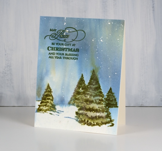
This simple card utilises only two stamps and three inks but I think it manages to convey an impression of a big winter sky. I splattered masking fluid on hot pressed watercolour paper then, after it had dried I sprayed water, stormy sky and forest moss stains over the panel. I did it fairly randomly but tilted the paper to keep one corner pale while the rest of the panel filled with colour.
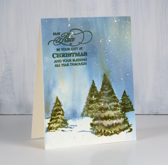
When the sky was partially dry I stamped the trees with forest moss distress ink. With the trees in place I added more drops of stormy sky stain and scattered straw stain while tilting the panel upside down to make the colours bleed up into the sky like the northern lights. I blended forest moss stain into the stamped trees then let the panel dry before removing the masking fluid.

I trimmed the panel to cover the whole card front and added a sentiment from the PB ‘Christmas and love’ set. I had forgotten how much I like the look of masking fluid splatter. I use it more as snow in wintry scenes than anything else but it adds a little something to other designs also. Now I want to go and splatter masking fluid on all my watercolour paper…
Supplies
Stamps: peaceful 30-511(PB), Christmas and love 30-508(PB)


Inks: forest moss distress stain, stormy sky distress stain, scattered straw distress stain olympia green versafine


Paper: hot pressed watercolour
Also: masking fluid

Christmas arrangement
Posted: September 11, 2018 Filed under: Christmas arrangement | Tags: Kuretake Zig clean color real brush markers, Penny Black stamps 4 Comments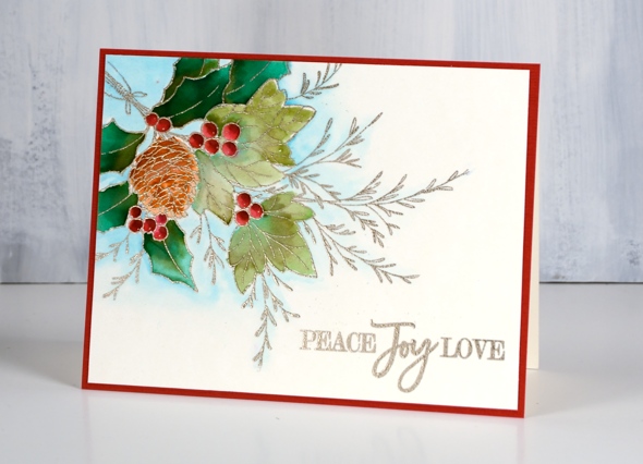
I have another Christmas card for you today; in fact it is going to be ‘Christmassy’ all week here on my blog. If you haven’t watched Michael McIntyre talk about feeling Christmassy you should check it out; I’m sure you’ll smile. I’m not actually feeling Christmassy myself; I love summer too much to wish it away right now but I have started creating with Christmas stamps as well as wintry images. This PB stamp is called ‘Christmas arrangement’. I embossed it in platinum embossing powder, which is such a lovely not gold/not silver but still shiny colour. All the watercolouring was done with zig clean colour real brush markers. If I didn’t have exactly the colour I wanted I did some blending to get it. You can see in the close up that I did not take all that much care with my colouring but the overall effect is still vibrant with the pop of red against both dark and muted greens.
The sentiment is from the ‘peaceful season’ set and the whole panel is matted in red to make those berries pop even more.
Now if you are in Australia or elsewhere in the Southern Hemisphere you would realise that preparing for Christmas does not herald the coming of winter, far from it. The Christmasses I enjoyed for the first part of my life were often hot and sunny. We headed off to the Christmas tree farm in t-shirts, played cricket in my grandparents back yard after Christmas dinner and often headed off for some time at the beach after Boxing Day.
Supplies
Stamps: Christmas arrangement 40-646(PB), peaceful season 30-498(PB)


Ink: versamark
Markers: zig clean color real brush markers

Paper: hot pressed watercolour, red
Also: platinum embossing powder

Christmas Glow
Posted: September 10, 2018 Filed under: Christmas glow | Tags: Penny Black stamps, Ranger Distress inks, WOW embossing powders 10 Comments
Penny Black has launched a challenge on their blog asking you to share your holiday themed PB creations.
Two lucky winners will receive a $25 shopping spree to our online store. And the grand prize winner will receive a $100 shopping spree to the Penny Black online store!That’s three winners! The $25 shopping spree winners will be announced here on the blog on September 28 and October 26. The grand prize winner will be announced on November 30th.
I am sharing Christmas cards on my blog this week; I hope you get inspired to do some creating with your PB stamps and dies. If you do make sure you enter the challenge; there are several ways to enter so check out the details here.
This large tree stamp is called Christmas glow and it is stamped on hot pressed watercolour paper. I coloured it with distress inks while working in a stamp positioning tool. I dabbed different green inks on the tree branches and spritzed lightly before stamping. I wanted to retain the shape of the tree but have the greens blend with each other so I added only enough water to move the ink a little. I stamped the pot in vintage photo then blended with a paint brush then added black soot ink to the inside of the pot.
I dried all the coloured stamping then inked the star and sentiment with versamark and coloured inside the string of lights with a versamarker (embossing pen) then embossed in gold powder. I used a gold gel pen to draw the string between the lights.
Supplies
Stamps: Christmas glow 40-627(PB), peaceful season 30-498(PB)

Inks: crushed olive, pine needles, mowed lawn, vintage photo, black soot distress inks & versamark


Paper:
Also: WOW metallic gold rich embossing powder, gold gel pen, embossing marker

Grevillea aflame
Posted: September 7, 2018 Filed under: grevilleas | Tags: Brusho, Darkroom Door stamps, Ranger Distress stains 8 Comments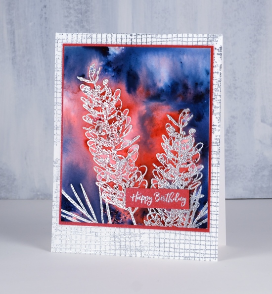
Thank you for the lovely comments you left on my previous post, also featuring the grevillea stamps. I love hearing from you and was very touched by your sweet words about me and my dad.
I’m sharing cards over on the Darkroom Door blog today. If you haven’t visited there you should; there is a collection of amazing artists who share their creations there. I have a couple of grevillea cards to share with you today. One of them not too realistic in colour but still bright and bold like the real thing. I stamped the grevillea in versamark twice and the foliage twice then embossed in silver embossing powder on hot pressed watercolour paper. I sprinkled brilliant red brusho around the flower heads and prussian blue brusho round the perimeter of the panel, spritzed with water and let the brusho activate before adding any more. I then played around with adding more water and tilting to make paint move. I also used a brush to pick up wet paint from panel to move it to an empty area then let it dry. 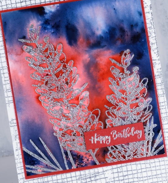
For a background I stamped mesh textures stamp four times on white card base with versamark ink (you could use mesh background stamp if you have it to fill card base) and embossed in silver. I stamped a sentiment from happy birthday sentiment strip in versamark on red cardstock and embossed it with silver powder. To complete the card I matted the grevillea panel with red cardstock and attached it to the card base.
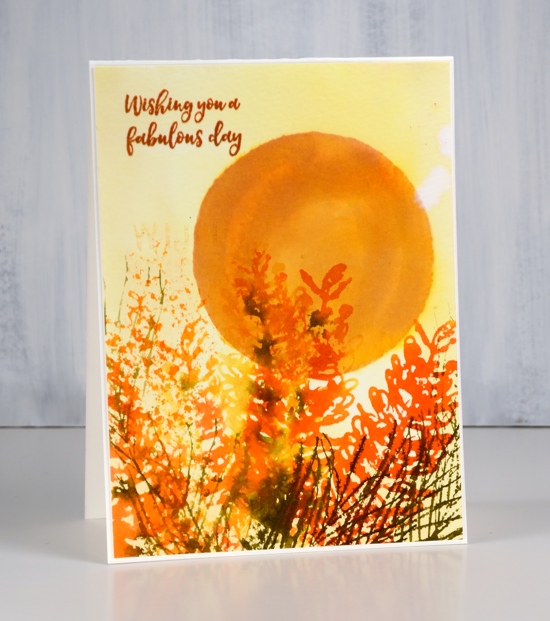
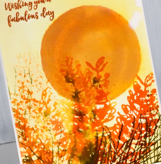
For this more realistic colour scheme I painted a circle in wild honey distress stain on cold pressed watercolour paper and let it dry. Then I painted scattered straw distress stain over whole panel and let that dry. I inked the large grevillea flower in wild honey, ripe persimmon, spiced marmalade and forest moss distress stains, spritzed stamp then stamped on the watercolour panel. I repeated by spritzing the stamp to get a paler impression then followed the same procedure to fill the base of the panel with flowers. I inked the foliage stamp with forest moss distress ink, stamped and restamped for bold and paler images.
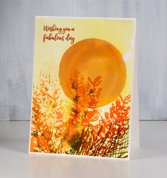
To finish I stamped a sentiment from ‘happy birthday’ set in rusty hinge distress ink then trimmed and attached the panel to natural white card base.
Supplies
Stamps: grevilleas, happy birthday, mesh textures (DD)


Card 1 Inks: versamark
Card 2 Inks: wild honey, scattered straw, ripe persimmon, spiced marmalade, forest moss distress stains, rusty hinge distress ink


Paint: brilliant red, prussian blue brusho

Paper: hot pressed watercolour paper, neenah natural white cardstock, neenah solar white, red cardstock
Also: stamping platform, silver embossing powder


