
Upcoming classes
Posted: March 17, 2015 Filed under: Classes 14 CommentsI just thought I would let you know about some card making classes coming up in March & April. I know many of you do not live close enough to attend a class but maybe a few of you do. I host monthly classes on Riverside Drive in Ottawa and they are listed on my CLASSES page. There is a link in the top right hand corner of the blog.
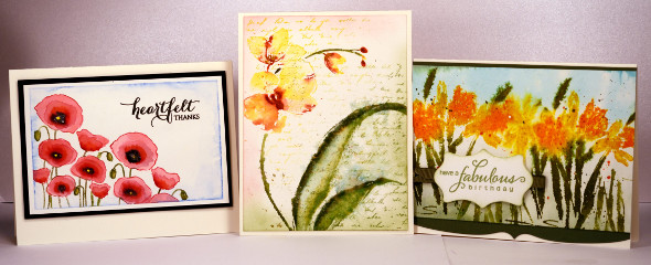
I also teach at the Ottawa scrapbooking store, Crop A While in Orleans. You can find the details on the Crop A While events page. I will be teaching my Stamps, Dies & Butterflies class there next week on Thursday, March 26th and Friday, March 27th. Check their events page for times and contact the store directly if you are interested. In April I will be teaching my Spring Watercolours class at Crop A While on Thursday April 23rd and Friday April 24th.
I am very excited to let you know that in April I will be teaching at Bizzy B’s Stamp and Scrap in Toronto. Please contact the store directly if you are interested in any of the following classes. I will be there on Friday, April 17th teaching my Background Beauty class.
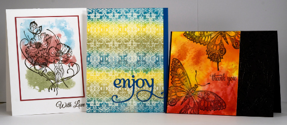
I will also be teaching the following two classes at Bizzy B’s on Saturday April 18th.
Stamps, Dies & Butterflies
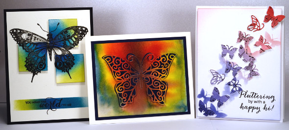
Spring Watercolours
Imagine
Posted: March 15, 2015 Filed under: Dies, Watercolour | Tags: Fabriano Watercolour Paper, Kuretake Gansai Tambi watercolour paints, Penny Black creative dies 57 Comments
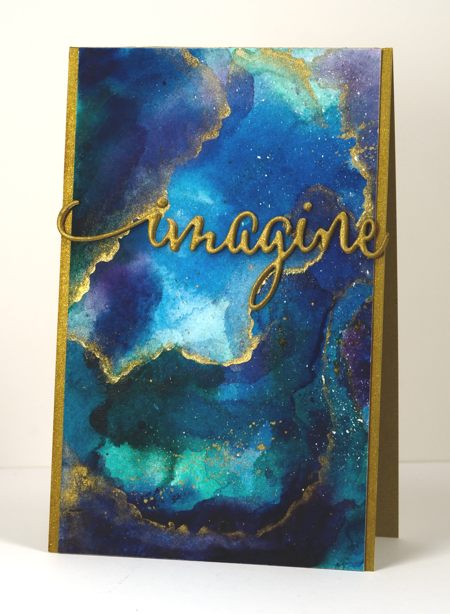
I am enjoying my new watercolour paints and have watched some recent watercolour videos by the very talented Sandy Allnock. She has been playing around with the same paints (Kuretake Gansai Tambi) and posted a video last week where she created a faux glass panel inspired by vase she saw. I used some of the same techniques and made a faux marble panel. I painted blues, greens and purples on a piece of watercolour paper and let them blend. I dried them with a heat tool then added more layers leaving some pale and others dark and intense. When I was happy with the colours I painted some thin lines of gold onto the panel and blended them out on one side with a very wet paint brush. This gave me a soft edge and a hard edge I also splattered some gold paint over parts of the panel. The piece on the card above is less than half the watercoloured panel so I have some more to play around with another day.
For the sentiment I stacked four diecuts of the word ‘imagine’ each with ‘stick it’ adhesive on the back to make them easier to stick together. The gold cardstock I used was slightly duller than the gold paint so I brightened it up with my gold wink of stella pen. I did the same with the sides of the card base so it would all match. I am thinking it might make a good graduation card.

Supplies
Creative Dies: Envision (PB)
Cardstock: Fabriano 100% cotton hot pressed watercolour paper, gold cardstock
Also: Kuretake Gansai Tambi watercolour paints 38, 50, 55, 56, 62, 66, 91 and gold wink of stella brush
Red Poppies
Posted: March 11, 2015 Filed under: Blooming Garden, Watercolour | Tags: Kuretake Gansai Tambi watercolour paints, Penny Black stamps 9 Comments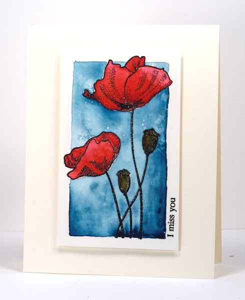
More poppies. I thought it might be fun to try a few different techniques with the same stamp, especially such a pretty stamp. In some ways outline stamps such as this one are more versatile than brushstroke or silhouette stamps. On my previous card I used the outline of the poppy as a guide for my watercolour painting. On this card the embossed outline is a fence to contain the watercolouring. I have a new set of Gansai Tambi watercolour paints that I am experimenting with so painting within the lines seemed to be a safe way to start.
I stamped in black and embossed in clear powder on watercolour paper. I chose a pinky red and an orange red for the petals, laying down the pinky red first over the whole petal then adding the orange red from the centre. I used an olive green and a brown to fill the seed pods. I decided to paint over the flowers with masking fluid while I painted the blue panel which was probably not necessary considering I had the embossing to fence in the colour. Once the masking fluid was dry I ruled a rectangle around the image letting a few petals extend over the edge. My pencil lines were my guide for painting the blue background. When it was all dry I peeled the masking fluid off and discovered it had absorbed a lot of the colour from the petals. I’m not sure why this happened so I will experiment further with paper, paints and different masking fluids. But for this panel I just added more colour and carried on. To finish I added a little sentiment on the side and popped up the panel on a cream card base.
I have created a few projects with the new watercolours now and I am really enjoying both the choice and the richness of the colours.
I’m not sure if I will follow this post with another poppy project; I have been wanting to play along with the current One Layer Simplicity challenge so we will have to see where the inspiration hits first.
Supplies:
Stamps: Blooming Garden, Snippets (PB)
Inks: Versafine Onyx Black (Tsukineko)
Cardstock: Fabriano 100% cotton hot pressed watercolour paper, Neenah Classic Crest Natural White 110lb smooth
Also: Kuretake Gansai Tambi 36 Watercolor Set
Pink Poppies
Posted: March 9, 2015 Filed under: Blooming tags, Sprigs | Tags: Faber-Castell Albrecht Durer Watercolour pencils, Penny Black creative dies, Penny Black stamps 18 Comments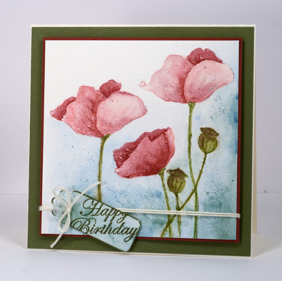
Last week I posted several loosely watercoloured cards. The poppies on today’s card were painted with more precision and there was no spritzing to make the colours blend and bleed. I worked on a watercolour block which I had splattered with a fine mist of masking fluid. The end result with such a fine mist could represent snow but I think it could pass for rain too. I have had snow fall on my daffodils and tulips but the poppies are pretty safe! Once the masking fluid was dry I inked the poppy image from ‘blooming garden‘ with memento angel pink and new sprout markers. The colours are fairly pale so I had an outline to work with but not so dark that it would be noticeable after I had added all the colour. For this one I used my watercolour pencils as paints. I do this by picking up colour from the lead of the pencil with a waterbrush then painting with it. For the poppies I used colour from three pink pencils (listed below), for the stems and seed heads two greens and a brown then a blue and a green for the background.
I didn’t want both of the tall poppies to look exactly the same so I altered the petals a bit on the left hand one. When I checked a photo of seed pods to choose my colours I saw many were quite round so I fattened mine up a little. When the poppies and seed heads had dried I drew some veins and ridges with the watercolour pencils.
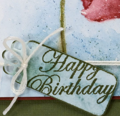
To create the little tag I painted a scrap of watercolour paper with the same colours I had used on the background of the main panel, die cut a ‘flower tag’, then stamped the sentiment from the ‘sprigs’ set across it. To complete the card I matted the panel with a narrow red mat, tied the tag on with embroidery floss, popped the panel up on a wider green mat and attached it to a cream card base.
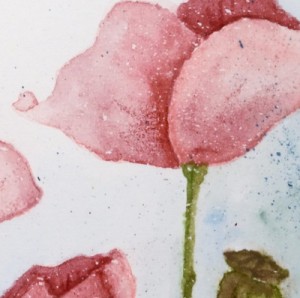
As you know I love doing the loose watery images but I also find it quite satisfying to work slowly to paint a more formal image.
Kathy Racoosin is doing a 30 day coloring challenge at present which inspired me to do pull out my pencils.
Supplies:
Stamps: Blooming Garden, Sprigs (PB)
Creative Dies: flower tags (PB)
Inks: Memento Angel Pink, New Sprout, Olive Grove markers (Tsukineko)
Cardstock: Fabriano 100% cotton hot pressed watercolour paper, Neenah Classic Crest Natural White 110lb smooth, pink and green cardstock
Also: Albrecht Durer watercolour pencils medium flesh 131, dark red 225, indian red 192, night green 155, pine green 267, olive green 173, moss green 168, apple green 170(Faber-Castell), Cream embroidery floss
Sweet Visit
Posted: March 6, 2015 Filed under: Sweet Visit, Watercolour | Tags: Fabriano Watercolour Paper, Penny Black stamps, Tsukineko Memento inks 20 Comments
It is always a thrill to see a hummingbird suspended in mid-air to take some nectar. I have never been successful in getting a good photo so I’m settling for a stamped and painted one. I have played with this stamp three times now. The first time I was happy with result but in a momentary lapse of reason stamped a sentiment in such a way as to render it pretty unappealing (I’ve saved it in case I get a brainwave for fixing it). The second one worked fairly well and will be in the Dirty Dozen gallery later this month. But this one is my fave. The other two panels had one bird and one flower; I think it makes way more impact with one bird on a panel full of flowers. But, enough of the comparisons with cards you haven’t even seen.
I started with the flowers at the bottom keeping in mind that I wanted the bird in the top right hand corner so I had to leave space. The three main flowers were inked with Memento markers, as seems to be my current habit, spritzed with water then stamped on watercolour paper. I blended the stamping with a waterbrush adding extra colour here and there. When the flowers were dry I used a marker to define the veins in the petals and the stigma. To create the paler background flowers I spritzed the stamp again without re-inking, stamped on scrap then stamped the remaining watery ink on the paper. I blended with a waterbrush to make the images even less distinct than they already were. The bird was also inked with markers, spritzed, then stamped and blended on the paper. To finish I splattered some pink, orange and green around the flowers. Sometimes when I want a bit of splatter I grab a watercolour pencil the same colour as the ink I’ve used and splatter that for more intense colour.
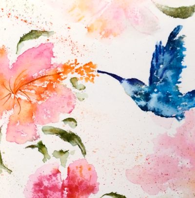
To finish the card I popped it up on a textured watercolour paper card base. I tried a narrow blue mat but it wasn’t needed; the little sentiment in blue ties in with the bird. I am linking up with the Spring Blooms challenge at the Inspiration Journal and the Spring is coming challenge at the Artistic Stamper.
(Please don’t be mad but this one was almost a video…I just got all inspired and started creating without turning on the camera! Soon, I promise.)
Supplies:
Stamps: Sweet visit, snippets(PB)
Inks: Nautical Blue, Bahama Blue, Danube Blue, Paris Dusk, Olive Grove, Bamboo Leaves, Desert Sand, Rose Bud, Tangelo, Potter’s Clay Memento markers (Imagine Craft/Tsukineko)
Cardstock: Fabriano hot pressed watercolour paper, Demco cold pressed watercolour paper
Also: Faber Castell Albrecht Durer watercolour pencils
April in Paris
Posted: March 4, 2015 Filed under: April in Paris 7 Comments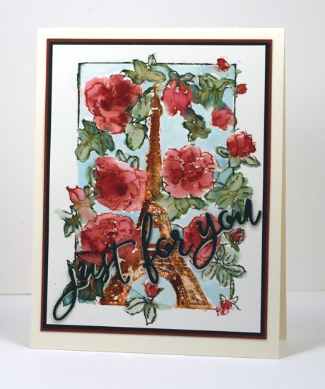
It would be nice to be in Paris in April don’t you think? Especially if, as this stamp suggests, spring would be well and truly sprung with roses blooming all around. This panel is another of my watery painting experiments where I let the colour go outside the lines and bleed where it wanted to. Once again I used Memento markers to ink the stamp then added water and more ink from the markers as I filled the roses with colour. I added the background blue last by painting some tumbled glass distress stain in the spaces.
The sentiment is a stacked die cut from the ‘for you’ set. I stacked two dark green on top of each other and then tucked a cream one slightly offset underneath to help the green stand out from all the busy flowers underneath. I matted in both green and deep red then attached it all to a cream card base. More than the usual number of layers for me but I think it works.
Supplies:
Stamps: April in Paris (PB)
Creative Dies: For You (PB)
Inks: Memento Rhubarb Stalk, Northern pine, Potter’s Clay, Rich Cocoa markers (Tsukineko) Broken China distress stain (Ranger)
Cardstock: Fabriano 100% cotton hot pressed watercolour paper, Neenah Natural White cardstock, red and green cardstock
Flower Sparks
Posted: March 3, 2015 Filed under: Flower sparks, Illuminate 5 Comments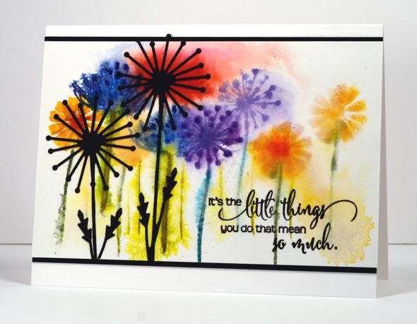
Today’s card features more watery blurred stamping, probably not the look we usually aim for when creating cards. I was having fun experimenting with some of the stamps I hadn’t used from the new “Bring on the Happy” release. These flowers are from the ‘Flower Sparks’ set which I had dipped into to make this card but had not used the other eight flower stamps. I used markers to ink the stamps and stamped on watercolour paper. To make the colour flow around the panel I spritzed and tilted the paper. Once again I used black for my sentiment and also borders and two die cut flowers.
There is a new challenge on the One Layer Simplicity blog hosted this month by Susan. She is challenging us to use only our word stamps, no flowers, trees, background stamps are allowed, only words! I hope you get inspired.
Supplies:
Stamps: Flower Sparks, Heartfelt (PB)
Creative Dies: Illuminate (PB)
Inks: Memento Northern Pine, Bamboo Leaves, Danube Blue, Love letter, Tangelo, Dandelion, Nautical Blue, Grape Jelly markers & Versafine Onyx Black (ImagineCrafts/Tsukineko)
Cardstock: Neenah Natural White 110lb cardstock, Neenah Epic Black cardstock, Fabriano watercolour paper
Windblown tulips
Posted: March 2, 2015 Filed under: CAS, Promise Me 6 Comments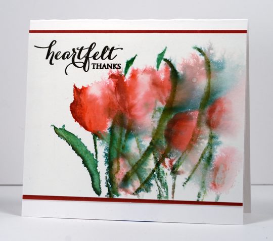
I pulled out a bunch of flower stamps the other day to create some spring themed cards. I don’t expect I will see any spring flowers around here for many weeks so a few on cards will have to suffice.
I worked with Memento markers to create the image above. I inked the petals on the stamp with rhubarb stalk, lady bug and angel pink markers and the leaves with northern pine, cottage ivy and pistachio. I stamped the first impression on the left after spritzing the stamp, I spritzed again without re-inking and stamped to the right, spritzed again without re-inking and stamped lower on the right. The result is paler images from each impression. I also spritzed the whole stamped image sending colour bleeding to the right which creates the wind blown look.
I added a sentiment in black, matted the stamped panel on red cardstock and attached to a white card base.
Thanks for dropping by.
Supplies:
Stamps: Promise Me, Heartfelt (PB)
Inks: Memento Angel Pink, Lady Bug, Rhubarb Stalk, Northern pine, Cottage Ivy, Pistachio markers (Tsukineko)
Cardstock: Fabriano 100% cotton hot pressed watercolour paper, Rose Garden mix & match paper (PB)
Warmth on a cold day
Posted: February 20, 2015 Filed under: Efflorescence, Watercolour | Tags: Penny Black stamps, Ranger Distress stains 17 Comments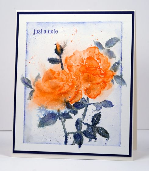
When it’s -25°C outside the best thing to do is stay inside and make pretty things. The weather here continues to be bitterly cold and I keep reading of places in the states where the kids have had a week of snow days. A week! No snow days here. My daughter caught the bus to work this morning and said if she kept her eyes open they froze but if she closed them the skin on her eyelids stung too much!
I used the rose from the new transparent set ‘Efflorescence’ to make this card and it will be a bit tricky to give you all the how-to details. I stamped and painted, left it, came back, spritzed it, left it, came back, stamped again…you get the idea. Basically I stamped with distress stains to give me a wet outline image from which I pulled in colour to fill the petals or leaves. I spritzed the painted images to let some of the colour bleed into the background. I let it dry before masking the first rose so I could stamp a second behind it plus some extra leaves. I wanted a little rosebud in there too so I painted my own. I created the border with a watercolour pencil then added a splatters of blue and orange before adding a little sentiment and a matching mat.
I don’t know about you but I have had to look up a few of the new PB stamp names in the dictionary. Efflorescence means the action or process of developing and unfolding as if coming into flower. Effulgence means radiant splendor. Ebullient means having or showing liveliness and enthusiasm. So there you go; stamping is expanding my vocabulary.
Supplies:
Stamps: Efflorescence, Snippets (PB)
Inks: Ripe Persimmon, Iced Spruce, Chipped Sapphire distress stains (Ranger), Memento Paris Dusk marker (Imagine Craft/Tsukineko)
Cardstock: Fabriano 100% cotton hot pressed watercolour paper, Navy paper, Neenah Natural White 110lb cardstock
Golden tones
Posted: February 19, 2015 Filed under: CAS, Flower sparks | Tags: Penny Black stamps, Ranger Distress inks 16 Comments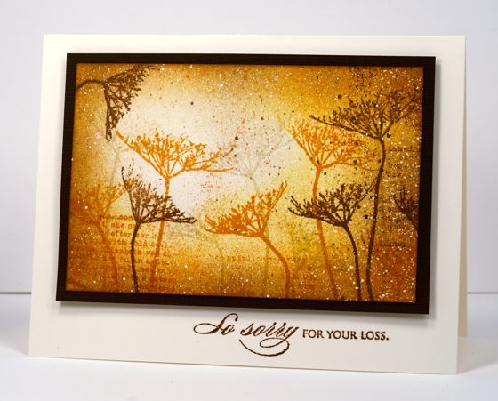
Perhaps the extremely cold weather we’re having at present is making me reach for warmer colours. The last three cards I’ve posted have featured warm golden tones. This card was stamped with two stamps from the new transparent set ‘flower sparks’. It is the first time I have used the set and I discovered it’s a clever little set. There are ten flowers in the set and each one is on a long thin stem which you can bend this way or that before you stick it on your acrylic block. With that kind of flexibility you end up with way more than ten stamps! Cool huh?
I used the same two stamps over and over but bent the stems different ways each time. I began with a piece of white cardstock flecked with masking fluid. Over that I stamped several flowers in antique linen distress ink. I chose a position for my light source and sponged antique linen, wild honey and vintage photo distress inks over the panel. When the sponging was done I added more flowers with the two darker inks. I grabbed a couple of watercolour pencils to flick spots of brown and honey colour in a few places before removing the masking fluid. It is matted in a textured brown cardstock then popped up on a natural card base.
Hope you’re staying warm.
Supplies:
Stamps: Flower Sparks, Heartfelt, Footnotes (PB)
Inks: Antique Linen, Wild Honey, Vintage Photo distress inks(Ranger)
Cardstock: Neenah Natural White 110lb cardstock, Neenah Solar White 110lb cardstock, Brown textured cardstock
Also: Winsor & Newton masking fluid











 Heather Telford