
Curtain Call Inspiration Challenge – Bouquet
Posted: April 15, 2015 Filed under: Efflorescence, Stitched Edges | Tags: Faber-Castell Polychromos Colour Pencil, Penny Black creative dies, Penny Black stamps, Ranger Distress stains 4 Comments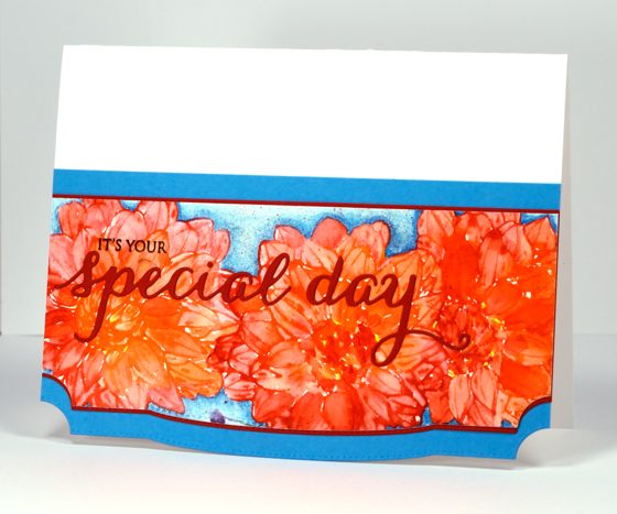
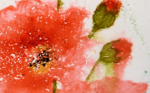
Penny Black is playing along with the Curtain Call Inspiration Challenge today and the inspiration picture is a big bright bouquet of flowers.

I chose to highlight one of the flowers, a dahlia I think, and repeated it three times across my panel. I inked the flower from the transparent set ‘Efflorescence’ in barn door and ripe persimmon distress stain, spritzed it so the stains would blend then stamped it once on the panel. I did one at a time so I could do all the painting for each one while the stain was still wet. I used a waterbrush to pull colour from the outline in to fill the petals. If the stain dried before I could pull colour in I squeezed some out of the bottle and picked it up with the brush. After letting the first flower dry I did another and then a third. When all three were dry I added a fine splatter of barn door stain.
The background is coloured with Faber Castell polychromos pencils in two blues, I also added some extra definition here and there on the petals with red and orange pencils. The bottom edge of the panel, as well as the red, the blue mat and the card base, is die-cut by one of the stitched edges dies. For the sentiment I stamped only part of a stamp from the Sprinke & Smiles set so I could finish the phrase with words die cut in the same red as the mat.
Make sure you check out the challenge and some more interpretations from the PB design team
Supplies:
Stamps: Efflorescence, Sprinkles and Smiles (PB)
Creative Dies: Stitched Edges, Splendid Wishes (PB)
Inks: Ripe Persimmon, Barn Door distress stains (Ranger), Versafine Onyx Black (Imagine Craft/Tsukineko)
Cardstock: Fabriano 100% cotton hot pressed watercolour paper, Red and Blue cardstock, Neenah Avon Brilliant White 110lb cardstock
OLS15 Blowin’ in the Wind
Posted: April 13, 2015 Filed under: Dandee | Tags: Penny Black stamps, Ranger Distress stains 19 Comments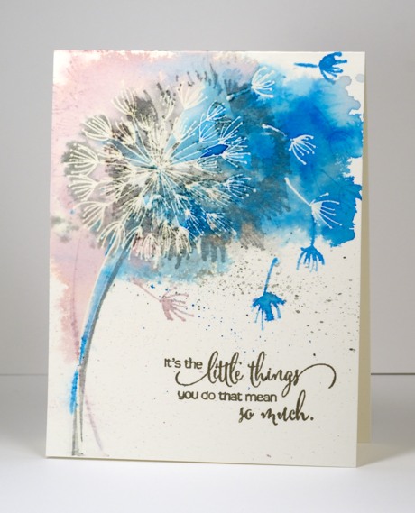
The One Layer Simplicity challenge this month is “Blowin’ in the Wind”. Karen is challenging us to show wind on our cards. She suggests using a straw to blow paint dropped onto your paper, stamp an image that shows something blowing in the wind or maybe try splatters that go in one direction?
I tried a few of her suggestions on my card beginning with a image that blows in the wind and also invites us to blow it ourselves – the dandelion seed head. I stamped and embossed the dandelion and three seeds on watercolour paper then re-inked the stamp with iced spruce distress stain. I spritzed the stamp, then after stamping, spritzed the paper until the stain started to spread. I tilted the paper to make the colour move in one direction then stamped again in salty ocean distress stain and milled lavender. I spritzed and tilted and moved a bit of colour around with a brush until I was happy with the coverage. To finish I splattered a bit of blue and grey then added the sentiment in versafine Smokey Grey. It just so happens that the Less is More challenge this week happens to be Splatters on a one layer card. Yay, I’m in!
Even though I had taped down the watercolour paper it was still a bit warped once it dried. I decided to iron it which got the kinks out and also removed the embossing. Karen has been doing all sorts of fabulous backgrounds with Bister on her cards lately which has inspired me to create a similar watery splashed background. I don’t have any Bister but I am happy with the way the colours bled and spread on this piece.
Thanks, Karen for a great challenge and all the wonderful inspiration on your blog, Snippets.
Supplies:
Stamps: Heartfelt, Dandee (PB)
Inks: Salty Ocean, Iced Spruce, Milled Lavender Distress Stains (Ranger) Versamark, Versafine smokey grey (Tsukineko)
Cardstock: Fabriano 100% cotton hot pressed watercolour paper
Also: clear embossing powder
Birds, blooms and balloons
Posted: April 4, 2015 Filed under: CAS, Tweet Thing, Uplifting | Tags: CAS, Fabriano Watercolour Paper, Penny Black creative dies, Ranger Distress stains 10 Comments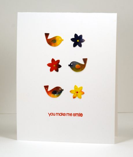
The theme at CASology this week is “Spring” and the sketch at CAS(E) this sketch is a 2×3 array. I had fun combining the two in the card above.

The watercolour panels were left over from my last class so I die cut little birds and flowers using dies from the ‘tweet things’ set to fit with the spring theme then arranged them according to the sketch.
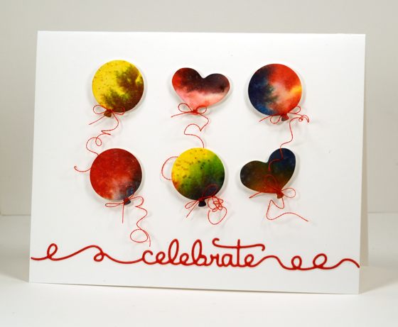
I don’t know that balloons are a spring thing but they do work perfectly for the sketch so I die cut some circle and heart balloons using dies from the ‘uplifting’ set, spent way too long tying six tiny bows of machine embroidery thread around the balloons then popped them up on dimensional tape. The embroidery thread is very shiny so I found the shiniest red cardstock I had and die cut the word celebrate from the ‘doodles’ set which works in well with the curls in the thread.
We had amazing spring weather yesterday; my girls and I went for a run in beautiful 15°C sunshine. This morning we woke up to fresh snow so my husband skied this afternoon. Happy Easter everyone.
Supplies:
Stamps: Snippets (PB)
Creative Dies: Tweet Things, Uplifting, Doodles (PB)
Inks: Barn Door, Mustard Seed, Chipped Sapphire Distress Stains (Ranger) Satin Red versafine ink (Tsukineko)
Cardstock: Fabriano 100% cotton hot pressed watercolour paper, Neenah solar white cardstock
Spring Things
Posted: March 25, 2015 Filed under: CAS, First Dance, Sun fire | Tags: Fabriano Watercolour Paper, Penny Black creative dies, Penny Black stamps, Ranger Distress stains 17 Comments
I pulled out one of last year’s floral stamps for this card and tried the co-ordinating die from this year’s release. I painted a pale background first and let it dry before I did any stamping. I inked the stamp directly with distress stains, spritzed, stamped then blended with a waterbrush and a clear wink of stella pen. The petals were inked in seedless preserves and dusty concord so there would be some light and dark purple to blend. On the main panel I added a few wink of stella highlights once I had blended the petals but on the die cut lily I did all the blending with a clear wink of stella so it has a subtle shimmer when it catches the light. The dots on the petals and the filaments get a bit lost when inked with distress stain so I went over them with a marker once the petals were dry.
I completed the card by matting the main panel in green and popping up the die cut lily over the top. I added a simple sentiment but I am realising now that this would have made a nice easter card. I guess I can stamp an easter sentiment inside.

Believe it or not I still have a few snowy scene card ideas bouncing around in my head. How about you – are you just stamping all things spring these days?
I’ve never entered Darnell’s cool NBUS challenge but I am eligible with my never before used ‘sun fire’ die so I will link up over there and at the Work it Wednesday Challenge on the Simon Says Stamp blog.

Supplies:
Stamps: First Dance, Snippets (PB)
Creative Dies: Sun fire (PB)
Inks: Dusty Concord, Seedless Preserves, Spiced Marmalade, Tumbled Glass, Ripe Persimmon, Forest Moss Distress Stains (Ranger)
Cardstock: Fabriano 100% cotton hot pressed watercolour paper, green cardstock, Neenah Natural white cardstock
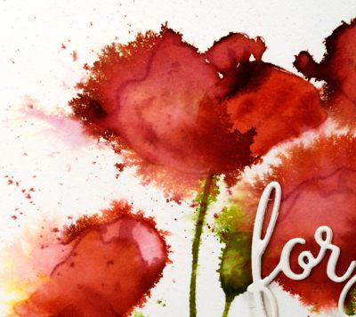
Deep Pink Poppies
Posted: March 20, 2015 Filed under: Blooming Garden, CAS, Watercolour | Tags: Fabriano Watercolour Paper, Penny Black creative dies, Penny Black stamps, Ranger Distress stains 7 Comments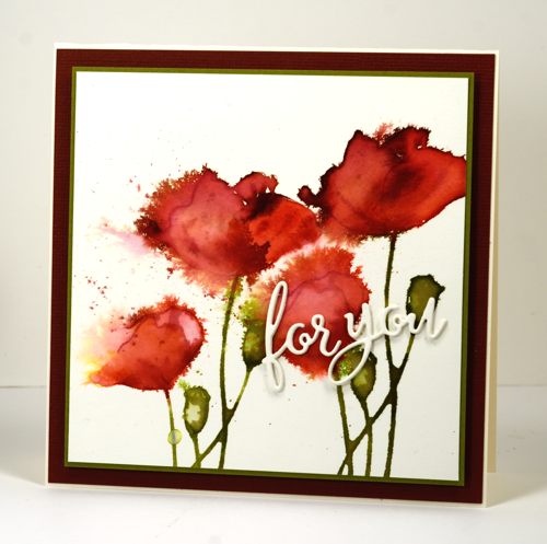
More poppies! I think this is the last for now. Maybe. As I mentioned in my last post, my poppy watercolouring has become progressively looser in the four cards I have recently created. This one might just be my favourite. It started out just like the last one; I inked the poppy stamp from Blooming Garden with distress stains (listed below). I stamped the image twice, spritzing the stamp with water before each impression but not re-inking. While the stain was wet I used a paintbrush to pull colour into the petals, adding stain or water here and there to make it lighter or darker. There was a bit of yellow left on the stamp from the previous card which ended up on the far left poppy and I quite like that happy accident. While the painted poppies were still damp I spritzed water over the images aiming from right to left so the poppy blow outs occurred in the same direction.
Even though this technique looks very loose and free it can go wrong very quickly. One of the keys to success is to spritz then wait to see what happens. If you spritz, take a quick look, think nothing has happened so spritz again, you can end up with water and colour everywhere but not in a very artistic arrangement. That kind of happened on the poppy under the die cut sentiment which, of course, is why it is under the die cut sentiment. Triple stacked die cut sentiment by the way. I really like the look of the stacked die cuts and I am getting better at lining them up so they look like one piece instead of multiples. I did try to incorporate some ribbon or embroidery thread but they just didn’t fit in so I resorted to simple mats to finish it off.
I’ve been inspired by Kathy Racoosin’s #thedailymarker30day colouring challenge. I haven’t coloured everyday but doing this poppy project has been like a mini colouring challenge. If you haven’t seen my first three, here are the links: Pink Poppies, Red Poppies and Orange Poppies. I don’t think I have ever done blue poppies but Penny Ward has in this beautiful card.
Supplies:
Stamps: Blooming Garden(PB)
Creative Dies: For You (PB)
Inks: Peeled Paint, Aged Mahogany, Festive Berries distress stains (Ranger)Cardstock: Fabriano 100% cotton hot pressed watercolour paper, Neenah Classic Crest Natural White 110lb smooth, burgandy and green cardstock
Also: Stick it adhesive sheets, dimensional adhesive
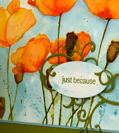
Orange Poppies
Posted: March 18, 2015 Filed under: Blooming Garden, Flourish | Tags: Penny Black creative dies, Penny Black stamps, Ranger Distress stains 14 Comments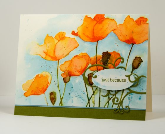
As you can see I haven’t finished experimenting with the poppy stamp just yet. I have another one after this one too and I noticed as I finished off this one that the watercolouring has got progressively looser in each design. In the first one, Pink Poppies I worked slowly with a fairly small brush, the second, Red Poppies, my brush work was looser but still contained by embossed borders. In this one I stayed mostly inside the outlines but pulled and pushed the colour around quickly with broader strokes. My next version is even looser. I worked with distress stains for this design. I inked the stamp with spiced marmalade and ripe persimmon stains on the petals and peeled paint on the stems and seed pods. I restamped the image after spritzing it with water. I didn’t re-ink because there was still plenty of stain left on the stamp. Then I did the same again. You can see the image on the left hand side is paler as the stain was more diluted by the time I stamped that one.
The stain sits on the hotpressed watercolour paper for a little while without soaking in which makes it possible to pull the colour into the petals and ‘paint’ them using the stamped stain. I do add more stain where I want it a little darker or dilute it with water to make it lighter. I painted the seed pods in the same way but added some vintage photo stain. Some colour does run in a direction you don’t want from time to time but I like a little bit of that on a loose watercolour. I added the blue background after the poppies were totally dry working with a water laden brush first then dropping tumbled glass stain and painting that around all the flowers. I added some splatters once the blue was dry.
Although I was happy with the poppies over all, some of the stems and seedpods crossing over and overlapping with the lower poppies in the bottom right corner did get a bit messy. I didn’t want to crop them out completely and lose half my panel so I decided to add the sentiment over the top held in place with a pretty little die cut flourish. The flourish is attached using ‘stick it’ adhesive sheet and the sentiment oval is popped up on dimensional squares. The nice thing about ‘stick it’ adhesive sheets is that you have a few moments to adjust the positioning before it sticks permanently so I was able to position the flourish then lift the little curls I wanted to sit on top of the popped up oval before pressing all the flourish firmly onto the panel. (Edited to add: I noticed the next day that I had called this post Orange Tulips! I’ve changed it to poppies)
Supplies: Stamps: Blooming Garden, Snippets (PB) Creative Dies: flourish (PB) Inks: Peeled Paint, Spiced Marmalade, Ripe Persimmon, Vintage Photo, Tumbled Glass distress stains (Ranger) Cardstock: Fabriano 100% cotton hot pressed watercolour paper, Neenah Classic Crest Natural White 110lb smooth, blue and green cardstock Also: Stick it adhesive sheets, scrapbook adhesive dimensional squares
Warmth on a cold day
Posted: February 20, 2015 Filed under: Efflorescence, Watercolour | Tags: Penny Black stamps, Ranger Distress stains 17 Comments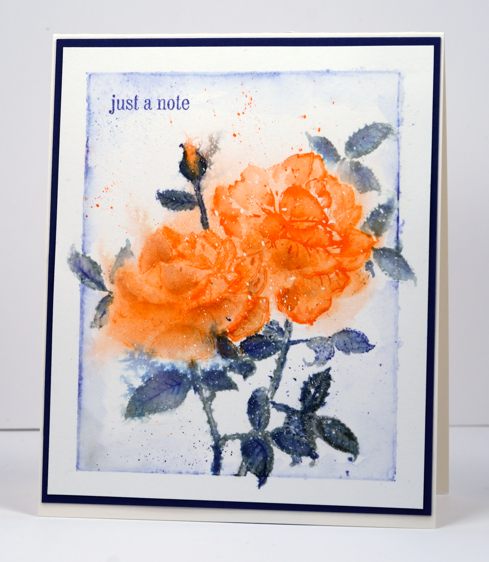
When it’s -25°C outside the best thing to do is stay inside and make pretty things. The weather here continues to be bitterly cold and I keep reading of places in the states where the kids have had a week of snow days. A week! No snow days here. My daughter caught the bus to work this morning and said if she kept her eyes open they froze but if she closed them the skin on her eyelids stung too much!
I used the rose from the new transparent set ‘Efflorescence’ to make this card and it will be a bit tricky to give you all the how-to details. I stamped and painted, left it, came back, spritzed it, left it, came back, stamped again…you get the idea. Basically I stamped with distress stains to give me a wet outline image from which I pulled in colour to fill the petals or leaves. I spritzed the painted images to let some of the colour bleed into the background. I let it dry before masking the first rose so I could stamp a second behind it plus some extra leaves. I wanted a little rosebud in there too so I painted my own. I created the border with a watercolour pencil then added a splatters of blue and orange before adding a little sentiment and a matching mat.
I don’t know about you but I have had to look up a few of the new PB stamp names in the dictionary. Efflorescence means the action or process of developing and unfolding as if coming into flower. Effulgence means radiant splendor. Ebullient means having or showing liveliness and enthusiasm. So there you go; stamping is expanding my vocabulary.
Supplies:
Stamps: Efflorescence, Snippets (PB)
Inks: Ripe Persimmon, Iced Spruce, Chipped Sapphire distress stains (Ranger), Memento Paris Dusk marker (Imagine Craft/Tsukineko)
Cardstock: Fabriano 100% cotton hot pressed watercolour paper, Navy paper, Neenah Natural White 110lb cardstock
More fresh poppies
Posted: February 15, 2015 Filed under: Fresh | Tags: Fabriano Watercolour Paper, Penny Black stamps, Ranger Distress stains 14 Comments
When I posted the first card made with the ‘fresh’ stamp I mentioned another watercolour panel where I painted the same stamped poppies but had created a different effect. Once again I stamped the image with several different distress inks and then painted inside the petals by pulling colour from the outline as well adding extra stain with a paintbrush. I worked a petal at a time so I could preserve some of the stamped outlines of the image. If I had spritzed with water at this point I could have ended up with a loose image like the pink one I posted first, but who knows; watercolour is an unpredictable technique. I painted the blue background after the poppies had dried to restrict the bleeding from the petals and stems into the background.
CAS-ual Fridays has a ‘Must Love Watercolor’ challenge at the moment so I will link there and also at the Crafting Cafe where the challenge is to use your favourite technique. Not too hard to guess what that is…
Have a great week
Supplies:
Stamps: Fresh , Snippets (PB)
Inks: Peeled Paint, Barn Door, Spiced Marmalade, Scattered Straw, Tumbled Glass, Broken China distress stains (Ranger), Memento Tuxedo Black, Bamboo Leaves inks (Imagine Craft/Tsukineko)
Cardstock: Fabriano 100% cotton hot pressed watercolour paper
Also: Winsor & Newton masking fluid
Sweet, fresh poppies
Posted: February 14, 2015 Filed under: CAS, Fresh | Tags: Fabriano Watercolour Paper, Penny Black stamps, Ranger Distress stains, Tsukineko Memento inks 17 Comments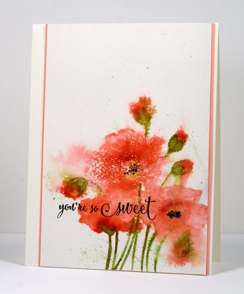
‘Fresh’ is one of the new slapstick cling stamps from the Penny Black “Bring on the Happy” release. I have been chasing deadlines all week so yesterday after getting all my ‘dirty dozen’ projects finished I pulled this nbus stamp out. I created two separate panels in different colour schemes using slightly different techniques. I started both the same way by stamping on watercolour paper in distress stain. Because distress stain is a liquid the stamp does not always ink up evenly but once stamped it does stay moist for longer than it would with the average dye ink. This gives me longer to pull colour from the stamped outline in to fill the petals, stems and buds (or whatever image I’m stamping). As you see in the stamp image below this is an outline stamp and I began by painting each petal, blending the colour with water to create light and dark shades within the petals. Although you wouldn’t know it to look at it now all the colouring was inside the lines!
At this point I chose to go for a much freer look and spritzed the flowers with water several times. I waited until the image was almost dry before adding a little yellow and finally black to the poppy centres. You have probably guessed already that the white specks and spots were made by splattering masking fluid on the paper before I began.
I trimmed the panel so all that white at the top could to balance all that colour at the bottom. The current sketch from CAS(E) this sketch helped me position my sentiment and then I played around with the pink mat for a little while before settling on a very narrow strip on each side. I will turn my other panel into a card in the next few days so you can see the more controlled ‘inside the lines’ approach.
Supplies:
Stamps: Fresh , Sprinkles and Smiles (PB)
Inks: Worn Lipstick, Peeled Paint, Festive Berries, Scattered Straw distress stains (Ranger), Memento Tuxedo Black, Bamboo Leaves inks (Imagine Craft/Tsukineko)
Cardstock: Fabriano 100% & 25% cotton hot pressed watercolour paper, Coral Reef mix & match paper (PB)
Pop pop poppies
Posted: February 5, 2015 Filed under: Pop pop poppy | Tags: Fabriano Watercolour Paper, Penny Black creative dies, Penny Black stamps, Ranger Distress stains 12 Comments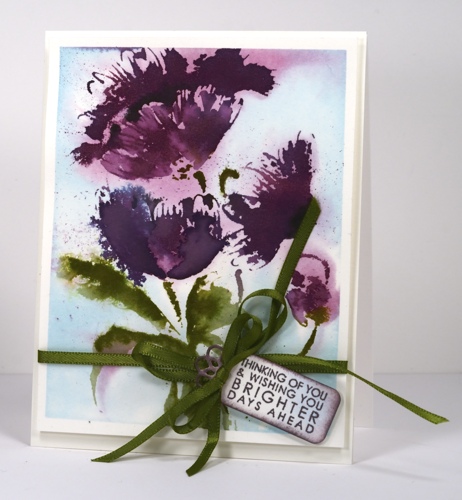
Today’s card features the new brushstroke stamp ‘Pop Pop Poppy’. All this week the new brush stroke stamps are the stars on the PB blog. Yesterday Jill Foster shared a video showing how to make her gorgeous watercolored card with this stamp.
I began by masking the watercolour panel with painter’s tape to create a border. I then painted water over the whole panel and inked the poppy petals with seeded preserves distress stain and the leaves with peeled paint distress stain. When I stamped it on the wet paper the colour bled into the surrounding area. I added tumbled glass distress stain with a paintbrush. I dabbed away a few dark areas of colour to leave areas of muted purple, blue and green on the panel as background colour. When the stain was almost dry I re-inked the petals with seeded preserves, and stamped again for a defined image. Using a stamp positioning tool I stamped the petals then the leaves with peeled paint and finally the flower centres with memento tuxedo black ink. I splattered a little seeded preserves stain over the panel as I like to do.
The little tag was cut using a die from the ‘flower tags’ set. I sponged the edges with seeded preserves ink then stamped a sentiment from ‘pretty petals’ in the same ink. To finish it all off I tied some ribbon around the panel and a bow on the tag before popping up the whole panel on a watercolour paper card base.
Supplies:
Stamps: Pop Pop Poppy, Pretty Petals (PB)
Creative Dies: Flower tags
Inks: Seedless Preserves, Dusty Concord, Bundled Sage, Tumbled Glass distress stains (Ranger), Memento Tuxedo Black ink (Imagine Craft/Tsukineko)
Cardstock: Fabriano 100% & 25% cotton hot pressed watercolour paper
Also: Green satin ribbon


